About
Services
Projects
Blog
Contact
Menu
About
Services
Projects
Blog
Contact
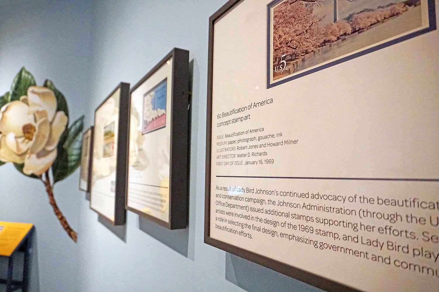
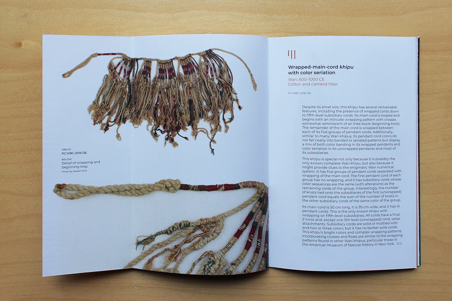
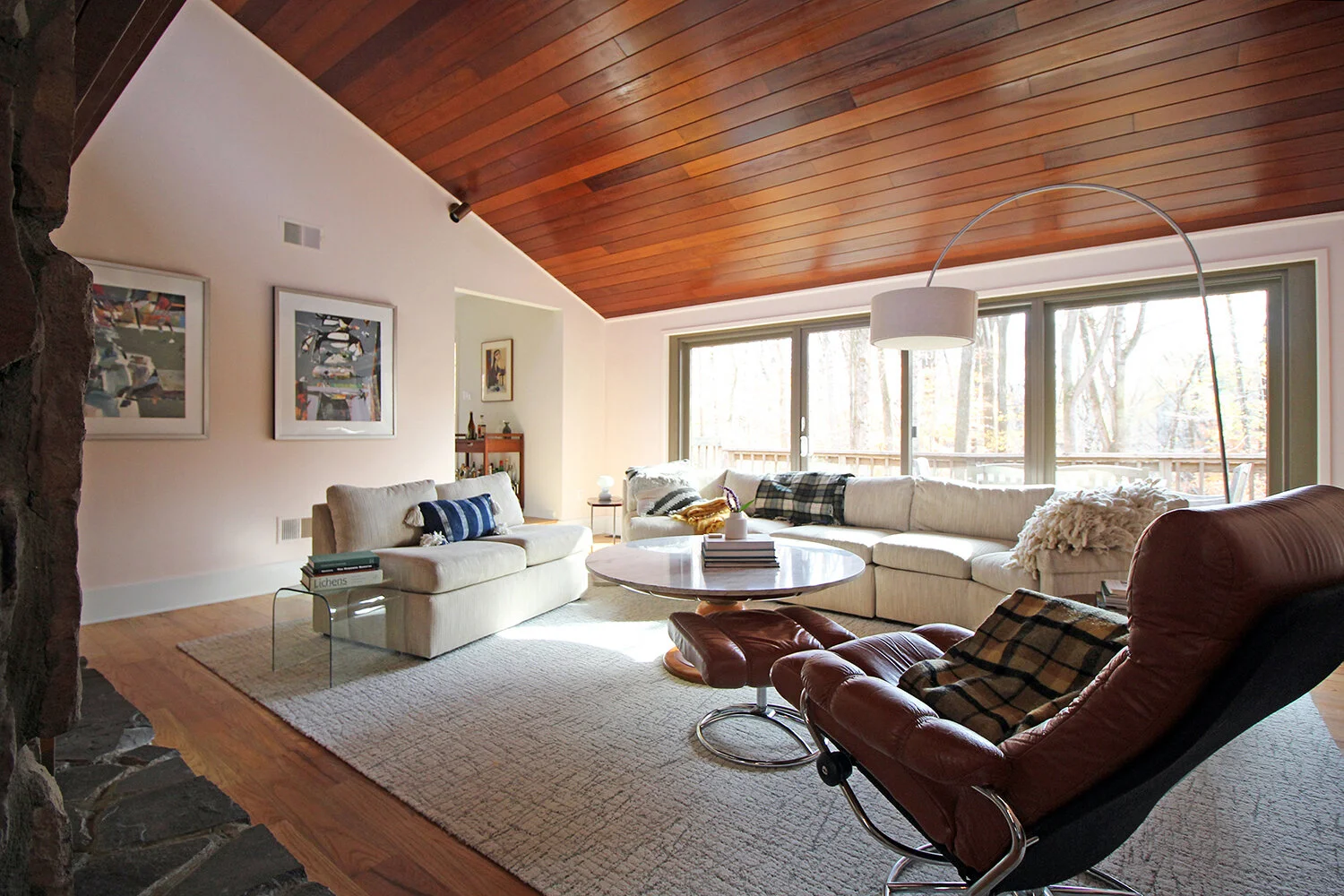
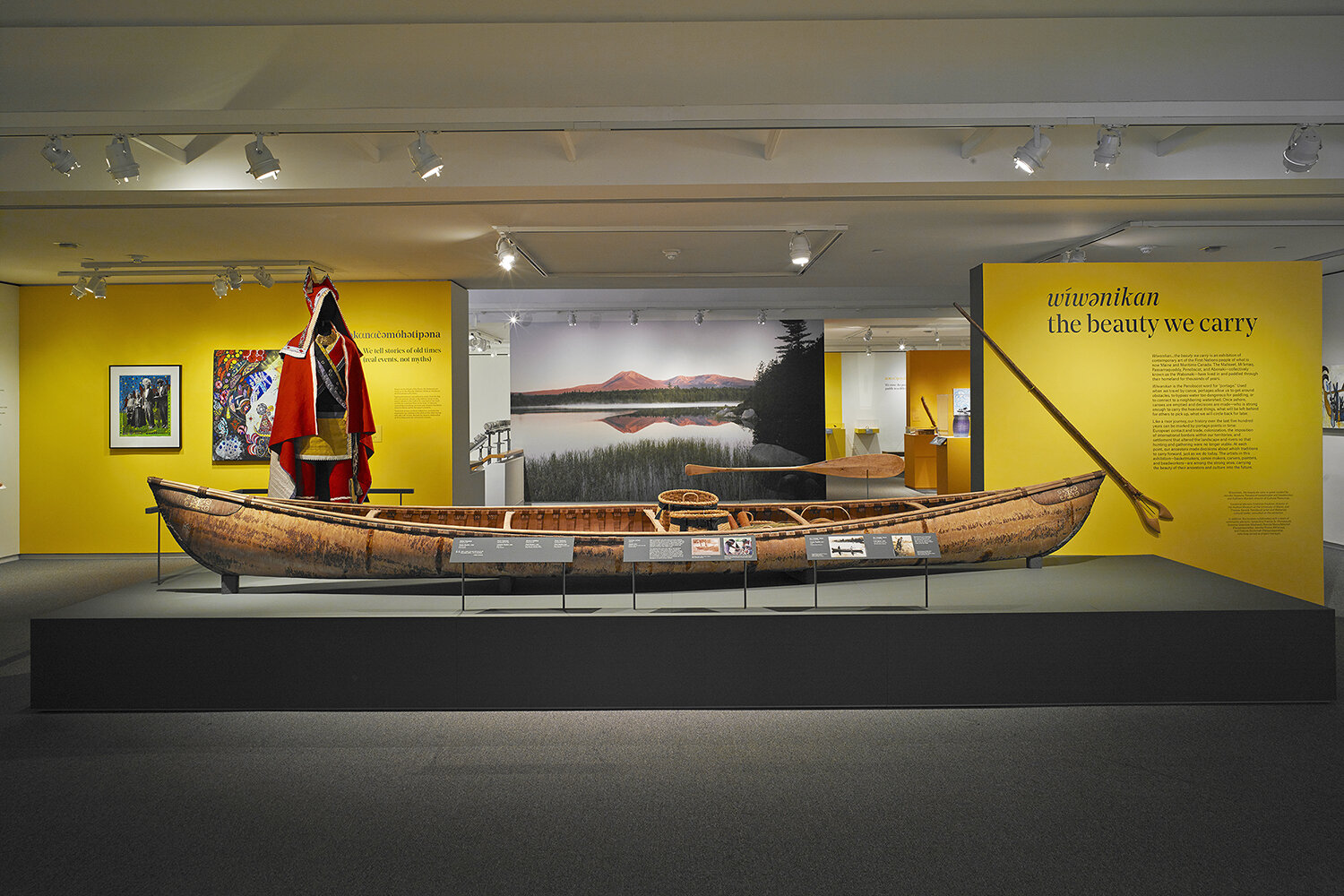
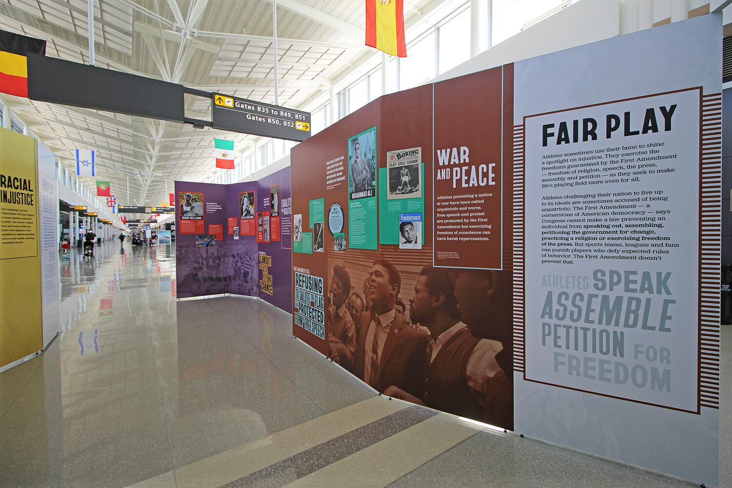
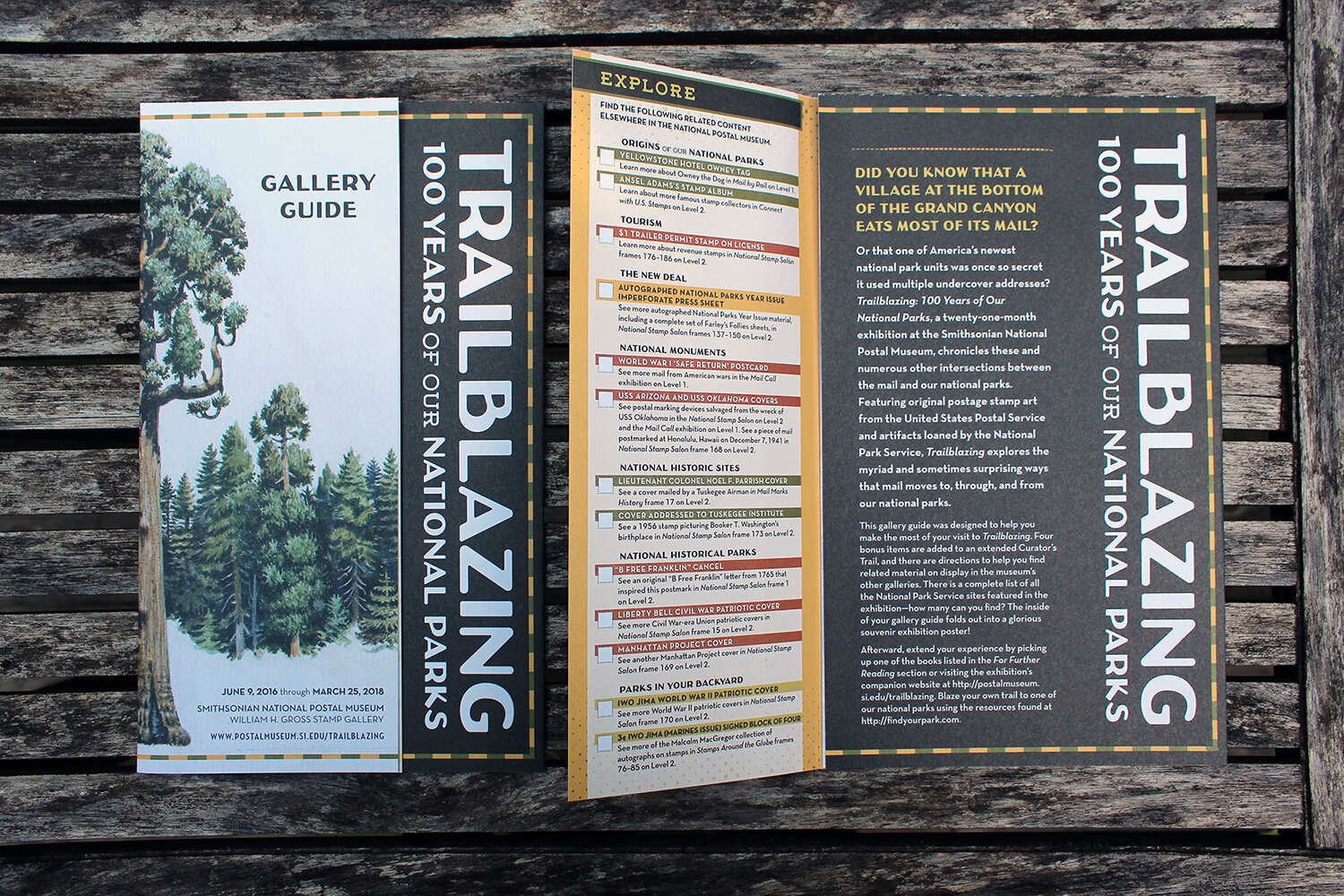
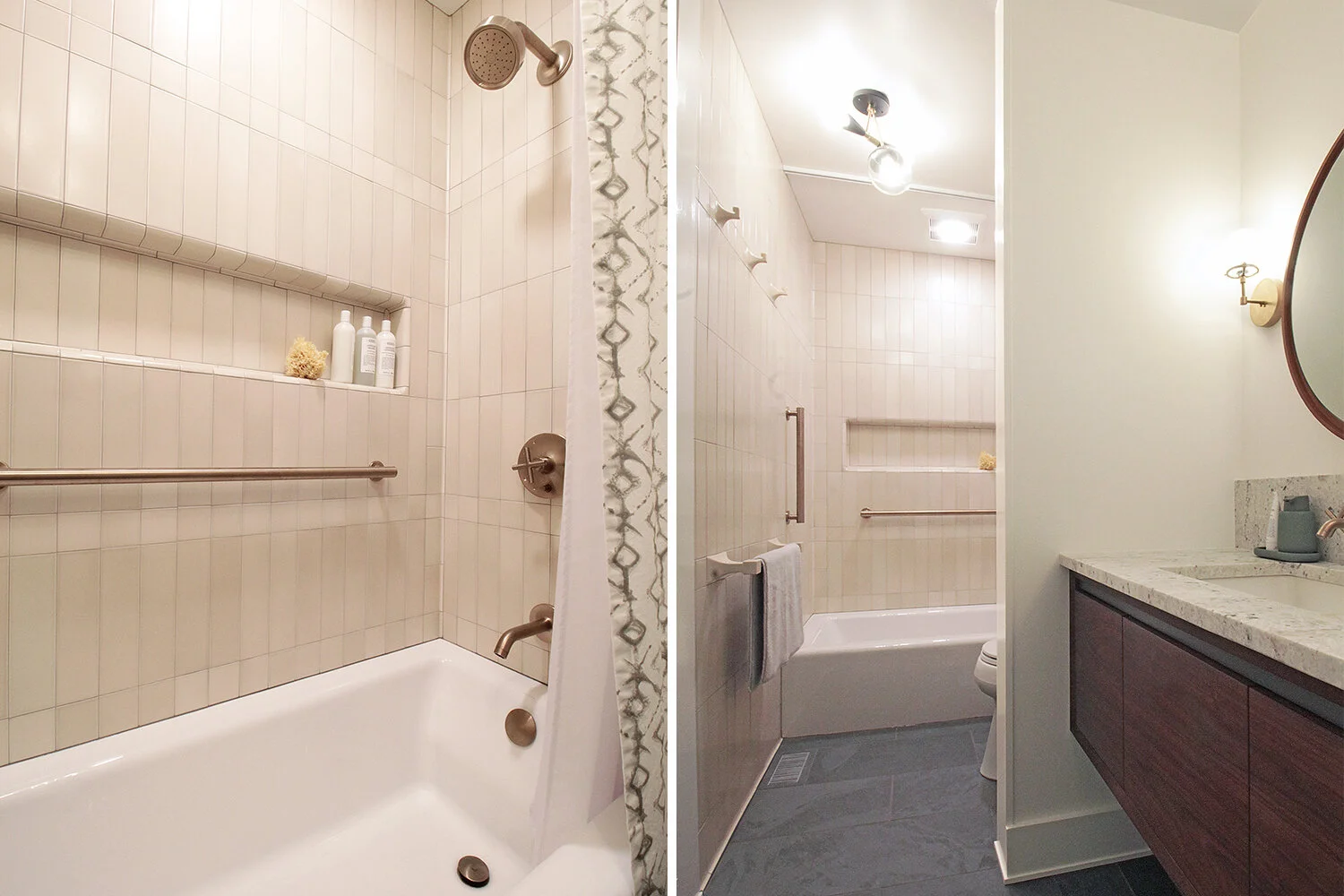
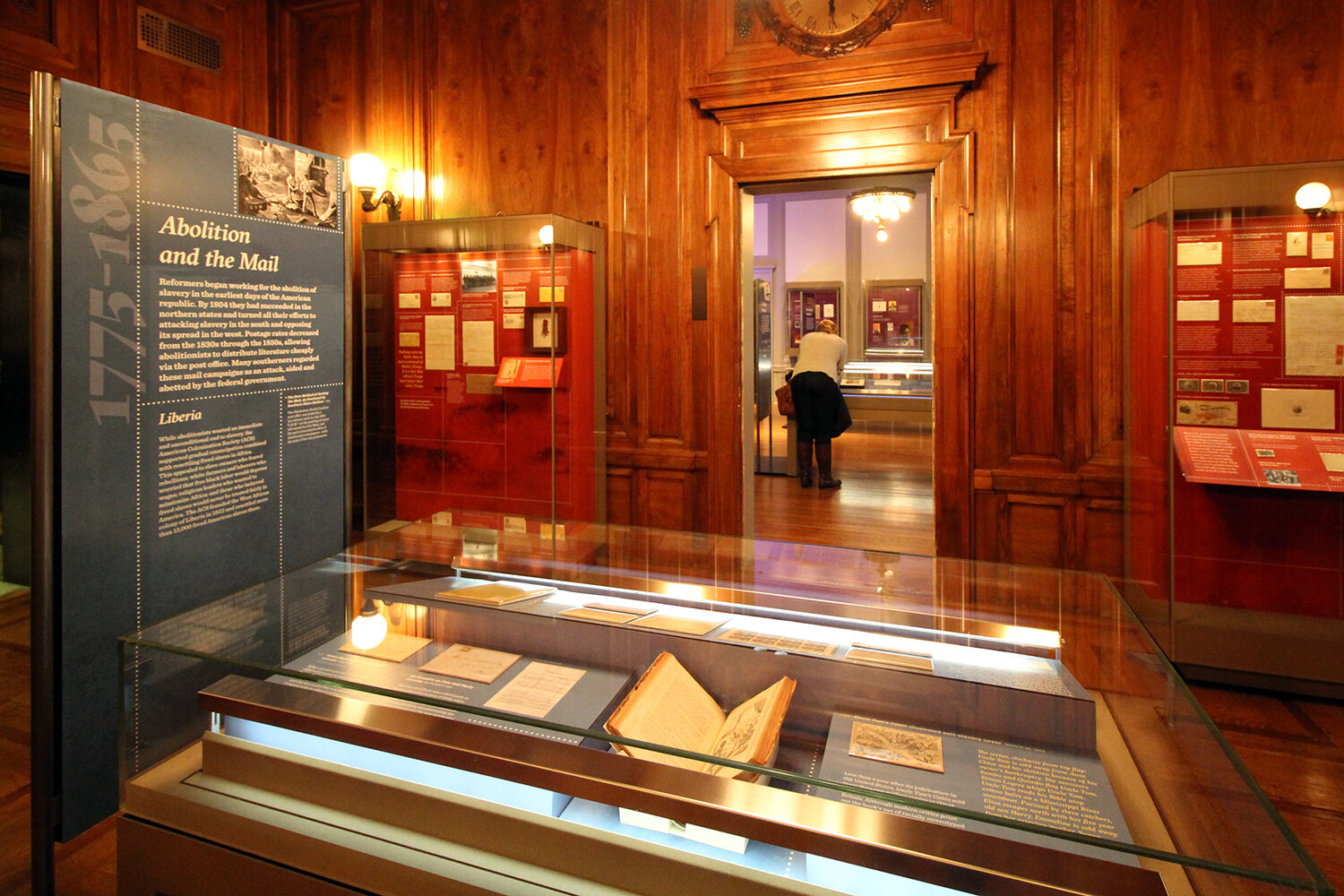
We are a small design studio specializing in museum exhibitions, interiors and graphic design, based in Washington, DC