installation

The Utopian Projects and What Absence Is Made Of

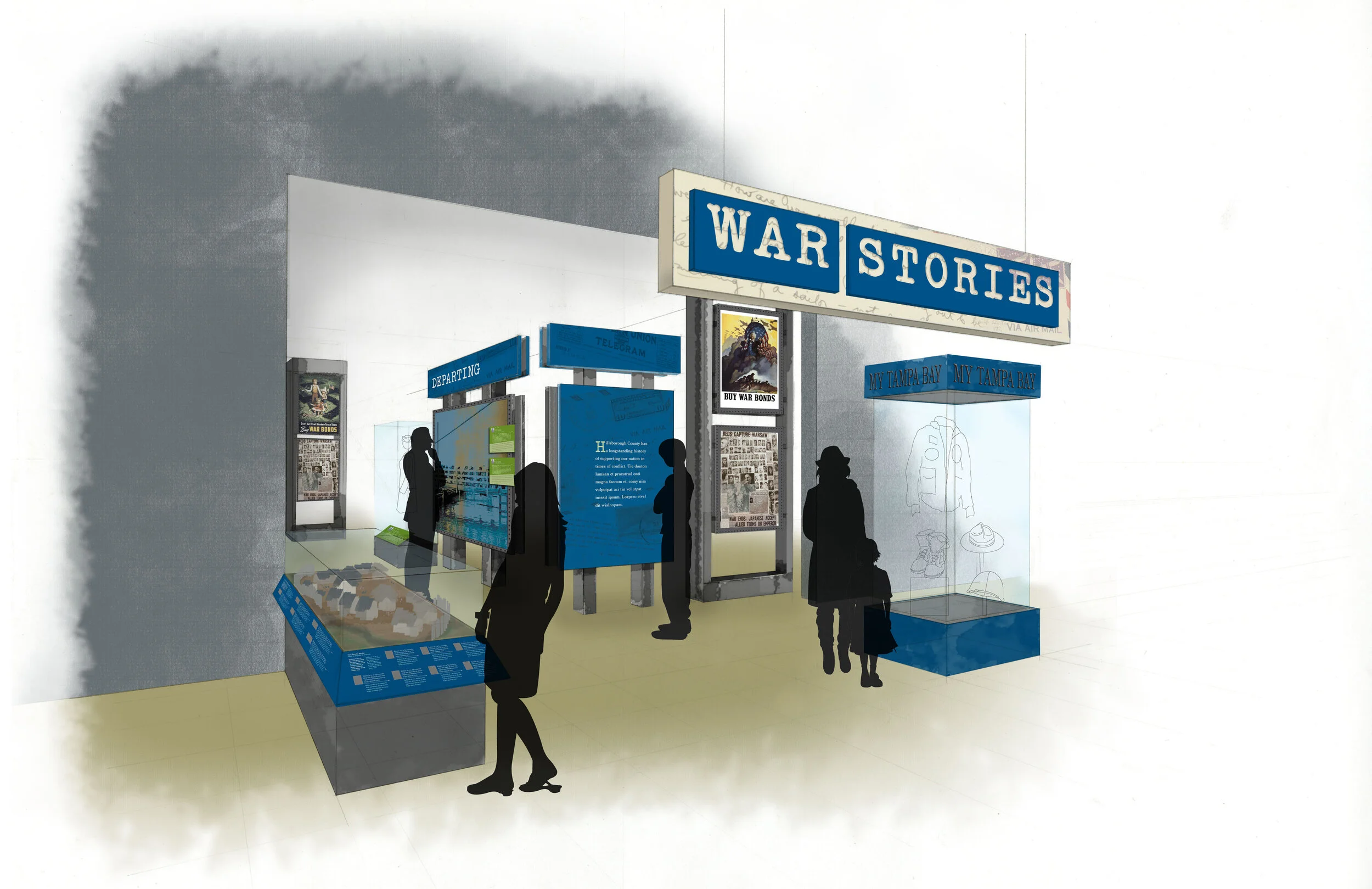
The Markus Lüpertz exhibition I shared in my last post is no longer on view at the Hirshhorn — it came and went so quickly! — but the museum has two other exhibitions currently on view for which I designed the graphics. First, Ilya and Emilia Kabakov: The Utopian Projects:

the-exhibit-designer_christine-lefebvre_Hirshhorn_Kabakov-entrance
the-exhibit-designer_christine-lefebvre_Hirshhorn_Kabakov-entrance2

Working in collaboration with the museum’s design department, I designed the exhibition’s title wall, didactic graphics, and wall quotations.

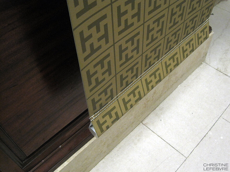
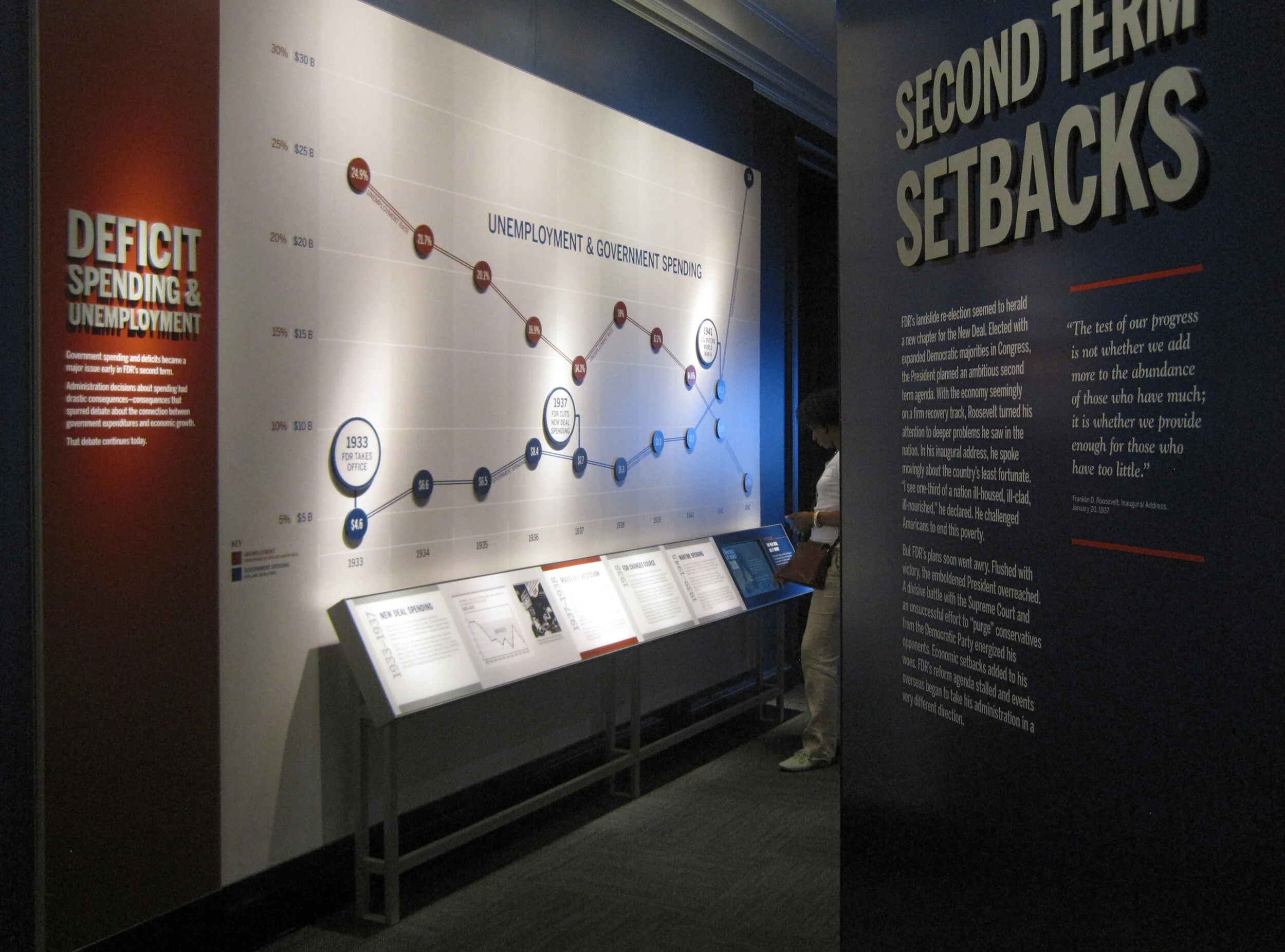
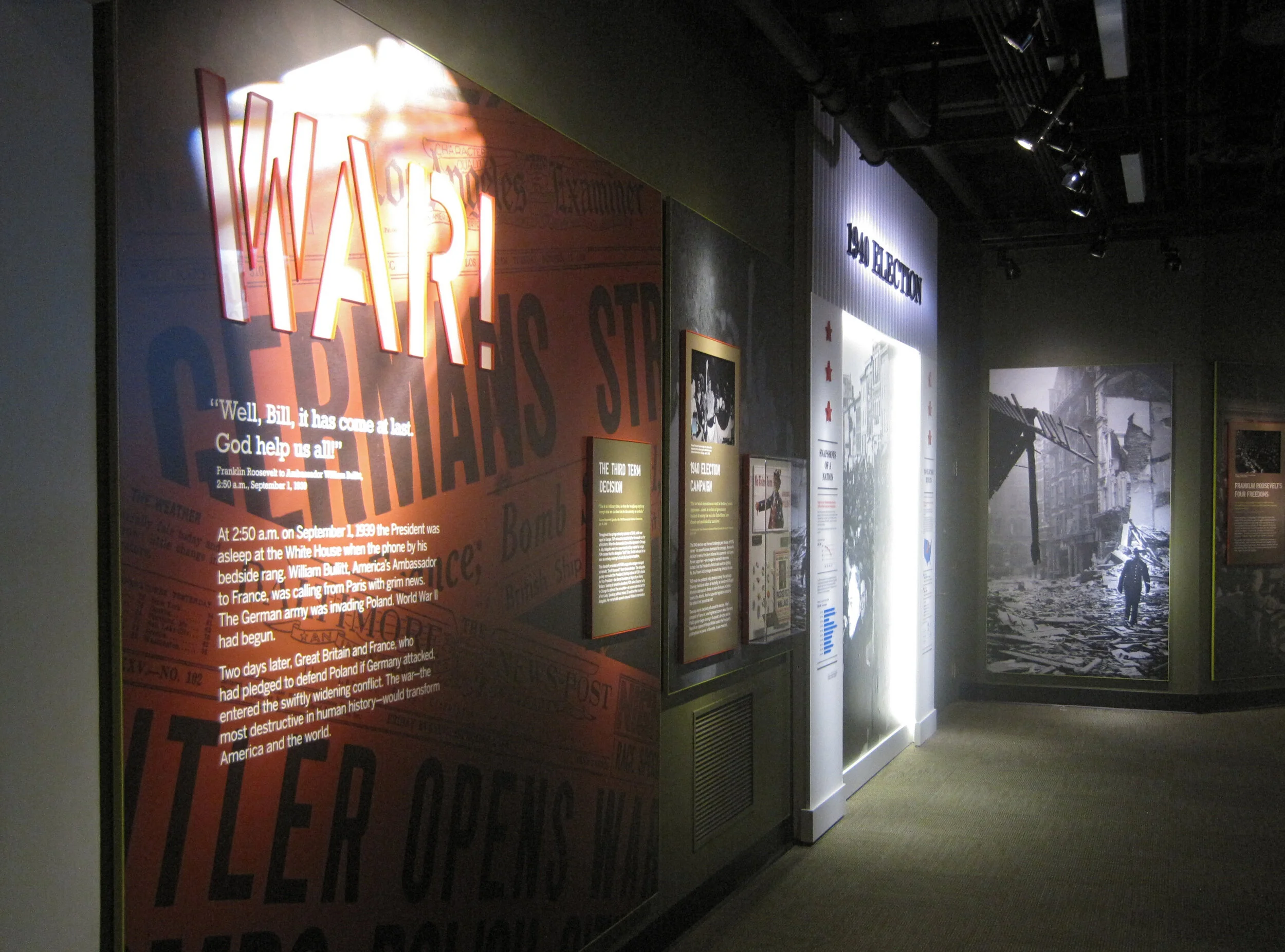
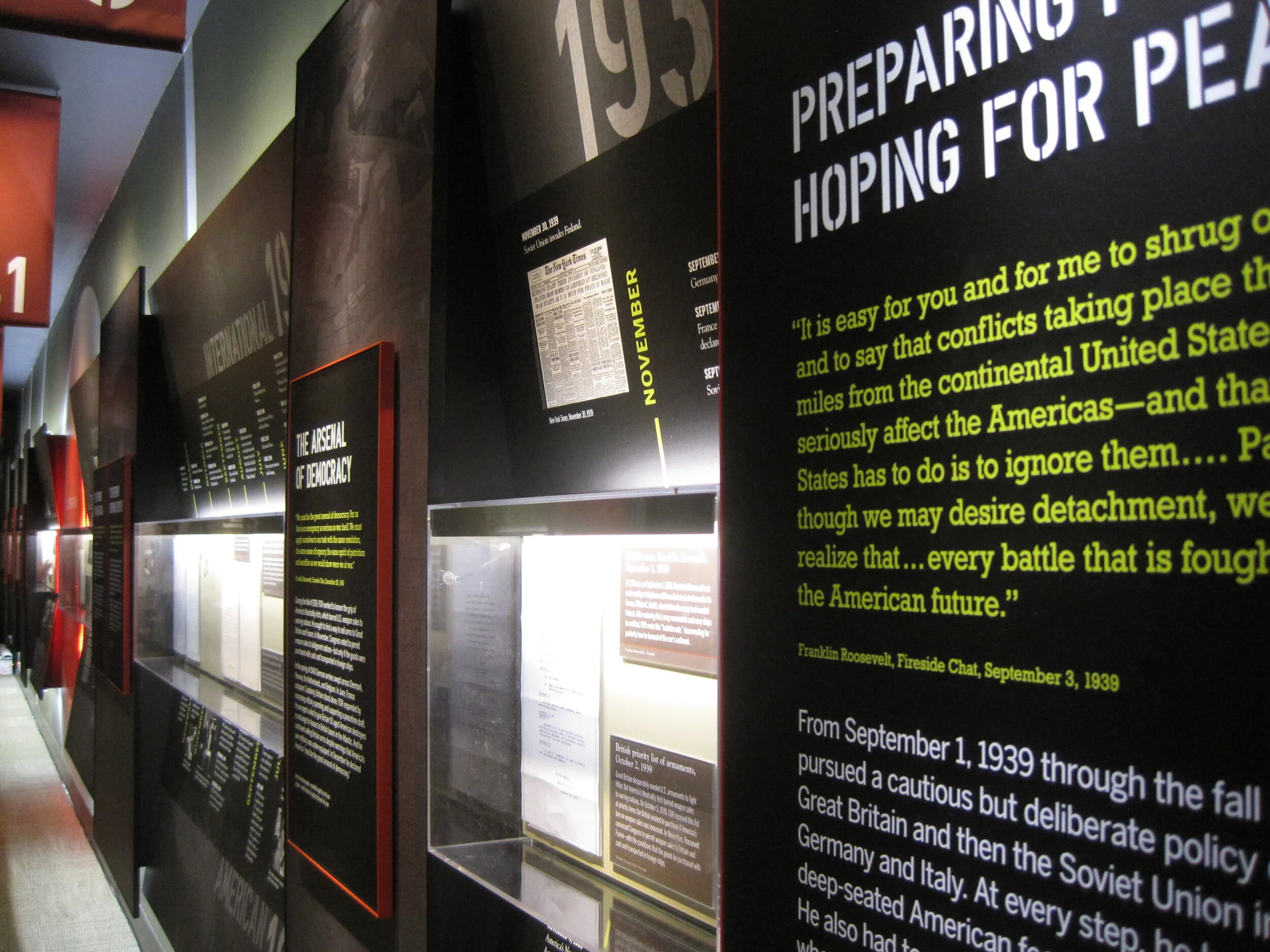
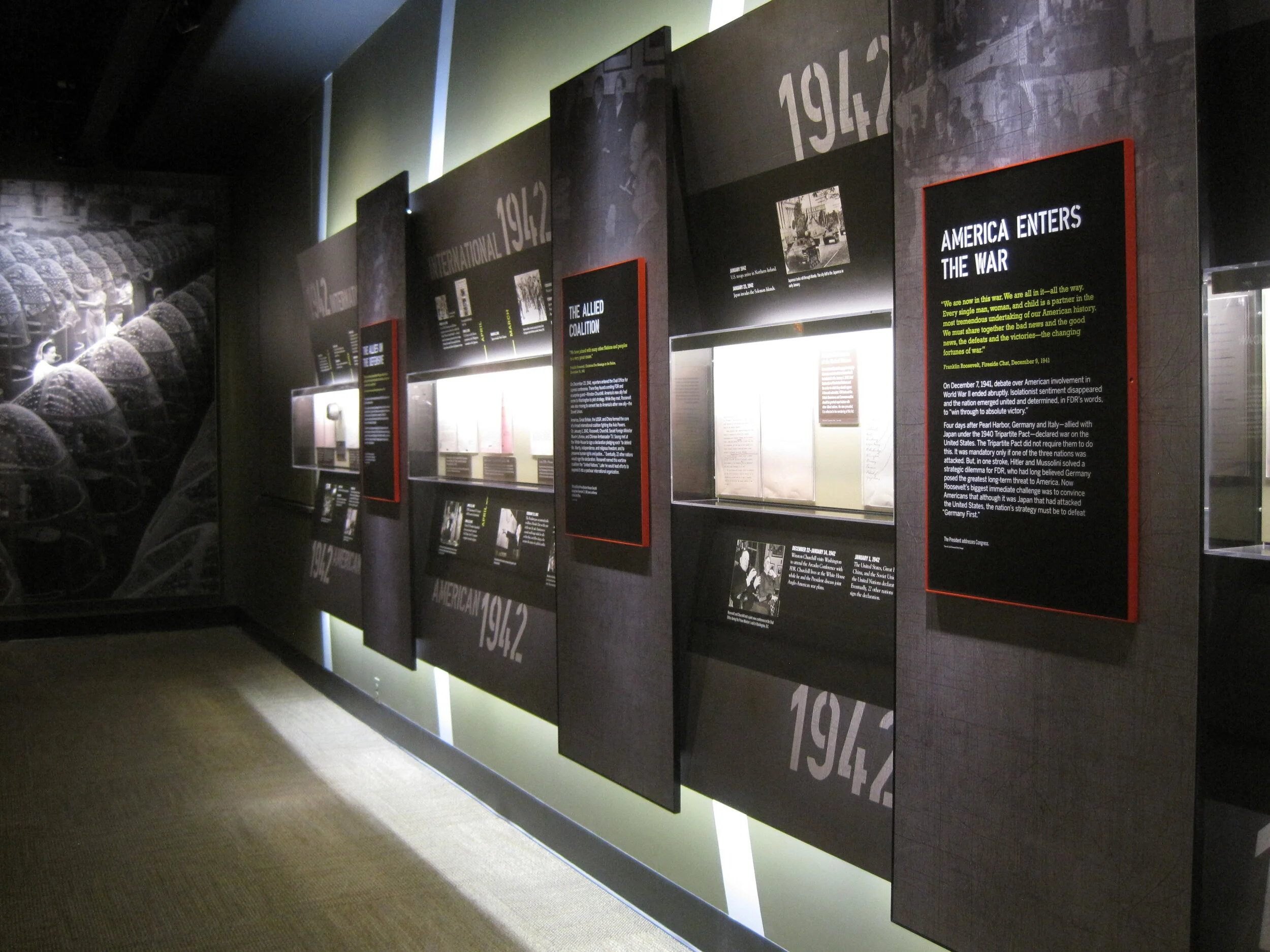
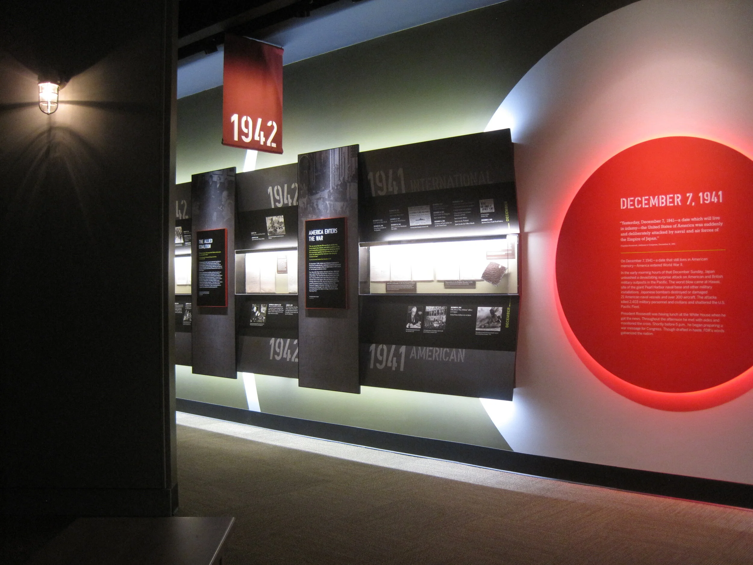
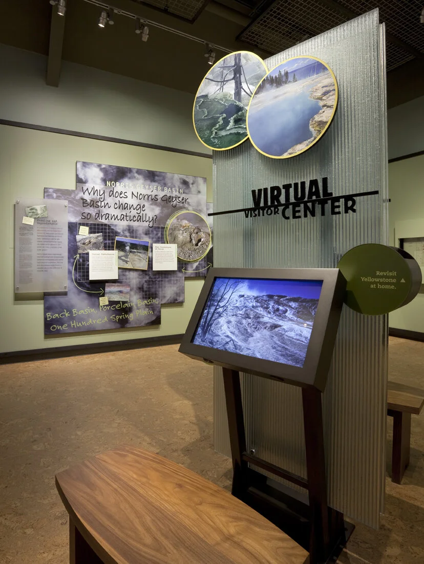
The title wall graphic is printed on DreamScape’s self-adhesive wallcovering, Caviar texture. I like the print quality of DreamScape wallcoverings — I first spec’ed them for the exhibits at the FDR Museum, and have used them a few times since. The wallcovering was installed using butt seams. The installers (Blair, Inc. in Virginia, also the graphics fabricator) wrapped the wallcovering around the wall’s edges, a tricky detail that would have looked terrible if done poorly.

the-exhibit-designer_christine-lefebvre_Hirshhorn_Kabakov-exhibition2

The graphic panels are digital prints wrapped on sign blank with a matte over-laminate. They are hung on French cleats (simple but strong), which is an easy way to hang nearly anything. Also on the panels’ backsides is MDF blocking that provides rigidity for the sign blank fronts. Here’s a photo I snapped during installation, of the backsides:

the-exhibit-designer_christine-lefebvre_Hirshhorn_Kabakov-panel-backs
the-exhibit-designer_christine-lefebvre_Hirshhorn_Kabakov-quote
the-exhibit-designer_christine-lefebvre_Hirshhorn_Kabakov-exhibition1

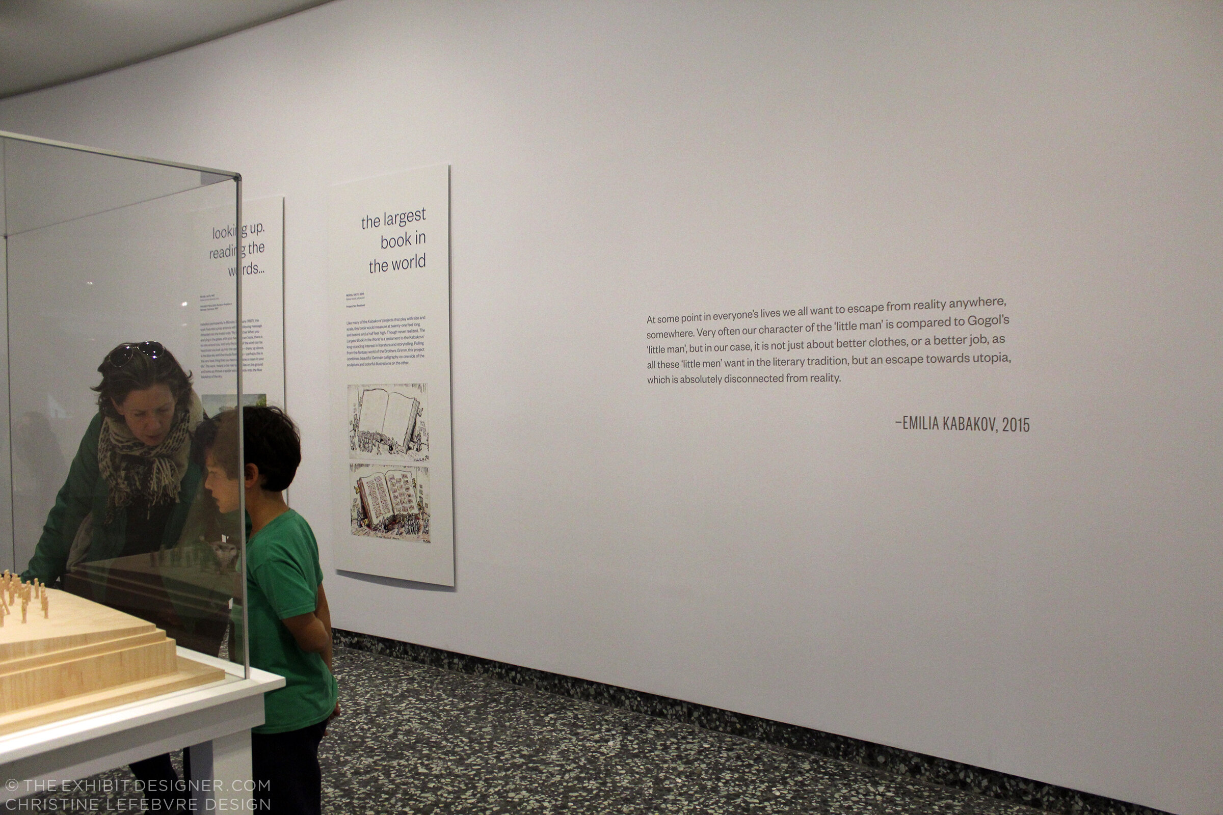
The Utopian Projects is on view through March 4. The Kabakovs’ work is fascinating — their models are so cool. Check it out if you can!

The other exhibition at the Hirshhorn, for which I designed the graphics, is What Absence Is Made Of, on view through Summer 2019. For this exhibition I designed the title wall, didactics, and an exterior advertising poster for the National Mall.

the-exhibit-designer_christine-lefebvre_Hirshhorn_WAIMO-entrance

The curator requested reflective vinyl. In addition to layout experiments, I played with color combinations (silver on white? silver on black? on gray? which gray?). I love the way the selected title design looks in silver vinyl — it catches reflections and disappears, then reappears, as you walk by it.

the-exhibit-designer_christine-lefebvre_Hirshhorn_WAIMO-entrance2
the-exhibit-designer_christine-lefebvre_Hirshhorn_WAIMO-didactic

Post updated in January 2021 with minor text edits. Broken links have been fixed. This post was originally published at theexhibitdesigner.com on 5 January 2018.

Pacific Exchange install

Work shown was completed while I was a designer at Gallagher & Associates.

I stopped by the Smithsonian National Postal Museum to check in on the installation of Pacific Exchange. I’m excited for the exhibit — my last project Gallagher & Associates — to open next week, on March 6.

While I was onsite, EPI Colorspace was there installing the large-format graphics. I’m very satisfied with the quality. Above, one of the EPI crew installs the hanging hardware for the set of three banners that introduce the exhibit. To the right is a fourth banner with the exhibit title.

After the banners were unfurled they were checked and checked again to ensure that they hung plumb. (Success!) The major graphics for this exhibit were in both English and simplified Chinese. Below: The windows to the right of the banners belong to the educational loft; we had some spectators!

Below: A detail of the weight and stitching at the banner’s bottom.

Above: Within the exhibit’s main room there is another dramatic introductory moment, this time produced in fabric stretched over a wooden frame and hung with heavy-duty D rings. There were happily no problems with measurements and everything went up easy peasy — I had my fingers crossed because there are odd cabinets with door knobs and molding behind the graphic. The EPI crew said I must be lucky.

Below: Graphics wait to be installed within the window openings between the gallery and the lobby.

Above: Work zone!—and three of the completed artifact cases. Below: Installed artifacts. More photos to come when everything is complete!

Post updated in January 2021 with minor text edits. Broken links have been fixed. This post was originally published at theexhibitdesigner.com on 27 February 2014.

FDR Museum, part 4: rear-lit and neon

Work shown was completed while I was a designer at Gallagher & Associates.

To wrap up my series on the design, fabrication, and installation of the Franklin D. Roosevelt Museum, a close look at the first exhibition gallery.

The first gallery sets the stage for FDR’s presidency: the Great Depression. The focal point here is the neon-illuminated “FEAR” wall. Text is silkscreened onto the glass panels and rear-illuminated with LED pads. The red color comes from the custom “UMEMPLOYED” neon letters; the mural image in the back is a black and white photographic print.

The FEAR letters are applied to the rear of the glass. I wanted them to be translucent — to allow the mural image to show through and create depth — and also be as richly black as possible. The fabricators, Explus, provided a variety of production samples to try to achieve the effect I was after. Printing the letters on a transparent film and applying it to the glass, in particular, was unacceptable as I wanted a uniform transparency (no streaks, no dots).

Explus created a self-adhering vinyl by applying Sentinel OptiClear Adhesive to the face of the gel sheet (Rosco Cinegel Neutral Density N.9 Gel Extra Wide) and die-cutting it. I was happy, but the fabricators had some difficulty with cutting and applying the gel sheets. Their graphics manager told me that if they were to do something like this again they would use a standard window tint that has the application adhesive already on it. Here’s the sample:

Turning to the wall opposite:

The background mural is printed on DreamScape, as I mentioned in a previous post. Most of the murals in this museum were applied to backers, framed, and cleat-hung to the wall, but this particular one was applied directly to the wall and its edges captured with flat aluminum strips.

The framed graphics are digital prints with an overlaminate, mounted to sign blank. They were applied onsite to an MDF backer panel and aluminum frame. (The backer and frame are screwed to the exhibit wall; the graphic is applied with VHB tape.) Explus welded the frames’ corners before painting them, and that made a huge difference in the appearance of them. They are nicely finished and high-quality.

Post updated in January 2021 with minor text edits. Broken links have been fixed. This post was originally published at theexhibitdesigner.com on 25 June 2013.

FDR Museum, part 3: almost done!

Work shown was completed while I was a designer at Gallagher & Associates.

I am back in Hyde Park — installation continues! The exhibits are quickly coming together as the opening nears. Most of the graphics are hung, dimensional letters have been pinned (there are a ton throughout the museum — I went dimensional-letter-happy), and the interactives are being field-tested. I think it all is looking great. Some photos of the A New Deal gallery:

IMG_8087.JPG
IMG_7985.JPG
IMG_7806.JPG
IMG_8131.JPG

Artifact cases are being filled:

It’s a papier-mâché FDR sphinx!

IMG_8146.JPG

The World War II timeline is nearly complete (two weeks ago there wasn’t much hung besides the skeleton). What a bear that was to design!

IMG_7941.JPG
IMG_8168.JPG

I may have snuck into some New York Times photos while I was onsite. The critic and photographer were there, I was there ... who’s to say. We’ll see.

Post updated in January 2021 with minor text edits and additional photos. This post was originally published at theexhibitdesigner.com on 24 June 2013.

FDR Museum, part 2: installation continues

Work shown was completed while I was a designer at Gallagher & Associates.

I was back onsite with the Gallagher team at the FDR Library this past week and took more photos of the exhibit installation. It’s exciting to see the various elements go up. The exhibits are dense and layered; it’s a big story to tell in a relatively small space. The exhibits are in the original — now renovated — library conceived by Roosevelt himself so we were restricted to the existing spaces while designing the new exhibits.

Most of the graphics still have a protective film layer and ID label on them. In other places there are backers awaiting graphics, brown paper-wrapped graphics sitting on the floor, and assorted construction detritus. But bit-by-bit it’s going up! And we all know that everything happens in the last week before opening anyway. ;)

Updated, to add a photo of the finished gallery, The Promise of Change:

IMG_8042.JPG

Updated, to add a photo of the finished gallery, Foundations of a Public Life:

IMG_8066.JPG

Below, left: These graphics will be installed into the WWII timeline, on the right side of the photo above. They are printed on Laserchrome, which I mentioned in my previous post — and they look incredible.

I also mentioned the DreamScape wallcovering; below is a shot of some installed murals. I think they look good. Once the text panels, dimensional titles, reader rails, etc. go up — it will look great. More, soon!

Post updated in January 2021 with minor text edits and additional photos. Broken links have been fixed. This post was originally published at theexhibitdesigner.com on 16 June 2013.

FDR Museum, part 1: under construction and opening soon

Work shown was completed while I was a designer at Gallagher & Associates.

For the past couple of years I’ve been working on the Franklin D. Roosevelt Presidential Library and Museum, in Hyde Park, New York and (holy cow) the public opening is less than a month away. With time dwindling, I am finally sharing some process photos: production samples, shop visits, and installation.

The library has been posting photos of the installation on their tumblr. (2021 update: their tumblr is still going strong!) The photo below comes from there; I grabbed it to highlight the graphic in the background. There are four of these structures throughout the museum, one for each of FDR’s elections.

The “election stats” graphics are silkscreened onto Acrylite P-95 with white vinyl film adhered to the second surface. Silkscreening on P-95 creates a subtle shadow, which at certain angles makes the text appear dimensional. (For this reason, it should also be done with caution.) Here’s a photo of the sample provided by Explus, the fabricator (the installed graphic above is waiting for its red dimensional stars to be attached):

Below, the main story panels, used in the World War II gallery, which I am especially happy with:

They’re built from 5/8" clear acrylic, which has been painted on the front surface with acrylic paint, with a “window” left free of paint. The text is printed onto the painted acrylic surface, and then the photo — a Laserchrome metallic print — is adhered to the second surface of the acrylic, within the window area.

The photo above gives you a sense of the depth and jewel box effect created by layering the photo behind the acrylic. And here’s a peek at the backside of the pane. The aluminum angle frames are painted with Matthews acrylic polyurethane paint:

For wall murals I spec’ed DreamScape wallcoverings in various finishes. Above is another photo from the FDR blog, showing a few installed murals (currently missing their dimensional titles, and the scaffolding structure that will be located in front). I’m pleased with the crisp image quality, especially on the rough textures, such as “Plaster” (below, on the left) and “Mystical” (on the right).

Post updated in January 2021 with minor text edits. Broken links have been fixed. This post was originally published at theexhibitdesigner.com on 3 June 2013.

Old Faithful Visitor Education Center (Happy Holidays)

Work shown was completed while I was a designer at Christopher Chadbourne & Associates.

This vintage Yellowstone ornament, a gift from my dad, holds extra significance because of my work on the design of the Old Faithful Visitor Education Center in Wyoming. The Education Center held its Dedication Ceremony and Grand Re-Opening earlier this year, on August 25.

000 yellowstone COMP_0106_o.jpg

The Old Faithful Visitor Education Center teaches the science behind Yellowstone National Park’s stunning hydrothermal and geological features.

As part of the Christopher Chadbourne & Associates design team, I worked on Design Development, and the Production Services phase. Ernesto Mendoza was the senior graphic designer.

Here’s a project description at SEGD that goes into detail about the design considerations and process, and an article from inhabitat with more photographs.

(The good photographs (i.e. those to the left and below, and the three at the bottom of this post) are by Jay Rosenblatt.)

023 yellowstone img_0150.jpg

I took on a lead design role for the Yellowstone is a Natural Laboratory area, and developed the visual concept, inspired by scientists’ gridded field notebooks. The entire exhibit, and this area in particular, used many interactive elements to explain complicated scientific concepts in an accessible way.

christine-lefebvre-yellowstone-visitor-center-title.jpg
IMG_2944.JPG
christine-lefebvre-yellowstone-visitor-center-lake.jpg
christine-lefebvre-yellowstone-visitor-center-norris.jpg

Here’s an elevation of the Norris Geyser Basin section (the graphic design was tweaked after this):

6.3 Norris Geyser.jpg
christine-lefebvre-yellowstone-visitor-center-interactive.jpg
christine-lefebvre-yellowstone-visitor-center-interactives.jpg
035 yellowstone _mg_3631.jpg
021 yellowstone img_0125.jpg
old-faithful08.jpg
042 yellowstone _mg_3658_o.jpg
old-faithful01.jpg

And because it’s fun to look back, here are some photos from a shop visit at Pacific Studio. It’s always exciting to see designs mocked up like this. (Not as exciting as the final exhibit, of course!) We used a lot of direct print on frosted P95 acrylic, and digital prints applied to sign blank (wrapped with an overlam), for graphic panels.

2010-06-28 12.57.54.jpg

Post updated in January 2021. Broken links have been fixed. This post was originally published at theexhibitdesigner.com on 26 December 2010.

The News 01.19.10

A compilation of design-related web finds.

L.A.’s Natural History Museum to receive $1-million grant for new permanent exhibition | Rising Currents: Projects for New York’s Waterfront — I’ve been following with interest the progress of the program and upcoming exhibit on the MoMA/P.S.1 blog | Towards a New Mainstream? On 27 January 2–3pm EST, a lecture by Gregory Rodriguez exploring demographic change in the Americas, cultural transformation, and the future of museums | Color Identifying System for the Color Blind | An Increasing Craving for Experiences; there has been a lot written lately about experience-over-stuff — hello, museums! | Light Touch interactive projector turns any flat surface into a touchscreen | An Architect’s Philosophy of Photography | Steffen Dam: Specimen Panels These are beautiful; very “natural history museum” | Barton’s Bonbonniere, From Architectural Forum c. 1952 — I love it! What a fun space.

AND NOW, something from the portfolio:

Work shown was completed while I was a designer at Christopher Chadbourne & Associates.

Perfectos.jpg

This time last year (January 17, 2009), the Tampa Bay History Center — designed by Christopher Chadbourne & Associates — held its grand opening in downtown Tampa, Florida. I worked closely with the project’s senior graphic designer Jeff Stammen on design development.

(Photo above and first three photos below, courtesy Tampa Bay History Center.)

Cattle.jpg
Container.jpg
07 Tampa Bay History Center 214_sm.jpg

I took a leading design role for the timeline (Your Tampa Bay) and the War Stories gallery. Below is my sketch of the War Stories gallery, and below that, a photo I took during installation — hence the empty case.

theexhibitdesigner_TBHC-war-stories-install.jpg

All the graphics in this museum were designed with both English and Spanish text. I love the challenge of designing multilingual graphics.

I was also responsible for Construction Administration, and supervised the exhibit installation. I love shop visits, site visits, inspecting fabrication samples … all of that. What happened with the Tampa installation was a little … let’s just say, complicated. The local fabricator, Creative Arts, was fantastic and saved the installation day in a lot of ways. I ended up effectively living in a hotel room for a couple weeks during the tail end of installation — much longer than my trip to Tampa was supposed to be. It was quite the learning experience. In hindsight, I can say I had fun.

(Photo above and photo below, courtesy Tampa Bay History Center.)

Your_Tampa_Bay.jpg
tampa_092.JPG
tampa_290edit.jpg

Post updated in January 2021. Broken links have been fixed or replaced with archived URLs, courtesy of archive.org. This post was originally published at theexhibitdesigner.com on 19 January 2010.