
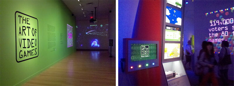
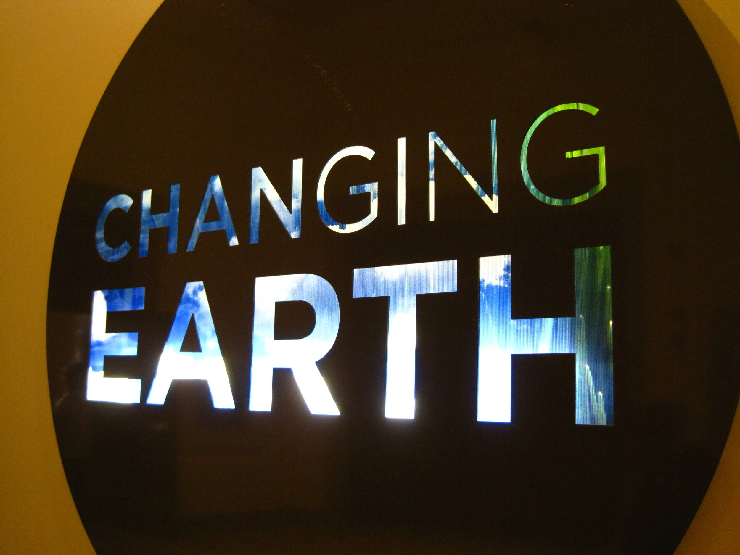
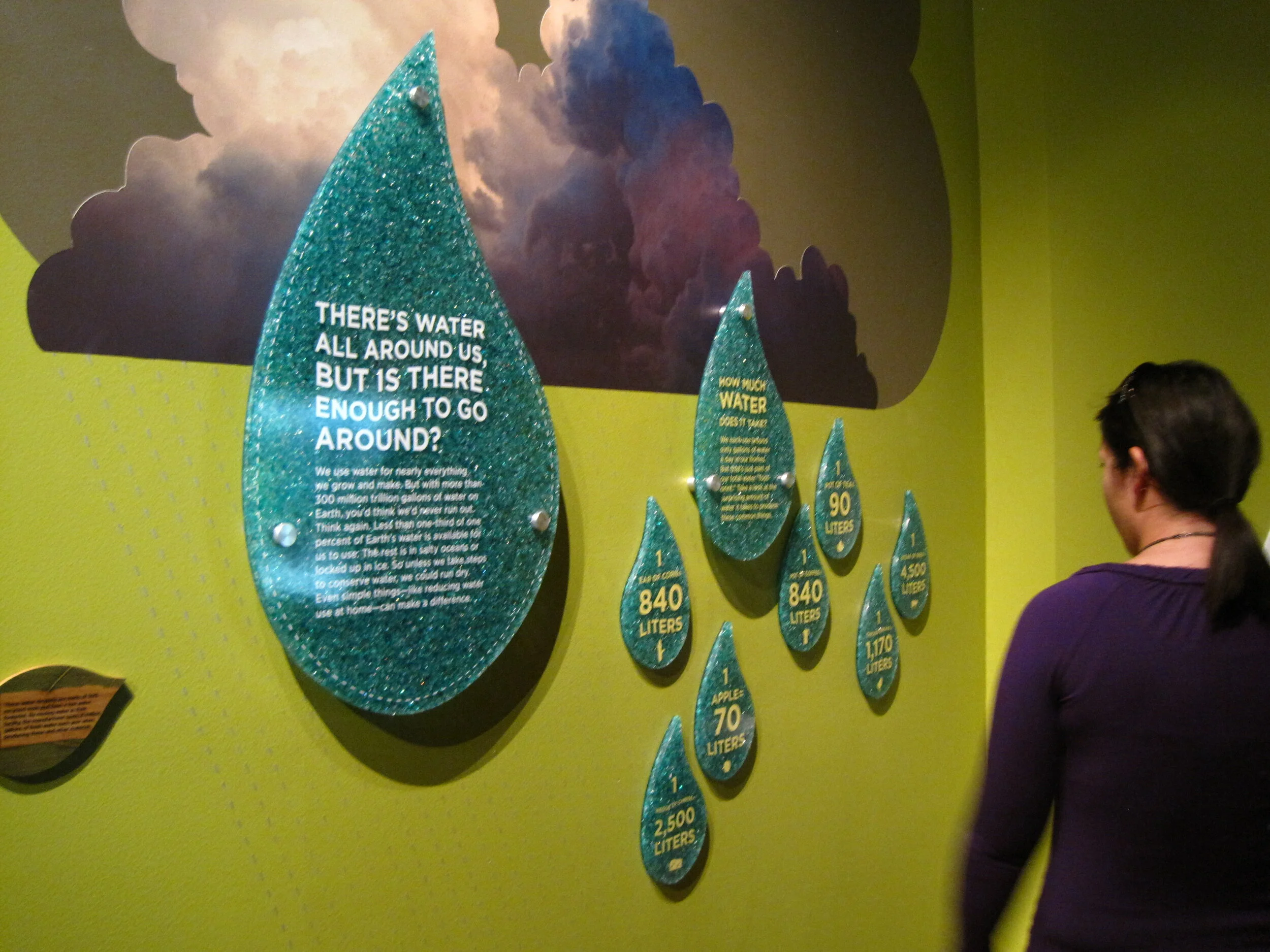
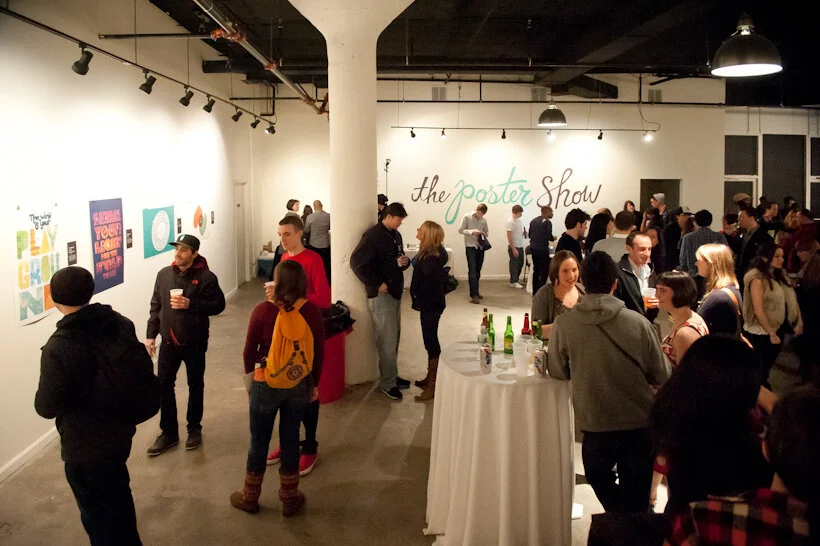
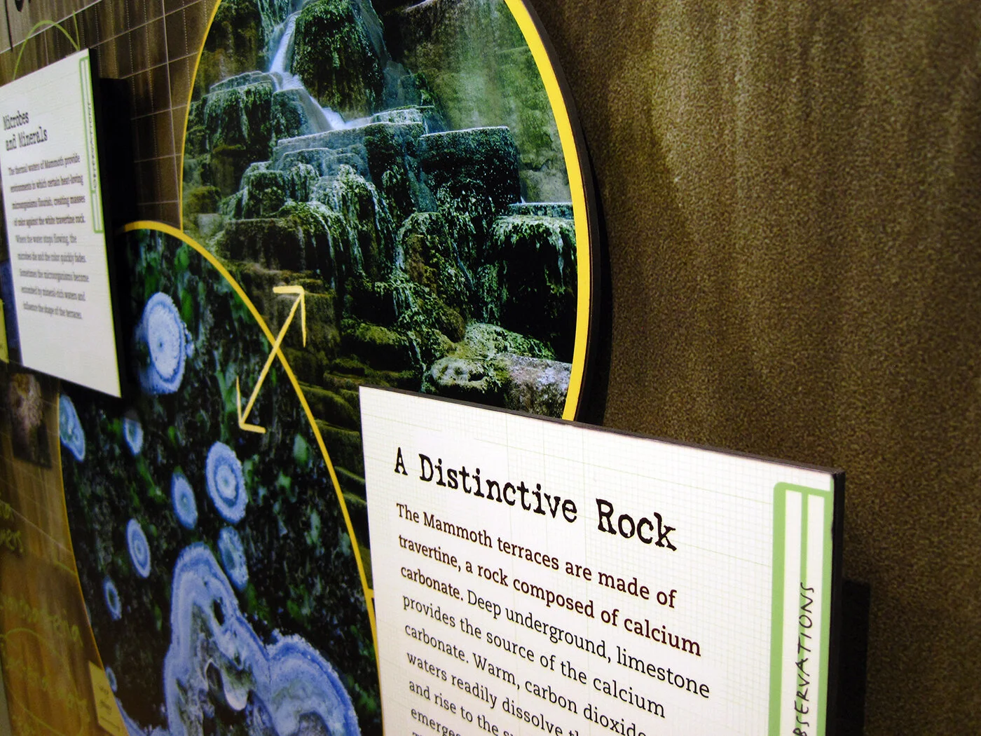
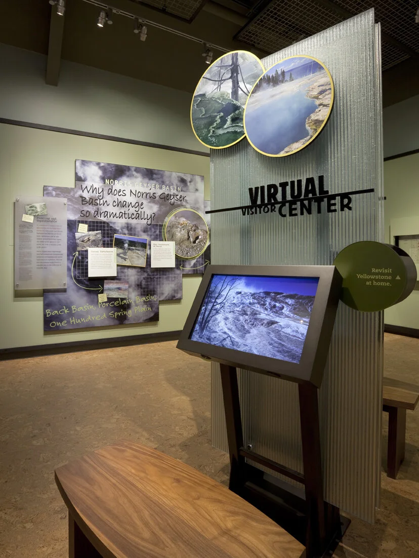
A compilation of design-related web finds.
The Google Web Lab at the Science Museum in London | Designing for Accessibility: MoMA’s Material Lab | Harvard Medical School’s “Training the Eye” course | SEGD is hosting a symposium, “The Art of Collaboration” (link no longer available) in Raleigh October 4–5 | The last day to see the Terracotta Warriors in North America is August 26 in Times Square | The National Museum of American Jewish History in Philadelphia now offers free admission for their first floor gallery | Why the Museum of Broken Relationships is so great (it’s not just the name) | 100 Toys that Define Our Childhood — vote for your favorites for a new exhibit at the Children’s Museum of Indianapolis. Voting ends tomorrow, August 17 | Places that Work: U.S. Botanic Gardens | Spiders Alive! at the American Museum of Natural History (NY Times review) | Are some fonts more believable than others? and How to explain why typography matters | I’ve been pinning obsessively over on Pinterest.
Post updated in January 2021 with minor text edits. Broken links have been replaced with archived URLs, courtesy of archive.org. This post was originally published at theexhibitdesigner.com on 16 August 2012.


