mv1

My hazy memories of the Perot Museum

A few days ago I was talking with some colleagues about the Perot Museum of Nature and History in Dallas, Texas. Someone remembered one responsive interactive; I remembered a different one ... and then I remembered that I haven’t shared any photos from my visit (nearly a year ago).

The responsive interactive I remembered was located in the lobby. Models of water molecules danced up and down from the ceiling in response to the movements of people below. The molecule models were controlled by cameras in the ceiling that sensed movement and triggered motors that made them dance.

And that’s about where my specific memories break down. What I do remember is how large the museum is, with 11 permanent exhibit halls, and that the day I went it was JAM-PACKED.

There was something there for everyone though, even if it took a bit of maneuvering to get around and find it. I liked the dinosaur gallery:

And bits and pieces of other galleries, including the entrance to the Gems and Minerals Hall:

I was really taken with these benches sprinkled throughout the museum, with their cut-out factoids:

Overall, we were intrigued, learned some things, and had fun. (Just don’t ask me for details.)

I’ll wrap this post up with a photo I took of the roof. From the museum’s Wikipedia page: “It has a stone roof which features a landscape of drought-tolerant greenery inspired by Dallas surroundings. … Building on the museum’s commitment to resource conservation, the new building integrates a variety of sustainable strategies including a rainwater collection system that captures run-off water from the roof and parking lot, satisfying 74% of the museum’s non-potable water needs and 100% of its irrigation needs.”

Post updated in January 2021 with minor text edits. This post was originally published at theexhibitdesigner.com on 20 March 2014.

Game on: The Art of Video Games

I visited The Art of Video Games at the Smithsonian American Art Museum. (It’s gotten quite a bit of press — here is one thoughtful review, from The Mary Sue.) The exhibit covers the past 40 years of video game art and includes interviews of game designers and developers, conceptual art, video displays of 80 games (voted on by the public), and playable games (five, for the five eras of game technology).

I would have loved to play some Super Mario Brothers, but the wait was at least 10 kids deep so I had to move on. Vintage game consoles were on display in lit display “consoles,” along with video game stills and interpretive text.

The exhibit designers describe their process and the materials and production techniques used, in this blog post from Smithsonian Exhibits. There is also an upcoming gallery talk, “Building The Art of Video Games(link no longer available) on August 21. For those of you not in the DC area, the exhibit will travel beginning late October.

Post updated in January 2021 with text edits. Broken links have been replaced with archived URLs, courtesy of archive.org. This post was originally published at theexhibitdesigner.com on 15 August 2012.

Another world: the Van Cleef & Arpels traveling exhibit

I am awed by the Van Cleef & Arpels traveling exhibition. But alas, I can only look at photos.

My colleague Zhengyuan saw this exhibit twice. Once while it was on view in NY at the Smithsonian Cooper-Hewitt (where it was called Set in Style) and then again when it moved to MOCA Shanghai (where its name was changed to Timeless Beauty). (When it was on view in Tokyo it had yet another name, Spirit of Beauty.)

Zhengyuan shared photos of the MOCA Shanghai exhibit:

She described the exhibit, “they didn't move the entire exhibit set to Shanghai, but there were some new displays, like the octopus-like structure. The space is very dark ... and the sparkling bubble glass displays make it look like an underwater world!” She thought both versions were fantastic.

The designers, Patrick Jouin, explain: “for this exhibition we wanted the visitors to lose all sense of time, to open a door onto an imaginary world. The nature theme, which is a major source of inspiration for Van Cleef & Arpels, has also influenced the scenography. The pieces in the exhibition are presented in gigantic glass drops. In order to create a sensual and mysterious installation, we have used various types of illusions.”

The photos below are from the Cooper-Hewitt exhibit, taken by Matt Flynn, © Smithsonian Institution:

While both exhibit versions used the bubble glass cases, the Cooper-Hewitt’s version seemed more traditional than MOCA Shanghai’s. Less octopus-structure and more tables and wall vitrines. I’m curious what challenges the designers had to address as they designed an exhibit for travel to four different countries (Japan, the US, Shanghai, and France). In all its iterations, it is a gorgeous exhibition.

Post updated in January 2021 with minor text edits. Broken links have been fixed. This post was originally published at theexhibitdesigner.com on 21 June 2012.

America’s Mayor, at MCNY

Dragging out photos from the archives for your inspiration:

I loved this exhibit at the Museum of the City of New York. America’s Mayor: John V. Lindsay and the Reinvention of News York opened and closed two years ago, but I still remember it for its bold colors and interesting story.

The museum’s description: “America’s Mayor examines the controversial tenure (1966–1973) and dramatic times of New York’s 103rd mayor. The exhibition presents John V. Lindsay’s efforts to lead a city that was undergoing radical changes and that was at the center of the upheavals of the 1960s and 1970s; it highlights Mayor Lindsay’s ambitious initiatives to redefine New York City’s government, economy, culture, and urban design. Through his outspoken championship of city life, commitment to civil rights, and opposition to the Vietnam War, Lindsay emerged as a national figure in a troubled and exhilarating era.”

The bold design pulled me in. I loved the punchy colors used on the murals and inside artifact cases. The images, text treatment, and the clustering of framed print artifacts, all helped to convey the upheaval of the time period.

Artifact vitrines intersect walls in interesting ways — such as the tabletop case above, and the vitrine below, which cuts into the triangular, freestanding wall. I liked the reflective, silver sides of the cases.

Also noteworthy was the amount of information and artifacts on display. Overwhelming, perhaps, for some, but my observation was that the people there were genuinely interested in reading and looking at objects and documents, and for those with shorter attention spans, the large titles provided sign posts to help locate areas that would be of most interest to them.

Post updated in January 2021 with text edits. Broken links have been replaced with archived URLs, courtesy of archive.org. This post was originally published at theexhibitdesigner.com on 10 June 2012.

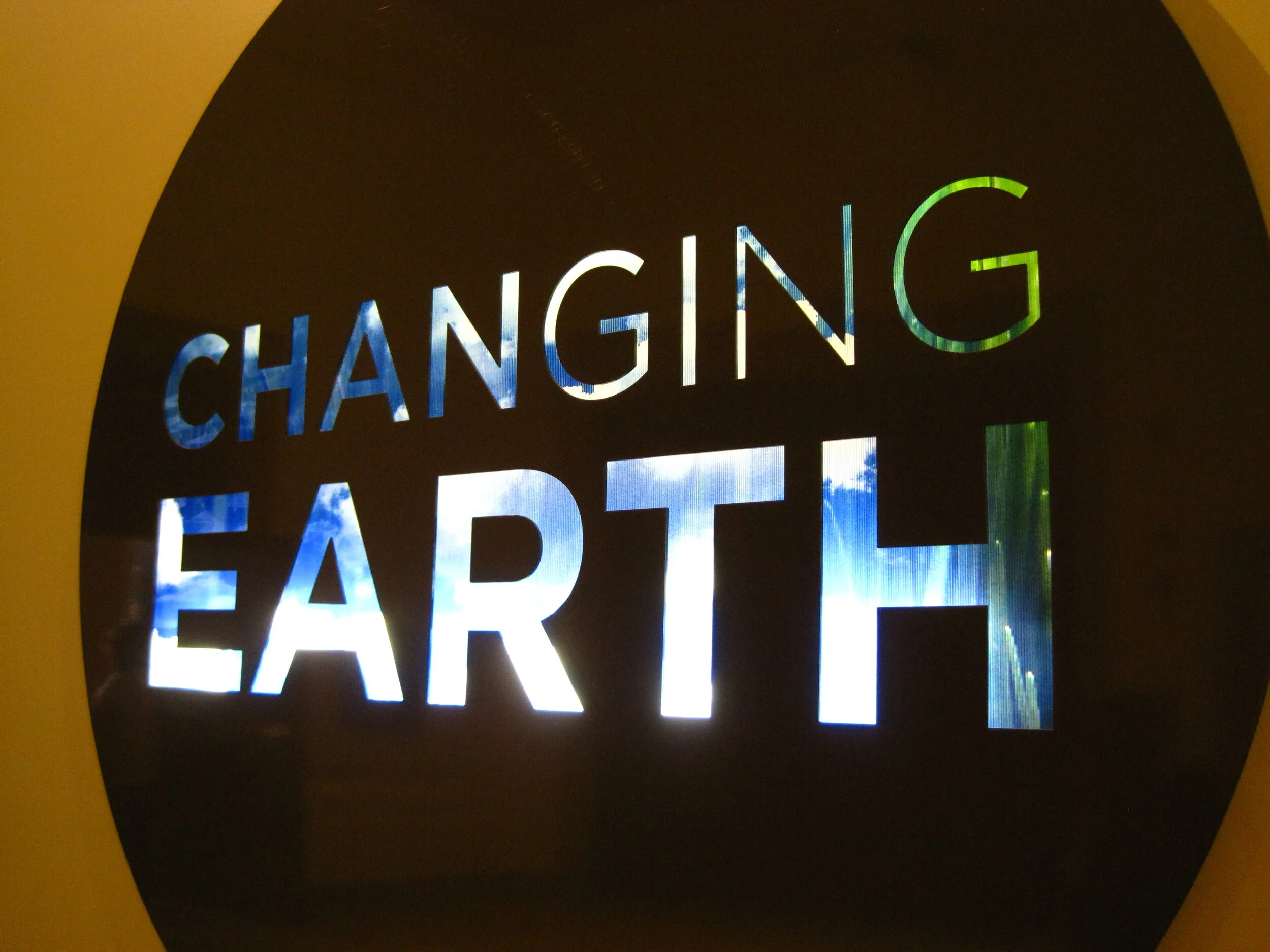
Changing Earth, at the Franklin Institute

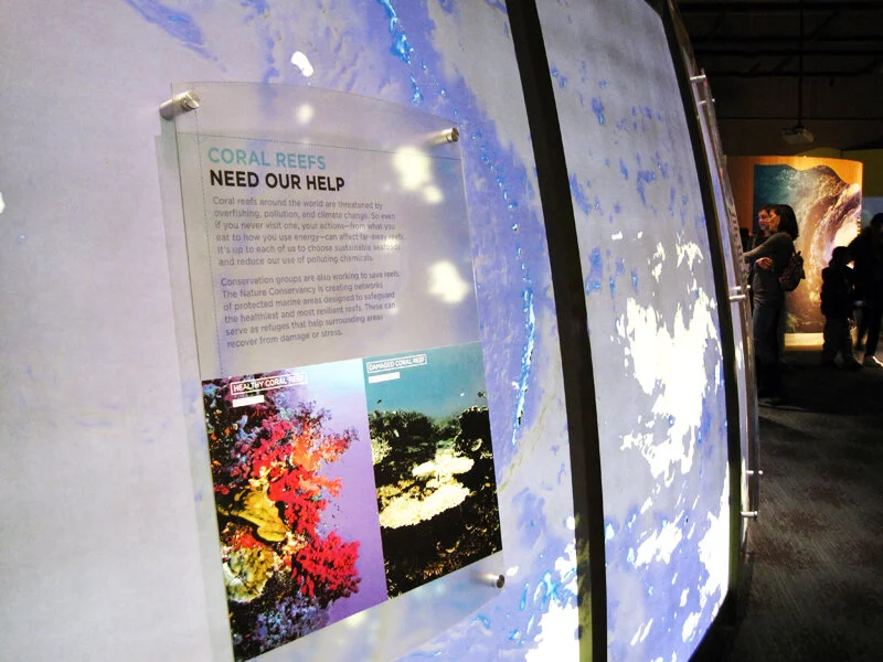
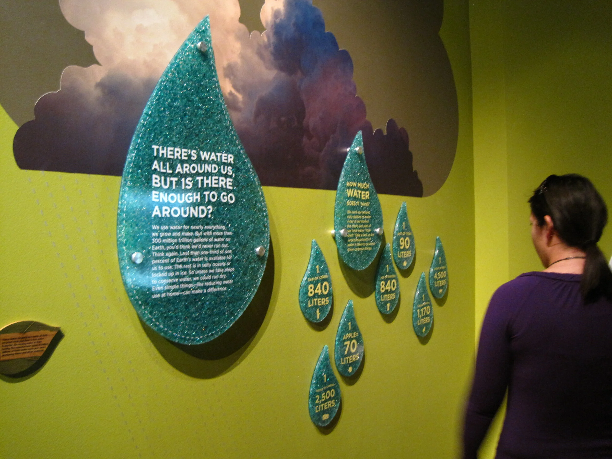
Changing Earth at the Franklin Institute in Philadelphia is about land, air, and water, and how these have changed and continue to change on our planet. There’s a lot happening in this exhibit and it was sometimes overstimulating, but overall it was nicely designed with clear ”take-home” messages and memorable interactive experiences.

The designers, Adirondack Studios, used environmentally-sensitive materials throughout the exhibit. From the museum’s website: “Changing Earth is constructed of sustainable materials. The flooring is made from recycled content and post-consumer waste products. All wood is Forest Stewardship Council certified or bamboo. All metal is recyclable. Paint is low-VOC and graphics are printed on recycled material using water-based inks.”

I visited this exhibit about a year ago, not too long after it opened (and wrote this post about the exhibit, Electricity, which had opened at the same time). My memories of the details are a little fuzzy I’m afraid, but both exhibits are still on view if you’d like to see them in person.

The centerpiece of the exhibit was a giant Earth dome (photo above) which housed an introductory film.

The exhibit was full of interactives and touchable displays, such as a stream table, weather forecast station, and earthquake simulator.

IMG_0151.jpg

Below is an example of the direct-to-substrate printing used throughout the exhibit.

IMG_0164.jpg
IMG_0157.JPG

Post updated in January 2021 with text and photo edits. This post was originally published at theexhibitdesigner.com on 4 April 2012.

Music at the MoMA

At the Museum of Modern Art in NY through June 6 is the exhibition Looking at Music 3.0. (Many installation photos at that link.) It explores music’s influence on contemporary art, and vice versa, during the 80s and 90s. Dim lighting, gaudy neon walls, and early music videos blasting on the large screen in the middle of the gallery — it’s as though you’ve returned to the time of boom boxes and mix tapes. Social and political issues are mentioned briefly in the exhibit copy, but there are many topics touched upon in this relatively small space, so don’t expect a thorough history lesson. Art and music are loosely grouped by topics such as “early hip hop” but, fittingly, neither chronology nor subject dictate the layout of the exhibition in an obvious way.

There was a large cushioned platform to sit and watch music videos. There were only a few in the loop, to discourage lingering I’d imagine. What they may not have realized is that people would stay quite awhile to watch Grace Jones. There were listening stations throughout the exhibition (below, left) and an interactive media installation by Perry Holberman (right).

You can read more about the process of creating the exhibit in this blog post, Listening to Art, written by the curator.

Below are photos of the entrance to Picasso: Guitars 1912–1914, an exhibition of 70 collages, constructions, drawings, mixed-media paintings, and photographs. On view through June 6 and definitely worth seeing.

Post updated in January 2021 with minor text edits. Broken links have been fixed. This post was originally published at theexhibitdesigner.com on 20 March 2011.

Electricity, at the Franklin Institute

Electricity at The Franklin Institute is about “the wonders of electricity … this interactive exhibit dedicated to the Museum’s namesake, Benjamin Franklin” serves up historical artifacts, cute diagrams ...

IMG_0217.JPG

… and plenty of techy interactives. The exhibit promises, “Learn how electricity is created and explore the fuel sources needed to generate our electricity. You’ll feel the force of electricity by manipulating electrical phenomena, exploring authentic artifacts … and tackling questions of sustainable energy.” Below, a touch screen to explore Ben Franklin's book Experiments and Observations on Electricity:

The “Electrical Signals” wall: use your phone and it responds with flashing LEDs. It was a lot of fun.

There were group interactives and experiments, and a “sustainable dance floor” which was a blast for all. The exhibit is ongoing.

Post updated in January 2021 with minor text edits. Broken links have been fixed. This post was originally published at theexhibitdesigner.com on 16 January 2011.

Build Boston 2011: Touring the MFA

GUEST POST

Writing and photography by Katelyn Mayfield, an exhibit designer at Christopher Chadbourne & Associates. She has a Bachelor of Architecture degree from the Rhode Island School of Design. In her spare time, she makes handstitched books.

After a private tour of the Museum of Fine Art Boston’s new Art of the Americas wing, given by architect Adi Toledano of CBT Architects, I now feel certain that Boston has a world class museum. The tour was given prior to the wing’s grand opening as part of Build Boston. We got up close and personal with the details since almost no one was around, except security guards and last minute glass case cleaners.

My first response in the galleries was to the artifact display cases. These cases were undeniably eye-catching, like no other. The glass was crystal clear, completely devoid of prints of any kind. When standing on one side of a case, I could see perfectly through it and into cases beyond because of the impeccable clarity. The sleekness of the cases also succeeds in hiding complex mechanics, as described in this article. All 200 cases in the new wing were designed, manufactured, and assembled in Milan, Italy by Goppion Museum Workshop before they were shipped to Boston for installation. Goppion has also created display systems for the Mona Lisa at the Louvre and the Crown Jewels of England, among others, so high quality craftsmanship is a given. And once I got past the perfection of the cases, the artifacts inside were not so bad themselves!

Sir Norman Foster along with Foster + Partners was the Design Architect and creative masterminds of the new wing. Our guide, Adi, kept repeating, “Foster wanted ‘everything to line up’”, meaning everything had to be flush. Foster gets what Foster wants. He was knighted in 1990 and won the Pritzker Architecture Prize for his entire portfolio in 1999, the most prestigious international prize awarded in the field of architecture. He was also awarded the American Institute of Architects Gold Medal in 1994. I think he is worthy of dictating every detail, as he did in this project. No detail was overlooked and all components work harmoniously. It was the responsibility of CBT, the local architect of record, to design the actual details that accomplished this harmony. For me, highlights were the “landscape corridor,” the day-lighting strategies, and the details that made “everything line up.”

The landscape corridor is a thoughtful nod to the existing museum structure and the outdoors. Between the original building and the new building, a narrow 6' space is left full of vegetation. While in the main courtyard, which has two elevations of three-story-high glass walls, the corridors are visible on either side. The natural light, the view of the vegetation and the sky beyond, and the height of the ceiling makes this space feel like an actual outdoor courtyard. The landscape corridor is also visible when crossing over the enclosed bridges from the new wing to other wings. It really is a nice sight.

The main concept of the day-lighting strategy is based on indirect light. It’s seemingly simple; very successful. Because all four floors of the wing open onto small glass vestibules which open to the stairways, and then to the courtyard, all four floors have indirect natural light access. Sunlight is obviously harmful to artwork and artifacts, but otherwise a welcome source of light. The solution to safely utilizing this indirect light was to diffuse it through two layers of glass.

This idea that “everything must line up” is showcased in every aspect of the architecture; from the construction of the walls, to the lighting in the ceiling, to the emergency exit signs. The wall surface uses the skim coat plaster technique that is superior to average drywall. It is labor intensive — thick coats of plaster are applied to an expanded wire lath — however, it provides better durability and ease of replacing single spots of wall if necessary.

Even the smallest components, the exit signs, were meticulously executed. In the auditorium, which is covered in wood paneling, a sign protruding perpendicularly from the wall would not do at all. Instead, the letters E-X-I-T were cut into the wood and green light shines through from behind. Apparently this small project in itself was not easily accomplished. It took much compromise and discussion from the Boston Fire Department. The outcome is sleek and yes, “lined up.”

Then there is the door to the bathroom hallway. So well done! The door has no molding, no knob, no latch; it’s a push door, double swing, that extends all the way to the ceiling, with just a 1/4" gap between.

I also have to mention the graphics. The explanatory texts were short and sweet, subtle yet still noticeable. I appreciated the subdued graphics and simple 1" deep panels painted the same color as the wall. This created a different visual plane to draw your attention, but allowed the artwork and artifacts to take the lead. Within the cases, small numbers on tiny frosted pieces of glass show you which artifact matches up with which label below. In any case, go see the Boston MFA’s new wing. It is elegant, modern, and simply beautiful.

Post updated in January 2021. Broken links have been fixed or replaced with archived URLs, courtesy of archive.org. This post was originally published at theexhibitdesigner.com on 1 December 2010.

Samurai in New York

Samurai in New York at the Museum of the City of New York, through November 7, “invites visitors to return to the New York of 150 years ago and to share the city’s excitement over the visit of a delegation of more than 70 samurai from Japan — the first Japanese to leave the closed island nation in over 200 years.”

I love the title wall treatment, and that the red and black bands are carried across the entire wall and around the corner. Exhibition and graphic design by PSnewyork. / New York Times review.

Post updated in January 2021. Broken links have been fixed. This post was originally published at theexhibitdesigner.com on 25 October 2010.

State of Deception, at USHMM

The United States Holocaust Memorial Museum has a temporary exhibition State of Deception: The Power of Nazi Propaganda that I’d like you all to see. (I know I have a stellar track record of posting about temporary exhibits after they’ve closed, but not this time — State of Deception is open through December 2011.)

The exhibition, by the museum’s description, “reveals how the Nazi Party used modern techniques as well as new technologies and carefully crafted messages to sway millions with its vision for a new Germany.” There are books, posters, newspapers, and photos to look at, archival sound recordings to listen to, and films to watch. There’s a lot to take in, but the exhibition does a great job of leading you through and presenting its themes clearly and succinctly.

I was drawn in by the compelling design of the exhibit’s graphics. I liked the modernist layouts, which reminded me of Die Neue Typographie and Jan Tschichold’s work during the mid–late 1920s. (Side note: Tschichold was arrested by the Nazis for his “un-German typography.”...If you're interested in being led astray by the internet: do some research into Nazi Germany’s changes in typeface doctrine.)

I liked that each graphic was unique — the torn paper and painting texture is all custom done. An interesting thing the designers did was to change the lengths of the secondary and label-level text panels to fit the length of the text. With a relatively small exhibit like this, it works well, though it would certainly be difficult to control for in a larger exhibit. But here it made every panel seem intentional and thoughtful. A lot of care was put into these graphics, and the effect is quite beautiful. I wanted to read every single label.

I also recommend that you spend some time with the exhibition’s accompanying website, if you make it to the exhibition in person or not. It is rich with information and the website design ties in well with the exhibition’s.

Post updated in January 2021 with minor text edits. Broken links have been fixed. This post was originally published at theexhibitdesigner.com on 7 October 2010.

Field Trip Day!

Last week a few of my Chadbourne colleagues and I took a day to visit some local museums in Cambridge.

Nothing I haven’t already covered here on TED, but it’s always nice to see old friends. First stop: the Harvard Museum of Natural History/Peabody Museum of Archeology & Ethnology. They had a new, small but interesting exhibit, Headgear: The Natural History of Horns and Antlers (left and center, below) and they seem to be continuing the renovation work begun in the Great Mammal Hall. I peeked behind a drawn curtain to see what the deal was, but was stopped by this guy on the right:

I’ve written in the past about the HMNH, but I can’t resist adding a few more photos here. Slowly but surely the museums seem to be getting cleaner and brighter.

We then made our way over to the Harvard Art Museums, currently housed in the Sackler Museum, and previously seen on The Exhibit Designer, here.

We ended the day at the MIT Museum where, because of our tired feet and the heat of the day, we plunked down on a bench and became entirely engrossed in a video of Alan Alda swimming with a robotic tuna. (No really, I’m not kidding about the tuna. The video is from the episode “Natural Born Robots” of the PBS show Scientific American Frontiers.) Previous MIT Museum coverage here.

Post updated in January 2021 with minor text edits. Broken links have been fixed. This post was originally published at theexhibitdesigner.com on 30 September 2010.

Two Whales

Update: The Whale Museum no longer exists. Instead, the Dorr Museum is located on the edge of the College of the Atlantic campus; exhibits are designed and produced by College of the Atlantic students.

A few photos from the Bar Harbor Whale Museum in Maine, an unassuming experience, with some whale skeletons and exhibits of marine mammals, prepared by students and staff of the College of the Atlantic.

whalemuseum1.jpg
whalemuseum2.jpg

Whales/Tohorā is at the Museum of Science, Boston through September 14. Just like at the Whale Museum, you will learn fascinating facts about whales: The first whales walked on land! Baleen whales have two blowholes! Toothed whales have only one! Unlike the Whale Museum, Whales/Tohorā is a slick exhibit with clearly a much bigger budget. It was developed by the Museum of New Zealand/Te Papa Tongarewa.

The black, slightly angled, reflective platforms below the two largest whale skeletons are a dramatic centerpiece to the exhibit. I found myself returning to this display numerous times to look again. The same technique was used for some of the smaller skeletons too, like that of the walking whale (below, right). Graphics were all rear-lit. It’s a fine line with rear-lit graphics … a soft glow is easier on the eyes.

The structure of this timeline/artifact case reminds me of a backbone and rib cage, and ever-so-slightly of the Design for a Living World exhibit I saw at the Cooper Hewitt.

The whale skulls cases (below) are beautiful. Everything looks substantial and high quality. I like this straightforward presentation style when showing multiples: Keep the design minimal and the text to a minimum.

Post updated in January 2021. Broken links have been fixed. This updated post, originally published at theexhibitdesigner.com on 12 August 2010, was combined with a similar post dated 8 August 2010.

American High Style

Mannequins like models on a runway, posed dramatically or playfully, frozen under spotlights in otherwise dimly-lit exhibit rooms. Stylized design details like gold dimensional letters for titles, and the mannequins’ sculpted hairstyles, added just a touch of flair to the restrained presentation.

American High Style: Fashioning a National Collection, at the Brooklyn Museum, is presented in honor of the transferred stewardship of the Brooklyn Museum’s costume collection to the Costume Institute at the Metropolitan Museum, and as a complement to the Met’s exhibit, American Woman: Fashioning a National Identity. The Met’s presentation is decidedly more theatrical, with its painted backdrops, props, wigs, and themed galleries. I haven’t yet seen it in person but I have seen photos, and I plan (to try) to catch it before it closes on August 15. Because that seems like the thing to do: see both and compare them.

But back to the Brooklyn Museum. Do see American High Style, I highly recommend it. And hurry — it closes on August 1.

The layout of the exhibit was straightforward, and it was apparent that a lot of thought was put into its organization. Approximately 85 mannequins were arranged into six groupings: the House of Worth, French Couture 1900–1940 and 1946–1970, the designer Elsa Schiaparelli, the designer Charles James, American women designers, and American men designers. Additionally, there were accessories and design sketches, a wall of rare dolls dressed in the finest French fashions from 1715–1906, and a room filled with shoe prototypes and drawings by Steven Arpad (a highlight). With all this to see, the exhibit was still succinct in its offering, and the accompanying text was interesting to read.

The mannequins stood on plywood “runways” with label text printed directly onto the plywood, with a subtle translucent white screen as first layer. (I'm guessing, as I can't tell for certain from my photographs and my memory fails me. Second guess: applied film. Anyone?) I liked the un-embellished, though still polished, plywood but not the trough-like detail at the front of the “runways.” It would have been cleaner if instead of its V shape, the runway were still angled at the front, but then went straight down, perpendicular to the floor. This was my only (minor) critique of an overall truly nice-looking exhibit.

Post updated in January 2021 with minor text edits. Broken links have been fixed. This post was originally published at theexhibitdesigner.com on 27 July 2010.

Too many mummies

There are SO MANY mummy exhibits right now. There is the heavily-advertised Tutankhamun and the Golden Age of the Pharaohs in New York; Cleopatra: The Search for the Last Queen of Egypt at the Franklin Institute in Philadelphia; Melvin the Mummy at the Brooklyn Museum; Mummies of the World at the California Science Center … and certainly many others which I am not aware of — and then there’s this underwater museum.

And THEN we have — had The Secrets of Tomb 10A at the Museum of Fine Arts Boston. I’ve taken so long to post about this exhibition that it seems to have closed. Yesterday. Sorry. Truly sorry. I liked the exhibit very much. You should have seen for yourself that it was a perfect balance of anthropology and art; it was fascinating and beautiful.

The story of Tomb 10A goes something like this: It was the tomb of the high official Djehutynakhts (pronounced “je-hooty-knocked”), discovered in 1920 by a group of Harvard University/Boston Museum of Fine Arts archeologists. Inside was the largest funerary assemblage of a Middle Kingdom (2040–1640 BC) official ever found intact (despite the tomb’s having been robbed in antiquity): four coffins, walking sticks, pottery, canopic jars, wooden models of daily life, and a disembodied head (great New York Times article). Egypt gave the entire collection to the MFA and sent it along to Boston. It met with some minor setbacks en route — not least, the collection’s catching fire — but arrive it did, only to be mostly tucked away in storage for ninety years. This exhibition was the first time that everything from the tomb has been put on display.

Walking into the exhibit, you first see a statue, representative of Egypt during the Middle Kingdom, standing in front of large, richly moody photographs of the area around the tomb. This first room sets the stage: information about Egypt during Djehutynakht’s time, introductions to the “cast of characters,” and a description of how the exhibit was organized. In the next room you’ll see objects from the actual tomb, in the third room you’ll see what was missing from the tomb, and in the final room you’ll learn about the archeological investigations still underway on the site. I appreciated this road map of what was to come in the relatively large exhibit. It helped to keep clear in my mind where I was within its organization. But, it begs the question, for non-museum-design/development-types: Is information like this important to you? Do you find it helpful? Do you even notice it?

The second room, below, was by far my favorite part of the exhibit. The wooden models were all gorgeous, and I love the simplicity of the wall of boats. The artifact displays throughout were sparse and reverential, arranged simply and tastefully. Absolutely lovely. The color palette was nice as well. (Speaking of colors, have you ever wondered about Egyptian color symbolism? Of course you have.)

I’ve also recently seen The Mummy Chamber at the Brooklyn Museum in New York (below). While Tomb 10A is dark and moody, The Mummy Chamber is bright, bright, bright — especially on a sunny summer afternoon. It too has some nicely currated artifact cases, though I prefer the moodiness of the MFA show. The Mummy Chamber exhibit is still open.

Post updated in January 2021 with minor text edits. Broken links have been fixed. This post was originally published at theexhibitdesigner.com on 29 June 2010.

Angularity at Denver Art

The Denver Art Museum’s new (c. 2006) Hamilton Building will make you do the Angle Dance, guaranteed.

Not one of the building’s planes — floor, wall, or ceiling — is parallel or perpendicular to another. Consider that for a moment.

Studio Libeskind’s design is meant to evoke “the peaks of the Rocky Mountains and geometric rock crystals found in the foothills near Denver,” an idea the exhibit designers ran with. Suspend your disbelief and peaks and rock crystals can be found everywhere — in the artwork hung directly onto skewed walls and the sculptures tucked into odd spaces where acute and obtuse walls meet.

You don’t actually have to suspend your disbelief to appreciate the angularity brought to aspects of the exhibit design, such as the display cases in the gallery of African art.

I’m not crazy about the light fixtures — they’re big and distracting! — but otherwise, the cases are intriguing and beautifully highlight the artwork and objects on display.

The dimensional letters used for gallery names are pretty incredible. The letters’ faces are perpendicular to the floor, and the depth, top-to-bottom, varies to meet the angle of the wall. I love the beautiful shapes and the shadows they create.

As for the art itself, I was surprised to find that I enjoyed the gallery of post-1900 Western American art (it’s not a genre I’d usually leap to explore). I also liked this installation by Sandy Skoglund.

Post updated in January 2021 with minor text edits. Broken links have been fixed. This post was originally published at theexhibitdesigner.com on 20 May 2010.

I love the Infantry Museum

I love the infantry because they are the underdogs. They are the mud-rain-frost-and-wind boys. They have no comforts, and they even learn to live without the necessities. And in the end they are the guys that wars can’t be won without.

— Ernie Pyle

3663088152_2719e4b083_c.jpg

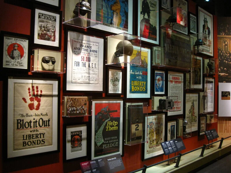
This past week I went down to Columbus, Georgia to see Christopher Chadbourne & Associates’s National Infantry Museum at Fort Benning. I worked on this project as a junior designer — I helped to finalize design drawings and produced final graphic design files. (Brent Johnson was the lead exhibit designer, and Jeff Stammen the lead graphic designer.) I suppose I cut my exhibit design teeth on this one. I learned SO MUCH about the design process while working on this. And I know all these graphics so well — it’s thrilling to see them realized, and in person. It was an honor to work on this museum.

3662317079_b59e1794d3_k.jpg
3662289083_caa2fd494e_c.jpg
3662312977_7ba0fdd5af_c.jpg
3663116074_775bc1f085_c.jpg
3663093094_619baa7b46_c.jpg
3662549865_9547275977_c.jpg
3662292219_65c5685a05_c.jpg
3662306275_62a45a58b5_c.jpg
3663101462_13b54694cb_c.jpg
3662301917_a8dca51e26_c.jpg
3662303971_56e07a4fd0_c.jpg
3663116830_126434212d_c.jpg
3663117450_6f3d182f7b_c.jpg
3662301179_f5d7e69775_c.jpg
3663097234_5befa0bb84_c.jpg
3663118116_1ace7be532_c.jpg

Post updated in January 2021. This post was originally published at theexhibitdesigner.com on 2 May 2010.

The scariest thing about Eastern State Penitentiary

The scariest thing about Eastern State Penitentiary … is surely not the daffodils growing outside its walls.

It calls itself “America’s Most Historic Prison.” The Library of Congress writes in this photo survey, It was elected to the World Monuments List in 1996 as one of the world’s 100 most endangered monuments. Eastern State Penitentiary is an internationally significant landmark which has directly influenced the design of 300 prisons on four continents and inspired an ongoing conversation about architecture and social control.”

ESP has a fascinating history. It closed as a prison in 1971, and remained abandoned (save for a family of feral cats) until 1994. In 1994 the tour program started and stabilization projects were initiated to maintain the prison as a “semi-ruin.” These stabilization projects were to “stop the deterioration and to make the tour route safe for visitors” and some projects restored areas (such as Al Capone’s cell) to how they looked at specific times in the building’s history. It makes for interesting juxtapositions of ruin/19th or 20th century prison design.

The penitentiary is open every day of the year and offers a number of themed tours. I would recommend that you explore on your own (on-your-own-with-a-friend I mean). Much like at the Ether Dome in Boston (post and photos, here) quiet and solitude enhance the experience. With that said, the free audio tour is worth picking up: it’s interesting and it is narrated by Steve Buscemi.

So is this place scary? I visited late on a chilly and overcast March day and rarely crossed paths with the few other visitors there. The photos I took certainly make the place look sinister, right? Above on the left is Cell Block 1, one of the originals from 1829. To the right, Death Row (Cell Block 15), built in 1959. Below is Cell Block 14. The sign reads “Is Eastern State Penitentiary Haunted?” (The short answer: yes.)

But I was going to tell you the scariest thing about Eastern State Penitentiary. I’d have to say it’s these pink exhibit graphics. Update, 2021: ESP has more recent exhibits whose design is more fitting to the environment.

Post updated in January 2021 with minor text edits. Broken links have been replaced with archived URLs, courtesy of archive.org. This post was originally published at theexhibitdesigner.com on 10 April 2010.

Naked Ambition

About a month or two back I visited the Museum of Sex in NY — an unfortunate time to visit, as they were in the midst of a renovation that closed off their main entrance and rerouted the visitor flow to a back stairwell coated with drywall dust and redolent with body odor. (Because of the construction? Just the usual aroma of the museum? Not sure. Moving on.)

On view during that time was Naked Ambition, an exhibition of Michael Grecco’s photographs taken at the AVN Awards in Las Vegas (the “Oscars of porn”). The photos and their accompanying text were from the Naked Ambition art book, and the videos on view were clips from the Naked Ambition documentary.

Within the exhibition and on the accompanying website (link no longer available), the entire undertaking is described as “an R rated look at an X rated industry.” I think that description is fitting. The exhibit (photos of porn stars) and certainly this museum (about sex) are not everyone’s cup of tea and if your sensibilities are easily offended, you will be offended. Subject matter aside, I thought the photography was quite good, and the subjects’ stories were interesting. And since this blog is foremost about exhibition design, I am now moving on, again.

nakedambition1.jpg

Lowercase Helvetica Rounded for the title, and the script typeface used for the “nicknames” above the photographs gave the exhibition just a touch of kitschy punch without distracting from the photographs. Overall, the design was pretty understated.

The biography text was too small and the line lengths too long, which made them difficult to read. A nice touch on these is the way they were produced: the entire text box was printed on vinyl with the names cut from the black band so that the wall showed through. I liked that.

There was an issue with shadows. The photos were all spot-lit from above, and in some areas this caused the frames to cast deep shadows over the text. It’s important to consider how shadows will affect graphics and other objects on display.

In addition to Spotlight on the Permanent Collection, there was a third temporary exhibit: Action: Sex and the Moving Image. I liked the design of the graphics, reminiscent of marquees, especially when backlit — as were the secondary-level stories. Since the room was so dark, though, reading the larger primary-level stories was difficult. (They were vinyl applied to the wall.) The tabletop screens made good use of the gallery space.

Post updated in January 2021 with minor text edits. Broken links have been fixed. This post was originally published at theexhibitdesigner.com on 13 March 2010.

Mathematica, the Eames-designed exhibit

The legendary Charles and Ray Eames are perhaps best known for their design of a certain lounge chair, but let’s not forget their architecture, print design, photography, film, textiles — and exhibitions. During their career they designed more than a dozen, of which only Mathematica: A World of Numbers ... and Beyond — from 1961! — is still on view.

Three versions were created and two of them remain open to the public: one at the New York Hall of Science and the other at Boston’s Museum of Science. Update: There is now a third at The Henry Ford Museum.

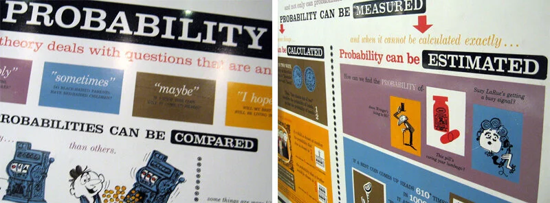
Probability, Topology, Boolean Algebra, Geometry, Calculus, and Logic ... I don't feel particularly moved by any of those, but inarguably this exhibition, with all its quirks and charms, makes math accessible and interesting. I have been to it a number of times, and it’s usually packed with people happily learning about mathematics and engaging with the interactive exhibits.

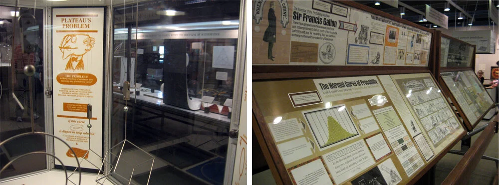
The photos above are of my favorite part of the exhibit: the case about projective geometry. I like the colors of the geometric shapes, the way that the pieces are held in position by Inspector Gadget-like hinged poles, and the grid on the bottom of the case. The graphics perched on black blocks are simple and handsome.

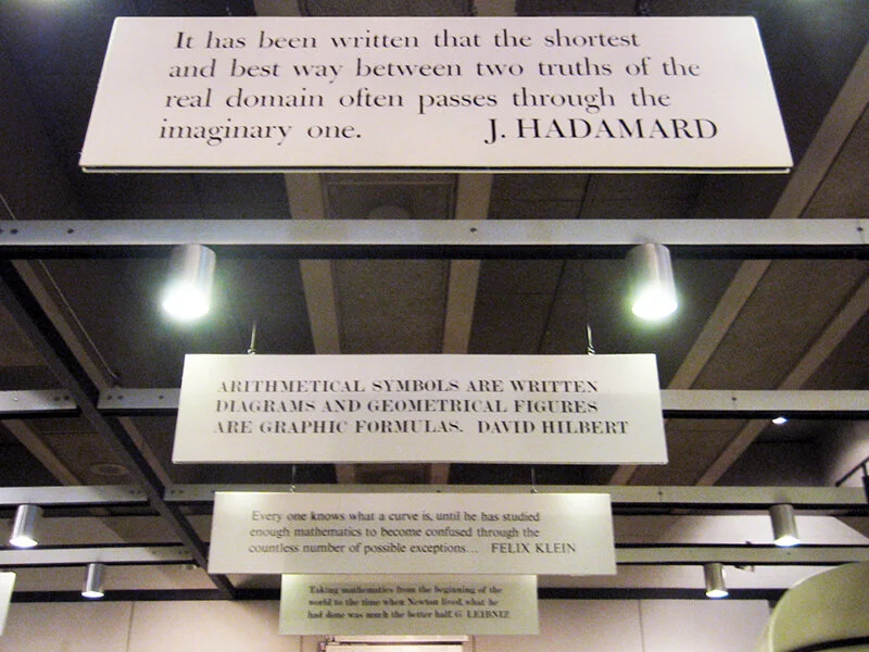
The photo below is of another element in the exhibit that I like: math-related quotation panels overhead, playing nice with the track lighting frame.

Mathematica is successful as an exhibit about math, but more importantly, from an exhibit-design standpoint it is an incomparable artifact, a fascinating time capsule of an exhibit designed during the 1960s.

I’m a sucker for retro graphic design, but I have to say that I don’t like the illustrations. They’re cute and fun, I suppose, but they annoy me.... I ... hate them. There, I said it.

I also don’t like that some parts of the exhibit look as though they were pasted together for a high school statistics class presentation. Picture below, on the right: I'm talking to you. This encased collage is deadly boring and it’s often skipped in favor of the fun hands-on interactives, which are fantastic.

The other part of the exhibit that doesn’t do it for me is the math history wall. I have heard it described as wallpaper, or an art piece. The black and white bars do create a graphically interesting pattern, but then the wall is cluttered up with other bits of browning paper and artwork.

The capitalized, justified serif font used is extremely difficult to read, if you were inclined to try. It makes me dizzy. And yet the darnedest thing: people do sometimes read it. (I have no idea....) Another (obvious) issue with this wall is that the timeline ends in 1961, and the MOS’s solution, a poster, is not well integrated. NYSCI’s solution, an interactive monitor, is a better one, at least in theory. (I haven't been to the New York Mathematica to see it firsthand.)

I like the “probability machine.” The full text reads: THE T/HEORY/OF PR/OBABI/LITIES/IS NO/THING/MORE/THAN/GOOD/SENSE/CONFI/RMED/BY CA/LCULATION. :LA/PLACE/1796

Balls fall from above and form a bell curve. Simple, elegant — and if the text is a little wonky, it does force you to read it over a few times to understand, maybe making you internalize its message.

I feel like quite the curmudgeon with my criticisms of Mathematica. The exhibit is nearly fifty years old, after all — it’s miraculous that it still exists. And despite its literal dustiness, it is an exhibit beloved and cherished by many, a vintage exhibit that allows us to step back in time to experience firsthand a 60s era exhibit full of the Eames’s joie de vivre, fun, and humor. I think any designer would agree that that in itself is pretty cool.

If you have been, what do you think?

Post updated in January 2021 with minor text edits. Broken links have been fixed or replaced. This post was originally published at theexhibitdesigner.com on 16 February 2010.

Visit the Ether Dome

Here’s something to do in Boston if you’re looking for an under-the-radar, quick-hit-of-history experience: visit the Ether Dome at Mass General. The Ether Dome was the hospital’s original surgical operating amphitheater and in it, on 16 October 1846, the use of ether as an anesthetic was first publicly demonstrated by dentist William T.G. Morton and MGH Chief of Surgery John Collins Warren. More info in the Wikipedia entry.

Unless in use for teaching, the Ether Dome is open to the public daily, 9am until 8pm. (Update: Hours are now Monday – Friday, 9am – 5pm.) I find it crazy, and love, that this place is open nearly anytime for anyone to explore. When I went, late in the afternoon on a Sunday, I had to call Security to unlock the door. I had to call Security a second time to ask how to turn on the lights. But then — wow! It is a little eerie, and very cool.

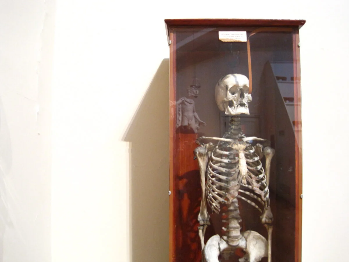
The space has been restored to how it looked when it was built, in the early 19th century. (If you’re curious to learn more: The Ether Dome: The restoration of an icon.) Inside you will find an Egyptian mummy, a statue of David, an anatomical skeleton once used for teaching, and a couple cases of antique surgical equipment. There are the seats used by doctors of yore, impossibly steep, with name plates attached to the backs, and that beautiful copper-plated, skylighted, dome.

There are old photographs and documents in the stairwell (look for the photo of the Bulfinch Building, home to the Ether Dome, from when it used to sit directly on the bank of the Charles River; the building is now about a quarter mile from the bank).

In the artifact cases, there are a few, brief, typewritten labels — but little overall in the way of interpretation. There is a text panel by the entrance to the Dome, and one resting at the feet of the Egyptian mummy. I’m glad I did a little bit of research before I went.

On the left, Dr. Warren’s seat:

I'll let you in on something I discovered: if you stand about where I was standing to take that photo (in front of the seats), make noise and listen for the acoustic effects.

Below is a contemporary painting of that famous surgery, created for “Ether Day 2001,” and here is an article about the reenactment staged for its creation. I put up my full set of Ether Dome photos on flickr, here.

Post updated in January 2021 with minor text edits. Broken links have been fixed, replaced, or replaced with archived URLs, courtesy of archive.org. This post was originally published at theexhibitdesigner.com on 18 January 2010.