supergraphics

AIGA Design Week and Timber City at National Building Museum

DC Design Week events have wrapped. This was a good Design Week — there were many more events than in years past, with a range of design focuses — and I was able to make it to a number of them! An event of particular interest to exhibition designers was held on Wednesday, at the National Building Museum: Design Matters with Debbie Millman featuring Abbott Miller: Design for the Built Environment.

theexhibitdesigner_dc-design-week

The conversation touched on exhibition design, architectural graphics, and performance design. And as a bonus, prior to the event start, the museum's newest temporary exhibition, Timber City, was open for us.

theexhibitdesigner_timbercity4

Timber City opened in September and is on view at NBM through May 2017. The two huge title signs in the museum atrium draw your eye up and point to the bay where the exhibition is located. Also impressive in its scale is the scaffolding holding up the signage.

theexhibitdesigner_timbercity5

The exhibition is not restricted to the interior gallery space. Lining the hall outside the gallery are large plinths, of staggered heights, that feature stories about buildings' timber technology. Within the window bays are views into the exhibition, and architectural models in cases. The text on the painted green walls appears to be cut vinyl.

theexhibitdesigner_timbercity6
theexhibitdesigner_timbercity3

Inside the gallery space, the exhibition is made up of large-scale, extra-thick, freestanding wood walls. (You can see the support structures below.) Graphics appear to be a mix of direct-print and cut vinyl. The large murals at either end of the gallery space are applied wallpapers.

theexhibitdesigner_timbercity11
theexhibitdesigner_timbercity7
theexhibitdesigner_timbercity8

Note for future exhibits: Laminated Strand Lumber does not take cut vinyl letters well. (above)

theexhibitdesigner_timbercity2

In the center of the gallery space are a trio of cheeky display case plinths, made of stacked wood circles. The wood walls are peppered with infographics, stylized illustrations, and green circles highlighting quick facts about timber.

theexhibitdesigner_timbercity9
theexhibitdesigner_timbercity10

Timber City was curated and designed by Boston-based ikd. And thanks to AIGA DC for putting on a great week of design events!

theexhibitdesigner_timbercity1

Post updated in January 2021 with minor text edits. Broken links have been replaced with archived URLs, courtesy of archive.org. This post was originally published at theexhibitdesigner.com on 31 October 2016.

Century of the Child, at MoMA

I stopped in on Century of the Child, “an exploration and celebration of modern design for children in the 20th century,” at the Museum of Modern Art in NY. It was fascinating and delightful, and brought back some memories. For further reading definitely check out the exhibition website, the blog, and the tumblr.
Post updated in January 2021 with minor text edits. Broken links have been replaced with archived URLs, courtesy of archive.org. This post was originally published at theexhibitdesigner.com on 19 August 2012.

Music at the MoMA

At the Museum of Modern Art in NY through June 6 is the exhibition Looking at Music 3.0. (Many installation photos at that link.) It explores music’s influence on contemporary art, and vice versa, during the 80s and 90s. Dim lighting, gaudy neon walls, and early music videos blasting on the large screen in the middle of the gallery — it’s as though you’ve returned to the time of boom boxes and mix tapes. Social and political issues are mentioned briefly in the exhibit copy, but there are many topics touched upon in this relatively small space, so don’t expect a thorough history lesson. Art and music are loosely grouped by topics such as “early hip hop” but, fittingly, neither chronology nor subject dictate the layout of the exhibition in an obvious way.

There was a large cushioned platform to sit and watch music videos. There were only a few in the loop, to discourage lingering I’d imagine. What they may not have realized is that people would stay quite awhile to watch Grace Jones. There were listening stations throughout the exhibition (below, left) and an interactive media installation by Perry Holberman (right).

You can read more about the process of creating the exhibit in this blog post, Listening to Art, written by the curator.

Below are photos of the entrance to Picasso: Guitars 1912–1914, an exhibition of 70 collages, constructions, drawings, mixed-media paintings, and photographs. On view through June 6 and definitely worth seeing.

Post updated in January 2021 with minor text edits. Broken links have been fixed. This post was originally published at theexhibitdesigner.com on 20 March 2011.

Samurai in New York

Samurai in New York at the Museum of the City of New York, through November 7, “invites visitors to return to the New York of 150 years ago and to share the city’s excitement over the visit of a delegation of more than 70 samurai from Japan — the first Japanese to leave the closed island nation in over 200 years.”

I love the title wall treatment, and that the red and black bands are carried across the entire wall and around the corner. Exhibition and graphic design by PSnewyork. / New York Times review.

Post updated in January 2021. Broken links have been fixed. This post was originally published at theexhibitdesigner.com on 25 October 2010.

Harvard Art Museum / Big

A big entry sign ... and big gallery titles ... leading to a bigger Harvard Art Museum. The Harvard Art Museum is in the midst of a “transformation” that will bring its three separate museums — the Fogg, the Busch-Reisinger, and the Sackler — together in a renovated and expanded building on Quincy Street. The project, designed by Renzo Piano (naturally: his name seems to be on every museum’s expansion), is scheduled to open in 2013.

In the meantime, the Sackler offers Re-View, a survey of the three museums’ collections. It’s worth a visit if you are in Cambridge. After, you can take a stroll down the street and stop in here for a scoop of Milk Chocolate Gianduia.

Post updated in January 2021 with minor text edits. Broken links have been fixed or replaced with archived URLs, courtesy of archive.org. This post was originally published at theexhibitdesigner.com on 20 June 2010.

Philagrafika

Philagrafika 2010 is a Philadelphia-wide festival and exhibition of contemporary printmaking. The festival is divided into three components: The Graphic Unconscious is the core exhibition that features the work of thirty-five artists, from eighteen countries, in five art museums and galleries; Out of Print is work created by five artists who were paired with historic Philadelphia institutions; and Independent Projects is a variety of exhibitions organized by other institutions throughout the city.

Additional programing — films and such — supplemented the exhibitions. I like that this festival is all over the city (it was obviously some undertaking), and I really like the title treatment (photo above) and festival map and guidebook by Philly-based Smyrski Creative. Quite nice.

I visited The Galleries at Moore College of Art & Design, part of the Graphic Unconscious exhibition, and saw (and loved) Regina Silveira’s Mundus Admirabilis, an installation wherein a domestic setting is invaded by common pests to invoke biblical plagues and comment on the “plagues” of contemporary society. You can read an interview with Regina Silveira on the Philagrafika blog, here.

Lucky Philadelphians, able to take their time exploring the entire festival, at least for another two weeks (it ends April 11). I wasn’t able to spend nearly enough time with it.

Post updated in Jan 2021 with minor text edits. Broken links have been fixed or replaced with archived URLs, courtesy of archive.org. This post was originally published at theexhibitdesigner.com on 29 March 2010.

Invention, Energy, and Exploration at CT Science Center

The Connecticut Science Center opened this past June, boasting ten galleries and 40,000 square feet of exhibits, and 150+ hands-on interactives. The building is nice, too — kinetic sculptures hang in the vertigo-inducing, six-story-high central atrium.

csc-lobby21.jpg

One aspect of the architecture that I really like is the number of windows. There are windows in the exhibit galleries that look out on the city of Hartford, and windows that look in, down on the atrium. To pause at those windows provides welcome and needed little moments of serenity.

I went to the science center on the rainy-day Friday after Thanksgiving. Yikes.

The pictures I am about to show will give you little sense of the number of people there, nor of the mayhem happening around me. It seemed that just about everything in the museum spun, whistled, bounced, beeped, whizzed, banged … and was covered in smudgy little fingerprints.

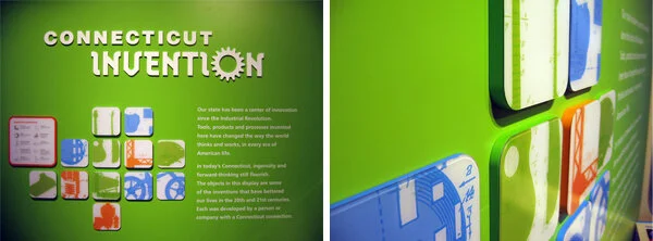
The Invention Dimension exhibit is about “the process of developing new products, new theories, new substances, and new uses for items that no one has ever thought of or attempted before.” The graphics are friendly, with rounded corners and bright, vibrant colors, and nicely illustrated — the illustrations are bold yet finely-detailed as in technical drawings.

csc-inventiondimension 1
csc-inventiondimension3

Energy City, about alternative energy technologies, was my favorite exhibit. I would describe the graphics as future-retro, with bright, bold colors, and video game-inspired diagrammatic illustrations. It was fun to see.

The graphic panels appeared to be printed on a metallic substrate then laminated with a protective film, or printed on the second side of a laminating film. The sheer number of graphic panels here was impressive.

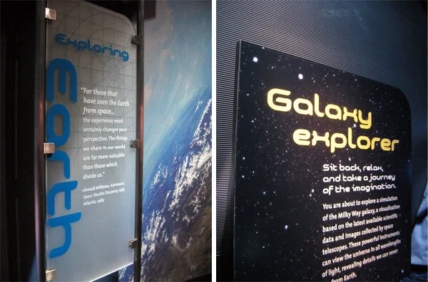
Exploring Space — spelled out in acrylic dimensional letters, over a color-changing lightbox.

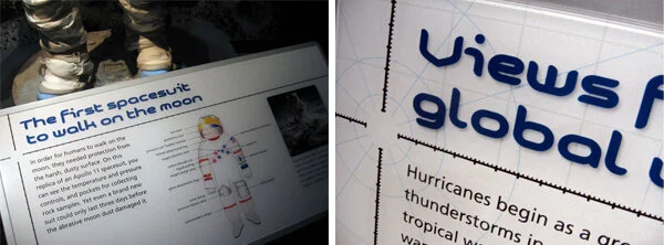
The large-scale images of extraterrestrial surfaces were striking as background murals. Area panels were front- and rear-printed on frosted acrylic, making effective use of the material’s depth. Graphics, especially the reader rail graphics, were cleanly designed with subtle textural details and interesting diagrams.

The Forces in Motion exhibit, about the power of the wind, magnets, and robotics, took advantage of its high ceilings: swaths of bold colors, supergraphic-sized type (FREEZE!), and huge vector diagrams on the walls.

There is a “design your own mag-lev (magnetic levitation) train” interactive which was a lot of fun.

The exhibits use low-energy lighting fixtures, which cuts their energy usage to 40% that of traditionally-lit exhibit spaces. It was too close to sensory-overload for my tastes, but if you’d like to engage with dozens of stellar exhibit interactives, you should take a trip here.

The exhibits were designed by Thinc Design (NY) and Jeff Kennedy & Associates (Boston), with many interaction designers: Snibbe Interactive, aesthetec, Boston Productions, Red Hill Studios, and I don't know who else (150+ interactives makes for a lot of interaction designers).

Post updated in January 2021 with minor text edits. Broken links have been fixed or replaced. This post was originally published at theexhibitdesigner.com on 29 November 2009.