sustainability

The News 03.16.2021

News from the worlds of exhibition design, interior design, and environmental graphics.

The secret life of museums during lockdown; “we miss our visitors” | COVID study finds that museums are safer than any other indoor activity | Covid-19 has driven millions of women out of the workforce | Smithsonian scales back its $2 billion expansion plan | Congress authorizes two new Smithsonian museums: the National Museum of the American Latino and the American Women’s History Museum — hoorah! | Steal this job: museum exhibit designer | Or build your own museum in a box | Researching a sustainable kitchen countertop | Should we revisit the term “master bedroom”? — and committing to “going into the basement” | I Love Typography’s favorite fonts of 2020 | Lessons learned about team projects | A treasure trove of exhibition design inspiration: past winners of the SEGD global design awards | Benchmarks for online museums | And while poking around the onlines, I found that an exhibit I designed is on Google Street View Arts & Culture! Here are some screenshots from Pacific Exchange: China & U.S. Mail, which was on view in 2014/2015 at the Smithsonian National Postal Museum:

theexhibitdesigner_pacfic-exchange-npm-google3.jpg
theexhibitdesigner_pacfic-exchange-npm-google1.jpg
theexhibitdesigner_pacfic-exchange-npm-google2.jpg

It’s a little “uncanny valley,” but also really neat to see an old friend. (Previous blog coverage, here and here.)

California Academy of Sciences, part 2: color and quakes

If forced to choose, my favorite part of the California Academy of Sciences would be the Rainforest Dome — check out Part 1 of my visit — but there were many other fascinating exhibitions to enjoy, including Color of Life: Discover Nature's Secret Language, designed by the museum’s Exhibits Studio and opened last year.

theexhibitdesigner-SF-academy-sciences_color-of-life
theexhibitdesigner-SF-academy-sciences_color-of-life4

The exhibition uses bright, bold colors, beautiful photographs, and accessible writing to “reveal the significant roles color plays across a spectrum of species.”

theexhibitdesigner-SF-academy-sciences_color-of-life2
theexhibitdesigner-SF-academy-sciences_color-of-life3
theexhibitdesigner-SF-academy-sciences_color-of-life5

Within the 8,000 square foot exhibition are immersive interactive experiences, including a musical color visualizer, designed by Tellart. Video screens respond to strings, plucked by visitors, with a show of images and videos related to that string’s color.

theexhibitdesigner-SF-academy-sciences_color-of-life7

Another popular interactive experience is the “Courtship Dance Stage.”

theexhibitdesigner-SF-academy-sciences_color-of-life8

Throughout the exhibition are dioramas and small interactives that allow you to see organisms under different types of lighting, or through the eyes of other animals (just for example).

theexhibitdesigner-SF-academy-sciences_color-of-life6.jpg
theexhibitdesigner-SF-academy-sciences_color-of-life9
theexhibitdesigner-SF-academy-sciences_earthquakes

Also 8,000 square feet in size, the older (circa-2012) exhibition, Earthquake: Life of a Dynamic Planet, explores the seismic science of Earth’s geologic transformations through installations such as a 25-foot-wide, walk-through model of Earth, and the immersive “Shake House.”

theexhibitdesigner-SF-academy-sciences_earthquakes2

Other sections of the Earthquake exhibit focus on the diverse life forms that evolved and spread as Pangaea split up, and earthquake preparedness.

theexhibitdesigner-SF-academy-sciences_life-drifts

There are mini-exhibits throughout the museum, including a show of Andy Warhol’s Endangered Species series of silkscreen prints, from 1983. In 2007 the bald eagle was removed from the endangered species list; the other featured animals remain.

theexhibitdesigner-SF-academy-sciences_hall3

Other mini-exhibits focused on variation, in ladybugs and in humans. 

Rounding out my visit, I strolled through the Human Odyssey exhibition, an exploration of the origins of humankind, and the African Hall, home to classic, stuffy, stuffed-animal dioramas (and live penguins).

theexhibitdesigner-SF-academy-sciences_african-hall.jpg

I highly recommend this museum — it’s beautifully designed, fascinating, and educational. I also recommend you consider picking up a City Pass if you plan to visit more than one museum. They are expensive in San Francisco — said from DC, where the museums are mostly free.

Post updated in January 2021 with minor text edits. Broken links have been fixed. This post was originally published at theexhibitdesigner.com on 3 October 2016.

California Academy of Sciences, part 1: rainforests and reefs

I wrapped up June — oh, wow it’s August! — with a trip to Yosemite (happy birthday, National Park Service) and San Francisco, where I spent a day parade-watching and a couple days museum-going.

theexhibitdesigner-SF-pride-2016

One museum that filled nearly an entire day was the California Academy of Sciences in Golden Gate Park. Below is a photo of the museum’s exterior and its brilliant Living Roof, as seen from the de Young Museum.

theexhibitdesigner-SF-academy-sciences_living-roof

There are so many exhibits within “the Academy” (and so many photos to show) that I’ve broken this post into two parts. Part 1 here covers the Aquarium on the lower level, designed by Thinc Design, and the Rainforest on Level 1.

theexhibitdesigner-SF-academy-sciences_visitor-guide

After entering the museum I was swept up with the crowds heading to the 4-story, 90-foot-diameter Rainforest Dome. Inside, the rainforest visit begins on a Bornean forest floor, winds upward through a Madagascan mid-story and a Costa Rican canopy, then ends on the lower level in an Amazonian flooded forest.

theexhibitdesigner-SF-academy-sciences_rainforest-dome

As a designer, I liked the dome’s juxtaposition of glass and steel and abstracted jungle motifs against living flora and fauna, and the changing vistas as I moved further up the dome. As a nature enthusiast, I enjoyed its subject matter; as a weary museum visitor, I appreciated its delivery: not too much, not too little; brief, interesting, and useful.

theexhibitdesigner-SF-academy-sciences_rainforest-levels
theexhibitdesigner-SF-academy-sciences_rainforest-area-signs
theexhibitdesigner-SF-academy-sciences_rainforest-animal-signs

The bright, straightforward graphics make use of vivid photographs, and the occasional illustration of an animal signals your arrival in a new area of the jungle. Bamboo- or vine-like vertical posts give a stylized–naturalistic element to exhibit tanks. The light touch with exhibit elements gives the rainforest dome a feeling of exploration and discovery (just ignore the school groups).

At the top of the dome, look out over the three stories you’ve just visited, and down, through a 100,000 gallon tank, to the flooded forest floor. Take an elevator down, then enter the tunnel you were just looking through from afar. Everyone says “oooh.”

theexhibitdesigner-SF-academy-sciences_rainforest-dome-lower2
theexhibitdesigner-SF-academy-sciences_rainforest-dome-lower1.jpg

The aquarium level felt jam-packed and massive; it’s where I spent most of my time during a 3 hour + visit. There were many exhibitions to see: Amazon Flooded Forest, Water Planet, California Coast, Coral Reefs of the World, Twilight Zone, and more.

Down here, animal identification is found on digital touchscreens. They were intuitive and fun to use, and had just the right amount of information: an animal’s common name, its scientific name, diet, and a one-sentence fact about it.

theexhibitdesigner-SF-academy-sciences_rainforest-digital-signs

Below are some photos of the Water Planet exhibition, which groups underwater animals by adaptations. Projected blue and green lighting casts an underwater glow on the sculptural wave walls (similar material here). In the center of the room are curvilinear tanks. (I was reminded of the Van Cleef & Arpels traveling exhibition, circa 2012. It must be the bubbles.)

theexhibitdesigner-SF-academy-sciences_aquarium-water-planet.jpg
theexhibitdesigner-SF-academy-sciences_aquarium-water-planet2
theexhibitdesigner-SF-academy-sciences_aquarium-water-planet3
theexhibitdesigner-SF-academy-sciences_aquarium-cal-coast

The highlight of the Coral Reefs of the World exhibition is the 25-foot deep Philippine Coral Reef tank (above). The exhibit graphics in this area are large image-based wallpapers.

theexhibitdesigner-SF-academy-sciences_aquarium-cal-coast2
theexhibitdesigner-SF-academy-sciences_aquarium-cal-coast3

The exhibition Twilight Zone: Deep Reefs Revealed had just opened on June 10. It’s memorable for its tanks filled with the most incredible jellies and vivid deep sea fishes.

theexhibitdesigner-SF-academy-sciences_aquarium-twilight-zone

Post updated in January 2021 with minor text edits. Broken links have been fixed. This post was originally published at theexhibitdesigner.com on 23 August 2016.

My hazy memories of the Perot Museum

A few days ago I was talking with some colleagues about the Perot Museum of Nature and History in Dallas, Texas. Someone remembered one responsive interactive; I remembered a different one ... and then I remembered that I haven’t shared any photos from my visit (nearly a year ago).

The responsive interactive I remembered was located in the lobby. Models of water molecules danced up and down from the ceiling in response to the movements of people below. The molecule models were controlled by cameras in the ceiling that sensed movement and triggered motors that made them dance.

And that’s about where my specific memories break down. What I do remember is how large the museum is, with 11 permanent exhibit halls, and that the day I went it was JAM-PACKED.

There was something there for everyone though, even if it took a bit of maneuvering to get around and find it. I liked the dinosaur gallery:

And bits and pieces of other galleries, including the entrance to the Gems and Minerals Hall:

I was really taken with these benches sprinkled throughout the museum, with their cut-out factoids:

Overall, we were intrigued, learned some things, and had fun. (Just don’t ask me for details.)

I’ll wrap this post up with a photo I took of the roof. From the museum’s Wikipedia page: “It has a stone roof which features a landscape of drought-tolerant greenery inspired by Dallas surroundings. … Building on the museum’s commitment to resource conservation, the new building integrates a variety of sustainable strategies including a rainwater collection system that captures run-off water from the roof and parking lot, satisfying 74% of the museum’s non-potable water needs and 100% of its irrigation needs.”

Post updated in January 2021 with minor text edits. This post was originally published at theexhibitdesigner.com on 20 March 2014.

Changing Earth, at the Franklin Institute

Changing Earth at the Franklin Institute in Philadelphia is about land, air, and water, and how these have changed and continue to change on our planet. There’s a lot happening in this exhibit and it was sometimes overstimulating, but overall it was nicely designed with clear ”take-home” messages and memorable interactive experiences.

The designers, Adirondack Studios, used environmentally-sensitive materials throughout the exhibit. From the museum’s website: “Changing Earth is constructed of sustainable materials. The flooring is made from recycled content and post-consumer waste products. All wood is Forest Stewardship Council certified or bamboo. All metal is recyclable. Paint is low-VOC and graphics are printed on recycled material using water-based inks.”

I visited this exhibit about a year ago, not too long after it opened (and wrote this post about the exhibit, Electricity, which had opened at the same time). My memories of the details are a little fuzzy I’m afraid, but both exhibits are still on view if you’d like to see them in person.

The centerpiece of the exhibit was a giant Earth dome (photo above) which housed an introductory film.

The exhibit was full of interactives and touchable displays, such as a stream table, weather forecast station, and earthquake simulator.

IMG_0151.jpg

Below is an example of the direct-to-substrate printing used throughout the exhibit.

IMG_0164.jpg
IMG_0157.JPG

Post updated in January 2021 with text and photo edits. This post was originally published at theexhibitdesigner.com on 4 April 2012.

Build Boston 2011: My conference experience

Last month I attended a few workshops at the Build Boston conference. Presented by the Boston Society of Architects, Build Boston is primarily targeted to architects and those who work with architects; it is “the Northeast’s largest tradeshow and conference for the design and construction industry” so I was surprised and happy to find a few programs on this year’s schedule of interest to museum exhibit designers.

First, the tours. Options included a tour of Boston’s boutique hotels, tours of the MIT Media Lab, and a tour of the new Art of the Americas wing at the Museum of Fine Arts Boston. A few of my coworkers got the behind-the-scenes sneak peak of the MFA (read Katelyn’s description); I instead attended a symposium called “Cultural Catalysts to Inclusive/ Socially Sustainable Design.” The MFA featured in my conference experience later when it was discussed at length during another symposium I attended, “Museums in the Digital Age.” I also stopped by the Build Boston PechaKucha, and attended the workshop, “Sustainability in Environmental Graphic Design.”

PechaKucha: PechaKucha Nights are events for designers to meet, network, and show their work. (Update: not just for designers anymore.) Presenters show 20 slides, for 20 seconds per slide. The slides automatically advance after 20 seconds, forcing presenters to stay on topic and talk fast. Highlights:

•Artforming, (link no longer available) with examples of their site-specific public art and architecture installations, which center around environment, emerging technologies, and the synthesis of art and science.

•Two Northeastern University students and their involvement in Freedom by Design. Freedom by Design, the AIAS’s (American Institute of Architecture Students) “community service program … uses the talents of architecture students to radically impact the lives of people in their community through modest design and construction solutions.”

•Saeed Arida and Saba Ghole, on the studio environment of NuVu (the Innovation School) in Kendall Square, Cambridge. NuVu is “a place of innovation where middle and high school students join together with experts from MIT and Harvard to create new views of the world.” It sounds like an incredible program.

Cultural Catalysts to Inclusive/Socially Sustainable Design: This symposium was sponsored by the Institute for Human Centered Design, an international education and design non-profit based in Boston that is “dedicated to enhancing the experience of people of all ages and abilities through excellence in design.”

•Dr. Shigeki Inoue from Hakuhodo Universal Design, a consulting and creative boutique in Tokyo that seeks to improve the lives and satisfaction of sei-katsu-sha (“living persons”) of differing needs and abilities. Dr. Inoue is researching “science in design”; specifically, creating a highly legible Japanese typeface. Dr. Inoue asked, “why do designers make designs that are difficult to read?” and spoke to how graphic design remains largely inaccessible for people who have low vision.

•Karin Bendixen is director of the consultancy Bexcom and founder and president of the Danish Design for All network. She writes about “Design for All” concepts, targeting architects, planners, designers, and politicians. She asked that we change our mindsets from designing for disabled individuals as a distinct segment of society to designing for society as though everyone has a disability — i.e. everything is accessible for everyone — and from “what design is” to “what design can do.” Bendixen encouraged us all to be better at promoting the messages of Universal Design: holistic design, sustainability, and design for all.

•Rachna Khare is Professor and Doctoral Research Coordinator at the School of Planning and Architecture in Bhopal, India. She lectures and writes about universal design in India. There are 70 million people with disabilities in India (5–6% of the population), and the majority live in rural areas. Most of the current accessibility efforts in India are “too Western” in their approach, according to Khare. Her goal is to make universal design an entrenched part of Indian culture.

•The new design director for the Visual Arts Division of the National Endowment for the Arts wrapped up the symposium. The NEA is an independent government agency and the largest national funder of the arts; it’s also a partner in Blue Star Museums, the program that offers free museum admission to military personnel and their families from Memorial Day through Labor Day. The agency is currently collecting datasets from all design disciplines, and is interested in strategic investment in design and connecting designers with businesses and federal organizations that are interested in design thinking. There are many funding opportunities, and grant money can be used to hire designers — design fees, preparing space for an exhibit, installation or de-installation of art, and community planning are eligible.

Museums in the Digital Age: Moderated by Aisha Densmore-Bey of the BSA’s Museum and Exhibit Design Committee, this symposium asks, “...even as daily life is reconfigured constantly by technology, museums retain their esteem as bastions of culture. In the face of an increasingly interactive world online, is a physical space still necessary to experience art?”

•Susan Leidy, Deputy Director of the Currier Museum of Art in Manchester, NH, asked, “What are museums currently thinking about and doing with media? Where does media fit in? Does original artwork still matter?” According to her, media and technology should only be used to further museums’ missions and museums should take care to stay true to those missions, whatever they might be: education, conservation, collecting, or something else. Original artwork does still matter … and so too do historical documents, artifacts, live animals, sight, sound, smell, touch. More than anything else, visitors want authenticity in a museum experience. They go to see real physical objects. Take home message: compromise authenticity for digital media at our peril.

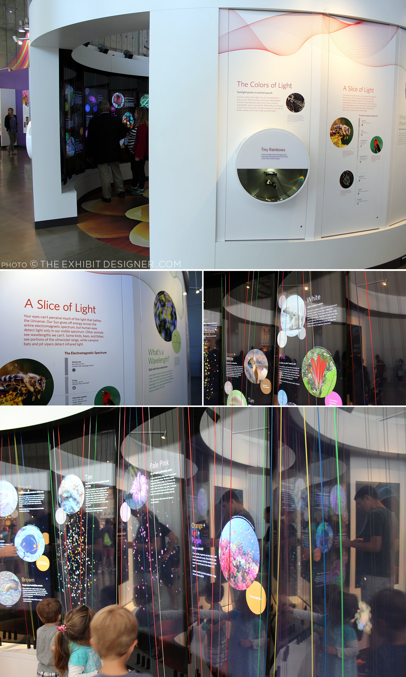
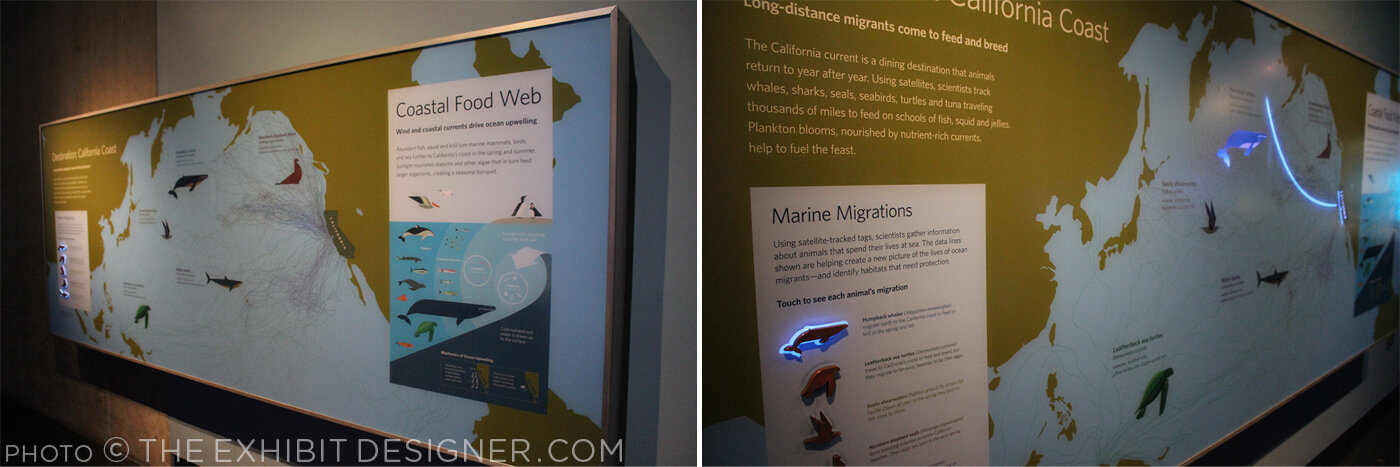
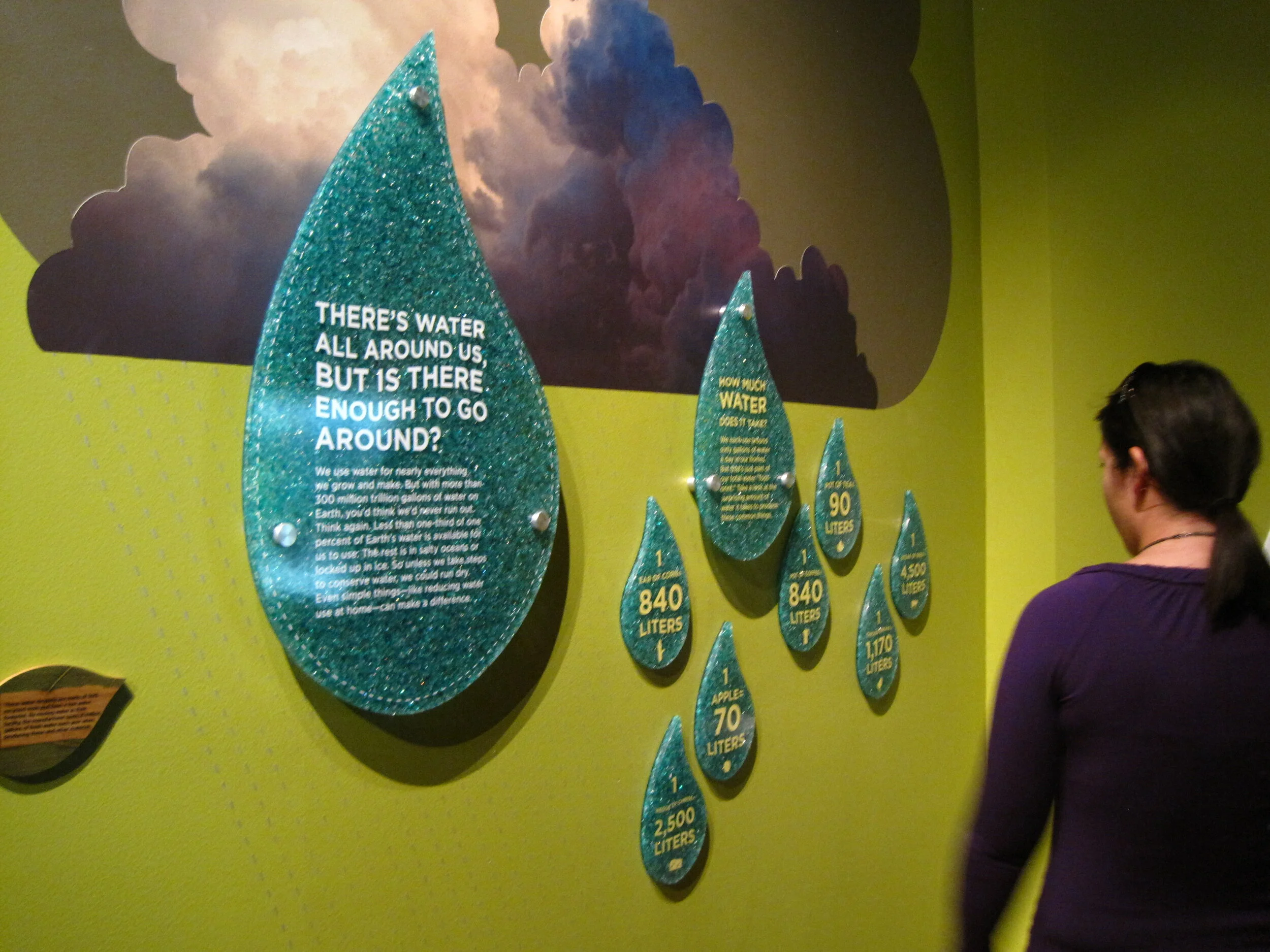
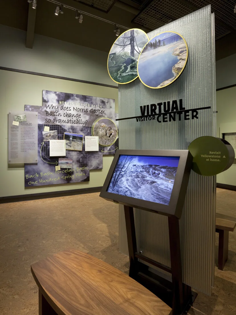
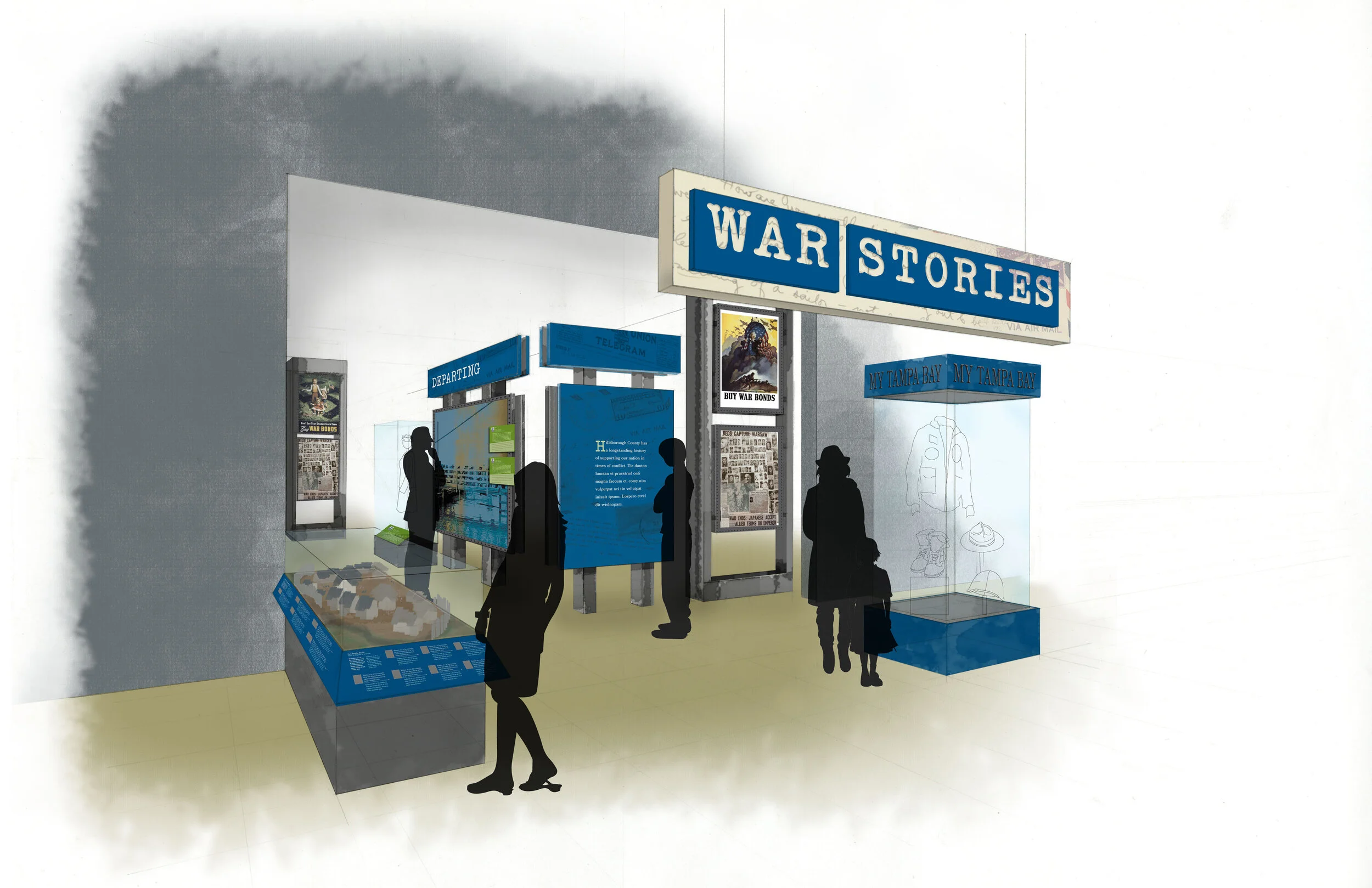
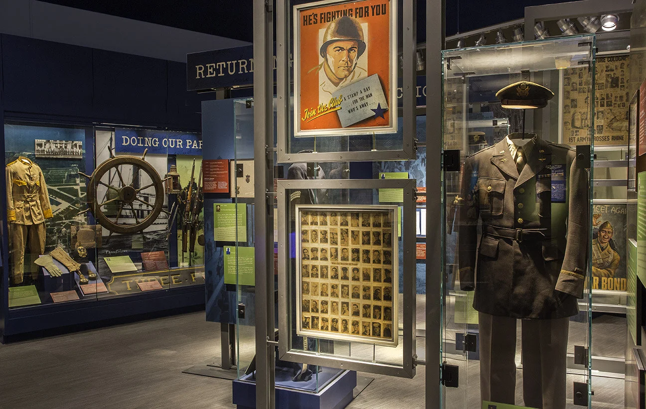
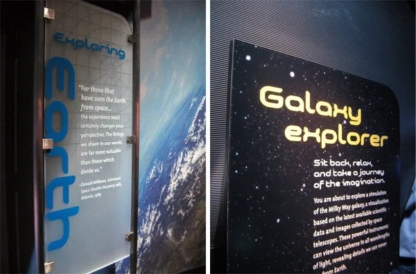
•Peter Kuttner, President of Cambridge Seven Associates in Cambridge, MA, drew connections between two different-seeming types of museum/themed experiences: the art museum and the zoo. Both are primarily about authenticity and seeing something in-person. The tendency in these types of environments is to separate the media from the art/animals so as not to detract from the art/animals. Kuttner gave a few case studies of projects by Cambridge Seven to illustrate media used thoughtfully in an exhibit. Media technology allows you to quickly respond to current events if there’s a reason to do so. It’s also possible to “hide” the technology by integrating it into the experience of the exhibit space (or, to put it another way: to allow technology to inform but not dominate a space). Technology can encourage group activity and indepth learning, but has to be taken to a level beyond sitting at a monitor.

•Ann Beha of Ann Beha Architects in Boston spoke at length about the Museum of Fine Arts’s new Art of the Americas wing. (A project, she noted, that she did not work on but admires.) One of the MFA’s media highlights is its new website, which features a homepage that continually updates and changes as it rotates through photos of its exhibitions, and introduces “Buzz,” their foray into social media. Buzz brings together the MFA’s Twitter, flickr, YouTube, and Facebook accounts and is an intentional attempt to engage in a dialogue with its visitors and gather real time feedback on people’s experiences at the museum. Beha mentioned that the MFA was the first museum to post its entire collection online, in 1995, and has in many ways been an internet leader in the museum industry. All technology within the MFA helps to support the museum’s missions of collecting, stewardship, scholarship, engagement, enlightenment. There are study stations incorporated into the wayfinding in the corridors; easy-to-use multimedia guides that provide options for self-directed learning; touch screen stations that teach and engage visitors on a deeper level than that provided by the exhibition labeling alone; touch tables. Everything is integrated into the environment of the museum in a seamless way with “intense design sensibilities.” The physical architecture of the museum building becomes a blank canvas for media, and an opportunity to create public spaces that are full of life and possibilities.

Sustainability in Environmental Graphic Design: Discussed in this workshop were strategies for EGD sustainability including material selection, resource and waste management, energy and lighting efficiency, air and water quality, public education, and costs. I’ve been working on a list of websites and blogs that focus on sustainability, and you can explore them in this website’s sidebar to the right. (links no longer available)

Post updated in January 2021 with minor text edits. Broken links have been replaced with archived URLs, courtesy of archive.org. This post was originally published at theexhibitdesigner.com on 17 January 2011.

Electricity, at the Franklin Institute

Electricity at The Franklin Institute is about “the wonders of electricity … this interactive exhibit dedicated to the Museum’s namesake, Benjamin Franklin” serves up historical artifacts, cute diagrams ...

IMG_0217.JPG

… and plenty of techy interactives. The exhibit promises, “Learn how electricity is created and explore the fuel sources needed to generate our electricity. You’ll feel the force of electricity by manipulating electrical phenomena, exploring authentic artifacts … and tackling questions of sustainable energy.” Below, a touch screen to explore Ben Franklin's book Experiments and Observations on Electricity:

The “Electrical Signals” wall: use your phone and it responds with flashing LEDs. It was a lot of fun.

There were group interactives and experiments, and a “sustainable dance floor” which was a blast for all. The exhibit is ongoing.

Post updated in January 2021 with minor text edits. Broken links have been fixed. This post was originally published at theexhibitdesigner.com on 16 January 2011.

Old Faithful Visitor Education Center (Happy Holidays)

Work shown was completed while I was a designer at Christopher Chadbourne & Associates.

This vintage Yellowstone ornament, a gift from my dad, holds extra significance because of my work on the design of the Old Faithful Visitor Education Center in Wyoming. The Education Center held its Dedication Ceremony and Grand Re-Opening earlier this year, on August 25.

000 yellowstone COMP_0106_o.jpg

The Old Faithful Visitor Education Center teaches the science behind Yellowstone National Park’s stunning hydrothermal and geological features.

As part of the Christopher Chadbourne & Associates design team, I worked on Design Development, and the Production Services phase. Ernesto Mendoza was the senior graphic designer.

Here’s a project description at SEGD that goes into detail about the design considerations and process, and an article from inhabitat with more photographs.

(The good photographs (i.e. those to the left and below, and the three at the bottom of this post) are by Jay Rosenblatt.)

023 yellowstone img_0150.jpg

I took on a lead design role for the Yellowstone is a Natural Laboratory area, and developed the visual concept, inspired by scientists’ gridded field notebooks. The entire exhibit, and this area in particular, used many interactive elements to explain complicated scientific concepts in an accessible way.

christine-lefebvre-yellowstone-visitor-center-title.jpg
IMG_2944.JPG
christine-lefebvre-yellowstone-visitor-center-lake.jpg
christine-lefebvre-yellowstone-visitor-center-norris.jpg

Here’s an elevation of the Norris Geyser Basin section (the graphic design was tweaked after this):

6.3 Norris Geyser.jpg
christine-lefebvre-yellowstone-visitor-center-interactive.jpg
christine-lefebvre-yellowstone-visitor-center-interactives.jpg
035 yellowstone _mg_3631.jpg
021 yellowstone img_0125.jpg
old-faithful08.jpg
042 yellowstone _mg_3658_o.jpg
old-faithful01.jpg

And because it’s fun to look back, here are some photos from a shop visit at Pacific Studio. It’s always exciting to see designs mocked up like this. (Not as exciting as the final exhibit, of course!) We used a lot of direct print on frosted P95 acrylic, and digital prints applied to sign blank (wrapped with an overlam), for graphic panels.

2010-06-28 12.57.54.jpg

Post updated in January 2021. Broken links have been fixed. This post was originally published at theexhibitdesigner.com on 26 December 2010.

The News 06.23.10

A compilation of design-related web finds.

Sometimes it seems like there really is a museum for and about everything. Name a topic, and I bet you can find an obscure museum dedicated to it. Tractors? Barbed wire? Plastics? Architectural models? Chinese shadow puppets? Battlestar Galactica? | Natural history exhibits opening this summer, in no way exhaustive: Whales at the Museum of Science, Boston (they offer a museum admission/whale watch ticket combo); The Deep at the Natural History Museum, London; Race to the End of the Earth, about Arctic explorers, at the American Museum of Natural History; the AMNH’s Climate Change exhibit moves to the Field Museum in Chicago; Age of Mammals, a “a postmodern diorama” in the Natural History Museum of Los Angeles’s newly restored 1912 building | This photo of the Smithsonian Natural History Museum’s collection of thousands of birds is just great | A Micro Museum for the Design of and with Typography; Typopassage Vienna is inside the Museumsquartier in Vienna and open 24 hours a day, every week of the year. (Curious; who’d be there at 4am?) | Shape Lab, an interactive educational space for families. Who wouldn’t want to play there? | The British Museum and Wikipedia’s unusual collaboration.

Post updated in January 2021 with minor text edits. Broken links have been fixed or replaced. This post was originally published at theexhibitdesigner.com on 23 June 2010.

2009 AIGA BoNE Show wins (another!) award

Exciting news: a project I worked on last year, the 2009 AIGA BoNE Show, has taken home another award!

As the exhibit designer, I worked with BoNE Show co-directors Jeff Stammen and Brandon Bird, to step up and shake up the biennial, Boston-based awards show/exhibition. It was a nearly year-long process to put it together and our goal throughout was to create something engaging and memorable. In the end, the feedback was glowing — everyone who went had the most fun at the show’s opening last June* — and we won a couple of design awards to boot.

In September, we received an AIGA (Re)designAward for Sustainable Design; the awards recognize social responsibility and environmental sustainability in design. We were one of 25 winners in 2009.

And last week at the 2010 SEGD Conference, we were honored with an SEGD Design Award, in the “Lot With a Little” category.

*Some blog post mentions: Common Content | Hart-Boillot | MIT Press | Pinkergreen | South of the Sahara

But — you ask — what exactly is this BoNE Show?

The BoNE (Best of New England) [Design] Show is a biennial competition, exhibition, and fundraiser to benefit AIGA’s Boston chapter. Our theme for 2009 was Community. While the primary purpose of the exhibition was to showcase the 49 winning design pieces, the planning team (myself included) also wanted the experience to engage, educate, and help designers to feel more connected to their design community. One aspect of that was re-branding the BoNE Show into B(oNE) — as in “be one” — with the tagline, “One Region. One community.”

Thirteen local designers, design firms, and artists were commissioned to build large dimensional letter sculptures that together spelled out AIGA B(oNE) SHOW. (top photo) This became a centerpiece of the exhibition, and the letters were auctioned off at the opening reception.

boneshow2009_4.jpg
boneshow2009_10.jpg

My goal was to create an exhibition that would celebrate the competition winners and also the New England design community as a whole. To push the Community theme, I created an infographic wall about the AIGA in New England, including chapter sizes, locations, and other basic information.

boneshow2009_11.jpg

A second infographic wall — B(oNE) Show Deconstructed — provided a glimpse into the creation of the exhibition, including statistics about the designers who entered work in the competition and the designers who won recognition.

boneshow2009_14.jpg
boneshow2009_13.jpg
boneshow2009_12.jpg

Another area of the exhibition gave visitors the opportunity to share their ideas of what it takes to “B” a great designer — by contributing to a wall of B (fill-in-the-blank) speech-bubble directives. Some were earnest; others humorous.

I sourced environment-friendly and local materials, with the help of my design team. Graphics were printed with UV-curing ink on recycled chlorine-free kraft paper, at a printer located five miles from the gallery — or they were drawn by hand. Discarded furniture taken off the street, piles of cardboard collected from area businesses, an old door and a roll of twine found in a garage: “trash” that we salvaged and put to good use. The designs integrated mechanical fasteners and non-toxic glues. And to describe the “greenness” of the project for visitors to the exhibit, we created the Green Lounge, which was painted entirely in green, even the furniture. We used Old Fashioned Milk Paint — it's earth- and people-friendly, and manufactured nearby in Groton, MA. The Green Lounge also featured a slide show of past award winners to pull together BoNE Shows past and present, and add another element of Community.

boneshow2009_9.jpg
boneshow2009_8.jpg
boneshow2009_15.jpg

The biggest undertaking for the exhibition were the displays for the winning entries. We repurposed roughly 50 wooden shipping pallets collected from around the Boston area. These were deconstructed into planks, then planed and reconfigured into custom display fixtures — shelves, platforms, and frames — each designed to highlight the unique elements of the winning entry it held.

boneshow2009_18.jpg
boneshow2009_19.jpg
boneshow2009_16.jpg
boneshow2009_20.jpg
boneshow2009_17.jpg
boneshow2009_22.jpg
boneshow2009_21.jpg
boneshow2009_23.jpg

More photos of the exhibit here, and of the opening night here.

I’m going to take advantage of my blog/soapbox to also thank the many, many people who volunteered their time and helped put together the show: event photographer Christian Phillips; carpenter Mark Laning, Matt White of Dirk+Weiss (A/V), Melissa DePasquale (print design), Rochelle Ask, Colleen Baker, Rachel Boothby, Kimberly Cloutier, Luke Garro, Ben Gebo, Lee Gentry, Justin Hattingh, Andrea Kulish, Joe Liberty, Mike Mai, Cedric Mason, Julie Ogletree, Juliana Press, George Restrepo, Jason Rubin, Shaona Sen, Andrea Shorey, Drew Spieth, Sarah Tenney Stammen, Jason Stevens, Ken Takagi, Mende Williams, and Andrea Worthington. Thank you also to the AIGA Boston board — especially Suzanne McKenzie and Tracy Swyst — and the most excellent people at CCA, who were never-endingly supportive of Jeff and I as we in effect worked a second full-time job (they wrote this lovely news release about us) and our friends and families who had to deal with us in the duration. And here it is, our SEGD award:

Post updated in January 2021. Broken links have been fixed or replaced with archived URLs, courtesy of archive.org. This post was originally published at theexhibitdesigner.com on 17 June 2010.

The News 04.13.10

A compilation of design-related web finds.

Grab a Museum Discovery Pass next time you’re in New York for 2-for-1 admission to seven of the city’s smaller, more specialized museums such as the American Folk Art Museum or Asia Society Museum | A green consulting company gains extra LEED points by effectively turning their office into an indoor jungle | The National September 11 Memorial & Museum announced that it will receive $2.29 million from the Lower Manhattan Development Corporation and released renderings of the exhibit design (renderings link no longer available; instead, an opinion on the building’s architecture) | MoMA’s upcoming design and architecture exhibition, Talk to Me, to explore “the communication between people and objects,” won’t open until next July, 2011 but in the meantime follow the exhibition blog | Esther Stocker’s installations, discovered via BLDGBLOG | Also seen on BLDGBLOG: Pulse Room, from 2006, an “interactive installation featuring one to three hundred clear incandescent light bulbs, the brightness of which was controlled by an interface and sensor that could detect the heart rate of participants” | And another light installation: UVA: Speed of Light is an immersive laser-based light installation and sound experience in London, up through April 19 | Endangered animals built from Legos by Sean Kenney for the Philadelphia Zoo exhibit Creatures of Habitat: A Gazillion-Piece Animal Adventure.

Post updated in January 2021 with minor text edits. Broken links have been fixed, replaced, or replaced with archived URLs, courtesy of archive.org. This post was originally published at theexhibitdesigner.com on 13 April 2010.

The News 03.30.10

A compilation of design-related web finds.

The Future is Collaborative from the Center for the Future of Museums; a call for libraries, archives, and museums to share resources | The MoMA blog has chronicled the development of the museum’s newest exhibition, Rising Currents: Projects for New York’s Waterfront, since November. ArchDaily has a descriptive article about the projects on view | Across the Atlantic? Another show about sustainability, Sustainable Futures, just opened at Design Museum London | Once you start to explore the Museum of Online Museums (review) just try to stop | The Art Handling Olympics, “a combination roast, ‘Jackass’-style stunt extravaganza, and excuse to drink a lot” | The Regent’s Place Pavilion in London looks beautiful in photos | I saw these sliding shelves and thought, hm ... add descriptive labels or an interactive prompt, and you’ve got yourself a nice display case. Or maybe I just see “museums” everywhere.

Post updated in January 2021 with minor text edits. Broken links have been fixed or replaced. This post was originally published at theexhibitdesigner.com on 30 April 2010.

The News 03.17.10

A compilation of design-related web finds.

Today, the Smithsonian’s Museum of Natural History opened its 15,000 square-foot Hall of Human Origins (original link no longer available). It looks nice. Lots of skulls | March is Women in History Month; to celebrate, the Smithsonian’s National Postal Museum has a four-part online exhibition Women on Stamps | A behind-the-scenes video of The First Ladies at the Smithsonian National Museum of American History | The MoMA’s changing wall colors, from their blog (link no longer available) | An interactive matrix of green design strategies | Congratulations to Bisphenol A (BPA) — found in my friend vinyl — for its win at The Toxies in the category “Worst Breakthrough Performance and Viewer’s Choice Award for Worst Chemical of 2009” | Kinetic sculptures are awesome: Magic Wave by Reuben Margolin, and the BMW Museum’s kinetic sculpture | “Moomin Valley,” designed for a family entertainment center, is adorable and clever | I love, love, love, Tara Donovan. If you’re anywhere near Indianapolis between April 4 and August 1, you need to see her show at the Indianapolis Museum of Art | Tomás Saraceno (link added in 2021; very cool website) collaborated with astrophysicists, architects, engineers and arachnologists (spider researchers!) for this interactive art installation based on “the imagery and structure of spider webs to map the origin and structure of the universe” | Bruno Maag’s typographic exhibition Shape My Language in which “long streams of clear plastic cards hang from the ceiling, engulfing the gallery visitors in a typographic mist.”

Post updated in January 2021 with minor text edits. Broken link has been fixed, replaced, or replaced with archived URLs, courtesy of archive.org. This post was originally published at theexhibitdesigner.com on 17 March 2010.

The News 02.23.10

A compilation of design-related web finds.

The Center for the Future of Museums on gestural interfaces and 3-D printers | At the end of the month, the exhibition Design for the Other 90%, from the Cooper Hewitt National Design Museum, will be closing at the Mercy Corps Action Center in Portland, Oregon. The exhibition will reopen in April at the National Geographic Museum in DC | In New York? Check out the art exhibition, Size DOES Matter, curated by Shaquille O’Neal. “This is art, people. This right here is art.” (Were you able to see Big! at the National Archives in DC before it closed? A small, deliberate, interesting exhibition … that also included a shoe belonging to Shaq. Here’s the review from the New York Times) | Running the Numbers: An American Self-Portrait by Chris Jordan (originally via The Age of Impossible Numbers, a slideshow from Seed Magazine) | We Remember the Frankfurt Victims of the Shoa the Jewish Museum Frankfurt.

Post updated in January 2021 with text edits. Broken links have been fixed, replaced, or replaced with archived URLs, courtesy of archive.org. This post was originally published at theexhibitdesigner.com on 23 February 2010.

The News 02.02.10

A compilation of design-related web finds.

FREE Day at Mass MoCA | “When you’ve hit that saturation point and your attention wanes, go gladly home. Take your joyful experience and be thankful for it.” (How to Go to the Zoo) | And with that — zoos and aquaria are excluded from accessing funds in the recently-passed House version of the “Jobs for Main Street Act” (H.R. 2847, Sec. 1702) | Ideum released an open-source gesture library for Flash multitouch development | Sync/Lost is a multi-user audio-visual installation for exploring the history of electronic music and the relationships amongst its sub-genres | From Lunar, The Designer’s Field Guide to Sustainability; “materials, processes and resources that will lessen the impact of products on our ecosystem” | Metal foam | We Love Typography | Diana Larrea’s installations | Pentagram’s new identity for the North Carolina Museum of Art — I love it | Pole Dance by SO-IL for P.S.1’s Young Architects Program.

Post updated in January 2021 with minor text edits. Broken links have been fixed, replaced, or replaced with archived URLs, courtesy of archive.org. This post was originally published at theexhibitdesigner.com on 2 February 2010.

The News 01.19.10

A compilation of design-related web finds.

L.A.’s Natural History Museum to receive $1-million grant for new permanent exhibition | Rising Currents: Projects for New York’s Waterfront — I’ve been following with interest the progress of the program and upcoming exhibit on the MoMA/P.S.1 blog | Towards a New Mainstream? On 27 January 2–3pm EST, a lecture by Gregory Rodriguez exploring demographic change in the Americas, cultural transformation, and the future of museums | Color Identifying System for the Color Blind | An Increasing Craving for Experiences; there has been a lot written lately about experience-over-stuff — hello, museums! | Light Touch interactive projector turns any flat surface into a touchscreen | An Architect’s Philosophy of Photography | Steffen Dam: Specimen Panels These are beautiful; very “natural history museum” | Barton’s Bonbonniere, From Architectural Forum c. 1952 — I love it! What a fun space.

AND NOW, something from the portfolio:

Work shown was completed while I was a designer at Christopher Chadbourne & Associates.

Perfectos.jpg

This time last year (January 17, 2009), the Tampa Bay History Center — designed by Christopher Chadbourne & Associates — held its grand opening in downtown Tampa, Florida. I worked closely with the project’s senior graphic designer Jeff Stammen on design development.

(Photo above and first three photos below, courtesy Tampa Bay History Center.)

Cattle.jpg
Container.jpg
07 Tampa Bay History Center 214_sm.jpg

I took a leading design role for the timeline (Your Tampa Bay) and the War Stories gallery. Below is my sketch of the War Stories gallery, and below that, a photo I took during installation — hence the empty case.

theexhibitdesigner_TBHC-war-stories-install.jpg

All the graphics in this museum were designed with both English and Spanish text. I love the challenge of designing multilingual graphics.

I was also responsible for Construction Administration, and supervised the exhibit installation. I love shop visits, site visits, inspecting fabrication samples … all of that. What happened with the Tampa installation was a little … let’s just say, complicated. The local fabricator, Creative Arts, was fantastic and saved the installation day in a lot of ways. I ended up effectively living in a hotel room for a couple weeks during the tail end of installation — much longer than my trip to Tampa was supposed to be. It was quite the learning experience. In hindsight, I can say I had fun.

(Photo above and photo below, courtesy Tampa Bay History Center.)

Your_Tampa_Bay.jpg
tampa_092.JPG
tampa_290edit.jpg

Post updated in January 2021. Broken links have been fixed or replaced with archived URLs, courtesy of archive.org. This post was originally published at theexhibitdesigner.com on 19 January 2010.

Design for a Living World

I’m glad I dragged myself out on New Year’s Eve Day to catch Design for a Living World at the Cooper Hewitt in NY. Maybe you too should ease back into work — take a half day, spend the afternoon in Andrew Carnegie’s mansion. The Monday after New Year’s is hard, I know.

While the other exhibit on display, Design USA, was a crowded retread of design work that I have seen many times before, by designers whose work I am already well familiar with — I didn’t leave it feeling any more illuminated or inspired than I did when I walked in — I really enjoyed Design for a Living World. The exhibit organizer, Nature Conservancy, and exhibit co-curators, Abbott Miller and Ellen Lupton, commissioned ten designers to develop new uses for sustainably grown and harvested materials from endangered ecosystems.

Abbott Miller also designed the exhibition, with Brian Raby, Jeremy Hoffman, and Kristen Spilman (Pentagram — the exhibition photos on their site are worlds better than my breaking-the-rules sneaky pics). It was tastefully, and thoughtfully, designed, with content that was succinct, organized, and very interesting in its explanation of the materials, the designers, and the ecosystems. On view were the final commissioned pieces from each designer, along with process sketches and experiments.

Wrapping the walls of the rooms were image panels, printed by dye-sublimation directly onto aluminum (manufactured with 94% recycled content). These appeared to glow and glitter. I really love the dye-sub printing process. The image panels were mounted to angled wooden scaffolding, made from FSC certified plywood. The legs of the display cases were also made from the plywood. More details about the “green” considerations for the design — of exhibition and of print — can be found in these posts from the Cooper Hewitt blog. The exhibit felt both minimal and rich, because of its materials and the attention to details. (Notice the little round number pucks in the display case, two photos below.)

One part of the exhibit that was particularly gorgeous (see here for a photo because I couldn’t get one, foiled by a docent!) was a long display case in the center of a long room, central within the exhibit space. I happened to come to this at the end of the exhibit, but just as easily I could have seen it first, and it would have worked either way. Printed on the base of the case was a black and white world map, and placed on their locations of origin were samples of the materials used by the ten designers. It was simple and beautiful, and tied everything together.

Post updated in January 2021 with minor text edits. Broken links have been fixed or replaced. This post was originally published at theexhibitdesigner.com on 4 January 2010.

Invention, Energy, and Exploration at CT Science Center

The Connecticut Science Center opened this past June, boasting ten galleries and 40,000 square feet of exhibits, and 150+ hands-on interactives. The building is nice, too — kinetic sculptures hang in the vertigo-inducing, six-story-high central atrium.

csc-lobby21.jpg

One aspect of the architecture that I really like is the number of windows. There are windows in the exhibit galleries that look out on the city of Hartford, and windows that look in, down on the atrium. To pause at those windows provides welcome and needed little moments of serenity.

I went to the science center on the rainy-day Friday after Thanksgiving. Yikes.

The pictures I am about to show will give you little sense of the number of people there, nor of the mayhem happening around me. It seemed that just about everything in the museum spun, whistled, bounced, beeped, whizzed, banged … and was covered in smudgy little fingerprints.

The Invention Dimension exhibit is about “the process of developing new products, new theories, new substances, and new uses for items that no one has ever thought of or attempted before.” The graphics are friendly, with rounded corners and bright, vibrant colors, and nicely illustrated — the illustrations are bold yet finely-detailed as in technical drawings.

csc-inventiondimension 1
csc-inventiondimension3

Energy City, about alternative energy technologies, was my favorite exhibit. I would describe the graphics as future-retro, with bright, bold colors, and video game-inspired diagrammatic illustrations. It was fun to see.

The graphic panels appeared to be printed on a metallic substrate then laminated with a protective film, or printed on the second side of a laminating film. The sheer number of graphic panels here was impressive.

Exploring Space — spelled out in acrylic dimensional letters, over a color-changing lightbox.

The large-scale images of extraterrestrial surfaces were striking as background murals. Area panels were front- and rear-printed on frosted acrylic, making effective use of the material’s depth. Graphics, especially the reader rail graphics, were cleanly designed with subtle textural details and interesting diagrams.

The Forces in Motion exhibit, about the power of the wind, magnets, and robotics, took advantage of its high ceilings: swaths of bold colors, supergraphic-sized type (FREEZE!), and huge vector diagrams on the walls.

There is a “design your own mag-lev (magnetic levitation) train” interactive which was a lot of fun.

The exhibits use low-energy lighting fixtures, which cuts their energy usage to 40% that of traditionally-lit exhibit spaces. It was too close to sensory-overload for my tastes, but if you’d like to engage with dozens of stellar exhibit interactives, you should take a trip here.

The exhibits were designed by Thinc Design (NY) and Jeff Kennedy & Associates (Boston), with many interaction designers: Snibbe Interactive, aesthetec, Boston Productions, Red Hill Studios, and I don't know who else (150+ interactives makes for a lot of interaction designers).

Post updated in January 2021 with minor text edits. Broken links have been fixed or replaced. This post was originally published at theexhibitdesigner.com on 29 November 2009.

Green Community, and House of Cars

Or, where to go if you want to see 24,708,421 museums, give or take.

Capitol-Dome

I recently flew down to Washington, DC for what might turn into a biennial pilgrimage of whirlwind museum visits. In 2007, there was the D.W. Reynolds Visitor Center at Mount Vernon, the International Spy Museum, the United States Holocaust Memorial Museum, the National Postal Museum, and the National Building Museum. This year, 2009, there was the National Museum of American History, the Newseum, the National Archives, the National Museum of Natural History, and — again! — the National Building Museum.

Green-Community-1

I hope to share many more highlights of my trip, but first let’s talk about the Building Museum, which convinced me to pay a repeat visit despite my time in DC being limited. Since it’s a little under-the-radar, being off the mall, it’s blissfully quiet — your shoes will echo in the stairways. The historic building is gorgeous and the temporary exhibits, the ones that I’ve seen, have all been thoughtfully and skillfully designed.

Green Community was designed by Brooklyn, NY-based firms MATTER (exhibit design and fabrication) and mgmt. design (graphics), with media design by Potion. (Links should all lead to project descriptions for Green Community.) I loved the striking cylinders full of dirt, wood chips, and shredded paper; the swirling pattern of cork on the floor; the clean, crisp lightbox graphics; and the “core drilling” timeline that spanned the length of the room, punctuated by materials like coal and bottle caps. It was a beautiful exhibit.

Update: I wrote a bit more about the exhibition floor in a later post.

Green-Community-8
Green-Community-2
Green-Community-3
Green-Community-9
Green-Community-6

House of Cars: Innovation and the Parking Garage is also worth a peak for its fascinating subject matter and clear content hierarchy. House of Cars is about “how the parked car has changed our built environments” and it surveys the early days of parking garages and the mid-century building boom, engineering, innovations, and the future of parking solutions within sustainable city planning.

Each section has its own color, numbered for easy navigation. (Like a parking garage!) The wall graphics and reading rails are densely packed with old photographs and architectural drawings, but the gridular layout keeps it all neat. I liked the metal structures that the graphics are mounted on; a touch of parking garage chic.

I managed to take only a few photos of the exhibit while attempting to dodge the hyper-vigilant docent (“no photography, please!!”); I present them to you now.

cl-nbm-houseofcars11.jpg
cl-nbm-houseofcars2.jpg

Post updated in January 2021, and combined with another post about the National Building Museum, dated November 26, 2009. Broken links have been fixed or replaced. This post was originally published at theexhibitdesigner.com on 9 November 2009.