display cases

Letters With Wings sneak peek at the National Postal Museum

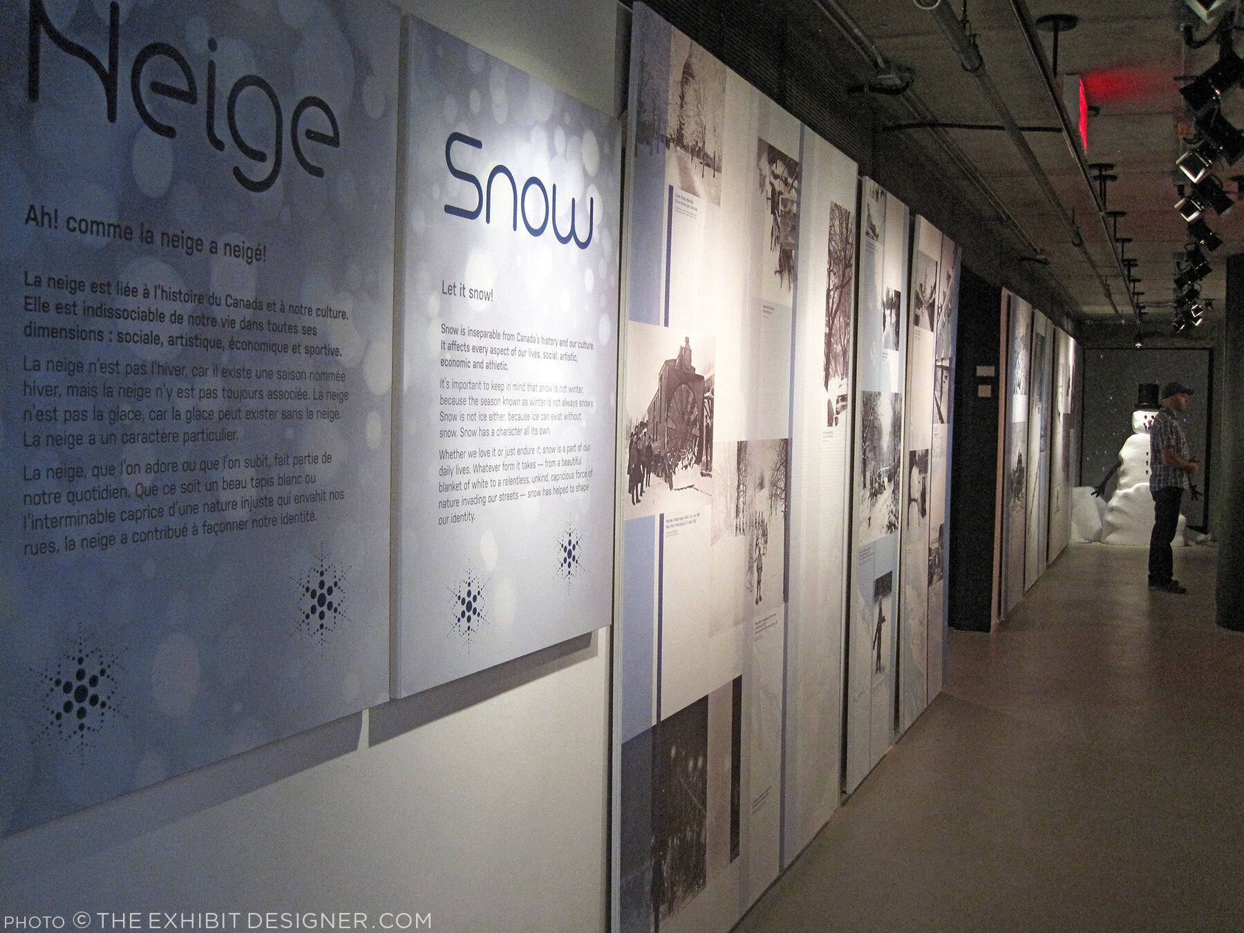
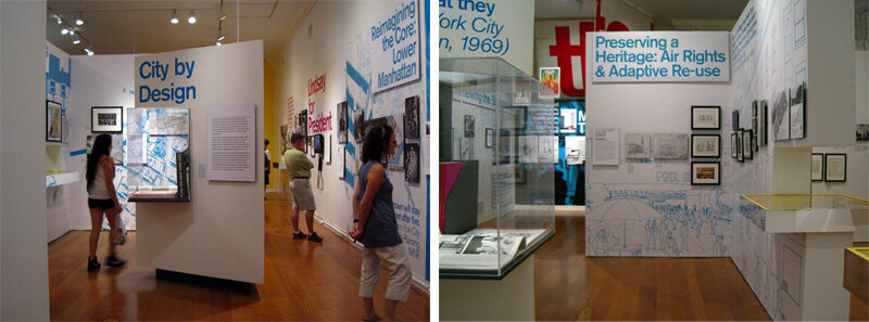
If you stop by the Smithsonian National Postal Museum during the next couple of months, you’ll be able to see two exhibitions that I’ve designed. One is New York City: A Portrait Through Stamp Art (on view through May 14; full project view here); the other just opened.

theexhibitdesigner_NPM-FranklinFoyer

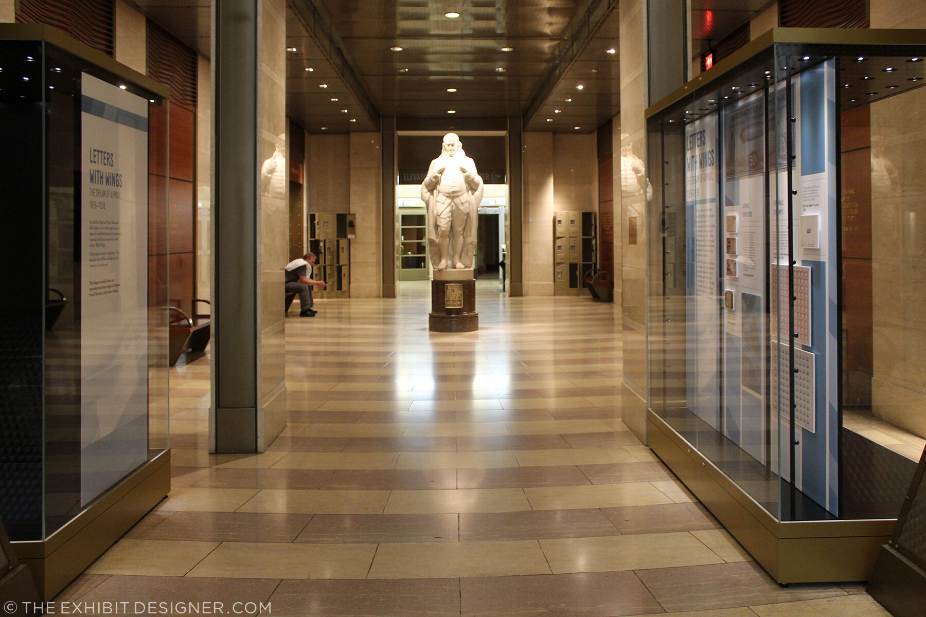
Beneath the museum’s escalators, in the Franklin Foyer, are two cases for temporary exhibitions. The museum intends to change these cases often with displays of recent acquisitions, favorite objects, niche subjects, and the like.

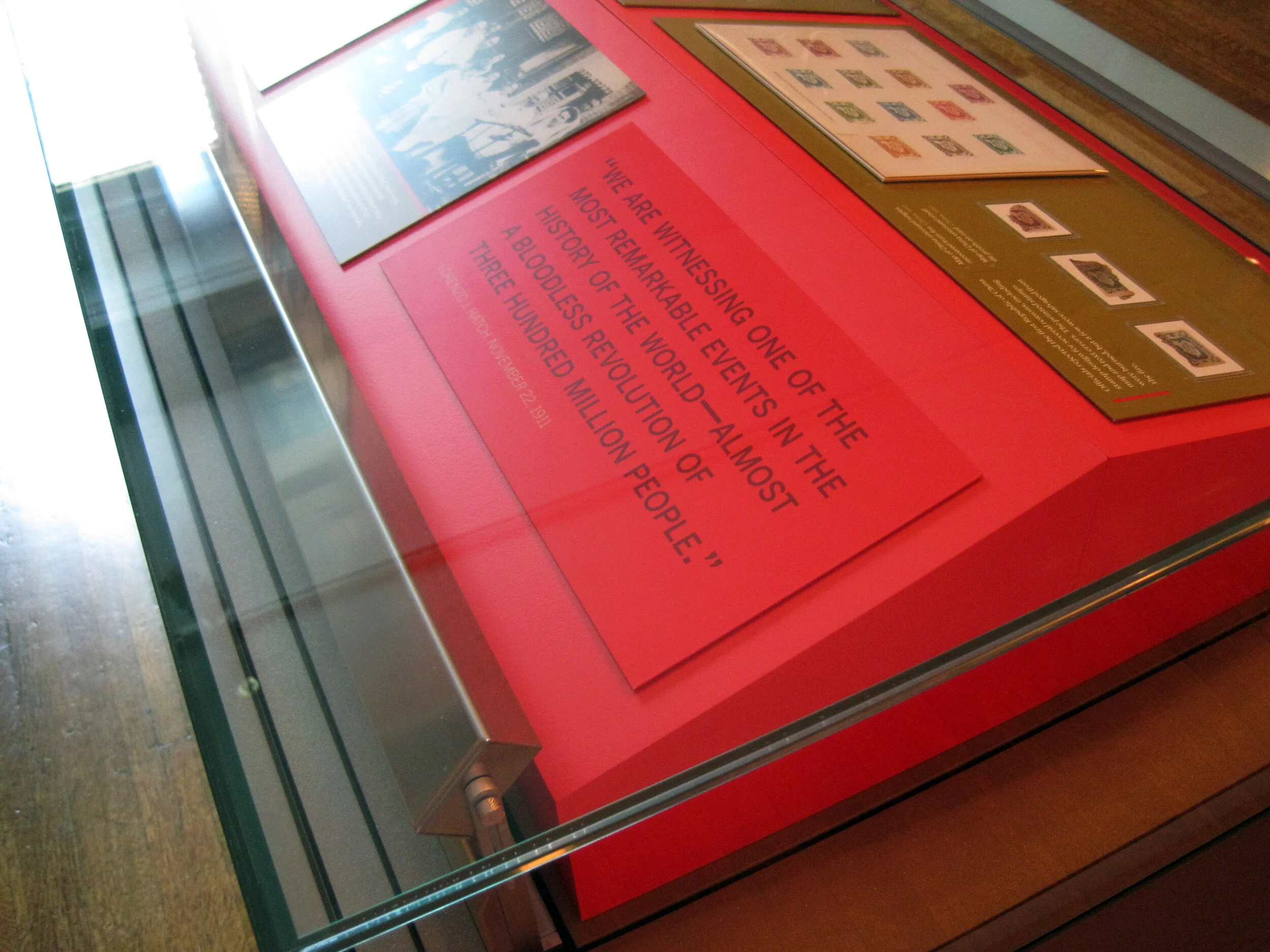
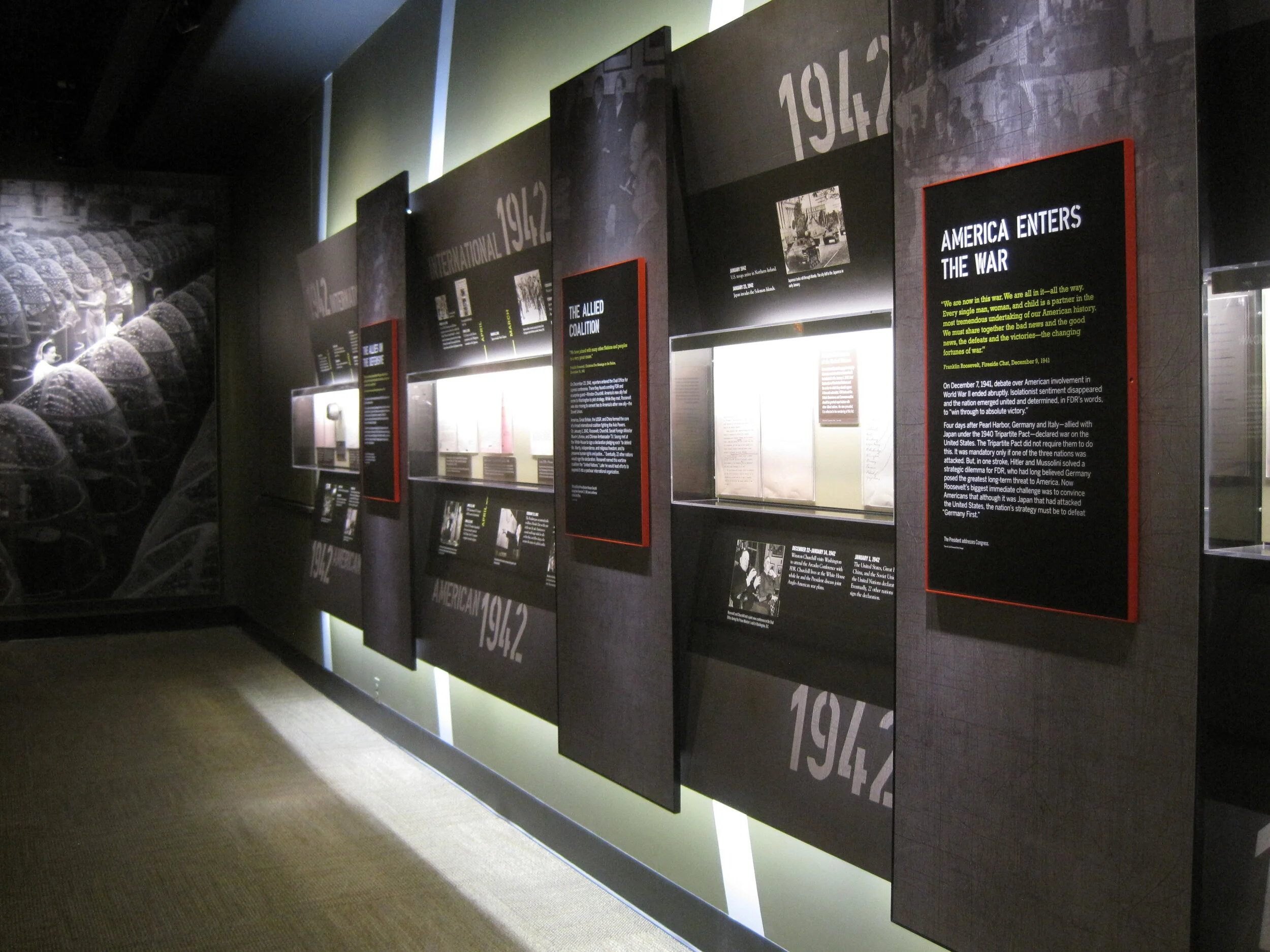
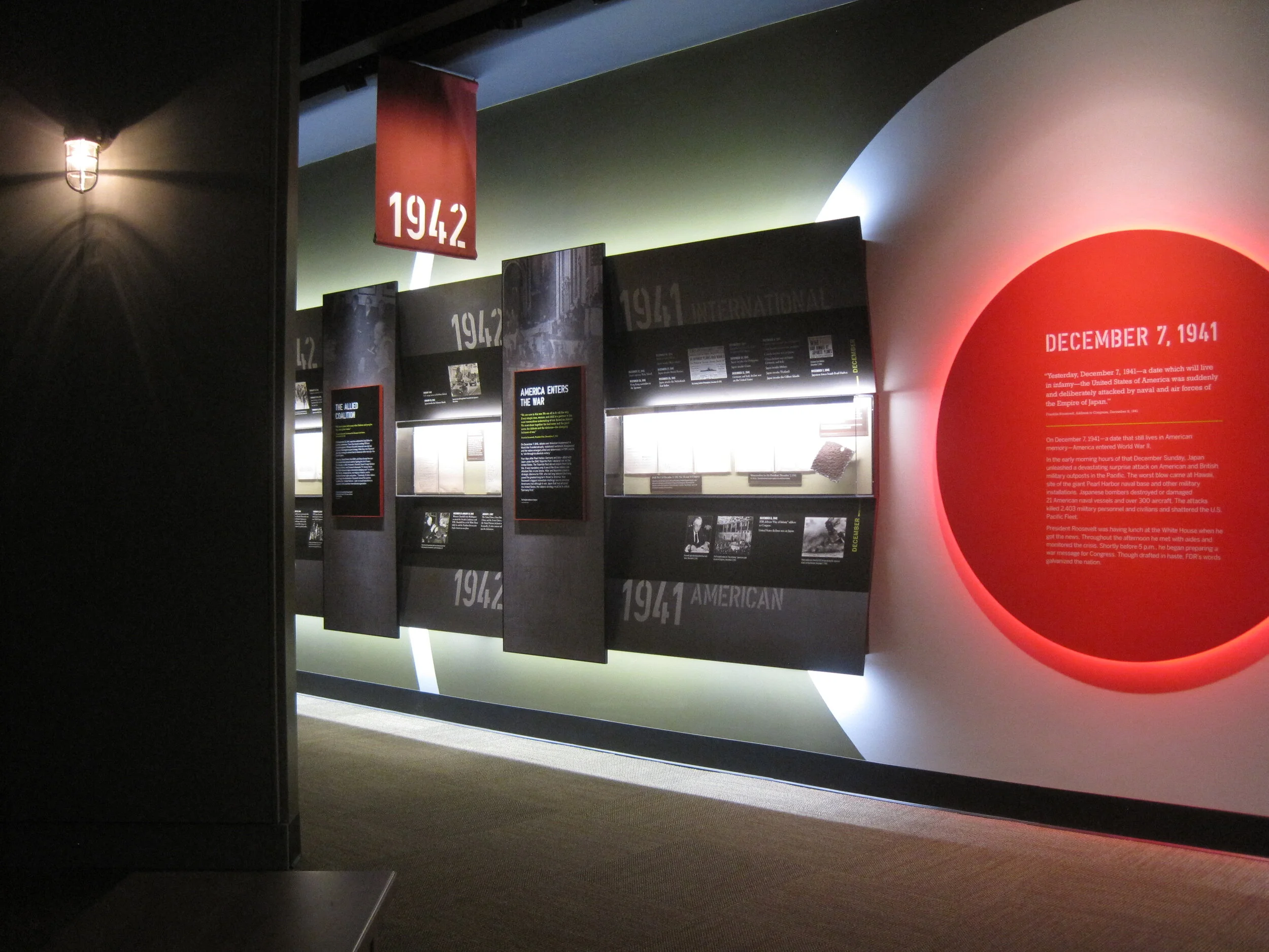
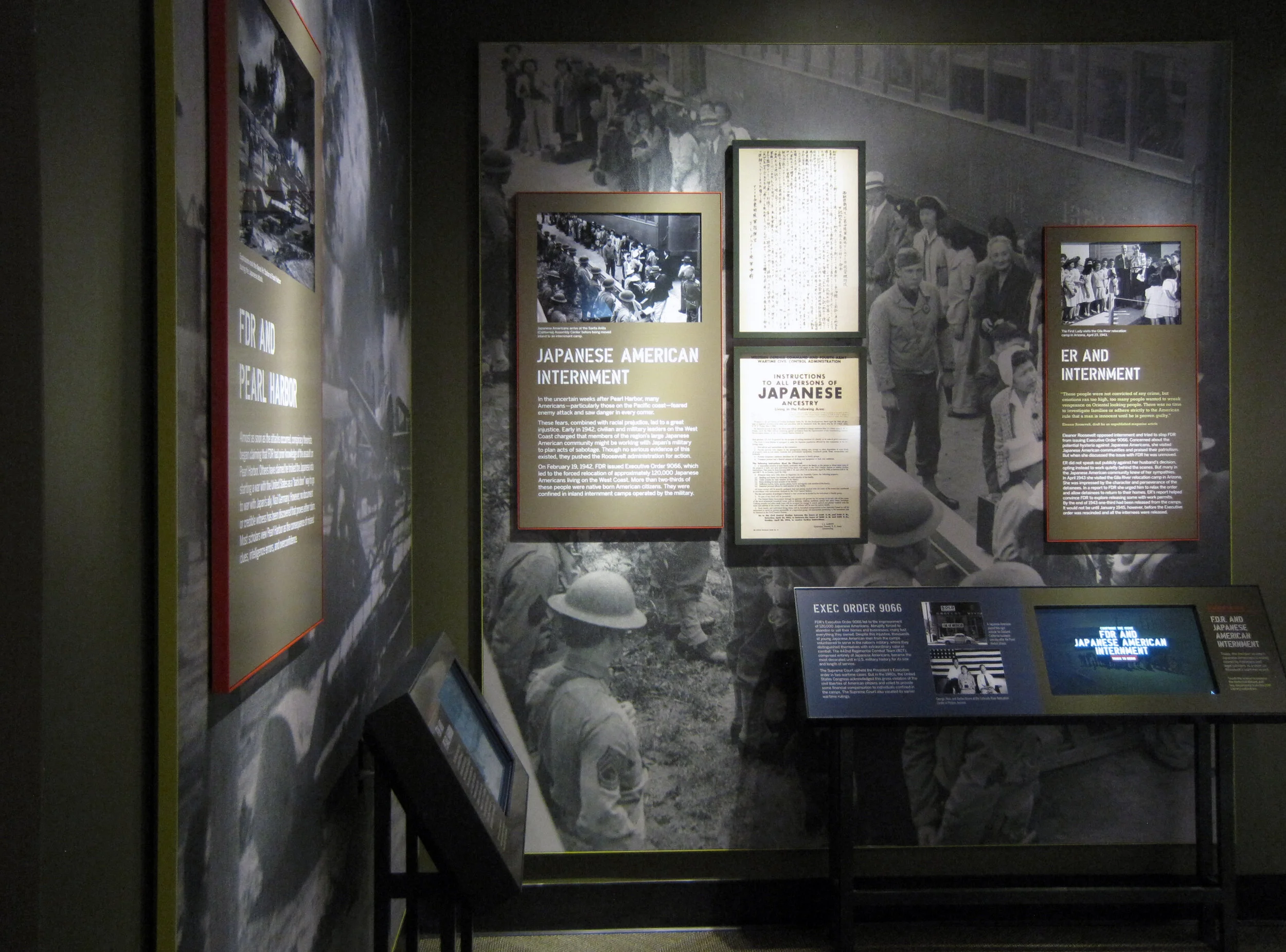
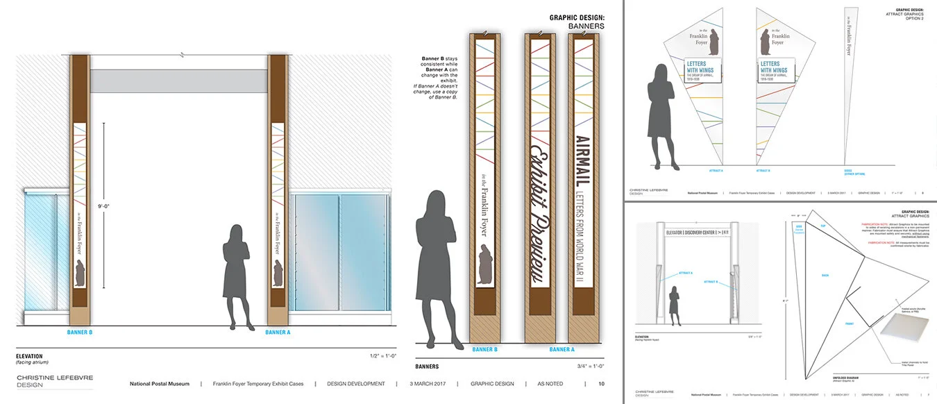
I created a design system for the museum’s in-house use when putting together these quick little exhibitions, and I designed the first exhibition to use the system: a “sneak peek” of an upcoming exhibition about WWII airmail tentatively called Letters With Wings.

theexhibitdesigner_NPM-FranklinFoyer_case1
theexhibitdesigner_NPM-FranklinFoyer_case2

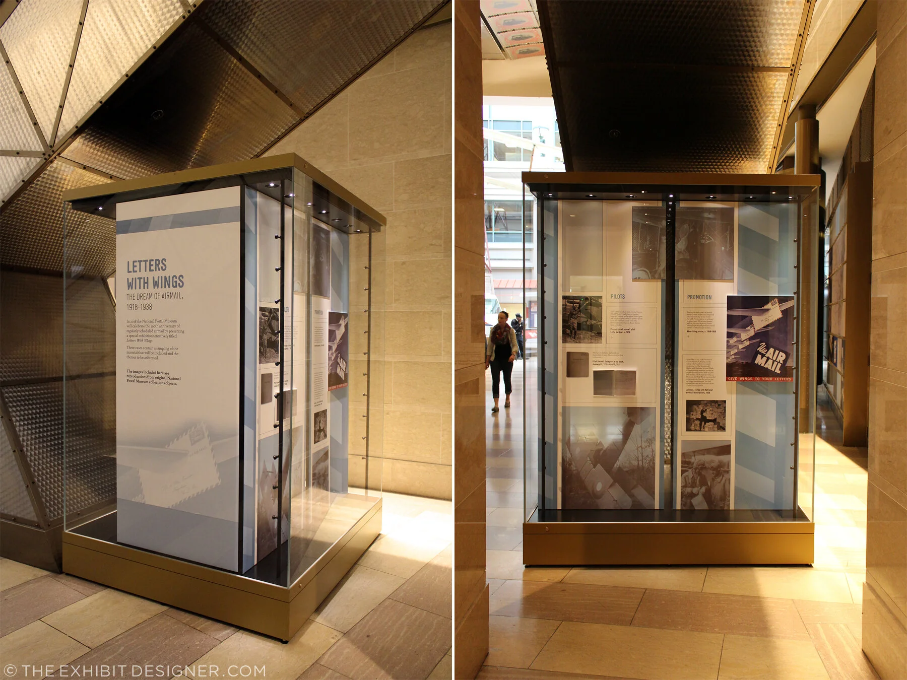
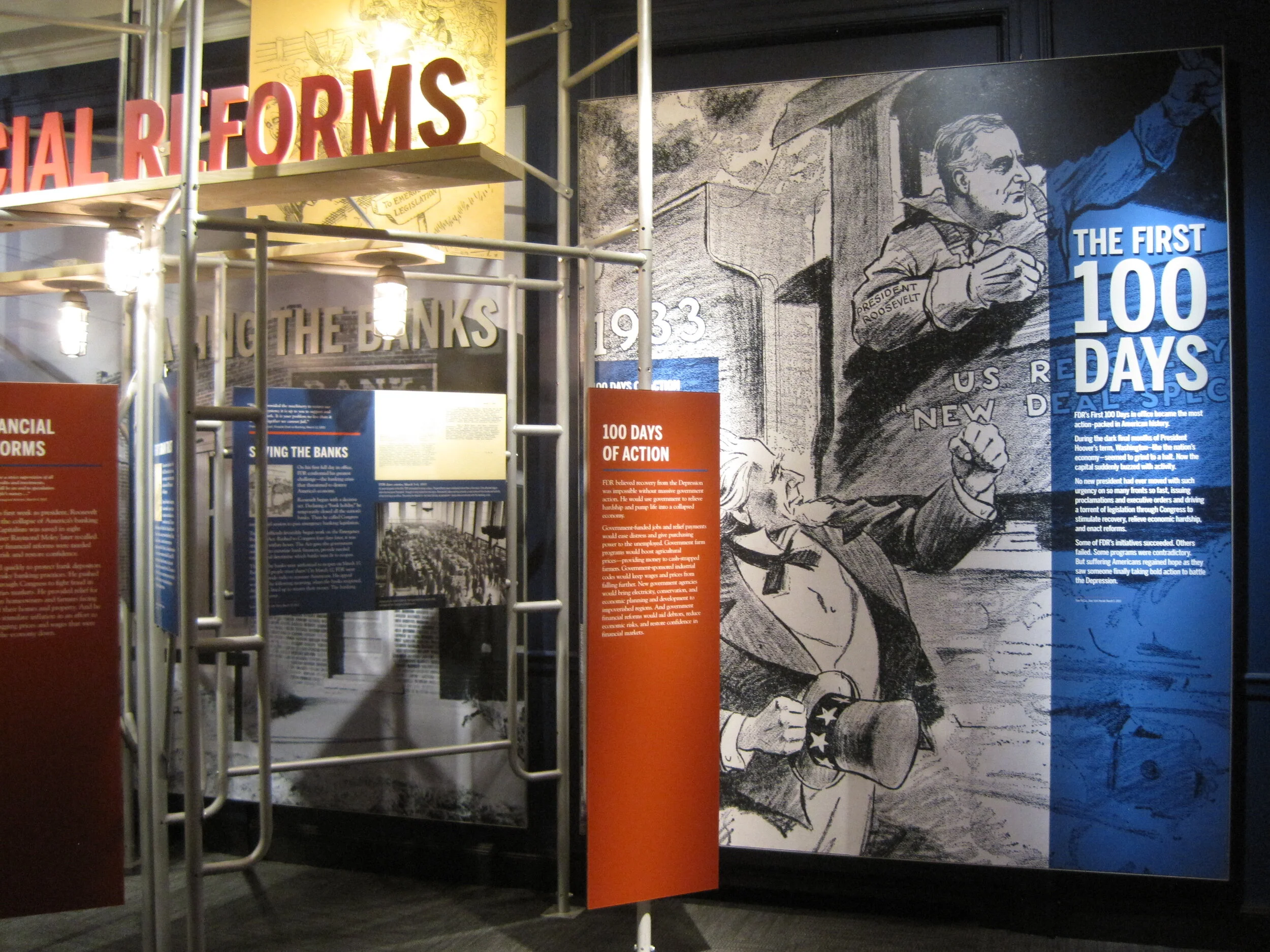
The design system included color palette, guidelines for layout of didactic and label graphics, sets of case furniture and graphic panels, and examples of case arrangements.

theexhibitdesigner_NPM-FranklinFoyer-system1
theexhibitdesigner_NPM-FranklinFoyer-system3

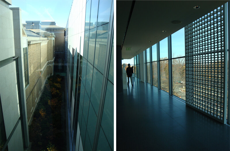
I also designed a series of banners and an “attract graphic” to brand the Franklin Foyer space. The attract graphic will be a geometric, cone-like acrylic structure with a changeable title panel; two will be installed in the open triangles of space between the artifact cases and the undersides of the escalators. (You can see the “open triangles of space” in the photos above.) They will protrude slightly into the space, above head level, and draw visitors’ attention from the atrium space. They’re not currently installed, but I look forward to seeing them there in the future.

theexhibitdesigner_NPM-FranklinFoyer-system2-1

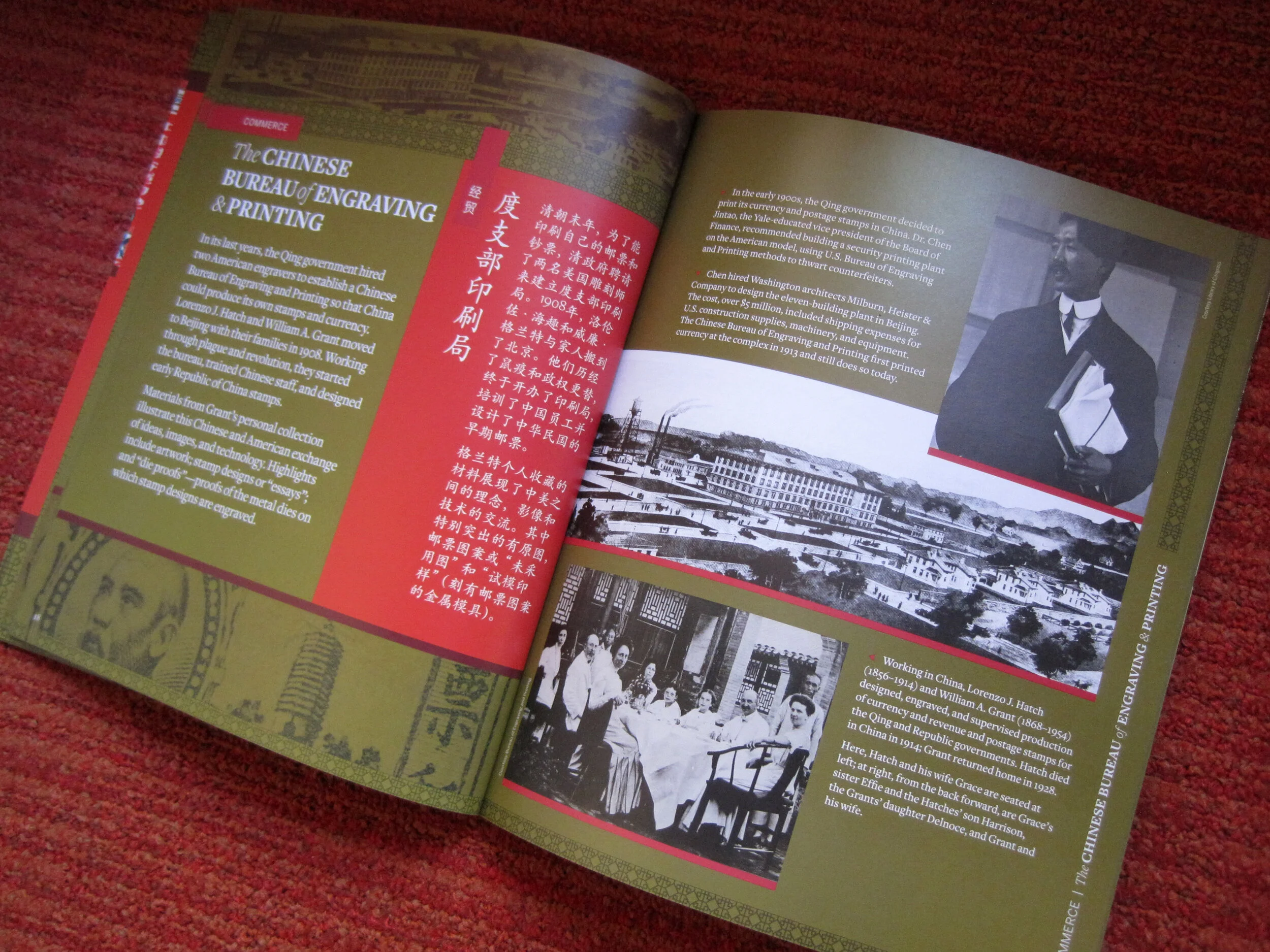
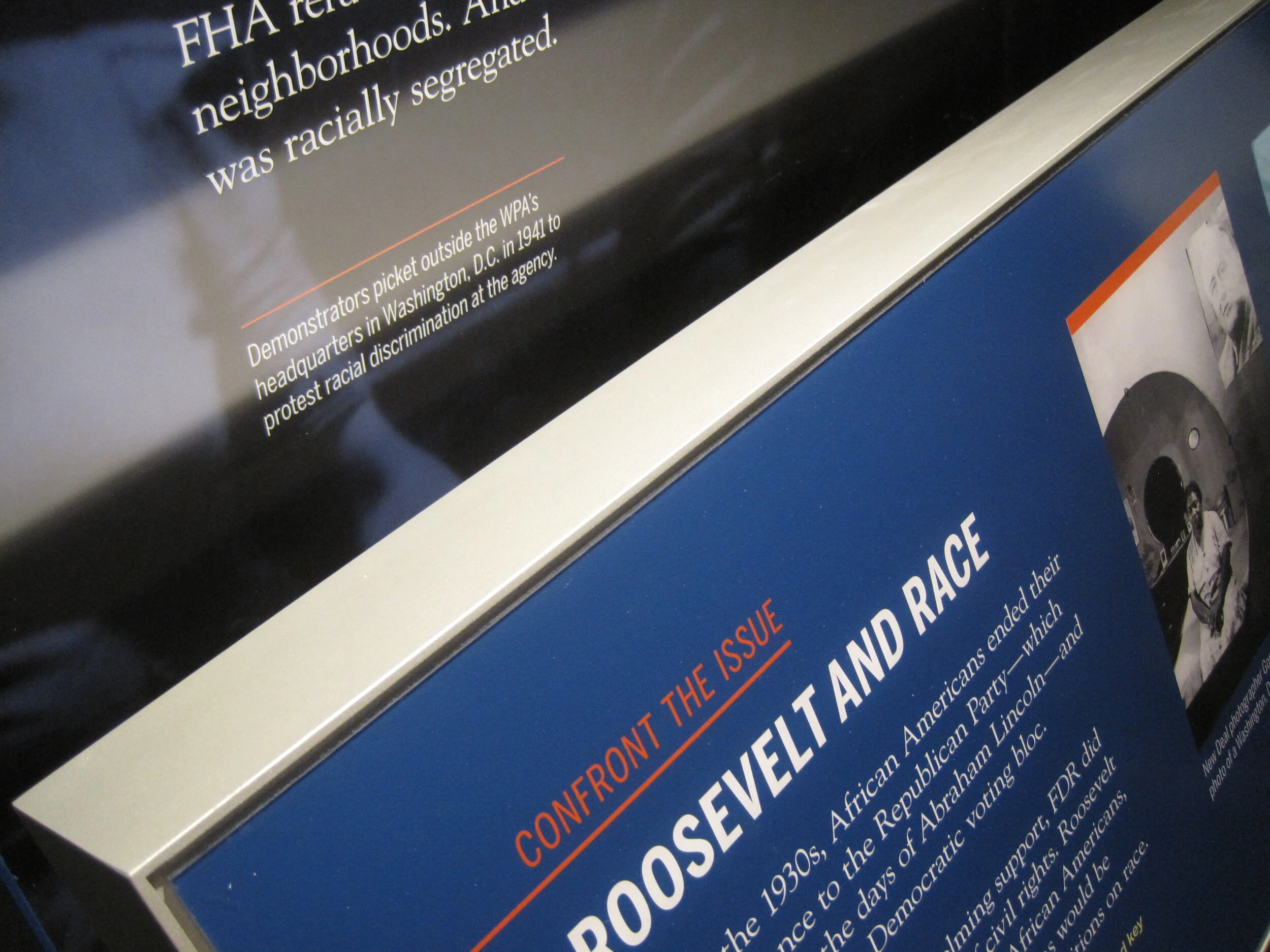
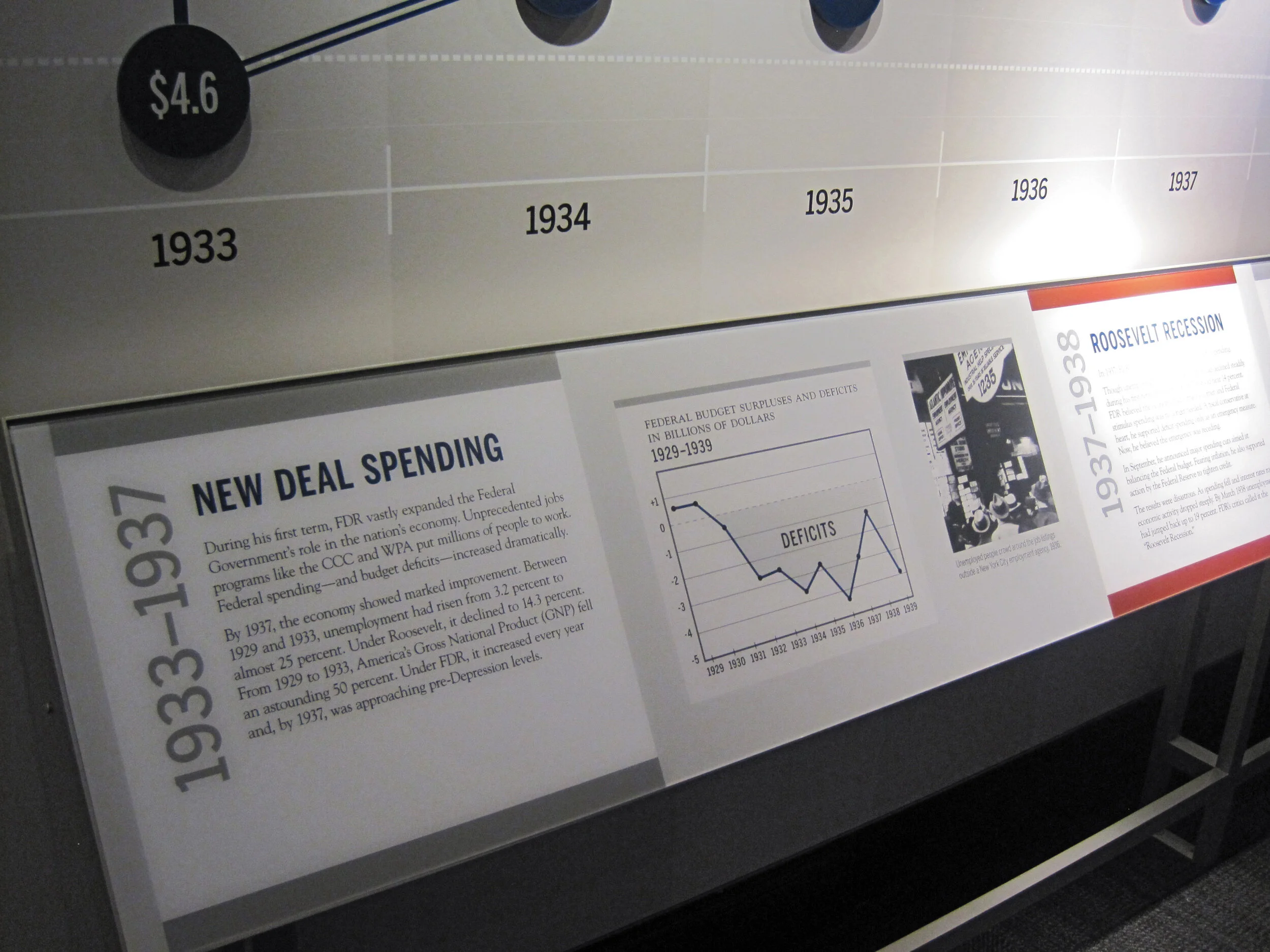
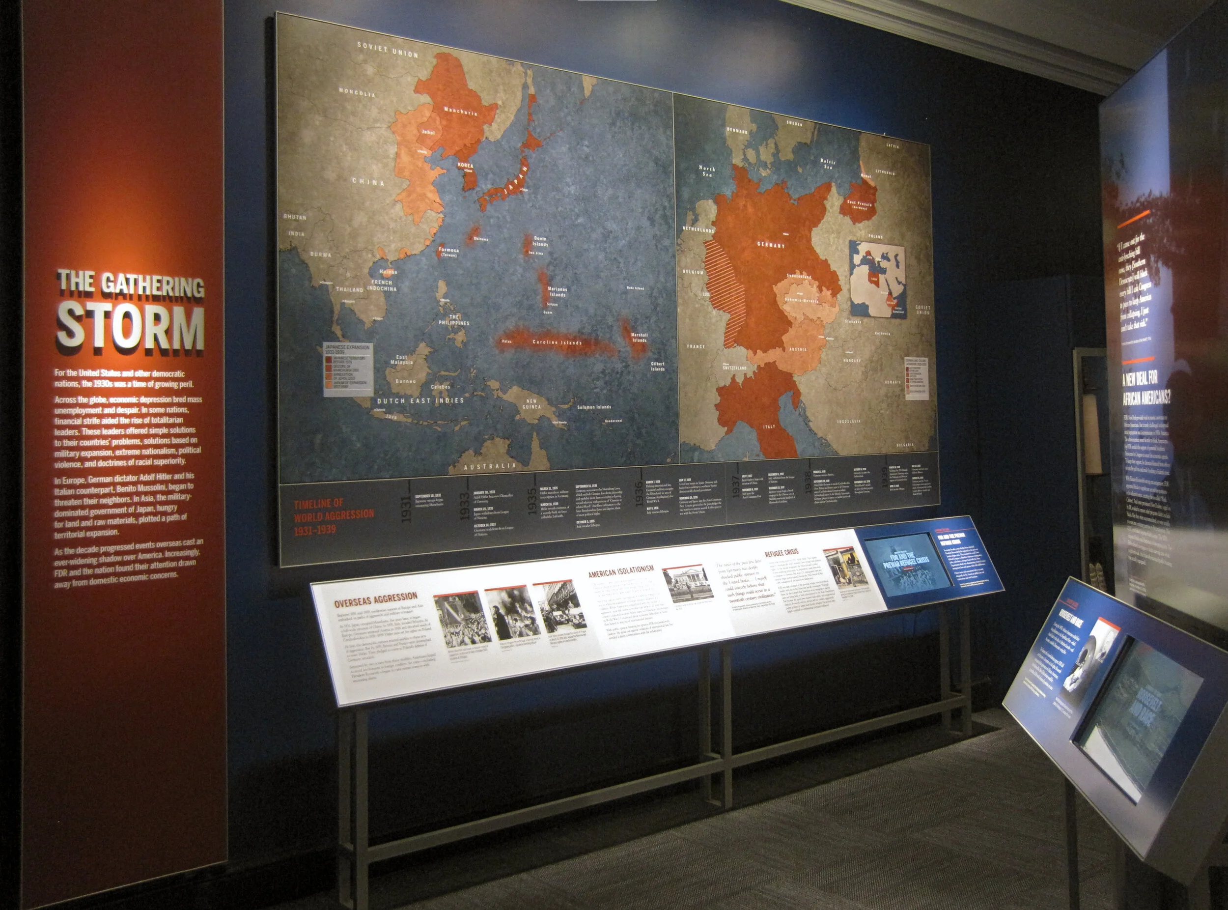
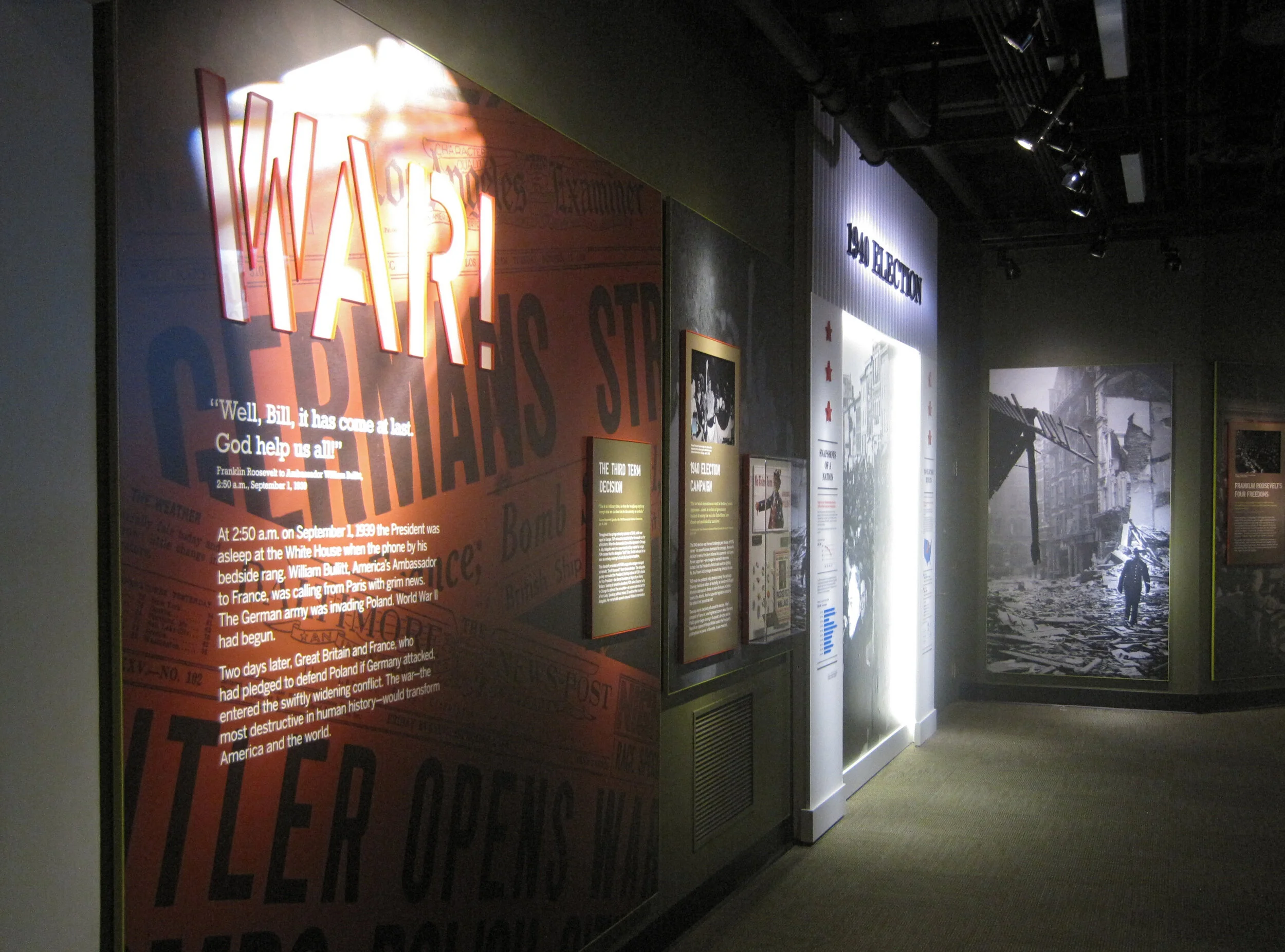
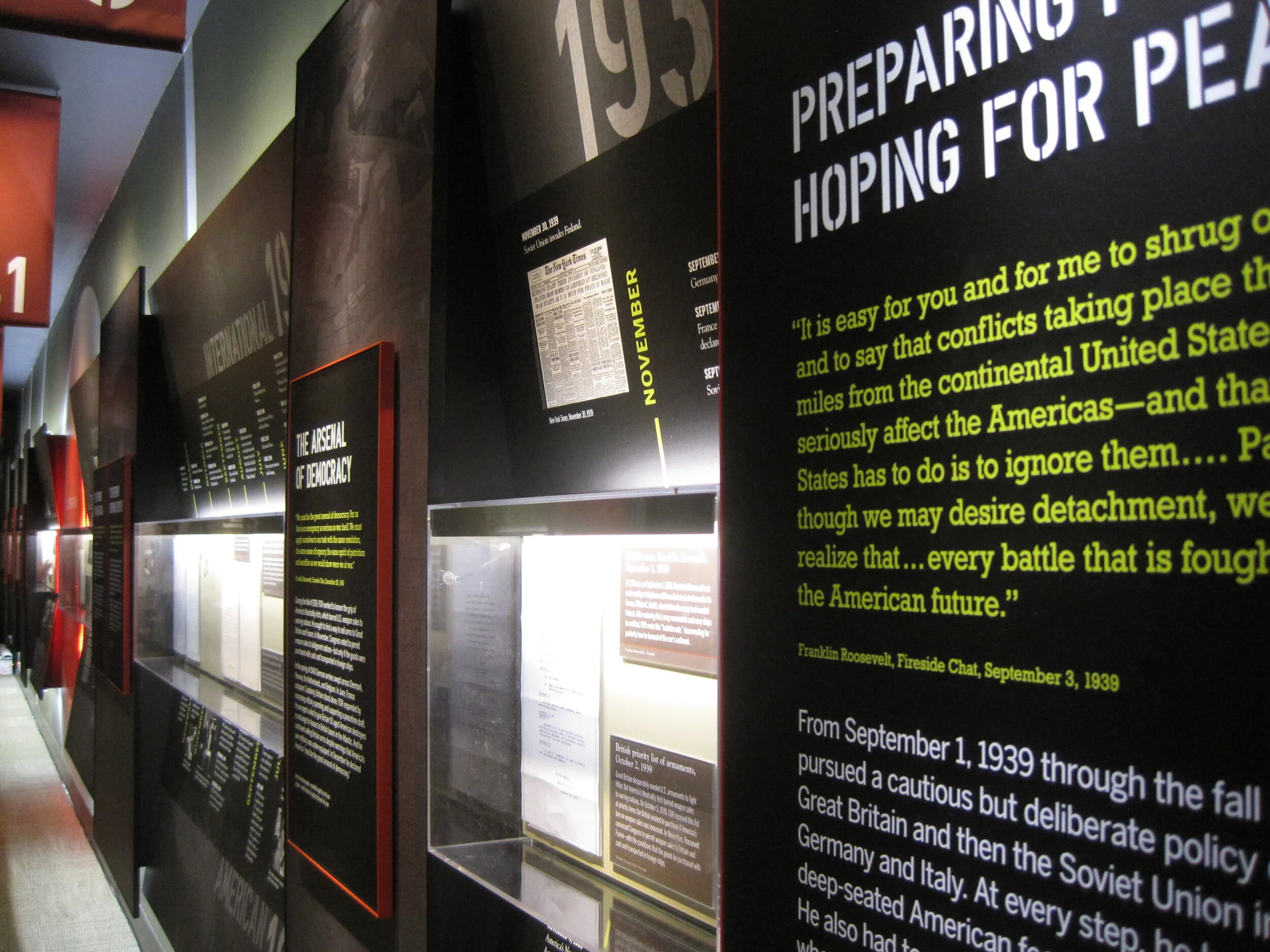
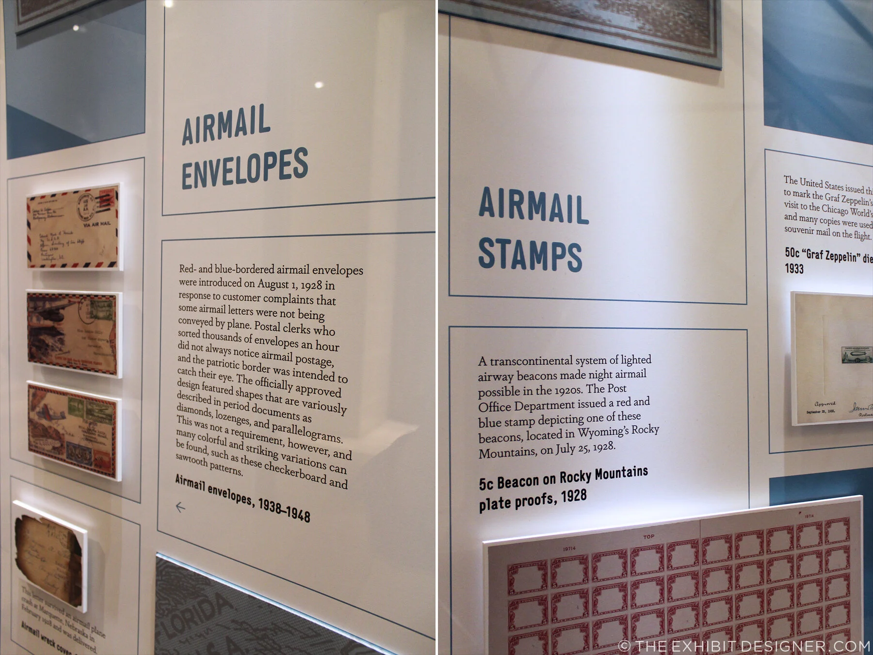
There are no physical artifacts in either case of the currently installed exhibition, so objects are represented as printed graphics. (Docents will occasionally bring out the real objects for visitors, which are being prepared for the larger exhibition.) The printed representations are mounted to sintra (a lightweight, yet rigid, PVC sheet) to give them depth.

theexhibitdesigner_NPM-FranklinFoyer_case1_details2.jpg
theexhibitdesigner_NPM-FranklinFoyer_case1_details

If you’re in the Washington, DC area, please check out this little exhibition — and New York Stamp Art, too — while they’re still on view!

theexhibitdesigner_NPM-FranklinFoyer_case1_2

Post updated in January 2021 with minor text edits. Broken links have been fixed. This post was originally published at theexhibitdesigner.com on 28 March 2017.

Pointe-à-Callière: Crossroads, Building Montréal, Snow

My final post about the Montréal museums I saw during my visit to the city in September 2015 — see also the Insectarium, the Biodôme, and Lazy Love at the Biodôme — here’s a look back at Pointe-à-Callière, Montreal’s Archeology and History Complex.

theexhibitdesigner_Pointe-a-Calliere_lobby-banner.jpg

The Pointe-à-Callière complex is built on archeological sites that span the city’s history. Exploring the museum is very interesting, and a lot of fun — you take passageways, bridges, and stairs over and through the archeological remains. Like the museum building itself, which was built on pilings to protect the site, exhibition elements tread lightly among the artifacts, and visitors are asked repeatedly via signage not to touch the remains. Like most places in Montréal, museum graphics are in French with English translations. I like the way the two languages are interwoven on the red lobby banner above.

theexhibitdesigner_Pointe-a-Calliere_passageways

The permanent exhibition in the basement, Crossroads Montréal, takes you through 1,000 years of the city’s remains, including the first Catholic cemetery (dating from 1643), and the foundation of the Royal Insurance Building (dating from 1861). Excavations continue and more exhibitions are planned to interpret what is unearthed. On the one hand: very cool premise, and very cool space to explore. On the other, I had trouble getting and keeping my bearings. Perhaps because the graphics didn’t hold my attention? The ruins themselves were more intriguing.

theexhibitdesigner_Pointe-a-Calliere_graphics2

I would have liked more information directed at the museum “streakers” like myself: the people who move quickly through exhibitions, and only read titles and very selective [random] bits and pieces of labels. (On my best days, I can be a “stroller.”) Perhaps a printed guide map would have helped me to understand where I was within the museum and what I was looking at. Perhaps I should have taken a guided tour.

theexhibitdesigner_Pointe-a-Calliere_built-in-graphics

I did like the graphics’ integration into the museum’s building structure, particularly the ceilings, and the minimalist construction-site aesthetic of their structures. Artifact cases, too, were carefully integrated into the site.

theexhibitdesigner_Pointe-a-Calliere_built-in-cases
theexhibitdesigner_Pointe-a-Calliere_pipes
theexhibitdesigner_Pointe-a-Calliere_reader-rails

Most graphics were rear-illuminated, which worked perfectly with the museum’s underground atmosphere.

theexhibitdesigner_Pointe-a-Calliere_graphics3
theexhibitdesigner_Pointe-a-Calliere_graphics

Also below-ground is the Building Montréal exhibition, where you’ll find the museum’s archeological crypt. The photos below are of the vaulted stone tunnel built on the bed of the Saint-Pierre River. See what I mean about the museum being fun to explore?

theexhibitdesigner_Pointe-a-Calliere_passageway
theexhibitdesigner_Pointe-a-Calliere_archeological-crypt

Set into the floor of Building Montréal are more than a dozen dioramas that show the city at different points in time. I love this use of space, and the vantage point it gives visitors. (I wrote this post about exhibition flooring, seven years ago, and Bridget mentioned the Pointe-à-Callière in the comments. I finally saw it for myself!)

theexhibitdesigner_Pointe-a-Calliere_floor-dioramas
theexhibitdesigner_Pointe-a-Calliere_floor-models
theexhibitdesigner_Pointe-a-Calliere_building-montreal

At the time, the museum also had a temporary exhibit on view called Snow, a fun look at winter culture in Canada. Notice the snowflakes cut from the apron fronts of reader rails!

theexhibitdesigner_Pointe-a-Calliere_snow1
theexhibitdesigner_Pointe-a-Calliere_snow2
theexhibitdesigner_Pointe-a-Calliere_snow3

Post updated in January 2021 with minor text edits. This post was originally published at theexhibitdesigner.com on 25 March 2017.

Space for Life, part 2: Insectarium

Update: The Insectarium is being redesigned, and is scheduled to reopen in 2021.

The Insectarium was our second stop in Montréal’s natural museum complex, Espace Pour La Vie (“Space for Life”). It’s a fascinating and excellently-designed museum. Its exterior looks like a home for insects, almost like a bee hive:

theexhibitdesigner_insectarium-exterior

The permanent exhibition is called We Are the Insects and it is predominately ... very green. Graphics are a mix of strikingly clean layouts and comic book-inspired illustrations.

theexhibitdesigner_insectarium-we-are

Here’s the view down to the bulk of the exhibition:

theexhibitdesigner_insectarium-overview

Each of the glowing cubes is a display case. Specimens are pinned to a rear-lit graphic, around text and images arranged in a clean, gridular design. Each layout looked nicer than the last, so I'm going to share photos of many.

theexhibitdesigner_insectarium-case-graphics1

Some layouts have a sense of irreverence, like this one, with its marching ants:

theexhibitdesigner_insectarium-case-graphics-fun

The different accent colors and stylized illustrations indicated the habitats (e.g. tropical forests) for the specimens.

theexhibitdesigner_insectarium-case-graphics2
theexhibitdesigner_insectarium-terrarium

Throughout the exhibition there were terrariums with some live critters, and beneath some display cubes there were dioramas (faux terrariums, if you will).

theexhibitdesigner_insectarium-faux-terrarium
theexhibitdesigner_insectarium-butterflies

There were wall displays, and plenty of interesting charts and diagrams. There were sections about insect lifestyles, diets, reproduction, and what people can do to protect endangered insects. The sheer number of displays could have made for a repetitive slog, but it did not feel that way at all — specimens were fascinating, text was succinct, and the layouts were visually varied while staying true to the design system.

theexhibitdesigner_insectarium-timeline-charts
theexhibitdesigner_insectarium-reproduction-pros
theexhibitdesigner_insectarium-different-tastes
theexhibitdesigner_insectarium-protect

Outside were additional exhibitions and a temporary interactive art installation. And then we were off to explore the Botanical Garden.

theexhibitdesigner_insectarium-outside-exhibits

Post updated in January 2021 with minor text edits. Broken links have been replaced with archived URLs, courtesy of archive.org. This post was originally published at theexhibitdesigner.com on 15 March 2017.

California Academy of Sciences, part 2: color and quakes

If forced to choose, my favorite part of the California Academy of Sciences would be the Rainforest Dome — check out Part 1 of my visit — but there were many other fascinating exhibitions to enjoy, including Color of Life: Discover Nature's Secret Language, designed by the museum’s Exhibits Studio and opened last year.

theexhibitdesigner-SF-academy-sciences_color-of-life
theexhibitdesigner-SF-academy-sciences_color-of-life4

The exhibition uses bright, bold colors, beautiful photographs, and accessible writing to “reveal the significant roles color plays across a spectrum of species.”

theexhibitdesigner-SF-academy-sciences_color-of-life2
theexhibitdesigner-SF-academy-sciences_color-of-life3
theexhibitdesigner-SF-academy-sciences_color-of-life5

Within the 8,000 square foot exhibition are immersive interactive experiences, including a musical color visualizer, designed by Tellart. Video screens respond to strings, plucked by visitors, with a show of images and videos related to that string’s color.

theexhibitdesigner-SF-academy-sciences_color-of-life7

Another popular interactive experience is the “Courtship Dance Stage.”

theexhibitdesigner-SF-academy-sciences_color-of-life8

Throughout the exhibition are dioramas and small interactives that allow you to see organisms under different types of lighting, or through the eyes of other animals (just for example).

theexhibitdesigner-SF-academy-sciences_color-of-life6.jpg
theexhibitdesigner-SF-academy-sciences_color-of-life9
theexhibitdesigner-SF-academy-sciences_earthquakes

Also 8,000 square feet in size, the older (circa-2012) exhibition, Earthquake: Life of a Dynamic Planet, explores the seismic science of Earth’s geologic transformations through installations such as a 25-foot-wide, walk-through model of Earth, and the immersive “Shake House.”

theexhibitdesigner-SF-academy-sciences_earthquakes2

Other sections of the Earthquake exhibit focus on the diverse life forms that evolved and spread as Pangaea split up, and earthquake preparedness.

theexhibitdesigner-SF-academy-sciences_life-drifts

There are mini-exhibits throughout the museum, including a show of Andy Warhol’s Endangered Species series of silkscreen prints, from 1983. In 2007 the bald eagle was removed from the endangered species list; the other featured animals remain.

theexhibitdesigner-SF-academy-sciences_hall3

Other mini-exhibits focused on variation, in ladybugs and in humans. 

Rounding out my visit, I strolled through the Human Odyssey exhibition, an exploration of the origins of humankind, and the African Hall, home to classic, stuffy, stuffed-animal dioramas (and live penguins).

theexhibitdesigner-SF-academy-sciences_african-hall.jpg

I highly recommend this museum — it’s beautifully designed, fascinating, and educational. I also recommend you consider picking up a City Pass if you plan to visit more than one museum. They are expensive in San Francisco — said from DC, where the museums are mostly free.

Post updated in January 2021 with minor text edits. Broken links have been fixed. This post was originally published at theexhibitdesigner.com on 3 October 2016.

Weekend in NYC: the Cooper Hewitt, Jewish Museum, more

I went up to New York City a couple weekends ago. My time was packed with museum visits, including my first to the Tenement Museum, at 97 Orchard Street in Manhattan’s Lower East Side. I took their Shop Life tour. The museum’s sixty- and ninety-minute-long tours are docent-led through restored tenement apartments. Most tours focuses on one apartment, one period in time, and one actual family; the Shop Life tour is slightly different in that it highlights multiple families, across time periods, who lived and worked in the basement-level shops. I highly recommend the museum for an engrossing, educational experience. (Summertime hint: the Shop Life tour is the only one air-conditioned!)

From top left, clock-wise: volunteers pull weeds on the High Line; the entrance to the "Shop Life" tour at the Tenement Museum (no photos allowed inside!); Fly By Night at the Brooklyn Navy Yard; Goshka Macuga at the New Museum

From top left, clock-wise: volunteers pull weeds on the High Line; the entrance to the "Shop Life" tour at the Tenement Museum (no photos allowed inside!); Fly By Night at the Brooklyn Navy Yard; Goshka Macuga at the New Museum

I also stopped by the New Museum, since I was in the neighborhood for the Tenement Museum, and truth be told, I was mostly perplexed (I’m not that hip, apparently). I paid another visit to the High Line, which has expanded and its plantings matured since I was last there. And I saw a performance of Duke Riley’s Fly By Night, in which, “at dusk, a massive flock of pigeons … elegantly twirl, swoop, and glide above the East River.” The pigeons wear LED anklets and respond to whistles and waving flags, flying overhead as commanded. The performance pays homage to the mostly forgotten culture of pigeon keeping and — with just another week to go — is being held at the Brooklyn Navy Yard, once home to the country’s largest naval fleet of pigeon carriers. I loved it.

theexhibitdesigner_new-york-met-breuer

At the Met Breuer, the Metropolitan Museum of Art’s new home for modern and contemporary exhibitions (in the Whitney’s former building), I saw the exhibition Unfinished. There was nothing ground breaking in the actual exhibition design, but the premise was compelling and a lot of the artwork was fantastic.

And I took in the Nasreen Mohamedi retrospective. (Just closed, on June 5.) After the jam-packed Unfinished, the meditative exhibition was a welcome respite.

theexhibitdesigner_new-york-met-breuer2

But hands down, my two favorite exhibits during this visit were at the Jewish Museum and the Cooper Hewitt.

theexhibitdesigner_new-york-jewishmus_burle-marx

At the Jewish Museum, I fell in love with Roberto Burle Marx. Burle Marx was a Brazilian artist who drew upon diverse cultural influences to reinvent the landscape architecture discipline. He incorporated abstracted, irregular forms, native plants (he was a passionate environmental advocate), and Brazilian modernism into his landscape designs. His work is incredible; visit this exhibition!

theexhibitdesigner_new-york-jewishmus_burle-marx-exhibit-cases

The exhibition design was spot-on, evoking the geometries and curves of Burle Marx’s landscapes and emphasizing the art on display. An interlocked massing of display cases in the center of the room dominated the exhibition space; an 87-foot-long tapestry (below, left), designed by Burle Marx for the Santo André Civic Center in 1969, provided a stunning focal point. His hand-drawn and painted landscape plans are wonderful to behold; some examples from the exhibition are shown below.

theexhibitdesigner_new-york-jewishmus_burle-marx-exhibit-displays
theexhibitdesigner_new-york-jewishmus_burle-marx2

A few blocks north, Beauty, the Cooper Hewitt Design Triennial was bustling. The wide-ranging contemporary design exhibition is a must-see for designers and artists.

theexhibitdesigner_new-york-cooper-hewitt-beauty
theexhibitdesigner_new-york-cooper-hewitt-beauty2

The exhibition design was minimal, just the simplest of reader rails and small text panels. The museum encourages use of “pens” that allow you to interact with the digitized collection on touchscreen tables and to save objects from the exhibitions to be accessed later. A nice benefit of accessing your visit online is that for each object, museum curators have selected related objects for further exploration. For example, the online entry for Atmospheric Reentry, designed by Maiko Takeda (above, left), led me to this hat from Cameroon and this “hairy” garden pavilion.

theexhibitdesigner_new-york-cooper-hewitt-beauty-reader-rails

Below is one of my favorite entries from the Beauty Triennial, Architecture is Everywhere, designed by Sou Fujimoto Architects. From the project description: “the project discovers architectural possibility in found objects and everyday materials. Simple artifacts such as a lottery ticket, an ashtray, or a ring of binder clips become intriguing structures when placed on pedestals with tiny human figures.” It was delightful.

theexhibitdesigner_new-york-cooper-hewitt-beauty3

Post updated in January 2021 with minor text edits. Broken links have been fixed. This post was originally published at theexhibitdesigner.com on 13 June 2016.

SEGD tour of National Museum of Health and Medicine

On Sunday I attended a tour of the very cool National Museum of Health and Medicine, now located in Silver Spring, Maryland. NMNH is a Department of Defense museum first established in 1862 as the Army Medical Museum, “a center for the collection of specimens for research in military medicine and surgery.”

the-exhibit-designer_SEGD-NMHM-tour1

The tour was organized by the Washington, DC chapter of SEGD (formerly the Society for Environmental Graphic Design, now the Society for Experiential Graphic Design) and led by members of the museum’s staff and the design team from Gallagher & Associates. (I used to be a designer at G&A.)

the-exhibit-designer_SEGD-NMHM-tour3

There was a crowd in attendance so we were split into two groups. My group was led by graphic designer Liza Rao (responsible for the museum’s fantastic colors and typography), and Andrea Schierkolk, NMHM’s public programs manager. It was a treat to hear reflections from both sides; what they love and what they love less; things that work great and things that didn't turn out as expected. It was also a treat to see some of my former colleagues.

the-exhibit-designer_SEGD-NMHM-tour4
the-exhibit-designer_SEGD-NMHM-tour5

The museum is divided into three major exhibits: Collection That Teaches (purple), Anatomy and Pathology (turquoise), and Advances in Military Medicine (brick red). Crisp white casework and glass shelves give the exhibit a “lab-like” look that I enjoyed, and the bold shots of color look great against the mostly tan, cream, and yellow objects on display — yes, most of those objects are corporeal remains. This museum is not for the sensitive of stomach.

the-exhibit-designer_SEGD-NMHM-tour2
the-exhibit-designer_SEGD-NMHM-tour7

The exhibits were designed precisely for the current objects on display, yet they are still changeable — graphics can be slid in and out as objects are rotated or stories are updated.

the-exhibit-designer_SEGD-NMHM-tour8

Thank you to our new DC SEGD chairs, Liza and Chris, for the great program — keep them coming, please!

the-exhibit-designer_SEGD-NMHM-tour6

Post updated in January 2021 with minor text edits. This post was originally published at theexhibitdesigner.com on 16 March 2016.

Freedom Just Around the Corner opens at the National Postal Museum

The exhibition I designed for the Smithsonian’s National Postal Museum, Freedom Just Around the Corner: Black America From Civil War to Civil Rights, opened yesterday!

CLD_NPM_Freedom-Exhibit1.jpg

Last night was its reception, with all expected fanfare including ribbon cutting and speeches, cocktails and finger foods. It was all quite nice — I do love exhibit openings. Here are some photos of the reception; thank you to photographer Bruce Guthrie for sharing them.

freedo_150212_001_stitch.jpg

Alongside the exhibition, I designed the catalogue, postcard takeaway, special postal cancel, and exterior banners. (Photos of the print design can be seen here.)

The women working the USPS table — who were selling commemorative stamps and giving commemorative cancels — heard that I was the designer and I ended up signing some books.

CLD-NPM-Freedom-catalog25.jpg

And, some photos of the exhibition. More photos can be seen, here.

CLD_NPM_Freedom-Exhibit5.jpg
CLD_NPM_Freedom-Exhibit16.jpg
CLD_NPM_Freedom-Exhibit23.jpg
CLD_NPM_Freedom-Exhibit7.jpg

Post updated in January 2021. This post was originally published at theexhibitdesigner.com on 13 February 2015. This updated post was combined with a similar post originally dated 19 February 2015.

Pacific Exchange, open at the National Postal Museum

Work shown was completed while I was a designer at Gallagher & Associates.

It’s open! Okay, old news. It opened well over a month ago, on March 6. I had also planned to post about the opening reception, but that was March 20, so — old news there as well. In any case, the reception was lovely, with Chinese food served and tinkling glassware and everyone dressed quite nicely.

Pacific Exchange: China & U.S. Mail is the second exhibit to be on view in the Postmasters Suite gallery at the Smithsonian National Postal Museum. From the exhibit website: Using mail and stamps, Pacific Exchange brings a human scale to Chinese–U.S. relations in three areas: commerce, culture, and community. The exhibit focuses on the 1860s to the 1970s, a time of extraordinary change in China. It also explores Chinese immigration to the United States, now home to four million Chinese Americans. (Thank you to James O'Donnell of the Smithsonian for the above photo.)

Upfront: I am a bit of a stamp nerd. I have a small collection of Olympics stamps, mostly international, from the 1960s and 1970s. (You have to focus when collecting stamps!) So I really enjoyed working on an exhibit about philately.

This was my swan song at Gallagher & Associates. I handled the design myself, from designing the exhibit’s visual concept to laying out production files for all of the graphics. I also designed the exhibit plan and artifact case layouts. Even though this is a small exhibit space, it had more than 100 artifacts, so making [nearly] everything fit comfortably was a bit of a challenge!

The design drawing above is an example of how a case layout looked during design development, and below are those same cases, made real:

PacificExchange_commerce-cases2.jpg

Graphics were digital output mounted on sign blank, trimmed to edges, with a matte overlaminate. The wall-mounted and freestanding graphics were backed with 1/2" MDF painted Benjamin Moore “Bonfire” to match the primary exhibit red (Pantone 1795). The freestanding graphics had duplicate panels on either side of the mdf — a panel sandwich which was held in place by adjustable metal sign bases. The Smithsonian Office of Exhibits Central printed and built the graphic components. Blair Fabrication built the case furniture.

PacificExchange_culture-case2.jpg

Most of the exhibit text is in English and Chinese, a design challenge I enjoyed. In the artifact case below, some of the artifacts were loans that had to be displayed flat. The other half of the plinth has a 15° rise to create a comfortable reading angle.

I arrived at the color palette after some research into significant colors in Chinese culture. I used red and gold as the dominant exhibit colors, with a deeper maroon red for accent. I used a third red, one with pink undertones — red, is the color of prosperity and good fortune, among other meanings — for the Commerce section of the exhibit; yellow, the color of heroism, for the Community section; and blue-green (or qing), to give a feeling of Chinese history and tradition, for the Culture section. I also drew distinctive vector patterns for each section.

The element that most people extol is the group of banners in the entrance. There are three individual banners and they’re more than 20 feet tall! EPI Colorspace printed and installed them. (Install photos here.) They were printed on “Brilliant Banner” 12 mil. polyester banner fabric. The fabric has a very subtle canvas texture that wasn’t what I originally intended — I wanted a silken look for the banners — but the color saturation and printing quality was so good that I went with EPI’s recommendation.

PacificExchange_entrance-timeline.jpg

I also designed a few of the related print graphics: the exhibit catalogue, a postcard, and the invitation to the opening reception.

The exhibit has been well-received overall and I’m thrilled with how everything turned out. If you’re in DC between now and January 4, 2015, please check it out!

Post updated in January 2021 with minor text edits and additional photos. Broken links have been fixed. This post was originally published at theexhibitdesigner.com on 26 April 2014.

FDR Museum, part 3: almost done!

Work shown was completed while I was a designer at Gallagher & Associates.

I am back in Hyde Park — installation continues! The exhibits are quickly coming together as the opening nears. Most of the graphics are hung, dimensional letters have been pinned (there are a ton throughout the museum — I went dimensional-letter-happy), and the interactives are being field-tested. I think it all is looking great. Some photos of the A New Deal gallery:

IMG_8087.JPG
IMG_7985.JPG
IMG_7806.JPG
IMG_8131.JPG

Artifact cases are being filled:

It’s a papier-mâché FDR sphinx!

IMG_8146.JPG

The World War II timeline is nearly complete (two weeks ago there wasn’t much hung besides the skeleton). What a bear that was to design!

IMG_7941.JPG
IMG_8168.JPG

I may have snuck into some New York Times photos while I was onsite. The critic and photographer were there, I was there ... who’s to say. We’ll see.

Post updated in January 2021 with minor text edits and additional photos. This post was originally published at theexhibitdesigner.com on 24 June 2013.

Game on: The Art of Video Games

I visited The Art of Video Games at the Smithsonian American Art Museum. (It’s gotten quite a bit of press — here is one thoughtful review, from The Mary Sue.) The exhibit covers the past 40 years of video game art and includes interviews of game designers and developers, conceptual art, video displays of 80 games (voted on by the public), and playable games (five, for the five eras of game technology).

I would have loved to play some Super Mario Brothers, but the wait was at least 10 kids deep so I had to move on. Vintage game consoles were on display in lit display “consoles,” along with video game stills and interpretive text.

The exhibit designers describe their process and the materials and production techniques used, in this blog post from Smithsonian Exhibits. There is also an upcoming gallery talk, “Building The Art of Video Games(link no longer available) on August 21. For those of you not in the DC area, the exhibit will travel beginning late October.

Post updated in January 2021 with text edits. Broken links have been replaced with archived URLs, courtesy of archive.org. This post was originally published at theexhibitdesigner.com on 15 August 2012.

Another world: the Van Cleef & Arpels traveling exhibit

I am awed by the Van Cleef & Arpels traveling exhibition. But alas, I can only look at photos.

My colleague Zhengyuan saw this exhibit twice. Once while it was on view in NY at the Smithsonian Cooper-Hewitt (where it was called Set in Style) and then again when it moved to MOCA Shanghai (where its name was changed to Timeless Beauty). (When it was on view in Tokyo it had yet another name, Spirit of Beauty.)

Zhengyuan shared photos of the MOCA Shanghai exhibit:

She described the exhibit, “they didn't move the entire exhibit set to Shanghai, but there were some new displays, like the octopus-like structure. The space is very dark ... and the sparkling bubble glass displays make it look like an underwater world!” She thought both versions were fantastic.

The designers, Patrick Jouin, explain: “for this exhibition we wanted the visitors to lose all sense of time, to open a door onto an imaginary world. The nature theme, which is a major source of inspiration for Van Cleef & Arpels, has also influenced the scenography. The pieces in the exhibition are presented in gigantic glass drops. In order to create a sensual and mysterious installation, we have used various types of illusions.”

The photos below are from the Cooper-Hewitt exhibit, taken by Matt Flynn, © Smithsonian Institution:

While both exhibit versions used the bubble glass cases, the Cooper-Hewitt’s version seemed more traditional than MOCA Shanghai’s. Less octopus-structure and more tables and wall vitrines. I’m curious what challenges the designers had to address as they designed an exhibit for travel to four different countries (Japan, the US, Shanghai, and France). In all its iterations, it is a gorgeous exhibition.

Post updated in January 2021 with minor text edits. Broken links have been fixed. This post was originally published at theexhibitdesigner.com on 21 June 2012.

America’s Mayor, at MCNY

Dragging out photos from the archives for your inspiration:

I loved this exhibit at the Museum of the City of New York. America’s Mayor: John V. Lindsay and the Reinvention of News York opened and closed two years ago, but I still remember it for its bold colors and interesting story.

The museum’s description: “America’s Mayor examines the controversial tenure (1966–1973) and dramatic times of New York’s 103rd mayor. The exhibition presents John V. Lindsay’s efforts to lead a city that was undergoing radical changes and that was at the center of the upheavals of the 1960s and 1970s; it highlights Mayor Lindsay’s ambitious initiatives to redefine New York City’s government, economy, culture, and urban design. Through his outspoken championship of city life, commitment to civil rights, and opposition to the Vietnam War, Lindsay emerged as a national figure in a troubled and exhilarating era.”

The bold design pulled me in. I loved the punchy colors used on the murals and inside artifact cases. The images, text treatment, and the clustering of framed print artifacts, all helped to convey the upheaval of the time period.

Artifact vitrines intersect walls in interesting ways — such as the tabletop case above, and the vitrine below, which cuts into the triangular, freestanding wall. I liked the reflective, silver sides of the cases.

Also noteworthy was the amount of information and artifacts on display. Overwhelming, perhaps, for some, but my observation was that the people there were genuinely interested in reading and looking at objects and documents, and for those with shorter attention spans, the large titles provided sign posts to help locate areas that would be of most interest to them.

Post updated in January 2021 with text edits. Broken links have been replaced with archived URLs, courtesy of archive.org. This post was originally published at theexhibitdesigner.com on 10 June 2012.

Talk to Me, at MoMA

I’d rather not include too many posts about now-closed exhibits that I saw ages ago, but in the case of Talk to Me at the MoMA, the online exhibit is itself worth exploring.

A simple but compelling design. I liked the pixel illustrations on the introduction wall and the punchy red walls and reader rails.

Post updated in January 2021 with minor text edits. Broken links have been fixed. This post was originally published at theexhibitdesigner.com on 8 April 2012.

Build Boston 2011: Touring the MFA

GUEST POST

Writing and photography by Katelyn Mayfield, an exhibit designer at Christopher Chadbourne & Associates. She has a Bachelor of Architecture degree from the Rhode Island School of Design. In her spare time, she makes handstitched books.

After a private tour of the Museum of Fine Art Boston’s new Art of the Americas wing, given by architect Adi Toledano of CBT Architects, I now feel certain that Boston has a world class museum. The tour was given prior to the wing’s grand opening as part of Build Boston. We got up close and personal with the details since almost no one was around, except security guards and last minute glass case cleaners.

My first response in the galleries was to the artifact display cases. These cases were undeniably eye-catching, like no other. The glass was crystal clear, completely devoid of prints of any kind. When standing on one side of a case, I could see perfectly through it and into cases beyond because of the impeccable clarity. The sleekness of the cases also succeeds in hiding complex mechanics, as described in this article. All 200 cases in the new wing were designed, manufactured, and assembled in Milan, Italy by Goppion Museum Workshop before they were shipped to Boston for installation. Goppion has also created display systems for the Mona Lisa at the Louvre and the Crown Jewels of England, among others, so high quality craftsmanship is a given. And once I got past the perfection of the cases, the artifacts inside were not so bad themselves!

Sir Norman Foster along with Foster + Partners was the Design Architect and creative masterminds of the new wing. Our guide, Adi, kept repeating, “Foster wanted ‘everything to line up’”, meaning everything had to be flush. Foster gets what Foster wants. He was knighted in 1990 and won the Pritzker Architecture Prize for his entire portfolio in 1999, the most prestigious international prize awarded in the field of architecture. He was also awarded the American Institute of Architects Gold Medal in 1994. I think he is worthy of dictating every detail, as he did in this project. No detail was overlooked and all components work harmoniously. It was the responsibility of CBT, the local architect of record, to design the actual details that accomplished this harmony. For me, highlights were the “landscape corridor,” the day-lighting strategies, and the details that made “everything line up.”

The landscape corridor is a thoughtful nod to the existing museum structure and the outdoors. Between the original building and the new building, a narrow 6' space is left full of vegetation. While in the main courtyard, which has two elevations of three-story-high glass walls, the corridors are visible on either side. The natural light, the view of the vegetation and the sky beyond, and the height of the ceiling makes this space feel like an actual outdoor courtyard. The landscape corridor is also visible when crossing over the enclosed bridges from the new wing to other wings. It really is a nice sight.

The main concept of the day-lighting strategy is based on indirect light. It’s seemingly simple; very successful. Because all four floors of the wing open onto small glass vestibules which open to the stairways, and then to the courtyard, all four floors have indirect natural light access. Sunlight is obviously harmful to artwork and artifacts, but otherwise a welcome source of light. The solution to safely utilizing this indirect light was to diffuse it through two layers of glass.

This idea that “everything must line up” is showcased in every aspect of the architecture; from the construction of the walls, to the lighting in the ceiling, to the emergency exit signs. The wall surface uses the skim coat plaster technique that is superior to average drywall. It is labor intensive — thick coats of plaster are applied to an expanded wire lath — however, it provides better durability and ease of replacing single spots of wall if necessary.

Even the smallest components, the exit signs, were meticulously executed. In the auditorium, which is covered in wood paneling, a sign protruding perpendicularly from the wall would not do at all. Instead, the letters E-X-I-T were cut into the wood and green light shines through from behind. Apparently this small project in itself was not easily accomplished. It took much compromise and discussion from the Boston Fire Department. The outcome is sleek and yes, “lined up.”

Then there is the door to the bathroom hallway. So well done! The door has no molding, no knob, no latch; it’s a push door, double swing, that extends all the way to the ceiling, with just a 1/4" gap between.

I also have to mention the graphics. The explanatory texts were short and sweet, subtle yet still noticeable. I appreciated the subdued graphics and simple 1" deep panels painted the same color as the wall. This created a different visual plane to draw your attention, but allowed the artwork and artifacts to take the lead. Within the cases, small numbers on tiny frosted pieces of glass show you which artifact matches up with which label below. In any case, go see the Boston MFA’s new wing. It is elegant, modern, and simply beautiful.

Post updated in January 2021. Broken links have been fixed or replaced with archived URLs, courtesy of archive.org. This post was originally published at theexhibitdesigner.com on 1 December 2010.

Samurai in New York

Samurai in New York at the Museum of the City of New York, through November 7, “invites visitors to return to the New York of 150 years ago and to share the city’s excitement over the visit of a delegation of more than 70 samurai from Japan — the first Japanese to leave the closed island nation in over 200 years.”

I love the title wall treatment, and that the red and black bands are carried across the entire wall and around the corner. Exhibition and graphic design by PSnewyork. / New York Times review.

Post updated in January 2021. Broken links have been fixed. This post was originally published at theexhibitdesigner.com on 25 October 2010.

Field Trip Day!

Last week a few of my Chadbourne colleagues and I took a day to visit some local museums in Cambridge.

Nothing I haven’t already covered here on TED, but it’s always nice to see old friends. First stop: the Harvard Museum of Natural History/Peabody Museum of Archeology & Ethnology. They had a new, small but interesting exhibit, Headgear: The Natural History of Horns and Antlers (left and center, below) and they seem to be continuing the renovation work begun in the Great Mammal Hall. I peeked behind a drawn curtain to see what the deal was, but was stopped by this guy on the right:

I’ve written in the past about the HMNH, but I can’t resist adding a few more photos here. Slowly but surely the museums seem to be getting cleaner and brighter.

We then made our way over to the Harvard Art Museums, currently housed in the Sackler Museum, and previously seen on The Exhibit Designer, here.

We ended the day at the MIT Museum where, because of our tired feet and the heat of the day, we plunked down on a bench and became entirely engrossed in a video of Alan Alda swimming with a robotic tuna. (No really, I’m not kidding about the tuna. The video is from the episode “Natural Born Robots” of the PBS show Scientific American Frontiers.) Previous MIT Museum coverage here.

Post updated in January 2021 with minor text edits. Broken links have been fixed. This post was originally published at theexhibitdesigner.com on 30 September 2010.

Two Whales

Update: The Whale Museum no longer exists. Instead, the Dorr Museum is located on the edge of the College of the Atlantic campus; exhibits are designed and produced by College of the Atlantic students.

A few photos from the Bar Harbor Whale Museum in Maine, an unassuming experience, with some whale skeletons and exhibits of marine mammals, prepared by students and staff of the College of the Atlantic.

whalemuseum1.jpg
whalemuseum2.jpg

Whales/Tohorā is at the Museum of Science, Boston through September 14. Just like at the Whale Museum, you will learn fascinating facts about whales: The first whales walked on land! Baleen whales have two blowholes! Toothed whales have only one! Unlike the Whale Museum, Whales/Tohorā is a slick exhibit with clearly a much bigger budget. It was developed by the Museum of New Zealand/Te Papa Tongarewa.

The black, slightly angled, reflective platforms below the two largest whale skeletons are a dramatic centerpiece to the exhibit. I found myself returning to this display numerous times to look again. The same technique was used for some of the smaller skeletons too, like that of the walking whale (below, right). Graphics were all rear-lit. It’s a fine line with rear-lit graphics … a soft glow is easier on the eyes.

The structure of this timeline/artifact case reminds me of a backbone and rib cage, and ever-so-slightly of the Design for a Living World exhibit I saw at the Cooper Hewitt.

The whale skulls cases (below) are beautiful. Everything looks substantial and high quality. I like this straightforward presentation style when showing multiples: Keep the design minimal and the text to a minimum.

Post updated in January 2021. Broken links have been fixed. This updated post, originally published at theexhibitdesigner.com on 12 August 2010, was combined with a similar post dated 8 August 2010.

Too many mummies

There are SO MANY mummy exhibits right now. There is the heavily-advertised Tutankhamun and the Golden Age of the Pharaohs in New York; Cleopatra: The Search for the Last Queen of Egypt at the Franklin Institute in Philadelphia; Melvin the Mummy at the Brooklyn Museum; Mummies of the World at the California Science Center … and certainly many others which I am not aware of — and then there’s this underwater museum.

And THEN we have — had The Secrets of Tomb 10A at the Museum of Fine Arts Boston. I’ve taken so long to post about this exhibition that it seems to have closed. Yesterday. Sorry. Truly sorry. I liked the exhibit very much. You should have seen for yourself that it was a perfect balance of anthropology and art; it was fascinating and beautiful.

The story of Tomb 10A goes something like this: It was the tomb of the high official Djehutynakhts (pronounced “je-hooty-knocked”), discovered in 1920 by a group of Harvard University/Boston Museum of Fine Arts archeologists. Inside was the largest funerary assemblage of a Middle Kingdom (2040–1640 BC) official ever found intact (despite the tomb’s having been robbed in antiquity): four coffins, walking sticks, pottery, canopic jars, wooden models of daily life, and a disembodied head (great New York Times article). Egypt gave the entire collection to the MFA and sent it along to Boston. It met with some minor setbacks en route — not least, the collection’s catching fire — but arrive it did, only to be mostly tucked away in storage for ninety years. This exhibition was the first time that everything from the tomb has been put on display.

Walking into the exhibit, you first see a statue, representative of Egypt during the Middle Kingdom, standing in front of large, richly moody photographs of the area around the tomb. This first room sets the stage: information about Egypt during Djehutynakht’s time, introductions to the “cast of characters,” and a description of how the exhibit was organized. In the next room you’ll see objects from the actual tomb, in the third room you’ll see what was missing from the tomb, and in the final room you’ll learn about the archeological investigations still underway on the site. I appreciated this road map of what was to come in the relatively large exhibit. It helped to keep clear in my mind where I was within its organization. But, it begs the question, for non-museum-design/development-types: Is information like this important to you? Do you find it helpful? Do you even notice it?

The second room, below, was by far my favorite part of the exhibit. The wooden models were all gorgeous, and I love the simplicity of the wall of boats. The artifact displays throughout were sparse and reverential, arranged simply and tastefully. Absolutely lovely. The color palette was nice as well. (Speaking of colors, have you ever wondered about Egyptian color symbolism? Of course you have.)

I’ve also recently seen The Mummy Chamber at the Brooklyn Museum in New York (below). While Tomb 10A is dark and moody, The Mummy Chamber is bright, bright, bright — especially on a sunny summer afternoon. It too has some nicely currated artifact cases, though I prefer the moodiness of the MFA show. The Mummy Chamber exhibit is still open.

Post updated in January 2021 with minor text edits. Broken links have been fixed. This post was originally published at theexhibitdesigner.com on 29 June 2010.

Angularity at Denver Art

The Denver Art Museum’s new (c. 2006) Hamilton Building will make you do the Angle Dance, guaranteed.

Not one of the building’s planes — floor, wall, or ceiling — is parallel or perpendicular to another. Consider that for a moment.

Studio Libeskind’s design is meant to evoke “the peaks of the Rocky Mountains and geometric rock crystals found in the foothills near Denver,” an idea the exhibit designers ran with. Suspend your disbelief and peaks and rock crystals can be found everywhere — in the artwork hung directly onto skewed walls and the sculptures tucked into odd spaces where acute and obtuse walls meet.

You don’t actually have to suspend your disbelief to appreciate the angularity brought to aspects of the exhibit design, such as the display cases in the gallery of African art.

I’m not crazy about the light fixtures — they’re big and distracting! — but otherwise, the cases are intriguing and beautifully highlight the artwork and objects on display.

The dimensional letters used for gallery names are pretty incredible. The letters’ faces are perpendicular to the floor, and the depth, top-to-bottom, varies to meet the angle of the wall. I love the beautiful shapes and the shadows they create.

As for the art itself, I was surprised to find that I enjoyed the gallery of post-1900 Western American art (it’s not a genre I’d usually leap to explore). I also liked this installation by Sandy Skoglund.

Post updated in January 2021 with minor text edits. Broken links have been fixed. This post was originally published at theexhibitdesigner.com on 20 May 2010.

I love the Infantry Museum

I love the infantry because they are the underdogs. They are the mud-rain-frost-and-wind boys. They have no comforts, and they even learn to live without the necessities. And in the end they are the guys that wars can’t be won without.

— Ernie Pyle

3663088152_2719e4b083_c.jpg

This past week I went down to Columbus, Georgia to see Christopher Chadbourne & Associates’s National Infantry Museum at Fort Benning. I worked on this project as a junior designer — I helped to finalize design drawings and produced final graphic design files. (Brent Johnson was the lead exhibit designer, and Jeff Stammen the lead graphic designer.) I suppose I cut my exhibit design teeth on this one. I learned SO MUCH about the design process while working on this. And I know all these graphics so well — it’s thrilling to see them realized, and in person. It was an honor to work on this museum.

3662317079_b59e1794d3_k.jpg
3662289083_caa2fd494e_c.jpg
3662312977_7ba0fdd5af_c.jpg
3663116074_775bc1f085_c.jpg
3663093094_619baa7b46_c.jpg
3662549865_9547275977_c.jpg
3662292219_65c5685a05_c.jpg
3662306275_62a45a58b5_c.jpg
3663101462_13b54694cb_c.jpg
3662301917_a8dca51e26_c.jpg
3662303971_56e07a4fd0_c.jpg
3663116830_126434212d_c.jpg
3663117450_6f3d182f7b_c.jpg
3662301179_f5d7e69775_c.jpg
3663097234_5befa0bb84_c.jpg
3663118116_1ace7be532_c.jpg

Post updated in January 2021. This post was originally published at theexhibitdesigner.com on 2 May 2010.