multilingual

Mr. Toilet House and Nam June Paik

In April I spent two weeks in South Korea and a week in Japan. While there, I did what I always do while touristing — visited many museums. Some of them were forgettable, but many are worthy of a post, including these two that are thematically very different but, geographically, neighbors; they are both located in Suwon, about 20 miles south of Seoul. First up is the Toilet Museum (Haewoojae) also known as “Mr. Toilet House.”

theexhibitdesigner_MrToiletHouse-exterior1.jpg
theexhibitdesigner_MrToiletHouse-exhibits1

The story behind Mr. Toilet House: Suwon’s late mayor Sim Jae-Duck was given the nickname “Mr. Toilet” for his passionate leadership of the “Toilet Culture Movement” to improve public toilets. In 1996 he started the Beautiful Toilet Culture Campaign, and the city declared its intent to build the most beautiful public toilets in the world (motivated also in part by the then-upcoming 2002 FIFA World Cup which they were to host). Mr. Toilet took things a bit further than merely creating government departments and task forces, however, when he rebuilt his own house in the shape of a toilet and named it Haewoojae, which means “a room where you can relieve your worries.” It features a central toilet room as the “core of living,” with transparent glass walls that turn opaque with the flip of a light switch. The house was completed in 2007, and upon Sim’s death in 2009, it was willed to the city of Suwon. The city then converted it into a museum and culture park.

theexhibitdesigner_MrToiletHouse-exhibits2

The museum is small and has clear, simple graphics (nearly all with English translations) that earnestly convey information about the history and global spread of modern sanitation, and other toilet-related subjects. There are also lighthearted illustrations of poops and flies (including on the floor, used as a navigational device) and hilarious double entendres in the writing.

Outside, there is a culture park. A meandering path leads you past examples of toilets, used throughout Eastern and Western history, that give an understanding of how toilets have physically changed over time.

theexhibitdesigner_MrToiletHouse-exterior2

Next door you can visit the Haewoojae Culture Center for a birds-eye view of the Toilet Museum.

theexhibitdesigner_MrToiletHouse-exterior3
theexhibitdesigner_NamJunePaikCenter-exterior2.jpg

Our next stop in Suwon: the Nam June Paik Art Center. The Nam June Paik Art Center opened in 2008 and holds 248 pieces of video installations and drawings, mostly of Nam June Paik’s but also of other contemporary artists. The art center hosts changing exhibitions of Paik’s work, special exhibitions of contemporary artists, performances, events, and educational programs. It also houses Paik’s archives and a library, undertakes research, and publishes scholarly journals and monographs.

theexhibitdesigner_NamJunePaikCenter-exhibits1

The art center changes exhibitions regularly; they use their Nam June Paik-focused exhibitions to focus on different aspects of his work. While I was there, the exhibition was called Point-Line-Plane-TV, which “explored Nam June Paik’s canvas including intermedia [sic] such as television, score, film, and video, in notion of flatness.”

theexhibitdesigner_NamJunePaikCenter-exhibits2.jpg
theexhibitdesigner_NamJunePaikCenter-exhibits4

On the mezzanine level is the Education Room, seen in the photos below; a quiet place to have a seat and read some tables about the artist’s life.

theexhibitdesigner_NamJunePaikCenter-exhibits3

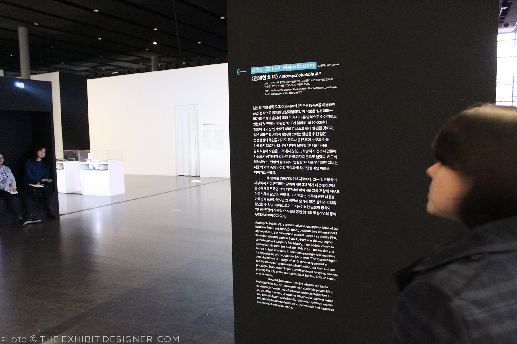
Upstairs was Imaginary Asia, a special exhibition of 23 pieces in the motion images genre. Many of the videos were projected onto large walls, with small bench nooks that could sit 2–3 people for viewing.

theexhibitdesigner_NamJunePaikCenter-exhibits6.jpg
theexhibitdesigner_NamJunePaikCenter-exhibits7

Like at Mr. Toilet House — and actually at many, many places I visited in South Korea — navigational cues and directions were applied directly to floors. In the Point-Line-Plane-TV exhibition as well they applied interpretive text to the floor. Interpretive text was in both Korean and English.

theexhibitdesigner_NamJunePaikCenter-exhibits5

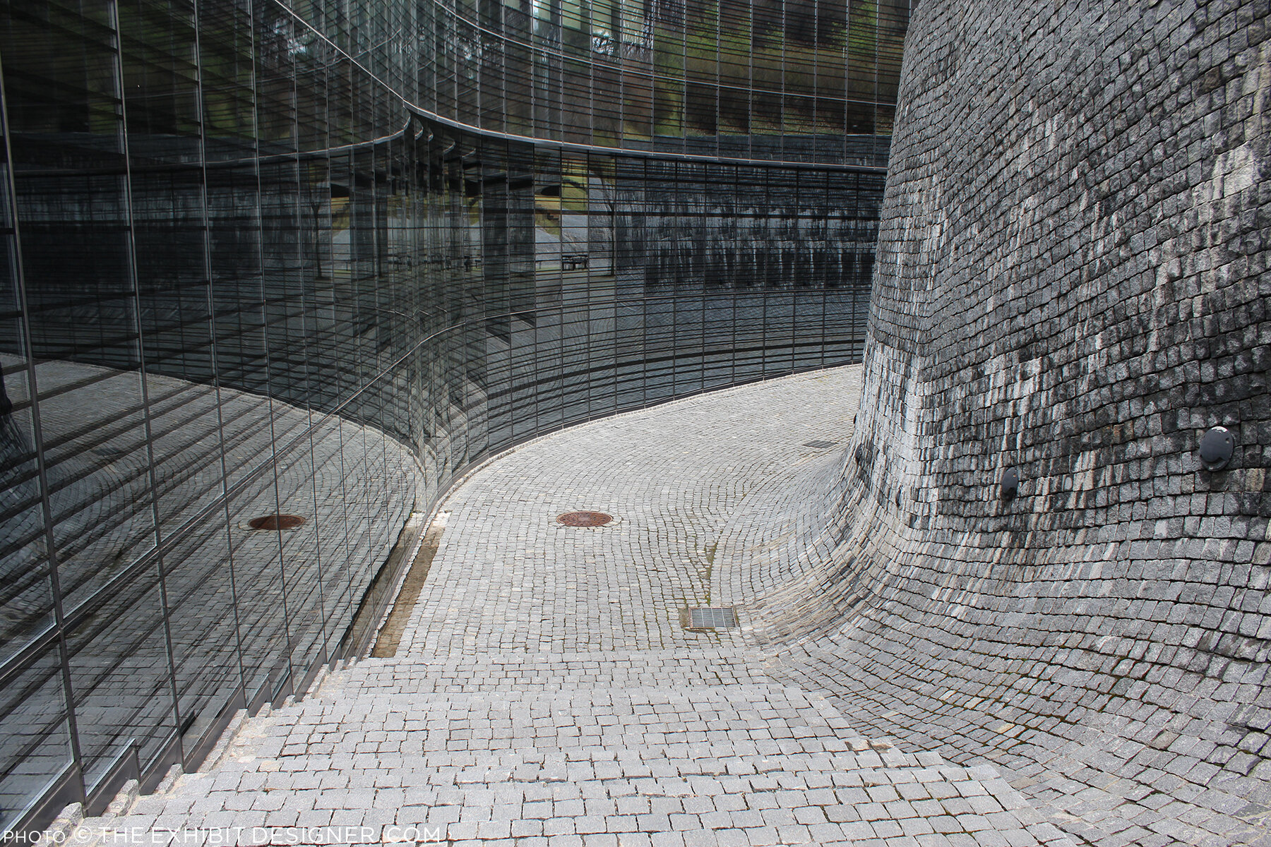
Outside, the curved glass exterior of the the art center is modeled on the form of a grand piano, a common motif in Paik’s work, and on the letter P. But that is only apparent when you look at the museum map — the actual experience from outside is simply of an impressive modernist building.

theexhibitdesigner_NamJunePaikCenter-exterior

There is a small park just beside the museum — perfect for a rest after an afternoon’s museum visit — and nearby are the Gyeonggi Provincial Museum (which has limited English translations) and the Gyeonggi Children’s Museum.

Post updated in January 2021 with minor text edits. Broken links have been replaced with archived URLs, courtesy of archive.org. This post was originally published at theexhibitdesigner.com on 24 May 2017.

Pointe-à-Callière: Crossroads, Building Montréal, Snow

My final post about the Montréal museums I saw during my visit to the city in September 2015 — see also the Insectarium, the Biodôme, and Lazy Love at the Biodôme — here’s a look back at Pointe-à-Callière, Montreal’s Archeology and History Complex.

theexhibitdesigner_Pointe-a-Calliere_lobby-banner.jpg

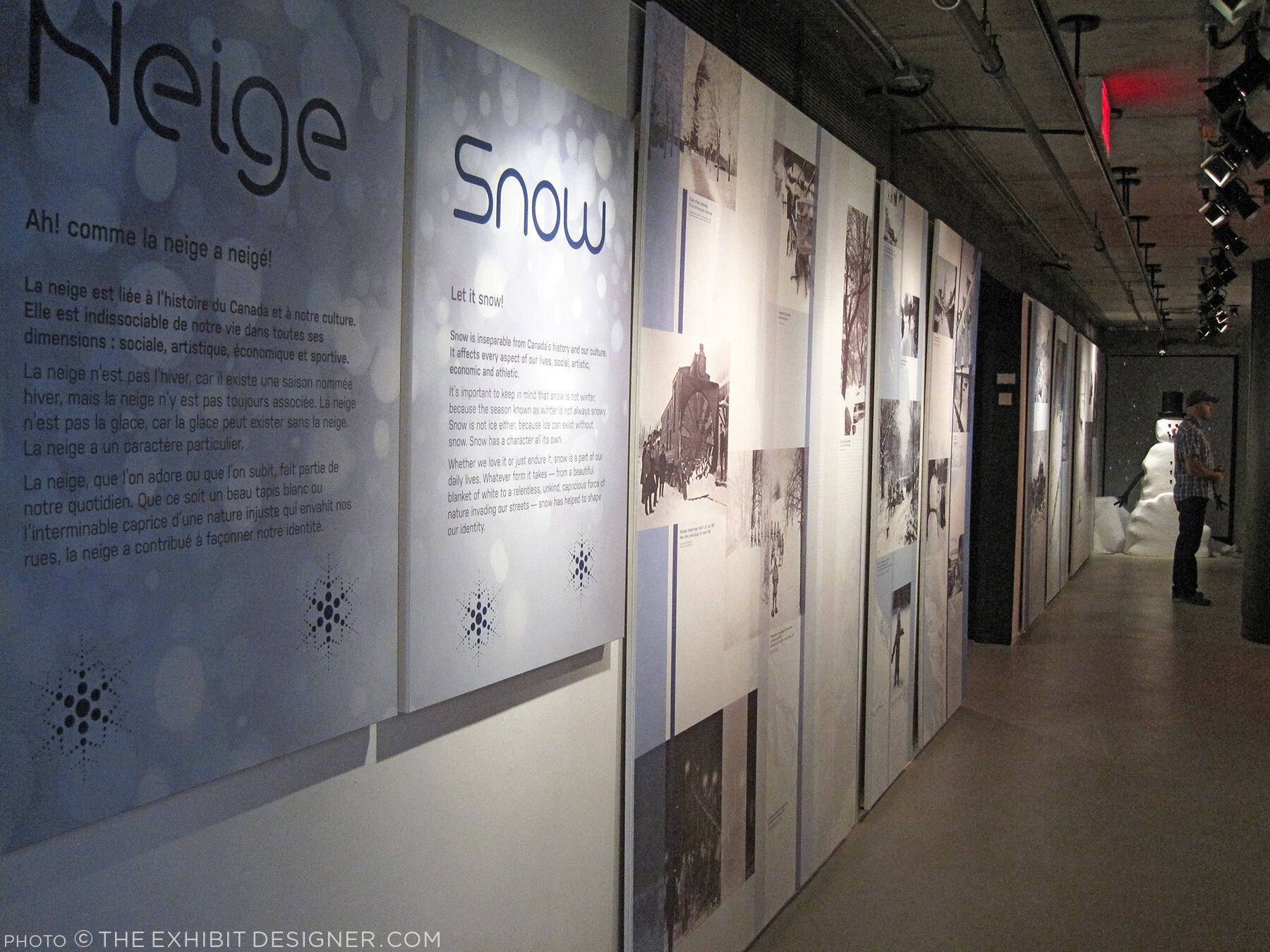
The Pointe-à-Callière complex is built on archeological sites that span the city’s history. Exploring the museum is very interesting, and a lot of fun — you take passageways, bridges, and stairs over and through the archeological remains. Like the museum building itself, which was built on pilings to protect the site, exhibition elements tread lightly among the artifacts, and visitors are asked repeatedly via signage not to touch the remains. Like most places in Montréal, museum graphics are in French with English translations. I like the way the two languages are interwoven on the red lobby banner above.

theexhibitdesigner_Pointe-a-Calliere_passageways

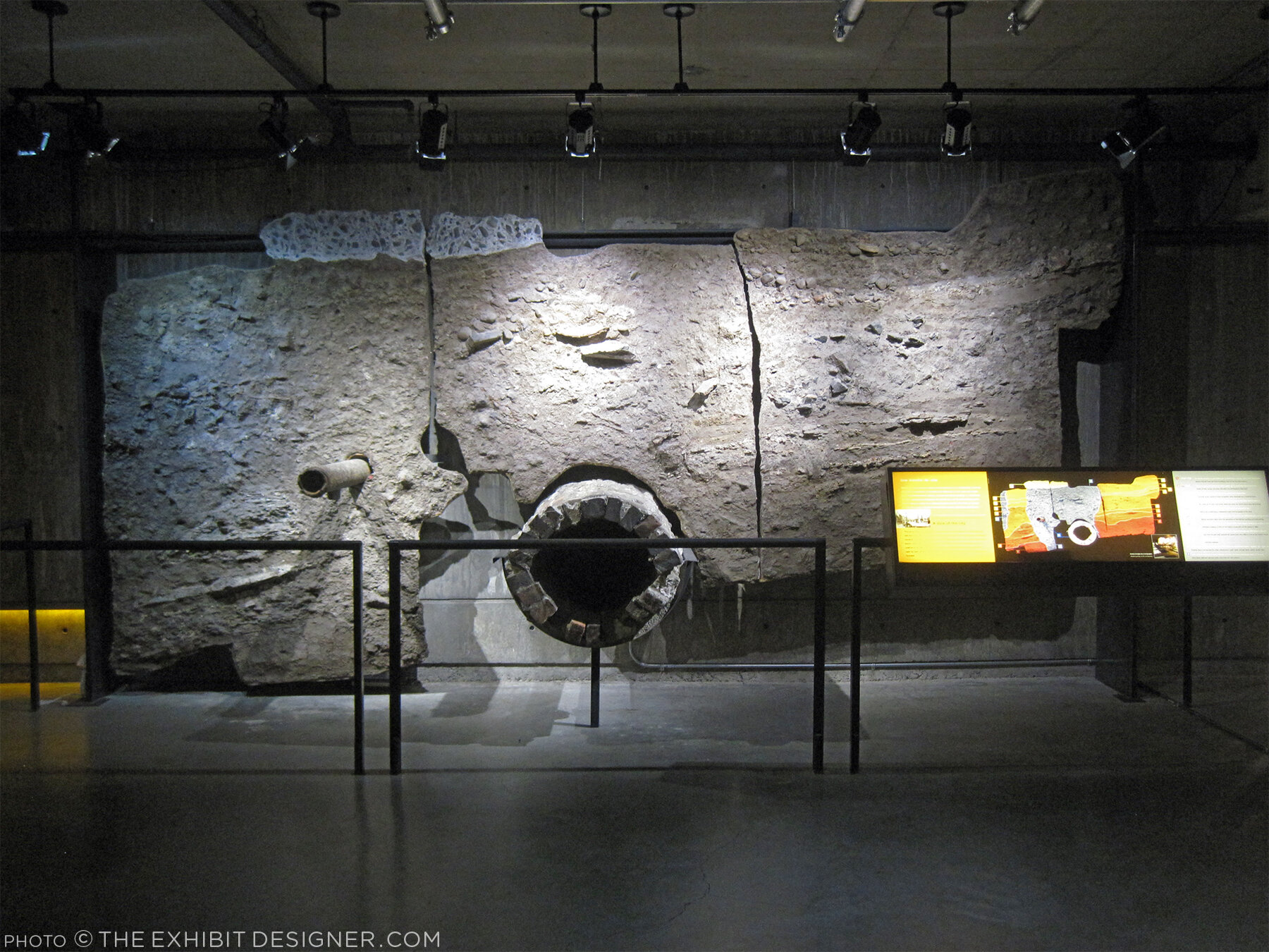
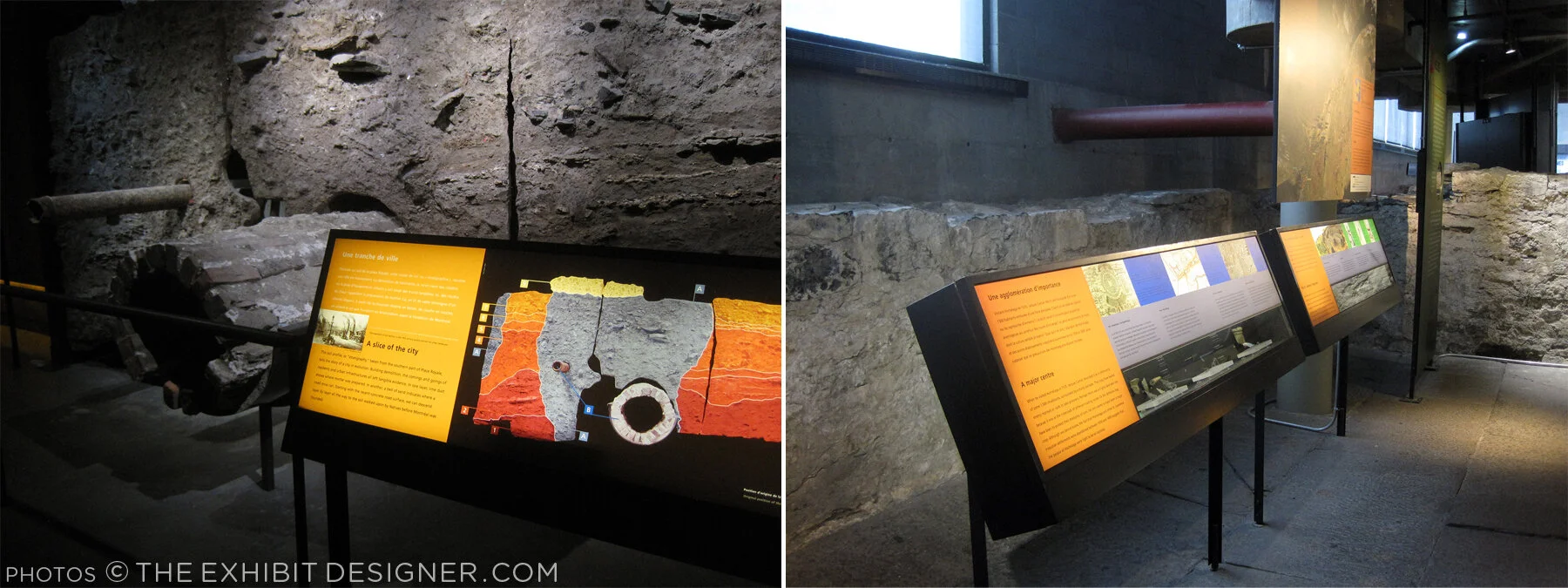
The permanent exhibition in the basement, Crossroads Montréal, takes you through 1,000 years of the city’s remains, including the first Catholic cemetery (dating from 1643), and the foundation of the Royal Insurance Building (dating from 1861). Excavations continue and more exhibitions are planned to interpret what is unearthed. On the one hand: very cool premise, and very cool space to explore. On the other, I had trouble getting and keeping my bearings. Perhaps because the graphics didn’t hold my attention? The ruins themselves were more intriguing.

theexhibitdesigner_Pointe-a-Calliere_graphics2

I would have liked more information directed at the museum “streakers” like myself: the people who move quickly through exhibitions, and only read titles and very selective [random] bits and pieces of labels. (On my best days, I can be a “stroller.”) Perhaps a printed guide map would have helped me to understand where I was within the museum and what I was looking at. Perhaps I should have taken a guided tour.

theexhibitdesigner_Pointe-a-Calliere_built-in-graphics

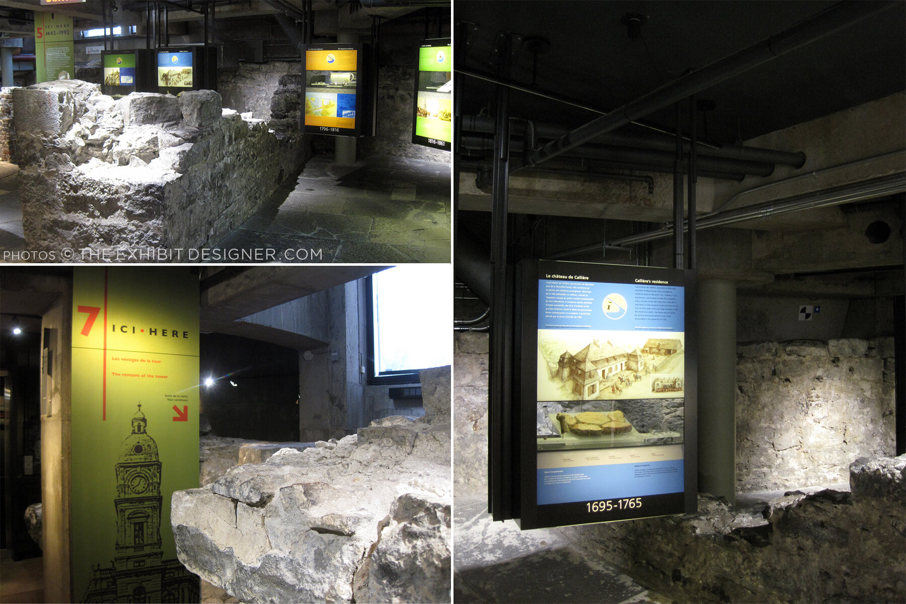
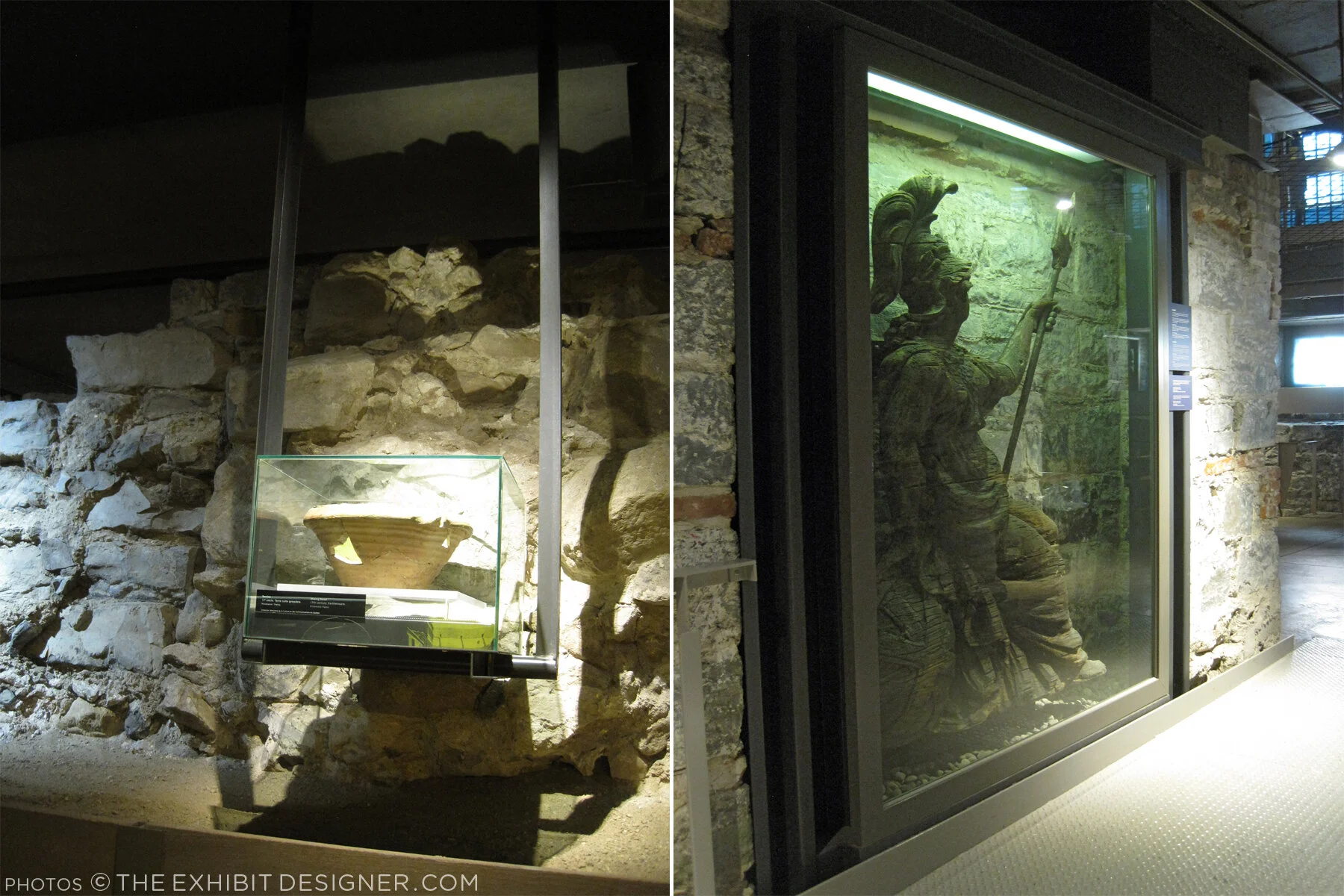
I did like the graphics’ integration into the museum’s building structure, particularly the ceilings, and the minimalist construction-site aesthetic of their structures. Artifact cases, too, were carefully integrated into the site.

theexhibitdesigner_Pointe-a-Calliere_built-in-cases
theexhibitdesigner_Pointe-a-Calliere_pipes
theexhibitdesigner_Pointe-a-Calliere_reader-rails

Most graphics were rear-illuminated, which worked perfectly with the museum’s underground atmosphere.

theexhibitdesigner_Pointe-a-Calliere_graphics3
theexhibitdesigner_Pointe-a-Calliere_graphics

Also below-ground is the Building Montréal exhibition, where you’ll find the museum’s archeological crypt. The photos below are of the vaulted stone tunnel built on the bed of the Saint-Pierre River. See what I mean about the museum being fun to explore?

theexhibitdesigner_Pointe-a-Calliere_passageway
theexhibitdesigner_Pointe-a-Calliere_archeological-crypt

Set into the floor of Building Montréal are more than a dozen dioramas that show the city at different points in time. I love this use of space, and the vantage point it gives visitors. (I wrote this post about exhibition flooring, seven years ago, and Bridget mentioned the Pointe-à-Callière in the comments. I finally saw it for myself!)

theexhibitdesigner_Pointe-a-Calliere_floor-dioramas
theexhibitdesigner_Pointe-a-Calliere_floor-models
theexhibitdesigner_Pointe-a-Calliere_building-montreal

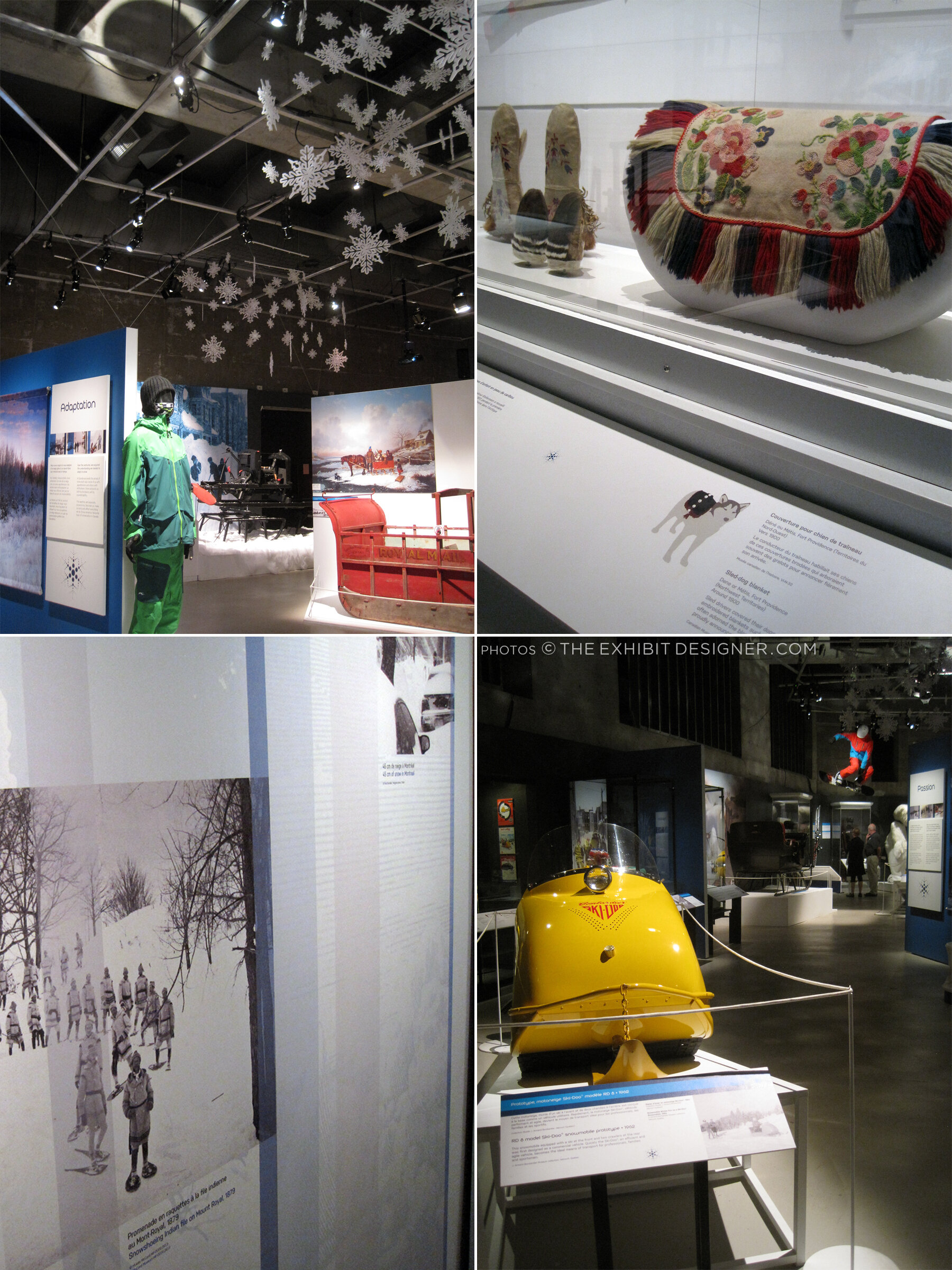
At the time, the museum also had a temporary exhibit on view called Snow, a fun look at winter culture in Canada. Notice the snowflakes cut from the apron fronts of reader rails!

theexhibitdesigner_Pointe-a-Calliere_snow1
theexhibitdesigner_Pointe-a-Calliere_snow2
theexhibitdesigner_Pointe-a-Calliere_snow3

Post updated in January 2021 with minor text edits. This post was originally published at theexhibitdesigner.com on 25 March 2017.

Space for Life, part 2: Insectarium

Update: The Insectarium is being redesigned, and is scheduled to reopen in 2021.

The Insectarium was our second stop in Montréal’s natural museum complex, Espace Pour La Vie (“Space for Life”). It’s a fascinating and excellently-designed museum. Its exterior looks like a home for insects, almost like a bee hive:

theexhibitdesigner_insectarium-exterior

The permanent exhibition is called We Are the Insects and it is predominately ... very green. Graphics are a mix of strikingly clean layouts and comic book-inspired illustrations.

theexhibitdesigner_insectarium-we-are

Here’s the view down to the bulk of the exhibition:

theexhibitdesigner_insectarium-overview

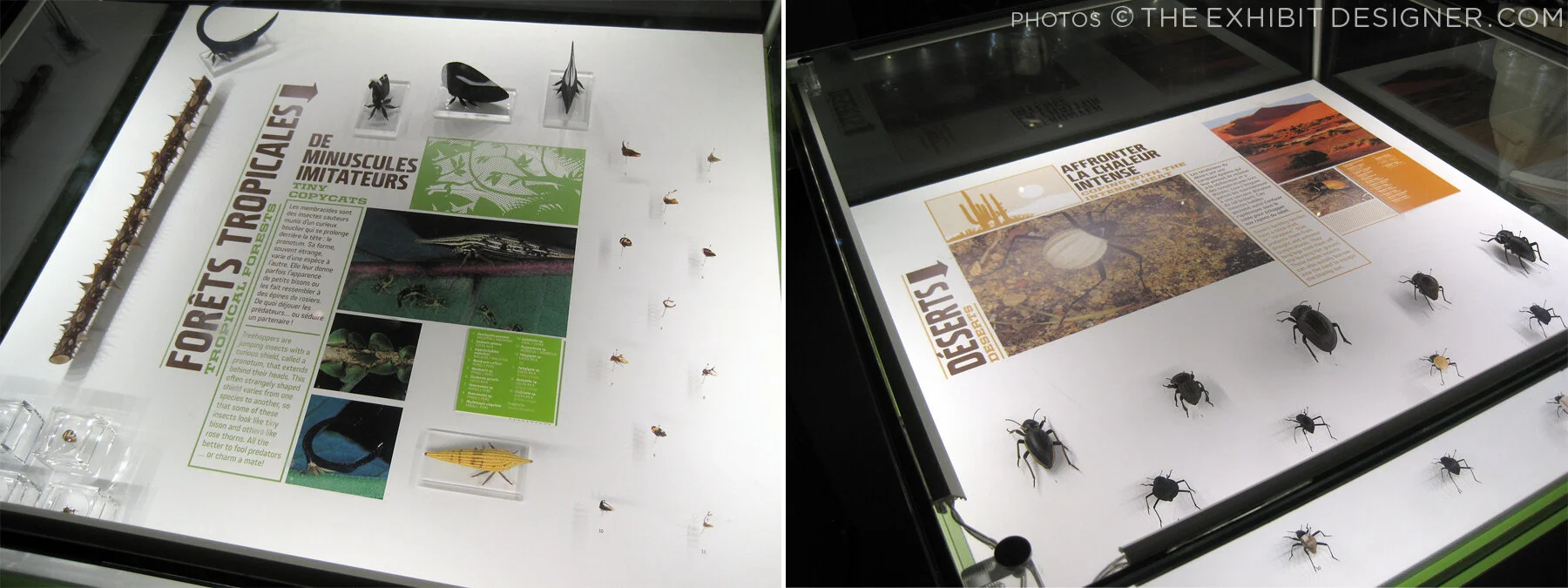
Each of the glowing cubes is a display case. Specimens are pinned to a rear-lit graphic, around text and images arranged in a clean, gridular design. Each layout looked nicer than the last, so I'm going to share photos of many.

theexhibitdesigner_insectarium-case-graphics1

Some layouts have a sense of irreverence, like this one, with its marching ants:

theexhibitdesigner_insectarium-case-graphics-fun

The different accent colors and stylized illustrations indicated the habitats (e.g. tropical forests) for the specimens.

theexhibitdesigner_insectarium-case-graphics2
theexhibitdesigner_insectarium-terrarium

Throughout the exhibition there were terrariums with some live critters, and beneath some display cubes there were dioramas (faux terrariums, if you will).

theexhibitdesigner_insectarium-faux-terrarium
theexhibitdesigner_insectarium-butterflies

There were wall displays, and plenty of interesting charts and diagrams. There were sections about insect lifestyles, diets, reproduction, and what people can do to protect endangered insects. The sheer number of displays could have made for a repetitive slog, but it did not feel that way at all — specimens were fascinating, text was succinct, and the layouts were visually varied while staying true to the design system.

theexhibitdesigner_insectarium-timeline-charts
theexhibitdesigner_insectarium-reproduction-pros
theexhibitdesigner_insectarium-different-tastes
theexhibitdesigner_insectarium-protect

Outside were additional exhibitions and a temporary interactive art installation. And then we were off to explore the Botanical Garden.

theexhibitdesigner_insectarium-outside-exhibits

Post updated in January 2021 with minor text edits. Broken links have been replaced with archived URLs, courtesy of archive.org. This post was originally published at theexhibitdesigner.com on 15 March 2017.

Space for Life, part 1: Biodôme

Back in September 2015, I spent a handful of days in Montréal. I visited a few museums, but at the time, I only gave one temporary exhibition at the Biodôme brief mention on this blog. This happens all the time — I take photos everywhere I go, and then I just sit on them.… So let’s dust off those photos (or pretend it’s September 2015), and visit the Biodôme.

theexhibitdesigner_biodome-entrance

The Biodôme is part of a museum complex called Espace Pour La Vie (“Space for Life”) that also includes the Insectarium, Jardin botanique (botanical gardens), and Planétarium. You can buy combination admission tickets and pick which you would like to visit. The largest exhibition, and primary draw, within the Biodôme is Ecosystems of the Americas. (But don’t miss the Insectarium!) The Ecosystems exhibition is broken into four ecosystems conveyed by immersive landscaping, climate, and live vegetation and wildlife. For example — the air inside the Tropical Rainforest ecosystem is warm and muggy, while inside the Sub-Antarctic Islands ecosystem it is decidedly chilly.

theexhibitdesigner_biodome-tropical-rainforest.jpg

Inside the Tropical Rainforest you walk through mature and secondary forests, and pass a waterfall, lake, river, cliffs, and caves. Graphics throughout are minimal, restricted to brief labels and occasional monitors. Like most places in Montréal, text is in French, with English translations.

theexhibitdesigner_biodome-tropical-rainforest-graphics

Charming illustrations and species’ statuses are available in the free Identification Guide.

theexhibitdesigner_biodome-guide

Inside the cave you’ll find terrarium-dwellers and nocturnal-types; these graphics were all rear-illuminated, and included a bit more information than graphics in the Rainforest:

theexhibitdesigner_biodome-tropical-rainforest-night-exhibit

Moving along, you reach the Laurentian Maple Forest. At the entrance to each ecosystem you are greeted by a large wall mural: a collage of color-saturated photos, clean-lined vector illustrations, and a where-in-the-world diagram.

theexhibitdesigner_biodome-maple-forest
theexhibitdesigner_biodome-maple-forest-graphic

Maintaining the minimal aesthetic throughout, there are still elements of whimsy, such as photos of playful otters applied to the glass wall of their enclosure. Wayfinding elements also show up on the floor, and on support columns.

theexhibitdesigner_biodome-polar

Downstairs, there are a couple of small exhibitions: the Naturalia Room, which is directed toward children, and a temporary exhibition, which at the time was The Fossil Affair.

Overall, the Biodôme was a fun museum to visit, and the immersive ecosystems were well-done.

theexhibitdesigner_biodome_fossil-affair

Post updated in January 2021 with minor text edits. Broken links have been replaced with archived URLs, courtesy of archive.org. This post was originally published at theexhibitdesigner.com on 14 March 2017.

Lazy Love at the Biodôme

I was in Montréal for just shy a week and spent a few hours at the Biodôme — it was so much fun! I have plenty to share of the rest of the museum, but to dip my toes back into blogging after (ahem) plenty of time away, here are some photos of the temporary exhibit/art installation, Calme Aimant (Lazy Love).

Within the low, glass-walled enclosure, sloths slept inside their cocoon-like nests, hanging from artistic interpretations of trees — the trees were wrapped in braids and painted in monochrome — while a couple tortoises tottered around. Sheer white fabric panels hung from the ceiling, rippling slightly as people passed beneath them.

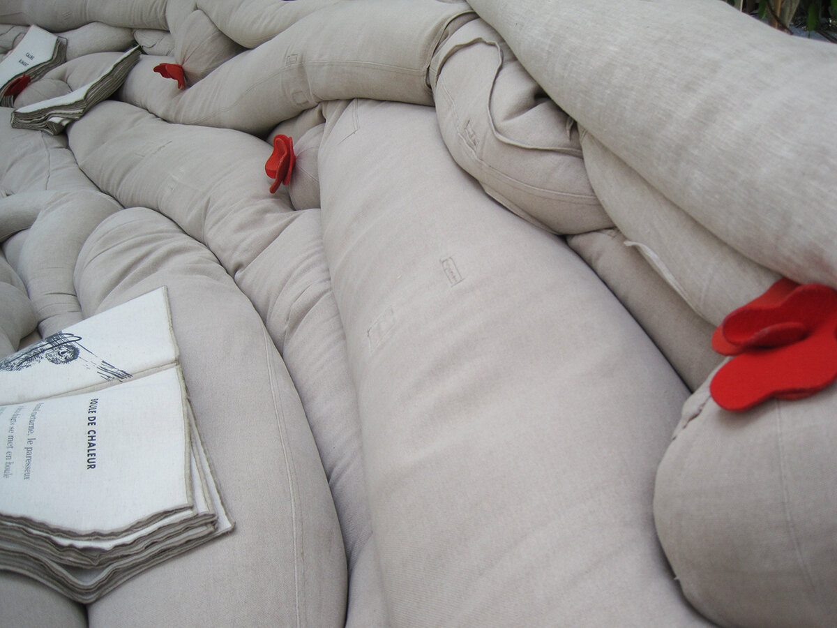
The exhibit invited guests to have a seat and enjoy a few moments of quiet contemplation. A quiet soundscape played from speakers hidden within the sofas — the speakers are the balls with red felt flowers — and fabric books told the sloths’ story.

Lazy Love was our last stop at the Biodôme, and it was a lovely, relaxing, quiet moment to end on. I am sorry to report that the exhibit closed last week, so a bientôt, sloths.

Post updated in January 2021 with minor text edits. Broken links have been replaced with archived URLs, courtesy of archive.org. This post was originally published at theexhibitdesigner.com on 18 September 2015.

Pacific Exchange, open at the National Postal Museum

Work shown was completed while I was a designer at Gallagher & Associates.

It’s open! Okay, old news. It opened well over a month ago, on March 6. I had also planned to post about the opening reception, but that was March 20, so — old news there as well. In any case, the reception was lovely, with Chinese food served and tinkling glassware and everyone dressed quite nicely.

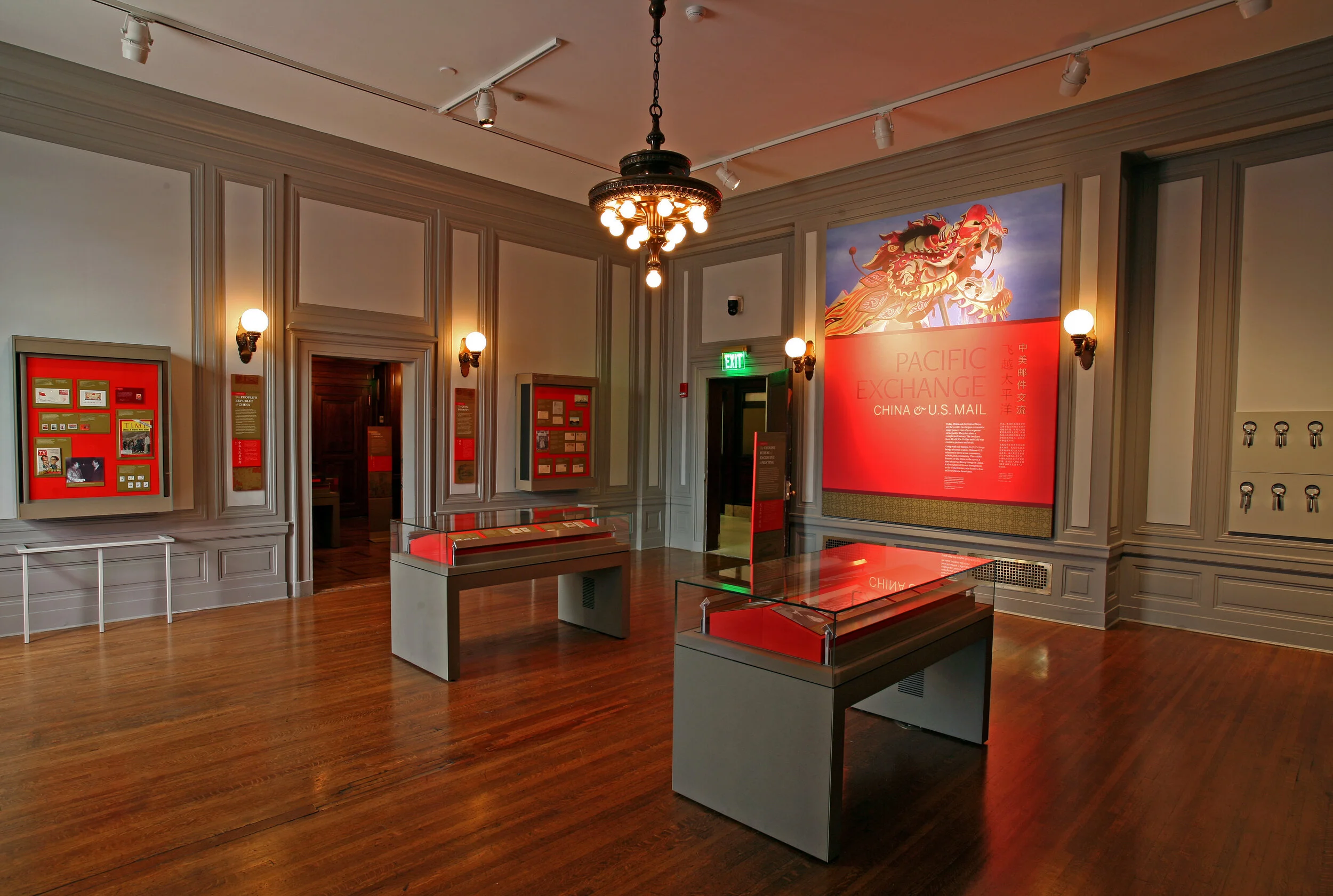
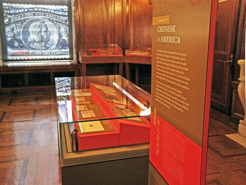
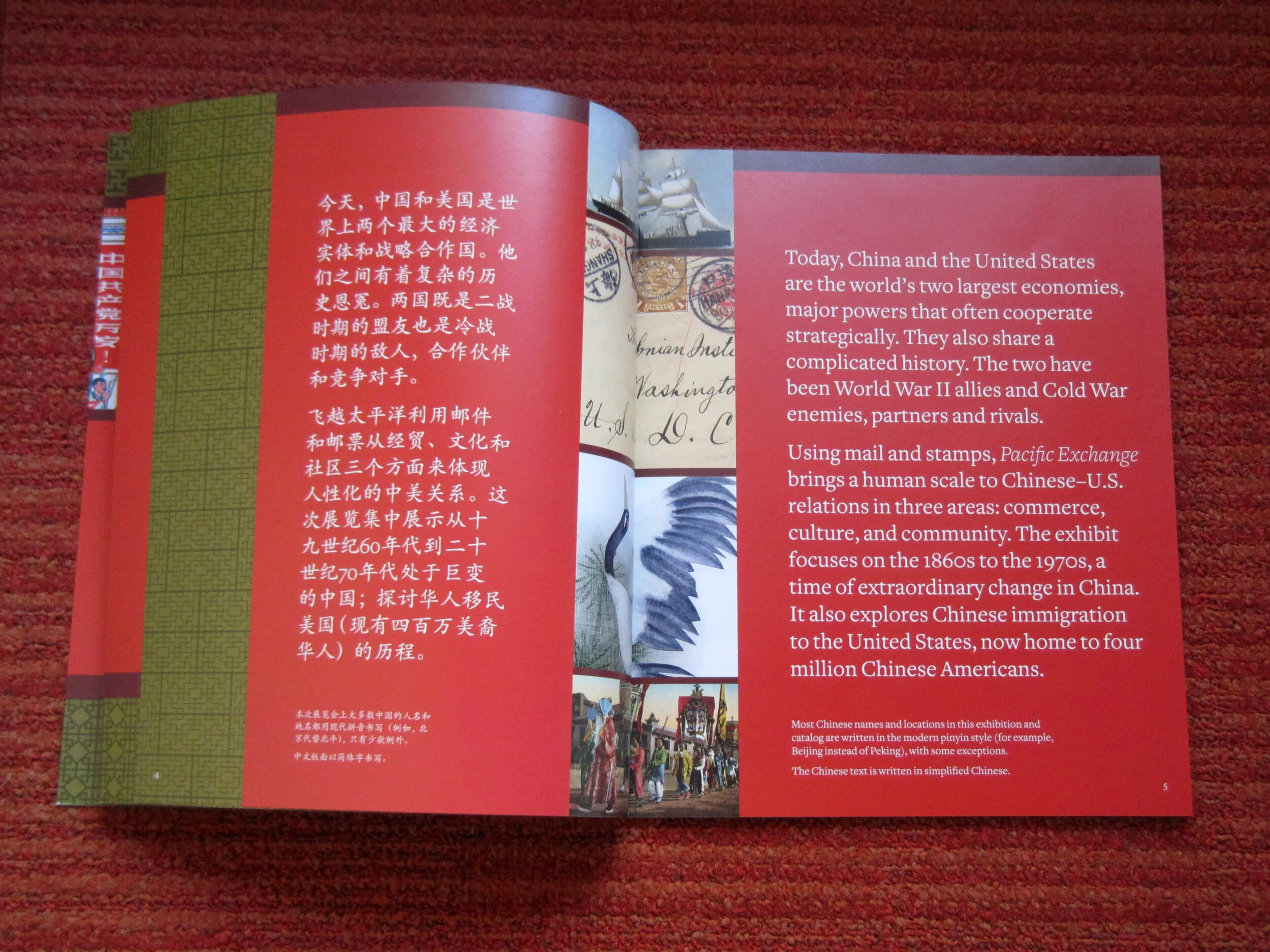
Pacific Exchange: China & U.S. Mail is the second exhibit to be on view in the Postmasters Suite gallery at the Smithsonian National Postal Museum. From the exhibit website: Using mail and stamps, Pacific Exchange brings a human scale to Chinese–U.S. relations in three areas: commerce, culture, and community. The exhibit focuses on the 1860s to the 1970s, a time of extraordinary change in China. It also explores Chinese immigration to the United States, now home to four million Chinese Americans. (Thank you to James O'Donnell of the Smithsonian for the above photo.)

Upfront: I am a bit of a stamp nerd. I have a small collection of Olympics stamps, mostly international, from the 1960s and 1970s. (You have to focus when collecting stamps!) So I really enjoyed working on an exhibit about philately.

This was my swan song at Gallagher & Associates. I handled the design myself, from designing the exhibit’s visual concept to laying out production files for all of the graphics. I also designed the exhibit plan and artifact case layouts. Even though this is a small exhibit space, it had more than 100 artifacts, so making [nearly] everything fit comfortably was a bit of a challenge!

The design drawing above is an example of how a case layout looked during design development, and below are those same cases, made real:

PacificExchange_commerce-cases2.jpg

Graphics were digital output mounted on sign blank, trimmed to edges, with a matte overlaminate. The wall-mounted and freestanding graphics were backed with 1/2" MDF painted Benjamin Moore “Bonfire” to match the primary exhibit red (Pantone 1795). The freestanding graphics had duplicate panels on either side of the mdf — a panel sandwich which was held in place by adjustable metal sign bases. The Smithsonian Office of Exhibits Central printed and built the graphic components. Blair Fabrication built the case furniture.

PacificExchange_culture-case2.jpg

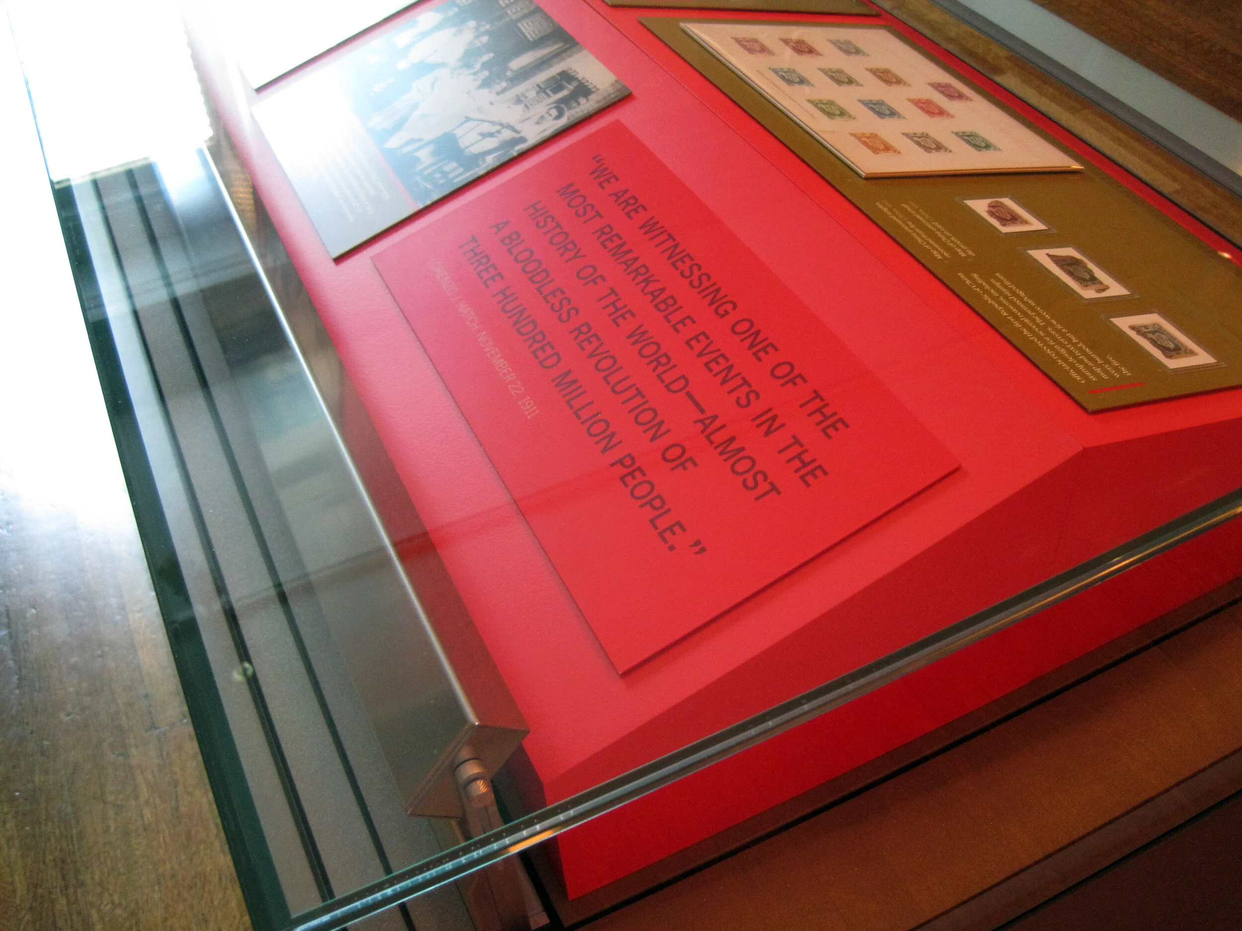
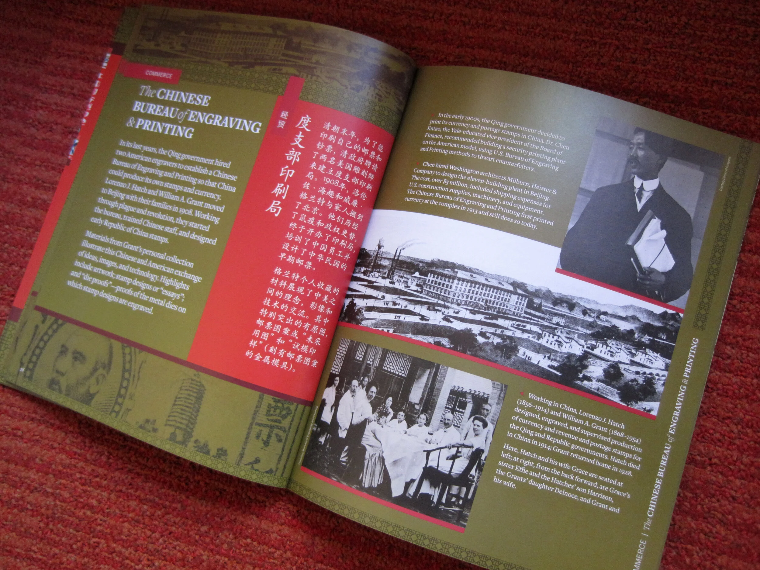
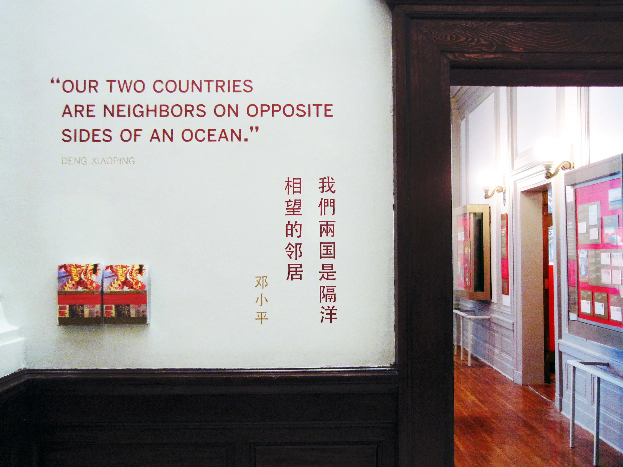
Most of the exhibit text is in English and Chinese, a design challenge I enjoyed. In the artifact case below, some of the artifacts were loans that had to be displayed flat. The other half of the plinth has a 15° rise to create a comfortable reading angle.

I arrived at the color palette after some research into significant colors in Chinese culture. I used red and gold as the dominant exhibit colors, with a deeper maroon red for accent. I used a third red, one with pink undertones — red, is the color of prosperity and good fortune, among other meanings — for the Commerce section of the exhibit; yellow, the color of heroism, for the Community section; and blue-green (or qing), to give a feeling of Chinese history and tradition, for the Culture section. I also drew distinctive vector patterns for each section.

The element that most people extol is the group of banners in the entrance. There are three individual banners and they’re more than 20 feet tall! EPI Colorspace printed and installed them. (Install photos here.) They were printed on “Brilliant Banner” 12 mil. polyester banner fabric. The fabric has a very subtle canvas texture that wasn’t what I originally intended — I wanted a silken look for the banners — but the color saturation and printing quality was so good that I went with EPI’s recommendation.

PacificExchange_entrance-timeline.jpg

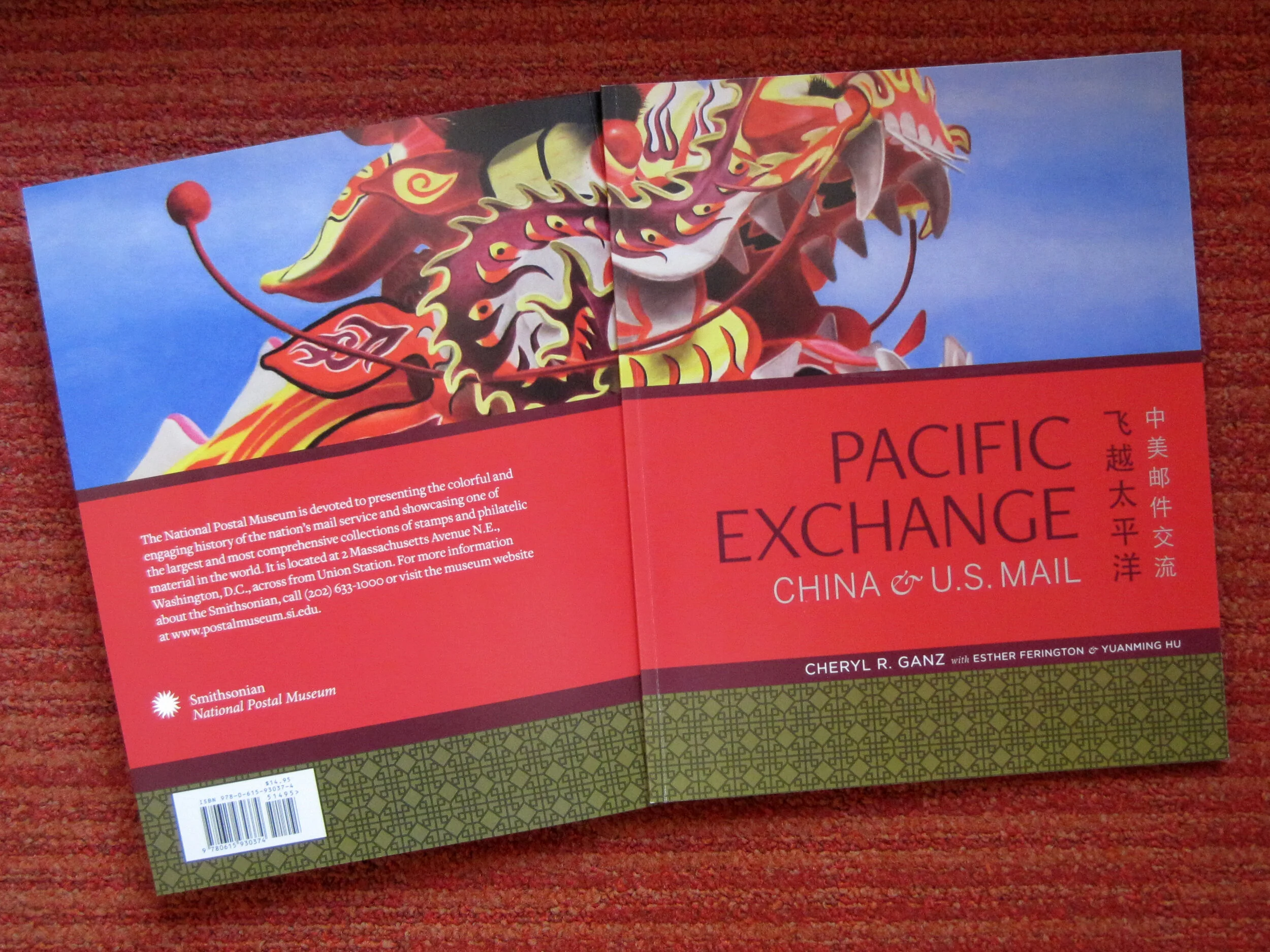
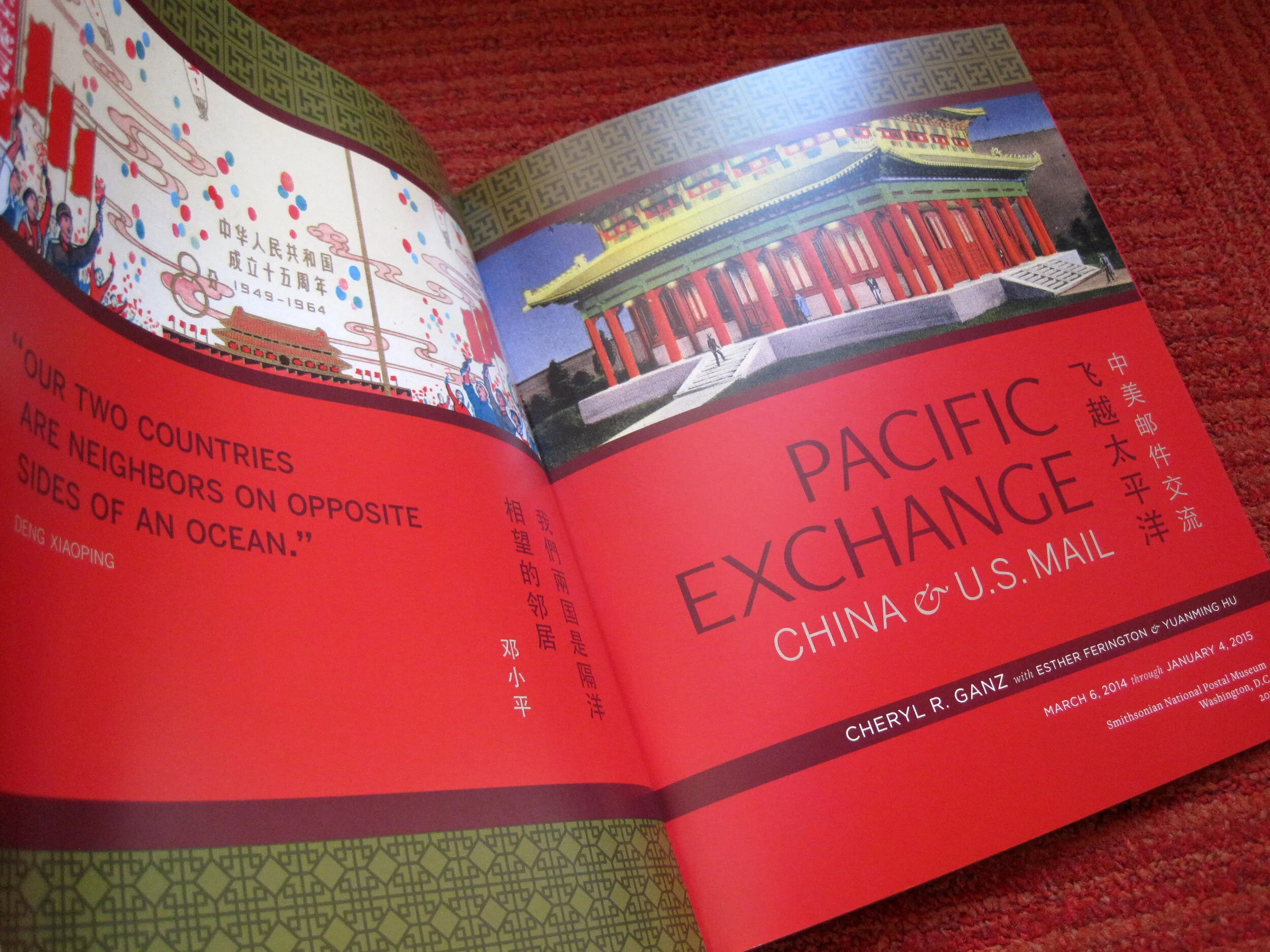
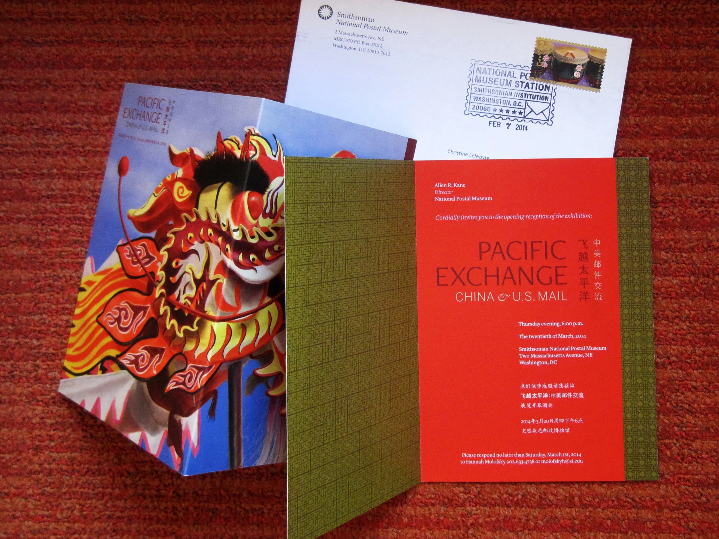
I also designed a few of the related print graphics: the exhibit catalogue, a postcard, and the invitation to the opening reception.

The exhibit has been well-received overall and I’m thrilled with how everything turned out. If you’re in DC between now and January 4, 2015, please check it out!

Post updated in January 2021 with minor text edits and additional photos. Broken links have been fixed. This post was originally published at theexhibitdesigner.com on 26 April 2014.

The News 01.19.10

A compilation of design-related web finds.

L.A.’s Natural History Museum to receive $1-million grant for new permanent exhibition | Rising Currents: Projects for New York’s Waterfront — I’ve been following with interest the progress of the program and upcoming exhibit on the MoMA/P.S.1 blog | Towards a New Mainstream? On 27 January 2–3pm EST, a lecture by Gregory Rodriguez exploring demographic change in the Americas, cultural transformation, and the future of museums | Color Identifying System for the Color Blind | An Increasing Craving for Experiences; there has been a lot written lately about experience-over-stuff — hello, museums! | Light Touch interactive projector turns any flat surface into a touchscreen | An Architect’s Philosophy of Photography | Steffen Dam: Specimen Panels These are beautiful; very “natural history museum” | Barton’s Bonbonniere, From Architectural Forum c. 1952 — I love it! What a fun space.

AND NOW, something from the portfolio:

Work shown was completed while I was a designer at Christopher Chadbourne & Associates.

Perfectos.jpg

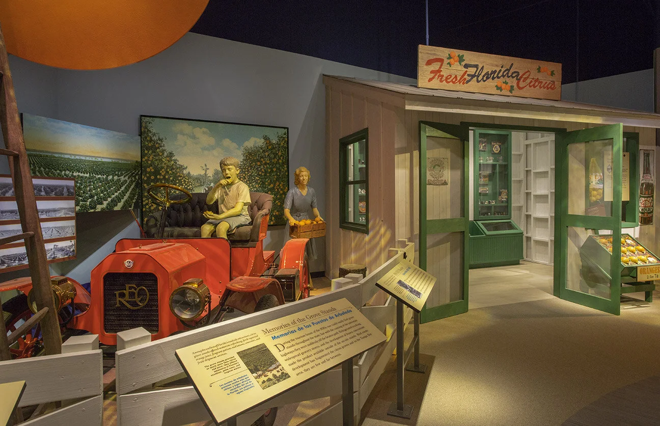
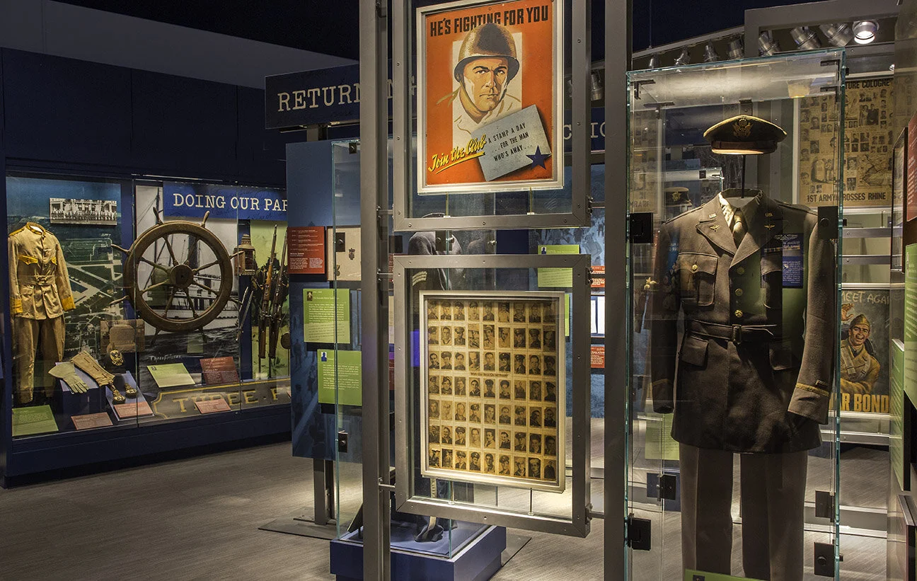
This time last year (January 17, 2009), the Tampa Bay History Center — designed by Christopher Chadbourne & Associates — held its grand opening in downtown Tampa, Florida. I worked closely with the project’s senior graphic designer Jeff Stammen on design development.

(Photo above and first three photos below, courtesy Tampa Bay History Center.)

Cattle.jpg
Container.jpg
07 Tampa Bay History Center 214_sm.jpg

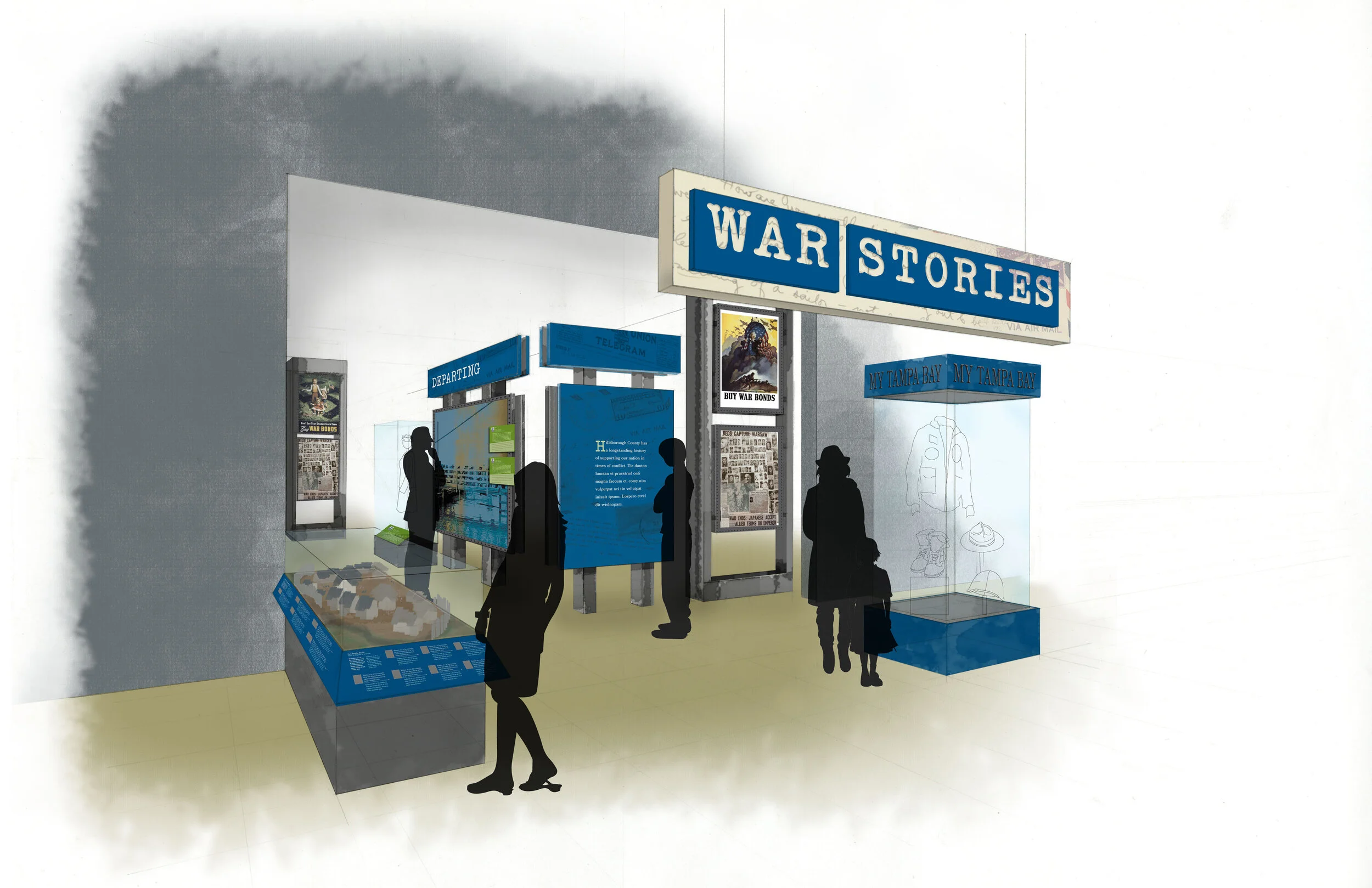
I took a leading design role for the timeline (Your Tampa Bay) and the War Stories gallery. Below is my sketch of the War Stories gallery, and below that, a photo I took during installation — hence the empty case.

theexhibitdesigner_TBHC-war-stories-install.jpg

All the graphics in this museum were designed with both English and Spanish text. I love the challenge of designing multilingual graphics.

I was also responsible for Construction Administration, and supervised the exhibit installation. I love shop visits, site visits, inspecting fabrication samples … all of that. What happened with the Tampa installation was a little … let’s just say, complicated. The local fabricator, Creative Arts, was fantastic and saved the installation day in a lot of ways. I ended up effectively living in a hotel room for a couple weeks during the tail end of installation — much longer than my trip to Tampa was supposed to be. It was quite the learning experience. In hindsight, I can say I had fun.

(Photo above and photo below, courtesy Tampa Bay History Center.)

Your_Tampa_Bay.jpg
tampa_092.JPG
tampa_290edit.jpg

Post updated in January 2021. Broken links have been fixed or replaced with archived URLs, courtesy of archive.org. This post was originally published at theexhibitdesigner.com on 19 January 2010.