architecture

Fair Play, the fourth Freedom Forum pop-up exhibit

My last post was about experiencing museum exhibits in-person when the museums themselves are closed due to Covid-19 precautions. Habitat is located outside (I shared some photos of it in the snow, but it’s really lovely to see when the weather is nice) and here’s another example, located inside, of an outside-the-museum museum exhibit.

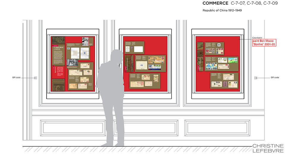
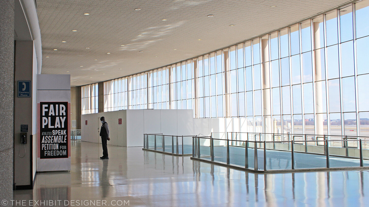
Fair Play: Athletes Speak, Assemble, Petition for Freedom just opened at Dulles International Airport and Ronald Reagan National Airport. It’s the result of a partnership between Freedom Forum (the Newseum) and the Metropolitan Washington Airports Authority; the fourth in a series designed by Christine Lefebvre Design.

CLD_FreedomForum_FairPlay7.jpg

If you’re in the DC area, it’s easy and free to see the exhibit at Reagan Airport!

And here’s how. If you’re driving, park in the Terminal A lot. I prefer to park on Level 5, close to the elevator access. Take your elevator all the way down, to Level G. From there you’ll follow the signs to Terminal A, on moving walkway after moving walkway … until you arrive at and take the escalator up to Level 1. There, you’ll turn LEFT (the signs will say Terminal A is to your right and Terminals B and C are to your left, but trust me: turn left) and you’ll almost immediately find yourself in Terminal A’s historic lobby. There it is, up above.

You don’t have to go through security, and if your visit is less than an hour, parking is free. (You can also get there by Metro.)

CLD_FreedomForum_FairPlay1.jpg
CLD_FreedomForum_FairPlay2.jpg
CLD_FreedomForum_FairPlay3.jpg

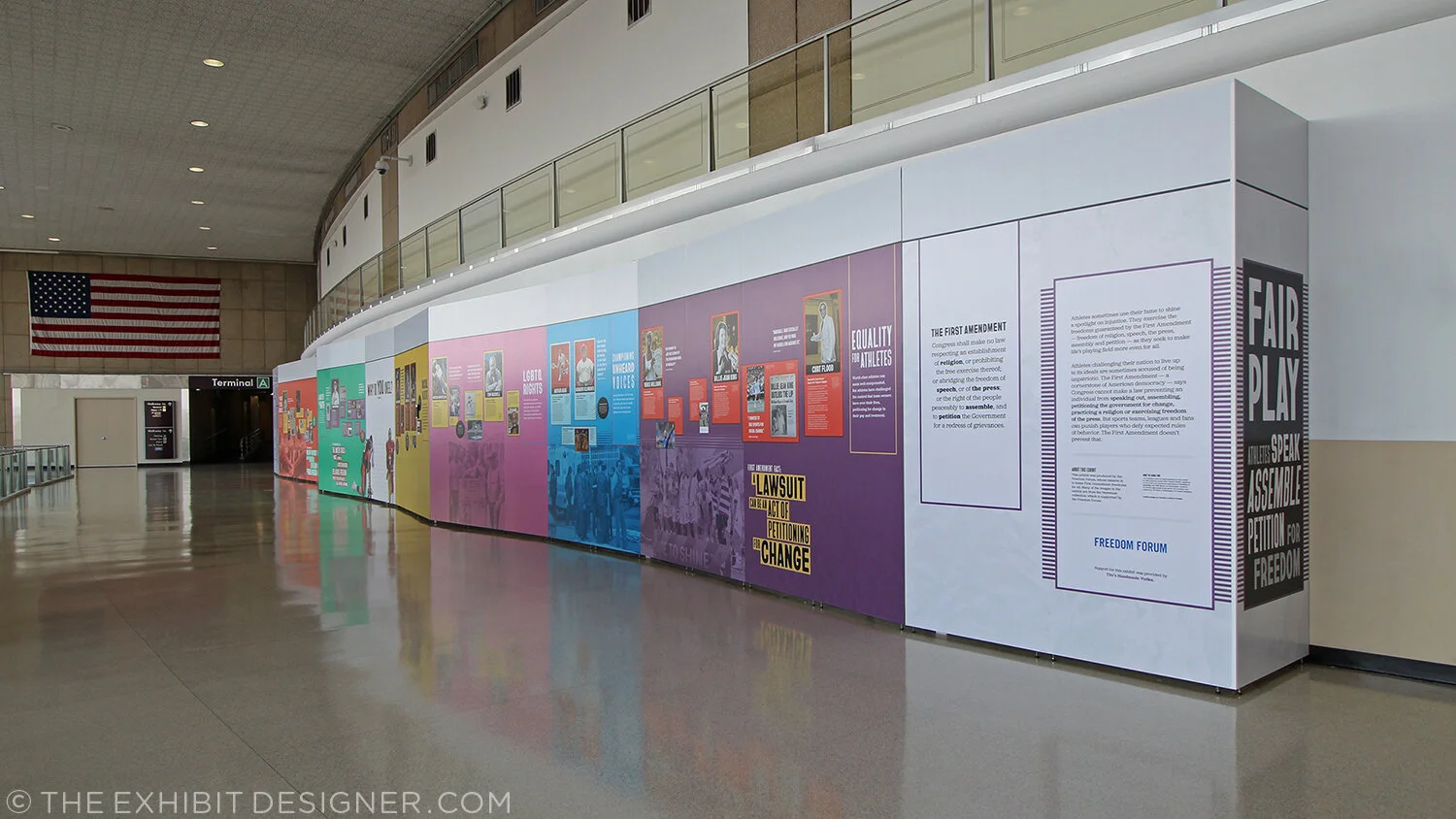
Perhaps my favorite aspect of the graphic design for this exhibit was font selection. Fonts were expressly chosen from the work of underrepresented type designers — we looked at typefaces by people of color, women, and LGBTQ people — before we ultimately settled on three typefaces by Black designers that also fit the sporty aesthetic of the exhibit. The typeface used for large headlines is called Bayard, named after Bayard Rustin, organizer of one of the most powerful expressions of freedom of assembly: the 1963 March on Washington. (Making it also fit strongly with the subject matter of the exhibit.) Inspired by protest signs used in the march, the typeface was created by Tré Seals, a Washington, DC-area designer. The other typefaces used in the exhibit are Jubilat and Halyard, by Black typographer Joshua Darden.

CLD_FreedomForum_FairPlay6.jpg

I hope you get a chance to see it!

Mr. Toilet House and Nam June Paik

In April I spent two weeks in South Korea and a week in Japan. While there, I did what I always do while touristing — visited many museums. Some of them were forgettable, but many are worthy of a post, including these two that are thematically very different but, geographically, neighbors; they are both located in Suwon, about 20 miles south of Seoul. First up is the Toilet Museum (Haewoojae) also known as “Mr. Toilet House.”

theexhibitdesigner_MrToiletHouse-exterior1.jpg
theexhibitdesigner_MrToiletHouse-exhibits1

The story behind Mr. Toilet House: Suwon’s late mayor Sim Jae-Duck was given the nickname “Mr. Toilet” for his passionate leadership of the “Toilet Culture Movement” to improve public toilets. In 1996 he started the Beautiful Toilet Culture Campaign, and the city declared its intent to build the most beautiful public toilets in the world (motivated also in part by the then-upcoming 2002 FIFA World Cup which they were to host). Mr. Toilet took things a bit further than merely creating government departments and task forces, however, when he rebuilt his own house in the shape of a toilet and named it Haewoojae, which means “a room where you can relieve your worries.” It features a central toilet room as the “core of living,” with transparent glass walls that turn opaque with the flip of a light switch. The house was completed in 2007, and upon Sim’s death in 2009, it was willed to the city of Suwon. The city then converted it into a museum and culture park.

theexhibitdesigner_MrToiletHouse-exhibits2

The museum is small and has clear, simple graphics (nearly all with English translations) that earnestly convey information about the history and global spread of modern sanitation, and other toilet-related subjects. There are also lighthearted illustrations of poops and flies (including on the floor, used as a navigational device) and hilarious double entendres in the writing.

Outside, there is a culture park. A meandering path leads you past examples of toilets, used throughout Eastern and Western history, that give an understanding of how toilets have physically changed over time.

theexhibitdesigner_MrToiletHouse-exterior2

Next door you can visit the Haewoojae Culture Center for a birds-eye view of the Toilet Museum.

theexhibitdesigner_MrToiletHouse-exterior3
theexhibitdesigner_NamJunePaikCenter-exterior2.jpg

Our next stop in Suwon: the Nam June Paik Art Center. The Nam June Paik Art Center opened in 2008 and holds 248 pieces of video installations and drawings, mostly of Nam June Paik’s but also of other contemporary artists. The art center hosts changing exhibitions of Paik’s work, special exhibitions of contemporary artists, performances, events, and educational programs. It also houses Paik’s archives and a library, undertakes research, and publishes scholarly journals and monographs.

theexhibitdesigner_NamJunePaikCenter-exhibits1

The art center changes exhibitions regularly; they use their Nam June Paik-focused exhibitions to focus on different aspects of his work. While I was there, the exhibition was called Point-Line-Plane-TV, which “explored Nam June Paik’s canvas including intermedia [sic] such as television, score, film, and video, in notion of flatness.”

theexhibitdesigner_NamJunePaikCenter-exhibits2.jpg
theexhibitdesigner_NamJunePaikCenter-exhibits4

On the mezzanine level is the Education Room, seen in the photos below; a quiet place to have a seat and read some tables about the artist’s life.

theexhibitdesigner_NamJunePaikCenter-exhibits3

Upstairs was Imaginary Asia, a special exhibition of 23 pieces in the motion images genre. Many of the videos were projected onto large walls, with small bench nooks that could sit 2–3 people for viewing.

theexhibitdesigner_NamJunePaikCenter-exhibits6.jpg
theexhibitdesigner_NamJunePaikCenter-exhibits7

Like at Mr. Toilet House — and actually at many, many places I visited in South Korea — navigational cues and directions were applied directly to floors. In the Point-Line-Plane-TV exhibition as well they applied interpretive text to the floor. Interpretive text was in both Korean and English.

theexhibitdesigner_NamJunePaikCenter-exhibits5

Outside, the curved glass exterior of the the art center is modeled on the form of a grand piano, a common motif in Paik’s work, and on the letter P. But that is only apparent when you look at the museum map — the actual experience from outside is simply of an impressive modernist building.

theexhibitdesigner_NamJunePaikCenter-exterior

There is a small park just beside the museum — perfect for a rest after an afternoon’s museum visit — and nearby are the Gyeonggi Provincial Museum (which has limited English translations) and the Gyeonggi Children’s Museum.

Post updated in January 2021 with minor text edits. Broken links have been replaced with archived URLs, courtesy of archive.org. This post was originally published at theexhibitdesigner.com on 24 May 2017.

Pointe-à-Callière: Crossroads, Building Montréal, Snow

My final post about the Montréal museums I saw during my visit to the city in September 2015 — see also the Insectarium, the Biodôme, and Lazy Love at the Biodôme — here’s a look back at Pointe-à-Callière, Montreal’s Archeology and History Complex.

theexhibitdesigner_Pointe-a-Calliere_lobby-banner.jpg

The Pointe-à-Callière complex is built on archeological sites that span the city’s history. Exploring the museum is very interesting, and a lot of fun — you take passageways, bridges, and stairs over and through the archeological remains. Like the museum building itself, which was built on pilings to protect the site, exhibition elements tread lightly among the artifacts, and visitors are asked repeatedly via signage not to touch the remains. Like most places in Montréal, museum graphics are in French with English translations. I like the way the two languages are interwoven on the red lobby banner above.

theexhibitdesigner_Pointe-a-Calliere_passageways

The permanent exhibition in the basement, Crossroads Montréal, takes you through 1,000 years of the city’s remains, including the first Catholic cemetery (dating from 1643), and the foundation of the Royal Insurance Building (dating from 1861). Excavations continue and more exhibitions are planned to interpret what is unearthed. On the one hand: very cool premise, and very cool space to explore. On the other, I had trouble getting and keeping my bearings. Perhaps because the graphics didn’t hold my attention? The ruins themselves were more intriguing.

theexhibitdesigner_Pointe-a-Calliere_graphics2

I would have liked more information directed at the museum “streakers” like myself: the people who move quickly through exhibitions, and only read titles and very selective [random] bits and pieces of labels. (On my best days, I can be a “stroller.”) Perhaps a printed guide map would have helped me to understand where I was within the museum and what I was looking at. Perhaps I should have taken a guided tour.

theexhibitdesigner_Pointe-a-Calliere_built-in-graphics

I did like the graphics’ integration into the museum’s building structure, particularly the ceilings, and the minimalist construction-site aesthetic of their structures. Artifact cases, too, were carefully integrated into the site.

theexhibitdesigner_Pointe-a-Calliere_built-in-cases
theexhibitdesigner_Pointe-a-Calliere_pipes
theexhibitdesigner_Pointe-a-Calliere_reader-rails

Most graphics were rear-illuminated, which worked perfectly with the museum’s underground atmosphere.

theexhibitdesigner_Pointe-a-Calliere_graphics3
theexhibitdesigner_Pointe-a-Calliere_graphics

Also below-ground is the Building Montréal exhibition, where you’ll find the museum’s archeological crypt. The photos below are of the vaulted stone tunnel built on the bed of the Saint-Pierre River. See what I mean about the museum being fun to explore?

theexhibitdesigner_Pointe-a-Calliere_passageway
theexhibitdesigner_Pointe-a-Calliere_archeological-crypt

Set into the floor of Building Montréal are more than a dozen dioramas that show the city at different points in time. I love this use of space, and the vantage point it gives visitors. (I wrote this post about exhibition flooring, seven years ago, and Bridget mentioned the Pointe-à-Callière in the comments. I finally saw it for myself!)

theexhibitdesigner_Pointe-a-Calliere_floor-dioramas
theexhibitdesigner_Pointe-a-Calliere_floor-models
theexhibitdesigner_Pointe-a-Calliere_building-montreal

At the time, the museum also had a temporary exhibit on view called Snow, a fun look at winter culture in Canada. Notice the snowflakes cut from the apron fronts of reader rails!

theexhibitdesigner_Pointe-a-Calliere_snow1
theexhibitdesigner_Pointe-a-Calliere_snow2
theexhibitdesigner_Pointe-a-Calliere_snow3

Post updated in January 2021 with minor text edits. This post was originally published at theexhibitdesigner.com on 25 March 2017.

AIGA Design Week and Timber City at National Building Museum

DC Design Week events have wrapped. This was a good Design Week — there were many more events than in years past, with a range of design focuses — and I was able to make it to a number of them! An event of particular interest to exhibition designers was held on Wednesday, at the National Building Museum: Design Matters with Debbie Millman featuring Abbott Miller: Design for the Built Environment.

theexhibitdesigner_dc-design-week

The conversation touched on exhibition design, architectural graphics, and performance design. And as a bonus, prior to the event start, the museum's newest temporary exhibition, Timber City, was open for us.

theexhibitdesigner_timbercity4

Timber City opened in September and is on view at NBM through May 2017. The two huge title signs in the museum atrium draw your eye up and point to the bay where the exhibition is located. Also impressive in its scale is the scaffolding holding up the signage.

theexhibitdesigner_timbercity5

The exhibition is not restricted to the interior gallery space. Lining the hall outside the gallery are large plinths, of staggered heights, that feature stories about buildings' timber technology. Within the window bays are views into the exhibition, and architectural models in cases. The text on the painted green walls appears to be cut vinyl.

theexhibitdesigner_timbercity6
theexhibitdesigner_timbercity3

Inside the gallery space, the exhibition is made up of large-scale, extra-thick, freestanding wood walls. (You can see the support structures below.) Graphics appear to be a mix of direct-print and cut vinyl. The large murals at either end of the gallery space are applied wallpapers.

theexhibitdesigner_timbercity11
theexhibitdesigner_timbercity7
theexhibitdesigner_timbercity8

Note for future exhibits: Laminated Strand Lumber does not take cut vinyl letters well. (above)

theexhibitdesigner_timbercity2

In the center of the gallery space are a trio of cheeky display case plinths, made of stacked wood circles. The wood walls are peppered with infographics, stylized illustrations, and green circles highlighting quick facts about timber.

theexhibitdesigner_timbercity9
theexhibitdesigner_timbercity10

Timber City was curated and designed by Boston-based ikd. And thanks to AIGA DC for putting on a great week of design events!

theexhibitdesigner_timbercity1

Post updated in January 2021 with minor text edits. Broken links have been replaced with archived URLs, courtesy of archive.org. This post was originally published at theexhibitdesigner.com on 31 October 2016.

California Academy of Sciences, part 1: rainforests and reefs

I wrapped up June — oh, wow it’s August! — with a trip to Yosemite (happy birthday, National Park Service) and San Francisco, where I spent a day parade-watching and a couple days museum-going.

theexhibitdesigner-SF-pride-2016

One museum that filled nearly an entire day was the California Academy of Sciences in Golden Gate Park. Below is a photo of the museum’s exterior and its brilliant Living Roof, as seen from the de Young Museum.

theexhibitdesigner-SF-academy-sciences_living-roof

There are so many exhibits within “the Academy” (and so many photos to show) that I’ve broken this post into two parts. Part 1 here covers the Aquarium on the lower level, designed by Thinc Design, and the Rainforest on Level 1.

theexhibitdesigner-SF-academy-sciences_visitor-guide

After entering the museum I was swept up with the crowds heading to the 4-story, 90-foot-diameter Rainforest Dome. Inside, the rainforest visit begins on a Bornean forest floor, winds upward through a Madagascan mid-story and a Costa Rican canopy, then ends on the lower level in an Amazonian flooded forest.

theexhibitdesigner-SF-academy-sciences_rainforest-dome

As a designer, I liked the dome’s juxtaposition of glass and steel and abstracted jungle motifs against living flora and fauna, and the changing vistas as I moved further up the dome. As a nature enthusiast, I enjoyed its subject matter; as a weary museum visitor, I appreciated its delivery: not too much, not too little; brief, interesting, and useful.

theexhibitdesigner-SF-academy-sciences_rainforest-levels
theexhibitdesigner-SF-academy-sciences_rainforest-area-signs
theexhibitdesigner-SF-academy-sciences_rainforest-animal-signs

The bright, straightforward graphics make use of vivid photographs, and the occasional illustration of an animal signals your arrival in a new area of the jungle. Bamboo- or vine-like vertical posts give a stylized–naturalistic element to exhibit tanks. The light touch with exhibit elements gives the rainforest dome a feeling of exploration and discovery (just ignore the school groups).

At the top of the dome, look out over the three stories you’ve just visited, and down, through a 100,000 gallon tank, to the flooded forest floor. Take an elevator down, then enter the tunnel you were just looking through from afar. Everyone says “oooh.”

theexhibitdesigner-SF-academy-sciences_rainforest-dome-lower2
theexhibitdesigner-SF-academy-sciences_rainforest-dome-lower1.jpg

The aquarium level felt jam-packed and massive; it’s where I spent most of my time during a 3 hour + visit. There were many exhibitions to see: Amazon Flooded Forest, Water Planet, California Coast, Coral Reefs of the World, Twilight Zone, and more.

Down here, animal identification is found on digital touchscreens. They were intuitive and fun to use, and had just the right amount of information: an animal’s common name, its scientific name, diet, and a one-sentence fact about it.

theexhibitdesigner-SF-academy-sciences_rainforest-digital-signs

Below are some photos of the Water Planet exhibition, which groups underwater animals by adaptations. Projected blue and green lighting casts an underwater glow on the sculptural wave walls (similar material here). In the center of the room are curvilinear tanks. (I was reminded of the Van Cleef & Arpels traveling exhibition, circa 2012. It must be the bubbles.)

theexhibitdesigner-SF-academy-sciences_aquarium-water-planet.jpg
theexhibitdesigner-SF-academy-sciences_aquarium-water-planet2
theexhibitdesigner-SF-academy-sciences_aquarium-water-planet3
theexhibitdesigner-SF-academy-sciences_aquarium-cal-coast

The highlight of the Coral Reefs of the World exhibition is the 25-foot deep Philippine Coral Reef tank (above). The exhibit graphics in this area are large image-based wallpapers.

theexhibitdesigner-SF-academy-sciences_aquarium-cal-coast2
theexhibitdesigner-SF-academy-sciences_aquarium-cal-coast3

The exhibition Twilight Zone: Deep Reefs Revealed had just opened on June 10. It’s memorable for its tanks filled with the most incredible jellies and vivid deep sea fishes.

theexhibitdesigner-SF-academy-sciences_aquarium-twilight-zone

Post updated in January 2021 with minor text edits. Broken links have been fixed. This post was originally published at theexhibitdesigner.com on 23 August 2016.

Madsonian Museum of Industrial Design

Back in November I took a trip to Warren, Vermont for a shoot with photographer Michael Tallman at the Archie Bunker House. When you hear “Vermont” and “architecture” your thoughts might not wander much beyond old red barns, but look up Prickly Mountain — the “anti-establishment utopia” of contemporary architecture. The Archie Bunker House is in that neighborhood of modernist homes, and really incredible. The shoot was a blast, and I promised David Sellers, the owner and architect of the house, that I would visit the Madsonian, his industrial design museum up the road.

I ran out of time during that trip in November, but a few weeks ago I made good on the promise, returned to Vermont and paid a visit to the Madsonian Museum of Industrial Design in Waitsfield. The temperature outside was somewhere between 0 and 5 degrees, and inside, the museum wasn’t much warmer, but still my friends and I had a great time touring the museum with Mr. Sellers himself as our tour guide.

The museum has an Industrial Designers “wall of fame,” an assortment of chair designs, vintage advertisements torn straight from magazines and pinned to the walls …

… lighting, a Mason and Hamlin organ, and a 1934 DeSoto Airflow coupe …

… an automatic pencil sharpener, Polaroid cameras, and many, many more examples of vintage and antique industrial design. Most everything on display had a personal story attached, such as this menu from the ocean liner SS Normandie. A couple donated it to the museum after their visit — they had honeymooned on the ship in the 1930s and kept the menu as a souvenir.

The layout of the exhibit was strictly utilitarian, with minimal to no explanatory text or graphics and the bones of the building which housed it on display. One bit of clever exhibitry I liked was the use of retractable extension cord reels for spot lighting. Need to move something around? Just screw in a new hook.

The Madsonian currently has an exhibit of classic toy designs, featuring model airplanes and trains (including the two biggest model trains built), an original Mr. Machine, and a toy cement mixer which a kid could use to mix actual cement. The toy’s fatal flaw was user error — most surviving examples are welded inoperable by dried cement.

If you go, be sure to grab a sandwich and a Sip of Sunshine afterward, at the Bridge Street Butchery (now closed) across the street.

Thank you to Michael Tallman for all photographs and to Dave Sellers for the museum tour!

Post updated in January 2021 with minor text edits. Broken links have been fixed. This post was originally published at theexhibitdesigner.com on 1 March 2015.

Pacific Exchange, open at the National Postal Museum

Work shown was completed while I was a designer at Gallagher & Associates.

It’s open! Okay, old news. It opened well over a month ago, on March 6. I had also planned to post about the opening reception, but that was March 20, so — old news there as well. In any case, the reception was lovely, with Chinese food served and tinkling glassware and everyone dressed quite nicely.

Pacific Exchange: China & U.S. Mail is the second exhibit to be on view in the Postmasters Suite gallery at the Smithsonian National Postal Museum. From the exhibit website: Using mail and stamps, Pacific Exchange brings a human scale to Chinese–U.S. relations in three areas: commerce, culture, and community. The exhibit focuses on the 1860s to the 1970s, a time of extraordinary change in China. It also explores Chinese immigration to the United States, now home to four million Chinese Americans. (Thank you to James O'Donnell of the Smithsonian for the above photo.)

Upfront: I am a bit of a stamp nerd. I have a small collection of Olympics stamps, mostly international, from the 1960s and 1970s. (You have to focus when collecting stamps!) So I really enjoyed working on an exhibit about philately.

This was my swan song at Gallagher & Associates. I handled the design myself, from designing the exhibit’s visual concept to laying out production files for all of the graphics. I also designed the exhibit plan and artifact case layouts. Even though this is a small exhibit space, it had more than 100 artifacts, so making [nearly] everything fit comfortably was a bit of a challenge!

The design drawing above is an example of how a case layout looked during design development, and below are those same cases, made real:

PacificExchange_commerce-cases2.jpg

Graphics were digital output mounted on sign blank, trimmed to edges, with a matte overlaminate. The wall-mounted and freestanding graphics were backed with 1/2" MDF painted Benjamin Moore “Bonfire” to match the primary exhibit red (Pantone 1795). The freestanding graphics had duplicate panels on either side of the mdf — a panel sandwich which was held in place by adjustable metal sign bases. The Smithsonian Office of Exhibits Central printed and built the graphic components. Blair Fabrication built the case furniture.

PacificExchange_culture-case2.jpg

Most of the exhibit text is in English and Chinese, a design challenge I enjoyed. In the artifact case below, some of the artifacts were loans that had to be displayed flat. The other half of the plinth has a 15° rise to create a comfortable reading angle.

I arrived at the color palette after some research into significant colors in Chinese culture. I used red and gold as the dominant exhibit colors, with a deeper maroon red for accent. I used a third red, one with pink undertones — red, is the color of prosperity and good fortune, among other meanings — for the Commerce section of the exhibit; yellow, the color of heroism, for the Community section; and blue-green (or qing), to give a feeling of Chinese history and tradition, for the Culture section. I also drew distinctive vector patterns for each section.

The element that most people extol is the group of banners in the entrance. There are three individual banners and they’re more than 20 feet tall! EPI Colorspace printed and installed them. (Install photos here.) They were printed on “Brilliant Banner” 12 mil. polyester banner fabric. The fabric has a very subtle canvas texture that wasn’t what I originally intended — I wanted a silken look for the banners — but the color saturation and printing quality was so good that I went with EPI’s recommendation.

PacificExchange_entrance-timeline.jpg

I also designed a few of the related print graphics: the exhibit catalogue, a postcard, and the invitation to the opening reception.

The exhibit has been well-received overall and I’m thrilled with how everything turned out. If you’re in DC between now and January 4, 2015, please check it out!

Post updated in January 2021 with minor text edits and additional photos. Broken links have been fixed. This post was originally published at theexhibitdesigner.com on 26 April 2014.

Pacific Exchange install

Work shown was completed while I was a designer at Gallagher & Associates.

I stopped by the Smithsonian National Postal Museum to check in on the installation of Pacific Exchange. I’m excited for the exhibit — my last project Gallagher & Associates — to open next week, on March 6.

While I was onsite, EPI Colorspace was there installing the large-format graphics. I’m very satisfied with the quality. Above, one of the EPI crew installs the hanging hardware for the set of three banners that introduce the exhibit. To the right is a fourth banner with the exhibit title.

After the banners were unfurled they were checked and checked again to ensure that they hung plumb. (Success!) The major graphics for this exhibit were in both English and simplified Chinese. Below: The windows to the right of the banners belong to the educational loft; we had some spectators!

Below: A detail of the weight and stitching at the banner’s bottom.

Above: Within the exhibit’s main room there is another dramatic introductory moment, this time produced in fabric stretched over a wooden frame and hung with heavy-duty D rings. There were happily no problems with measurements and everything went up easy peasy — I had my fingers crossed because there are odd cabinets with door knobs and molding behind the graphic. The EPI crew said I must be lucky.

Below: Graphics wait to be installed within the window openings between the gallery and the lobby.

Above: Work zone!—and three of the completed artifact cases. Below: Installed artifacts. More photos to come when everything is complete!

Post updated in January 2021 with minor text edits. Broken links have been fixed. This post was originally published at theexhibitdesigner.com on 27 February 2014.

The News 05.01.11

A compilation of design-related web finds.

Creating Material Lab at MoMA | Design to Preserve by the Cooper-Hewitt | Coming soon to the Mall? National Women’s History Museum Makes Another Push Toward Existence and National Latino Museum Plan Faces Fight (hint: probably not) |Jurassic Park meets Buckminster Fuller” — a zoo that imagines a reunited Pangea | MoMath, the National Museum of Mathematics in New York, is raising funds | Vertical Urban Factory at the Skyscraper Museum in New York (slide show here) | Architecture in Uniform: Designing and Building for the Second World War at the Canadian Centre for Architecture | The World’s Largest Dinosaurs at the American Museum of Natural History looks amazing (slide show here; I love photo 3!) | La Plaza de Cultura y Artes, Mexican American cultural center in LA, “screens in a public alley space that both bring the stories out of the museum and draw passersby into the experience.” More in this article from GOOD | The National Museum of American Jewish History opens in Philadelphia | Illinois Holocaust Museum & Education Center opens in Skokie (review and slide show) | The Museum of Tolerance in Los Angeles (review and slide show) | The MBTA steps up its “See Something Say Something” campaign, and in Boston’s North Station:

AND an upcoming opening!

Conner Prairie Interactive History Park is opening a new exhibit, 1863 Civil War Journey: Raid on Indiana, in June. Part theater, part living history museum; the interactive experience is centered around a recreation of a Civil War-era town complete with homes, a general store, and a schoolhouse. As part of the Christopher Chadbourne & Associates team, I designed the graphics located in the schoolhouse, where the lessons of the park are pulled together.

I designed a tabletop graphic for a touch table that houses three monitors. It’s meant to appear as though it were strewn with historic maps and military tactical manuals. I also designed a flipbook that holds background information about the park’s characters, in the style of a scrapbook; and a large “chalkboard” wall graphic inspired by Civil War broadsides and illustrated with a map and hand lettering. These were fun graphics to design, geared toward families and school groups.

conner-prairie_interactive-table.jpg

Post updated in January 2021. Broken links have been replaced with archived URLs, courtesy of archive.org. This post was originally published at theexhibitdesigner.com on 1 May 2011.

The News 02.17.11

A compilation of design-related web finds.

The realities of renovating the Barnum Museum in Bridgeport, CT after it was hit by a tornado | The winner of the PaleoArt Prize in 3D art for “achievement in ... depicting or sculpting paleontological subjects and fossils” | China asks the Penn Museum to return all artifacts from its Silk Road exhibition | The New York Times, on scalies | Winners of this year’s MoMA PS1 Young Architects program asked local businesses and nonprofits what materials they needed, then designed the courtyard space to incorporate those materials, with the intention of donating them at the end of the summer | An exhibit of tattooed arms in Paris | And another, of dismembered dandies, in Sweden | South African printmaking at Boston University’s 808 Gallery | Edward Gorey at the Boston Athenæum | Tangible Things at Harvard | The Charles Hayden Planetarium in Boston reopens after a $9 million yearlong reconstruction | The Museum of Arts and Design’s new Center for Olfactory Art | The reopening of the American Museum of the Moving Image; inaugural events continue.

Post updated in January 2021 with minor text edits. Broken links have been fixed or replaced with archived URLs, courtesy of archive.org. This post was originally published at theexhibitdesigner.com on 17 February 2011.

Build Boston 2011: My conference experience

Last month I attended a few workshops at the Build Boston conference. Presented by the Boston Society of Architects, Build Boston is primarily targeted to architects and those who work with architects; it is “the Northeast’s largest tradeshow and conference for the design and construction industry” so I was surprised and happy to find a few programs on this year’s schedule of interest to museum exhibit designers.

First, the tours. Options included a tour of Boston’s boutique hotels, tours of the MIT Media Lab, and a tour of the new Art of the Americas wing at the Museum of Fine Arts Boston. A few of my coworkers got the behind-the-scenes sneak peak of the MFA (read Katelyn’s description); I instead attended a symposium called “Cultural Catalysts to Inclusive/ Socially Sustainable Design.” The MFA featured in my conference experience later when it was discussed at length during another symposium I attended, “Museums in the Digital Age.” I also stopped by the Build Boston PechaKucha, and attended the workshop, “Sustainability in Environmental Graphic Design.”

PechaKucha: PechaKucha Nights are events for designers to meet, network, and show their work. (Update: not just for designers anymore.) Presenters show 20 slides, for 20 seconds per slide. The slides automatically advance after 20 seconds, forcing presenters to stay on topic and talk fast. Highlights:

•Artforming, (link no longer available) with examples of their site-specific public art and architecture installations, which center around environment, emerging technologies, and the synthesis of art and science.

•Two Northeastern University students and their involvement in Freedom by Design. Freedom by Design, the AIAS’s (American Institute of Architecture Students) “community service program … uses the talents of architecture students to radically impact the lives of people in their community through modest design and construction solutions.”

•Saeed Arida and Saba Ghole, on the studio environment of NuVu (the Innovation School) in Kendall Square, Cambridge. NuVu is “a place of innovation where middle and high school students join together with experts from MIT and Harvard to create new views of the world.” It sounds like an incredible program.

Cultural Catalysts to Inclusive/Socially Sustainable Design: This symposium was sponsored by the Institute for Human Centered Design, an international education and design non-profit based in Boston that is “dedicated to enhancing the experience of people of all ages and abilities through excellence in design.”

•Dr. Shigeki Inoue from Hakuhodo Universal Design, a consulting and creative boutique in Tokyo that seeks to improve the lives and satisfaction of sei-katsu-sha (“living persons”) of differing needs and abilities. Dr. Inoue is researching “science in design”; specifically, creating a highly legible Japanese typeface. Dr. Inoue asked, “why do designers make designs that are difficult to read?” and spoke to how graphic design remains largely inaccessible for people who have low vision.

•Karin Bendixen is director of the consultancy Bexcom and founder and president of the Danish Design for All network. She writes about “Design for All” concepts, targeting architects, planners, designers, and politicians. She asked that we change our mindsets from designing for disabled individuals as a distinct segment of society to designing for society as though everyone has a disability — i.e. everything is accessible for everyone — and from “what design is” to “what design can do.” Bendixen encouraged us all to be better at promoting the messages of Universal Design: holistic design, sustainability, and design for all.

•Rachna Khare is Professor and Doctoral Research Coordinator at the School of Planning and Architecture in Bhopal, India. She lectures and writes about universal design in India. There are 70 million people with disabilities in India (5–6% of the population), and the majority live in rural areas. Most of the current accessibility efforts in India are “too Western” in their approach, according to Khare. Her goal is to make universal design an entrenched part of Indian culture.

•The new design director for the Visual Arts Division of the National Endowment for the Arts wrapped up the symposium. The NEA is an independent government agency and the largest national funder of the arts; it’s also a partner in Blue Star Museums, the program that offers free museum admission to military personnel and their families from Memorial Day through Labor Day. The agency is currently collecting datasets from all design disciplines, and is interested in strategic investment in design and connecting designers with businesses and federal organizations that are interested in design thinking. There are many funding opportunities, and grant money can be used to hire designers — design fees, preparing space for an exhibit, installation or de-installation of art, and community planning are eligible.

Museums in the Digital Age: Moderated by Aisha Densmore-Bey of the BSA’s Museum and Exhibit Design Committee, this symposium asks, “...even as daily life is reconfigured constantly by technology, museums retain their esteem as bastions of culture. In the face of an increasingly interactive world online, is a physical space still necessary to experience art?”

•Susan Leidy, Deputy Director of the Currier Museum of Art in Manchester, NH, asked, “What are museums currently thinking about and doing with media? Where does media fit in? Does original artwork still matter?” According to her, media and technology should only be used to further museums’ missions and museums should take care to stay true to those missions, whatever they might be: education, conservation, collecting, or something else. Original artwork does still matter … and so too do historical documents, artifacts, live animals, sight, sound, smell, touch. More than anything else, visitors want authenticity in a museum experience. They go to see real physical objects. Take home message: compromise authenticity for digital media at our peril.

•Peter Kuttner, President of Cambridge Seven Associates in Cambridge, MA, drew connections between two different-seeming types of museum/themed experiences: the art museum and the zoo. Both are primarily about authenticity and seeing something in-person. The tendency in these types of environments is to separate the media from the art/animals so as not to detract from the art/animals. Kuttner gave a few case studies of projects by Cambridge Seven to illustrate media used thoughtfully in an exhibit. Media technology allows you to quickly respond to current events if there’s a reason to do so. It’s also possible to “hide” the technology by integrating it into the experience of the exhibit space (or, to put it another way: to allow technology to inform but not dominate a space). Technology can encourage group activity and indepth learning, but has to be taken to a level beyond sitting at a monitor.

•Ann Beha of Ann Beha Architects in Boston spoke at length about the Museum of Fine Arts’s new Art of the Americas wing. (A project, she noted, that she did not work on but admires.) One of the MFA’s media highlights is its new website, which features a homepage that continually updates and changes as it rotates through photos of its exhibitions, and introduces “Buzz,” their foray into social media. Buzz brings together the MFA’s Twitter, flickr, YouTube, and Facebook accounts and is an intentional attempt to engage in a dialogue with its visitors and gather real time feedback on people’s experiences at the museum. Beha mentioned that the MFA was the first museum to post its entire collection online, in 1995, and has in many ways been an internet leader in the museum industry. All technology within the MFA helps to support the museum’s missions of collecting, stewardship, scholarship, engagement, enlightenment. There are study stations incorporated into the wayfinding in the corridors; easy-to-use multimedia guides that provide options for self-directed learning; touch screen stations that teach and engage visitors on a deeper level than that provided by the exhibition labeling alone; touch tables. Everything is integrated into the environment of the museum in a seamless way with “intense design sensibilities.” The physical architecture of the museum building becomes a blank canvas for media, and an opportunity to create public spaces that are full of life and possibilities.

Sustainability in Environmental Graphic Design: Discussed in this workshop were strategies for EGD sustainability including material selection, resource and waste management, energy and lighting efficiency, air and water quality, public education, and costs. I’ve been working on a list of websites and blogs that focus on sustainability, and you can explore them in this website’s sidebar to the right. (links no longer available)

Post updated in January 2021 with minor text edits. Broken links have been replaced with archived URLs, courtesy of archive.org. This post was originally published at theexhibitdesigner.com on 17 January 2011.

Build Boston 2011: Touring the MFA

GUEST POST

Writing and photography by Katelyn Mayfield, an exhibit designer at Christopher Chadbourne & Associates. She has a Bachelor of Architecture degree from the Rhode Island School of Design. In her spare time, she makes handstitched books.

After a private tour of the Museum of Fine Art Boston’s new Art of the Americas wing, given by architect Adi Toledano of CBT Architects, I now feel certain that Boston has a world class museum. The tour was given prior to the wing’s grand opening as part of Build Boston. We got up close and personal with the details since almost no one was around, except security guards and last minute glass case cleaners.

My first response in the galleries was to the artifact display cases. These cases were undeniably eye-catching, like no other. The glass was crystal clear, completely devoid of prints of any kind. When standing on one side of a case, I could see perfectly through it and into cases beyond because of the impeccable clarity. The sleekness of the cases also succeeds in hiding complex mechanics, as described in this article. All 200 cases in the new wing were designed, manufactured, and assembled in Milan, Italy by Goppion Museum Workshop before they were shipped to Boston for installation. Goppion has also created display systems for the Mona Lisa at the Louvre and the Crown Jewels of England, among others, so high quality craftsmanship is a given. And once I got past the perfection of the cases, the artifacts inside were not so bad themselves!

Sir Norman Foster along with Foster + Partners was the Design Architect and creative masterminds of the new wing. Our guide, Adi, kept repeating, “Foster wanted ‘everything to line up’”, meaning everything had to be flush. Foster gets what Foster wants. He was knighted in 1990 and won the Pritzker Architecture Prize for his entire portfolio in 1999, the most prestigious international prize awarded in the field of architecture. He was also awarded the American Institute of Architects Gold Medal in 1994. I think he is worthy of dictating every detail, as he did in this project. No detail was overlooked and all components work harmoniously. It was the responsibility of CBT, the local architect of record, to design the actual details that accomplished this harmony. For me, highlights were the “landscape corridor,” the day-lighting strategies, and the details that made “everything line up.”

The landscape corridor is a thoughtful nod to the existing museum structure and the outdoors. Between the original building and the new building, a narrow 6' space is left full of vegetation. While in the main courtyard, which has two elevations of three-story-high glass walls, the corridors are visible on either side. The natural light, the view of the vegetation and the sky beyond, and the height of the ceiling makes this space feel like an actual outdoor courtyard. The landscape corridor is also visible when crossing over the enclosed bridges from the new wing to other wings. It really is a nice sight.

The main concept of the day-lighting strategy is based on indirect light. It’s seemingly simple; very successful. Because all four floors of the wing open onto small glass vestibules which open to the stairways, and then to the courtyard, all four floors have indirect natural light access. Sunlight is obviously harmful to artwork and artifacts, but otherwise a welcome source of light. The solution to safely utilizing this indirect light was to diffuse it through two layers of glass.

This idea that “everything must line up” is showcased in every aspect of the architecture; from the construction of the walls, to the lighting in the ceiling, to the emergency exit signs. The wall surface uses the skim coat plaster technique that is superior to average drywall. It is labor intensive — thick coats of plaster are applied to an expanded wire lath — however, it provides better durability and ease of replacing single spots of wall if necessary.

Even the smallest components, the exit signs, were meticulously executed. In the auditorium, which is covered in wood paneling, a sign protruding perpendicularly from the wall would not do at all. Instead, the letters E-X-I-T were cut into the wood and green light shines through from behind. Apparently this small project in itself was not easily accomplished. It took much compromise and discussion from the Boston Fire Department. The outcome is sleek and yes, “lined up.”

Then there is the door to the bathroom hallway. So well done! The door has no molding, no knob, no latch; it’s a push door, double swing, that extends all the way to the ceiling, with just a 1/4" gap between.

I also have to mention the graphics. The explanatory texts were short and sweet, subtle yet still noticeable. I appreciated the subdued graphics and simple 1" deep panels painted the same color as the wall. This created a different visual plane to draw your attention, but allowed the artwork and artifacts to take the lead. Within the cases, small numbers on tiny frosted pieces of glass show you which artifact matches up with which label below. In any case, go see the Boston MFA’s new wing. It is elegant, modern, and simply beautiful.

Post updated in January 2021. Broken links have been fixed or replaced with archived URLs, courtesy of archive.org. This post was originally published at theexhibitdesigner.com on 1 December 2010.

Angularity at Denver Art

The Denver Art Museum’s new (c. 2006) Hamilton Building will make you do the Angle Dance, guaranteed.

Not one of the building’s planes — floor, wall, or ceiling — is parallel or perpendicular to another. Consider that for a moment.

Studio Libeskind’s design is meant to evoke “the peaks of the Rocky Mountains and geometric rock crystals found in the foothills near Denver,” an idea the exhibit designers ran with. Suspend your disbelief and peaks and rock crystals can be found everywhere — in the artwork hung directly onto skewed walls and the sculptures tucked into odd spaces where acute and obtuse walls meet.

You don’t actually have to suspend your disbelief to appreciate the angularity brought to aspects of the exhibit design, such as the display cases in the gallery of African art.

I’m not crazy about the light fixtures — they’re big and distracting! — but otherwise, the cases are intriguing and beautifully highlight the artwork and objects on display.

The dimensional letters used for gallery names are pretty incredible. The letters’ faces are perpendicular to the floor, and the depth, top-to-bottom, varies to meet the angle of the wall. I love the beautiful shapes and the shadows they create.

As for the art itself, I was surprised to find that I enjoyed the gallery of post-1900 Western American art (it’s not a genre I’d usually leap to explore). I also liked this installation by Sandy Skoglund.

Post updated in January 2021 with minor text edits. Broken links have been fixed. This post was originally published at theexhibitdesigner.com on 20 May 2010.

The News 04.13.10

A compilation of design-related web finds.

Grab a Museum Discovery Pass next time you’re in New York for 2-for-1 admission to seven of the city’s smaller, more specialized museums such as the American Folk Art Museum or Asia Society Museum | A green consulting company gains extra LEED points by effectively turning their office into an indoor jungle | The National September 11 Memorial & Museum announced that it will receive $2.29 million from the Lower Manhattan Development Corporation and released renderings of the exhibit design (renderings link no longer available; instead, an opinion on the building’s architecture) | MoMA’s upcoming design and architecture exhibition, Talk to Me, to explore “the communication between people and objects,” won’t open until next July, 2011 but in the meantime follow the exhibition blog | Esther Stocker’s installations, discovered via BLDGBLOG | Also seen on BLDGBLOG: Pulse Room, from 2006, an “interactive installation featuring one to three hundred clear incandescent light bulbs, the brightness of which was controlled by an interface and sensor that could detect the heart rate of participants” | And another light installation: UVA: Speed of Light is an immersive laser-based light installation and sound experience in London, up through April 19 | Endangered animals built from Legos by Sean Kenney for the Philadelphia Zoo exhibit Creatures of Habitat: A Gazillion-Piece Animal Adventure.

Post updated in January 2021 with minor text edits. Broken links have been fixed, replaced, or replaced with archived URLs, courtesy of archive.org. This post was originally published at theexhibitdesigner.com on 13 April 2010.

The scariest thing about Eastern State Penitentiary

The scariest thing about Eastern State Penitentiary … is surely not the daffodils growing outside its walls.

It calls itself “America’s Most Historic Prison.” The Library of Congress writes in this photo survey, It was elected to the World Monuments List in 1996 as one of the world’s 100 most endangered monuments. Eastern State Penitentiary is an internationally significant landmark which has directly influenced the design of 300 prisons on four continents and inspired an ongoing conversation about architecture and social control.”

ESP has a fascinating history. It closed as a prison in 1971, and remained abandoned (save for a family of feral cats) until 1994. In 1994 the tour program started and stabilization projects were initiated to maintain the prison as a “semi-ruin.” These stabilization projects were to “stop the deterioration and to make the tour route safe for visitors” and some projects restored areas (such as Al Capone’s cell) to how they looked at specific times in the building’s history. It makes for interesting juxtapositions of ruin/19th or 20th century prison design.

The penitentiary is open every day of the year and offers a number of themed tours. I would recommend that you explore on your own (on-your-own-with-a-friend I mean). Much like at the Ether Dome in Boston (post and photos, here) quiet and solitude enhance the experience. With that said, the free audio tour is worth picking up: it’s interesting and it is narrated by Steve Buscemi.

So is this place scary? I visited late on a chilly and overcast March day and rarely crossed paths with the few other visitors there. The photos I took certainly make the place look sinister, right? Above on the left is Cell Block 1, one of the originals from 1829. To the right, Death Row (Cell Block 15), built in 1959. Below is Cell Block 14. The sign reads “Is Eastern State Penitentiary Haunted?” (The short answer: yes.)

But I was going to tell you the scariest thing about Eastern State Penitentiary. I’d have to say it’s these pink exhibit graphics. Update, 2021: ESP has more recent exhibits whose design is more fitting to the environment.

Post updated in January 2021 with minor text edits. Broken links have been replaced with archived URLs, courtesy of archive.org. This post was originally published at theexhibitdesigner.com on 10 April 2010.

The News 03.23.10

A compilation of design-related web finds.

The exhibition China Design Now at the Portland Art Museum transformed the city and demonstrated the four Cs of relevant museum experiences: Content, Conversation, Curation, and Continuation | I’m spending some quality time in the New York Times Museums Special Section | D-Shape printer uses sand and magnesium-based glue to print 3D rock sculptures ... potentially entire buildings ... potentially on the moon | The Curno Public Library in Italy is a “monolith of concrete pigmented with iron oxides, completely decorated with a bas-relief engraved with the letters of the alphabet.” Beautiful | Frank Gehry uses plywood in some funky ways for the Signature Theater Company in NY | Photos from Shanghai as it prepares for the 2010 World Expo — amazing creativity.

Post updated in January 2021 with minor text edits. Broken link has been replaced with archived URL, courtesy of archive.org. This post was originally published at theexhibitdesigner.com on 23 March 2010.

The News 02.16.10

A compilation of design-related web finds.

The Red Line Tour of Innovation in Boston. First stop: Ether Dome | I haven’t yet been to The New Typography at MoMA, but it is up there on my list of things to see. Interview with the exhibition’s curator | I have been to Slash: Paper Under the Knife at the Museum of Arts and Design in NY, and I can’t rave enough about it. I took home the exhibition catalogue — I love it | Israel now has a Design Museum | The Changing Landscape of Education in EGD, from Arrows & Icons Magazine | Hate mail | Patterned prefabricated concrete (link no longer available) | Where Ben Franklin Meets Supermodels. I love the Woodward and for some time have wanted to show you its modern/colonial cabinet of curiosities mashup style, but each time I go I am unfortunately too busy drinking delicious cocktails to be bothered with taking photos | Neon Bone Yard in Las Vegas | Gold leaf glass gilding by sign painter John Downer, a lost art | Beautiful,subtle wayfinding for Surry Hills Library | The Third & The Seventh; or take a quick look at the stills | The Pursuit of Happiness by Maira Kalman, the interview | And finally, Happy Valentine's Day, to you.

Post updated in January 2021 with minor text edits. Broken links have been fixed, replaced, or replaced with archived URLs, courtesy of archive.org. This post was originally published at theexhibitdesigner.com on 16 February 2010.

The News 02.02.10

A compilation of design-related web finds.

FREE Day at Mass MoCA | “When you’ve hit that saturation point and your attention wanes, go gladly home. Take your joyful experience and be thankful for it.” (How to Go to the Zoo) | And with that — zoos and aquaria are excluded from accessing funds in the recently-passed House version of the “Jobs for Main Street Act” (H.R. 2847, Sec. 1702) | Ideum released an open-source gesture library for Flash multitouch development | Sync/Lost is a multi-user audio-visual installation for exploring the history of electronic music and the relationships amongst its sub-genres | From Lunar, The Designer’s Field Guide to Sustainability; “materials, processes and resources that will lessen the impact of products on our ecosystem” | Metal foam | We Love Typography | Diana Larrea’s installations | Pentagram’s new identity for the North Carolina Museum of Art — I love it | Pole Dance by SO-IL for P.S.1’s Young Architects Program.

Post updated in January 2021 with minor text edits. Broken links have been fixed, replaced, or replaced with archived URLs, courtesy of archive.org. This post was originally published at theexhibitdesigner.com on 2 February 2010.

The News 01.26.10

A compilation of design-related web finds.

The Isabella Stewart Gardner Museum announced that it has broken ground on a new 70,000 sq ft wing designed by Renzo Piano. I think the expanded space is much needed and it should be beautiful. But what about that whole “the museum has to stay As-Is for perpetuity” thing? Further reading: write-ups from the New York Times and the Boston Globe | Why do we go to museums?, from the Walker Art Center, includes a list of visitors’ motivational identities and characterizations | Paola Antonelli, Architecture and Design Curator for the MoMA, talks to Johnny Holland Magazine about “her process for creating an exhibition, the future of design, and how we make people and objects more elastic” | No, everything is not going to be okay | Why [designers don't have a] place at the table | Gravity is a Force to be Reckoned With at Mass MoCA; “based upon Mies van der Rohe’s uncompleted project, the House with Four Columns (1951), a square structure open to view on all four sides through glass walls. … the house was constructed at approximately half scale and inverted, the ceiling of the original becoming the sculpture’s floor, the floor becoming the ceiling, and all interior elements such as Mies-designed furniture and partition walls installed upside down” | Eero Saarinen: Shaping the Future at the Museum of the City of New York; “the first retrospective of this prolific, unorthodox, and controversial 20th-century architect” | Read My Pins: The Madeline Albright Collection at the Museum of Arts and Design in NY | An interactive map of public art and notable architecture on the MIT campus, from the List Center | Trade Show History, a photo archive to spend some hours in | If your interest in New England textiles was piqued by my post about the American Textile History Museum, a short essay from Looking Backward: Why Chicago Made Doors and Boston Made Textiles | Boarded up Buckydome along with Buckminster Fuller’s Everything I Know | Urban Nature Project by Naoko Ito.

Post updated in January 2021 with minor text edits. Broken links have been fixed, replaced, or replaced with archived URLs, courtesy of archive.org. This post was originally published at theexhibitdesigner.com on 26 January 2010.

The News 01.19.10

A compilation of design-related web finds.

L.A.’s Natural History Museum to receive $1-million grant for new permanent exhibition | Rising Currents: Projects for New York’s Waterfront — I’ve been following with interest the progress of the program and upcoming exhibit on the MoMA/P.S.1 blog | Towards a New Mainstream? On 27 January 2–3pm EST, a lecture by Gregory Rodriguez exploring demographic change in the Americas, cultural transformation, and the future of museums | Color Identifying System for the Color Blind | An Increasing Craving for Experiences; there has been a lot written lately about experience-over-stuff — hello, museums! | Light Touch interactive projector turns any flat surface into a touchscreen | An Architect’s Philosophy of Photography | Steffen Dam: Specimen Panels These are beautiful; very “natural history museum” | Barton’s Bonbonniere, From Architectural Forum c. 1952 — I love it! What a fun space.

AND NOW, something from the portfolio:

Work shown was completed while I was a designer at Christopher Chadbourne & Associates.

Perfectos.jpg

This time last year (January 17, 2009), the Tampa Bay History Center — designed by Christopher Chadbourne & Associates — held its grand opening in downtown Tampa, Florida. I worked closely with the project’s senior graphic designer Jeff Stammen on design development.

(Photo above and first three photos below, courtesy Tampa Bay History Center.)

Cattle.jpg
Container.jpg
07 Tampa Bay History Center 214_sm.jpg

I took a leading design role for the timeline (Your Tampa Bay) and the War Stories gallery. Below is my sketch of the War Stories gallery, and below that, a photo I took during installation — hence the empty case.

theexhibitdesigner_TBHC-war-stories-install.jpg

All the graphics in this museum were designed with both English and Spanish text. I love the challenge of designing multilingual graphics.

I was also responsible for Construction Administration, and supervised the exhibit installation. I love shop visits, site visits, inspecting fabrication samples … all of that. What happened with the Tampa installation was a little … let’s just say, complicated. The local fabricator, Creative Arts, was fantastic and saved the installation day in a lot of ways. I ended up effectively living in a hotel room for a couple weeks during the tail end of installation — much longer than my trip to Tampa was supposed to be. It was quite the learning experience. In hindsight, I can say I had fun.

(Photo above and photo below, courtesy Tampa Bay History Center.)

Your_Tampa_Bay.jpg
tampa_092.JPG
tampa_290edit.jpg

Post updated in January 2021. Broken links have been fixed or replaced with archived URLs, courtesy of archive.org. This post was originally published at theexhibitdesigner.com on 19 January 2010.