illustrations

Space for Life, part 2: Insectarium

Update: The Insectarium is being redesigned, and is scheduled to reopen in 2021.

The Insectarium was our second stop in Montréal’s natural museum complex, Espace Pour La Vie (“Space for Life”). It’s a fascinating and excellently-designed museum. Its exterior looks like a home for insects, almost like a bee hive:

theexhibitdesigner_insectarium-exterior

The permanent exhibition is called We Are the Insects and it is predominately ... very green. Graphics are a mix of strikingly clean layouts and comic book-inspired illustrations.

theexhibitdesigner_insectarium-we-are

Here’s the view down to the bulk of the exhibition:

theexhibitdesigner_insectarium-overview

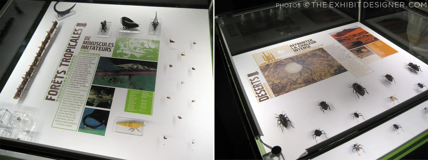
Each of the glowing cubes is a display case. Specimens are pinned to a rear-lit graphic, around text and images arranged in a clean, gridular design. Each layout looked nicer than the last, so I'm going to share photos of many.

theexhibitdesigner_insectarium-case-graphics1

Some layouts have a sense of irreverence, like this one, with its marching ants:

theexhibitdesigner_insectarium-case-graphics-fun

The different accent colors and stylized illustrations indicated the habitats (e.g. tropical forests) for the specimens.

theexhibitdesigner_insectarium-case-graphics2
theexhibitdesigner_insectarium-terrarium

Throughout the exhibition there were terrariums with some live critters, and beneath some display cubes there were dioramas (faux terrariums, if you will).

theexhibitdesigner_insectarium-faux-terrarium
theexhibitdesigner_insectarium-butterflies

There were wall displays, and plenty of interesting charts and diagrams. There were sections about insect lifestyles, diets, reproduction, and what people can do to protect endangered insects. The sheer number of displays could have made for a repetitive slog, but it did not feel that way at all — specimens were fascinating, text was succinct, and the layouts were visually varied while staying true to the design system.

theexhibitdesigner_insectarium-timeline-charts
theexhibitdesigner_insectarium-reproduction-pros
theexhibitdesigner_insectarium-different-tastes
theexhibitdesigner_insectarium-protect

Outside were additional exhibitions and a temporary interactive art installation. And then we were off to explore the Botanical Garden.

theexhibitdesigner_insectarium-outside-exhibits

Post updated in January 2021 with minor text edits. Broken links have been replaced with archived URLs, courtesy of archive.org. This post was originally published at theexhibitdesigner.com on 15 March 2017.

Space for Life, part 1: Biodôme

Back in September 2015, I spent a handful of days in Montréal. I visited a few museums, but at the time, I only gave one temporary exhibition at the Biodôme brief mention on this blog. This happens all the time — I take photos everywhere I go, and then I just sit on them.… So let’s dust off those photos (or pretend it’s September 2015), and visit the Biodôme.

theexhibitdesigner_biodome-entrance

The Biodôme is part of a museum complex called Espace Pour La Vie (“Space for Life”) that also includes the Insectarium, Jardin botanique (botanical gardens), and Planétarium. You can buy combination admission tickets and pick which you would like to visit. The largest exhibition, and primary draw, within the Biodôme is Ecosystems of the Americas. (But don’t miss the Insectarium!) The Ecosystems exhibition is broken into four ecosystems conveyed by immersive landscaping, climate, and live vegetation and wildlife. For example — the air inside the Tropical Rainforest ecosystem is warm and muggy, while inside the Sub-Antarctic Islands ecosystem it is decidedly chilly.

theexhibitdesigner_biodome-tropical-rainforest.jpg

Inside the Tropical Rainforest you walk through mature and secondary forests, and pass a waterfall, lake, river, cliffs, and caves. Graphics throughout are minimal, restricted to brief labels and occasional monitors. Like most places in Montréal, text is in French, with English translations.

theexhibitdesigner_biodome-tropical-rainforest-graphics

Charming illustrations and species’ statuses are available in the free Identification Guide.

theexhibitdesigner_biodome-guide

Inside the cave you’ll find terrarium-dwellers and nocturnal-types; these graphics were all rear-illuminated, and included a bit more information than graphics in the Rainforest:

theexhibitdesigner_biodome-tropical-rainforest-night-exhibit

Moving along, you reach the Laurentian Maple Forest. At the entrance to each ecosystem you are greeted by a large wall mural: a collage of color-saturated photos, clean-lined vector illustrations, and a where-in-the-world diagram.

theexhibitdesigner_biodome-maple-forest
theexhibitdesigner_biodome-maple-forest-graphic

Maintaining the minimal aesthetic throughout, there are still elements of whimsy, such as photos of playful otters applied to the glass wall of their enclosure. Wayfinding elements also show up on the floor, and on support columns.

theexhibitdesigner_biodome-polar

Downstairs, there are a couple of small exhibitions: the Naturalia Room, which is directed toward children, and a temporary exhibition, which at the time was The Fossil Affair.

Overall, the Biodôme was a fun museum to visit, and the immersive ecosystems were well-done.

theexhibitdesigner_biodome_fossil-affair

Post updated in January 2021 with minor text edits. Broken links have been replaced with archived URLs, courtesy of archive.org. This post was originally published at theexhibitdesigner.com on 14 March 2017.

Pacific Exchange, open at the National Postal Museum

Work shown was completed while I was a designer at Gallagher & Associates.

It’s open! Okay, old news. It opened well over a month ago, on March 6. I had also planned to post about the opening reception, but that was March 20, so — old news there as well. In any case, the reception was lovely, with Chinese food served and tinkling glassware and everyone dressed quite nicely.

Pacific Exchange: China & U.S. Mail is the second exhibit to be on view in the Postmasters Suite gallery at the Smithsonian National Postal Museum. From the exhibit website: Using mail and stamps, Pacific Exchange brings a human scale to Chinese–U.S. relations in three areas: commerce, culture, and community. The exhibit focuses on the 1860s to the 1970s, a time of extraordinary change in China. It also explores Chinese immigration to the United States, now home to four million Chinese Americans. (Thank you to James O'Donnell of the Smithsonian for the above photo.)

Upfront: I am a bit of a stamp nerd. I have a small collection of Olympics stamps, mostly international, from the 1960s and 1970s. (You have to focus when collecting stamps!) So I really enjoyed working on an exhibit about philately.

This was my swan song at Gallagher & Associates. I handled the design myself, from designing the exhibit’s visual concept to laying out production files for all of the graphics. I also designed the exhibit plan and artifact case layouts. Even though this is a small exhibit space, it had more than 100 artifacts, so making [nearly] everything fit comfortably was a bit of a challenge!

The design drawing above is an example of how a case layout looked during design development, and below are those same cases, made real:

PacificExchange_commerce-cases2.jpg

Graphics were digital output mounted on sign blank, trimmed to edges, with a matte overlaminate. The wall-mounted and freestanding graphics were backed with 1/2" MDF painted Benjamin Moore “Bonfire” to match the primary exhibit red (Pantone 1795). The freestanding graphics had duplicate panels on either side of the mdf — a panel sandwich which was held in place by adjustable metal sign bases. The Smithsonian Office of Exhibits Central printed and built the graphic components. Blair Fabrication built the case furniture.

PacificExchange_culture-case2.jpg

Most of the exhibit text is in English and Chinese, a design challenge I enjoyed. In the artifact case below, some of the artifacts were loans that had to be displayed flat. The other half of the plinth has a 15° rise to create a comfortable reading angle.

I arrived at the color palette after some research into significant colors in Chinese culture. I used red and gold as the dominant exhibit colors, with a deeper maroon red for accent. I used a third red, one with pink undertones — red, is the color of prosperity and good fortune, among other meanings — for the Commerce section of the exhibit; yellow, the color of heroism, for the Community section; and blue-green (or qing), to give a feeling of Chinese history and tradition, for the Culture section. I also drew distinctive vector patterns for each section.

The element that most people extol is the group of banners in the entrance. There are three individual banners and they’re more than 20 feet tall! EPI Colorspace printed and installed them. (Install photos here.) They were printed on “Brilliant Banner” 12 mil. polyester banner fabric. The fabric has a very subtle canvas texture that wasn’t what I originally intended — I wanted a silken look for the banners — but the color saturation and printing quality was so good that I went with EPI’s recommendation.

PacificExchange_entrance-timeline.jpg

I also designed a few of the related print graphics: the exhibit catalogue, a postcard, and the invitation to the opening reception.

The exhibit has been well-received overall and I’m thrilled with how everything turned out. If you’re in DC between now and January 4, 2015, please check it out!

Post updated in January 2021 with minor text edits and additional photos. Broken links have been fixed. This post was originally published at theexhibitdesigner.com on 26 April 2014.

Talk to Me, at MoMA

I’d rather not include too many posts about now-closed exhibits that I saw ages ago, but in the case of Talk to Me at the MoMA, the online exhibit is itself worth exploring.

A simple but compelling design. I liked the pixel illustrations on the introduction wall and the punchy red walls and reader rails.

Post updated in January 2021 with minor text edits. Broken links have been fixed. This post was originally published at theexhibitdesigner.com on 8 April 2012.

Electricity, at the Franklin Institute

Electricity at The Franklin Institute is about “the wonders of electricity … this interactive exhibit dedicated to the Museum’s namesake, Benjamin Franklin” serves up historical artifacts, cute diagrams ...

IMG_0217.JPG

… and plenty of techy interactives. The exhibit promises, “Learn how electricity is created and explore the fuel sources needed to generate our electricity. You’ll feel the force of electricity by manipulating electrical phenomena, exploring authentic artifacts … and tackling questions of sustainable energy.” Below, a touch screen to explore Ben Franklin's book Experiments and Observations on Electricity:

The “Electrical Signals” wall: use your phone and it responds with flashing LEDs. It was a lot of fun.

There were group interactives and experiments, and a “sustainable dance floor” which was a blast for all. The exhibit is ongoing.

Post updated in January 2021 with minor text edits. Broken links have been fixed. This post was originally published at theexhibitdesigner.com on 16 January 2011.

Mathematica, the Eames-designed exhibit

The legendary Charles and Ray Eames are perhaps best known for their design of a certain lounge chair, but let’s not forget their architecture, print design, photography, film, textiles — and exhibitions. During their career they designed more than a dozen, of which only Mathematica: A World of Numbers ... and Beyond — from 1961! — is still on view.

Three versions were created and two of them remain open to the public: one at the New York Hall of Science and the other at Boston’s Museum of Science. Update: There is now a third at The Henry Ford Museum.

Probability, Topology, Boolean Algebra, Geometry, Calculus, and Logic ... I don't feel particularly moved by any of those, but inarguably this exhibition, with all its quirks and charms, makes math accessible and interesting. I have been to it a number of times, and it’s usually packed with people happily learning about mathematics and engaging with the interactive exhibits.

The photos above are of my favorite part of the exhibit: the case about projective geometry. I like the colors of the geometric shapes, the way that the pieces are held in position by Inspector Gadget-like hinged poles, and the grid on the bottom of the case. The graphics perched on black blocks are simple and handsome.

The photo below is of another element in the exhibit that I like: math-related quotation panels overhead, playing nice with the track lighting frame.

Mathematica is successful as an exhibit about math, but more importantly, from an exhibit-design standpoint it is an incomparable artifact, a fascinating time capsule of an exhibit designed during the 1960s.

I’m a sucker for retro graphic design, but I have to say that I don’t like the illustrations. They’re cute and fun, I suppose, but they annoy me.... I ... hate them. There, I said it.

I also don’t like that some parts of the exhibit look as though they were pasted together for a high school statistics class presentation. Picture below, on the right: I'm talking to you. This encased collage is deadly boring and it’s often skipped in favor of the fun hands-on interactives, which are fantastic.

The other part of the exhibit that doesn’t do it for me is the math history wall. I have heard it described as wallpaper, or an art piece. The black and white bars do create a graphically interesting pattern, but then the wall is cluttered up with other bits of browning paper and artwork.

The capitalized, justified serif font used is extremely difficult to read, if you were inclined to try. It makes me dizzy. And yet the darnedest thing: people do sometimes read it. (I have no idea....) Another (obvious) issue with this wall is that the timeline ends in 1961, and the MOS’s solution, a poster, is not well integrated. NYSCI’s solution, an interactive monitor, is a better one, at least in theory. (I haven't been to the New York Mathematica to see it firsthand.)

I like the “probability machine.” The full text reads: THE T/HEORY/OF PR/OBABI/LITIES/IS NO/THING/MORE/THAN/GOOD/SENSE/CONFI/RMED/BY CA/LCULATION. :LA/PLACE/1796

Balls fall from above and form a bell curve. Simple, elegant — and if the text is a little wonky, it does force you to read it over a few times to understand, maybe making you internalize its message.

I feel like quite the curmudgeon with my criticisms of Mathematica. The exhibit is nearly fifty years old, after all — it’s miraculous that it still exists. And despite its literal dustiness, it is an exhibit beloved and cherished by many, a vintage exhibit that allows us to step back in time to experience firsthand a 60s era exhibit full of the Eames’s joie de vivre, fun, and humor. I think any designer would agree that that in itself is pretty cool.

If you have been, what do you think?

Post updated in January 2021 with minor text edits. Broken links have been fixed or replaced. This post was originally published at theexhibitdesigner.com on 16 February 2010.

A thought or two on curved reader rails

I have been working on some curved reader rails and I feel for anyone who has to design them regularly — they involve advanced geometric wizardry that can make your head spin. (Or not ... but actually, yes, they are tricky.)

Below are two curved reader rails in the Ocean Hall at the National Museum of Natural History in DC. On the left is a rail that looks as though its graphics were not laid-out correctly; I’d guess that the text blocks and graphic elements are angled, but not CURVED to match the round rail edges, which makes the graphic look a little wonky. Look specifically at the text “Meet Phoenix” — see how it angles toward the text block below it? (But how cute is that whale illustration?) On the right, from the same exhibit, another curved rail. It’s a much simpler design, and it works: just two lines of text, set on a baseline curved to the radius of the rail.

Below is a reader rail that I designed for the National Museum of the US Army in Fort Belvoir, Virginia. (We — Christopher Chadbourne & Associates — are still in Design Development so text and images are not final.)

It will ultimately surround a circular, glass-enclosed diorama. Every line of text is on its own track, curved to the radius of the rail; in fact, all graphic elements, including lines and images, have horizontal lines curved to that radius. It took a long time to lay this out.

curved rail2.jpg

Update, 2021: The museum is now open (!!) — but also temporarily closed due to Covid-19 — and you can see the round reader rail and diorama in the photo of the Cold War gallery on the NMUSA website.

Post updated in January 2021. Broken links have been fixed, replaced, or replaced with archived URLs, courtesy of archive.org. This post was originally published at theexhibitdesigner.com on 10 January 2010.

Invention, Energy, and Exploration at CT Science Center

The Connecticut Science Center opened this past June, boasting ten galleries and 40,000 square feet of exhibits, and 150+ hands-on interactives. The building is nice, too — kinetic sculptures hang in the vertigo-inducing, six-story-high central atrium.

csc-lobby21.jpg

One aspect of the architecture that I really like is the number of windows. There are windows in the exhibit galleries that look out on the city of Hartford, and windows that look in, down on the atrium. To pause at those windows provides welcome and needed little moments of serenity.

I went to the science center on the rainy-day Friday after Thanksgiving. Yikes.

The pictures I am about to show will give you little sense of the number of people there, nor of the mayhem happening around me. It seemed that just about everything in the museum spun, whistled, bounced, beeped, whizzed, banged … and was covered in smudgy little fingerprints.

The Invention Dimension exhibit is about “the process of developing new products, new theories, new substances, and new uses for items that no one has ever thought of or attempted before.” The graphics are friendly, with rounded corners and bright, vibrant colors, and nicely illustrated — the illustrations are bold yet finely-detailed as in technical drawings.

csc-inventiondimension 1
csc-inventiondimension3

Energy City, about alternative energy technologies, was my favorite exhibit. I would describe the graphics as future-retro, with bright, bold colors, and video game-inspired diagrammatic illustrations. It was fun to see.

The graphic panels appeared to be printed on a metallic substrate then laminated with a protective film, or printed on the second side of a laminating film. The sheer number of graphic panels here was impressive.

Exploring Space — spelled out in acrylic dimensional letters, over a color-changing lightbox.

The large-scale images of extraterrestrial surfaces were striking as background murals. Area panels were front- and rear-printed on frosted acrylic, making effective use of the material’s depth. Graphics, especially the reader rail graphics, were cleanly designed with subtle textural details and interesting diagrams.

The Forces in Motion exhibit, about the power of the wind, magnets, and robotics, took advantage of its high ceilings: swaths of bold colors, supergraphic-sized type (FREEZE!), and huge vector diagrams on the walls.

There is a “design your own mag-lev (magnetic levitation) train” interactive which was a lot of fun.

The exhibits use low-energy lighting fixtures, which cuts their energy usage to 40% that of traditionally-lit exhibit spaces. It was too close to sensory-overload for my tastes, but if you’d like to engage with dozens of stellar exhibit interactives, you should take a trip here.

The exhibits were designed by Thinc Design (NY) and Jeff Kennedy & Associates (Boston), with many interaction designers: Snibbe Interactive, aesthetec, Boston Productions, Red Hill Studios, and I don't know who else (150+ interactives makes for a lot of interaction designers).

Post updated in January 2021 with minor text edits. Broken links have been fixed or replaced. This post was originally published at theexhibitdesigner.com on 29 November 2009.

DC part 3: National Museum of Natural History

For this final post about my recent trip to DC, I am sharing some photographs from the Smithsonian’s National Museum of Natural History. NMNH is a big museum, with some exhibits dating back to the Paleolithic era, so I skipped a lot of it. The three permanent exhibits below are a few to see if, like me, you’re primarily interested in a museum’s graphics.

nmnh-title

The Sant Ocean Hall recently re-opened, in 2008, with exhibit redesign by Maryland-based Gallagher & Associates. (Exhibit photos on the fabricator, D&P’s website.) Each subject area in the Ocean Hall had color palettes distinct from other area; important because there wasn’t a prescribed path for a visitor to follow — everyone wandered around in whatever direction struck their fancy. The colors unified the island-like display cases. I liked the color selections and image/title compositions for the area introductions. (Seahorses, they are photogenic!) The infilled, etched illustrations were quite nice.

Ocean-Hall1
Ocean-Hall2
Ocean-Hall3

In the Bone Hall; cheerful colors and swirling, retro patterns. This is an old exhibit, but wonderful nonetheless, with clever interplay between the patterns at the backs of display cases and the skeletons’ poses. I didn’t look closely at how these graphics were produced but I would hazard a guess that patterns were painted/stenciled on the wall and text was silkscreened. (Thanks to my colleague Jeff for these two photos.)

bones3
bones2

And finally, the Hall of Mammals, an excellent redesign by Canadian firm Reich + Petch. (Great photos of the exhibition at that link.) The gallery panels were beautiful: they were scenically-treated and textured lightboxes (the third image below is a close-up of the texture on the North American panel) which was in beautiful contrast to the overall minimalism of the exhibit. I also liked the use of vector art in the diorama backdrops (an example is shown in the “Getting Around in Open Woodlands” photo), which added another element to the graphic palette. The line illustrations on the specimen labels were great. (Thanks to my colleague Jeff for the Australia diorama and the ‘Rainforest’ text photos.)

Mammals1
Mammals5
Mammals4
Mammals3
Mammals2

Post updated in January 2021 with minor text edits. Broken links have been fixed or replaced. This post was originally published at theexhibitdesigner.com on 14 November 2009.