rear-lit graphics

Pointe-à-Callière: Crossroads, Building Montréal, Snow

My final post about the Montréal museums I saw during my visit to the city in September 2015 — see also the Insectarium, the Biodôme, and Lazy Love at the Biodôme — here’s a look back at Pointe-à-Callière, Montreal’s Archeology and History Complex.

theexhibitdesigner_Pointe-a-Calliere_lobby-banner.jpg

The Pointe-à-Callière complex is built on archeological sites that span the city’s history. Exploring the museum is very interesting, and a lot of fun — you take passageways, bridges, and stairs over and through the archeological remains. Like the museum building itself, which was built on pilings to protect the site, exhibition elements tread lightly among the artifacts, and visitors are asked repeatedly via signage not to touch the remains. Like most places in Montréal, museum graphics are in French with English translations. I like the way the two languages are interwoven on the red lobby banner above.

theexhibitdesigner_Pointe-a-Calliere_passageways

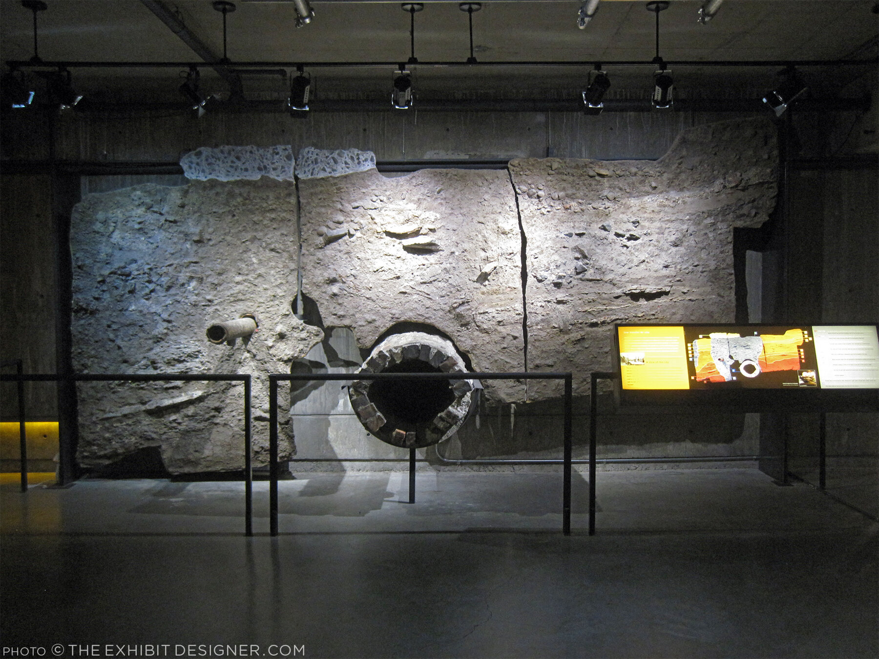
The permanent exhibition in the basement, Crossroads Montréal, takes you through 1,000 years of the city’s remains, including the first Catholic cemetery (dating from 1643), and the foundation of the Royal Insurance Building (dating from 1861). Excavations continue and more exhibitions are planned to interpret what is unearthed. On the one hand: very cool premise, and very cool space to explore. On the other, I had trouble getting and keeping my bearings. Perhaps because the graphics didn’t hold my attention? The ruins themselves were more intriguing.

theexhibitdesigner_Pointe-a-Calliere_graphics2

I would have liked more information directed at the museum “streakers” like myself: the people who move quickly through exhibitions, and only read titles and very selective [random] bits and pieces of labels. (On my best days, I can be a “stroller.”) Perhaps a printed guide map would have helped me to understand where I was within the museum and what I was looking at. Perhaps I should have taken a guided tour.

theexhibitdesigner_Pointe-a-Calliere_built-in-graphics

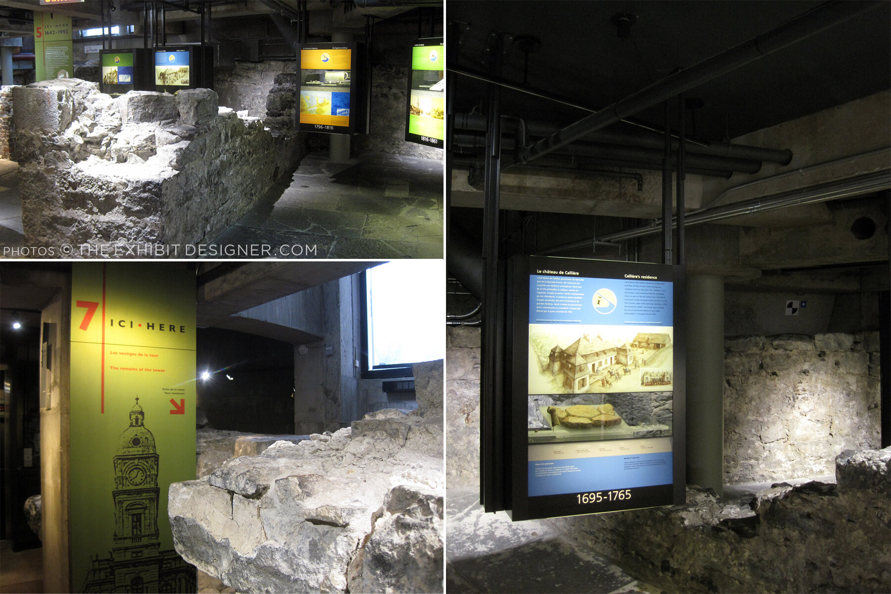
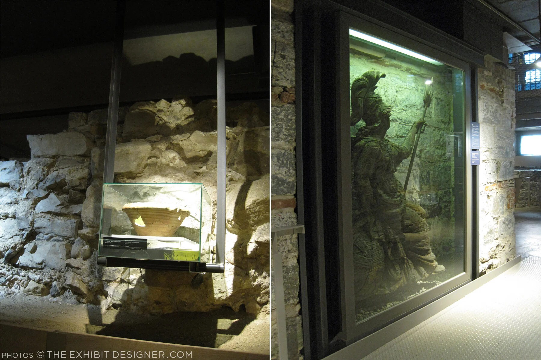
I did like the graphics’ integration into the museum’s building structure, particularly the ceilings, and the minimalist construction-site aesthetic of their structures. Artifact cases, too, were carefully integrated into the site.

theexhibitdesigner_Pointe-a-Calliere_built-in-cases
theexhibitdesigner_Pointe-a-Calliere_pipes
theexhibitdesigner_Pointe-a-Calliere_reader-rails

Most graphics were rear-illuminated, which worked perfectly with the museum’s underground atmosphere.

theexhibitdesigner_Pointe-a-Calliere_graphics3
theexhibitdesigner_Pointe-a-Calliere_graphics

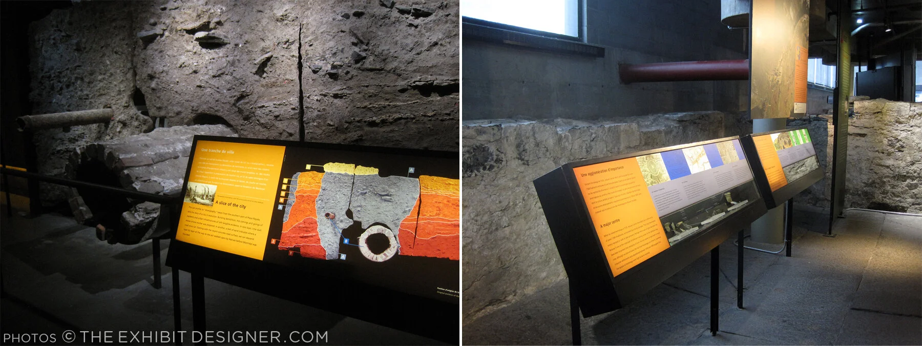
Also below-ground is the Building Montréal exhibition, where you’ll find the museum’s archeological crypt. The photos below are of the vaulted stone tunnel built on the bed of the Saint-Pierre River. See what I mean about the museum being fun to explore?

theexhibitdesigner_Pointe-a-Calliere_passageway
theexhibitdesigner_Pointe-a-Calliere_archeological-crypt

Set into the floor of Building Montréal are more than a dozen dioramas that show the city at different points in time. I love this use of space, and the vantage point it gives visitors. (I wrote this post about exhibition flooring, seven years ago, and Bridget mentioned the Pointe-à-Callière in the comments. I finally saw it for myself!)

theexhibitdesigner_Pointe-a-Calliere_floor-dioramas
theexhibitdesigner_Pointe-a-Calliere_floor-models
theexhibitdesigner_Pointe-a-Calliere_building-montreal

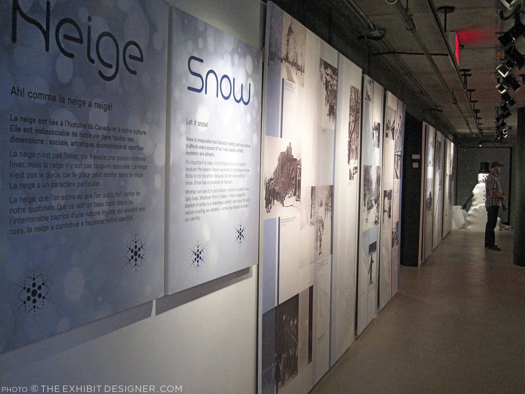
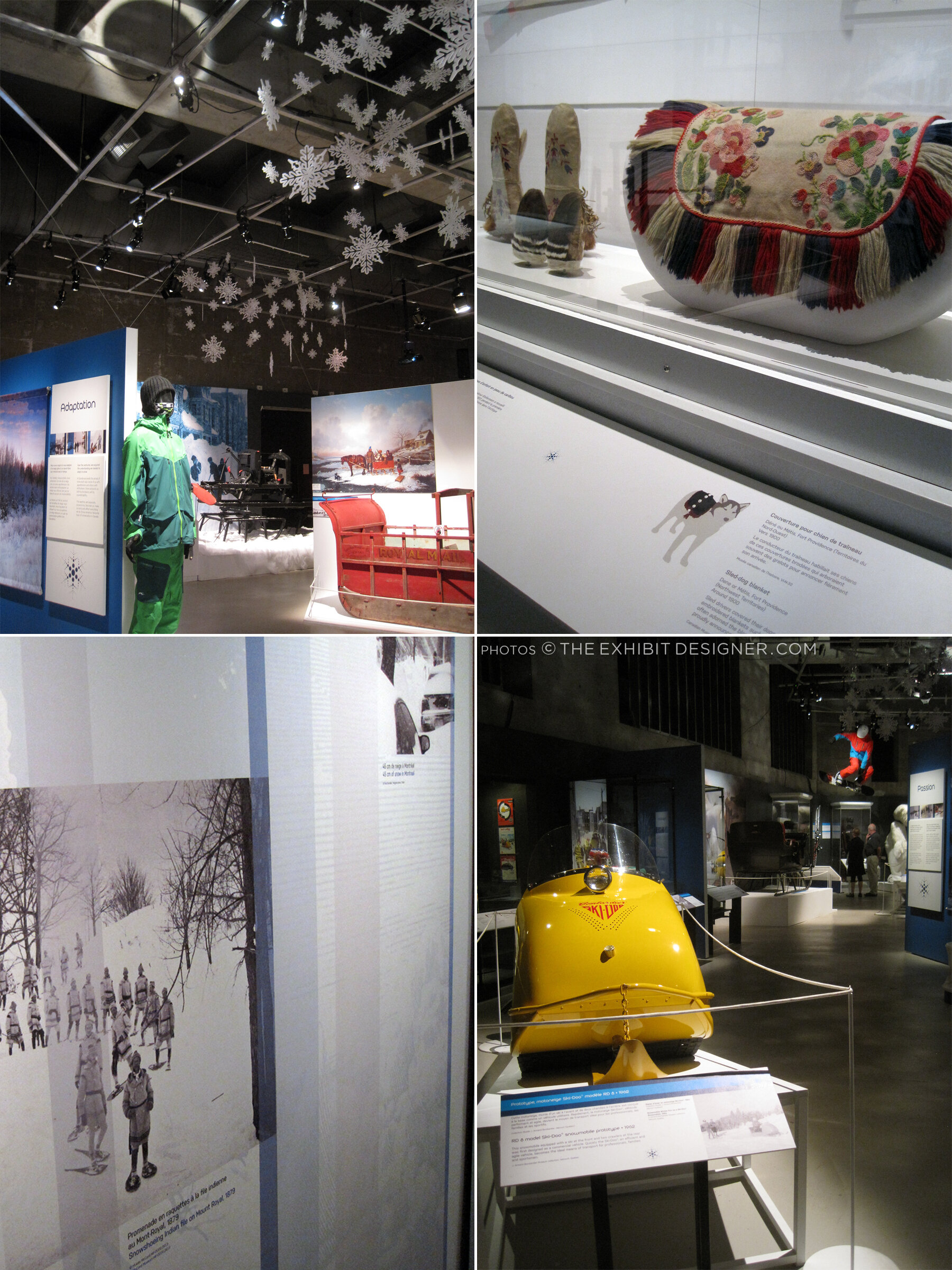
At the time, the museum also had a temporary exhibit on view called Snow, a fun look at winter culture in Canada. Notice the snowflakes cut from the apron fronts of reader rails!

theexhibitdesigner_Pointe-a-Calliere_snow1
theexhibitdesigner_Pointe-a-Calliere_snow2
theexhibitdesigner_Pointe-a-Calliere_snow3

Post updated in January 2021 with minor text edits. This post was originally published at theexhibitdesigner.com on 25 March 2017.

Space for Life, part 2: Insectarium

Update: The Insectarium is being redesigned, and is scheduled to reopen in 2021.

The Insectarium was our second stop in Montréal’s natural museum complex, Espace Pour La Vie (“Space for Life”). It’s a fascinating and excellently-designed museum. Its exterior looks like a home for insects, almost like a bee hive:

theexhibitdesigner_insectarium-exterior

The permanent exhibition is called We Are the Insects and it is predominately ... very green. Graphics are a mix of strikingly clean layouts and comic book-inspired illustrations.

theexhibitdesigner_insectarium-we-are

Here’s the view down to the bulk of the exhibition:

theexhibitdesigner_insectarium-overview

Each of the glowing cubes is a display case. Specimens are pinned to a rear-lit graphic, around text and images arranged in a clean, gridular design. Each layout looked nicer than the last, so I'm going to share photos of many.

theexhibitdesigner_insectarium-case-graphics1

Some layouts have a sense of irreverence, like this one, with its marching ants:

theexhibitdesigner_insectarium-case-graphics-fun

The different accent colors and stylized illustrations indicated the habitats (e.g. tropical forests) for the specimens.

theexhibitdesigner_insectarium-case-graphics2
theexhibitdesigner_insectarium-terrarium

Throughout the exhibition there were terrariums with some live critters, and beneath some display cubes there were dioramas (faux terrariums, if you will).

theexhibitdesigner_insectarium-faux-terrarium
theexhibitdesigner_insectarium-butterflies

There were wall displays, and plenty of interesting charts and diagrams. There were sections about insect lifestyles, diets, reproduction, and what people can do to protect endangered insects. The sheer number of displays could have made for a repetitive slog, but it did not feel that way at all — specimens were fascinating, text was succinct, and the layouts were visually varied while staying true to the design system.

theexhibitdesigner_insectarium-timeline-charts
theexhibitdesigner_insectarium-reproduction-pros
theexhibitdesigner_insectarium-different-tastes
theexhibitdesigner_insectarium-protect

Outside were additional exhibitions and a temporary interactive art installation. And then we were off to explore the Botanical Garden.

theexhibitdesigner_insectarium-outside-exhibits

Post updated in January 2021 with minor text edits. Broken links have been replaced with archived URLs, courtesy of archive.org. This post was originally published at theexhibitdesigner.com on 15 March 2017.

Space for Life, part 1: Biodôme

Back in September 2015, I spent a handful of days in Montréal. I visited a few museums, but at the time, I only gave one temporary exhibition at the Biodôme brief mention on this blog. This happens all the time — I take photos everywhere I go, and then I just sit on them.… So let’s dust off those photos (or pretend it’s September 2015), and visit the Biodôme.

theexhibitdesigner_biodome-entrance

The Biodôme is part of a museum complex called Espace Pour La Vie (“Space for Life”) that also includes the Insectarium, Jardin botanique (botanical gardens), and Planétarium. You can buy combination admission tickets and pick which you would like to visit. The largest exhibition, and primary draw, within the Biodôme is Ecosystems of the Americas. (But don’t miss the Insectarium!) The Ecosystems exhibition is broken into four ecosystems conveyed by immersive landscaping, climate, and live vegetation and wildlife. For example — the air inside the Tropical Rainforest ecosystem is warm and muggy, while inside the Sub-Antarctic Islands ecosystem it is decidedly chilly.

theexhibitdesigner_biodome-tropical-rainforest.jpg

Inside the Tropical Rainforest you walk through mature and secondary forests, and pass a waterfall, lake, river, cliffs, and caves. Graphics throughout are minimal, restricted to brief labels and occasional monitors. Like most places in Montréal, text is in French, with English translations.

theexhibitdesigner_biodome-tropical-rainforest-graphics

Charming illustrations and species’ statuses are available in the free Identification Guide.

theexhibitdesigner_biodome-guide

Inside the cave you’ll find terrarium-dwellers and nocturnal-types; these graphics were all rear-illuminated, and included a bit more information than graphics in the Rainforest:

theexhibitdesigner_biodome-tropical-rainforest-night-exhibit

Moving along, you reach the Laurentian Maple Forest. At the entrance to each ecosystem you are greeted by a large wall mural: a collage of color-saturated photos, clean-lined vector illustrations, and a where-in-the-world diagram.

theexhibitdesigner_biodome-maple-forest
theexhibitdesigner_biodome-maple-forest-graphic

Maintaining the minimal aesthetic throughout, there are still elements of whimsy, such as photos of playful otters applied to the glass wall of their enclosure. Wayfinding elements also show up on the floor, and on support columns.

theexhibitdesigner_biodome-polar

Downstairs, there are a couple of small exhibitions: the Naturalia Room, which is directed toward children, and a temporary exhibition, which at the time was The Fossil Affair.

Overall, the Biodôme was a fun museum to visit, and the immersive ecosystems were well-done.

theexhibitdesigner_biodome_fossil-affair

Post updated in January 2021 with minor text edits. Broken links have been replaced with archived URLs, courtesy of archive.org. This post was originally published at theexhibitdesigner.com on 14 March 2017.

California Academy of Sciences, part 1: rainforests and reefs

I wrapped up June — oh, wow it’s August! — with a trip to Yosemite (happy birthday, National Park Service) and San Francisco, where I spent a day parade-watching and a couple days museum-going.

theexhibitdesigner-SF-pride-2016

One museum that filled nearly an entire day was the California Academy of Sciences in Golden Gate Park. Below is a photo of the museum’s exterior and its brilliant Living Roof, as seen from the de Young Museum.

theexhibitdesigner-SF-academy-sciences_living-roof

There are so many exhibits within “the Academy” (and so many photos to show) that I’ve broken this post into two parts. Part 1 here covers the Aquarium on the lower level, designed by Thinc Design, and the Rainforest on Level 1.

theexhibitdesigner-SF-academy-sciences_visitor-guide

After entering the museum I was swept up with the crowds heading to the 4-story, 90-foot-diameter Rainforest Dome. Inside, the rainforest visit begins on a Bornean forest floor, winds upward through a Madagascan mid-story and a Costa Rican canopy, then ends on the lower level in an Amazonian flooded forest.

theexhibitdesigner-SF-academy-sciences_rainforest-dome

As a designer, I liked the dome’s juxtaposition of glass and steel and abstracted jungle motifs against living flora and fauna, and the changing vistas as I moved further up the dome. As a nature enthusiast, I enjoyed its subject matter; as a weary museum visitor, I appreciated its delivery: not too much, not too little; brief, interesting, and useful.

theexhibitdesigner-SF-academy-sciences_rainforest-levels
theexhibitdesigner-SF-academy-sciences_rainforest-area-signs
theexhibitdesigner-SF-academy-sciences_rainforest-animal-signs

The bright, straightforward graphics make use of vivid photographs, and the occasional illustration of an animal signals your arrival in a new area of the jungle. Bamboo- or vine-like vertical posts give a stylized–naturalistic element to exhibit tanks. The light touch with exhibit elements gives the rainforest dome a feeling of exploration and discovery (just ignore the school groups).

At the top of the dome, look out over the three stories you’ve just visited, and down, through a 100,000 gallon tank, to the flooded forest floor. Take an elevator down, then enter the tunnel you were just looking through from afar. Everyone says “oooh.”

theexhibitdesigner-SF-academy-sciences_rainforest-dome-lower2
theexhibitdesigner-SF-academy-sciences_rainforest-dome-lower1.jpg

The aquarium level felt jam-packed and massive; it’s where I spent most of my time during a 3 hour + visit. There were many exhibitions to see: Amazon Flooded Forest, Water Planet, California Coast, Coral Reefs of the World, Twilight Zone, and more.

Down here, animal identification is found on digital touchscreens. They were intuitive and fun to use, and had just the right amount of information: an animal’s common name, its scientific name, diet, and a one-sentence fact about it.

theexhibitdesigner-SF-academy-sciences_rainforest-digital-signs

Below are some photos of the Water Planet exhibition, which groups underwater animals by adaptations. Projected blue and green lighting casts an underwater glow on the sculptural wave walls (similar material here). In the center of the room are curvilinear tanks. (I was reminded of the Van Cleef & Arpels traveling exhibition, circa 2012. It must be the bubbles.)

theexhibitdesigner-SF-academy-sciences_aquarium-water-planet.jpg
theexhibitdesigner-SF-academy-sciences_aquarium-water-planet2
theexhibitdesigner-SF-academy-sciences_aquarium-water-planet3
theexhibitdesigner-SF-academy-sciences_aquarium-cal-coast

The highlight of the Coral Reefs of the World exhibition is the 25-foot deep Philippine Coral Reef tank (above). The exhibit graphics in this area are large image-based wallpapers.

theexhibitdesigner-SF-academy-sciences_aquarium-cal-coast2
theexhibitdesigner-SF-academy-sciences_aquarium-cal-coast3

The exhibition Twilight Zone: Deep Reefs Revealed had just opened on June 10. It’s memorable for its tanks filled with the most incredible jellies and vivid deep sea fishes.

theexhibitdesigner-SF-academy-sciences_aquarium-twilight-zone

Post updated in January 2021 with minor text edits. Broken links have been fixed. This post was originally published at theexhibitdesigner.com on 23 August 2016.

On view now! New York City: A Portrait Through Stamp Art

New York City: A Portrait Through Stamp Art opened — today! — at the Smithsonian National Postal Museum. I was delighted to design this temporary art exhibition.

Postal-Museum-stamp-art_90A0119_Fotobriceno
Postal-Museum-stamp-art_90A0167_Fotobriceno

… Along with some printed pieces: a postcard booklet (free for museum visitors) and special postal cancellation (available in the museum’s post office).

christine-lefebvre-NYC-stamp-art_postcards-unfolded-sm.jpg

The thirty pieces of original artwork on display are part of the Postmaster General's [extensive] Art Collection, and are arranged in six categories: Baseball, Broadway, City Life, Icons, Politics, and Music. The artwork was selected to “celebrate important citizens, events and iconic buildings that have defined New York City as one of the greatest cities in the world.” Who knew there were so many New York City-themed stamps??

christine-lefebvre_Smithsonian-Postal-NYC-Stamp-Art-1
christine-lefebvre_Smithsonian-Postal-NYC-Stamp-Art-2
CLD_NPM_NYCstamp-Exhibit8.jpg

The exhibition will be on view through March 13, 2017. If you want the distinct pleasure of seeing TWO of my exhibits in one museum, Freedom Just Around the Corner is also on view at the National Postal Museum for two more months, until February 15, 2016.

christine-lefebvre_Smithsonian-Postal-Museum-stamp-art_90A0161_Fotobriceno-sm.jpg

Post updated in January 2021 with minor text edits. Broken links have been fixed. This post was originally published at theexhibitdesigner.com on 10 December 2015.

FDR Museum, part 4: rear-lit and neon

Work shown was completed while I was a designer at Gallagher & Associates.

To wrap up my series on the design, fabrication, and installation of the Franklin D. Roosevelt Museum, a close look at the first exhibition gallery.

The first gallery sets the stage for FDR’s presidency: the Great Depression. The focal point here is the neon-illuminated “FEAR” wall. Text is silkscreened onto the glass panels and rear-illuminated with LED pads. The red color comes from the custom “UMEMPLOYED” neon letters; the mural image in the back is a black and white photographic print.

The FEAR letters are applied to the rear of the glass. I wanted them to be translucent — to allow the mural image to show through and create depth — and also be as richly black as possible. The fabricators, Explus, provided a variety of production samples to try to achieve the effect I was after. Printing the letters on a transparent film and applying it to the glass, in particular, was unacceptable as I wanted a uniform transparency (no streaks, no dots).

Explus created a self-adhering vinyl by applying Sentinel OptiClear Adhesive to the face of the gel sheet (Rosco Cinegel Neutral Density N.9 Gel Extra Wide) and die-cutting it. I was happy, but the fabricators had some difficulty with cutting and applying the gel sheets. Their graphics manager told me that if they were to do something like this again they would use a standard window tint that has the application adhesive already on it. Here’s the sample:

Turning to the wall opposite:

The background mural is printed on DreamScape, as I mentioned in a previous post. Most of the murals in this museum were applied to backers, framed, and cleat-hung to the wall, but this particular one was applied directly to the wall and its edges captured with flat aluminum strips.

The framed graphics are digital prints with an overlaminate, mounted to sign blank. They were applied onsite to an MDF backer panel and aluminum frame. (The backer and frame are screwed to the exhibit wall; the graphic is applied with VHB tape.) Explus welded the frames’ corners before painting them, and that made a huge difference in the appearance of them. They are nicely finished and high-quality.

Post updated in January 2021 with minor text edits. Broken links have been fixed. This post was originally published at theexhibitdesigner.com on 25 June 2013.

Game on: The Art of Video Games

I visited The Art of Video Games at the Smithsonian American Art Museum. (It’s gotten quite a bit of press — here is one thoughtful review, from The Mary Sue.) The exhibit covers the past 40 years of video game art and includes interviews of game designers and developers, conceptual art, video displays of 80 games (voted on by the public), and playable games (five, for the five eras of game technology).

I would have loved to play some Super Mario Brothers, but the wait was at least 10 kids deep so I had to move on. Vintage game consoles were on display in lit display “consoles,” along with video game stills and interpretive text.

The exhibit designers describe their process and the materials and production techniques used, in this blog post from Smithsonian Exhibits. There is also an upcoming gallery talk, “Building The Art of Video Games(link no longer available) on August 21. For those of you not in the DC area, the exhibit will travel beginning late October.

Post updated in January 2021 with text edits. Broken links have been replaced with archived URLs, courtesy of archive.org. This post was originally published at theexhibitdesigner.com on 15 August 2012.

Changing Earth, at the Franklin Institute

Changing Earth at the Franklin Institute in Philadelphia is about land, air, and water, and how these have changed and continue to change on our planet. There’s a lot happening in this exhibit and it was sometimes overstimulating, but overall it was nicely designed with clear ”take-home” messages and memorable interactive experiences.

The designers, Adirondack Studios, used environmentally-sensitive materials throughout the exhibit. From the museum’s website: “Changing Earth is constructed of sustainable materials. The flooring is made from recycled content and post-consumer waste products. All wood is Forest Stewardship Council certified or bamboo. All metal is recyclable. Paint is low-VOC and graphics are printed on recycled material using water-based inks.”

I visited this exhibit about a year ago, not too long after it opened (and wrote this post about the exhibit, Electricity, which had opened at the same time). My memories of the details are a little fuzzy I’m afraid, but both exhibits are still on view if you’d like to see them in person.

The centerpiece of the exhibit was a giant Earth dome (photo above) which housed an introductory film.

The exhibit was full of interactives and touchable displays, such as a stream table, weather forecast station, and earthquake simulator.

IMG_0151.jpg

Below is an example of the direct-to-substrate printing used throughout the exhibit.

IMG_0164.jpg
IMG_0157.JPG

Post updated in January 2021 with text and photo edits. This post was originally published at theexhibitdesigner.com on 4 April 2012.

Two Whales

Update: The Whale Museum no longer exists. Instead, the Dorr Museum is located on the edge of the College of the Atlantic campus; exhibits are designed and produced by College of the Atlantic students.

A few photos from the Bar Harbor Whale Museum in Maine, an unassuming experience, with some whale skeletons and exhibits of marine mammals, prepared by students and staff of the College of the Atlantic.

whalemuseum1.jpg
whalemuseum2.jpg

Whales/Tohorā is at the Museum of Science, Boston through September 14. Just like at the Whale Museum, you will learn fascinating facts about whales: The first whales walked on land! Baleen whales have two blowholes! Toothed whales have only one! Unlike the Whale Museum, Whales/Tohorā is a slick exhibit with clearly a much bigger budget. It was developed by the Museum of New Zealand/Te Papa Tongarewa.

The black, slightly angled, reflective platforms below the two largest whale skeletons are a dramatic centerpiece to the exhibit. I found myself returning to this display numerous times to look again. The same technique was used for some of the smaller skeletons too, like that of the walking whale (below, right). Graphics were all rear-lit. It’s a fine line with rear-lit graphics … a soft glow is easier on the eyes.

The structure of this timeline/artifact case reminds me of a backbone and rib cage, and ever-so-slightly of the Design for a Living World exhibit I saw at the Cooper Hewitt.

The whale skulls cases (below) are beautiful. Everything looks substantial and high quality. I like this straightforward presentation style when showing multiples: Keep the design minimal and the text to a minimum.

Post updated in January 2021. Broken links have been fixed. This updated post, originally published at theexhibitdesigner.com on 12 August 2010, was combined with a similar post dated 8 August 2010.

Naked Ambition

About a month or two back I visited the Museum of Sex in NY — an unfortunate time to visit, as they were in the midst of a renovation that closed off their main entrance and rerouted the visitor flow to a back stairwell coated with drywall dust and redolent with body odor. (Because of the construction? Just the usual aroma of the museum? Not sure. Moving on.)

On view during that time was Naked Ambition, an exhibition of Michael Grecco’s photographs taken at the AVN Awards in Las Vegas (the “Oscars of porn”). The photos and their accompanying text were from the Naked Ambition art book, and the videos on view were clips from the Naked Ambition documentary.

Within the exhibition and on the accompanying website (link no longer available), the entire undertaking is described as “an R rated look at an X rated industry.” I think that description is fitting. The exhibit (photos of porn stars) and certainly this museum (about sex) are not everyone’s cup of tea and if your sensibilities are easily offended, you will be offended. Subject matter aside, I thought the photography was quite good, and the subjects’ stories were interesting. And since this blog is foremost about exhibition design, I am now moving on, again.

nakedambition1.jpg

Lowercase Helvetica Rounded for the title, and the script typeface used for the “nicknames” above the photographs gave the exhibition just a touch of kitschy punch without distracting from the photographs. Overall, the design was pretty understated.

The biography text was too small and the line lengths too long, which made them difficult to read. A nice touch on these is the way they were produced: the entire text box was printed on vinyl with the names cut from the black band so that the wall showed through. I liked that.

There was an issue with shadows. The photos were all spot-lit from above, and in some areas this caused the frames to cast deep shadows over the text. It’s important to consider how shadows will affect graphics and other objects on display.

In addition to Spotlight on the Permanent Collection, there was a third temporary exhibit: Action: Sex and the Moving Image. I liked the design of the graphics, reminiscent of marquees, especially when backlit — as were the secondary-level stories. Since the room was so dark, though, reading the larger primary-level stories was difficult. (They were vinyl applied to the wall.) The tabletop screens made good use of the gallery space.

Post updated in January 2021 with minor text edits. Broken links have been fixed. This post was originally published at theexhibitdesigner.com on 13 March 2010.

Invention, Energy, and Exploration at CT Science Center

The Connecticut Science Center opened this past June, boasting ten galleries and 40,000 square feet of exhibits, and 150+ hands-on interactives. The building is nice, too — kinetic sculptures hang in the vertigo-inducing, six-story-high central atrium.

csc-lobby21.jpg

One aspect of the architecture that I really like is the number of windows. There are windows in the exhibit galleries that look out on the city of Hartford, and windows that look in, down on the atrium. To pause at those windows provides welcome and needed little moments of serenity.

I went to the science center on the rainy-day Friday after Thanksgiving. Yikes.

The pictures I am about to show will give you little sense of the number of people there, nor of the mayhem happening around me. It seemed that just about everything in the museum spun, whistled, bounced, beeped, whizzed, banged … and was covered in smudgy little fingerprints.

The Invention Dimension exhibit is about “the process of developing new products, new theories, new substances, and new uses for items that no one has ever thought of or attempted before.” The graphics are friendly, with rounded corners and bright, vibrant colors, and nicely illustrated — the illustrations are bold yet finely-detailed as in technical drawings.

csc-inventiondimension 1
csc-inventiondimension3

Energy City, about alternative energy technologies, was my favorite exhibit. I would describe the graphics as future-retro, with bright, bold colors, and video game-inspired diagrammatic illustrations. It was fun to see.

The graphic panels appeared to be printed on a metallic substrate then laminated with a protective film, or printed on the second side of a laminating film. The sheer number of graphic panels here was impressive.

Exploring Space — spelled out in acrylic dimensional letters, over a color-changing lightbox.

The large-scale images of extraterrestrial surfaces were striking as background murals. Area panels were front- and rear-printed on frosted acrylic, making effective use of the material’s depth. Graphics, especially the reader rail graphics, were cleanly designed with subtle textural details and interesting diagrams.

The Forces in Motion exhibit, about the power of the wind, magnets, and robotics, took advantage of its high ceilings: swaths of bold colors, supergraphic-sized type (FREEZE!), and huge vector diagrams on the walls.

There is a “design your own mag-lev (magnetic levitation) train” interactive which was a lot of fun.

The exhibits use low-energy lighting fixtures, which cuts their energy usage to 40% that of traditionally-lit exhibit spaces. It was too close to sensory-overload for my tastes, but if you’d like to engage with dozens of stellar exhibit interactives, you should take a trip here.

The exhibits were designed by Thinc Design (NY) and Jeff Kennedy & Associates (Boston), with many interaction designers: Snibbe Interactive, aesthetec, Boston Productions, Red Hill Studios, and I don't know who else (150+ interactives makes for a lot of interaction designers).

Post updated in January 2021 with minor text edits. Broken links have been fixed or replaced. This post was originally published at theexhibitdesigner.com on 29 November 2009.

Timelines (and more) at the Newseum

Update: The Newseum closed to the public in 2019. The Freedom Forum hopes to find a suitable location to serve as the Newseum’s next home; in the meantime, it hosts traveling exhibits and pop-up exhibits.

newseum-lobby-walk

In October 2007, while preparing for a visit to Washington, DC, I wrote to a friend, “The Newseum doesn’t open until April! Bummed I can’t see it. I’ll have to go back….” Go back I did.

Here is my live, in-person, eye-witness report: It is every bit as superlative as I had heard. Ralph Appelbaum & Associates did an amazing job on this project. I spent hours and hours and hours there. It’s huge! And so much of the content is fascinating.

newseum-1
newseum-2

What riveted me most, of course, were the graphics. They’re gorgeous. I loved the inset painted titles, and that rich black the designers used. Reversed text? Yes, please! Looks good.

newseum-3

The graphics throughout the museum were clean and modern (excluding some temporary exhibits, which had themed but still lovely aesthetics). The mood was sometimes somber, sometimes light — I love the treatment for Who Controls the News? —but either way, done just right.

newseum-4

There were a number of timelines in the Newseum, and I liked how artifact cases were integrated into them in a way that didn’t feel cluttered or overwhelming. I am always on the lookout for timeline inspiration; designing timelines regularly is nearly unavoidable in this field. If you see one that’s done well, please share!

newseum-8
newseum-10
newseum-7
newseum-9

Post updated in January 2021 with minor text edits. Links have been fixed. This post was originally published at theexhibitdesigner.com on 11 November 2009.

Green Community, and House of Cars

Or, where to go if you want to see 24,708,421 museums, give or take.

Capitol-Dome

I recently flew down to Washington, DC for what might turn into a biennial pilgrimage of whirlwind museum visits. In 2007, there was the D.W. Reynolds Visitor Center at Mount Vernon, the International Spy Museum, the United States Holocaust Memorial Museum, the National Postal Museum, and the National Building Museum. This year, 2009, there was the National Museum of American History, the Newseum, the National Archives, the National Museum of Natural History, and — again! — the National Building Museum.

Green-Community-1

I hope to share many more highlights of my trip, but first let’s talk about the Building Museum, which convinced me to pay a repeat visit despite my time in DC being limited. Since it’s a little under-the-radar, being off the mall, it’s blissfully quiet — your shoes will echo in the stairways. The historic building is gorgeous and the temporary exhibits, the ones that I’ve seen, have all been thoughtfully and skillfully designed.

Green Community was designed by Brooklyn, NY-based firms MATTER (exhibit design and fabrication) and mgmt. design (graphics), with media design by Potion. (Links should all lead to project descriptions for Green Community.) I loved the striking cylinders full of dirt, wood chips, and shredded paper; the swirling pattern of cork on the floor; the clean, crisp lightbox graphics; and the “core drilling” timeline that spanned the length of the room, punctuated by materials like coal and bottle caps. It was a beautiful exhibit.

Update: I wrote a bit more about the exhibition floor in a later post.

Green-Community-8
Green-Community-2
Green-Community-3
Green-Community-9
Green-Community-6

House of Cars: Innovation and the Parking Garage is also worth a peak for its fascinating subject matter and clear content hierarchy. House of Cars is about “how the parked car has changed our built environments” and it surveys the early days of parking garages and the mid-century building boom, engineering, innovations, and the future of parking solutions within sustainable city planning.

Each section has its own color, numbered for easy navigation. (Like a parking garage!) The wall graphics and reading rails are densely packed with old photographs and architectural drawings, but the gridular layout keeps it all neat. I liked the metal structures that the graphics are mounted on; a touch of parking garage chic.

I managed to take only a few photos of the exhibit while attempting to dodge the hyper-vigilant docent (“no photography, please!!”); I present them to you now.

cl-nbm-houseofcars11.jpg
cl-nbm-houseofcars2.jpg

Post updated in January 2021, and combined with another post about the National Building Museum, dated November 26, 2009. Broken links have been fixed or replaced. This post was originally published at theexhibitdesigner.com on 9 November 2009.