ny1

FDR Museum, part 1: under construction and opening soon

Work shown was completed while I was a designer at Gallagher & Associates.

For the past couple of years I’ve been working on the Franklin D. Roosevelt Presidential Library and Museum, in Hyde Park, New York and (holy cow) the public opening is less than a month away. With time dwindling, I am finally sharing some process photos: production samples, shop visits, and installation.

The library has been posting photos of the installation on their tumblr. (2021 update: their tumblr is still going strong!) The photo below comes from there; I grabbed it to highlight the graphic in the background. There are four of these structures throughout the museum, one for each of FDR’s elections.

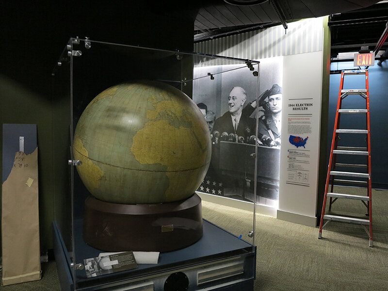
The “election stats” graphics are silkscreened onto Acrylite P-95 with white vinyl film adhered to the second surface. Silkscreening on P-95 creates a subtle shadow, which at certain angles makes the text appear dimensional. (For this reason, it should also be done with caution.) Here’s a photo of the sample provided by Explus, the fabricator (the installed graphic above is waiting for its red dimensional stars to be attached):

Below, the main story panels, used in the World War II gallery, which I am especially happy with:

They’re built from 5/8" clear acrylic, which has been painted on the front surface with acrylic paint, with a “window” left free of paint. The text is printed onto the painted acrylic surface, and then the photo — a Laserchrome metallic print — is adhered to the second surface of the acrylic, within the window area.

The photo above gives you a sense of the depth and jewel box effect created by layering the photo behind the acrylic. And here’s a peek at the backside of the pane. The aluminum angle frames are painted with Matthews acrylic polyurethane paint:

For wall murals I spec’ed DreamScape wallcoverings in various finishes. Above is another photo from the FDR blog, showing a few installed murals (currently missing their dimensional titles, and the scaffolding structure that will be located in front). I’m pleased with the crisp image quality, especially on the rough textures, such as “Plaster” (below, on the left) and “Mystical” (on the right).

Post updated in January 2021 with minor text edits. Broken links have been fixed. This post was originally published at theexhibitdesigner.com on 3 June 2013.

Century of the Child, at MoMA

I stopped in on Century of the Child, “an exploration and celebration of modern design for children in the 20th century,” at the Museum of Modern Art in NY. It was fascinating and delightful, and brought back some memories. For further reading definitely check out the exhibition website, the blog, and the tumblr.

Post updated in January 2021 with minor text edits. Broken links have been replaced with archived URLs, courtesy of archive.org. This post was originally published at theexhibitdesigner.com on 19 August 2012.

The News 08.16.12

A compilation of design-related web finds.

The Google Web Lab at the Science Museum in London | Designing for Accessibility: MoMA’s Material Lab | Harvard Medical School’s “Training the Eye” course | SEGD is hosting a symposium, “The Art of Collaboration” (link no longer available) in Raleigh October 4–5 | The last day to see the Terracotta Warriors in North America is August 26 in Times Square | The National Museum of American Jewish History in Philadelphia now offers free admission for their first floor gallery | Why the Museum of Broken Relationships is so great (it’s not just the name) | 100 Toys that Define Our Childhood — vote for your favorites for a new exhibit at the Children’s Museum of Indianapolis. Voting ends tomorrow, August 17 | Places that Work: U.S. Botanic Gardens | Spiders Alive! at the American Museum of Natural History (NY Times review) | Are some fonts more believable than others? and How to explain why typography matters | I’ve been pinning obsessively over on Pinterest.

Post updated in January 2021 with minor text edits. Broken links have been replaced with archived URLs, courtesy of archive.org. This post was originally published at theexhibitdesigner.com on 16 August 2012.

Another world: the Van Cleef & Arpels traveling exhibit

I am awed by the Van Cleef & Arpels traveling exhibition. But alas, I can only look at photos.

My colleague Zhengyuan saw this exhibit twice. Once while it was on view in NY at the Smithsonian Cooper-Hewitt (where it was called Set in Style) and then again when it moved to MOCA Shanghai (where its name was changed to Timeless Beauty). (When it was on view in Tokyo it had yet another name, Spirit of Beauty.)

Zhengyuan shared photos of the MOCA Shanghai exhibit:

She described the exhibit, “they didn't move the entire exhibit set to Shanghai, but there were some new displays, like the octopus-like structure. The space is very dark ... and the sparkling bubble glass displays make it look like an underwater world!” She thought both versions were fantastic.

The designers, Patrick Jouin, explain: “for this exhibition we wanted the visitors to lose all sense of time, to open a door onto an imaginary world. The nature theme, which is a major source of inspiration for Van Cleef & Arpels, has also influenced the scenography. The pieces in the exhibition are presented in gigantic glass drops. In order to create a sensual and mysterious installation, we have used various types of illusions.”

The photos below are from the Cooper-Hewitt exhibit, taken by Matt Flynn, © Smithsonian Institution:

While both exhibit versions used the bubble glass cases, the Cooper-Hewitt’s version seemed more traditional than MOCA Shanghai’s. Less octopus-structure and more tables and wall vitrines. I’m curious what challenges the designers had to address as they designed an exhibit for travel to four different countries (Japan, the US, Shanghai, and France). In all its iterations, it is a gorgeous exhibition.

Post updated in January 2021 with minor text edits. Broken links have been fixed. This post was originally published at theexhibitdesigner.com on 21 June 2012.

America’s Mayor, at MCNY

Dragging out photos from the archives for your inspiration:

I loved this exhibit at the Museum of the City of New York. America’s Mayor: John V. Lindsay and the Reinvention of News York opened and closed two years ago, but I still remember it for its bold colors and interesting story.

The museum’s description: “America’s Mayor examines the controversial tenure (1966–1973) and dramatic times of New York’s 103rd mayor. The exhibition presents John V. Lindsay’s efforts to lead a city that was undergoing radical changes and that was at the center of the upheavals of the 1960s and 1970s; it highlights Mayor Lindsay’s ambitious initiatives to redefine New York City’s government, economy, culture, and urban design. Through his outspoken championship of city life, commitment to civil rights, and opposition to the Vietnam War, Lindsay emerged as a national figure in a troubled and exhilarating era.”

The bold design pulled me in. I loved the punchy colors used on the murals and inside artifact cases. The images, text treatment, and the clustering of framed print artifacts, all helped to convey the upheaval of the time period.

Artifact vitrines intersect walls in interesting ways — such as the tabletop case above, and the vitrine below, which cuts into the triangular, freestanding wall. I liked the reflective, silver sides of the cases.

Also noteworthy was the amount of information and artifacts on display. Overwhelming, perhaps, for some, but my observation was that the people there were genuinely interested in reading and looking at objects and documents, and for those with shorter attention spans, the large titles provided sign posts to help locate areas that would be of most interest to them.

Post updated in January 2021 with text edits. Broken links have been replaced with archived URLs, courtesy of archive.org. This post was originally published at theexhibitdesigner.com on 10 June 2012.

The News 04.11.12

A compilation of design-related web finds.

Everyone’s been raving about Doug Aitken: SONG 1 at the Hirshhorn — because it’s awesome. I’ve visited twice and would (will) visit at least once more before it closes on May 13. You have to experience it in person.

My former firm, Christopher Chadbourne & Associates, announced their closure. This past summer I accepted a position with Gallagher & Associates, and moved to Washington, DC | In memory of the 100th anniversary of the Titanic’s sinking on April 15, dozens of exhibits about the ship have opened, including the the world’s largest, in Belfast; also: Fire & Ice: Hindenburg and Titanic at the Smithsonian National Postal Museum; Titanic: The Artifact Exhibition, everywhere; Titanic at the South Street Seaport Museum in New York, NY | The Union Pacific Railroad Museum’s Building America traveling exhibit is located in a traveling train car, naturally. The entire museum opens in Iowa in a month | Part 1 in a series of articles describing exhibit design, from Mark Walhimer at museumplanner.org | Blueprint, a guidebook to build your own history museum in the 21st century, from The Museum of the Future | Pinned Inspiration: ice ceiling; purple-sided lightboxes; German Expressionism at the MoMA; education center at the San Diego Children's Museum.

Post updated in January 2021 with text edits. Broken links have been replaced with archived URLs, courtesy of archive.org. This post was originally published at theexhibitdesigner.com on 11 April 2012.

Talk to Me, at MoMA

I’d rather not include too many posts about now-closed exhibits that I saw ages ago, but in the case of Talk to Me at the MoMA, the online exhibit is itself worth exploring.

A simple but compelling design. I liked the pixel illustrations on the introduction wall and the punchy red walls and reader rails.

Post updated in January 2021 with minor text edits. Broken links have been fixed. This post was originally published at theexhibitdesigner.com on 8 April 2012.

The News 05.01.11

A compilation of design-related web finds.

Creating Material Lab at MoMA | Design to Preserve by the Cooper-Hewitt | Coming soon to the Mall? National Women’s History Museum Makes Another Push Toward Existence and National Latino Museum Plan Faces Fight (hint: probably not) |Jurassic Park meets Buckminster Fuller” — a zoo that imagines a reunited Pangea | MoMath, the National Museum of Mathematics in New York, is raising funds | Vertical Urban Factory at the Skyscraper Museum in New York (slide show here) | Architecture in Uniform: Designing and Building for the Second World War at the Canadian Centre for Architecture | The World’s Largest Dinosaurs at the American Museum of Natural History looks amazing (slide show here; I love photo 3!) | La Plaza de Cultura y Artes, Mexican American cultural center in LA, “screens in a public alley space that both bring the stories out of the museum and draw passersby into the experience.” More in this article from GOOD | The National Museum of American Jewish History opens in Philadelphia | Illinois Holocaust Museum & Education Center opens in Skokie (review and slide show) | The Museum of Tolerance in Los Angeles (review and slide show) | The MBTA steps up its “See Something Say Something” campaign, and in Boston’s North Station:

AND an upcoming opening!

Conner Prairie Interactive History Park is opening a new exhibit, 1863 Civil War Journey: Raid on Indiana, in June. Part theater, part living history museum; the interactive experience is centered around a recreation of a Civil War-era town complete with homes, a general store, and a schoolhouse. As part of the Christopher Chadbourne & Associates team, I designed the graphics located in the schoolhouse, where the lessons of the park are pulled together.

I designed a tabletop graphic for a touch table that houses three monitors. It’s meant to appear as though it were strewn with historic maps and military tactical manuals. I also designed a flipbook that holds background information about the park’s characters, in the style of a scrapbook; and a large “chalkboard” wall graphic inspired by Civil War broadsides and illustrated with a map and hand lettering. These were fun graphics to design, geared toward families and school groups.

conner-prairie_interactive-table.jpg

Post updated in January 2021. Broken links have been replaced with archived URLs, courtesy of archive.org. This post was originally published at theexhibitdesigner.com on 1 May 2011.

Music at the MoMA

At the Museum of Modern Art in NY through June 6 is the exhibition Looking at Music 3.0. (Many installation photos at that link.) It explores music’s influence on contemporary art, and vice versa, during the 80s and 90s. Dim lighting, gaudy neon walls, and early music videos blasting on the large screen in the middle of the gallery — it’s as though you’ve returned to the time of boom boxes and mix tapes. Social and political issues are mentioned briefly in the exhibit copy, but there are many topics touched upon in this relatively small space, so don’t expect a thorough history lesson. Art and music are loosely grouped by topics such as “early hip hop” but, fittingly, neither chronology nor subject dictate the layout of the exhibition in an obvious way.

There was a large cushioned platform to sit and watch music videos. There were only a few in the loop, to discourage lingering I’d imagine. What they may not have realized is that people would stay quite awhile to watch Grace Jones. There were listening stations throughout the exhibition (below, left) and an interactive media installation by Perry Holberman (right).

You can read more about the process of creating the exhibit in this blog post, Listening to Art, written by the curator.

Below are photos of the entrance to Picasso: Guitars 1912–1914, an exhibition of 70 collages, constructions, drawings, mixed-media paintings, and photographs. On view through June 6 and definitely worth seeing.

Post updated in January 2021 with minor text edits. Broken links have been fixed. This post was originally published at theexhibitdesigner.com on 20 March 2011.

The News 02.17.11

A compilation of design-related web finds.

The realities of renovating the Barnum Museum in Bridgeport, CT after it was hit by a tornado | The winner of the PaleoArt Prize in 3D art for “achievement in ... depicting or sculpting paleontological subjects and fossils” | China asks the Penn Museum to return all artifacts from its Silk Road exhibition | The New York Times, on scalies | Winners of this year’s MoMA PS1 Young Architects program asked local businesses and nonprofits what materials they needed, then designed the courtyard space to incorporate those materials, with the intention of donating them at the end of the summer | An exhibit of tattooed arms in Paris | And another, of dismembered dandies, in Sweden | South African printmaking at Boston University’s 808 Gallery | Edward Gorey at the Boston Athenæum | Tangible Things at Harvard | The Charles Hayden Planetarium in Boston reopens after a $9 million yearlong reconstruction | The Museum of Arts and Design’s new Center for Olfactory Art | The reopening of the American Museum of the Moving Image; inaugural events continue.

Post updated in January 2021 with minor text edits. Broken links have been fixed or replaced with archived URLs, courtesy of archive.org. This post was originally published at theexhibitdesigner.com on 17 February 2011.

Samurai in New York

Samurai in New York at the Museum of the City of New York, through November 7, “invites visitors to return to the New York of 150 years ago and to share the city’s excitement over the visit of a delegation of more than 70 samurai from Japan — the first Japanese to leave the closed island nation in over 200 years.”

I love the title wall treatment, and that the red and black bands are carried across the entire wall and around the corner. Exhibition and graphic design by PSnewyork. / New York Times review.

Post updated in January 2021. Broken links have been fixed. This post was originally published at theexhibitdesigner.com on 25 October 2010.

American High Style

Mannequins like models on a runway, posed dramatically or playfully, frozen under spotlights in otherwise dimly-lit exhibit rooms. Stylized design details like gold dimensional letters for titles, and the mannequins’ sculpted hairstyles, added just a touch of flair to the restrained presentation.

American High Style: Fashioning a National Collection, at the Brooklyn Museum, is presented in honor of the transferred stewardship of the Brooklyn Museum’s costume collection to the Costume Institute at the Metropolitan Museum, and as a complement to the Met’s exhibit, American Woman: Fashioning a National Identity. The Met’s presentation is decidedly more theatrical, with its painted backdrops, props, wigs, and themed galleries. I haven’t yet seen it in person but I have seen photos, and I plan (to try) to catch it before it closes on August 15. Because that seems like the thing to do: see both and compare them.

But back to the Brooklyn Museum. Do see American High Style, I highly recommend it. And hurry — it closes on August 1.

The layout of the exhibit was straightforward, and it was apparent that a lot of thought was put into its organization. Approximately 85 mannequins were arranged into six groupings: the House of Worth, French Couture 1900–1940 and 1946–1970, the designer Elsa Schiaparelli, the designer Charles James, American women designers, and American men designers. Additionally, there were accessories and design sketches, a wall of rare dolls dressed in the finest French fashions from 1715–1906, and a room filled with shoe prototypes and drawings by Steven Arpad (a highlight). With all this to see, the exhibit was still succinct in its offering, and the accompanying text was interesting to read.

The mannequins stood on plywood “runways” with label text printed directly onto the plywood, with a subtle translucent white screen as first layer. (I'm guessing, as I can't tell for certain from my photographs and my memory fails me. Second guess: applied film. Anyone?) I liked the un-embellished, though still polished, plywood but not the trough-like detail at the front of the “runways.” It would have been cleaner if instead of its V shape, the runway were still angled at the front, but then went straight down, perpendicular to the floor. This was my only (minor) critique of an overall truly nice-looking exhibit.

Post updated in January 2021 with minor text edits. Broken links have been fixed. This post was originally published at theexhibitdesigner.com on 27 July 2010.

Too many mummies

There are SO MANY mummy exhibits right now. There is the heavily-advertised Tutankhamun and the Golden Age of the Pharaohs in New York; Cleopatra: The Search for the Last Queen of Egypt at the Franklin Institute in Philadelphia; Melvin the Mummy at the Brooklyn Museum; Mummies of the World at the California Science Center … and certainly many others which I am not aware of — and then there’s this underwater museum.

And THEN we have — had The Secrets of Tomb 10A at the Museum of Fine Arts Boston. I’ve taken so long to post about this exhibition that it seems to have closed. Yesterday. Sorry. Truly sorry. I liked the exhibit very much. You should have seen for yourself that it was a perfect balance of anthropology and art; it was fascinating and beautiful.

The story of Tomb 10A goes something like this: It was the tomb of the high official Djehutynakhts (pronounced “je-hooty-knocked”), discovered in 1920 by a group of Harvard University/Boston Museum of Fine Arts archeologists. Inside was the largest funerary assemblage of a Middle Kingdom (2040–1640 BC) official ever found intact (despite the tomb’s having been robbed in antiquity): four coffins, walking sticks, pottery, canopic jars, wooden models of daily life, and a disembodied head (great New York Times article). Egypt gave the entire collection to the MFA and sent it along to Boston. It met with some minor setbacks en route — not least, the collection’s catching fire — but arrive it did, only to be mostly tucked away in storage for ninety years. This exhibition was the first time that everything from the tomb has been put on display.

Walking into the exhibit, you first see a statue, representative of Egypt during the Middle Kingdom, standing in front of large, richly moody photographs of the area around the tomb. This first room sets the stage: information about Egypt during Djehutynakht’s time, introductions to the “cast of characters,” and a description of how the exhibit was organized. In the next room you’ll see objects from the actual tomb, in the third room you’ll see what was missing from the tomb, and in the final room you’ll learn about the archeological investigations still underway on the site. I appreciated this road map of what was to come in the relatively large exhibit. It helped to keep clear in my mind where I was within its organization. But, it begs the question, for non-museum-design/development-types: Is information like this important to you? Do you find it helpful? Do you even notice it?

The second room, below, was by far my favorite part of the exhibit. The wooden models were all gorgeous, and I love the simplicity of the wall of boats. The artifact displays throughout were sparse and reverential, arranged simply and tastefully. Absolutely lovely. The color palette was nice as well. (Speaking of colors, have you ever wondered about Egyptian color symbolism? Of course you have.)

I’ve also recently seen The Mummy Chamber at the Brooklyn Museum in New York (below). While Tomb 10A is dark and moody, The Mummy Chamber is bright, bright, bright — especially on a sunny summer afternoon. It too has some nicely currated artifact cases, though I prefer the moodiness of the MFA show. The Mummy Chamber exhibit is still open.

Post updated in January 2021 with minor text edits. Broken links have been fixed. This post was originally published at theexhibitdesigner.com on 29 June 2010.

The News 06.23.10

A compilation of design-related web finds.

Sometimes it seems like there really is a museum for and about everything. Name a topic, and I bet you can find an obscure museum dedicated to it. Tractors? Barbed wire? Plastics? Architectural models? Chinese shadow puppets? Battlestar Galactica? | Natural history exhibits opening this summer, in no way exhaustive: Whales at the Museum of Science, Boston (they offer a museum admission/whale watch ticket combo); The Deep at the Natural History Museum, London; Race to the End of the Earth, about Arctic explorers, at the American Museum of Natural History; the AMNH’s Climate Change exhibit moves to the Field Museum in Chicago; Age of Mammals, a “a postmodern diorama” in the Natural History Museum of Los Angeles’s newly restored 1912 building | This photo of the Smithsonian Natural History Museum’s collection of thousands of birds is just great | A Micro Museum for the Design of and with Typography; Typopassage Vienna is inside the Museumsquartier in Vienna and open 24 hours a day, every week of the year. (Curious; who’d be there at 4am?) | Shape Lab, an interactive educational space for families. Who wouldn’t want to play there? | The British Museum and Wikipedia’s unusual collaboration.

Post updated in January 2021 with minor text edits. Broken links have been fixed or replaced. This post was originally published at theexhibitdesigner.com on 23 June 2010.

The News 04.13.10

A compilation of design-related web finds.

Grab a Museum Discovery Pass next time you’re in New York for 2-for-1 admission to seven of the city’s smaller, more specialized museums such as the American Folk Art Museum or Asia Society Museum | A green consulting company gains extra LEED points by effectively turning their office into an indoor jungle | The National September 11 Memorial & Museum announced that it will receive $2.29 million from the Lower Manhattan Development Corporation and released renderings of the exhibit design (renderings link no longer available; instead, an opinion on the building’s architecture) | MoMA’s upcoming design and architecture exhibition, Talk to Me, to explore “the communication between people and objects,” won’t open until next July, 2011 but in the meantime follow the exhibition blog | Esther Stocker’s installations, discovered via BLDGBLOG | Also seen on BLDGBLOG: Pulse Room, from 2006, an “interactive installation featuring one to three hundred clear incandescent light bulbs, the brightness of which was controlled by an interface and sensor that could detect the heart rate of participants” | And another light installation: UVA: Speed of Light is an immersive laser-based light installation and sound experience in London, up through April 19 | Endangered animals built from Legos by Sean Kenney for the Philadelphia Zoo exhibit Creatures of Habitat: A Gazillion-Piece Animal Adventure.

Post updated in January 2021 with minor text edits. Broken links have been fixed, replaced, or replaced with archived URLs, courtesy of archive.org. This post was originally published at theexhibitdesigner.com on 13 April 2010.

The News 03.30.10

A compilation of design-related web finds.

The Future is Collaborative from the Center for the Future of Museums; a call for libraries, archives, and museums to share resources | The MoMA blog has chronicled the development of the museum’s newest exhibition, Rising Currents: Projects for New York’s Waterfront, since November. ArchDaily has a descriptive article about the projects on view | Across the Atlantic? Another show about sustainability, Sustainable Futures, just opened at Design Museum London | Once you start to explore the Museum of Online Museums (review) just try to stop | The Art Handling Olympics, “a combination roast, ‘Jackass’-style stunt extravaganza, and excuse to drink a lot” | The Regent’s Place Pavilion in London looks beautiful in photos | I saw these sliding shelves and thought, hm ... add descriptive labels or an interactive prompt, and you’ve got yourself a nice display case. Or maybe I just see “museums” everywhere.

Post updated in January 2021 with minor text edits. Broken links have been fixed or replaced. This post was originally published at theexhibitdesigner.com on 30 April 2010.

The News 03.23.10

A compilation of design-related web finds.

The exhibition China Design Now at the Portland Art Museum transformed the city and demonstrated the four Cs of relevant museum experiences: Content, Conversation, Curation, and Continuation | I’m spending some quality time in the New York Times Museums Special Section | D-Shape printer uses sand and magnesium-based glue to print 3D rock sculptures ... potentially entire buildings ... potentially on the moon | The Curno Public Library in Italy is a “monolith of concrete pigmented with iron oxides, completely decorated with a bas-relief engraved with the letters of the alphabet.” Beautiful | Frank Gehry uses plywood in some funky ways for the Signature Theater Company in NY | Photos from Shanghai as it prepares for the 2010 World Expo — amazing creativity.

Post updated in January 2021 with minor text edits. Broken link has been replaced with archived URL, courtesy of archive.org. This post was originally published at theexhibitdesigner.com on 23 March 2010.

Naked Ambition

About a month or two back I visited the Museum of Sex in NY — an unfortunate time to visit, as they were in the midst of a renovation that closed off their main entrance and rerouted the visitor flow to a back stairwell coated with drywall dust and redolent with body odor. (Because of the construction? Just the usual aroma of the museum? Not sure. Moving on.)

On view during that time was Naked Ambition, an exhibition of Michael Grecco’s photographs taken at the AVN Awards in Las Vegas (the “Oscars of porn”). The photos and their accompanying text were from the Naked Ambition art book, and the videos on view were clips from the Naked Ambition documentary.

Within the exhibition and on the accompanying website (link no longer available), the entire undertaking is described as “an R rated look at an X rated industry.” I think that description is fitting. The exhibit (photos of porn stars) and certainly this museum (about sex) are not everyone’s cup of tea and if your sensibilities are easily offended, you will be offended. Subject matter aside, I thought the photography was quite good, and the subjects’ stories were interesting. And since this blog is foremost about exhibition design, I am now moving on, again.

nakedambition1.jpg

Lowercase Helvetica Rounded for the title, and the script typeface used for the “nicknames” above the photographs gave the exhibition just a touch of kitschy punch without distracting from the photographs. Overall, the design was pretty understated.

The biography text was too small and the line lengths too long, which made them difficult to read. A nice touch on these is the way they were produced: the entire text box was printed on vinyl with the names cut from the black band so that the wall showed through. I liked that.

There was an issue with shadows. The photos were all spot-lit from above, and in some areas this caused the frames to cast deep shadows over the text. It’s important to consider how shadows will affect graphics and other objects on display.

In addition to Spotlight on the Permanent Collection, there was a third temporary exhibit: Action: Sex and the Moving Image. I liked the design of the graphics, reminiscent of marquees, especially when backlit — as were the secondary-level stories. Since the room was so dark, though, reading the larger primary-level stories was difficult. (They were vinyl applied to the wall.) The tabletop screens made good use of the gallery space.

Post updated in January 2021 with minor text edits. Broken links have been fixed. This post was originally published at theexhibitdesigner.com on 13 March 2010.

The News 03.02.10

A compilation of design-related web finds.

Design Museum Boston (update: now simply, Design Museum) is all set to pop-up in the window of an abandoned storefront near you | A video tour of the “Biology Range” at the New York State Museum, where they keep their preserved biological specimens | The Mercedes-Benz Museum in Stuttgart has the World’s Largest Artificial Tornado inside; the ventilation system draws in smoke from the building and sends it up and out an exhaust vent | Another German museum, another car museum: exploded views from the Porsche Museum (also in Stuttgart) and the Harley Davidson Museum (in Milwaukee) | If cars are not your thing but exploded views are, you might instead enjoy one of an Etch A Sketch | Multiple Shadow House by Olafur Eliasson at the Tonya Bonakdar Gallery in NY: “The individual lights are all different colors, but they create white light when they all blend on a single wall. As visitors walk in front of the light sources, that hides certain colors — thus freeing the rest to reveal themselves as colored shadows.” | The One Day Poem Pavilion “demonstrates the poetic, transitory, site-sensitive and time-based nature of light and shadow.”

Post updated in January 2021 with minor text edits. Broken link has been fixed. This post was originally published at theexhibitdesigner.com on 2 March 2010.

Look down: memorable exhibit floors

The commercial carpeting seen on the floors of so many museums is oftentimes blah, ugly, or at best: invisible. The floor is a perfect place to execute a creative idea. It’s a fresh, unexpected spot. Here are some examples:

On the floor outside the entrance to Tim Burton at the Museum of Modern Art in New York, is a spiral that collides with and veers up onto the wall, ending in an arrow that points the way to the gaping maw at the exhibition entrance. Clearly inspired, in general, by Mr. Burton’s distinctive style — and perhaps directly by this painting mentioned in MoMA’s blog — the spiral is fun and my favorite design detail from the exhibit.

Within the Exploring Space exhibit at the Connecticut Science Center, there are stars above and around you, in the form of tiny flickering LED lights embedded in the fabric-covered walls — and there are stars below you, projected onto the floor by GOBOs. This dark, starlit room allows you to pretend you are in deep space. (More from that museum visit in this blog post.)

In the Hall of Mammals at the National Museum of Natural History in Washington, DC, there is a treat for those who spend any time looking at their shoes: fossilized footprints visible through the floor. Below, on the left, is another example from that same exhibit. Because the video monitors were set in a row, many people could stand around and watch without crowding, and because they were set into the floor, the short video (about animals’ adaption to the wet and dry seasons of Africa) didn’t distract from the exhibitry. (More from that museum visit in this post.)

Above, on the right, is a reproduction of a 13'-square battlefield map of Gettysburg from Big! at the National Archives Museum. Walking on and looking down at this huge, beautiful, old map was more engaging than had it been traditionally hung on the wall.

Green Community at the National Building Museum in DC had a few interesting things going on with the floor: 1. More than one type of flooring material was used, which gave the floor variety in textural feeling underfoot; 2. Varied and interesting colors and patterns on the floor; 3. The exhibit’s main messages were integrated directly into the floor. Overall, the effect was very impressive. (More from that exhibit visit in this post — my very first blog entry!)

These are just a few I’ve seen. I’d love to hear about an exhibition floor you’ve seen that made an impression.

Post updated in January 2021 with minor text edits. Broken link has been fixed or replaced. This post was originally published at theexhibitdesigner.com on 1 March 2010.