CCA

The News 04.11.12

A compilation of design-related web finds.

Everyone’s been raving about Doug Aitken: SONG 1 at the Hirshhorn — because it’s awesome. I’ve visited twice and would (will) visit at least once more before it closes on May 13. You have to experience it in person.

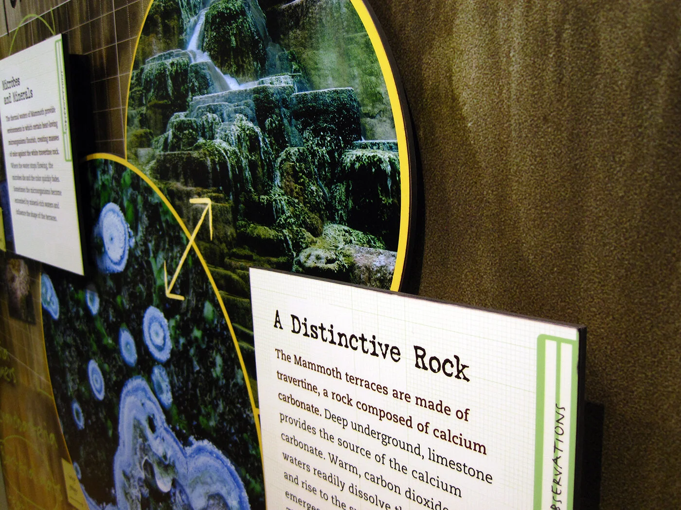
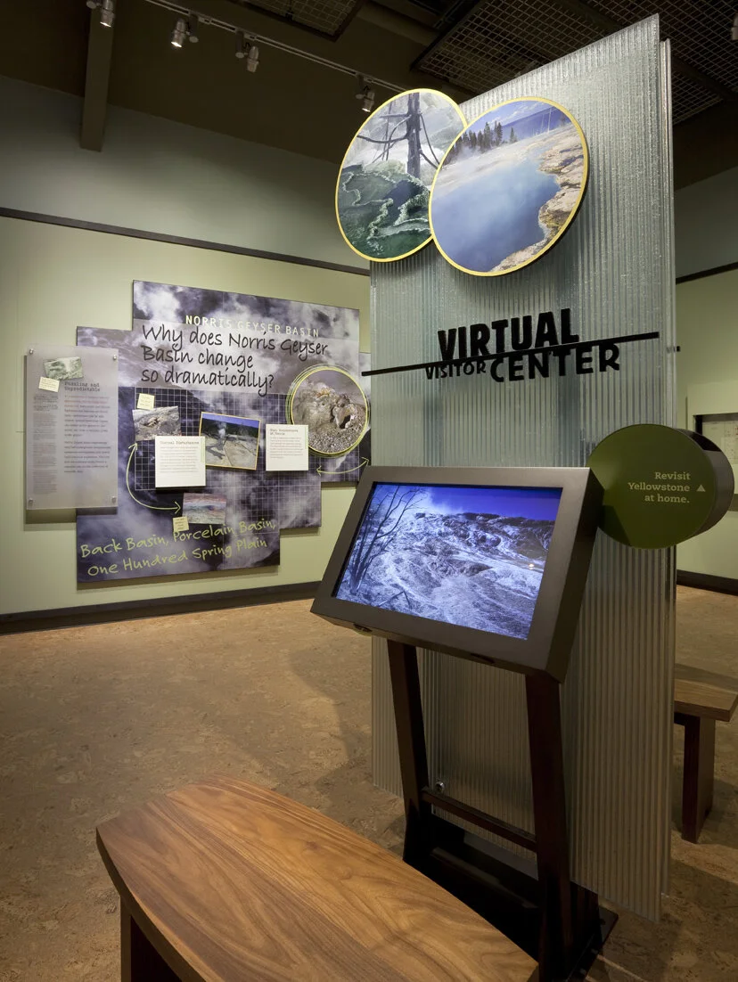
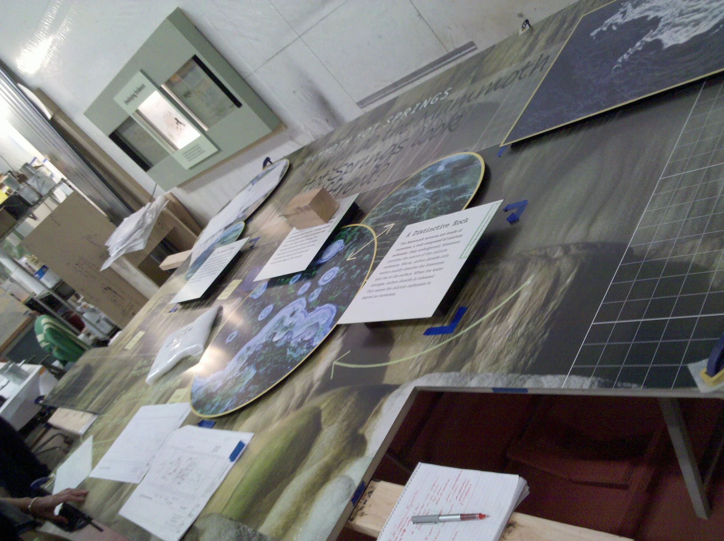
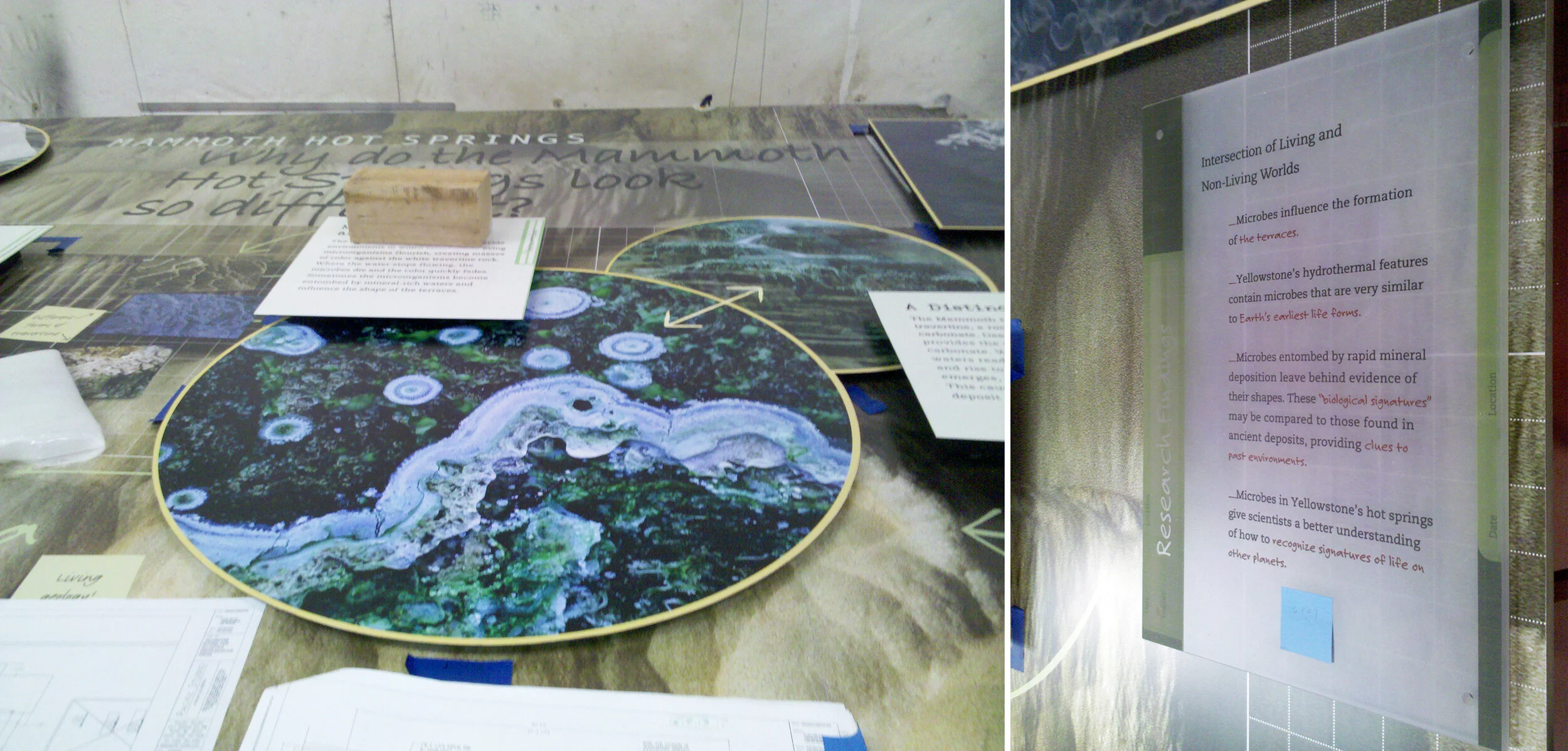
My former firm, Christopher Chadbourne & Associates, announced their closure. This past summer I accepted a position with Gallagher & Associates, and moved to Washington, DC | In memory of the 100th anniversary of the Titanic’s sinking on April 15, dozens of exhibits about the ship have opened, including the the world’s largest, in Belfast; also: Fire & Ice: Hindenburg and Titanic at the Smithsonian National Postal Museum; Titanic: The Artifact Exhibition, everywhere; Titanic at the South Street Seaport Museum in New York, NY | The Union Pacific Railroad Museum’s Building America traveling exhibit is located in a traveling train car, naturally. The entire museum opens in Iowa in a month | Part 1 in a series of articles describing exhibit design, from Mark Walhimer at museumplanner.org | Blueprint, a guidebook to build your own history museum in the 21st century, from The Museum of the Future | Pinned Inspiration: ice ceiling; purple-sided lightboxes; German Expressionism at the MoMA; education center at the San Diego Children's Museum.

Post updated in January 2021 with text edits. Broken links have been replaced with archived URLs, courtesy of archive.org. This post was originally published at theexhibitdesigner.com on 11 April 2012.

The News 05.01.11

A compilation of design-related web finds.

Creating Material Lab at MoMA | Design to Preserve by the Cooper-Hewitt | Coming soon to the Mall? National Women’s History Museum Makes Another Push Toward Existence and National Latino Museum Plan Faces Fight (hint: probably not) |Jurassic Park meets Buckminster Fuller” — a zoo that imagines a reunited Pangea | MoMath, the National Museum of Mathematics in New York, is raising funds | Vertical Urban Factory at the Skyscraper Museum in New York (slide show here) | Architecture in Uniform: Designing and Building for the Second World War at the Canadian Centre for Architecture | The World’s Largest Dinosaurs at the American Museum of Natural History looks amazing (slide show here; I love photo 3!) | La Plaza de Cultura y Artes, Mexican American cultural center in LA, “screens in a public alley space that both bring the stories out of the museum and draw passersby into the experience.” More in this article from GOOD | The National Museum of American Jewish History opens in Philadelphia | Illinois Holocaust Museum & Education Center opens in Skokie (review and slide show) | The Museum of Tolerance in Los Angeles (review and slide show) | The MBTA steps up its “See Something Say Something” campaign, and in Boston’s North Station:

AND an upcoming opening!

Conner Prairie Interactive History Park is opening a new exhibit, 1863 Civil War Journey: Raid on Indiana, in June. Part theater, part living history museum; the interactive experience is centered around a recreation of a Civil War-era town complete with homes, a general store, and a schoolhouse. As part of the Christopher Chadbourne & Associates team, I designed the graphics located in the schoolhouse, where the lessons of the park are pulled together.

I designed a tabletop graphic for a touch table that houses three monitors. It’s meant to appear as though it were strewn with historic maps and military tactical manuals. I also designed a flipbook that holds background information about the park’s characters, in the style of a scrapbook; and a large “chalkboard” wall graphic inspired by Civil War broadsides and illustrated with a map and hand lettering. These were fun graphics to design, geared toward families and school groups.

conner-prairie_interactive-table.jpg

Post updated in January 2021. Broken links have been replaced with archived URLs, courtesy of archive.org. This post was originally published at theexhibitdesigner.com on 1 May 2011.

Old Faithful Visitor Education Center (Happy Holidays)

Work shown was completed while I was a designer at Christopher Chadbourne & Associates.

This vintage Yellowstone ornament, a gift from my dad, holds extra significance because of my work on the design of the Old Faithful Visitor Education Center in Wyoming. The Education Center held its Dedication Ceremony and Grand Re-Opening earlier this year, on August 25.

000 yellowstone COMP_0106_o.jpg

The Old Faithful Visitor Education Center teaches the science behind Yellowstone National Park’s stunning hydrothermal and geological features.

As part of the Christopher Chadbourne & Associates design team, I worked on Design Development, and the Production Services phase. Ernesto Mendoza was the senior graphic designer.

Here’s a project description at SEGD that goes into detail about the design considerations and process, and an article from inhabitat with more photographs.

(The good photographs (i.e. those to the left and below, and the three at the bottom of this post) are by Jay Rosenblatt.)

023 yellowstone img_0150.jpg

I took on a lead design role for the Yellowstone is a Natural Laboratory area, and developed the visual concept, inspired by scientists’ gridded field notebooks. The entire exhibit, and this area in particular, used many interactive elements to explain complicated scientific concepts in an accessible way.

christine-lefebvre-yellowstone-visitor-center-title.jpg
IMG_2944.JPG
christine-lefebvre-yellowstone-visitor-center-lake.jpg
christine-lefebvre-yellowstone-visitor-center-norris.jpg

Here’s an elevation of the Norris Geyser Basin section (the graphic design was tweaked after this):

6.3 Norris Geyser.jpg
christine-lefebvre-yellowstone-visitor-center-interactive.jpg
christine-lefebvre-yellowstone-visitor-center-interactives.jpg
035 yellowstone _mg_3631.jpg
021 yellowstone img_0125.jpg
old-faithful08.jpg
042 yellowstone _mg_3658_o.jpg
old-faithful01.jpg

And because it’s fun to look back, here are some photos from a shop visit at Pacific Studio. It’s always exciting to see designs mocked up like this. (Not as exciting as the final exhibit, of course!) We used a lot of direct print on frosted P95 acrylic, and digital prints applied to sign blank (wrapped with an overlam), for graphic panels.

2010-06-28 12.57.54.jpg

Post updated in January 2021. Broken links have been fixed. This post was originally published at theexhibitdesigner.com on 26 December 2010.

Build Boston 2011: Touring the MFA

GUEST POST

Writing and photography by Katelyn Mayfield, an exhibit designer at Christopher Chadbourne & Associates. She has a Bachelor of Architecture degree from the Rhode Island School of Design. In her spare time, she makes handstitched books.

After a private tour of the Museum of Fine Art Boston’s new Art of the Americas wing, given by architect Adi Toledano of CBT Architects, I now feel certain that Boston has a world class museum. The tour was given prior to the wing’s grand opening as part of Build Boston. We got up close and personal with the details since almost no one was around, except security guards and last minute glass case cleaners.

My first response in the galleries was to the artifact display cases. These cases were undeniably eye-catching, like no other. The glass was crystal clear, completely devoid of prints of any kind. When standing on one side of a case, I could see perfectly through it and into cases beyond because of the impeccable clarity. The sleekness of the cases also succeeds in hiding complex mechanics, as described in this article. All 200 cases in the new wing were designed, manufactured, and assembled in Milan, Italy by Goppion Museum Workshop before they were shipped to Boston for installation. Goppion has also created display systems for the Mona Lisa at the Louvre and the Crown Jewels of England, among others, so high quality craftsmanship is a given. And once I got past the perfection of the cases, the artifacts inside were not so bad themselves!

Sir Norman Foster along with Foster + Partners was the Design Architect and creative masterminds of the new wing. Our guide, Adi, kept repeating, “Foster wanted ‘everything to line up’”, meaning everything had to be flush. Foster gets what Foster wants. He was knighted in 1990 and won the Pritzker Architecture Prize for his entire portfolio in 1999, the most prestigious international prize awarded in the field of architecture. He was also awarded the American Institute of Architects Gold Medal in 1994. I think he is worthy of dictating every detail, as he did in this project. No detail was overlooked and all components work harmoniously. It was the responsibility of CBT, the local architect of record, to design the actual details that accomplished this harmony. For me, highlights were the “landscape corridor,” the day-lighting strategies, and the details that made “everything line up.”

The landscape corridor is a thoughtful nod to the existing museum structure and the outdoors. Between the original building and the new building, a narrow 6' space is left full of vegetation. While in the main courtyard, which has two elevations of three-story-high glass walls, the corridors are visible on either side. The natural light, the view of the vegetation and the sky beyond, and the height of the ceiling makes this space feel like an actual outdoor courtyard. The landscape corridor is also visible when crossing over the enclosed bridges from the new wing to other wings. It really is a nice sight.

The main concept of the day-lighting strategy is based on indirect light. It’s seemingly simple; very successful. Because all four floors of the wing open onto small glass vestibules which open to the stairways, and then to the courtyard, all four floors have indirect natural light access. Sunlight is obviously harmful to artwork and artifacts, but otherwise a welcome source of light. The solution to safely utilizing this indirect light was to diffuse it through two layers of glass.

This idea that “everything must line up” is showcased in every aspect of the architecture; from the construction of the walls, to the lighting in the ceiling, to the emergency exit signs. The wall surface uses the skim coat plaster technique that is superior to average drywall. It is labor intensive — thick coats of plaster are applied to an expanded wire lath — however, it provides better durability and ease of replacing single spots of wall if necessary.

Even the smallest components, the exit signs, were meticulously executed. In the auditorium, which is covered in wood paneling, a sign protruding perpendicularly from the wall would not do at all. Instead, the letters E-X-I-T were cut into the wood and green light shines through from behind. Apparently this small project in itself was not easily accomplished. It took much compromise and discussion from the Boston Fire Department. The outcome is sleek and yes, “lined up.”

Then there is the door to the bathroom hallway. So well done! The door has no molding, no knob, no latch; it’s a push door, double swing, that extends all the way to the ceiling, with just a 1/4" gap between.

I also have to mention the graphics. The explanatory texts were short and sweet, subtle yet still noticeable. I appreciated the subdued graphics and simple 1" deep panels painted the same color as the wall. This created a different visual plane to draw your attention, but allowed the artwork and artifacts to take the lead. Within the cases, small numbers on tiny frosted pieces of glass show you which artifact matches up with which label below. In any case, go see the Boston MFA’s new wing. It is elegant, modern, and simply beautiful.

Post updated in January 2021. Broken links have been fixed or replaced with archived URLs, courtesy of archive.org. This post was originally published at theexhibitdesigner.com on 1 December 2010.

Old Faithful Visitor Center’s grand opening

I took a trip out West last week, with my colleagues from Christopher Chadbourne & Associates, for the grand opening of the Old Faithful Visitor Education Center in Yellowstone National Park. Exciting! Post soon!

I have a somewhat hefty backlog of content for the blog. Some of it dates to when we were wearing knit hats and snow boots. I hope to have it all up asap.

Update: I got most of them. Changing Earth | Electricity | State of Deception | Cars, Culture, and the City | America’s Mayor | Samurai in New York | New England Habitats | Mass MoCA | Old Faithful Visitor Center

Post updated in January 2021. Broken links have been fixed. This post was originally published at theexhibitdesigner.com on 29 August 2010.

I love the Infantry Museum

I love the infantry because they are the underdogs. They are the mud-rain-frost-and-wind boys. They have no comforts, and they even learn to live without the necessities. And in the end they are the guys that wars can’t be won without.

— Ernie Pyle

3663088152_2719e4b083_c.jpg

This past week I went down to Columbus, Georgia to see Christopher Chadbourne & Associates’s National Infantry Museum at Fort Benning. I worked on this project as a junior designer — I helped to finalize design drawings and produced final graphic design files. (Brent Johnson was the lead exhibit designer, and Jeff Stammen the lead graphic designer.) I suppose I cut my exhibit design teeth on this one. I learned SO MUCH about the design process while working on this. And I know all these graphics so well — it’s thrilling to see them realized, and in person. It was an honor to work on this museum.

3662317079_b59e1794d3_k.jpg
3662289083_caa2fd494e_c.jpg
3662312977_7ba0fdd5af_c.jpg
3663116074_775bc1f085_c.jpg
3663093094_619baa7b46_c.jpg
3662549865_9547275977_c.jpg
3662292219_65c5685a05_c.jpg
3662306275_62a45a58b5_c.jpg
3663101462_13b54694cb_c.jpg
3662301917_a8dca51e26_c.jpg
3662303971_56e07a4fd0_c.jpg
3663116830_126434212d_c.jpg
3663117450_6f3d182f7b_c.jpg
3662301179_f5d7e69775_c.jpg
3663097234_5befa0bb84_c.jpg
3663118116_1ace7be532_c.jpg

Post updated in January 2021. This post was originally published at theexhibitdesigner.com on 2 May 2010.

The News 01.19.10

A compilation of design-related web finds.

L.A.’s Natural History Museum to receive $1-million grant for new permanent exhibition | Rising Currents: Projects for New York’s Waterfront — I’ve been following with interest the progress of the program and upcoming exhibit on the MoMA/P.S.1 blog | Towards a New Mainstream? On 27 January 2–3pm EST, a lecture by Gregory Rodriguez exploring demographic change in the Americas, cultural transformation, and the future of museums | Color Identifying System for the Color Blind | An Increasing Craving for Experiences; there has been a lot written lately about experience-over-stuff — hello, museums! | Light Touch interactive projector turns any flat surface into a touchscreen | An Architect’s Philosophy of Photography | Steffen Dam: Specimen Panels These are beautiful; very “natural history museum” | Barton’s Bonbonniere, From Architectural Forum c. 1952 — I love it! What a fun space.

AND NOW, something from the portfolio:

Work shown was completed while I was a designer at Christopher Chadbourne & Associates.

Perfectos.jpg

This time last year (January 17, 2009), the Tampa Bay History Center — designed by Christopher Chadbourne & Associates — held its grand opening in downtown Tampa, Florida. I worked closely with the project’s senior graphic designer Jeff Stammen on design development.

(Photo above and first three photos below, courtesy Tampa Bay History Center.)

Cattle.jpg
Container.jpg
07 Tampa Bay History Center 214_sm.jpg

I took a leading design role for the timeline (Your Tampa Bay) and the War Stories gallery. Below is my sketch of the War Stories gallery, and below that, a photo I took during installation — hence the empty case.

theexhibitdesigner_TBHC-war-stories-install.jpg

All the graphics in this museum were designed with both English and Spanish text. I love the challenge of designing multilingual graphics.

I was also responsible for Construction Administration, and supervised the exhibit installation. I love shop visits, site visits, inspecting fabrication samples … all of that. What happened with the Tampa installation was a little … let’s just say, complicated. The local fabricator, Creative Arts, was fantastic and saved the installation day in a lot of ways. I ended up effectively living in a hotel room for a couple weeks during the tail end of installation — much longer than my trip to Tampa was supposed to be. It was quite the learning experience. In hindsight, I can say I had fun.

(Photo above and photo below, courtesy Tampa Bay History Center.)

Your_Tampa_Bay.jpg
tampa_092.JPG
tampa_290edit.jpg

Post updated in January 2021. Broken links have been fixed or replaced with archived URLs, courtesy of archive.org. This post was originally published at theexhibitdesigner.com on 19 January 2010.

A thought or two on curved reader rails

I have been working on some curved reader rails and I feel for anyone who has to design them regularly — they involve advanced geometric wizardry that can make your head spin. (Or not ... but actually, yes, they are tricky.)

Below are two curved reader rails in the Ocean Hall at the National Museum of Natural History in DC. On the left is a rail that looks as though its graphics were not laid-out correctly; I’d guess that the text blocks and graphic elements are angled, but not CURVED to match the round rail edges, which makes the graphic look a little wonky. Look specifically at the text “Meet Phoenix” — see how it angles toward the text block below it? (But how cute is that whale illustration?) On the right, from the same exhibit, another curved rail. It’s a much simpler design, and it works: just two lines of text, set on a baseline curved to the radius of the rail.

Below is a reader rail that I designed for the National Museum of the US Army in Fort Belvoir, Virginia. (We — Christopher Chadbourne & Associates — are still in Design Development so text and images are not final.)

It will ultimately surround a circular, glass-enclosed diorama. Every line of text is on its own track, curved to the radius of the rail; in fact, all graphic elements, including lines and images, have horizontal lines curved to that radius. It took a long time to lay this out.

curved rail2.jpg

Update, 2021: The museum is now open (!!) — but also temporarily closed due to Covid-19 — and you can see the round reader rail and diorama in the photo of the Cold War gallery on the NMUSA website.

Post updated in January 2021. Broken links have been fixed, replaced, or replaced with archived URLs, courtesy of archive.org. This post was originally published at theexhibitdesigner.com on 10 January 2010.

Picturing the Promise

The Scurlock Studio and Black Washington: Picturing the Promise — a collaboration between the National Museum of African American History and Culture and the National Museum of American History — is currently on view in the NMAAHC gallery within NMAH. You have about two months to catch it; it closes on February 28. Construction of the NMAAHC’s permanent home on the mall is scheduled to begin in 2012, and its opening is scheduled for 2015.

This exhibit was designed by Christopher Chadbourne & Associates. I assisted with the graphic design.

theexhibitdesign_chadbourne_scurlock1.jpg
theexhibitdesign_chadbourne_scurlock2.jpg

Post updated in January 2021 with minor text edits. Broken links have been fixed or replaced with archived URLs, courtesy of archive.org. This post was originally published at theexhibitdesigner.com on 3 January 2010.