dc1

Openings and Closings: The past seven months

It’s been busy, busy, busy here at Christine Lefebvre Design since I last posted — seven months ago! — about the Baselitz and Lozano-Hemmer exhibitions at the Hirshhorn.

clefebvredesign_newseum_digital1.jpg

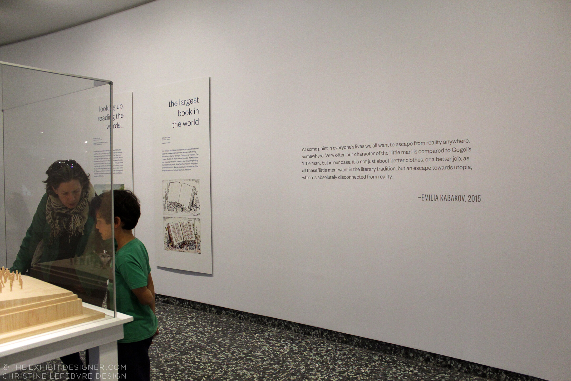
Around the same time, and since, we’ve seen a bunch of openings: Five Communities at the National Law Enforcement Museum; Digital Disruption and A Deadly Attack at the Newseum; Habitat for Smithsonian Gardens; Hoops at the National Building Museum; Wíwənikan…the beauty we carry at the Colby College Museum of Art; and Man Walks on the Moon for the Newseum, at Dulles and Reagan Airports.

A few are already nearing the ends of their runs! If you have a chance to visit any, I would love to hear from you about what you thought of them.

The Newseum will close its doors on December 31, 2019 (though the Freedom Forum and the Newseum’s collection will carry on). It’s your last chance to see Digital Disruption in the News History gallery, and the rest of the museum’s incredible exhibitions.

I worked with the Newseum on three “pop-up” exhibitions, on view concurrently at Reagan National Airport and Dulles International Airport. The first of these, Man Walks on the Moon, is closing this week.

cld_newseum_manwalksonmoon.jpg

Another pop-up at Dulles and Reagan airports will soon take its place — the exhibitions are currently being installed — followed by a third in the spring.

Also closing soon is Hoops: Community Portraits by Bill Bamberger at the National Building Museum. Hoops will close on December 1, 2019, after which the museum will close temporarily from December 2 until March 2020. The gist of a glowing review from a friend: “I thought this wouldn’t interest me because I could care less about basketball, however … this is a really great exhibit!” That sounds underhanded, but I assure you they really liked it.

4-2019_03_21_nbm_hoops_cld-0150_be-1.jpg

When the Building Museum reopens, you can look forward to my next exhibition for them, Alan Karchmer: The Architects’ Photographer.

Wíwənikan…the beauty we carry at the Colby College Museum of Art will close on January 12, 2020. If you find yourself in the Waterville, Maine area please pay a visit.

cld_wiwenikan-1.jpg

And that takes us through the end of 2019! If you miss the exhibitions that are closing soon, Smithsonian Gardens’s Habitat will remain on view (all over the National Mall) through at least December 2020, and of course there are those three upcoming openings. Until our next check-in....

Post updated in January 2021 with minor text edits. Broken link has been replaced with archived URL, courtesy of archive.org. This post was originally published at theexhibitdesigner.com on 29 October 2019.

Two more at the Hirshhorn Museum

Phew! It has been a busy 14+ months since I last posted. (14 months?! Oh my....) In that time, I’ve designed seven exhibitions of varying size and scope, four print projects, and three large production jobs. I am currently in early design development for an exciting project in Maine, and then there is the typical day-to-day of running a small design studio. Yep, just sitting around eating bon-bons.

In an attempt to get back into posting on The Exhibit Designer, I am kicking off with a book-end to my last post: two more exhibitions at the Hirshhorn Museum. These two were both located in the same gallery, and were on view one right after the other.

the-exhibit-designer_christine-lefebvre_Hirshhorn_Baselitz-escalator
the-exhibit-designer_christine-lefebvre_Hirshhorn_Baselitz-entrance

Baselitz: Six Decades ran from June 21, 2018 through September 16, 2018, then Rafael Lozano-Hemmer: Pulse opened in its place on November 1. Pulse is on view for another month, if you’d like to check it out.

the-exhibit-designer_christine-lefebvre_Hirshhorn_Pulse-entrance

The title treatment for Pulse played on the visual of the pulsing incandescent light bulbs hanging from the ceiling in Lozano-Hemmer’s installation Pulse Room …

the-exhibit-designer_christine-lefebvre_Hirshhorn_Pulse-detail

… while the title for Baselitz was a straight-forward title lockup. An early concept, in which “George” and “Baselitz” were alternately flipped upside down (Baselitz is known for his “inverted” paintings) was rejected, and I am a little sad for what could have been.

the-exhibit-designer_christine-lefebvre_baselitz-concept
the-exhibit-designer_christine-lefebvre_Hirshhorn_Baselitz-escalator2

In the end, the final title lockup and entry wall treatment created a neat refraction effect when ascending the escalator, as the letters reflected in the glass.

Post updated in January 2021 with minor text edits. This post was originally published at theexhibitdesigner.com on 25 March 2019.

The Utopian Projects and What Absence Is Made Of

The Markus Lüpertz exhibition I shared in my last post is no longer on view at the Hirshhorn — it came and went so quickly! — but the museum has two other exhibitions currently on view for which I designed the graphics. First, Ilya and Emilia Kabakov: The Utopian Projects:

the-exhibit-designer_christine-lefebvre_Hirshhorn_Kabakov-entrance
the-exhibit-designer_christine-lefebvre_Hirshhorn_Kabakov-entrance2

Working in collaboration with the museum’s design department, I designed the exhibition’s title wall, didactic graphics, and wall quotations.

The title wall graphic is printed on DreamScape’s self-adhesive wallcovering, Caviar texture. I like the print quality of DreamScape wallcoverings — I first spec’ed them for the exhibits at the FDR Museum, and have used them a few times since. The wallcovering was installed using butt seams. The installers (Blair, Inc. in Virginia, also the graphics fabricator) wrapped the wallcovering around the wall’s edges, a tricky detail that would have looked terrible if done poorly.

the-exhibit-designer_christine-lefebvre_Hirshhorn_Kabakov-exhibition2

The graphic panels are digital prints wrapped on sign blank with a matte over-laminate. They are hung on French cleats (simple but strong), which is an easy way to hang nearly anything. Also on the panels’ backsides is MDF blocking that provides rigidity for the sign blank fronts. Here’s a photo I snapped during installation, of the backsides:

the-exhibit-designer_christine-lefebvre_Hirshhorn_Kabakov-panel-backs
the-exhibit-designer_christine-lefebvre_Hirshhorn_Kabakov-quote
the-exhibit-designer_christine-lefebvre_Hirshhorn_Kabakov-exhibition1

The Utopian Projects is on view through March 4. The Kabakovs’ work is fascinating — their models are so cool. Check it out if you can!

The other exhibition at the Hirshhorn, for which I designed the graphics, is What Absence Is Made Of, on view through Summer 2019. For this exhibition I designed the title wall, didactics, and an exterior advertising poster for the National Mall.

the-exhibit-designer_christine-lefebvre_Hirshhorn_WAIMO-entrance

The curator requested reflective vinyl. In addition to layout experiments, I played with color combinations (silver on white? silver on black? on gray? which gray?). I love the way the selected title design looks in silver vinyl — it catches reflections and disappears, then reappears, as you walk by it.

the-exhibit-designer_christine-lefebvre_Hirshhorn_WAIMO-entrance2
the-exhibit-designer_christine-lefebvre_Hirshhorn_WAIMO-didactic

Post updated in January 2021 with minor text edits. Broken links have been fixed. This post was originally published at theexhibitdesigner.com on 5 January 2018.

Markus Lüpertz: Threads of History

A quick check-in here. I stopped by the Hirshhorn Museum and Sculpture Garden this past weekend for Sound Scene X, and to take some photos of a project I currently have on view in the museum’s lower level: the exhibition Markus Lüpertz: Threads of History, on view through September 10.

the-exhibit-designer_christine-lefebvre_Hirshhorn_Lupertz_entrance.jpg

I developed the concept for the exhibition graphics, and after many rounds of refinement, handed over template files for the museum’s designers to produce final graphics (with the exception of the timeline graphic, which I laid out). I much prefer to handle the layout of final production files but aligning the museum’s schedule with mine was tough in this instance.

the-exhibit-designer_christine-lefebvre_Hirshhorn_Lupertz_entrance_timeline.jpg
the-exhibit-designer_christine-lefebvre_Hirshhorn_Lupertz_timeline-details.jpg
the-exhibit-designer_christine-lefebvre_Hirshhorn_Lupertz_section.jpg

I also designed two exterior signs advertising the exhibition, for display outside the museum. The blue sign has already been replaced with one for another exhibition — things move fast on the Mall sometimes! Additional information about the exhibition can be found on my portfolio.

the-exhibit-designer_christine-lefebvre_Hirshhorn_Lupertz_exterior-signs

Please check out the exhibition if you're in the DC area! And if you like it, there is a concurrently-open exhibition to see, Markus Lüpertz at the Phillips Collection. I have become a fan of Lüpertz’s work — particularly the Donald Duck paintings, one of which is visible through the exhibition’s entrance (in the first photo) and on the blue sign above.

Hirshhorn_SoundSceneX.jpg

This weekend was a good time to be a kid (of any age) at the Hirshhorn—the galleries were full of interactive sound installations, live museum, and sound-related activities, all part of Sound Scene X: Dissonance.

While there, I took the opportunity to also check out the newly-opened, Ai WeiWei: Trace at Hirshhorn.

Hirshhorn_AiWeiwei

I am currently working with the museum on another exhibition, Ilya and Emilia Kabakov: Utopian Projects, set to open in a month. Stay tuned for that!

Post updated in January 2021 with minor text edits. This post was originally published at theexhibitdesigner.com on 10 July 2017.

Letters With Wings sneak peek at the National Postal Museum

If you stop by the Smithsonian National Postal Museum during the next couple of months, you’ll be able to see two exhibitions that I’ve designed. One is New York City: A Portrait Through Stamp Art (on view through May 14; full project view here); the other just opened.

theexhibitdesigner_NPM-FranklinFoyer

Beneath the museum’s escalators, in the Franklin Foyer, are two cases for temporary exhibitions. The museum intends to change these cases often with displays of recent acquisitions, favorite objects, niche subjects, and the like.

I created a design system for the museum’s in-house use when putting together these quick little exhibitions, and I designed the first exhibition to use the system: a “sneak peek” of an upcoming exhibition about WWII airmail tentatively called Letters With Wings.

theexhibitdesigner_NPM-FranklinFoyer_case1
theexhibitdesigner_NPM-FranklinFoyer_case2

The design system included color palette, guidelines for layout of didactic and label graphics, sets of case furniture and graphic panels, and examples of case arrangements.

theexhibitdesigner_NPM-FranklinFoyer-system1
theexhibitdesigner_NPM-FranklinFoyer-system3

I also designed a series of banners and an “attract graphic” to brand the Franklin Foyer space. The attract graphic will be a geometric, cone-like acrylic structure with a changeable title panel; two will be installed in the open triangles of space between the artifact cases and the undersides of the escalators. (You can see the “open triangles of space” in the photos above.) They will protrude slightly into the space, above head level, and draw visitors’ attention from the atrium space. They’re not currently installed, but I look forward to seeing them there in the future.

theexhibitdesigner_NPM-FranklinFoyer-system2-1

There are no physical artifacts in either case of the currently installed exhibition, so objects are represented as printed graphics. (Docents will occasionally bring out the real objects for visitors, which are being prepared for the larger exhibition.) The printed representations are mounted to sintra (a lightweight, yet rigid, PVC sheet) to give them depth.

theexhibitdesigner_NPM-FranklinFoyer_case1_details2.jpg
theexhibitdesigner_NPM-FranklinFoyer_case1_details

If you’re in the Washington, DC area, please check out this little exhibition — and New York Stamp Art, too — while they’re still on view!

theexhibitdesigner_NPM-FranklinFoyer_case1_2

Post updated in January 2021 with minor text edits. Broken links have been fixed. This post was originally published at theexhibitdesigner.com on 28 March 2017.

AIGA Design Week and Timber City at National Building Museum

DC Design Week events have wrapped. This was a good Design Week — there were many more events than in years past, with a range of design focuses — and I was able to make it to a number of them! An event of particular interest to exhibition designers was held on Wednesday, at the National Building Museum: Design Matters with Debbie Millman featuring Abbott Miller: Design for the Built Environment.

theexhibitdesigner_dc-design-week

The conversation touched on exhibition design, architectural graphics, and performance design. And as a bonus, prior to the event start, the museum's newest temporary exhibition, Timber City, was open for us.

theexhibitdesigner_timbercity4

Timber City opened in September and is on view at NBM through May 2017. The two huge title signs in the museum atrium draw your eye up and point to the bay where the exhibition is located. Also impressive in its scale is the scaffolding holding up the signage.

theexhibitdesigner_timbercity5

The exhibition is not restricted to the interior gallery space. Lining the hall outside the gallery are large plinths, of staggered heights, that feature stories about buildings' timber technology. Within the window bays are views into the exhibition, and architectural models in cases. The text on the painted green walls appears to be cut vinyl.

theexhibitdesigner_timbercity6
theexhibitdesigner_timbercity3

Inside the gallery space, the exhibition is made up of large-scale, extra-thick, freestanding wood walls. (You can see the support structures below.) Graphics appear to be a mix of direct-print and cut vinyl. The large murals at either end of the gallery space are applied wallpapers.

theexhibitdesigner_timbercity11
theexhibitdesigner_timbercity7
theexhibitdesigner_timbercity8

Note for future exhibits: Laminated Strand Lumber does not take cut vinyl letters well. (above)

theexhibitdesigner_timbercity2

In the center of the gallery space are a trio of cheeky display case plinths, made of stacked wood circles. The wood walls are peppered with infographics, stylized illustrations, and green circles highlighting quick facts about timber.

theexhibitdesigner_timbercity9
theexhibitdesigner_timbercity10

Timber City was curated and designed by Boston-based ikd. And thanks to AIGA DC for putting on a great week of design events!

theexhibitdesigner_timbercity1

Post updated in January 2021 with minor text edits. Broken links have been replaced with archived URLs, courtesy of archive.org. This post was originally published at theexhibitdesigner.com on 31 October 2016.

SEGD tour of National Museum of Health and Medicine

On Sunday I attended a tour of the very cool National Museum of Health and Medicine, now located in Silver Spring, Maryland. NMNH is a Department of Defense museum first established in 1862 as the Army Medical Museum, “a center for the collection of specimens for research in military medicine and surgery.”

the-exhibit-designer_SEGD-NMHM-tour1

The tour was organized by the Washington, DC chapter of SEGD (formerly the Society for Environmental Graphic Design, now the Society for Experiential Graphic Design) and led by members of the museum’s staff and the design team from Gallagher & Associates. (I used to be a designer at G&A.)

the-exhibit-designer_SEGD-NMHM-tour3

There was a crowd in attendance so we were split into two groups. My group was led by graphic designer Liza Rao (responsible for the museum’s fantastic colors and typography), and Andrea Schierkolk, NMHM’s public programs manager. It was a treat to hear reflections from both sides; what they love and what they love less; things that work great and things that didn't turn out as expected. It was also a treat to see some of my former colleagues.

the-exhibit-designer_SEGD-NMHM-tour4
the-exhibit-designer_SEGD-NMHM-tour5

The museum is divided into three major exhibits: Collection That Teaches (purple), Anatomy and Pathology (turquoise), and Advances in Military Medicine (brick red). Crisp white casework and glass shelves give the exhibit a “lab-like” look that I enjoyed, and the bold shots of color look great against the mostly tan, cream, and yellow objects on display — yes, most of those objects are corporeal remains. This museum is not for the sensitive of stomach.

the-exhibit-designer_SEGD-NMHM-tour2
the-exhibit-designer_SEGD-NMHM-tour7

The exhibits were designed precisely for the current objects on display, yet they are still changeable — graphics can be slid in and out as objects are rotated or stories are updated.

the-exhibit-designer_SEGD-NMHM-tour8

Thank you to our new DC SEGD chairs, Liza and Chris, for the great program — keep them coming, please!

the-exhibit-designer_SEGD-NMHM-tour6

Post updated in January 2021 with minor text edits. This post was originally published at theexhibitdesigner.com on 16 March 2016.

On view now! New York City: A Portrait Through Stamp Art

New York City: A Portrait Through Stamp Art opened — today! — at the Smithsonian National Postal Museum. I was delighted to design this temporary art exhibition.

Postal-Museum-stamp-art_90A0119_Fotobriceno
Postal-Museum-stamp-art_90A0167_Fotobriceno

… Along with some printed pieces: a postcard booklet (free for museum visitors) and special postal cancellation (available in the museum’s post office).

christine-lefebvre-NYC-stamp-art_postcards-unfolded-sm.jpg

The thirty pieces of original artwork on display are part of the Postmaster General's [extensive] Art Collection, and are arranged in six categories: Baseball, Broadway, City Life, Icons, Politics, and Music. The artwork was selected to “celebrate important citizens, events and iconic buildings that have defined New York City as one of the greatest cities in the world.” Who knew there were so many New York City-themed stamps??

christine-lefebvre_Smithsonian-Postal-NYC-Stamp-Art-1
christine-lefebvre_Smithsonian-Postal-NYC-Stamp-Art-2
CLD_NPM_NYCstamp-Exhibit8.jpg

The exhibition will be on view through March 13, 2017. If you want the distinct pleasure of seeing TWO of my exhibits in one museum, Freedom Just Around the Corner is also on view at the National Postal Museum for two more months, until February 15, 2016.

christine-lefebvre_Smithsonian-Postal-Museum-stamp-art_90A0161_Fotobriceno-sm.jpg

Post updated in January 2021 with minor text edits. Broken links have been fixed. This post was originally published at theexhibitdesigner.com on 10 December 2015.

Freedom Just Around the Corner opens at the National Postal Museum

The exhibition I designed for the Smithsonian’s National Postal Museum, Freedom Just Around the Corner: Black America From Civil War to Civil Rights, opened yesterday!

CLD_NPM_Freedom-Exhibit1.jpg

Last night was its reception, with all expected fanfare including ribbon cutting and speeches, cocktails and finger foods. It was all quite nice — I do love exhibit openings. Here are some photos of the reception; thank you to photographer Bruce Guthrie for sharing them.

freedo_150212_001_stitch.jpg

Alongside the exhibition, I designed the catalogue, postcard takeaway, special postal cancel, and exterior banners. (Photos of the print design can be seen here.)

The women working the USPS table — who were selling commemorative stamps and giving commemorative cancels — heard that I was the designer and I ended up signing some books.

CLD-NPM-Freedom-catalog25.jpg

And, some photos of the exhibition. More photos can be seen, here.

CLD_NPM_Freedom-Exhibit5.jpg
CLD_NPM_Freedom-Exhibit16.jpg
CLD_NPM_Freedom-Exhibit23.jpg
CLD_NPM_Freedom-Exhibit7.jpg

Post updated in January 2021. This post was originally published at theexhibitdesigner.com on 13 February 2015. This updated post was combined with a similar post originally dated 19 February 2015.

I Want to Design this Exhibit: Banned Books Week

While scooting through downtown yesterday I saw these great big graphics on the side of the the DC Public Library on G Street.

I like the red blocks — they make me think of classified documents and redacted memos. Since the graphics had so successfully caught my attention, I was bummed to learn that I have missed Banned Books Week 2014 and its associated events. But I have enjoyed designing a little temporary exhibit in my mind ... books to flip through, excerpts printed large. I imagine someone reading one and saying, “really?! Charlotte’s Web??” and discussions about First Amendment rights and censorship.... Next year?

Post updated in January 2021 with minor text edits. Broken links have been replaced with archived URLs, courtesy of archive.org. This post was originally published at theexhibitdesigner.com on 3 October 2014.

Pacific Exchange, open at the National Postal Museum

Work shown was completed while I was a designer at Gallagher & Associates.

It’s open! Okay, old news. It opened well over a month ago, on March 6. I had also planned to post about the opening reception, but that was March 20, so — old news there as well. In any case, the reception was lovely, with Chinese food served and tinkling glassware and everyone dressed quite nicely.

Pacific Exchange: China & U.S. Mail is the second exhibit to be on view in the Postmasters Suite gallery at the Smithsonian National Postal Museum. From the exhibit website: Using mail and stamps, Pacific Exchange brings a human scale to Chinese–U.S. relations in three areas: commerce, culture, and community. The exhibit focuses on the 1860s to the 1970s, a time of extraordinary change in China. It also explores Chinese immigration to the United States, now home to four million Chinese Americans. (Thank you to James O'Donnell of the Smithsonian for the above photo.)

Upfront: I am a bit of a stamp nerd. I have a small collection of Olympics stamps, mostly international, from the 1960s and 1970s. (You have to focus when collecting stamps!) So I really enjoyed working on an exhibit about philately.

This was my swan song at Gallagher & Associates. I handled the design myself, from designing the exhibit’s visual concept to laying out production files for all of the graphics. I also designed the exhibit plan and artifact case layouts. Even though this is a small exhibit space, it had more than 100 artifacts, so making [nearly] everything fit comfortably was a bit of a challenge!

The design drawing above is an example of how a case layout looked during design development, and below are those same cases, made real:

PacificExchange_commerce-cases2.jpg

Graphics were digital output mounted on sign blank, trimmed to edges, with a matte overlaminate. The wall-mounted and freestanding graphics were backed with 1/2" MDF painted Benjamin Moore “Bonfire” to match the primary exhibit red (Pantone 1795). The freestanding graphics had duplicate panels on either side of the mdf — a panel sandwich which was held in place by adjustable metal sign bases. The Smithsonian Office of Exhibits Central printed and built the graphic components. Blair Fabrication built the case furniture.

PacificExchange_culture-case2.jpg

Most of the exhibit text is in English and Chinese, a design challenge I enjoyed. In the artifact case below, some of the artifacts were loans that had to be displayed flat. The other half of the plinth has a 15° rise to create a comfortable reading angle.

I arrived at the color palette after some research into significant colors in Chinese culture. I used red and gold as the dominant exhibit colors, with a deeper maroon red for accent. I used a third red, one with pink undertones — red, is the color of prosperity and good fortune, among other meanings — for the Commerce section of the exhibit; yellow, the color of heroism, for the Community section; and blue-green (or qing), to give a feeling of Chinese history and tradition, for the Culture section. I also drew distinctive vector patterns for each section.

The element that most people extol is the group of banners in the entrance. There are three individual banners and they’re more than 20 feet tall! EPI Colorspace printed and installed them. (Install photos here.) They were printed on “Brilliant Banner” 12 mil. polyester banner fabric. The fabric has a very subtle canvas texture that wasn’t what I originally intended — I wanted a silken look for the banners — but the color saturation and printing quality was so good that I went with EPI’s recommendation.

PacificExchange_entrance-timeline.jpg

I also designed a few of the related print graphics: the exhibit catalogue, a postcard, and the invitation to the opening reception.

The exhibit has been well-received overall and I’m thrilled with how everything turned out. If you’re in DC between now and January 4, 2015, please check it out!

Post updated in January 2021 with minor text edits and additional photos. Broken links have been fixed. This post was originally published at theexhibitdesigner.com on 26 April 2014.

Pacific Exchange install

Work shown was completed while I was a designer at Gallagher & Associates.

I stopped by the Smithsonian National Postal Museum to check in on the installation of Pacific Exchange. I’m excited for the exhibit — my last project Gallagher & Associates — to open next week, on March 6.

While I was onsite, EPI Colorspace was there installing the large-format graphics. I’m very satisfied with the quality. Above, one of the EPI crew installs the hanging hardware for the set of three banners that introduce the exhibit. To the right is a fourth banner with the exhibit title.

After the banners were unfurled they were checked and checked again to ensure that they hung plumb. (Success!) The major graphics for this exhibit were in both English and simplified Chinese. Below: The windows to the right of the banners belong to the educational loft; we had some spectators!

Below: A detail of the weight and stitching at the banner’s bottom.

Above: Within the exhibit’s main room there is another dramatic introductory moment, this time produced in fabric stretched over a wooden frame and hung with heavy-duty D rings. There were happily no problems with measurements and everything went up easy peasy — I had my fingers crossed because there are odd cabinets with door knobs and molding behind the graphic. The EPI crew said I must be lucky.

Below: Graphics wait to be installed within the window openings between the gallery and the lobby.

Above: Work zone!—and three of the completed artifact cases. Below: Installed artifacts. More photos to come when everything is complete!

Post updated in January 2021 with minor text edits. Broken links have been fixed. This post was originally published at theexhibitdesigner.com on 27 February 2014.

Gone Solo

I’ve thought about setting out on my own for a while now.

ChristineLefebvreDesign_open2.jpg

When my partner and I chose to move to a beautiful house in the woods just outside southern DC — which would make commuting up to Silver Spring onerous — the timing suddenly made sense to leave my position as a Senior Designer at Gallagher & Associates.

I am now practicing as Christine Lefebvre Design. I offer services in graphic design, museum exhibition design, and interiors. Over the past eight years I’ve had the opportunity to work on a vast assortment of design projects in various capacities. My experience has been both specialized — in museum exhibition design, all phases — and broad. (Print work? Of course. Website design? Check. Event graphics? Yep.) I am currently available for project-based contract work, so if you are interested in working together, please get in touch! Thank you all for your support, and for following along on The Exhibit Designer.

Post updated in January 2021. This post was originally published at theexhibitdesigner.com on 11 Feb 2014.

Fun projects for the National Postal Museum

Work shown was completed while I was a designer at Gallagher & Associates.

I spent the end of summer through early fall wrapping up construction administration work for the newly opened Stamp Gallery at the Smithsonian National Postal Museum. (Designed by Gallagher & Associates.)

I inherited the project from a departing colleague and had very little to do with the design of the exhibit, but I did design the museum’s gallery guide, a fun little project.

I have also been working on a temporary exhibit for the Postal Museum called Pacific Exchange, about China–U.S. relations “through the lens” of stamps and mail. The opening is set for March and I am excited. I’ve really enjoyed the content and being able to give a good amount of attention to a small exhibit. Here’s a sneak peak of the design development:

Post updated in January 2021 with minor text edits. Broken links have been fixed. This post was originally published at theexhibitdesigner.com on 19 November 2013.

The News 08.16.12

A compilation of design-related web finds.

The Google Web Lab at the Science Museum in London | Designing for Accessibility: MoMA’s Material Lab | Harvard Medical School’s “Training the Eye” course | SEGD is hosting a symposium, “The Art of Collaboration” (link no longer available) in Raleigh October 4–5 | The last day to see the Terracotta Warriors in North America is August 26 in Times Square | The National Museum of American Jewish History in Philadelphia now offers free admission for their first floor gallery | Why the Museum of Broken Relationships is so great (it’s not just the name) | 100 Toys that Define Our Childhood — vote for your favorites for a new exhibit at the Children’s Museum of Indianapolis. Voting ends tomorrow, August 17 | Places that Work: U.S. Botanic Gardens | Spiders Alive! at the American Museum of Natural History (NY Times review) | Are some fonts more believable than others? and How to explain why typography matters | I’ve been pinning obsessively over on Pinterest.

Post updated in January 2021 with minor text edits. Broken links have been replaced with archived URLs, courtesy of archive.org. This post was originally published at theexhibitdesigner.com on 16 August 2012.

Game on: The Art of Video Games

I visited The Art of Video Games at the Smithsonian American Art Museum. (It’s gotten quite a bit of press — here is one thoughtful review, from The Mary Sue.) The exhibit covers the past 40 years of video game art and includes interviews of game designers and developers, conceptual art, video displays of 80 games (voted on by the public), and playable games (five, for the five eras of game technology).

I would have loved to play some Super Mario Brothers, but the wait was at least 10 kids deep so I had to move on. Vintage game consoles were on display in lit display “consoles,” along with video game stills and interpretive text.

The exhibit designers describe their process and the materials and production techniques used, in this blog post from Smithsonian Exhibits. There is also an upcoming gallery talk, “Building The Art of Video Games(link no longer available) on August 21. For those of you not in the DC area, the exhibit will travel beginning late October.

Post updated in January 2021 with text edits. Broken links have been replaced with archived URLs, courtesy of archive.org. This post was originally published at theexhibitdesigner.com on 15 August 2012.

The News 04.11.12

A compilation of design-related web finds.

Everyone’s been raving about Doug Aitken: SONG 1 at the Hirshhorn — because it’s awesome. I’ve visited twice and would (will) visit at least once more before it closes on May 13. You have to experience it in person.

My former firm, Christopher Chadbourne & Associates, announced their closure. This past summer I accepted a position with Gallagher & Associates, and moved to Washington, DC | In memory of the 100th anniversary of the Titanic’s sinking on April 15, dozens of exhibits about the ship have opened, including the the world’s largest, in Belfast; also: Fire & Ice: Hindenburg and Titanic at the Smithsonian National Postal Museum; Titanic: The Artifact Exhibition, everywhere; Titanic at the South Street Seaport Museum in New York, NY | The Union Pacific Railroad Museum’s Building America traveling exhibit is located in a traveling train car, naturally. The entire museum opens in Iowa in a month | Part 1 in a series of articles describing exhibit design, from Mark Walhimer at museumplanner.org | Blueprint, a guidebook to build your own history museum in the 21st century, from The Museum of the Future | Pinned Inspiration: ice ceiling; purple-sided lightboxes; German Expressionism at the MoMA; education center at the San Diego Children's Museum.

Post updated in January 2021 with text edits. Broken links have been replaced with archived URLs, courtesy of archive.org. This post was originally published at theexhibitdesigner.com on 11 April 2012.

The News 05.01.11

A compilation of design-related web finds.

Creating Material Lab at MoMA | Design to Preserve by the Cooper-Hewitt | Coming soon to the Mall? National Women’s History Museum Makes Another Push Toward Existence and National Latino Museum Plan Faces Fight (hint: probably not) |Jurassic Park meets Buckminster Fuller” — a zoo that imagines a reunited Pangea | MoMath, the National Museum of Mathematics in New York, is raising funds | Vertical Urban Factory at the Skyscraper Museum in New York (slide show here) | Architecture in Uniform: Designing and Building for the Second World War at the Canadian Centre for Architecture | The World’s Largest Dinosaurs at the American Museum of Natural History looks amazing (slide show here; I love photo 3!) | La Plaza de Cultura y Artes, Mexican American cultural center in LA, “screens in a public alley space that both bring the stories out of the museum and draw passersby into the experience.” More in this article from GOOD | The National Museum of American Jewish History opens in Philadelphia | Illinois Holocaust Museum & Education Center opens in Skokie (review and slide show) | The Museum of Tolerance in Los Angeles (review and slide show) | The MBTA steps up its “See Something Say Something” campaign, and in Boston’s North Station:

AND an upcoming opening!

Conner Prairie Interactive History Park is opening a new exhibit, 1863 Civil War Journey: Raid on Indiana, in June. Part theater, part living history museum; the interactive experience is centered around a recreation of a Civil War-era town complete with homes, a general store, and a schoolhouse. As part of the Christopher Chadbourne & Associates team, I designed the graphics located in the schoolhouse, where the lessons of the park are pulled together.

I designed a tabletop graphic for a touch table that houses three monitors. It’s meant to appear as though it were strewn with historic maps and military tactical manuals. I also designed a flipbook that holds background information about the park’s characters, in the style of a scrapbook; and a large “chalkboard” wall graphic inspired by Civil War broadsides and illustrated with a map and hand lettering. These were fun graphics to design, geared toward families and school groups.

conner-prairie_interactive-table.jpg

Post updated in January 2021. Broken links have been replaced with archived URLs, courtesy of archive.org. This post was originally published at theexhibitdesigner.com on 1 May 2011.

State of Deception, at USHMM

The United States Holocaust Memorial Museum has a temporary exhibition State of Deception: The Power of Nazi Propaganda that I’d like you all to see. (I know I have a stellar track record of posting about temporary exhibits after they’ve closed, but not this time — State of Deception is open through December 2011.)

The exhibition, by the museum’s description, “reveals how the Nazi Party used modern techniques as well as new technologies and carefully crafted messages to sway millions with its vision for a new Germany.” There are books, posters, newspapers, and photos to look at, archival sound recordings to listen to, and films to watch. There’s a lot to take in, but the exhibition does a great job of leading you through and presenting its themes clearly and succinctly.

I was drawn in by the compelling design of the exhibit’s graphics. I liked the modernist layouts, which reminded me of Die Neue Typographie and Jan Tschichold’s work during the mid–late 1920s. (Side note: Tschichold was arrested by the Nazis for his “un-German typography.”...If you're interested in being led astray by the internet: do some research into Nazi Germany’s changes in typeface doctrine.)

I liked that each graphic was unique — the torn paper and painting texture is all custom done. An interesting thing the designers did was to change the lengths of the secondary and label-level text panels to fit the length of the text. With a relatively small exhibit like this, it works well, though it would certainly be difficult to control for in a larger exhibit. But here it made every panel seem intentional and thoughtful. A lot of care was put into these graphics, and the effect is quite beautiful. I wanted to read every single label.

I also recommend that you spend some time with the exhibition’s accompanying website, if you make it to the exhibition in person or not. It is rich with information and the website design ties in well with the exhibition’s.

Post updated in January 2021 with minor text edits. Broken links have been fixed. This post was originally published at theexhibitdesigner.com on 7 October 2010.

Lists: not done

Just my luck! I arrived when the exhibition Lists: To-dos, Illustrated Inventories, Collected Thoughts, and Other Artists' Enumerations (in the Lawrence A. Fleischman Gallery at the Reynolds Center) was closed to transition from Part One to Two, when all the cases were empty and the only thing to read, teasingly, was the silkscreen on the wall. It would have been great to see the lists in person, but alas, I'll have to make due with the book.

Post updated in January 2021. Broken links have been fixed. This post was originally published at theexhibitdesigner.com on 27 June 2010.