New York

Weekend in NYC: the Cooper Hewitt, Jewish Museum, more

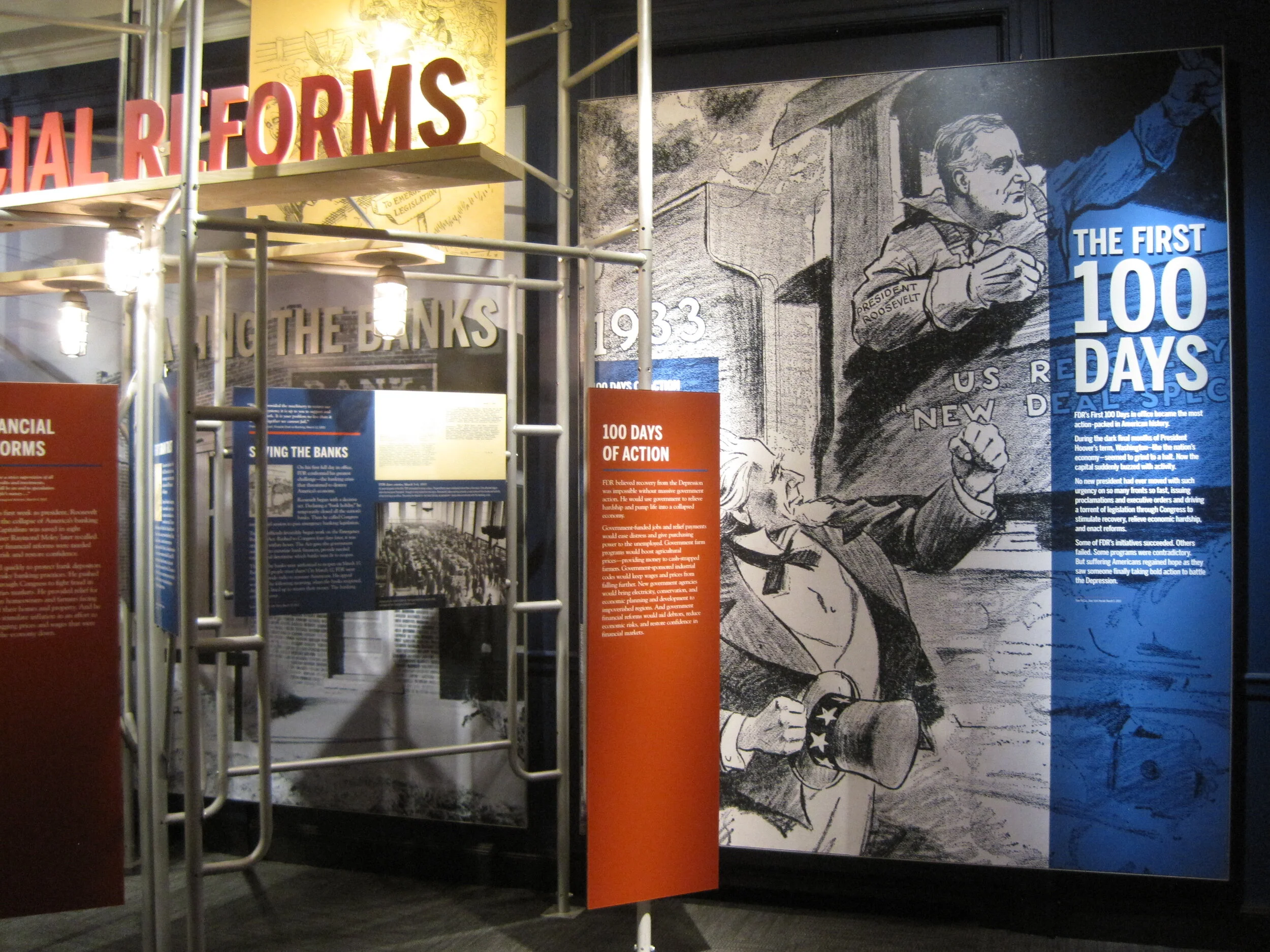
I went up to New York City a couple weekends ago. My time was packed with museum visits, including my first to the Tenement Museum, at 97 Orchard Street in Manhattan’s Lower East Side. I took their Shop Life tour. The museum’s sixty- and ninety-minute-long tours are docent-led through restored tenement apartments. Most tours focuses on one apartment, one period in time, and one actual family; the Shop Life tour is slightly different in that it highlights multiple families, across time periods, who lived and worked in the basement-level shops. I highly recommend the museum for an engrossing, educational experience. (Summertime hint: the Shop Life tour is the only one air-conditioned!)

From top left, clock-wise: volunteers pull weeds on the High Line; the entrance to the "Shop Life" tour at the Tenement Museum (no photos allowed inside!); Fly By Night at the Brooklyn Navy Yard; Goshka Macuga at the New Museum

From top left, clock-wise: volunteers pull weeds on the High Line; the entrance to the "Shop Life" tour at the Tenement Museum (no photos allowed inside!); Fly By Night at the Brooklyn Navy Yard; Goshka Macuga at the New Museum

I also stopped by the New Museum, since I was in the neighborhood for the Tenement Museum, and truth be told, I was mostly perplexed (I’m not that hip, apparently). I paid another visit to the High Line, which has expanded and its plantings matured since I was last there. And I saw a performance of Duke Riley’s Fly By Night, in which, “at dusk, a massive flock of pigeons … elegantly twirl, swoop, and glide above the East River.” The pigeons wear LED anklets and respond to whistles and waving flags, flying overhead as commanded. The performance pays homage to the mostly forgotten culture of pigeon keeping and — with just another week to go — is being held at the Brooklyn Navy Yard, once home to the country’s largest naval fleet of pigeon carriers. I loved it.

theexhibitdesigner_new-york-met-breuer

At the Met Breuer, the Metropolitan Museum of Art’s new home for modern and contemporary exhibitions (in the Whitney’s former building), I saw the exhibition Unfinished. There was nothing ground breaking in the actual exhibition design, but the premise was compelling and a lot of the artwork was fantastic.

And I took in the Nasreen Mohamedi retrospective. (Just closed, on June 5.) After the jam-packed Unfinished, the meditative exhibition was a welcome respite.

theexhibitdesigner_new-york-met-breuer2

But hands down, my two favorite exhibits during this visit were at the Jewish Museum and the Cooper Hewitt.

theexhibitdesigner_new-york-jewishmus_burle-marx

At the Jewish Museum, I fell in love with Roberto Burle Marx. Burle Marx was a Brazilian artist who drew upon diverse cultural influences to reinvent the landscape architecture discipline. He incorporated abstracted, irregular forms, native plants (he was a passionate environmental advocate), and Brazilian modernism into his landscape designs. His work is incredible; visit this exhibition!

theexhibitdesigner_new-york-jewishmus_burle-marx-exhibit-cases

The exhibition design was spot-on, evoking the geometries and curves of Burle Marx’s landscapes and emphasizing the art on display. An interlocked massing of display cases in the center of the room dominated the exhibition space; an 87-foot-long tapestry (below, left), designed by Burle Marx for the Santo André Civic Center in 1969, provided a stunning focal point. His hand-drawn and painted landscape plans are wonderful to behold; some examples from the exhibition are shown below.

theexhibitdesigner_new-york-jewishmus_burle-marx-exhibit-displays
theexhibitdesigner_new-york-jewishmus_burle-marx2

A few blocks north, Beauty, the Cooper Hewitt Design Triennial was bustling. The wide-ranging contemporary design exhibition is a must-see for designers and artists.

theexhibitdesigner_new-york-cooper-hewitt-beauty
theexhibitdesigner_new-york-cooper-hewitt-beauty2

The exhibition design was minimal, just the simplest of reader rails and small text panels. The museum encourages use of “pens” that allow you to interact with the digitized collection on touchscreen tables and to save objects from the exhibitions to be accessed later. A nice benefit of accessing your visit online is that for each object, museum curators have selected related objects for further exploration. For example, the online entry for Atmospheric Reentry, designed by Maiko Takeda (above, left), led me to this hat from Cameroon and this “hairy” garden pavilion.

theexhibitdesigner_new-york-cooper-hewitt-beauty-reader-rails

Below is one of my favorite entries from the Beauty Triennial, Architecture is Everywhere, designed by Sou Fujimoto Architects. From the project description: “the project discovers architectural possibility in found objects and everyday materials. Simple artifacts such as a lottery ticket, an ashtray, or a ring of binder clips become intriguing structures when placed on pedestals with tiny human figures.” It was delightful.

theexhibitdesigner_new-york-cooper-hewitt-beauty3

Post updated in January 2021 with minor text edits. Broken links have been fixed. This post was originally published at theexhibitdesigner.com on 13 June 2016.

On view now! New York City: A Portrait Through Stamp Art

New York City: A Portrait Through Stamp Art opened — today! — at the Smithsonian National Postal Museum. I was delighted to design this temporary art exhibition.

Postal-Museum-stamp-art_90A0119_Fotobriceno
Postal-Museum-stamp-art_90A0167_Fotobriceno

… Along with some printed pieces: a postcard booklet (free for museum visitors) and special postal cancellation (available in the museum’s post office).

christine-lefebvre-NYC-stamp-art_postcards-unfolded-sm.jpg

The thirty pieces of original artwork on display are part of the Postmaster General's [extensive] Art Collection, and are arranged in six categories: Baseball, Broadway, City Life, Icons, Politics, and Music. The artwork was selected to “celebrate important citizens, events and iconic buildings that have defined New York City as one of the greatest cities in the world.” Who knew there were so many New York City-themed stamps??

christine-lefebvre_Smithsonian-Postal-NYC-Stamp-Art-1
christine-lefebvre_Smithsonian-Postal-NYC-Stamp-Art-2
CLD_NPM_NYCstamp-Exhibit8.jpg

The exhibition will be on view through March 13, 2017. If you want the distinct pleasure of seeing TWO of my exhibits in one museum, Freedom Just Around the Corner is also on view at the National Postal Museum for two more months, until February 15, 2016.

christine-lefebvre_Smithsonian-Postal-Museum-stamp-art_90A0161_Fotobriceno-sm.jpg

Post updated in January 2021 with minor text edits. Broken links have been fixed. This post was originally published at theexhibitdesigner.com on 10 December 2015.

The FDR Museum is open!

The Franklin D. Roosevelt Presidential Library and Museum was rededicated on Sunday June 29 and is now open to the public. The New York Times published a flattering review and we are thrilled. Here we (the Gallagher team) are at the gala reception, with the museum’s chief curator:

Post updated in January 2021 with minor text edits. Broken links have been fixed. This post was originally published at theexhibitdesigner.com on 3 July 2013.

FDR Museum, part 4: rear-lit and neon

Work shown was completed while I was a designer at Gallagher & Associates.

To wrap up my series on the design, fabrication, and installation of the Franklin D. Roosevelt Museum, a close look at the first exhibition gallery.

The first gallery sets the stage for FDR’s presidency: the Great Depression. The focal point here is the neon-illuminated “FEAR” wall. Text is silkscreened onto the glass panels and rear-illuminated with LED pads. The red color comes from the custom “UMEMPLOYED” neon letters; the mural image in the back is a black and white photographic print.

The FEAR letters are applied to the rear of the glass. I wanted them to be translucent — to allow the mural image to show through and create depth — and also be as richly black as possible. The fabricators, Explus, provided a variety of production samples to try to achieve the effect I was after. Printing the letters on a transparent film and applying it to the glass, in particular, was unacceptable as I wanted a uniform transparency (no streaks, no dots).

Explus created a self-adhering vinyl by applying Sentinel OptiClear Adhesive to the face of the gel sheet (Rosco Cinegel Neutral Density N.9 Gel Extra Wide) and die-cutting it. I was happy, but the fabricators had some difficulty with cutting and applying the gel sheets. Their graphics manager told me that if they were to do something like this again they would use a standard window tint that has the application adhesive already on it. Here’s the sample:

Turning to the wall opposite:

The background mural is printed on DreamScape, as I mentioned in a previous post. Most of the murals in this museum were applied to backers, framed, and cleat-hung to the wall, but this particular one was applied directly to the wall and its edges captured with flat aluminum strips.

The framed graphics are digital prints with an overlaminate, mounted to sign blank. They were applied onsite to an MDF backer panel and aluminum frame. (The backer and frame are screwed to the exhibit wall; the graphic is applied with VHB tape.) Explus welded the frames’ corners before painting them, and that made a huge difference in the appearance of them. They are nicely finished and high-quality.

Post updated in January 2021 with minor text edits. Broken links have been fixed. This post was originally published at theexhibitdesigner.com on 25 June 2013.

FDR Museum, part 3: almost done!

Work shown was completed while I was a designer at Gallagher & Associates.

I am back in Hyde Park — installation continues! The exhibits are quickly coming together as the opening nears. Most of the graphics are hung, dimensional letters have been pinned (there are a ton throughout the museum — I went dimensional-letter-happy), and the interactives are being field-tested. I think it all is looking great. Some photos of the A New Deal gallery:

IMG_8087.JPG
IMG_7985.JPG
IMG_7806.JPG
IMG_8131.JPG

Artifact cases are being filled:

It’s a papier-mâché FDR sphinx!

IMG_8146.JPG

The World War II timeline is nearly complete (two weeks ago there wasn’t much hung besides the skeleton). What a bear that was to design!

IMG_7941.JPG
IMG_8168.JPG

I may have snuck into some New York Times photos while I was onsite. The critic and photographer were there, I was there ... who’s to say. We’ll see.

Post updated in January 2021 with minor text edits and additional photos. This post was originally published at theexhibitdesigner.com on 24 June 2013.

FDR Museum, part 2: installation continues

Work shown was completed while I was a designer at Gallagher & Associates.

I was back onsite with the Gallagher team at the FDR Library this past week and took more photos of the exhibit installation. It’s exciting to see the various elements go up. The exhibits are dense and layered; it’s a big story to tell in a relatively small space. The exhibits are in the original — now renovated — library conceived by Roosevelt himself so we were restricted to the existing spaces while designing the new exhibits.

Most of the graphics still have a protective film layer and ID label on them. In other places there are backers awaiting graphics, brown paper-wrapped graphics sitting on the floor, and assorted construction detritus. But bit-by-bit it’s going up! And we all know that everything happens in the last week before opening anyway. ;)

Updated, to add a photo of the finished gallery, The Promise of Change:

IMG_8042.JPG

Updated, to add a photo of the finished gallery, Foundations of a Public Life:

IMG_8066.JPG

Below, left: These graphics will be installed into the WWII timeline, on the right side of the photo above. They are printed on Laserchrome, which I mentioned in my previous post — and they look incredible.

I also mentioned the DreamScape wallcovering; below is a shot of some installed murals. I think they look good. Once the text panels, dimensional titles, reader rails, etc. go up — it will look great. More, soon!

Post updated in January 2021 with minor text edits and additional photos. Broken links have been fixed. This post was originally published at theexhibitdesigner.com on 16 June 2013.

FDR Museum, part 1: under construction and opening soon

Work shown was completed while I was a designer at Gallagher & Associates.

For the past couple of years I’ve been working on the Franklin D. Roosevelt Presidential Library and Museum, in Hyde Park, New York and (holy cow) the public opening is less than a month away. With time dwindling, I am finally sharing some process photos: production samples, shop visits, and installation.

The library has been posting photos of the installation on their tumblr. (2021 update: their tumblr is still going strong!) The photo below comes from there; I grabbed it to highlight the graphic in the background. There are four of these structures throughout the museum, one for each of FDR’s elections.

The “election stats” graphics are silkscreened onto Acrylite P-95 with white vinyl film adhered to the second surface. Silkscreening on P-95 creates a subtle shadow, which at certain angles makes the text appear dimensional. (For this reason, it should also be done with caution.) Here’s a photo of the sample provided by Explus, the fabricator (the installed graphic above is waiting for its red dimensional stars to be attached):

Below, the main story panels, used in the World War II gallery, which I am especially happy with:

They’re built from 5/8" clear acrylic, which has been painted on the front surface with acrylic paint, with a “window” left free of paint. The text is printed onto the painted acrylic surface, and then the photo — a Laserchrome metallic print — is adhered to the second surface of the acrylic, within the window area.

The photo above gives you a sense of the depth and jewel box effect created by layering the photo behind the acrylic. And here’s a peek at the backside of the pane. The aluminum angle frames are painted with Matthews acrylic polyurethane paint:

For wall murals I spec’ed DreamScape wallcoverings in various finishes. Above is another photo from the FDR blog, showing a few installed murals (currently missing their dimensional titles, and the scaffolding structure that will be located in front). I’m pleased with the crisp image quality, especially on the rough textures, such as “Plaster” (below, on the left) and “Mystical” (on the right).

Post updated in January 2021 with minor text edits. Broken links have been fixed. This post was originally published at theexhibitdesigner.com on 3 June 2013.

Century of the Child, at MoMA

I stopped in on Century of the Child, “an exploration and celebration of modern design for children in the 20th century,” at the Museum of Modern Art in NY. It was fascinating and delightful, and brought back some memories. For further reading definitely check out the exhibition website, the blog, and the tumblr.

Post updated in January 2021 with minor text edits. Broken links have been replaced with archived URLs, courtesy of archive.org. This post was originally published at theexhibitdesigner.com on 19 August 2012.

The News 08.16.12

A compilation of design-related web finds.

The Google Web Lab at the Science Museum in London | Designing for Accessibility: MoMA’s Material Lab | Harvard Medical School’s “Training the Eye” course | SEGD is hosting a symposium, “The Art of Collaboration” (link no longer available) in Raleigh October 4–5 | The last day to see the Terracotta Warriors in North America is August 26 in Times Square | The National Museum of American Jewish History in Philadelphia now offers free admission for their first floor gallery | Why the Museum of Broken Relationships is so great (it’s not just the name) | 100 Toys that Define Our Childhood — vote for your favorites for a new exhibit at the Children’s Museum of Indianapolis. Voting ends tomorrow, August 17 | Places that Work: U.S. Botanic Gardens | Spiders Alive! at the American Museum of Natural History (NY Times review) | Are some fonts more believable than others? and How to explain why typography matters | I’ve been pinning obsessively over on Pinterest.

Post updated in January 2021 with minor text edits. Broken links have been replaced with archived URLs, courtesy of archive.org. This post was originally published at theexhibitdesigner.com on 16 August 2012.

Another world: the Van Cleef & Arpels traveling exhibit

I am awed by the Van Cleef & Arpels traveling exhibition. But alas, I can only look at photos.

My colleague Zhengyuan saw this exhibit twice. Once while it was on view in NY at the Smithsonian Cooper-Hewitt (where it was called Set in Style) and then again when it moved to MOCA Shanghai (where its name was changed to Timeless Beauty). (When it was on view in Tokyo it had yet another name, Spirit of Beauty.)

Zhengyuan shared photos of the MOCA Shanghai exhibit:

She described the exhibit, “they didn't move the entire exhibit set to Shanghai, but there were some new displays, like the octopus-like structure. The space is very dark ... and the sparkling bubble glass displays make it look like an underwater world!” She thought both versions were fantastic.

The designers, Patrick Jouin, explain: “for this exhibition we wanted the visitors to lose all sense of time, to open a door onto an imaginary world. The nature theme, which is a major source of inspiration for Van Cleef & Arpels, has also influenced the scenography. The pieces in the exhibition are presented in gigantic glass drops. In order to create a sensual and mysterious installation, we have used various types of illusions.”

The photos below are from the Cooper-Hewitt exhibit, taken by Matt Flynn, © Smithsonian Institution:

While both exhibit versions used the bubble glass cases, the Cooper-Hewitt’s version seemed more traditional than MOCA Shanghai’s. Less octopus-structure and more tables and wall vitrines. I’m curious what challenges the designers had to address as they designed an exhibit for travel to four different countries (Japan, the US, Shanghai, and France). In all its iterations, it is a gorgeous exhibition.

Post updated in January 2021 with minor text edits. Broken links have been fixed. This post was originally published at theexhibitdesigner.com on 21 June 2012.

America’s Mayor, at MCNY

Dragging out photos from the archives for your inspiration:

I loved this exhibit at the Museum of the City of New York. America’s Mayor: John V. Lindsay and the Reinvention of News York opened and closed two years ago, but I still remember it for its bold colors and interesting story.

The museum’s description: “America’s Mayor examines the controversial tenure (1966–1973) and dramatic times of New York’s 103rd mayor. The exhibition presents John V. Lindsay’s efforts to lead a city that was undergoing radical changes and that was at the center of the upheavals of the 1960s and 1970s; it highlights Mayor Lindsay’s ambitious initiatives to redefine New York City’s government, economy, culture, and urban design. Through his outspoken championship of city life, commitment to civil rights, and opposition to the Vietnam War, Lindsay emerged as a national figure in a troubled and exhilarating era.”

The bold design pulled me in. I loved the punchy colors used on the murals and inside artifact cases. The images, text treatment, and the clustering of framed print artifacts, all helped to convey the upheaval of the time period.

Artifact vitrines intersect walls in interesting ways — such as the tabletop case above, and the vitrine below, which cuts into the triangular, freestanding wall. I liked the reflective, silver sides of the cases.

Also noteworthy was the amount of information and artifacts on display. Overwhelming, perhaps, for some, but my observation was that the people there were genuinely interested in reading and looking at objects and documents, and for those with shorter attention spans, the large titles provided sign posts to help locate areas that would be of most interest to them.

Post updated in January 2021 with text edits. Broken links have been replaced with archived URLs, courtesy of archive.org. This post was originally published at theexhibitdesigner.com on 10 June 2012.

The News 04.11.12

A compilation of design-related web finds.

Everyone’s been raving about Doug Aitken: SONG 1 at the Hirshhorn — because it’s awesome. I’ve visited twice and would (will) visit at least once more before it closes on May 13. You have to experience it in person.

My former firm, Christopher Chadbourne & Associates, announced their closure. This past summer I accepted a position with Gallagher & Associates, and moved to Washington, DC | In memory of the 100th anniversary of the Titanic’s sinking on April 15, dozens of exhibits about the ship have opened, including the the world’s largest, in Belfast; also: Fire & Ice: Hindenburg and Titanic at the Smithsonian National Postal Museum; Titanic: The Artifact Exhibition, everywhere; Titanic at the South Street Seaport Museum in New York, NY | The Union Pacific Railroad Museum’s Building America traveling exhibit is located in a traveling train car, naturally. The entire museum opens in Iowa in a month | Part 1 in a series of articles describing exhibit design, from Mark Walhimer at museumplanner.org | Blueprint, a guidebook to build your own history museum in the 21st century, from The Museum of the Future | Pinned Inspiration: ice ceiling; purple-sided lightboxes; German Expressionism at the MoMA; education center at the San Diego Children's Museum.

Post updated in January 2021 with text edits. Broken links have been replaced with archived URLs, courtesy of archive.org. This post was originally published at theexhibitdesigner.com on 11 April 2012.

Talk to Me, at MoMA

I’d rather not include too many posts about now-closed exhibits that I saw ages ago, but in the case of Talk to Me at the MoMA, the online exhibit is itself worth exploring.

A simple but compelling design. I liked the pixel illustrations on the introduction wall and the punchy red walls and reader rails.

Post updated in January 2021 with minor text edits. Broken links have been fixed. This post was originally published at theexhibitdesigner.com on 8 April 2012.

The News 05.01.11

A compilation of design-related web finds.

Creating Material Lab at MoMA | Design to Preserve by the Cooper-Hewitt | Coming soon to the Mall? National Women’s History Museum Makes Another Push Toward Existence and National Latino Museum Plan Faces Fight (hint: probably not) |Jurassic Park meets Buckminster Fuller” — a zoo that imagines a reunited Pangea | MoMath, the National Museum of Mathematics in New York, is raising funds | Vertical Urban Factory at the Skyscraper Museum in New York (slide show here) | Architecture in Uniform: Designing and Building for the Second World War at the Canadian Centre for Architecture | The World’s Largest Dinosaurs at the American Museum of Natural History looks amazing (slide show here; I love photo 3!) | La Plaza de Cultura y Artes, Mexican American cultural center in LA, “screens in a public alley space that both bring the stories out of the museum and draw passersby into the experience.” More in this article from GOOD | The National Museum of American Jewish History opens in Philadelphia | Illinois Holocaust Museum & Education Center opens in Skokie (review and slide show) | The Museum of Tolerance in Los Angeles (review and slide show) | The MBTA steps up its “See Something Say Something” campaign, and in Boston’s North Station:

AND an upcoming opening!

Conner Prairie Interactive History Park is opening a new exhibit, 1863 Civil War Journey: Raid on Indiana, in June. Part theater, part living history museum; the interactive experience is centered around a recreation of a Civil War-era town complete with homes, a general store, and a schoolhouse. As part of the Christopher Chadbourne & Associates team, I designed the graphics located in the schoolhouse, where the lessons of the park are pulled together.

I designed a tabletop graphic for a touch table that houses three monitors. It’s meant to appear as though it were strewn with historic maps and military tactical manuals. I also designed a flipbook that holds background information about the park’s characters, in the style of a scrapbook; and a large “chalkboard” wall graphic inspired by Civil War broadsides and illustrated with a map and hand lettering. These were fun graphics to design, geared toward families and school groups.

conner-prairie_interactive-table.jpg

Post updated in January 2021. Broken links have been replaced with archived URLs, courtesy of archive.org. This post was originally published at theexhibitdesigner.com on 1 May 2011.

Music at the MoMA

At the Museum of Modern Art in NY through June 6 is the exhibition Looking at Music 3.0. (Many installation photos at that link.) It explores music’s influence on contemporary art, and vice versa, during the 80s and 90s. Dim lighting, gaudy neon walls, and early music videos blasting on the large screen in the middle of the gallery — it’s as though you’ve returned to the time of boom boxes and mix tapes. Social and political issues are mentioned briefly in the exhibit copy, but there are many topics touched upon in this relatively small space, so don’t expect a thorough history lesson. Art and music are loosely grouped by topics such as “early hip hop” but, fittingly, neither chronology nor subject dictate the layout of the exhibition in an obvious way.

There was a large cushioned platform to sit and watch music videos. There were only a few in the loop, to discourage lingering I’d imagine. What they may not have realized is that people would stay quite awhile to watch Grace Jones. There were listening stations throughout the exhibition (below, left) and an interactive media installation by Perry Holberman (right).

You can read more about the process of creating the exhibit in this blog post, Listening to Art, written by the curator.

Below are photos of the entrance to Picasso: Guitars 1912–1914, an exhibition of 70 collages, constructions, drawings, mixed-media paintings, and photographs. On view through June 6 and definitely worth seeing.

Post updated in January 2021 with minor text edits. Broken links have been fixed. This post was originally published at theexhibitdesigner.com on 20 March 2011.

The News 02.17.11

A compilation of design-related web finds.

The realities of renovating the Barnum Museum in Bridgeport, CT after it was hit by a tornado | The winner of the PaleoArt Prize in 3D art for “achievement in ... depicting or sculpting paleontological subjects and fossils” | China asks the Penn Museum to return all artifacts from its Silk Road exhibition | The New York Times, on scalies | Winners of this year’s MoMA PS1 Young Architects program asked local businesses and nonprofits what materials they needed, then designed the courtyard space to incorporate those materials, with the intention of donating them at the end of the summer | An exhibit of tattooed arms in Paris | And another, of dismembered dandies, in Sweden | South African printmaking at Boston University’s 808 Gallery | Edward Gorey at the Boston Athenæum | Tangible Things at Harvard | The Charles Hayden Planetarium in Boston reopens after a $9 million yearlong reconstruction | The Museum of Arts and Design’s new Center for Olfactory Art | The reopening of the American Museum of the Moving Image; inaugural events continue.

Post updated in January 2021 with minor text edits. Broken links have been fixed or replaced with archived URLs, courtesy of archive.org. This post was originally published at theexhibitdesigner.com on 17 February 2011.

Samurai in New York

Samurai in New York at the Museum of the City of New York, through November 7, “invites visitors to return to the New York of 150 years ago and to share the city’s excitement over the visit of a delegation of more than 70 samurai from Japan — the first Japanese to leave the closed island nation in over 200 years.”

I love the title wall treatment, and that the red and black bands are carried across the entire wall and around the corner. Exhibition and graphic design by PSnewyork. / New York Times review.

Post updated in January 2021. Broken links have been fixed. This post was originally published at theexhibitdesigner.com on 25 October 2010.

American High Style

Mannequins like models on a runway, posed dramatically or playfully, frozen under spotlights in otherwise dimly-lit exhibit rooms. Stylized design details like gold dimensional letters for titles, and the mannequins’ sculpted hairstyles, added just a touch of flair to the restrained presentation.

American High Style: Fashioning a National Collection, at the Brooklyn Museum, is presented in honor of the transferred stewardship of the Brooklyn Museum’s costume collection to the Costume Institute at the Metropolitan Museum, and as a complement to the Met’s exhibit, American Woman: Fashioning a National Identity. The Met’s presentation is decidedly more theatrical, with its painted backdrops, props, wigs, and themed galleries. I haven’t yet seen it in person but I have seen photos, and I plan (to try) to catch it before it closes on August 15. Because that seems like the thing to do: see both and compare them.

But back to the Brooklyn Museum. Do see American High Style, I highly recommend it. And hurry — it closes on August 1.

The layout of the exhibit was straightforward, and it was apparent that a lot of thought was put into its organization. Approximately 85 mannequins were arranged into six groupings: the House of Worth, French Couture 1900–1940 and 1946–1970, the designer Elsa Schiaparelli, the designer Charles James, American women designers, and American men designers. Additionally, there were accessories and design sketches, a wall of rare dolls dressed in the finest French fashions from 1715–1906, and a room filled with shoe prototypes and drawings by Steven Arpad (a highlight). With all this to see, the exhibit was still succinct in its offering, and the accompanying text was interesting to read.

The mannequins stood on plywood “runways” with label text printed directly onto the plywood, with a subtle translucent white screen as first layer. (I'm guessing, as I can't tell for certain from my photographs and my memory fails me. Second guess: applied film. Anyone?) I liked the un-embellished, though still polished, plywood but not the trough-like detail at the front of the “runways.” It would have been cleaner if instead of its V shape, the runway were still angled at the front, but then went straight down, perpendicular to the floor. This was my only (minor) critique of an overall truly nice-looking exhibit.

Post updated in January 2021 with minor text edits. Broken links have been fixed. This post was originally published at theexhibitdesigner.com on 27 July 2010.

Too many mummies

There are SO MANY mummy exhibits right now. There is the heavily-advertised Tutankhamun and the Golden Age of the Pharaohs in New York; Cleopatra: The Search for the Last Queen of Egypt at the Franklin Institute in Philadelphia; Melvin the Mummy at the Brooklyn Museum; Mummies of the World at the California Science Center … and certainly many others which I am not aware of — and then there’s this underwater museum.

And THEN we have — had The Secrets of Tomb 10A at the Museum of Fine Arts Boston. I’ve taken so long to post about this exhibition that it seems to have closed. Yesterday. Sorry. Truly sorry. I liked the exhibit very much. You should have seen for yourself that it was a perfect balance of anthropology and art; it was fascinating and beautiful.

The story of Tomb 10A goes something like this: It was the tomb of the high official Djehutynakhts (pronounced “je-hooty-knocked”), discovered in 1920 by a group of Harvard University/Boston Museum of Fine Arts archeologists. Inside was the largest funerary assemblage of a Middle Kingdom (2040–1640 BC) official ever found intact (despite the tomb’s having been robbed in antiquity): four coffins, walking sticks, pottery, canopic jars, wooden models of daily life, and a disembodied head (great New York Times article). Egypt gave the entire collection to the MFA and sent it along to Boston. It met with some minor setbacks en route — not least, the collection’s catching fire — but arrive it did, only to be mostly tucked away in storage for ninety years. This exhibition was the first time that everything from the tomb has been put on display.

Walking into the exhibit, you first see a statue, representative of Egypt during the Middle Kingdom, standing in front of large, richly moody photographs of the area around the tomb. This first room sets the stage: information about Egypt during Djehutynakht’s time, introductions to the “cast of characters,” and a description of how the exhibit was organized. In the next room you’ll see objects from the actual tomb, in the third room you’ll see what was missing from the tomb, and in the final room you’ll learn about the archeological investigations still underway on the site. I appreciated this road map of what was to come in the relatively large exhibit. It helped to keep clear in my mind where I was within its organization. But, it begs the question, for non-museum-design/development-types: Is information like this important to you? Do you find it helpful? Do you even notice it?

The second room, below, was by far my favorite part of the exhibit. The wooden models were all gorgeous, and I love the simplicity of the wall of boats. The artifact displays throughout were sparse and reverential, arranged simply and tastefully. Absolutely lovely. The color palette was nice as well. (Speaking of colors, have you ever wondered about Egyptian color symbolism? Of course you have.)

I’ve also recently seen The Mummy Chamber at the Brooklyn Museum in New York (below). While Tomb 10A is dark and moody, The Mummy Chamber is bright, bright, bright — especially on a sunny summer afternoon. It too has some nicely currated artifact cases, though I prefer the moodiness of the MFA show. The Mummy Chamber exhibit is still open.

Post updated in January 2021 with minor text edits. Broken links have been fixed. This post was originally published at theexhibitdesigner.com on 29 June 2010.

The News 06.23.10

A compilation of design-related web finds.

Sometimes it seems like there really is a museum for and about everything. Name a topic, and I bet you can find an obscure museum dedicated to it. Tractors? Barbed wire? Plastics? Architectural models? Chinese shadow puppets? Battlestar Galactica? | Natural history exhibits opening this summer, in no way exhaustive: Whales at the Museum of Science, Boston (they offer a museum admission/whale watch ticket combo); The Deep at the Natural History Museum, London; Race to the End of the Earth, about Arctic explorers, at the American Museum of Natural History; the AMNH’s Climate Change exhibit moves to the Field Museum in Chicago; Age of Mammals, a “a postmodern diorama” in the Natural History Museum of Los Angeles’s newly restored 1912 building | This photo of the Smithsonian Natural History Museum’s collection of thousands of birds is just great | A Micro Museum for the Design of and with Typography; Typopassage Vienna is inside the Museumsquartier in Vienna and open 24 hours a day, every week of the year. (Curious; who’d be there at 4am?) | Shape Lab, an interactive educational space for families. Who wouldn’t want to play there? | The British Museum and Wikipedia’s unusual collaboration.

Post updated in January 2021 with minor text edits. Broken links have been fixed or replaced. This post was originally published at theexhibitdesigner.com on 23 June 2010.