timelines

Markus Lüpertz: Threads of History

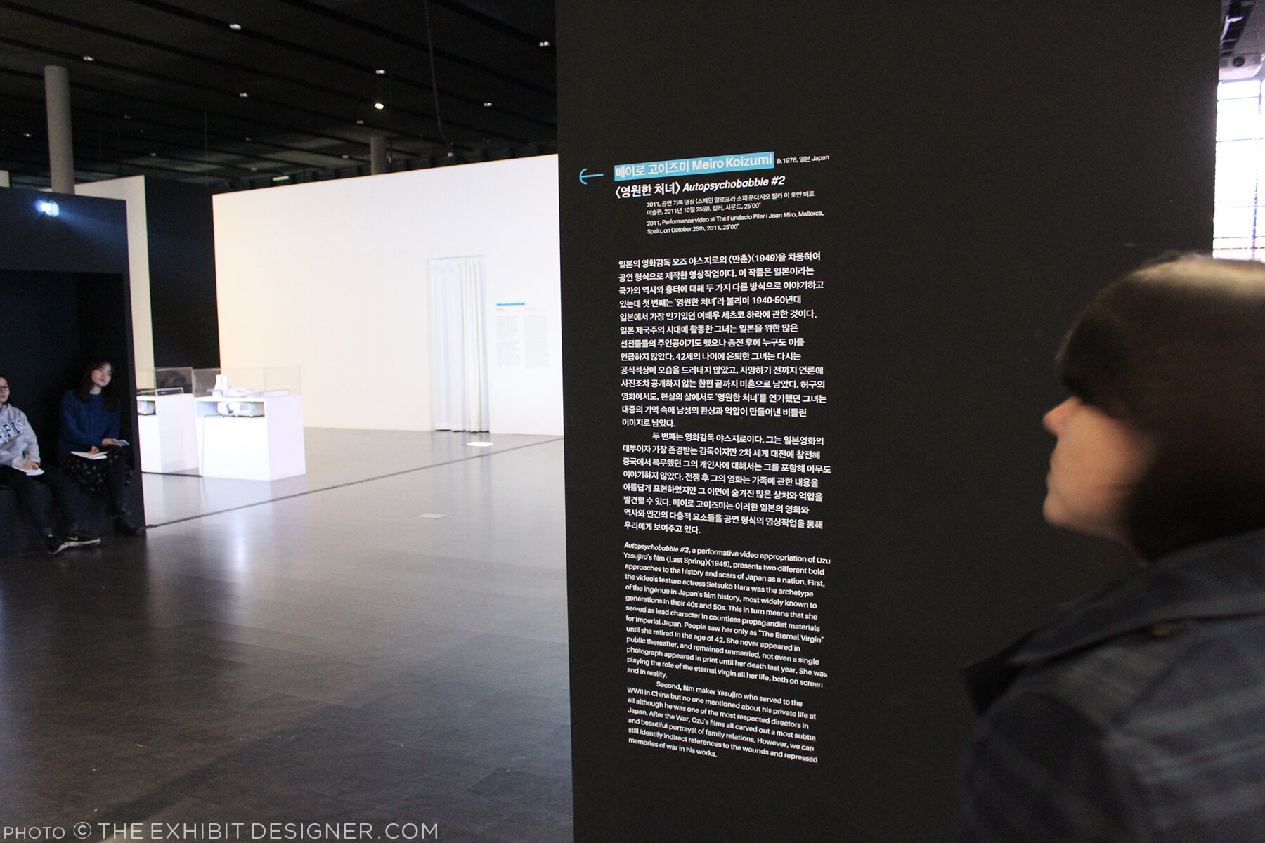
A quick check-in here. I stopped by the Hirshhorn Museum and Sculpture Garden this past weekend for Sound Scene X, and to take some photos of a project I currently have on view in the museum’s lower level: the exhibition Markus Lüpertz: Threads of History, on view through September 10.

the-exhibit-designer_christine-lefebvre_Hirshhorn_Lupertz_entrance.jpg

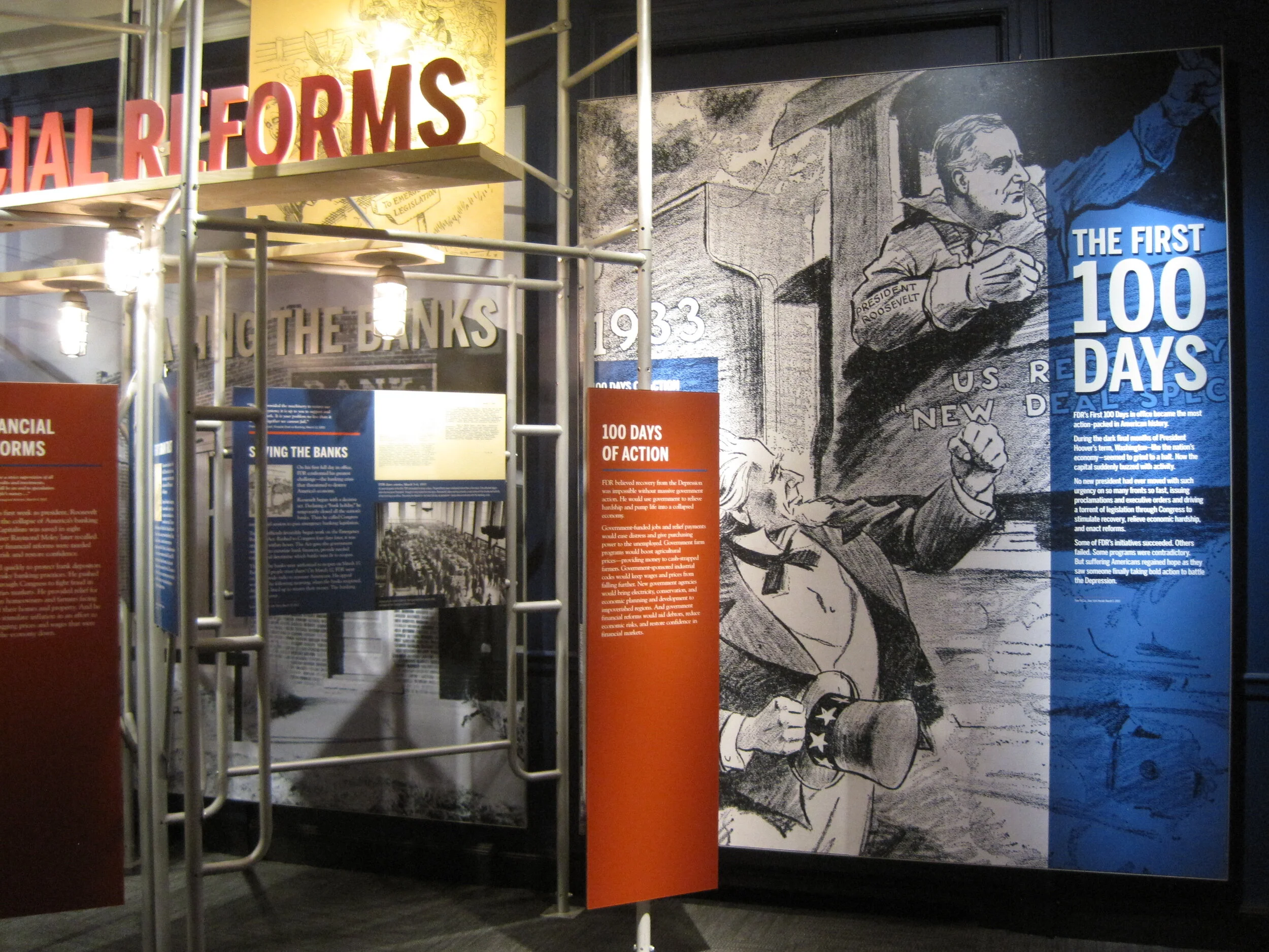
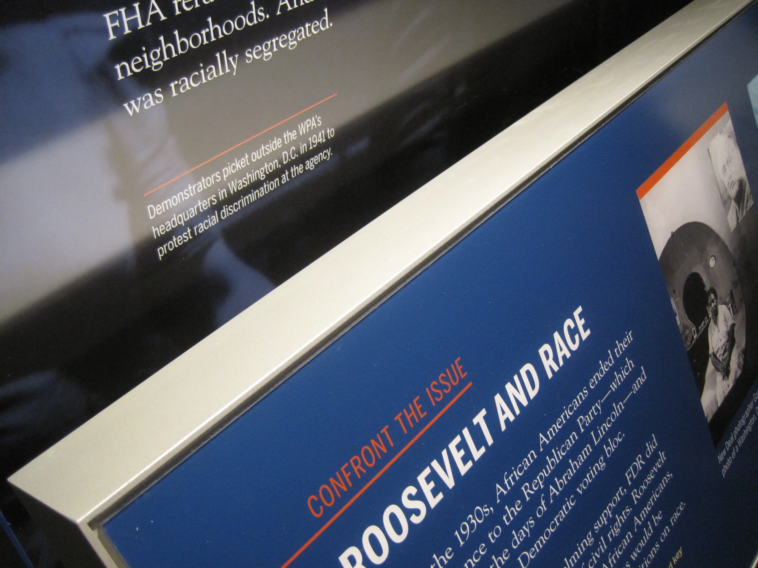
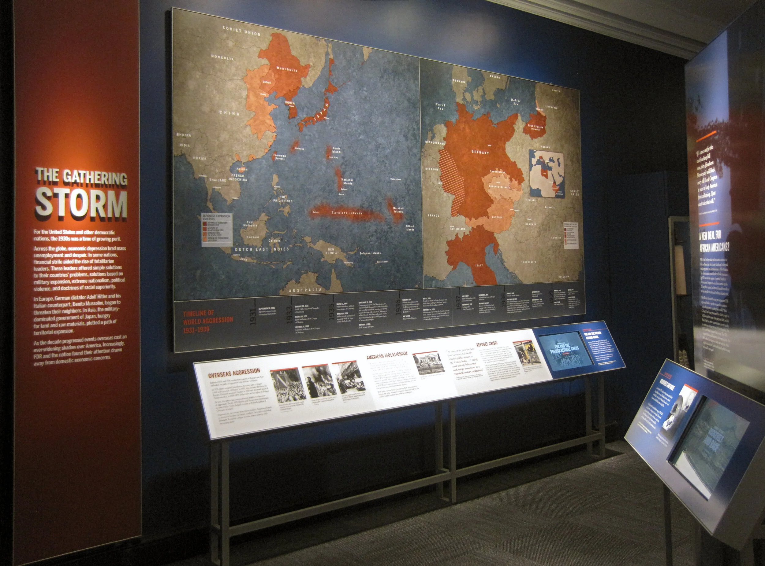
I developed the concept for the exhibition graphics, and after many rounds of refinement, handed over template files for the museum’s designers to produce final graphics (with the exception of the timeline graphic, which I laid out). I much prefer to handle the layout of final production files but aligning the museum’s schedule with mine was tough in this instance.

the-exhibit-designer_christine-lefebvre_Hirshhorn_Lupertz_entrance_timeline.jpg
the-exhibit-designer_christine-lefebvre_Hirshhorn_Lupertz_timeline-details.jpg
the-exhibit-designer_christine-lefebvre_Hirshhorn_Lupertz_section.jpg

I also designed two exterior signs advertising the exhibition, for display outside the museum. The blue sign has already been replaced with one for another exhibition — things move fast on the Mall sometimes! Additional information about the exhibition can be found on my portfolio.

the-exhibit-designer_christine-lefebvre_Hirshhorn_Lupertz_exterior-signs

Please check out the exhibition if you're in the DC area! And if you like it, there is a concurrently-open exhibition to see, Markus Lüpertz at the Phillips Collection. I have become a fan of Lüpertz’s work — particularly the Donald Duck paintings, one of which is visible through the exhibition’s entrance (in the first photo) and on the blue sign above.

Hirshhorn_SoundSceneX.jpg

This weekend was a good time to be a kid (of any age) at the Hirshhorn—the galleries were full of interactive sound installations, live museum, and sound-related activities, all part of Sound Scene X: Dissonance.

While there, I took the opportunity to also check out the newly-opened, Ai WeiWei: Trace at Hirshhorn.

Hirshhorn_AiWeiwei

I am currently working with the museum on another exhibition, Ilya and Emilia Kabakov: Utopian Projects, set to open in a month. Stay tuned for that!

Post updated in January 2021 with minor text edits. This post was originally published at theexhibitdesigner.com on 10 July 2017.

Mr. Toilet House and Nam June Paik

In April I spent two weeks in South Korea and a week in Japan. While there, I did what I always do while touristing — visited many museums. Some of them were forgettable, but many are worthy of a post, including these two that are thematically very different but, geographically, neighbors; they are both located in Suwon, about 20 miles south of Seoul. First up is the Toilet Museum (Haewoojae) also known as “Mr. Toilet House.”

theexhibitdesigner_MrToiletHouse-exterior1.jpg
theexhibitdesigner_MrToiletHouse-exhibits1

The story behind Mr. Toilet House: Suwon’s late mayor Sim Jae-Duck was given the nickname “Mr. Toilet” for his passionate leadership of the “Toilet Culture Movement” to improve public toilets. In 1996 he started the Beautiful Toilet Culture Campaign, and the city declared its intent to build the most beautiful public toilets in the world (motivated also in part by the then-upcoming 2002 FIFA World Cup which they were to host). Mr. Toilet took things a bit further than merely creating government departments and task forces, however, when he rebuilt his own house in the shape of a toilet and named it Haewoojae, which means “a room where you can relieve your worries.” It features a central toilet room as the “core of living,” with transparent glass walls that turn opaque with the flip of a light switch. The house was completed in 2007, and upon Sim’s death in 2009, it was willed to the city of Suwon. The city then converted it into a museum and culture park.

theexhibitdesigner_MrToiletHouse-exhibits2

The museum is small and has clear, simple graphics (nearly all with English translations) that earnestly convey information about the history and global spread of modern sanitation, and other toilet-related subjects. There are also lighthearted illustrations of poops and flies (including on the floor, used as a navigational device) and hilarious double entendres in the writing.

Outside, there is a culture park. A meandering path leads you past examples of toilets, used throughout Eastern and Western history, that give an understanding of how toilets have physically changed over time.

theexhibitdesigner_MrToiletHouse-exterior2

Next door you can visit the Haewoojae Culture Center for a birds-eye view of the Toilet Museum.

theexhibitdesigner_MrToiletHouse-exterior3
theexhibitdesigner_NamJunePaikCenter-exterior2.jpg

Our next stop in Suwon: the Nam June Paik Art Center. The Nam June Paik Art Center opened in 2008 and holds 248 pieces of video installations and drawings, mostly of Nam June Paik’s but also of other contemporary artists. The art center hosts changing exhibitions of Paik’s work, special exhibitions of contemporary artists, performances, events, and educational programs. It also houses Paik’s archives and a library, undertakes research, and publishes scholarly journals and monographs.

theexhibitdesigner_NamJunePaikCenter-exhibits1

The art center changes exhibitions regularly; they use their Nam June Paik-focused exhibitions to focus on different aspects of his work. While I was there, the exhibition was called Point-Line-Plane-TV, which “explored Nam June Paik’s canvas including intermedia [sic] such as television, score, film, and video, in notion of flatness.”

theexhibitdesigner_NamJunePaikCenter-exhibits2.jpg
theexhibitdesigner_NamJunePaikCenter-exhibits4

On the mezzanine level is the Education Room, seen in the photos below; a quiet place to have a seat and read some tables about the artist’s life.

theexhibitdesigner_NamJunePaikCenter-exhibits3

Upstairs was Imaginary Asia, a special exhibition of 23 pieces in the motion images genre. Many of the videos were projected onto large walls, with small bench nooks that could sit 2–3 people for viewing.

theexhibitdesigner_NamJunePaikCenter-exhibits6.jpg
theexhibitdesigner_NamJunePaikCenter-exhibits7

Like at Mr. Toilet House — and actually at many, many places I visited in South Korea — navigational cues and directions were applied directly to floors. In the Point-Line-Plane-TV exhibition as well they applied interpretive text to the floor. Interpretive text was in both Korean and English.

theexhibitdesigner_NamJunePaikCenter-exhibits5

Outside, the curved glass exterior of the the art center is modeled on the form of a grand piano, a common motif in Paik’s work, and on the letter P. But that is only apparent when you look at the museum map — the actual experience from outside is simply of an impressive modernist building.

theexhibitdesigner_NamJunePaikCenter-exterior

There is a small park just beside the museum — perfect for a rest after an afternoon’s museum visit — and nearby are the Gyeonggi Provincial Museum (which has limited English translations) and the Gyeonggi Children’s Museum.

Post updated in January 2021 with minor text edits. Broken links have been replaced with archived URLs, courtesy of archive.org. This post was originally published at theexhibitdesigner.com on 24 May 2017.

FDR Museum, part 3: almost done!

Work shown was completed while I was a designer at Gallagher & Associates.

I am back in Hyde Park — installation continues! The exhibits are quickly coming together as the opening nears. Most of the graphics are hung, dimensional letters have been pinned (there are a ton throughout the museum — I went dimensional-letter-happy), and the interactives are being field-tested. I think it all is looking great. Some photos of the A New Deal gallery:

IMG_8087.JPG
IMG_7985.JPG
IMG_7806.JPG
IMG_8131.JPG

Artifact cases are being filled:

It’s a papier-mâché FDR sphinx!

IMG_8146.JPG

The World War II timeline is nearly complete (two weeks ago there wasn’t much hung besides the skeleton). What a bear that was to design!

IMG_7941.JPG
IMG_8168.JPG

I may have snuck into some New York Times photos while I was onsite. The critic and photographer were there, I was there ... who’s to say. We’ll see.

Post updated in January 2021 with minor text edits and additional photos. This post was originally published at theexhibitdesigner.com on 24 June 2013.

Two Whales

Update: The Whale Museum no longer exists. Instead, the Dorr Museum is located on the edge of the College of the Atlantic campus; exhibits are designed and produced by College of the Atlantic students.

A few photos from the Bar Harbor Whale Museum in Maine, an unassuming experience, with some whale skeletons and exhibits of marine mammals, prepared by students and staff of the College of the Atlantic.

whalemuseum1.jpg
whalemuseum2.jpg

Whales/Tohorā is at the Museum of Science, Boston through September 14. Just like at the Whale Museum, you will learn fascinating facts about whales: The first whales walked on land! Baleen whales have two blowholes! Toothed whales have only one! Unlike the Whale Museum, Whales/Tohorā is a slick exhibit with clearly a much bigger budget. It was developed by the Museum of New Zealand/Te Papa Tongarewa.

The black, slightly angled, reflective platforms below the two largest whale skeletons are a dramatic centerpiece to the exhibit. I found myself returning to this display numerous times to look again. The same technique was used for some of the smaller skeletons too, like that of the walking whale (below, right). Graphics were all rear-lit. It’s a fine line with rear-lit graphics … a soft glow is easier on the eyes.

The structure of this timeline/artifact case reminds me of a backbone and rib cage, and ever-so-slightly of the Design for a Living World exhibit I saw at the Cooper Hewitt.

The whale skulls cases (below) are beautiful. Everything looks substantial and high quality. I like this straightforward presentation style when showing multiples: Keep the design minimal and the text to a minimum.

Post updated in January 2021. Broken links have been fixed. This updated post, originally published at theexhibitdesigner.com on 12 August 2010, was combined with a similar post dated 8 August 2010.

2009 AIGA BoNE Show wins (another!) award

Exciting news: a project I worked on last year, the 2009 AIGA BoNE Show, has taken home another award!

As the exhibit designer, I worked with BoNE Show co-directors Jeff Stammen and Brandon Bird, to step up and shake up the biennial, Boston-based awards show/exhibition. It was a nearly year-long process to put it together and our goal throughout was to create something engaging and memorable. In the end, the feedback was glowing — everyone who went had the most fun at the show’s opening last June* — and we won a couple of design awards to boot.

In September, we received an AIGA (Re)designAward for Sustainable Design; the awards recognize social responsibility and environmental sustainability in design. We were one of 25 winners in 2009.

And last week at the 2010 SEGD Conference, we were honored with an SEGD Design Award, in the “Lot With a Little” category.

*Some blog post mentions: Common Content | Hart-Boillot | MIT Press | Pinkergreen | South of the Sahara

But — you ask — what exactly is this BoNE Show?

The BoNE (Best of New England) [Design] Show is a biennial competition, exhibition, and fundraiser to benefit AIGA’s Boston chapter. Our theme for 2009 was Community. While the primary purpose of the exhibition was to showcase the 49 winning design pieces, the planning team (myself included) also wanted the experience to engage, educate, and help designers to feel more connected to their design community. One aspect of that was re-branding the BoNE Show into B(oNE) — as in “be one” — with the tagline, “One Region. One community.”

Thirteen local designers, design firms, and artists were commissioned to build large dimensional letter sculptures that together spelled out AIGA B(oNE) SHOW. (top photo) This became a centerpiece of the exhibition, and the letters were auctioned off at the opening reception.

boneshow2009_4.jpg
boneshow2009_10.jpg

My goal was to create an exhibition that would celebrate the competition winners and also the New England design community as a whole. To push the Community theme, I created an infographic wall about the AIGA in New England, including chapter sizes, locations, and other basic information.

boneshow2009_11.jpg

A second infographic wall — B(oNE) Show Deconstructed — provided a glimpse into the creation of the exhibition, including statistics about the designers who entered work in the competition and the designers who won recognition.

boneshow2009_14.jpg
boneshow2009_13.jpg
boneshow2009_12.jpg

Another area of the exhibition gave visitors the opportunity to share their ideas of what it takes to “B” a great designer — by contributing to a wall of B (fill-in-the-blank) speech-bubble directives. Some were earnest; others humorous.

I sourced environment-friendly and local materials, with the help of my design team. Graphics were printed with UV-curing ink on recycled chlorine-free kraft paper, at a printer located five miles from the gallery — or they were drawn by hand. Discarded furniture taken off the street, piles of cardboard collected from area businesses, an old door and a roll of twine found in a garage: “trash” that we salvaged and put to good use. The designs integrated mechanical fasteners and non-toxic glues. And to describe the “greenness” of the project for visitors to the exhibit, we created the Green Lounge, which was painted entirely in green, even the furniture. We used Old Fashioned Milk Paint — it's earth- and people-friendly, and manufactured nearby in Groton, MA. The Green Lounge also featured a slide show of past award winners to pull together BoNE Shows past and present, and add another element of Community.

boneshow2009_9.jpg
boneshow2009_8.jpg
boneshow2009_15.jpg

The biggest undertaking for the exhibition were the displays for the winning entries. We repurposed roughly 50 wooden shipping pallets collected from around the Boston area. These were deconstructed into planks, then planed and reconfigured into custom display fixtures — shelves, platforms, and frames — each designed to highlight the unique elements of the winning entry it held.

boneshow2009_18.jpg
boneshow2009_19.jpg
boneshow2009_16.jpg
boneshow2009_20.jpg
boneshow2009_17.jpg
boneshow2009_22.jpg
boneshow2009_21.jpg
boneshow2009_23.jpg

More photos of the exhibit here, and of the opening night here.

I’m going to take advantage of my blog/soapbox to also thank the many, many people who volunteered their time and helped put together the show: event photographer Christian Phillips; carpenter Mark Laning, Matt White of Dirk+Weiss (A/V), Melissa DePasquale (print design), Rochelle Ask, Colleen Baker, Rachel Boothby, Kimberly Cloutier, Luke Garro, Ben Gebo, Lee Gentry, Justin Hattingh, Andrea Kulish, Joe Liberty, Mike Mai, Cedric Mason, Julie Ogletree, Juliana Press, George Restrepo, Jason Rubin, Shaona Sen, Andrea Shorey, Drew Spieth, Sarah Tenney Stammen, Jason Stevens, Ken Takagi, Mende Williams, and Andrea Worthington. Thank you also to the AIGA Boston board — especially Suzanne McKenzie and Tracy Swyst — and the most excellent people at CCA, who were never-endingly supportive of Jeff and I as we in effect worked a second full-time job (they wrote this lovely news release about us) and our friends and families who had to deal with us in the duration. And here it is, our SEGD award:

Post updated in January 2021. Broken links have been fixed or replaced with archived URLs, courtesy of archive.org. This post was originally published at theexhibitdesigner.com on 17 June 2010.

Mathematica, the Eames-designed exhibit

The legendary Charles and Ray Eames are perhaps best known for their design of a certain lounge chair, but let’s not forget their architecture, print design, photography, film, textiles — and exhibitions. During their career they designed more than a dozen, of which only Mathematica: A World of Numbers ... and Beyond — from 1961! — is still on view.

Three versions were created and two of them remain open to the public: one at the New York Hall of Science and the other at Boston’s Museum of Science. Update: There is now a third at The Henry Ford Museum.

Probability, Topology, Boolean Algebra, Geometry, Calculus, and Logic ... I don't feel particularly moved by any of those, but inarguably this exhibition, with all its quirks and charms, makes math accessible and interesting. I have been to it a number of times, and it’s usually packed with people happily learning about mathematics and engaging with the interactive exhibits.

The photos above are of my favorite part of the exhibit: the case about projective geometry. I like the colors of the geometric shapes, the way that the pieces are held in position by Inspector Gadget-like hinged poles, and the grid on the bottom of the case. The graphics perched on black blocks are simple and handsome.

The photo below is of another element in the exhibit that I like: math-related quotation panels overhead, playing nice with the track lighting frame.

Mathematica is successful as an exhibit about math, but more importantly, from an exhibit-design standpoint it is an incomparable artifact, a fascinating time capsule of an exhibit designed during the 1960s.

I’m a sucker for retro graphic design, but I have to say that I don’t like the illustrations. They’re cute and fun, I suppose, but they annoy me.... I ... hate them. There, I said it.

I also don’t like that some parts of the exhibit look as though they were pasted together for a high school statistics class presentation. Picture below, on the right: I'm talking to you. This encased collage is deadly boring and it’s often skipped in favor of the fun hands-on interactives, which are fantastic.

The other part of the exhibit that doesn’t do it for me is the math history wall. I have heard it described as wallpaper, or an art piece. The black and white bars do create a graphically interesting pattern, but then the wall is cluttered up with other bits of browning paper and artwork.

The capitalized, justified serif font used is extremely difficult to read, if you were inclined to try. It makes me dizzy. And yet the darnedest thing: people do sometimes read it. (I have no idea....) Another (obvious) issue with this wall is that the timeline ends in 1961, and the MOS’s solution, a poster, is not well integrated. NYSCI’s solution, an interactive monitor, is a better one, at least in theory. (I haven't been to the New York Mathematica to see it firsthand.)

I like the “probability machine.” The full text reads: THE T/HEORY/OF PR/OBABI/LITIES/IS NO/THING/MORE/THAN/GOOD/SENSE/CONFI/RMED/BY CA/LCULATION. :LA/PLACE/1796

Balls fall from above and form a bell curve. Simple, elegant — and if the text is a little wonky, it does force you to read it over a few times to understand, maybe making you internalize its message.

I feel like quite the curmudgeon with my criticisms of Mathematica. The exhibit is nearly fifty years old, after all — it’s miraculous that it still exists. And despite its literal dustiness, it is an exhibit beloved and cherished by many, a vintage exhibit that allows us to step back in time to experience firsthand a 60s era exhibit full of the Eames’s joie de vivre, fun, and humor. I think any designer would agree that that in itself is pretty cool.

If you have been, what do you think?

Post updated in January 2021 with minor text edits. Broken links have been fixed or replaced. This post was originally published at theexhibitdesigner.com on 16 February 2010.

The News 01.19.10

A compilation of design-related web finds.

L.A.’s Natural History Museum to receive $1-million grant for new permanent exhibition | Rising Currents: Projects for New York’s Waterfront — I’ve been following with interest the progress of the program and upcoming exhibit on the MoMA/P.S.1 blog | Towards a New Mainstream? On 27 January 2–3pm EST, a lecture by Gregory Rodriguez exploring demographic change in the Americas, cultural transformation, and the future of museums | Color Identifying System for the Color Blind | An Increasing Craving for Experiences; there has been a lot written lately about experience-over-stuff — hello, museums! | Light Touch interactive projector turns any flat surface into a touchscreen | An Architect’s Philosophy of Photography | Steffen Dam: Specimen Panels These are beautiful; very “natural history museum” | Barton’s Bonbonniere, From Architectural Forum c. 1952 — I love it! What a fun space.

AND NOW, something from the portfolio:

Work shown was completed while I was a designer at Christopher Chadbourne & Associates.

Perfectos.jpg

This time last year (January 17, 2009), the Tampa Bay History Center — designed by Christopher Chadbourne & Associates — held its grand opening in downtown Tampa, Florida. I worked closely with the project’s senior graphic designer Jeff Stammen on design development.

(Photo above and first three photos below, courtesy Tampa Bay History Center.)

Cattle.jpg
Container.jpg
07 Tampa Bay History Center 214_sm.jpg

I took a leading design role for the timeline (Your Tampa Bay) and the War Stories gallery. Below is my sketch of the War Stories gallery, and below that, a photo I took during installation — hence the empty case.

theexhibitdesigner_TBHC-war-stories-install.jpg

All the graphics in this museum were designed with both English and Spanish text. I love the challenge of designing multilingual graphics.

I was also responsible for Construction Administration, and supervised the exhibit installation. I love shop visits, site visits, inspecting fabrication samples … all of that. What happened with the Tampa installation was a little … let’s just say, complicated. The local fabricator, Creative Arts, was fantastic and saved the installation day in a lot of ways. I ended up effectively living in a hotel room for a couple weeks during the tail end of installation — much longer than my trip to Tampa was supposed to be. It was quite the learning experience. In hindsight, I can say I had fun.

(Photo above and photo below, courtesy Tampa Bay History Center.)

Your_Tampa_Bay.jpg
tampa_092.JPG
tampa_290edit.jpg

Post updated in January 2021. Broken links have been fixed or replaced with archived URLs, courtesy of archive.org. This post was originally published at theexhibitdesigner.com on 19 January 2010.

The Silk Road, Tim Burton, and Bauhaus

I have no photos to share of the American Museum of Natural History‘s new exhibit Traveling the Silk Road: Ancient Pathway to the Modern World — though you can see some here and in the New York Times review — so you’ll have to take my word for it that it is fantastic. The museum invited in the NY chapter of SEGD for an exhibit open house on Friday evening. (I am in the Boston chapter, but they let me crash the party.) It was a really nice experience — I’d like to give a big thank-you to the museum’s in-house design department, who were all super friendly and welcoming.

See it now through the end of August, or if you somehow are able to wait for it, the exhibit will eventually travel to other museums. Silk Road has everything that I’ve come to expect from AMNH: an interesting theme, beautiful prop work, fascinating artifact displays, and lovely, compelling graphics.

Saturday, I had a less-than-pleasant experience at the Tim Burton exhibit at the MoMA. (Exhibit timeline, above.) It wasn’t Tim Burton’s fault (I love his work), and not entirely the exhibit’s fault, but I do think it was a mistake for the museum to put this exhibit in the gallery they did. The larger gallery space on the sixth floor might have been better able to handle the number of people. Granted, it was a Saturday afternoon when I went, but people were packed cheek by jowl, making it impossible to move, and it was unbearably hot.

I had trouble figuring out the intended navigation of the space, which seemed to be trying for a chronological arrangement. The placement of the walls, however, created human gridlocks as people came around walls from different directions and refused to cede any space in front of any of the art. Photos of the exhibit can be seen at the exhibit link.

Then, I was on to the exhibit Bauhaus 1919–1933: Workshops for Modernity. I loved the work on display, which included everything from furniture to tapestry to poster design, from the Avant-Garde art school, and I really liked the entrance graphics. This post from the MoMA blog talks about the graphic design department’s process of designing the exhibit as a fresh take on Bauhaus graphic sensibilities.

Post updated in January 2021 with minor text edits. Broken links have been fixed or replaced. This post was originally published at theexhibitdesigner.com on 15 December 2009.

Timelines (and more) at the Newseum

Update: The Newseum closed to the public in 2019. The Freedom Forum hopes to find a suitable location to serve as the Newseum’s next home; in the meantime, it hosts traveling exhibits and pop-up exhibits.

newseum-lobby-walk

In October 2007, while preparing for a visit to Washington, DC, I wrote to a friend, “The Newseum doesn’t open until April! Bummed I can’t see it. I’ll have to go back….” Go back I did.

Here is my live, in-person, eye-witness report: It is every bit as superlative as I had heard. Ralph Appelbaum & Associates did an amazing job on this project. I spent hours and hours and hours there. It’s huge! And so much of the content is fascinating.

newseum-1
newseum-2

What riveted me most, of course, were the graphics. They’re gorgeous. I loved the inset painted titles, and that rich black the designers used. Reversed text? Yes, please! Looks good.

newseum-3

The graphics throughout the museum were clean and modern (excluding some temporary exhibits, which had themed but still lovely aesthetics). The mood was sometimes somber, sometimes light — I love the treatment for Who Controls the News? —but either way, done just right.

newseum-4

There were a number of timelines in the Newseum, and I liked how artifact cases were integrated into them in a way that didn’t feel cluttered or overwhelming. I am always on the lookout for timeline inspiration; designing timelines regularly is nearly unavoidable in this field. If you see one that’s done well, please share!

newseum-8
newseum-10
newseum-7
newseum-9

Post updated in January 2021 with minor text edits. Links have been fixed. This post was originally published at theexhibitdesigner.com on 11 November 2009.

Green Community, and House of Cars

Or, where to go if you want to see 24,708,421 museums, give or take.

Capitol-Dome

I recently flew down to Washington, DC for what might turn into a biennial pilgrimage of whirlwind museum visits. In 2007, there was the D.W. Reynolds Visitor Center at Mount Vernon, the International Spy Museum, the United States Holocaust Memorial Museum, the National Postal Museum, and the National Building Museum. This year, 2009, there was the National Museum of American History, the Newseum, the National Archives, the National Museum of Natural History, and — again! — the National Building Museum.

Green-Community-1

I hope to share many more highlights of my trip, but first let’s talk about the Building Museum, which convinced me to pay a repeat visit despite my time in DC being limited. Since it’s a little under-the-radar, being off the mall, it’s blissfully quiet — your shoes will echo in the stairways. The historic building is gorgeous and the temporary exhibits, the ones that I’ve seen, have all been thoughtfully and skillfully designed.

Green Community was designed by Brooklyn, NY-based firms MATTER (exhibit design and fabrication) and mgmt. design (graphics), with media design by Potion. (Links should all lead to project descriptions for Green Community.) I loved the striking cylinders full of dirt, wood chips, and shredded paper; the swirling pattern of cork on the floor; the clean, crisp lightbox graphics; and the “core drilling” timeline that spanned the length of the room, punctuated by materials like coal and bottle caps. It was a beautiful exhibit.

Update: I wrote a bit more about the exhibition floor in a later post.

Green-Community-8
Green-Community-2
Green-Community-3
Green-Community-9
Green-Community-6

House of Cars: Innovation and the Parking Garage is also worth a peak for its fascinating subject matter and clear content hierarchy. House of Cars is about “how the parked car has changed our built environments” and it surveys the early days of parking garages and the mid-century building boom, engineering, innovations, and the future of parking solutions within sustainable city planning.

Each section has its own color, numbered for easy navigation. (Like a parking garage!) The wall graphics and reading rails are densely packed with old photographs and architectural drawings, but the gridular layout keeps it all neat. I liked the metal structures that the graphics are mounted on; a touch of parking garage chic.

I managed to take only a few photos of the exhibit while attempting to dodge the hyper-vigilant docent (“no photography, please!!”); I present them to you now.

cl-nbm-houseofcars11.jpg
cl-nbm-houseofcars2.jpg

Post updated in January 2021, and combined with another post about the National Building Museum, dated November 26, 2009. Broken links have been fixed or replaced. This post was originally published at theexhibitdesigner.com on 9 November 2009.