Massachusetts

BoNE Show 2011, the wrap-up

The AIGA BoNE Show — Best of New England [Design] — is a design competition for New England, hosted biennially by AIGA Boston. I was asked to direct the 2011 show, after doing a decent job of designing the exhibit for the 2009 show, and when I said “yes!” without even thinking about it, I found myself responsible for its call-for-entries, judging, meet-the-judges event, awards show, exhibition, website, catalogue ... every little thing involved in putting on a design competition. (It was also the very last thing I did before I left Boston for DC, back in June.)

First I had to create a theme. I worked with George Restrepo to brainstorm a half dozen promising directions. The eventual winner — “Wicked Problems/Wicked Solutions” — was born while myself, George, and a couple other AIGA volunteers on the BoNE committee were discussing the concept of wicked problems and how design is essential to problem solving. Keeping tongue in cheek, I also liked that if people didn’t exactly understand the deeper meaning of the theme, it could also be interpreted as simply “wicked” in the New England sense.

The call-for-entries (above), designed by Kristen Coogan, featured a playful Rube Goldberg-esque problem-solving machine. This visual identity was carried through the rest of the competition and awards show’s graphic pieces, including the website, designed by Justin Hattingh, with technical assistance from Jeremy Perkins.

Below: In keeping everything aligned to the theme, at the meet-the-judges event — held in Boston the evening before judging began — the three judges each gave a presentation related to “wicked problems.”

All event and exhibition photos by Ben Gebo Photography. More event photos, here.

When designing the exhibition, we continued to play with the problem solving theme. Katelyn Mayfield designed a component-based display system: individual displays could be arranged in any configuration to take advantage of our huge gallery space on Boston University’s campus. The displays could then be packed flat and shipped to other venues when the BoNE Show “went on the road” after its run in Boston.

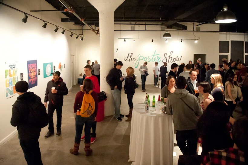
Here is the exhibition, full of guests on the evening of the awards show:

Exhibit displays were located in the front third of the 808 Gallery. Each display was custom-designed for the design project it held and hand-built from corrugated plastic sheets and PVC pipes. Windows and shelves were built by cutting and folding the plastic sheets, by Katelyn and a crack team of volunteers, including BU’s student AIGA group.

WICKED PROBLEMS and WICKED SOLUTIONS were applied to the wall in giant red and cyan vinyl. Winners’ names were laser cut from thick illustration board and the edges of shelves were finished with cyan-colored tape.

Above, left: I commissioned furniture designer Seth Wiseman of ConForm Lab to design and build two sets of benches which could be moved into endless configurations — a human-sized three-dimensional tangram game. The benches were sold during the event auction and the money benefited AIGA Boston. Seth also designed and built the tangram stage, which is in a couple of photos below.

Above, right: For the media-based winning entries, we built a simple kiosk. Joe Morris designed the interface.

Below, left: Dan Watkins (aka Dan the Man Photo) manned the “photo booth.” He also shot all the photography for the show’s catalogue. Below, right: DJs Dan Riti & Kevin James in their sophomore BoNE Show appearance.

Above, left: The silent auction table. We also held a live auction for the big-ticket items. Jason Stevens and Kathleen Byrnes headed the sponsorship drive. Because the point of this entire production was to raise money for AIGA, we tried to get everything for free (or at least on the cheap), and were very thankful for all of our generous sponsors.

And then there was the gorgeous (award-winning, itself) awards show catalogue, designed by George Restrepo and printed and bound by ACME Bookbinding. The embossed covers came in both red and cyan. The keepsake entry ticket was designed by Ira Cummings and printed and foil stamped by EM Letterpress.

And … the awards show! AIGA Boston chapter president Matthew Bacon served as Master of Ceremonies. Trophies were bone-shaped and cast in aluminum (bronzed for the Judges’ Choice winners), with embossed winners’ names. Names were all punched by hand (by Bridget Sandison, who also — along with Juliana Press and Meghann Hickson — took care of receiving and sorting and tracking all the competition entries) using a vintage Dymo label maker. Same way the awards have been made since the BoNE Show’s inception in 1995.

Thank you to Tracy Swyst, AIGA Boston’s VP of operation, who has overseen many many many BoNE Shows, and to the rest of the AIGA Boston board: Heather, Jodi, Colleen, Brandon, Jillfrancis, Diane, Chiranit, Lee, Mat, Jason R, and Sarah, and to the boards from AIGA Connecticut, Rhode Island, Maine, and NH/VT, and everyone else who lent a hand in any way. It was a really great experience.

Post updated in January 2021 with text edits and minor photo edits. Broken links have been fixed. This post was originally published at theexhibitdesigner.com on 24 April 2012.

The News 05.01.11

A compilation of design-related web finds.

Creating Material Lab at MoMA | Design to Preserve by the Cooper-Hewitt | Coming soon to the Mall? National Women’s History Museum Makes Another Push Toward Existence and National Latino Museum Plan Faces Fight (hint: probably not) |Jurassic Park meets Buckminster Fuller” — a zoo that imagines a reunited Pangea | MoMath, the National Museum of Mathematics in New York, is raising funds | Vertical Urban Factory at the Skyscraper Museum in New York (slide show here) | Architecture in Uniform: Designing and Building for the Second World War at the Canadian Centre for Architecture | The World’s Largest Dinosaurs at the American Museum of Natural History looks amazing (slide show here; I love photo 3!) | La Plaza de Cultura y Artes, Mexican American cultural center in LA, “screens in a public alley space that both bring the stories out of the museum and draw passersby into the experience.” More in this article from GOOD | The National Museum of American Jewish History opens in Philadelphia | Illinois Holocaust Museum & Education Center opens in Skokie (review and slide show) | The Museum of Tolerance in Los Angeles (review and slide show) | The MBTA steps up its “See Something Say Something” campaign, and in Boston’s North Station:

AND an upcoming opening!

Conner Prairie Interactive History Park is opening a new exhibit, 1863 Civil War Journey: Raid on Indiana, in June. Part theater, part living history museum; the interactive experience is centered around a recreation of a Civil War-era town complete with homes, a general store, and a schoolhouse. As part of the Christopher Chadbourne & Associates team, I designed the graphics located in the schoolhouse, where the lessons of the park are pulled together.

I designed a tabletop graphic for a touch table that houses three monitors. It’s meant to appear as though it were strewn with historic maps and military tactical manuals. I also designed a flipbook that holds background information about the park’s characters, in the style of a scrapbook; and a large “chalkboard” wall graphic inspired by Civil War broadsides and illustrated with a map and hand lettering. These were fun graphics to design, geared toward families and school groups.

conner-prairie_interactive-table.jpg

Post updated in January 2021. Broken links have been replaced with archived URLs, courtesy of archive.org. This post was originally published at theexhibitdesigner.com on 1 May 2011.

Say Something, the wrap-up

I was honored to be involved with the Say Something Poster Project* by lending my exhibit design services to the first ever Poster Show, a fundraiser for Boston-based nonprofit The Home for Little Wanderers.

sspp_01.jpg

This was a case of less being much more. Initially I started with grand ideas to incorporate elements from the website branding into the three-dimensional exhibit space, but gradually I whittled down the exhibition design to its essence, to give the 25 poster finalists all the attention (and to make the installation manageable).

sspp_02.jpg
sspp_05.jpg

Posters were hung using 1.25" bulldog clips held to the wall with L pins. Labels were laser prints mounted to black illustration board and attached to the wall top and bottom with L pins. (And because I’m quite particular, you bet all the white paper edges were hit with a deft stroke of gray marker.) The large script title (“the poster show”) was drawn by illustrator Chris Piascik. I put it on the wall in contour-cut vinyl.

sspp_06.jpg

Guests voted for their ten favorite posters from the 25 finalists on view at the event. I designed the voting sheet.

sspp_57.jpg
ssps4_crop.jpg

Below is Mat Budelman, with his poster Think Half Full, one of the winning entries. Kudos to the finalists and winners, the volunteers, and to organizer Jason Stevens. Ben Gebo shot these event photos, and was also, incidentally, the photographer for the event I organized for Friday, AIGA BoNE Show’s “Meet the Judges.”

Post updated in January 2021. Broken links have been fixed or replaced with archived URLs, courtesy of archive.org. This post was originally published at theexhibitdesigner.com on 4 March 2011.
*Archived website leads to the second Say Something Poster Show; the first is no longer available online.

The News 02.17.11

A compilation of design-related web finds.

The realities of renovating the Barnum Museum in Bridgeport, CT after it was hit by a tornado | The winner of the PaleoArt Prize in 3D art for “achievement in ... depicting or sculpting paleontological subjects and fossils” | China asks the Penn Museum to return all artifacts from its Silk Road exhibition | The New York Times, on scalies | Winners of this year’s MoMA PS1 Young Architects program asked local businesses and nonprofits what materials they needed, then designed the courtyard space to incorporate those materials, with the intention of donating them at the end of the summer | An exhibit of tattooed arms in Paris | And another, of dismembered dandies, in Sweden | South African printmaking at Boston University’s 808 Gallery | Edward Gorey at the Boston Athenæum | Tangible Things at Harvard | The Charles Hayden Planetarium in Boston reopens after a $9 million yearlong reconstruction | The Museum of Arts and Design’s new Center for Olfactory Art | The reopening of the American Museum of the Moving Image; inaugural events continue.

Post updated in January 2021 with minor text edits. Broken links have been fixed or replaced with archived URLs, courtesy of archive.org. This post was originally published at theexhibitdesigner.com on 17 February 2011.

Build Boston 2011: My conference experience

Last month I attended a few workshops at the Build Boston conference. Presented by the Boston Society of Architects, Build Boston is primarily targeted to architects and those who work with architects; it is “the Northeast’s largest tradeshow and conference for the design and construction industry” so I was surprised and happy to find a few programs on this year’s schedule of interest to museum exhibit designers.

First, the tours. Options included a tour of Boston’s boutique hotels, tours of the MIT Media Lab, and a tour of the new Art of the Americas wing at the Museum of Fine Arts Boston. A few of my coworkers got the behind-the-scenes sneak peak of the MFA (read Katelyn’s description); I instead attended a symposium called “Cultural Catalysts to Inclusive/ Socially Sustainable Design.” The MFA featured in my conference experience later when it was discussed at length during another symposium I attended, “Museums in the Digital Age.” I also stopped by the Build Boston PechaKucha, and attended the workshop, “Sustainability in Environmental Graphic Design.”

PechaKucha: PechaKucha Nights are events for designers to meet, network, and show their work. (Update: not just for designers anymore.) Presenters show 20 slides, for 20 seconds per slide. The slides automatically advance after 20 seconds, forcing presenters to stay on topic and talk fast. Highlights:

•Artforming, (link no longer available) with examples of their site-specific public art and architecture installations, which center around environment, emerging technologies, and the synthesis of art and science.

•Two Northeastern University students and their involvement in Freedom by Design. Freedom by Design, the AIAS’s (American Institute of Architecture Students) “community service program … uses the talents of architecture students to radically impact the lives of people in their community through modest design and construction solutions.”

•Saeed Arida and Saba Ghole, on the studio environment of NuVu (the Innovation School) in Kendall Square, Cambridge. NuVu is “a place of innovation where middle and high school students join together with experts from MIT and Harvard to create new views of the world.” It sounds like an incredible program.

Cultural Catalysts to Inclusive/Socially Sustainable Design: This symposium was sponsored by the Institute for Human Centered Design, an international education and design non-profit based in Boston that is “dedicated to enhancing the experience of people of all ages and abilities through excellence in design.”

•Dr. Shigeki Inoue from Hakuhodo Universal Design, a consulting and creative boutique in Tokyo that seeks to improve the lives and satisfaction of sei-katsu-sha (“living persons”) of differing needs and abilities. Dr. Inoue is researching “science in design”; specifically, creating a highly legible Japanese typeface. Dr. Inoue asked, “why do designers make designs that are difficult to read?” and spoke to how graphic design remains largely inaccessible for people who have low vision.

•Karin Bendixen is director of the consultancy Bexcom and founder and president of the Danish Design for All network. She writes about “Design for All” concepts, targeting architects, planners, designers, and politicians. She asked that we change our mindsets from designing for disabled individuals as a distinct segment of society to designing for society as though everyone has a disability — i.e. everything is accessible for everyone — and from “what design is” to “what design can do.” Bendixen encouraged us all to be better at promoting the messages of Universal Design: holistic design, sustainability, and design for all.

•Rachna Khare is Professor and Doctoral Research Coordinator at the School of Planning and Architecture in Bhopal, India. She lectures and writes about universal design in India. There are 70 million people with disabilities in India (5–6% of the population), and the majority live in rural areas. Most of the current accessibility efforts in India are “too Western” in their approach, according to Khare. Her goal is to make universal design an entrenched part of Indian culture.

•The new design director for the Visual Arts Division of the National Endowment for the Arts wrapped up the symposium. The NEA is an independent government agency and the largest national funder of the arts; it’s also a partner in Blue Star Museums, the program that offers free museum admission to military personnel and their families from Memorial Day through Labor Day. The agency is currently collecting datasets from all design disciplines, and is interested in strategic investment in design and connecting designers with businesses and federal organizations that are interested in design thinking. There are many funding opportunities, and grant money can be used to hire designers — design fees, preparing space for an exhibit, installation or de-installation of art, and community planning are eligible.

Museums in the Digital Age: Moderated by Aisha Densmore-Bey of the BSA’s Museum and Exhibit Design Committee, this symposium asks, “...even as daily life is reconfigured constantly by technology, museums retain their esteem as bastions of culture. In the face of an increasingly interactive world online, is a physical space still necessary to experience art?”

•Susan Leidy, Deputy Director of the Currier Museum of Art in Manchester, NH, asked, “What are museums currently thinking about and doing with media? Where does media fit in? Does original artwork still matter?” According to her, media and technology should only be used to further museums’ missions and museums should take care to stay true to those missions, whatever they might be: education, conservation, collecting, or something else. Original artwork does still matter … and so too do historical documents, artifacts, live animals, sight, sound, smell, touch. More than anything else, visitors want authenticity in a museum experience. They go to see real physical objects. Take home message: compromise authenticity for digital media at our peril.

•Peter Kuttner, President of Cambridge Seven Associates in Cambridge, MA, drew connections between two different-seeming types of museum/themed experiences: the art museum and the zoo. Both are primarily about authenticity and seeing something in-person. The tendency in these types of environments is to separate the media from the art/animals so as not to detract from the art/animals. Kuttner gave a few case studies of projects by Cambridge Seven to illustrate media used thoughtfully in an exhibit. Media technology allows you to quickly respond to current events if there’s a reason to do so. It’s also possible to “hide” the technology by integrating it into the experience of the exhibit space (or, to put it another way: to allow technology to inform but not dominate a space). Technology can encourage group activity and indepth learning, but has to be taken to a level beyond sitting at a monitor.

•Ann Beha of Ann Beha Architects in Boston spoke at length about the Museum of Fine Arts’s new Art of the Americas wing. (A project, she noted, that she did not work on but admires.) One of the MFA’s media highlights is its new website, which features a homepage that continually updates and changes as it rotates through photos of its exhibitions, and introduces “Buzz,” their foray into social media. Buzz brings together the MFA’s Twitter, flickr, YouTube, and Facebook accounts and is an intentional attempt to engage in a dialogue with its visitors and gather real time feedback on people’s experiences at the museum. Beha mentioned that the MFA was the first museum to post its entire collection online, in 1995, and has in many ways been an internet leader in the museum industry. All technology within the MFA helps to support the museum’s missions of collecting, stewardship, scholarship, engagement, enlightenment. There are study stations incorporated into the wayfinding in the corridors; easy-to-use multimedia guides that provide options for self-directed learning; touch screen stations that teach and engage visitors on a deeper level than that provided by the exhibition labeling alone; touch tables. Everything is integrated into the environment of the museum in a seamless way with “intense design sensibilities.” The physical architecture of the museum building becomes a blank canvas for media, and an opportunity to create public spaces that are full of life and possibilities.

Sustainability in Environmental Graphic Design: Discussed in this workshop were strategies for EGD sustainability including material selection, resource and waste management, energy and lighting efficiency, air and water quality, public education, and costs. I’ve been working on a list of websites and blogs that focus on sustainability, and you can explore them in this website’s sidebar to the right. (links no longer available)

Post updated in January 2021 with minor text edits. Broken links have been replaced with archived URLs, courtesy of archive.org. This post was originally published at theexhibitdesigner.com on 17 January 2011.

Build Boston 2011: Touring the MFA

GUEST POST

Writing and photography by Katelyn Mayfield, an exhibit designer at Christopher Chadbourne & Associates. She has a Bachelor of Architecture degree from the Rhode Island School of Design. In her spare time, she makes handstitched books.

After a private tour of the Museum of Fine Art Boston’s new Art of the Americas wing, given by architect Adi Toledano of CBT Architects, I now feel certain that Boston has a world class museum. The tour was given prior to the wing’s grand opening as part of Build Boston. We got up close and personal with the details since almost no one was around, except security guards and last minute glass case cleaners.

My first response in the galleries was to the artifact display cases. These cases were undeniably eye-catching, like no other. The glass was crystal clear, completely devoid of prints of any kind. When standing on one side of a case, I could see perfectly through it and into cases beyond because of the impeccable clarity. The sleekness of the cases also succeeds in hiding complex mechanics, as described in this article. All 200 cases in the new wing were designed, manufactured, and assembled in Milan, Italy by Goppion Museum Workshop before they were shipped to Boston for installation. Goppion has also created display systems for the Mona Lisa at the Louvre and the Crown Jewels of England, among others, so high quality craftsmanship is a given. And once I got past the perfection of the cases, the artifacts inside were not so bad themselves!

Sir Norman Foster along with Foster + Partners was the Design Architect and creative masterminds of the new wing. Our guide, Adi, kept repeating, “Foster wanted ‘everything to line up’”, meaning everything had to be flush. Foster gets what Foster wants. He was knighted in 1990 and won the Pritzker Architecture Prize for his entire portfolio in 1999, the most prestigious international prize awarded in the field of architecture. He was also awarded the American Institute of Architects Gold Medal in 1994. I think he is worthy of dictating every detail, as he did in this project. No detail was overlooked and all components work harmoniously. It was the responsibility of CBT, the local architect of record, to design the actual details that accomplished this harmony. For me, highlights were the “landscape corridor,” the day-lighting strategies, and the details that made “everything line up.”

The landscape corridor is a thoughtful nod to the existing museum structure and the outdoors. Between the original building and the new building, a narrow 6' space is left full of vegetation. While in the main courtyard, which has two elevations of three-story-high glass walls, the corridors are visible on either side. The natural light, the view of the vegetation and the sky beyond, and the height of the ceiling makes this space feel like an actual outdoor courtyard. The landscape corridor is also visible when crossing over the enclosed bridges from the new wing to other wings. It really is a nice sight.

The main concept of the day-lighting strategy is based on indirect light. It’s seemingly simple; very successful. Because all four floors of the wing open onto small glass vestibules which open to the stairways, and then to the courtyard, all four floors have indirect natural light access. Sunlight is obviously harmful to artwork and artifacts, but otherwise a welcome source of light. The solution to safely utilizing this indirect light was to diffuse it through two layers of glass.

This idea that “everything must line up” is showcased in every aspect of the architecture; from the construction of the walls, to the lighting in the ceiling, to the emergency exit signs. The wall surface uses the skim coat plaster technique that is superior to average drywall. It is labor intensive — thick coats of plaster are applied to an expanded wire lath — however, it provides better durability and ease of replacing single spots of wall if necessary.

Even the smallest components, the exit signs, were meticulously executed. In the auditorium, which is covered in wood paneling, a sign protruding perpendicularly from the wall would not do at all. Instead, the letters E-X-I-T were cut into the wood and green light shines through from behind. Apparently this small project in itself was not easily accomplished. It took much compromise and discussion from the Boston Fire Department. The outcome is sleek and yes, “lined up.”

Then there is the door to the bathroom hallway. So well done! The door has no molding, no knob, no latch; it’s a push door, double swing, that extends all the way to the ceiling, with just a 1/4" gap between.

I also have to mention the graphics. The explanatory texts were short and sweet, subtle yet still noticeable. I appreciated the subdued graphics and simple 1" deep panels painted the same color as the wall. This created a different visual plane to draw your attention, but allowed the artwork and artifacts to take the lead. Within the cases, small numbers on tiny frosted pieces of glass show you which artifact matches up with which label below. In any case, go see the Boston MFA’s new wing. It is elegant, modern, and simply beautiful.

Post updated in January 2021. Broken links have been fixed or replaced with archived URLs, courtesy of archive.org. This post was originally published at theexhibitdesigner.com on 1 December 2010.

New England Habitats

At the Museum of Science, Boston they’ve quietly redesigned the graphics in their New England Habitats exhibit. Direct print on solid wood, matte varnish. Nice!

Apparently, there are gremlins painted into some of the diorama backdrops. (From the link above: “Artist Francis Lee Jaques, famous for his ability to blend background paintings seamlessly with three-dimensional foregrounds, painted many of these along with several other Museum dioramas. When he was on lunch break, Jaques’ wife sometimes snuck into the hall and painted little, hidden gremlins into his backgrounds. Look for her handiwork in the Crane Beach diorama!”) I never noticed this, but now must go to the museum to confirm….

Post updated in January 2021. Broken links have been fixed. This post was originally published at theexhibitdesigner.com on 10 October 2010.

Field Trip Day!

Last week a few of my Chadbourne colleagues and I took a day to visit some local museums in Cambridge.

Nothing I haven’t already covered here on TED, but it’s always nice to see old friends. First stop: the Harvard Museum of Natural History/Peabody Museum of Archeology & Ethnology. They had a new, small but interesting exhibit, Headgear: The Natural History of Horns and Antlers (left and center, below) and they seem to be continuing the renovation work begun in the Great Mammal Hall. I peeked behind a drawn curtain to see what the deal was, but was stopped by this guy on the right:

I’ve written in the past about the HMNH, but I can’t resist adding a few more photos here. Slowly but surely the museums seem to be getting cleaner and brighter.

We then made our way over to the Harvard Art Museums, currently housed in the Sackler Museum, and previously seen on The Exhibit Designer, here.

We ended the day at the MIT Museum where, because of our tired feet and the heat of the day, we plunked down on a bench and became entirely engrossed in a video of Alan Alda swimming with a robotic tuna. (No really, I’m not kidding about the tuna. The video is from the episode “Natural Born Robots” of the PBS show Scientific American Frontiers.) Previous MIT Museum coverage here.

Post updated in January 2021 with minor text edits. Broken links have been fixed. This post was originally published at theexhibitdesigner.com on 30 September 2010.

Two Whales

Update: The Whale Museum no longer exists. Instead, the Dorr Museum is located on the edge of the College of the Atlantic campus; exhibits are designed and produced by College of the Atlantic students.

A few photos from the Bar Harbor Whale Museum in Maine, an unassuming experience, with some whale skeletons and exhibits of marine mammals, prepared by students and staff of the College of the Atlantic.

whalemuseum1.jpg
whalemuseum2.jpg

Whales/Tohorā is at the Museum of Science, Boston through September 14. Just like at the Whale Museum, you will learn fascinating facts about whales: The first whales walked on land! Baleen whales have two blowholes! Toothed whales have only one! Unlike the Whale Museum, Whales/Tohorā is a slick exhibit with clearly a much bigger budget. It was developed by the Museum of New Zealand/Te Papa Tongarewa.

The black, slightly angled, reflective platforms below the two largest whale skeletons are a dramatic centerpiece to the exhibit. I found myself returning to this display numerous times to look again. The same technique was used for some of the smaller skeletons too, like that of the walking whale (below, right). Graphics were all rear-lit. It’s a fine line with rear-lit graphics … a soft glow is easier on the eyes.

The structure of this timeline/artifact case reminds me of a backbone and rib cage, and ever-so-slightly of the Design for a Living World exhibit I saw at the Cooper Hewitt.

The whale skulls cases (below) are beautiful. Everything looks substantial and high quality. I like this straightforward presentation style when showing multiples: Keep the design minimal and the text to a minimum.

Post updated in January 2021. Broken links have been fixed. This updated post, originally published at theexhibitdesigner.com on 12 August 2010, was combined with a similar post dated 8 August 2010.

Too many mummies

There are SO MANY mummy exhibits right now. There is the heavily-advertised Tutankhamun and the Golden Age of the Pharaohs in New York; Cleopatra: The Search for the Last Queen of Egypt at the Franklin Institute in Philadelphia; Melvin the Mummy at the Brooklyn Museum; Mummies of the World at the California Science Center … and certainly many others which I am not aware of — and then there’s this underwater museum.

And THEN we have — had The Secrets of Tomb 10A at the Museum of Fine Arts Boston. I’ve taken so long to post about this exhibition that it seems to have closed. Yesterday. Sorry. Truly sorry. I liked the exhibit very much. You should have seen for yourself that it was a perfect balance of anthropology and art; it was fascinating and beautiful.

The story of Tomb 10A goes something like this: It was the tomb of the high official Djehutynakhts (pronounced “je-hooty-knocked”), discovered in 1920 by a group of Harvard University/Boston Museum of Fine Arts archeologists. Inside was the largest funerary assemblage of a Middle Kingdom (2040–1640 BC) official ever found intact (despite the tomb’s having been robbed in antiquity): four coffins, walking sticks, pottery, canopic jars, wooden models of daily life, and a disembodied head (great New York Times article). Egypt gave the entire collection to the MFA and sent it along to Boston. It met with some minor setbacks en route — not least, the collection’s catching fire — but arrive it did, only to be mostly tucked away in storage for ninety years. This exhibition was the first time that everything from the tomb has been put on display.

Walking into the exhibit, you first see a statue, representative of Egypt during the Middle Kingdom, standing in front of large, richly moody photographs of the area around the tomb. This first room sets the stage: information about Egypt during Djehutynakht’s time, introductions to the “cast of characters,” and a description of how the exhibit was organized. In the next room you’ll see objects from the actual tomb, in the third room you’ll see what was missing from the tomb, and in the final room you’ll learn about the archeological investigations still underway on the site. I appreciated this road map of what was to come in the relatively large exhibit. It helped to keep clear in my mind where I was within its organization. But, it begs the question, for non-museum-design/development-types: Is information like this important to you? Do you find it helpful? Do you even notice it?

The second room, below, was by far my favorite part of the exhibit. The wooden models were all gorgeous, and I love the simplicity of the wall of boats. The artifact displays throughout were sparse and reverential, arranged simply and tastefully. Absolutely lovely. The color palette was nice as well. (Speaking of colors, have you ever wondered about Egyptian color symbolism? Of course you have.)

I’ve also recently seen The Mummy Chamber at the Brooklyn Museum in New York (below). While Tomb 10A is dark and moody, The Mummy Chamber is bright, bright, bright — especially on a sunny summer afternoon. It too has some nicely currated artifact cases, though I prefer the moodiness of the MFA show. The Mummy Chamber exhibit is still open.

Post updated in January 2021 with minor text edits. Broken links have been fixed. This post was originally published at theexhibitdesigner.com on 29 June 2010.

The News 06.23.10

A compilation of design-related web finds.

Sometimes it seems like there really is a museum for and about everything. Name a topic, and I bet you can find an obscure museum dedicated to it. Tractors? Barbed wire? Plastics? Architectural models? Chinese shadow puppets? Battlestar Galactica? | Natural history exhibits opening this summer, in no way exhaustive: Whales at the Museum of Science, Boston (they offer a museum admission/whale watch ticket combo); The Deep at the Natural History Museum, London; Race to the End of the Earth, about Arctic explorers, at the American Museum of Natural History; the AMNH’s Climate Change exhibit moves to the Field Museum in Chicago; Age of Mammals, a “a postmodern diorama” in the Natural History Museum of Los Angeles’s newly restored 1912 building | This photo of the Smithsonian Natural History Museum’s collection of thousands of birds is just great | A Micro Museum for the Design of and with Typography; Typopassage Vienna is inside the Museumsquartier in Vienna and open 24 hours a day, every week of the year. (Curious; who’d be there at 4am?) | Shape Lab, an interactive educational space for families. Who wouldn’t want to play there? | The British Museum and Wikipedia’s unusual collaboration.

Post updated in January 2021 with minor text edits. Broken links have been fixed or replaced. This post was originally published at theexhibitdesigner.com on 23 June 2010.

Harvard Art Museum / Big

A big entry sign ... and big gallery titles ... leading to a bigger Harvard Art Museum. The Harvard Art Museum is in the midst of a “transformation” that will bring its three separate museums — the Fogg, the Busch-Reisinger, and the Sackler — together in a renovated and expanded building on Quincy Street. The project, designed by Renzo Piano (naturally: his name seems to be on every museum’s expansion), is scheduled to open in 2013.

In the meantime, the Sackler offers Re-View, a survey of the three museums’ collections. It’s worth a visit if you are in Cambridge. After, you can take a stroll down the street and stop in here for a scoop of Milk Chocolate Gianduia.

Post updated in January 2021 with minor text edits. Broken links have been fixed or replaced with archived URLs, courtesy of archive.org. This post was originally published at theexhibitdesigner.com on 20 June 2010.

2009 AIGA BoNE Show wins (another!) award

Exciting news: a project I worked on last year, the 2009 AIGA BoNE Show, has taken home another award!

As the exhibit designer, I worked with BoNE Show co-directors Jeff Stammen and Brandon Bird, to step up and shake up the biennial, Boston-based awards show/exhibition. It was a nearly year-long process to put it together and our goal throughout was to create something engaging and memorable. In the end, the feedback was glowing — everyone who went had the most fun at the show’s opening last June* — and we won a couple of design awards to boot.

In September, we received an AIGA (Re)designAward for Sustainable Design; the awards recognize social responsibility and environmental sustainability in design. We were one of 25 winners in 2009.

And last week at the 2010 SEGD Conference, we were honored with an SEGD Design Award, in the “Lot With a Little” category.

*Some blog post mentions: Common Content | Hart-Boillot | MIT Press | Pinkergreen | South of the Sahara

But — you ask — what exactly is this BoNE Show?

The BoNE (Best of New England) [Design] Show is a biennial competition, exhibition, and fundraiser to benefit AIGA’s Boston chapter. Our theme for 2009 was Community. While the primary purpose of the exhibition was to showcase the 49 winning design pieces, the planning team (myself included) also wanted the experience to engage, educate, and help designers to feel more connected to their design community. One aspect of that was re-branding the BoNE Show into B(oNE) — as in “be one” — with the tagline, “One Region. One community.”

Thirteen local designers, design firms, and artists were commissioned to build large dimensional letter sculptures that together spelled out AIGA B(oNE) SHOW. (top photo) This became a centerpiece of the exhibition, and the letters were auctioned off at the opening reception.

boneshow2009_4.jpg
boneshow2009_10.jpg

My goal was to create an exhibition that would celebrate the competition winners and also the New England design community as a whole. To push the Community theme, I created an infographic wall about the AIGA in New England, including chapter sizes, locations, and other basic information.

boneshow2009_11.jpg

A second infographic wall — B(oNE) Show Deconstructed — provided a glimpse into the creation of the exhibition, including statistics about the designers who entered work in the competition and the designers who won recognition.

boneshow2009_14.jpg
boneshow2009_13.jpg
boneshow2009_12.jpg

Another area of the exhibition gave visitors the opportunity to share their ideas of what it takes to “B” a great designer — by contributing to a wall of B (fill-in-the-blank) speech-bubble directives. Some were earnest; others humorous.

I sourced environment-friendly and local materials, with the help of my design team. Graphics were printed with UV-curing ink on recycled chlorine-free kraft paper, at a printer located five miles from the gallery — or they were drawn by hand. Discarded furniture taken off the street, piles of cardboard collected from area businesses, an old door and a roll of twine found in a garage: “trash” that we salvaged and put to good use. The designs integrated mechanical fasteners and non-toxic glues. And to describe the “greenness” of the project for visitors to the exhibit, we created the Green Lounge, which was painted entirely in green, even the furniture. We used Old Fashioned Milk Paint — it's earth- and people-friendly, and manufactured nearby in Groton, MA. The Green Lounge also featured a slide show of past award winners to pull together BoNE Shows past and present, and add another element of Community.

boneshow2009_9.jpg
boneshow2009_8.jpg
boneshow2009_15.jpg

The biggest undertaking for the exhibition were the displays for the winning entries. We repurposed roughly 50 wooden shipping pallets collected from around the Boston area. These were deconstructed into planks, then planed and reconfigured into custom display fixtures — shelves, platforms, and frames — each designed to highlight the unique elements of the winning entry it held.

boneshow2009_18.jpg
boneshow2009_19.jpg
boneshow2009_16.jpg
boneshow2009_20.jpg
boneshow2009_17.jpg
boneshow2009_22.jpg
boneshow2009_21.jpg
boneshow2009_23.jpg

More photos of the exhibit here, and of the opening night here.

I’m going to take advantage of my blog/soapbox to also thank the many, many people who volunteered their time and helped put together the show: event photographer Christian Phillips; carpenter Mark Laning, Matt White of Dirk+Weiss (A/V), Melissa DePasquale (print design), Rochelle Ask, Colleen Baker, Rachel Boothby, Kimberly Cloutier, Luke Garro, Ben Gebo, Lee Gentry, Justin Hattingh, Andrea Kulish, Joe Liberty, Mike Mai, Cedric Mason, Julie Ogletree, Juliana Press, George Restrepo, Jason Rubin, Shaona Sen, Andrea Shorey, Drew Spieth, Sarah Tenney Stammen, Jason Stevens, Ken Takagi, Mende Williams, and Andrea Worthington. Thank you also to the AIGA Boston board — especially Suzanne McKenzie and Tracy Swyst — and the most excellent people at CCA, who were never-endingly supportive of Jeff and I as we in effect worked a second full-time job (they wrote this lovely news release about us) and our friends and families who had to deal with us in the duration. And here it is, our SEGD award:

Post updated in January 2021. Broken links have been fixed or replaced with archived URLs, courtesy of archive.org. This post was originally published at theexhibitdesigner.com on 17 June 2010.

The News 03.02.10

A compilation of design-related web finds.

Design Museum Boston (update: now simply, Design Museum) is all set to pop-up in the window of an abandoned storefront near you | A video tour of the “Biology Range” at the New York State Museum, where they keep their preserved biological specimens | The Mercedes-Benz Museum in Stuttgart has the World’s Largest Artificial Tornado inside; the ventilation system draws in smoke from the building and sends it up and out an exhaust vent | Another German museum, another car museum: exploded views from the Porsche Museum (also in Stuttgart) and the Harley Davidson Museum (in Milwaukee) | If cars are not your thing but exploded views are, you might instead enjoy one of an Etch A Sketch | Multiple Shadow House by Olafur Eliasson at the Tonya Bonakdar Gallery in NY: “The individual lights are all different colors, but they create white light when they all blend on a single wall. As visitors walk in front of the light sources, that hides certain colors — thus freeing the rest to reveal themselves as colored shadows.” | The One Day Poem Pavilion “demonstrates the poetic, transitory, site-sensitive and time-based nature of light and shadow.”

Post updated in January 2021 with minor text edits. Broken link has been fixed. This post was originally published at theexhibitdesigner.com on 2 March 2010.

The News 02.16.10

A compilation of design-related web finds.

The Red Line Tour of Innovation in Boston. First stop: Ether Dome | I haven’t yet been to The New Typography at MoMA, but it is up there on my list of things to see. Interview with the exhibition’s curator | I have been to Slash: Paper Under the Knife at the Museum of Arts and Design in NY, and I can’t rave enough about it. I took home the exhibition catalogue — I love it | Israel now has a Design Museum | The Changing Landscape of Education in EGD, from Arrows & Icons Magazine | Hate mail | Patterned prefabricated concrete (link no longer available) | Where Ben Franklin Meets Supermodels. I love the Woodward and for some time have wanted to show you its modern/colonial cabinet of curiosities mashup style, but each time I go I am unfortunately too busy drinking delicious cocktails to be bothered with taking photos | Neon Bone Yard in Las Vegas | Gold leaf glass gilding by sign painter John Downer, a lost art | Beautiful,subtle wayfinding for Surry Hills Library | The Third & The Seventh; or take a quick look at the stills | The Pursuit of Happiness by Maira Kalman, the interview | And finally, Happy Valentine's Day, to you.

Post updated in January 2021 with minor text edits. Broken links have been fixed, replaced, or replaced with archived URLs, courtesy of archive.org. This post was originally published at theexhibitdesigner.com on 16 February 2010.

Mathematica, the Eames-designed exhibit

The legendary Charles and Ray Eames are perhaps best known for their design of a certain lounge chair, but let’s not forget their architecture, print design, photography, film, textiles — and exhibitions. During their career they designed more than a dozen, of which only Mathematica: A World of Numbers ... and Beyond — from 1961! — is still on view.

Three versions were created and two of them remain open to the public: one at the New York Hall of Science and the other at Boston’s Museum of Science. Update: There is now a third at The Henry Ford Museum.

Probability, Topology, Boolean Algebra, Geometry, Calculus, and Logic ... I don't feel particularly moved by any of those, but inarguably this exhibition, with all its quirks and charms, makes math accessible and interesting. I have been to it a number of times, and it’s usually packed with people happily learning about mathematics and engaging with the interactive exhibits.

The photos above are of my favorite part of the exhibit: the case about projective geometry. I like the colors of the geometric shapes, the way that the pieces are held in position by Inspector Gadget-like hinged poles, and the grid on the bottom of the case. The graphics perched on black blocks are simple and handsome.

The photo below is of another element in the exhibit that I like: math-related quotation panels overhead, playing nice with the track lighting frame.

Mathematica is successful as an exhibit about math, but more importantly, from an exhibit-design standpoint it is an incomparable artifact, a fascinating time capsule of an exhibit designed during the 1960s.

I’m a sucker for retro graphic design, but I have to say that I don’t like the illustrations. They’re cute and fun, I suppose, but they annoy me.... I ... hate them. There, I said it.

I also don’t like that some parts of the exhibit look as though they were pasted together for a high school statistics class presentation. Picture below, on the right: I'm talking to you. This encased collage is deadly boring and it’s often skipped in favor of the fun hands-on interactives, which are fantastic.

The other part of the exhibit that doesn’t do it for me is the math history wall. I have heard it described as wallpaper, or an art piece. The black and white bars do create a graphically interesting pattern, but then the wall is cluttered up with other bits of browning paper and artwork.

The capitalized, justified serif font used is extremely difficult to read, if you were inclined to try. It makes me dizzy. And yet the darnedest thing: people do sometimes read it. (I have no idea....) Another (obvious) issue with this wall is that the timeline ends in 1961, and the MOS’s solution, a poster, is not well integrated. NYSCI’s solution, an interactive monitor, is a better one, at least in theory. (I haven't been to the New York Mathematica to see it firsthand.)

I like the “probability machine.” The full text reads: THE T/HEORY/OF PR/OBABI/LITIES/IS NO/THING/MORE/THAN/GOOD/SENSE/CONFI/RMED/BY CA/LCULATION. :LA/PLACE/1796

Balls fall from above and form a bell curve. Simple, elegant — and if the text is a little wonky, it does force you to read it over a few times to understand, maybe making you internalize its message.

I feel like quite the curmudgeon with my criticisms of Mathematica. The exhibit is nearly fifty years old, after all — it’s miraculous that it still exists. And despite its literal dustiness, it is an exhibit beloved and cherished by many, a vintage exhibit that allows us to step back in time to experience firsthand a 60s era exhibit full of the Eames’s joie de vivre, fun, and humor. I think any designer would agree that that in itself is pretty cool.

If you have been, what do you think?

Post updated in January 2021 with minor text edits. Broken links have been fixed or replaced. This post was originally published at theexhibitdesigner.com on 16 February 2010.