Connecticut

The News 02.17.11

A compilation of design-related web finds.

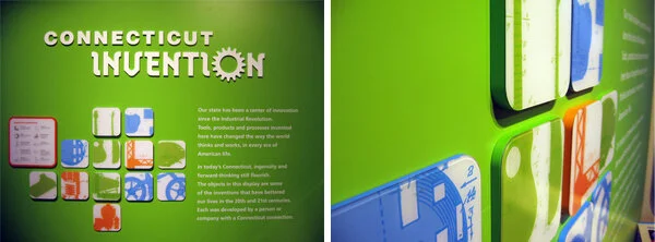
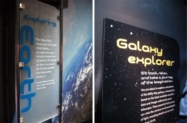
The realities of renovating the Barnum Museum in Bridgeport, CT after it was hit by a tornado | The winner of the PaleoArt Prize in 3D art for “achievement in ... depicting or sculpting paleontological subjects and fossils” | China asks the Penn Museum to return all artifacts from its Silk Road exhibition | The New York Times, on scalies | Winners of this year’s MoMA PS1 Young Architects program asked local businesses and nonprofits what materials they needed, then designed the courtyard space to incorporate those materials, with the intention of donating them at the end of the summer | An exhibit of tattooed arms in Paris | And another, of dismembered dandies, in Sweden | South African printmaking at Boston University’s 808 Gallery | Edward Gorey at the Boston Athenæum | Tangible Things at Harvard | The Charles Hayden Planetarium in Boston reopens after a $9 million yearlong reconstruction | The Museum of Arts and Design’s new Center for Olfactory Art | The reopening of the American Museum of the Moving Image; inaugural events continue.

Post updated in January 2021 with minor text edits. Broken links have been fixed or replaced with archived URLs, courtesy of archive.org. This post was originally published at theexhibitdesigner.com on 17 February 2011.

Look down: memorable exhibit floors

The commercial carpeting seen on the floors of so many museums is oftentimes blah, ugly, or at best: invisible. The floor is a perfect place to execute a creative idea. It’s a fresh, unexpected spot. Here are some examples:

On the floor outside the entrance to Tim Burton at the Museum of Modern Art in New York, is a spiral that collides with and veers up onto the wall, ending in an arrow that points the way to the gaping maw at the exhibition entrance. Clearly inspired, in general, by Mr. Burton’s distinctive style — and perhaps directly by this painting mentioned in MoMA’s blog — the spiral is fun and my favorite design detail from the exhibit.

Within the Exploring Space exhibit at the Connecticut Science Center, there are stars above and around you, in the form of tiny flickering LED lights embedded in the fabric-covered walls — and there are stars below you, projected onto the floor by GOBOs. This dark, starlit room allows you to pretend you are in deep space. (More from that museum visit in this blog post.)

In the Hall of Mammals at the National Museum of Natural History in Washington, DC, there is a treat for those who spend any time looking at their shoes: fossilized footprints visible through the floor. Below, on the left, is another example from that same exhibit. Because the video monitors were set in a row, many people could stand around and watch without crowding, and because they were set into the floor, the short video (about animals’ adaption to the wet and dry seasons of Africa) didn’t distract from the exhibitry. (More from that museum visit in this post.)

Above, on the right, is a reproduction of a 13'-square battlefield map of Gettysburg from Big! at the National Archives Museum. Walking on and looking down at this huge, beautiful, old map was more engaging than had it been traditionally hung on the wall.

Green Community at the National Building Museum in DC had a few interesting things going on with the floor: 1. More than one type of flooring material was used, which gave the floor variety in textural feeling underfoot; 2. Varied and interesting colors and patterns on the floor; 3. The exhibit’s main messages were integrated directly into the floor. Overall, the effect was very impressive. (More from that exhibit visit in this post — my very first blog entry!)

These are just a few I’ve seen. I’d love to hear about an exhibition floor you’ve seen that made an impression.

Post updated in January 2021 with minor text edits. Broken link has been fixed or replaced. This post was originally published at theexhibitdesigner.com on 1 March 2010.

Invention, Energy, and Exploration at CT Science Center

The Connecticut Science Center opened this past June, boasting ten galleries and 40,000 square feet of exhibits, and 150+ hands-on interactives. The building is nice, too — kinetic sculptures hang in the vertigo-inducing, six-story-high central atrium.

csc-lobby21.jpg

One aspect of the architecture that I really like is the number of windows. There are windows in the exhibit galleries that look out on the city of Hartford, and windows that look in, down on the atrium. To pause at those windows provides welcome and needed little moments of serenity.

I went to the science center on the rainy-day Friday after Thanksgiving. Yikes.

The pictures I am about to show will give you little sense of the number of people there, nor of the mayhem happening around me. It seemed that just about everything in the museum spun, whistled, bounced, beeped, whizzed, banged … and was covered in smudgy little fingerprints.

The Invention Dimension exhibit is about “the process of developing new products, new theories, new substances, and new uses for items that no one has ever thought of or attempted before.” The graphics are friendly, with rounded corners and bright, vibrant colors, and nicely illustrated — the illustrations are bold yet finely-detailed as in technical drawings.

csc-inventiondimension 1
csc-inventiondimension3

Energy City, about alternative energy technologies, was my favorite exhibit. I would describe the graphics as future-retro, with bright, bold colors, and video game-inspired diagrammatic illustrations. It was fun to see.

The graphic panels appeared to be printed on a metallic substrate then laminated with a protective film, or printed on the second side of a laminating film. The sheer number of graphic panels here was impressive.

Exploring Space — spelled out in acrylic dimensional letters, over a color-changing lightbox.

The large-scale images of extraterrestrial surfaces were striking as background murals. Area panels were front- and rear-printed on frosted acrylic, making effective use of the material’s depth. Graphics, especially the reader rail graphics, were cleanly designed with subtle textural details and interesting diagrams.

The Forces in Motion exhibit, about the power of the wind, magnets, and robotics, took advantage of its high ceilings: swaths of bold colors, supergraphic-sized type (FREEZE!), and huge vector diagrams on the walls.

There is a “design your own mag-lev (magnetic levitation) train” interactive which was a lot of fun.

The exhibits use low-energy lighting fixtures, which cuts their energy usage to 40% that of traditionally-lit exhibit spaces. It was too close to sensory-overload for my tastes, but if you’d like to engage with dozens of stellar exhibit interactives, you should take a trip here.

The exhibits were designed by Thinc Design (NY) and Jeff Kennedy & Associates (Boston), with many interaction designers: Snibbe Interactive, aesthetec, Boston Productions, Red Hill Studios, and I don't know who else (150+ interactives makes for a lot of interaction designers).

Post updated in January 2021 with minor text edits. Broken links have been fixed or replaced. This post was originally published at theexhibitdesigner.com on 29 November 2009.