Pennsylvania

The News 08.16.12

A compilation of design-related web finds.

The Google Web Lab at the Science Museum in London | Designing for Accessibility: MoMA’s Material Lab | Harvard Medical School’s “Training the Eye” course | SEGD is hosting a symposium, “The Art of Collaboration” (link no longer available) in Raleigh October 4–5 | The last day to see the Terracotta Warriors in North America is August 26 in Times Square | The National Museum of American Jewish History in Philadelphia now offers free admission for their first floor gallery | Why the Museum of Broken Relationships is so great (it’s not just the name) | 100 Toys that Define Our Childhood — vote for your favorites for a new exhibit at the Children’s Museum of Indianapolis. Voting ends tomorrow, August 17 | Places that Work: U.S. Botanic Gardens | Spiders Alive! at the American Museum of Natural History (NY Times review) | Are some fonts more believable than others? and How to explain why typography matters | I’ve been pinning obsessively over on Pinterest.

Post updated in January 2021 with minor text edits. Broken links have been replaced with archived URLs, courtesy of archive.org. This post was originally published at theexhibitdesigner.com on 16 August 2012.

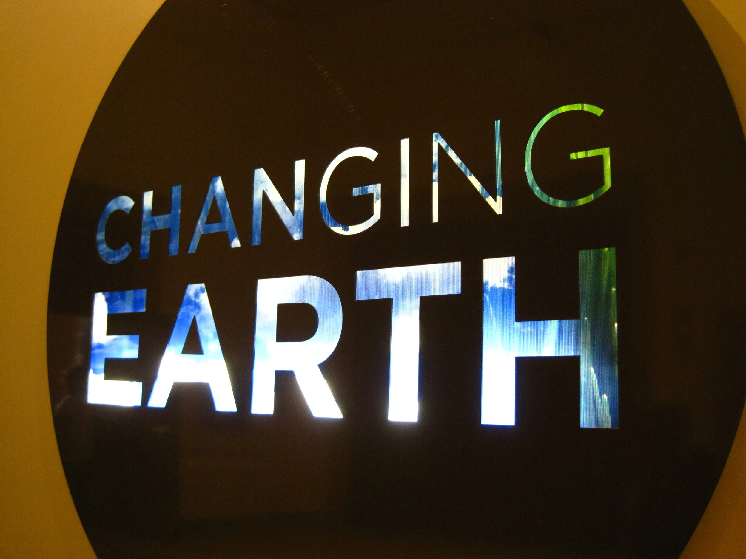
Changing Earth, at the Franklin Institute

Changing Earth at the Franklin Institute in Philadelphia is about land, air, and water, and how these have changed and continue to change on our planet. There’s a lot happening in this exhibit and it was sometimes overstimulating, but overall it was nicely designed with clear ”take-home” messages and memorable interactive experiences.

The designers, Adirondack Studios, used environmentally-sensitive materials throughout the exhibit. From the museum’s website: “Changing Earth is constructed of sustainable materials. The flooring is made from recycled content and post-consumer waste products. All wood is Forest Stewardship Council certified or bamboo. All metal is recyclable. Paint is low-VOC and graphics are printed on recycled material using water-based inks.”

I visited this exhibit about a year ago, not too long after it opened (and wrote this post about the exhibit, Electricity, which had opened at the same time). My memories of the details are a little fuzzy I’m afraid, but both exhibits are still on view if you’d like to see them in person.

The centerpiece of the exhibit was a giant Earth dome (photo above) which housed an introductory film.

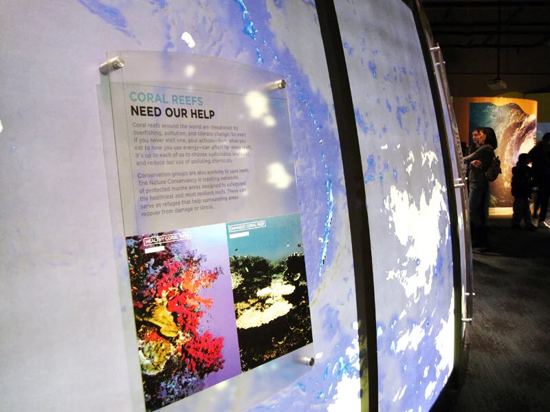
The exhibit was full of interactives and touchable displays, such as a stream table, weather forecast station, and earthquake simulator.

IMG_0151.jpg

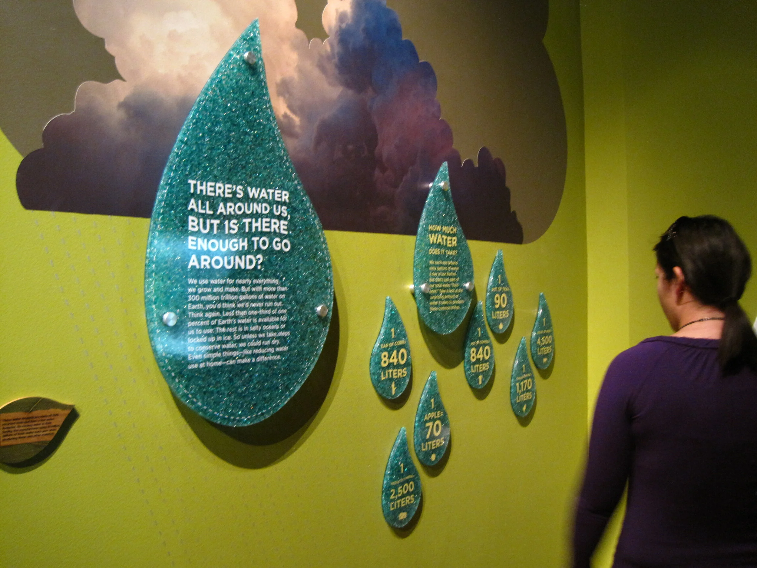
Below is an example of the direct-to-substrate printing used throughout the exhibit.

IMG_0164.jpg
IMG_0157.JPG

Post updated in January 2021 with text and photo edits. This post was originally published at theexhibitdesigner.com on 4 April 2012.

The News 05.01.11

A compilation of design-related web finds.

Creating Material Lab at MoMA | Design to Preserve by the Cooper-Hewitt | Coming soon to the Mall? National Women’s History Museum Makes Another Push Toward Existence and National Latino Museum Plan Faces Fight (hint: probably not) |Jurassic Park meets Buckminster Fuller” — a zoo that imagines a reunited Pangea | MoMath, the National Museum of Mathematics in New York, is raising funds | Vertical Urban Factory at the Skyscraper Museum in New York (slide show here) | Architecture in Uniform: Designing and Building for the Second World War at the Canadian Centre for Architecture | The World’s Largest Dinosaurs at the American Museum of Natural History looks amazing (slide show here; I love photo 3!) | La Plaza de Cultura y Artes, Mexican American cultural center in LA, “screens in a public alley space that both bring the stories out of the museum and draw passersby into the experience.” More in this article from GOOD | The National Museum of American Jewish History opens in Philadelphia | Illinois Holocaust Museum & Education Center opens in Skokie (review and slide show) | The Museum of Tolerance in Los Angeles (review and slide show) | The MBTA steps up its “See Something Say Something” campaign, and in Boston’s North Station:

AND an upcoming opening!

Conner Prairie Interactive History Park is opening a new exhibit, 1863 Civil War Journey: Raid on Indiana, in June. Part theater, part living history museum; the interactive experience is centered around a recreation of a Civil War-era town complete with homes, a general store, and a schoolhouse. As part of the Christopher Chadbourne & Associates team, I designed the graphics located in the schoolhouse, where the lessons of the park are pulled together.

I designed a tabletop graphic for a touch table that houses three monitors. It’s meant to appear as though it were strewn with historic maps and military tactical manuals. I also designed a flipbook that holds background information about the park’s characters, in the style of a scrapbook; and a large “chalkboard” wall graphic inspired by Civil War broadsides and illustrated with a map and hand lettering. These were fun graphics to design, geared toward families and school groups.

conner-prairie_interactive-table.jpg

Post updated in January 2021. Broken links have been replaced with archived URLs, courtesy of archive.org. This post was originally published at theexhibitdesigner.com on 1 May 2011.

The News 02.17.11

A compilation of design-related web finds.

The realities of renovating the Barnum Museum in Bridgeport, CT after it was hit by a tornado | The winner of the PaleoArt Prize in 3D art for “achievement in ... depicting or sculpting paleontological subjects and fossils” | China asks the Penn Museum to return all artifacts from its Silk Road exhibition | The New York Times, on scalies | Winners of this year’s MoMA PS1 Young Architects program asked local businesses and nonprofits what materials they needed, then designed the courtyard space to incorporate those materials, with the intention of donating them at the end of the summer | An exhibit of tattooed arms in Paris | And another, of dismembered dandies, in Sweden | South African printmaking at Boston University’s 808 Gallery | Edward Gorey at the Boston Athenæum | Tangible Things at Harvard | The Charles Hayden Planetarium in Boston reopens after a $9 million yearlong reconstruction | The Museum of Arts and Design’s new Center for Olfactory Art | The reopening of the American Museum of the Moving Image; inaugural events continue.

Post updated in January 2021 with minor text edits. Broken links have been fixed or replaced with archived URLs, courtesy of archive.org. This post was originally published at theexhibitdesigner.com on 17 February 2011.

Electricity, at the Franklin Institute

Electricity at The Franklin Institute is about “the wonders of electricity … this interactive exhibit dedicated to the Museum’s namesake, Benjamin Franklin” serves up historical artifacts, cute diagrams ...

IMG_0217.JPG

… and plenty of techy interactives. The exhibit promises, “Learn how electricity is created and explore the fuel sources needed to generate our electricity. You’ll feel the force of electricity by manipulating electrical phenomena, exploring authentic artifacts … and tackling questions of sustainable energy.” Below, a touch screen to explore Ben Franklin's book Experiments and Observations on Electricity:

The “Electrical Signals” wall: use your phone and it responds with flashing LEDs. It was a lot of fun.

There were group interactives and experiments, and a “sustainable dance floor” which was a blast for all. The exhibit is ongoing.

Post updated in January 2021 with minor text edits. Broken links have been fixed. This post was originally published at theexhibitdesigner.com on 16 January 2011.

The News 04.13.10

A compilation of design-related web finds.

Grab a Museum Discovery Pass next time you’re in New York for 2-for-1 admission to seven of the city’s smaller, more specialized museums such as the American Folk Art Museum or Asia Society Museum | A green consulting company gains extra LEED points by effectively turning their office into an indoor jungle | The National September 11 Memorial & Museum announced that it will receive $2.29 million from the Lower Manhattan Development Corporation and released renderings of the exhibit design (renderings link no longer available; instead, an opinion on the building’s architecture) | MoMA’s upcoming design and architecture exhibition, Talk to Me, to explore “the communication between people and objects,” won’t open until next July, 2011 but in the meantime follow the exhibition blog | Esther Stocker’s installations, discovered via BLDGBLOG | Also seen on BLDGBLOG: Pulse Room, from 2006, an “interactive installation featuring one to three hundred clear incandescent light bulbs, the brightness of which was controlled by an interface and sensor that could detect the heart rate of participants” | And another light installation: UVA: Speed of Light is an immersive laser-based light installation and sound experience in London, up through April 19 | Endangered animals built from Legos by Sean Kenney for the Philadelphia Zoo exhibit Creatures of Habitat: A Gazillion-Piece Animal Adventure.

Post updated in January 2021 with minor text edits. Broken links have been fixed, replaced, or replaced with archived URLs, courtesy of archive.org. This post was originally published at theexhibitdesigner.com on 13 April 2010.

The scariest thing about Eastern State Penitentiary

The scariest thing about Eastern State Penitentiary … is surely not the daffodils growing outside its walls.

It calls itself “America’s Most Historic Prison.” The Library of Congress writes in this photo survey, It was elected to the World Monuments List in 1996 as one of the world’s 100 most endangered monuments. Eastern State Penitentiary is an internationally significant landmark which has directly influenced the design of 300 prisons on four continents and inspired an ongoing conversation about architecture and social control.”

ESP has a fascinating history. It closed as a prison in 1971, and remained abandoned (save for a family of feral cats) until 1994. In 1994 the tour program started and stabilization projects were initiated to maintain the prison as a “semi-ruin.” These stabilization projects were to “stop the deterioration and to make the tour route safe for visitors” and some projects restored areas (such as Al Capone’s cell) to how they looked at specific times in the building’s history. It makes for interesting juxtapositions of ruin/19th or 20th century prison design.

The penitentiary is open every day of the year and offers a number of themed tours. I would recommend that you explore on your own (on-your-own-with-a-friend I mean). Much like at the Ether Dome in Boston (post and photos, here) quiet and solitude enhance the experience. With that said, the free audio tour is worth picking up: it’s interesting and it is narrated by Steve Buscemi.

So is this place scary? I visited late on a chilly and overcast March day and rarely crossed paths with the few other visitors there. The photos I took certainly make the place look sinister, right? Above on the left is Cell Block 1, one of the originals from 1829. To the right, Death Row (Cell Block 15), built in 1959. Below is Cell Block 14. The sign reads “Is Eastern State Penitentiary Haunted?” (The short answer: yes.)

But I was going to tell you the scariest thing about Eastern State Penitentiary. I’d have to say it’s these pink exhibit graphics. Update, 2021: ESP has more recent exhibits whose design is more fitting to the environment.

Post updated in January 2021 with minor text edits. Broken links have been replaced with archived URLs, courtesy of archive.org. This post was originally published at theexhibitdesigner.com on 10 April 2010.

Philagrafika

Philagrafika 2010 is a Philadelphia-wide festival and exhibition of contemporary printmaking. The festival is divided into three components: The Graphic Unconscious is the core exhibition that features the work of thirty-five artists, from eighteen countries, in five art museums and galleries; Out of Print is work created by five artists who were paired with historic Philadelphia institutions; and Independent Projects is a variety of exhibitions organized by other institutions throughout the city.

Additional programing — films and such — supplemented the exhibitions. I like that this festival is all over the city (it was obviously some undertaking), and I really like the title treatment (photo above) and festival map and guidebook by Philly-based Smyrski Creative. Quite nice.

I visited The Galleries at Moore College of Art & Design, part of the Graphic Unconscious exhibition, and saw (and loved) Regina Silveira’s Mundus Admirabilis, an installation wherein a domestic setting is invaded by common pests to invoke biblical plagues and comment on the “plagues” of contemporary society. You can read an interview with Regina Silveira on the Philagrafika blog, here.

Lucky Philadelphians, able to take their time exploring the entire festival, at least for another two weeks (it ends April 11). I wasn’t able to spend nearly enough time with it.

Post updated in Jan 2021 with minor text edits. Broken links have been fixed or replaced with archived URLs, courtesy of archive.org. This post was originally published at theexhibitdesigner.com on 29 March 2010.