natural history exhibits

Habitat, in the snow

Before the Covid-19 pandemic disrupted everyone’s life, if the weather were terrible … well, at least you could pop into a museum and while away an hour or two.

theexhibitdesigner_habitat-in-snow1.jpg

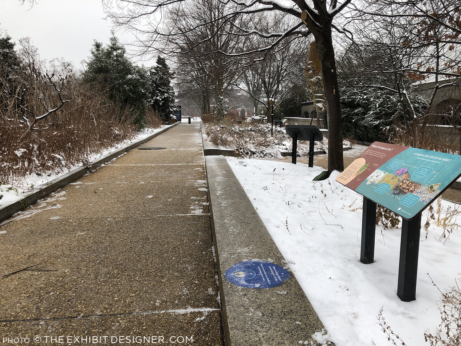
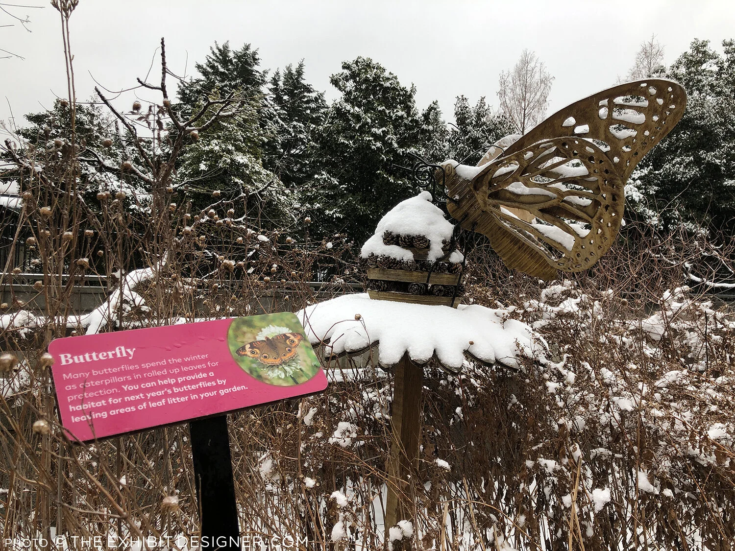
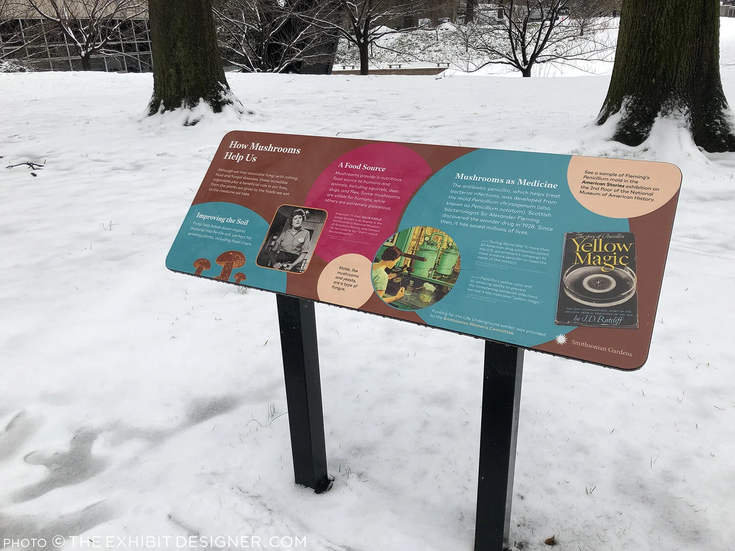
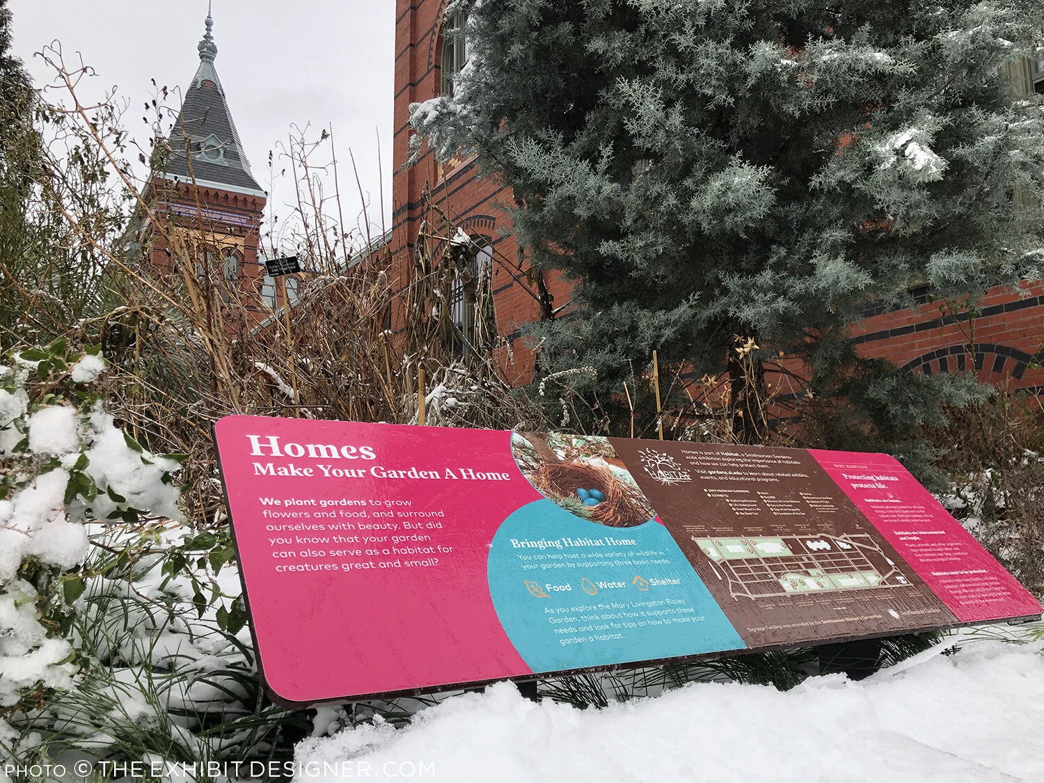
Museums in the Washington, DC region are currently closed to the public, but there is still opportunity to see outdoor exhibitions — even in terrible weather. I took these photos yesterday, of the exhibition, Habitat, that I designed for Smithsonian Gardens. (More photos, taken in warmer times, along with a project description.)

theexhibitdesigner_habitat-in-snow2.jpg

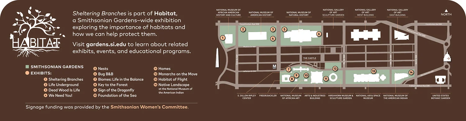
If you’re interested in exploring the Habitat exhibition, on the National Mall in Washington, DC, here is the wayfinding map to help you locate the different exhibits:

Christine Lefebvre Design - Habitat wayfinding map
theexhibitdesigner_habitat-in-snow4.jpg

What interesting outdoor exhibitions have you seen recently? Let me know in the comments!

Space for Life, part 2: Insectarium

Update: The Insectarium is being redesigned, and is scheduled to reopen in 2021.

The Insectarium was our second stop in Montréal’s natural museum complex, Espace Pour La Vie (“Space for Life”). It’s a fascinating and excellently-designed museum. Its exterior looks like a home for insects, almost like a bee hive:

theexhibitdesigner_insectarium-exterior

The permanent exhibition is called We Are the Insects and it is predominately ... very green. Graphics are a mix of strikingly clean layouts and comic book-inspired illustrations.

theexhibitdesigner_insectarium-we-are

Here’s the view down to the bulk of the exhibition:

theexhibitdesigner_insectarium-overview

Each of the glowing cubes is a display case. Specimens are pinned to a rear-lit graphic, around text and images arranged in a clean, gridular design. Each layout looked nicer than the last, so I'm going to share photos of many.

theexhibitdesigner_insectarium-case-graphics1

Some layouts have a sense of irreverence, like this one, with its marching ants:

theexhibitdesigner_insectarium-case-graphics-fun

The different accent colors and stylized illustrations indicated the habitats (e.g. tropical forests) for the specimens.

theexhibitdesigner_insectarium-case-graphics2
theexhibitdesigner_insectarium-terrarium

Throughout the exhibition there were terrariums with some live critters, and beneath some display cubes there were dioramas (faux terrariums, if you will).

theexhibitdesigner_insectarium-faux-terrarium
theexhibitdesigner_insectarium-butterflies

There were wall displays, and plenty of interesting charts and diagrams. There were sections about insect lifestyles, diets, reproduction, and what people can do to protect endangered insects. The sheer number of displays could have made for a repetitive slog, but it did not feel that way at all — specimens were fascinating, text was succinct, and the layouts were visually varied while staying true to the design system.

theexhibitdesigner_insectarium-timeline-charts
theexhibitdesigner_insectarium-reproduction-pros
theexhibitdesigner_insectarium-different-tastes
theexhibitdesigner_insectarium-protect

Outside were additional exhibitions and a temporary interactive art installation. And then we were off to explore the Botanical Garden.

theexhibitdesigner_insectarium-outside-exhibits

Post updated in January 2021 with minor text edits. Broken links have been replaced with archived URLs, courtesy of archive.org. This post was originally published at theexhibitdesigner.com on 15 March 2017.

Space for Life, part 1: Biodôme

Back in September 2015, I spent a handful of days in Montréal. I visited a few museums, but at the time, I only gave one temporary exhibition at the Biodôme brief mention on this blog. This happens all the time — I take photos everywhere I go, and then I just sit on them.… So let’s dust off those photos (or pretend it’s September 2015), and visit the Biodôme.

theexhibitdesigner_biodome-entrance

The Biodôme is part of a museum complex called Espace Pour La Vie (“Space for Life”) that also includes the Insectarium, Jardin botanique (botanical gardens), and Planétarium. You can buy combination admission tickets and pick which you would like to visit. The largest exhibition, and primary draw, within the Biodôme is Ecosystems of the Americas. (But don’t miss the Insectarium!) The Ecosystems exhibition is broken into four ecosystems conveyed by immersive landscaping, climate, and live vegetation and wildlife. For example — the air inside the Tropical Rainforest ecosystem is warm and muggy, while inside the Sub-Antarctic Islands ecosystem it is decidedly chilly.

theexhibitdesigner_biodome-tropical-rainforest.jpg

Inside the Tropical Rainforest you walk through mature and secondary forests, and pass a waterfall, lake, river, cliffs, and caves. Graphics throughout are minimal, restricted to brief labels and occasional monitors. Like most places in Montréal, text is in French, with English translations.

theexhibitdesigner_biodome-tropical-rainforest-graphics

Charming illustrations and species’ statuses are available in the free Identification Guide.

theexhibitdesigner_biodome-guide

Inside the cave you’ll find terrarium-dwellers and nocturnal-types; these graphics were all rear-illuminated, and included a bit more information than graphics in the Rainforest:

theexhibitdesigner_biodome-tropical-rainforest-night-exhibit

Moving along, you reach the Laurentian Maple Forest. At the entrance to each ecosystem you are greeted by a large wall mural: a collage of color-saturated photos, clean-lined vector illustrations, and a where-in-the-world diagram.

theexhibitdesigner_biodome-maple-forest
theexhibitdesigner_biodome-maple-forest-graphic

Maintaining the minimal aesthetic throughout, there are still elements of whimsy, such as photos of playful otters applied to the glass wall of their enclosure. Wayfinding elements also show up on the floor, and on support columns.

theexhibitdesigner_biodome-polar

Downstairs, there are a couple of small exhibitions: the Naturalia Room, which is directed toward children, and a temporary exhibition, which at the time was The Fossil Affair.

Overall, the Biodôme was a fun museum to visit, and the immersive ecosystems were well-done.

theexhibitdesigner_biodome_fossil-affair

Post updated in January 2021 with minor text edits. Broken links have been replaced with archived URLs, courtesy of archive.org. This post was originally published at theexhibitdesigner.com on 14 March 2017.

California Academy of Sciences, part 2: color and quakes

If forced to choose, my favorite part of the California Academy of Sciences would be the Rainforest Dome — check out Part 1 of my visit — but there were many other fascinating exhibitions to enjoy, including Color of Life: Discover Nature's Secret Language, designed by the museum’s Exhibits Studio and opened last year.

theexhibitdesigner-SF-academy-sciences_color-of-life
theexhibitdesigner-SF-academy-sciences_color-of-life4

The exhibition uses bright, bold colors, beautiful photographs, and accessible writing to “reveal the significant roles color plays across a spectrum of species.”

theexhibitdesigner-SF-academy-sciences_color-of-life2
theexhibitdesigner-SF-academy-sciences_color-of-life3
theexhibitdesigner-SF-academy-sciences_color-of-life5

Within the 8,000 square foot exhibition are immersive interactive experiences, including a musical color visualizer, designed by Tellart. Video screens respond to strings, plucked by visitors, with a show of images and videos related to that string’s color.

theexhibitdesigner-SF-academy-sciences_color-of-life7

Another popular interactive experience is the “Courtship Dance Stage.”

theexhibitdesigner-SF-academy-sciences_color-of-life8

Throughout the exhibition are dioramas and small interactives that allow you to see organisms under different types of lighting, or through the eyes of other animals (just for example).

theexhibitdesigner-SF-academy-sciences_color-of-life6.jpg
theexhibitdesigner-SF-academy-sciences_color-of-life9
theexhibitdesigner-SF-academy-sciences_earthquakes

Also 8,000 square feet in size, the older (circa-2012) exhibition, Earthquake: Life of a Dynamic Planet, explores the seismic science of Earth’s geologic transformations through installations such as a 25-foot-wide, walk-through model of Earth, and the immersive “Shake House.”

theexhibitdesigner-SF-academy-sciences_earthquakes2

Other sections of the Earthquake exhibit focus on the diverse life forms that evolved and spread as Pangaea split up, and earthquake preparedness.

theexhibitdesigner-SF-academy-sciences_life-drifts

There are mini-exhibits throughout the museum, including a show of Andy Warhol’s Endangered Species series of silkscreen prints, from 1983. In 2007 the bald eagle was removed from the endangered species list; the other featured animals remain.

theexhibitdesigner-SF-academy-sciences_hall3

Other mini-exhibits focused on variation, in ladybugs and in humans. 

Rounding out my visit, I strolled through the Human Odyssey exhibition, an exploration of the origins of humankind, and the African Hall, home to classic, stuffy, stuffed-animal dioramas (and live penguins).

theexhibitdesigner-SF-academy-sciences_african-hall.jpg

I highly recommend this museum — it’s beautifully designed, fascinating, and educational. I also recommend you consider picking up a City Pass if you plan to visit more than one museum. They are expensive in San Francisco — said from DC, where the museums are mostly free.

Post updated in January 2021 with minor text edits. Broken links have been fixed. This post was originally published at theexhibitdesigner.com on 3 October 2016.

California Academy of Sciences, part 1: rainforests and reefs

I wrapped up June — oh, wow it’s August! — with a trip to Yosemite (happy birthday, National Park Service) and San Francisco, where I spent a day parade-watching and a couple days museum-going.

theexhibitdesigner-SF-pride-2016

One museum that filled nearly an entire day was the California Academy of Sciences in Golden Gate Park. Below is a photo of the museum’s exterior and its brilliant Living Roof, as seen from the de Young Museum.

theexhibitdesigner-SF-academy-sciences_living-roof

There are so many exhibits within “the Academy” (and so many photos to show) that I’ve broken this post into two parts. Part 1 here covers the Aquarium on the lower level, designed by Thinc Design, and the Rainforest on Level 1.

theexhibitdesigner-SF-academy-sciences_visitor-guide

After entering the museum I was swept up with the crowds heading to the 4-story, 90-foot-diameter Rainforest Dome. Inside, the rainforest visit begins on a Bornean forest floor, winds upward through a Madagascan mid-story and a Costa Rican canopy, then ends on the lower level in an Amazonian flooded forest.

theexhibitdesigner-SF-academy-sciences_rainforest-dome

As a designer, I liked the dome’s juxtaposition of glass and steel and abstracted jungle motifs against living flora and fauna, and the changing vistas as I moved further up the dome. As a nature enthusiast, I enjoyed its subject matter; as a weary museum visitor, I appreciated its delivery: not too much, not too little; brief, interesting, and useful.

theexhibitdesigner-SF-academy-sciences_rainforest-levels
theexhibitdesigner-SF-academy-sciences_rainforest-area-signs
theexhibitdesigner-SF-academy-sciences_rainforest-animal-signs

The bright, straightforward graphics make use of vivid photographs, and the occasional illustration of an animal signals your arrival in a new area of the jungle. Bamboo- or vine-like vertical posts give a stylized–naturalistic element to exhibit tanks. The light touch with exhibit elements gives the rainforest dome a feeling of exploration and discovery (just ignore the school groups).

At the top of the dome, look out over the three stories you’ve just visited, and down, through a 100,000 gallon tank, to the flooded forest floor. Take an elevator down, then enter the tunnel you were just looking through from afar. Everyone says “oooh.”

theexhibitdesigner-SF-academy-sciences_rainforest-dome-lower2
theexhibitdesigner-SF-academy-sciences_rainforest-dome-lower1.jpg

The aquarium level felt jam-packed and massive; it’s where I spent most of my time during a 3 hour + visit. There were many exhibitions to see: Amazon Flooded Forest, Water Planet, California Coast, Coral Reefs of the World, Twilight Zone, and more.

Down here, animal identification is found on digital touchscreens. They were intuitive and fun to use, and had just the right amount of information: an animal’s common name, its scientific name, diet, and a one-sentence fact about it.

theexhibitdesigner-SF-academy-sciences_rainforest-digital-signs

Below are some photos of the Water Planet exhibition, which groups underwater animals by adaptations. Projected blue and green lighting casts an underwater glow on the sculptural wave walls (similar material here). In the center of the room are curvilinear tanks. (I was reminded of the Van Cleef & Arpels traveling exhibition, circa 2012. It must be the bubbles.)

theexhibitdesigner-SF-academy-sciences_aquarium-water-planet.jpg
theexhibitdesigner-SF-academy-sciences_aquarium-water-planet2
theexhibitdesigner-SF-academy-sciences_aquarium-water-planet3
theexhibitdesigner-SF-academy-sciences_aquarium-cal-coast

The highlight of the Coral Reefs of the World exhibition is the 25-foot deep Philippine Coral Reef tank (above). The exhibit graphics in this area are large image-based wallpapers.

theexhibitdesigner-SF-academy-sciences_aquarium-cal-coast2
theexhibitdesigner-SF-academy-sciences_aquarium-cal-coast3

The exhibition Twilight Zone: Deep Reefs Revealed had just opened on June 10. It’s memorable for its tanks filled with the most incredible jellies and vivid deep sea fishes.

theexhibitdesigner-SF-academy-sciences_aquarium-twilight-zone

Post updated in January 2021 with minor text edits. Broken links have been fixed. This post was originally published at theexhibitdesigner.com on 23 August 2016.

My hazy memories of the Perot Museum

A few days ago I was talking with some colleagues about the Perot Museum of Nature and History in Dallas, Texas. Someone remembered one responsive interactive; I remembered a different one ... and then I remembered that I haven’t shared any photos from my visit (nearly a year ago).

The responsive interactive I remembered was located in the lobby. Models of water molecules danced up and down from the ceiling in response to the movements of people below. The molecule models were controlled by cameras in the ceiling that sensed movement and triggered motors that made them dance.

And that’s about where my specific memories break down. What I do remember is how large the museum is, with 11 permanent exhibit halls, and that the day I went it was JAM-PACKED.

There was something there for everyone though, even if it took a bit of maneuvering to get around and find it. I liked the dinosaur gallery:

And bits and pieces of other galleries, including the entrance to the Gems and Minerals Hall:

I was really taken with these benches sprinkled throughout the museum, with their cut-out factoids:

Overall, we were intrigued, learned some things, and had fun. (Just don’t ask me for details.)

I’ll wrap this post up with a photo I took of the roof. From the museum’s Wikipedia page: “It has a stone roof which features a landscape of drought-tolerant greenery inspired by Dallas surroundings. … Building on the museum’s commitment to resource conservation, the new building integrates a variety of sustainable strategies including a rainwater collection system that captures run-off water from the roof and parking lot, satisfying 74% of the museum’s non-potable water needs and 100% of its irrigation needs.”

Post updated in January 2021 with minor text edits. This post was originally published at theexhibitdesigner.com on 20 March 2014.

The News 05.01.11

A compilation of design-related web finds.

Creating Material Lab at MoMA | Design to Preserve by the Cooper-Hewitt | Coming soon to the Mall? National Women’s History Museum Makes Another Push Toward Existence and National Latino Museum Plan Faces Fight (hint: probably not) |Jurassic Park meets Buckminster Fuller” — a zoo that imagines a reunited Pangea | MoMath, the National Museum of Mathematics in New York, is raising funds | Vertical Urban Factory at the Skyscraper Museum in New York (slide show here) | Architecture in Uniform: Designing and Building for the Second World War at the Canadian Centre for Architecture | The World’s Largest Dinosaurs at the American Museum of Natural History looks amazing (slide show here; I love photo 3!) | La Plaza de Cultura y Artes, Mexican American cultural center in LA, “screens in a public alley space that both bring the stories out of the museum and draw passersby into the experience.” More in this article from GOOD | The National Museum of American Jewish History opens in Philadelphia | Illinois Holocaust Museum & Education Center opens in Skokie (review and slide show) | The Museum of Tolerance in Los Angeles (review and slide show) | The MBTA steps up its “See Something Say Something” campaign, and in Boston’s North Station:

AND an upcoming opening!

Conner Prairie Interactive History Park is opening a new exhibit, 1863 Civil War Journey: Raid on Indiana, in June. Part theater, part living history museum; the interactive experience is centered around a recreation of a Civil War-era town complete with homes, a general store, and a schoolhouse. As part of the Christopher Chadbourne & Associates team, I designed the graphics located in the schoolhouse, where the lessons of the park are pulled together.

I designed a tabletop graphic for a touch table that houses three monitors. It’s meant to appear as though it were strewn with historic maps and military tactical manuals. I also designed a flipbook that holds background information about the park’s characters, in the style of a scrapbook; and a large “chalkboard” wall graphic inspired by Civil War broadsides and illustrated with a map and hand lettering. These were fun graphics to design, geared toward families and school groups.

conner-prairie_interactive-table.jpg

Post updated in January 2021. Broken links have been replaced with archived URLs, courtesy of archive.org. This post was originally published at theexhibitdesigner.com on 1 May 2011.

New England Habitats

At the Museum of Science, Boston they’ve quietly redesigned the graphics in their New England Habitats exhibit. Direct print on solid wood, matte varnish. Nice!

Apparently, there are gremlins painted into some of the diorama backdrops. (From the link above: “Artist Francis Lee Jaques, famous for his ability to blend background paintings seamlessly with three-dimensional foregrounds, painted many of these along with several other Museum dioramas. When he was on lunch break, Jaques’ wife sometimes snuck into the hall and painted little, hidden gremlins into his backgrounds. Look for her handiwork in the Crane Beach diorama!”) I never noticed this, but now must go to the museum to confirm….

Post updated in January 2021. Broken links have been fixed. This post was originally published at theexhibitdesigner.com on 10 October 2010.

Field Trip Day!

Last week a few of my Chadbourne colleagues and I took a day to visit some local museums in Cambridge.

Nothing I haven’t already covered here on TED, but it’s always nice to see old friends. First stop: the Harvard Museum of Natural History/Peabody Museum of Archeology & Ethnology. They had a new, small but interesting exhibit, Headgear: The Natural History of Horns and Antlers (left and center, below) and they seem to be continuing the renovation work begun in the Great Mammal Hall. I peeked behind a drawn curtain to see what the deal was, but was stopped by this guy on the right:

I’ve written in the past about the HMNH, but I can’t resist adding a few more photos here. Slowly but surely the museums seem to be getting cleaner and brighter.

We then made our way over to the Harvard Art Museums, currently housed in the Sackler Museum, and previously seen on The Exhibit Designer, here.

We ended the day at the MIT Museum where, because of our tired feet and the heat of the day, we plunked down on a bench and became entirely engrossed in a video of Alan Alda swimming with a robotic tuna. (No really, I’m not kidding about the tuna. The video is from the episode “Natural Born Robots” of the PBS show Scientific American Frontiers.) Previous MIT Museum coverage here.

Post updated in January 2021 with minor text edits. Broken links have been fixed. This post was originally published at theexhibitdesigner.com on 30 September 2010.

The News 06.23.10

A compilation of design-related web finds.

Sometimes it seems like there really is a museum for and about everything. Name a topic, and I bet you can find an obscure museum dedicated to it. Tractors? Barbed wire? Plastics? Architectural models? Chinese shadow puppets? Battlestar Galactica? | Natural history exhibits opening this summer, in no way exhaustive: Whales at the Museum of Science, Boston (they offer a museum admission/whale watch ticket combo); The Deep at the Natural History Museum, London; Race to the End of the Earth, about Arctic explorers, at the American Museum of Natural History; the AMNH’s Climate Change exhibit moves to the Field Museum in Chicago; Age of Mammals, a “a postmodern diorama” in the Natural History Museum of Los Angeles’s newly restored 1912 building | This photo of the Smithsonian Natural History Museum’s collection of thousands of birds is just great | A Micro Museum for the Design of and with Typography; Typopassage Vienna is inside the Museumsquartier in Vienna and open 24 hours a day, every week of the year. (Curious; who’d be there at 4am?) | Shape Lab, an interactive educational space for families. Who wouldn’t want to play there? | The British Museum and Wikipedia’s unusual collaboration.

Post updated in January 2021 with minor text edits. Broken links have been fixed or replaced. This post was originally published at theexhibitdesigner.com on 23 June 2010.

The News 03.17.10

A compilation of design-related web finds.

Today, the Smithsonian’s Museum of Natural History opened its 15,000 square-foot Hall of Human Origins (original link no longer available). It looks nice. Lots of skulls | March is Women in History Month; to celebrate, the Smithsonian’s National Postal Museum has a four-part online exhibition Women on Stamps | A behind-the-scenes video of The First Ladies at the Smithsonian National Museum of American History | The MoMA’s changing wall colors, from their blog (link no longer available) | An interactive matrix of green design strategies | Congratulations to Bisphenol A (BPA) — found in my friend vinyl — for its win at The Toxies in the category “Worst Breakthrough Performance and Viewer’s Choice Award for Worst Chemical of 2009” | Kinetic sculptures are awesome: Magic Wave by Reuben Margolin, and the BMW Museum’s kinetic sculpture | “Moomin Valley,” designed for a family entertainment center, is adorable and clever | I love, love, love, Tara Donovan. If you’re anywhere near Indianapolis between April 4 and August 1, you need to see her show at the Indianapolis Museum of Art | Tomás Saraceno (link added in 2021; very cool website) collaborated with astrophysicists, architects, engineers and arachnologists (spider researchers!) for this interactive art installation based on “the imagery and structure of spider webs to map the origin and structure of the universe” | Bruno Maag’s typographic exhibition Shape My Language in which “long streams of clear plastic cards hang from the ceiling, engulfing the gallery visitors in a typographic mist.”

Post updated in January 2021 with minor text edits. Broken link has been fixed, replaced, or replaced with archived URLs, courtesy of archive.org. This post was originally published at theexhibitdesigner.com on 17 March 2010.

The News 03.02.10

A compilation of design-related web finds.

Design Museum Boston (update: now simply, Design Museum) is all set to pop-up in the window of an abandoned storefront near you | A video tour of the “Biology Range” at the New York State Museum, where they keep their preserved biological specimens | The Mercedes-Benz Museum in Stuttgart has the World’s Largest Artificial Tornado inside; the ventilation system draws in smoke from the building and sends it up and out an exhaust vent | Another German museum, another car museum: exploded views from the Porsche Museum (also in Stuttgart) and the Harley Davidson Museum (in Milwaukee) | If cars are not your thing but exploded views are, you might instead enjoy one of an Etch A Sketch | Multiple Shadow House by Olafur Eliasson at the Tonya Bonakdar Gallery in NY: “The individual lights are all different colors, but they create white light when they all blend on a single wall. As visitors walk in front of the light sources, that hides certain colors — thus freeing the rest to reveal themselves as colored shadows.” | The One Day Poem Pavilion “demonstrates the poetic, transitory, site-sensitive and time-based nature of light and shadow.”

Post updated in January 2021 with minor text edits. Broken link has been fixed. This post was originally published at theexhibitdesigner.com on 2 March 2010.

The News 01.19.10

A compilation of design-related web finds.

L.A.’s Natural History Museum to receive $1-million grant for new permanent exhibition | Rising Currents: Projects for New York’s Waterfront — I’ve been following with interest the progress of the program and upcoming exhibit on the MoMA/P.S.1 blog | Towards a New Mainstream? On 27 January 2–3pm EST, a lecture by Gregory Rodriguez exploring demographic change in the Americas, cultural transformation, and the future of museums | Color Identifying System for the Color Blind | An Increasing Craving for Experiences; there has been a lot written lately about experience-over-stuff — hello, museums! | Light Touch interactive projector turns any flat surface into a touchscreen | An Architect’s Philosophy of Photography | Steffen Dam: Specimen Panels These are beautiful; very “natural history museum” | Barton’s Bonbonniere, From Architectural Forum c. 1952 — I love it! What a fun space.

AND NOW, something from the portfolio:

Work shown was completed while I was a designer at Christopher Chadbourne & Associates.

Perfectos.jpg

This time last year (January 17, 2009), the Tampa Bay History Center — designed by Christopher Chadbourne & Associates — held its grand opening in downtown Tampa, Florida. I worked closely with the project’s senior graphic designer Jeff Stammen on design development.

(Photo above and first three photos below, courtesy Tampa Bay History Center.)

Cattle.jpg
Container.jpg
07 Tampa Bay History Center 214_sm.jpg

I took a leading design role for the timeline (Your Tampa Bay) and the War Stories gallery. Below is my sketch of the War Stories gallery, and below that, a photo I took during installation — hence the empty case.

theexhibitdesigner_TBHC-war-stories-install.jpg

All the graphics in this museum were designed with both English and Spanish text. I love the challenge of designing multilingual graphics.

I was also responsible for Construction Administration, and supervised the exhibit installation. I love shop visits, site visits, inspecting fabrication samples … all of that. What happened with the Tampa installation was a little … let’s just say, complicated. The local fabricator, Creative Arts, was fantastic and saved the installation day in a lot of ways. I ended up effectively living in a hotel room for a couple weeks during the tail end of installation — much longer than my trip to Tampa was supposed to be. It was quite the learning experience. In hindsight, I can say I had fun.

(Photo above and photo below, courtesy Tampa Bay History Center.)

Your_Tampa_Bay.jpg
tampa_092.JPG
tampa_290edit.jpg

Post updated in January 2021. Broken links have been fixed or replaced with archived URLs, courtesy of archive.org. This post was originally published at theexhibitdesigner.com on 19 January 2010.

A thought or two on curved reader rails

I have been working on some curved reader rails and I feel for anyone who has to design them regularly — they involve advanced geometric wizardry that can make your head spin. (Or not ... but actually, yes, they are tricky.)

Below are two curved reader rails in the Ocean Hall at the National Museum of Natural History in DC. On the left is a rail that looks as though its graphics were not laid-out correctly; I’d guess that the text blocks and graphic elements are angled, but not CURVED to match the round rail edges, which makes the graphic look a little wonky. Look specifically at the text “Meet Phoenix” — see how it angles toward the text block below it? (But how cute is that whale illustration?) On the right, from the same exhibit, another curved rail. It’s a much simpler design, and it works: just two lines of text, set on a baseline curved to the radius of the rail.

Below is a reader rail that I designed for the National Museum of the US Army in Fort Belvoir, Virginia. (We — Christopher Chadbourne & Associates — are still in Design Development so text and images are not final.)

It will ultimately surround a circular, glass-enclosed diorama. Every line of text is on its own track, curved to the radius of the rail; in fact, all graphic elements, including lines and images, have horizontal lines curved to that radius. It took a long time to lay this out.

curved rail2.jpg

Update, 2021: The museum is now open (!!) — but also temporarily closed due to Covid-19 — and you can see the round reader rail and diorama in the photo of the Cold War gallery on the NMUSA website.

Post updated in January 2021. Broken links have been fixed, replaced, or replaced with archived URLs, courtesy of archive.org. This post was originally published at theexhibitdesigner.com on 10 January 2010.

Glass flowers and old museum labels

The Harvard Museum of Natural History was founded not too long ago, in 1998, yet it is one of the oldest natural history museums in the country — older than both the National Museum in DC (founded 1910) and the American Museum in New York (1868).

Harvard’s museum was established as “the public face” of three museums: the Museum of Comparative Zoology (founded 1859), the Harvard University Herbaria (1858), and the Mineralogical and Geological Museum (1784). I included all those dates to impress on you that this is an old museum.

Old natural history museums have old funky taxidermy and old funky graphic design. I am not here to pick on HMNH — on the contrary. I’m focusing this post on their older exhibits — the botanical, the zoological, and the mineralogical galleries — because I think their outmoded displays of minerals and glass flowers, and their similarly outmoded specimen labels within, are beyond charming. The labels say as much about the history of the museum, and exhibit design as a whole, as they do about the taxidermy they're identifying.

The Glass Flowers gallery is a perfect example of that. It is mesmerizing. In a smallish, dimly-lit room are displayed the 4,400 life-size glass models made between 1886 and 1936 by father and son glass artists Leopold and Rudolph Blaschka. Every single flower, leaf, and seed, is made out of colored or hand-painted glass. Some have wire armatures. It is a beautifully illustrated botany book in three dimensions — all crafted in glass. The labels are modest and straightforward, without extraneous decoration, which feel just right here. It’s an incredible presentation and a must-see.

Most of the taxidermy displays in the older sections of the museum are like that: charmingly antiquated little labels with nothing more than a common and a Latin name, maybe a genus, a species; maybe a sentence about what an animal likes to eat, or where it likes to live. I just love these bird displays:

Every display looks different from the others because each one was put together at a different time and made in a different way by different people. Even within a single display there can be a lack of consistency, based, maybe, on when the museum acquired different specimens. Take the photographs below. It might be hard to tell (none of my close-up photos turned out, unfortunately) but trust me — there is quite the smorgasbord of type represented here.

Do I think these old galleries needs an upgrade? Yes, with a ‘but.’ On the one hand, a redesign is exactly what is needed to revive these rather gloomy collections of musty stuffed animals (among other things, like better lighting, and ventilation). And alongside the “charmingly-antiquated” graphics are a lot of ugly, unfortunate graphics. (Much of that is found in the relatively-recently designed parts of the museum.)

Those old, neglected galleries can be dark, creepy, and stinky — all in marked contrast to the museum’s newly-renovated Hall of Mammals (below). The Hall of Mammal’s historically-sensitive renovation was completed in October of this year. Original nineteen-century paint colors were restored, the animals were given a good dusting (conservation), and energy-conserving light bulbs were thrown in for good measure. After making my way through the narrow maze-like hallways of the previous galleries, it was a relief to come out into this lovely light-filled room:

This is a good direction for the museum: thoughtful renovations that retain the character and charm of the old exhibits. But here’s the on-the-other-hand: The new graphics in the Hall of Mammals are simple, nice, and unoffensive, yet they are missing that old natural history museum je ne sais quoi.

It could have been worse, true. The overhaul of a museum’s labeling, giving it a true “graphic system,” does not necessarily result in great graphics. Couldn’t the graphics have been done in such a way as to be both fresh and cabinet-of-curiosities; given some personality and a nod to the museum’s history? Obviously, the answer is yes. I hope that when the museum renovates other galleries (rumor has it that the mineral gallery might be next), it keeps that in mind.

To wrap this up: In the fossils hall, there are some fantastic dimensional letters. Cut out by hand, undoubtedly. In a shade of green you don’t often see anymore. I believe Crayola calls it “Old Natural History Museum Green.” (It’s in the 120 pack.)

Post updated in January 2021 with minor text edits. Broken links have been fixed. This post was originally published at theexhibitdesigner.com on 24 November 2009.

DC part 3: National Museum of Natural History

For this final post about my recent trip to DC, I am sharing some photographs from the Smithsonian’s National Museum of Natural History. NMNH is a big museum, with some exhibits dating back to the Paleolithic era, so I skipped a lot of it. The three permanent exhibits below are a few to see if, like me, you’re primarily interested in a museum’s graphics.

nmnh-title

The Sant Ocean Hall recently re-opened, in 2008, with exhibit redesign by Maryland-based Gallagher & Associates. (Exhibit photos on the fabricator, D&P’s website.) Each subject area in the Ocean Hall had color palettes distinct from other area; important because there wasn’t a prescribed path for a visitor to follow — everyone wandered around in whatever direction struck their fancy. The colors unified the island-like display cases. I liked the color selections and image/title compositions for the area introductions. (Seahorses, they are photogenic!) The infilled, etched illustrations were quite nice.

Ocean-Hall1
Ocean-Hall2
Ocean-Hall3

In the Bone Hall; cheerful colors and swirling, retro patterns. This is an old exhibit, but wonderful nonetheless, with clever interplay between the patterns at the backs of display cases and the skeletons’ poses. I didn’t look closely at how these graphics were produced but I would hazard a guess that patterns were painted/stenciled on the wall and text was silkscreened. (Thanks to my colleague Jeff for these two photos.)

bones3
bones2

And finally, the Hall of Mammals, an excellent redesign by Canadian firm Reich + Petch. (Great photos of the exhibition at that link.) The gallery panels were beautiful: they were scenically-treated and textured lightboxes (the third image below is a close-up of the texture on the North American panel) which was in beautiful contrast to the overall minimalism of the exhibit. I also liked the use of vector art in the diorama backdrops (an example is shown in the “Getting Around in Open Woodlands” photo), which added another element to the graphic palette. The line illustrations on the specimen labels were great. (Thanks to my colleague Jeff for the Australia diorama and the ‘Rainforest’ text photos.)

Mammals1
Mammals5
Mammals4
Mammals3
Mammals2

Post updated in January 2021 with minor text edits. Broken links have been fixed or replaced. This post was originally published at theexhibitdesigner.com on 14 November 2009.