experiences

Markus Lüpertz: Threads of History

A quick check-in here. I stopped by the Hirshhorn Museum and Sculpture Garden this past weekend for Sound Scene X, and to take some photos of a project I currently have on view in the museum’s lower level: the exhibition Markus Lüpertz: Threads of History, on view through September 10.

the-exhibit-designer_christine-lefebvre_Hirshhorn_Lupertz_entrance.jpg

I developed the concept for the exhibition graphics, and after many rounds of refinement, handed over template files for the museum’s designers to produce final graphics (with the exception of the timeline graphic, which I laid out). I much prefer to handle the layout of final production files but aligning the museum’s schedule with mine was tough in this instance.

the-exhibit-designer_christine-lefebvre_Hirshhorn_Lupertz_entrance_timeline.jpg
the-exhibit-designer_christine-lefebvre_Hirshhorn_Lupertz_timeline-details.jpg
the-exhibit-designer_christine-lefebvre_Hirshhorn_Lupertz_section.jpg

I also designed two exterior signs advertising the exhibition, for display outside the museum. The blue sign has already been replaced with one for another exhibition — things move fast on the Mall sometimes! Additional information about the exhibition can be found on my portfolio.

the-exhibit-designer_christine-lefebvre_Hirshhorn_Lupertz_exterior-signs

Please check out the exhibition if you're in the DC area! And if you like it, there is a concurrently-open exhibition to see, Markus Lüpertz at the Phillips Collection. I have become a fan of Lüpertz’s work — particularly the Donald Duck paintings, one of which is visible through the exhibition’s entrance (in the first photo) and on the blue sign above.

Hirshhorn_SoundSceneX.jpg

This weekend was a good time to be a kid (of any age) at the Hirshhorn—the galleries were full of interactive sound installations, live museum, and sound-related activities, all part of Sound Scene X: Dissonance.

While there, I took the opportunity to also check out the newly-opened, Ai WeiWei: Trace at Hirshhorn.

Hirshhorn_AiWeiwei

I am currently working with the museum on another exhibition, Ilya and Emilia Kabakov: Utopian Projects, set to open in a month. Stay tuned for that!

Post updated in January 2021 with minor text edits. This post was originally published at theexhibitdesigner.com on 10 July 2017.

California Academy of Sciences, part 1: rainforests and reefs

I wrapped up June — oh, wow it’s August! — with a trip to Yosemite (happy birthday, National Park Service) and San Francisco, where I spent a day parade-watching and a couple days museum-going.

theexhibitdesigner-SF-pride-2016

One museum that filled nearly an entire day was the California Academy of Sciences in Golden Gate Park. Below is a photo of the museum’s exterior and its brilliant Living Roof, as seen from the de Young Museum.

theexhibitdesigner-SF-academy-sciences_living-roof

There are so many exhibits within “the Academy” (and so many photos to show) that I’ve broken this post into two parts. Part 1 here covers the Aquarium on the lower level, designed by Thinc Design, and the Rainforest on Level 1.

theexhibitdesigner-SF-academy-sciences_visitor-guide

After entering the museum I was swept up with the crowds heading to the 4-story, 90-foot-diameter Rainforest Dome. Inside, the rainforest visit begins on a Bornean forest floor, winds upward through a Madagascan mid-story and a Costa Rican canopy, then ends on the lower level in an Amazonian flooded forest.

theexhibitdesigner-SF-academy-sciences_rainforest-dome

As a designer, I liked the dome’s juxtaposition of glass and steel and abstracted jungle motifs against living flora and fauna, and the changing vistas as I moved further up the dome. As a nature enthusiast, I enjoyed its subject matter; as a weary museum visitor, I appreciated its delivery: not too much, not too little; brief, interesting, and useful.

theexhibitdesigner-SF-academy-sciences_rainforest-levels
theexhibitdesigner-SF-academy-sciences_rainforest-area-signs
theexhibitdesigner-SF-academy-sciences_rainforest-animal-signs

The bright, straightforward graphics make use of vivid photographs, and the occasional illustration of an animal signals your arrival in a new area of the jungle. Bamboo- or vine-like vertical posts give a stylized–naturalistic element to exhibit tanks. The light touch with exhibit elements gives the rainforest dome a feeling of exploration and discovery (just ignore the school groups).

At the top of the dome, look out over the three stories you’ve just visited, and down, through a 100,000 gallon tank, to the flooded forest floor. Take an elevator down, then enter the tunnel you were just looking through from afar. Everyone says “oooh.”

theexhibitdesigner-SF-academy-sciences_rainforest-dome-lower2
theexhibitdesigner-SF-academy-sciences_rainforest-dome-lower1.jpg

The aquarium level felt jam-packed and massive; it’s where I spent most of my time during a 3 hour + visit. There were many exhibitions to see: Amazon Flooded Forest, Water Planet, California Coast, Coral Reefs of the World, Twilight Zone, and more.

Down here, animal identification is found on digital touchscreens. They were intuitive and fun to use, and had just the right amount of information: an animal’s common name, its scientific name, diet, and a one-sentence fact about it.

theexhibitdesigner-SF-academy-sciences_rainforest-digital-signs

Below are some photos of the Water Planet exhibition, which groups underwater animals by adaptations. Projected blue and green lighting casts an underwater glow on the sculptural wave walls (similar material here). In the center of the room are curvilinear tanks. (I was reminded of the Van Cleef & Arpels traveling exhibition, circa 2012. It must be the bubbles.)

theexhibitdesigner-SF-academy-sciences_aquarium-water-planet.jpg
theexhibitdesigner-SF-academy-sciences_aquarium-water-planet2
theexhibitdesigner-SF-academy-sciences_aquarium-water-planet3
theexhibitdesigner-SF-academy-sciences_aquarium-cal-coast

The highlight of the Coral Reefs of the World exhibition is the 25-foot deep Philippine Coral Reef tank (above). The exhibit graphics in this area are large image-based wallpapers.

theexhibitdesigner-SF-academy-sciences_aquarium-cal-coast2
theexhibitdesigner-SF-academy-sciences_aquarium-cal-coast3

The exhibition Twilight Zone: Deep Reefs Revealed had just opened on June 10. It’s memorable for its tanks filled with the most incredible jellies and vivid deep sea fishes.

theexhibitdesigner-SF-academy-sciences_aquarium-twilight-zone

Post updated in January 2021 with minor text edits. Broken links have been fixed. This post was originally published at theexhibitdesigner.com on 23 August 2016.

Weekend in NYC: the Cooper Hewitt, Jewish Museum, more

I went up to New York City a couple weekends ago. My time was packed with museum visits, including my first to the Tenement Museum, at 97 Orchard Street in Manhattan’s Lower East Side. I took their Shop Life tour. The museum’s sixty- and ninety-minute-long tours are docent-led through restored tenement apartments. Most tours focuses on one apartment, one period in time, and one actual family; the Shop Life tour is slightly different in that it highlights multiple families, across time periods, who lived and worked in the basement-level shops. I highly recommend the museum for an engrossing, educational experience. (Summertime hint: the Shop Life tour is the only one air-conditioned!)

From top left, clock-wise: volunteers pull weeds on the High Line; the entrance to the "Shop Life" tour at the Tenement Museum (no photos allowed inside!); Fly By Night at the Brooklyn Navy Yard; Goshka Macuga at the New Museum

From top left, clock-wise: volunteers pull weeds on the High Line; the entrance to the "Shop Life" tour at the Tenement Museum (no photos allowed inside!); Fly By Night at the Brooklyn Navy Yard; Goshka Macuga at the New Museum

I also stopped by the New Museum, since I was in the neighborhood for the Tenement Museum, and truth be told, I was mostly perplexed (I’m not that hip, apparently). I paid another visit to the High Line, which has expanded and its plantings matured since I was last there. And I saw a performance of Duke Riley’s Fly By Night, in which, “at dusk, a massive flock of pigeons … elegantly twirl, swoop, and glide above the East River.” The pigeons wear LED anklets and respond to whistles and waving flags, flying overhead as commanded. The performance pays homage to the mostly forgotten culture of pigeon keeping and — with just another week to go — is being held at the Brooklyn Navy Yard, once home to the country’s largest naval fleet of pigeon carriers. I loved it.

theexhibitdesigner_new-york-met-breuer

At the Met Breuer, the Metropolitan Museum of Art’s new home for modern and contemporary exhibitions (in the Whitney’s former building), I saw the exhibition Unfinished. There was nothing ground breaking in the actual exhibition design, but the premise was compelling and a lot of the artwork was fantastic.

And I took in the Nasreen Mohamedi retrospective. (Just closed, on June 5.) After the jam-packed Unfinished, the meditative exhibition was a welcome respite.

theexhibitdesigner_new-york-met-breuer2

But hands down, my two favorite exhibits during this visit were at the Jewish Museum and the Cooper Hewitt.

theexhibitdesigner_new-york-jewishmus_burle-marx

At the Jewish Museum, I fell in love with Roberto Burle Marx. Burle Marx was a Brazilian artist who drew upon diverse cultural influences to reinvent the landscape architecture discipline. He incorporated abstracted, irregular forms, native plants (he was a passionate environmental advocate), and Brazilian modernism into his landscape designs. His work is incredible; visit this exhibition!

theexhibitdesigner_new-york-jewishmus_burle-marx-exhibit-cases

The exhibition design was spot-on, evoking the geometries and curves of Burle Marx’s landscapes and emphasizing the art on display. An interlocked massing of display cases in the center of the room dominated the exhibition space; an 87-foot-long tapestry (below, left), designed by Burle Marx for the Santo André Civic Center in 1969, provided a stunning focal point. His hand-drawn and painted landscape plans are wonderful to behold; some examples from the exhibition are shown below.

theexhibitdesigner_new-york-jewishmus_burle-marx-exhibit-displays
theexhibitdesigner_new-york-jewishmus_burle-marx2

A few blocks north, Beauty, the Cooper Hewitt Design Triennial was bustling. The wide-ranging contemporary design exhibition is a must-see for designers and artists.

theexhibitdesigner_new-york-cooper-hewitt-beauty
theexhibitdesigner_new-york-cooper-hewitt-beauty2

The exhibition design was minimal, just the simplest of reader rails and small text panels. The museum encourages use of “pens” that allow you to interact with the digitized collection on touchscreen tables and to save objects from the exhibitions to be accessed later. A nice benefit of accessing your visit online is that for each object, museum curators have selected related objects for further exploration. For example, the online entry for Atmospheric Reentry, designed by Maiko Takeda (above, left), led me to this hat from Cameroon and this “hairy” garden pavilion.

theexhibitdesigner_new-york-cooper-hewitt-beauty-reader-rails

Below is one of my favorite entries from the Beauty Triennial, Architecture is Everywhere, designed by Sou Fujimoto Architects. From the project description: “the project discovers architectural possibility in found objects and everyday materials. Simple artifacts such as a lottery ticket, an ashtray, or a ring of binder clips become intriguing structures when placed on pedestals with tiny human figures.” It was delightful.

theexhibitdesigner_new-york-cooper-hewitt-beauty3

Post updated in January 2021 with minor text edits. Broken links have been fixed. This post was originally published at theexhibitdesigner.com on 13 June 2016.

Lazy Love at the Biodôme

I was in Montréal for just shy a week and spent a few hours at the Biodôme — it was so much fun! I have plenty to share of the rest of the museum, but to dip my toes back into blogging after (ahem) plenty of time away, here are some photos of the temporary exhibit/art installation, Calme Aimant (Lazy Love).

Within the low, glass-walled enclosure, sloths slept inside their cocoon-like nests, hanging from artistic interpretations of trees — the trees were wrapped in braids and painted in monochrome — while a couple tortoises tottered around. Sheer white fabric panels hung from the ceiling, rippling slightly as people passed beneath them.

The exhibit invited guests to have a seat and enjoy a few moments of quiet contemplation. A quiet soundscape played from speakers hidden within the sofas — the speakers are the balls with red felt flowers — and fabric books told the sloths’ story.

Lazy Love was our last stop at the Biodôme, and it was a lovely, relaxing, quiet moment to end on. I am sorry to report that the exhibit closed last week, so a bientôt, sloths.

Post updated in January 2021 with minor text edits. Broken links have been replaced with archived URLs, courtesy of archive.org. This post was originally published at theexhibitdesigner.com on 18 September 2015.

Madsonian Museum of Industrial Design

Back in November I took a trip to Warren, Vermont for a shoot with photographer Michael Tallman at the Archie Bunker House. When you hear “Vermont” and “architecture” your thoughts might not wander much beyond old red barns, but look up Prickly Mountain — the “anti-establishment utopia” of contemporary architecture. The Archie Bunker House is in that neighborhood of modernist homes, and really incredible. The shoot was a blast, and I promised David Sellers, the owner and architect of the house, that I would visit the Madsonian, his industrial design museum up the road.

I ran out of time during that trip in November, but a few weeks ago I made good on the promise, returned to Vermont and paid a visit to the Madsonian Museum of Industrial Design in Waitsfield. The temperature outside was somewhere between 0 and 5 degrees, and inside, the museum wasn’t much warmer, but still my friends and I had a great time touring the museum with Mr. Sellers himself as our tour guide.

The museum has an Industrial Designers “wall of fame,” an assortment of chair designs, vintage advertisements torn straight from magazines and pinned to the walls …

… lighting, a Mason and Hamlin organ, and a 1934 DeSoto Airflow coupe …

… an automatic pencil sharpener, Polaroid cameras, and many, many more examples of vintage and antique industrial design. Most everything on display had a personal story attached, such as this menu from the ocean liner SS Normandie. A couple donated it to the museum after their visit — they had honeymooned on the ship in the 1930s and kept the menu as a souvenir.

The layout of the exhibit was strictly utilitarian, with minimal to no explanatory text or graphics and the bones of the building which housed it on display. One bit of clever exhibitry I liked was the use of retractable extension cord reels for spot lighting. Need to move something around? Just screw in a new hook.

The Madsonian currently has an exhibit of classic toy designs, featuring model airplanes and trains (including the two biggest model trains built), an original Mr. Machine, and a toy cement mixer which a kid could use to mix actual cement. The toy’s fatal flaw was user error — most surviving examples are welded inoperable by dried cement.

If you go, be sure to grab a sandwich and a Sip of Sunshine afterward, at the Bridge Street Butchery (now closed) across the street.

Thank you to Michael Tallman for all photographs and to Dave Sellers for the museum tour!

Post updated in January 2021 with minor text edits. Broken links have been fixed. This post was originally published at theexhibitdesigner.com on 1 March 2015.

The News 04.11.12

A compilation of design-related web finds.

Everyone’s been raving about Doug Aitken: SONG 1 at the Hirshhorn — because it’s awesome. I’ve visited twice and would (will) visit at least once more before it closes on May 13. You have to experience it in person.

My former firm, Christopher Chadbourne & Associates, announced their closure. This past summer I accepted a position with Gallagher & Associates, and moved to Washington, DC | In memory of the 100th anniversary of the Titanic’s sinking on April 15, dozens of exhibits about the ship have opened, including the the world’s largest, in Belfast; also: Fire & Ice: Hindenburg and Titanic at the Smithsonian National Postal Museum; Titanic: The Artifact Exhibition, everywhere; Titanic at the South Street Seaport Museum in New York, NY | The Union Pacific Railroad Museum’s Building America traveling exhibit is located in a traveling train car, naturally. The entire museum opens in Iowa in a month | Part 1 in a series of articles describing exhibit design, from Mark Walhimer at museumplanner.org | Blueprint, a guidebook to build your own history museum in the 21st century, from The Museum of the Future | Pinned Inspiration: ice ceiling; purple-sided lightboxes; German Expressionism at the MoMA; education center at the San Diego Children's Museum.

Post updated in January 2021 with text edits. Broken links have been replaced with archived URLs, courtesy of archive.org. This post was originally published at theexhibitdesigner.com on 11 April 2012.

The News 05.01.11

A compilation of design-related web finds.

Creating Material Lab at MoMA | Design to Preserve by the Cooper-Hewitt | Coming soon to the Mall? National Women’s History Museum Makes Another Push Toward Existence and National Latino Museum Plan Faces Fight (hint: probably not) |Jurassic Park meets Buckminster Fuller” — a zoo that imagines a reunited Pangea | MoMath, the National Museum of Mathematics in New York, is raising funds | Vertical Urban Factory at the Skyscraper Museum in New York (slide show here) | Architecture in Uniform: Designing and Building for the Second World War at the Canadian Centre for Architecture | The World’s Largest Dinosaurs at the American Museum of Natural History looks amazing (slide show here; I love photo 3!) | La Plaza de Cultura y Artes, Mexican American cultural center in LA, “screens in a public alley space that both bring the stories out of the museum and draw passersby into the experience.” More in this article from GOOD | The National Museum of American Jewish History opens in Philadelphia | Illinois Holocaust Museum & Education Center opens in Skokie (review and slide show) | The Museum of Tolerance in Los Angeles (review and slide show) | The MBTA steps up its “See Something Say Something” campaign, and in Boston’s North Station:

AND an upcoming opening!

Conner Prairie Interactive History Park is opening a new exhibit, 1863 Civil War Journey: Raid on Indiana, in June. Part theater, part living history museum; the interactive experience is centered around a recreation of a Civil War-era town complete with homes, a general store, and a schoolhouse. As part of the Christopher Chadbourne & Associates team, I designed the graphics located in the schoolhouse, where the lessons of the park are pulled together.

I designed a tabletop graphic for a touch table that houses three monitors. It’s meant to appear as though it were strewn with historic maps and military tactical manuals. I also designed a flipbook that holds background information about the park’s characters, in the style of a scrapbook; and a large “chalkboard” wall graphic inspired by Civil War broadsides and illustrated with a map and hand lettering. These were fun graphics to design, geared toward families and school groups.

conner-prairie_interactive-table.jpg

Post updated in January 2021. Broken links have been replaced with archived URLs, courtesy of archive.org. This post was originally published at theexhibitdesigner.com on 1 May 2011.

Music at the MoMA

At the Museum of Modern Art in NY through June 6 is the exhibition Looking at Music 3.0. (Many installation photos at that link.) It explores music’s influence on contemporary art, and vice versa, during the 80s and 90s. Dim lighting, gaudy neon walls, and early music videos blasting on the large screen in the middle of the gallery — it’s as though you’ve returned to the time of boom boxes and mix tapes. Social and political issues are mentioned briefly in the exhibit copy, but there are many topics touched upon in this relatively small space, so don’t expect a thorough history lesson. Art and music are loosely grouped by topics such as “early hip hop” but, fittingly, neither chronology nor subject dictate the layout of the exhibition in an obvious way.

There was a large cushioned platform to sit and watch music videos. There were only a few in the loop, to discourage lingering I’d imagine. What they may not have realized is that people would stay quite awhile to watch Grace Jones. There were listening stations throughout the exhibition (below, left) and an interactive media installation by Perry Holberman (right).

You can read more about the process of creating the exhibit in this blog post, Listening to Art, written by the curator.

Below are photos of the entrance to Picasso: Guitars 1912–1914, an exhibition of 70 collages, constructions, drawings, mixed-media paintings, and photographs. On view through June 6 and definitely worth seeing.

Post updated in January 2021 with minor text edits. Broken links have been fixed. This post was originally published at theexhibitdesigner.com on 20 March 2011.

The scariest thing about Eastern State Penitentiary

The scariest thing about Eastern State Penitentiary … is surely not the daffodils growing outside its walls.

It calls itself “America’s Most Historic Prison.” The Library of Congress writes in this photo survey, It was elected to the World Monuments List in 1996 as one of the world’s 100 most endangered monuments. Eastern State Penitentiary is an internationally significant landmark which has directly influenced the design of 300 prisons on four continents and inspired an ongoing conversation about architecture and social control.”

ESP has a fascinating history. It closed as a prison in 1971, and remained abandoned (save for a family of feral cats) until 1994. In 1994 the tour program started and stabilization projects were initiated to maintain the prison as a “semi-ruin.” These stabilization projects were to “stop the deterioration and to make the tour route safe for visitors” and some projects restored areas (such as Al Capone’s cell) to how they looked at specific times in the building’s history. It makes for interesting juxtapositions of ruin/19th or 20th century prison design.

The penitentiary is open every day of the year and offers a number of themed tours. I would recommend that you explore on your own (on-your-own-with-a-friend I mean). Much like at the Ether Dome in Boston (post and photos, here) quiet and solitude enhance the experience. With that said, the free audio tour is worth picking up: it’s interesting and it is narrated by Steve Buscemi.

So is this place scary? I visited late on a chilly and overcast March day and rarely crossed paths with the few other visitors there. The photos I took certainly make the place look sinister, right? Above on the left is Cell Block 1, one of the originals from 1829. To the right, Death Row (Cell Block 15), built in 1959. Below is Cell Block 14. The sign reads “Is Eastern State Penitentiary Haunted?” (The short answer: yes.)

But I was going to tell you the scariest thing about Eastern State Penitentiary. I’d have to say it’s these pink exhibit graphics. Update, 2021: ESP has more recent exhibits whose design is more fitting to the environment.

Post updated in January 2021 with minor text edits. Broken links have been replaced with archived URLs, courtesy of archive.org. This post was originally published at theexhibitdesigner.com on 10 April 2010.

Philagrafika

Philagrafika 2010 is a Philadelphia-wide festival and exhibition of contemporary printmaking. The festival is divided into three components: The Graphic Unconscious is the core exhibition that features the work of thirty-five artists, from eighteen countries, in five art museums and galleries; Out of Print is work created by five artists who were paired with historic Philadelphia institutions; and Independent Projects is a variety of exhibitions organized by other institutions throughout the city.

Additional programing — films and such — supplemented the exhibitions. I like that this festival is all over the city (it was obviously some undertaking), and I really like the title treatment (photo above) and festival map and guidebook by Philly-based Smyrski Creative. Quite nice.

I visited The Galleries at Moore College of Art & Design, part of the Graphic Unconscious exhibition, and saw (and loved) Regina Silveira’s Mundus Admirabilis, an installation wherein a domestic setting is invaded by common pests to invoke biblical plagues and comment on the “plagues” of contemporary society. You can read an interview with Regina Silveira on the Philagrafika blog, here.

Lucky Philadelphians, able to take their time exploring the entire festival, at least for another two weeks (it ends April 11). I wasn’t able to spend nearly enough time with it.

Post updated in Jan 2021 with minor text edits. Broken links have been fixed or replaced with archived URLs, courtesy of archive.org. This post was originally published at theexhibitdesigner.com on 29 March 2010.

The News 03.23.10

A compilation of design-related web finds.

The exhibition China Design Now at the Portland Art Museum transformed the city and demonstrated the four Cs of relevant museum experiences: Content, Conversation, Curation, and Continuation | I’m spending some quality time in the New York Times Museums Special Section | D-Shape printer uses sand and magnesium-based glue to print 3D rock sculptures ... potentially entire buildings ... potentially on the moon | The Curno Public Library in Italy is a “monolith of concrete pigmented with iron oxides, completely decorated with a bas-relief engraved with the letters of the alphabet.” Beautiful | Frank Gehry uses plywood in some funky ways for the Signature Theater Company in NY | Photos from Shanghai as it prepares for the 2010 World Expo — amazing creativity.

Post updated in January 2021 with minor text edits. Broken link has been replaced with archived URL, courtesy of archive.org. This post was originally published at theexhibitdesigner.com on 23 March 2010.

The News 03.17.10

A compilation of design-related web finds.

Today, the Smithsonian’s Museum of Natural History opened its 15,000 square-foot Hall of Human Origins (original link no longer available). It looks nice. Lots of skulls | March is Women in History Month; to celebrate, the Smithsonian’s National Postal Museum has a four-part online exhibition Women on Stamps | A behind-the-scenes video of The First Ladies at the Smithsonian National Museum of American History | The MoMA’s changing wall colors, from their blog (link no longer available) | An interactive matrix of green design strategies | Congratulations to Bisphenol A (BPA) — found in my friend vinyl — for its win at The Toxies in the category “Worst Breakthrough Performance and Viewer’s Choice Award for Worst Chemical of 2009” | Kinetic sculptures are awesome: Magic Wave by Reuben Margolin, and the BMW Museum’s kinetic sculpture | “Moomin Valley,” designed for a family entertainment center, is adorable and clever | I love, love, love, Tara Donovan. If you’re anywhere near Indianapolis between April 4 and August 1, you need to see her show at the Indianapolis Museum of Art | Tomás Saraceno (link added in 2021; very cool website) collaborated with astrophysicists, architects, engineers and arachnologists (spider researchers!) for this interactive art installation based on “the imagery and structure of spider webs to map the origin and structure of the universe” | Bruno Maag’s typographic exhibition Shape My Language in which “long streams of clear plastic cards hang from the ceiling, engulfing the gallery visitors in a typographic mist.”

Post updated in January 2021 with minor text edits. Broken link has been fixed, replaced, or replaced with archived URLs, courtesy of archive.org. This post was originally published at theexhibitdesigner.com on 17 March 2010.

The News 03.02.10

A compilation of design-related web finds.

Design Museum Boston (update: now simply, Design Museum) is all set to pop-up in the window of an abandoned storefront near you | A video tour of the “Biology Range” at the New York State Museum, where they keep their preserved biological specimens | The Mercedes-Benz Museum in Stuttgart has the World’s Largest Artificial Tornado inside; the ventilation system draws in smoke from the building and sends it up and out an exhaust vent | Another German museum, another car museum: exploded views from the Porsche Museum (also in Stuttgart) and the Harley Davidson Museum (in Milwaukee) | If cars are not your thing but exploded views are, you might instead enjoy one of an Etch A Sketch | Multiple Shadow House by Olafur Eliasson at the Tonya Bonakdar Gallery in NY: “The individual lights are all different colors, but they create white light when they all blend on a single wall. As visitors walk in front of the light sources, that hides certain colors — thus freeing the rest to reveal themselves as colored shadows.” | The One Day Poem Pavilion “demonstrates the poetic, transitory, site-sensitive and time-based nature of light and shadow.”

Post updated in January 2021 with minor text edits. Broken link has been fixed. This post was originally published at theexhibitdesigner.com on 2 March 2010.

The News 02.09.10

A compilation of design-related web finds.

“...The abandoned Tremont Street Subway tunnel, which runs underneath Boston Common ... becomes a network of underground cultural venues, including a theater, a cinema, art galleries, and a ‘media-infused trolley museum.’” From the winning proposal for the SHIFTboston Ideas Competition | How Different Types of Museums Approach Participation, from Museum 2.0 | Aquarium Design: Top 10 Trends, from ObjectIDEA | Easy=True (link no longer available) | Museum admissions tabs: part ticket, part souvenir; Tag, You're It! | ExhibitFiles has launched a new “Bits” feature | A Parallel Image light installation at Transmediale, the festival for art and digital culture in Berlin; “an electronic camera obscura ... media-archaeological, interactive sculpture.” Your guess as to what that means is probably better than mine | “Four days into the show, sufficient personal injury had been incurred — with ambulances being called in and a first aid unit being erected inside the Tate — that the Director, Norman Reid, decided to close the exhibition.” Neo Classic at the Tate, 1971.

Post updated in January 2021 with minor text edits. Broken links have been fixed, replaced, or replaced with archived URLs, courtesy of archive.org. This post was originally published at theexhibitdesigner.com on 9 February 2010.

The News 01.26.10

A compilation of design-related web finds.

The Isabella Stewart Gardner Museum announced that it has broken ground on a new 70,000 sq ft wing designed by Renzo Piano. I think the expanded space is much needed and it should be beautiful. But what about that whole “the museum has to stay As-Is for perpetuity” thing? Further reading: write-ups from the New York Times and the Boston Globe | Why do we go to museums?, from the Walker Art Center, includes a list of visitors’ motivational identities and characterizations | Paola Antonelli, Architecture and Design Curator for the MoMA, talks to Johnny Holland Magazine about “her process for creating an exhibition, the future of design, and how we make people and objects more elastic” | No, everything is not going to be okay | Why [designers don't have a] place at the table | Gravity is a Force to be Reckoned With at Mass MoCA; “based upon Mies van der Rohe’s uncompleted project, the House with Four Columns (1951), a square structure open to view on all four sides through glass walls. … the house was constructed at approximately half scale and inverted, the ceiling of the original becoming the sculpture’s floor, the floor becoming the ceiling, and all interior elements such as Mies-designed furniture and partition walls installed upside down” | Eero Saarinen: Shaping the Future at the Museum of the City of New York; “the first retrospective of this prolific, unorthodox, and controversial 20th-century architect” | Read My Pins: The Madeline Albright Collection at the Museum of Arts and Design in NY | An interactive map of public art and notable architecture on the MIT campus, from the List Center | Trade Show History, a photo archive to spend some hours in | If your interest in New England textiles was piqued by my post about the American Textile History Museum, a short essay from Looking Backward: Why Chicago Made Doors and Boston Made Textiles | Boarded up Buckydome along with Buckminster Fuller’s Everything I Know | Urban Nature Project by Naoko Ito.

Post updated in January 2021 with minor text edits. Broken links have been fixed, replaced, or replaced with archived URLs, courtesy of archive.org. This post was originally published at theexhibitdesigner.com on 26 January 2010.

The News 01.19.10

A compilation of design-related web finds.

L.A.’s Natural History Museum to receive $1-million grant for new permanent exhibition | Rising Currents: Projects for New York’s Waterfront — I’ve been following with interest the progress of the program and upcoming exhibit on the MoMA/P.S.1 blog | Towards a New Mainstream? On 27 January 2–3pm EST, a lecture by Gregory Rodriguez exploring demographic change in the Americas, cultural transformation, and the future of museums | Color Identifying System for the Color Blind | An Increasing Craving for Experiences; there has been a lot written lately about experience-over-stuff — hello, museums! | Light Touch interactive projector turns any flat surface into a touchscreen | An Architect’s Philosophy of Photography | Steffen Dam: Specimen Panels These are beautiful; very “natural history museum” | Barton’s Bonbonniere, From Architectural Forum c. 1952 — I love it! What a fun space.

AND NOW, something from the portfolio:

Work shown was completed while I was a designer at Christopher Chadbourne & Associates.

Perfectos.jpg

This time last year (January 17, 2009), the Tampa Bay History Center — designed by Christopher Chadbourne & Associates — held its grand opening in downtown Tampa, Florida. I worked closely with the project’s senior graphic designer Jeff Stammen on design development.

(Photo above and first three photos below, courtesy Tampa Bay History Center.)

Cattle.jpg
Container.jpg
07 Tampa Bay History Center 214_sm.jpg

I took a leading design role for the timeline (Your Tampa Bay) and the War Stories gallery. Below is my sketch of the War Stories gallery, and below that, a photo I took during installation — hence the empty case.

theexhibitdesigner_TBHC-war-stories-install.jpg

All the graphics in this museum were designed with both English and Spanish text. I love the challenge of designing multilingual graphics.

I was also responsible for Construction Administration, and supervised the exhibit installation. I love shop visits, site visits, inspecting fabrication samples … all of that. What happened with the Tampa installation was a little … let’s just say, complicated. The local fabricator, Creative Arts, was fantastic and saved the installation day in a lot of ways. I ended up effectively living in a hotel room for a couple weeks during the tail end of installation — much longer than my trip to Tampa was supposed to be. It was quite the learning experience. In hindsight, I can say I had fun.

(Photo above and photo below, courtesy Tampa Bay History Center.)

Your_Tampa_Bay.jpg
tampa_092.JPG
tampa_290edit.jpg

Post updated in January 2021. Broken links have been fixed or replaced with archived URLs, courtesy of archive.org. This post was originally published at theexhibitdesigner.com on 19 January 2010.

Visit the Ether Dome

Here’s something to do in Boston if you’re looking for an under-the-radar, quick-hit-of-history experience: visit the Ether Dome at Mass General. The Ether Dome was the hospital’s original surgical operating amphitheater and in it, on 16 October 1846, the use of ether as an anesthetic was first publicly demonstrated by dentist William T.G. Morton and MGH Chief of Surgery John Collins Warren. More info in the Wikipedia entry.

Unless in use for teaching, the Ether Dome is open to the public daily, 9am until 8pm. (Update: Hours are now Monday – Friday, 9am – 5pm.) I find it crazy, and love, that this place is open nearly anytime for anyone to explore. When I went, late in the afternoon on a Sunday, I had to call Security to unlock the door. I had to call Security a second time to ask how to turn on the lights. But then — wow! It is a little eerie, and very cool.

The space has been restored to how it looked when it was built, in the early 19th century. (If you’re curious to learn more: The Ether Dome: The restoration of an icon.) Inside you will find an Egyptian mummy, a statue of David, an anatomical skeleton once used for teaching, and a couple cases of antique surgical equipment. There are the seats used by doctors of yore, impossibly steep, with name plates attached to the backs, and that beautiful copper-plated, skylighted, dome.

There are old photographs and documents in the stairwell (look for the photo of the Bulfinch Building, home to the Ether Dome, from when it used to sit directly on the bank of the Charles River; the building is now about a quarter mile from the bank).

In the artifact cases, there are a few, brief, typewritten labels — but little overall in the way of interpretation. There is a text panel by the entrance to the Dome, and one resting at the feet of the Egyptian mummy. I’m glad I did a little bit of research before I went.

On the left, Dr. Warren’s seat:

I'll let you in on something I discovered: if you stand about where I was standing to take that photo (in front of the seats), make noise and listen for the acoustic effects.

Below is a contemporary painting of that famous surgery, created for “Ether Day 2001,” and here is an article about the reenactment staged for its creation. I put up my full set of Ether Dome photos on flickr, here.

Post updated in January 2021 with minor text edits. Broken links have been fixed, replaced, or replaced with archived URLs, courtesy of archive.org. This post was originally published at theexhibitdesigner.com on 18 January 2010.

Exhibit in a brewery

The Long Trail Brewery in Bridgewater, Vermont has a self-guided brewery tour/mini exhibit. It consists of four reader rails along the sides of a catwalk above the factory floor.

The rails are moderately interesting in their descriptions of Long Trail’s brewing process, types of beer, and design of the factory layout. The diagrams are pretty well done. I liked the illustration of the workers pouring hops into the brewing vats, and bottle caps into the ... capper vats. And they made the effort in having a little exhibit, right?

The best part of the brewery is their collection of old beer cans:

Post updated in January 2021 with minor text edits. Broken links have been fixed. This post was originally published at theexhibitdesigner.com on 26 December 2009.

A private WWII museum outside Boston

Update: In 2019, “The International Museum of World War II in Natick closed down abruptly over the weekend amid a legal battle with billionaire Ronald S. Lauder, with whose help the museum had planned to relocate eventually to Washington, D.C.” — from The Boston Globe (pdf)

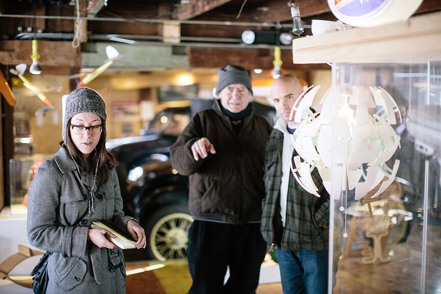
Yesterday I had an incredible experience. A group of colleagues and I took a trip to the Museum of World War II in Natick, MA. This museum is not open to the public; it is a private collection, open often but not always, and only by appointment.

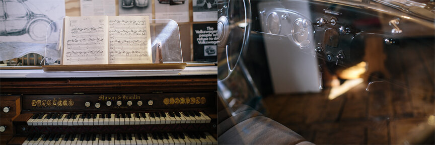
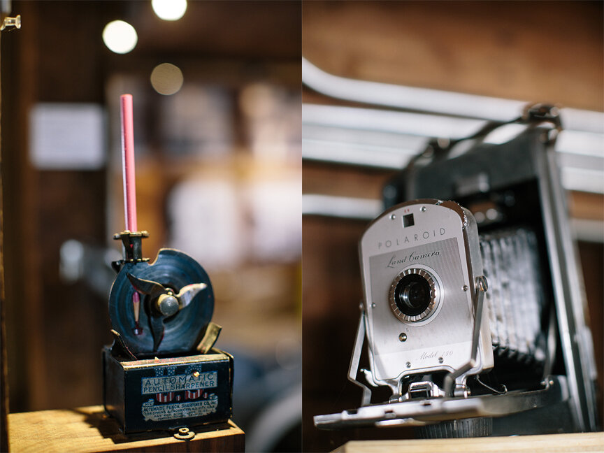
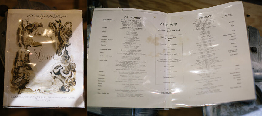
On display is the continually-expanding collection of Kenneth Rendell, accumulated over the past forty years. It is “the most comprehensive display of original World War II artifacts on display anywhere in the world,” according to the museum's website, and it spans from the Versailles Treaty, after World War I, to the Nuremberg and Tokyo war crimes trials. It is an amazing collection. The space is packed fore and aft, and there is so, so much to see — and touch. The 10,000 square foot space reflects Mr. Rendell’s vision of the ideal history museum and his philosophy on artifacts. While some of the fragile or especially valuable artifacts are inside glass display cases, most — I’m serious: most —are set out on tables, hung on walls, stacked up on the floor.

Here are some of my memorable experiences: I touched Hitler’s SA shirt. (Touching the mannequins, however, is frowned upon — apparently a number of veterans want to shake the Hitler mannequin’s hand and now it has a permanently dislocated right shoulder.) It gave me chills to touch it, and to look at personal objects like his reading glasses, with their little carrying case, and his sketches. I picked up shell cases and bullets, then put on a helmet to climb into a Sherman Tank. That scared me. I couldn’t believe how thin the floor seemed, and how cramped the interior is. I scrutinized Winston Churchill’s “Siren Suit” for spots of oil paint. David turned the handle of an air raid siren (for far too long) — I had never heard that sound outside of a movie, and it is chilling. I marveled at the impossibly tiny compasses in the area about espionage, and felt sick looking at huge knives that could puncture helmets. I was bemused by the bust of Hitler that General Patton used as a doorstop — Patton taught his dog to urinate on it, and it has never been cleaned. (I did not touch that.)

There are few interpretive text panels, but they are beside the point. While there are enough artifact labels to call attention to key artifacts, “less time reading and more time looking” seemed to be the motto at the Museum of WWII. An audio tour gave only the barest of context and some anecdotal history — like the story about Patton’s Hitler bust — but Mr. Rendell was there to answer questions. He wants visitors to really look at and interact with his collection, and in doing so, connect with the people embodied by these pieces of history. An artifact locked behind glass … how do you create a human connections with that? How do you absorb the stories they can tell if you can’t hold them and examine them up-close? This museum is an argument for artifacts themselves creating the narrative.

Of course an experience like this is nearly impossible to offer to the general public. How would you protect the artifacts from damage and theft? How can a person without at least some understanding of historical context appreciate the significance of an object if there isn’t a helpful and knowledgeable guide alongside them? I feel fortunate to have been able to visit this museum, as did my coworkers who went with me. We couldn’t stop talking about it for the rest of the day, and the next day too; it was that incredible an experience. I hope that every one of you, Readers, gets to have experiences like this yourselves, often and regularly.

More details about the museum, and pictures can be found in this article from the Boston Globe.

Post updated in January 2021 with text edits. Broken links have been replaced with archived URLs, courtesy of archive.org. This post was originally published at theexhibitdesigner.com on 11 December 2009.

Glass flowers and old museum labels

The Harvard Museum of Natural History was founded not too long ago, in 1998, yet it is one of the oldest natural history museums in the country — older than both the National Museum in DC (founded 1910) and the American Museum in New York (1868).

Harvard’s museum was established as “the public face” of three museums: the Museum of Comparative Zoology (founded 1859), the Harvard University Herbaria (1858), and the Mineralogical and Geological Museum (1784). I included all those dates to impress on you that this is an old museum.

Old natural history museums have old funky taxidermy and old funky graphic design. I am not here to pick on HMNH — on the contrary. I’m focusing this post on their older exhibits — the botanical, the zoological, and the mineralogical galleries — because I think their outmoded displays of minerals and glass flowers, and their similarly outmoded specimen labels within, are beyond charming. The labels say as much about the history of the museum, and exhibit design as a whole, as they do about the taxidermy they're identifying.

The Glass Flowers gallery is a perfect example of that. It is mesmerizing. In a smallish, dimly-lit room are displayed the 4,400 life-size glass models made between 1886 and 1936 by father and son glass artists Leopold and Rudolph Blaschka. Every single flower, leaf, and seed, is made out of colored or hand-painted glass. Some have wire armatures. It is a beautifully illustrated botany book in three dimensions — all crafted in glass. The labels are modest and straightforward, without extraneous decoration, which feel just right here. It’s an incredible presentation and a must-see.

Most of the taxidermy displays in the older sections of the museum are like that: charmingly antiquated little labels with nothing more than a common and a Latin name, maybe a genus, a species; maybe a sentence about what an animal likes to eat, or where it likes to live. I just love these bird displays:

Every display looks different from the others because each one was put together at a different time and made in a different way by different people. Even within a single display there can be a lack of consistency, based, maybe, on when the museum acquired different specimens. Take the photographs below. It might be hard to tell (none of my close-up photos turned out, unfortunately) but trust me — there is quite the smorgasbord of type represented here.

Do I think these old galleries needs an upgrade? Yes, with a ‘but.’ On the one hand, a redesign is exactly what is needed to revive these rather gloomy collections of musty stuffed animals (among other things, like better lighting, and ventilation). And alongside the “charmingly-antiquated” graphics are a lot of ugly, unfortunate graphics. (Much of that is found in the relatively-recently designed parts of the museum.)

Those old, neglected galleries can be dark, creepy, and stinky — all in marked contrast to the museum’s newly-renovated Hall of Mammals (below). The Hall of Mammal’s historically-sensitive renovation was completed in October of this year. Original nineteen-century paint colors were restored, the animals were given a good dusting (conservation), and energy-conserving light bulbs were thrown in for good measure. After making my way through the narrow maze-like hallways of the previous galleries, it was a relief to come out into this lovely light-filled room:

This is a good direction for the museum: thoughtful renovations that retain the character and charm of the old exhibits. But here’s the on-the-other-hand: The new graphics in the Hall of Mammals are simple, nice, and unoffensive, yet they are missing that old natural history museum je ne sais quoi.

It could have been worse, true. The overhaul of a museum’s labeling, giving it a true “graphic system,” does not necessarily result in great graphics. Couldn’t the graphics have been done in such a way as to be both fresh and cabinet-of-curiosities; given some personality and a nod to the museum’s history? Obviously, the answer is yes. I hope that when the museum renovates other galleries (rumor has it that the mineral gallery might be next), it keeps that in mind.

To wrap this up: In the fossils hall, there are some fantastic dimensional letters. Cut out by hand, undoubtedly. In a shade of green you don’t often see anymore. I believe Crayola calls it “Old Natural History Museum Green.” (It’s in the 120 pack.)

Post updated in January 2021 with minor text edits. Broken links have been fixed. This post was originally published at theexhibitdesigner.com on 24 November 2009.