ae1

Two more at the Hirshhorn Museum

Phew! It has been a busy 14+ months since I last posted. (14 months?! Oh my....) In that time, I’ve designed seven exhibitions of varying size and scope, four print projects, and three large production jobs. I am currently in early design development for an exciting project in Maine, and then there is the typical day-to-day of running a small design studio. Yep, just sitting around eating bon-bons.

In an attempt to get back into posting on The Exhibit Designer, I am kicking off with a book-end to my last post: two more exhibitions at the Hirshhorn Museum. These two were both located in the same gallery, and were on view one right after the other.

the-exhibit-designer_christine-lefebvre_Hirshhorn_Baselitz-escalator
the-exhibit-designer_christine-lefebvre_Hirshhorn_Baselitz-entrance

Baselitz: Six Decades ran from June 21, 2018 through September 16, 2018, then Rafael Lozano-Hemmer: Pulse opened in its place on November 1. Pulse is on view for another month, if you’d like to check it out.

the-exhibit-designer_christine-lefebvre_Hirshhorn_Pulse-entrance

The title treatment for Pulse played on the visual of the pulsing incandescent light bulbs hanging from the ceiling in Lozano-Hemmer’s installation Pulse Room …

the-exhibit-designer_christine-lefebvre_Hirshhorn_Pulse-detail

… while the title for Baselitz was a straight-forward title lockup. An early concept, in which “George” and “Baselitz” were alternately flipped upside down (Baselitz is known for his “inverted” paintings) was rejected, and I am a little sad for what could have been.

the-exhibit-designer_christine-lefebvre_baselitz-concept
the-exhibit-designer_christine-lefebvre_Hirshhorn_Baselitz-escalator2

In the end, the final title lockup and entry wall treatment created a neat refraction effect when ascending the escalator, as the letters reflected in the glass.

Post updated in January 2021 with minor text edits. This post was originally published at theexhibitdesigner.com on 25 March 2019.

The Utopian Projects and What Absence Is Made Of

The Markus Lüpertz exhibition I shared in my last post is no longer on view at the Hirshhorn — it came and went so quickly! — but the museum has two other exhibitions currently on view for which I designed the graphics. First, Ilya and Emilia Kabakov: The Utopian Projects:

the-exhibit-designer_christine-lefebvre_Hirshhorn_Kabakov-entrance
the-exhibit-designer_christine-lefebvre_Hirshhorn_Kabakov-entrance2

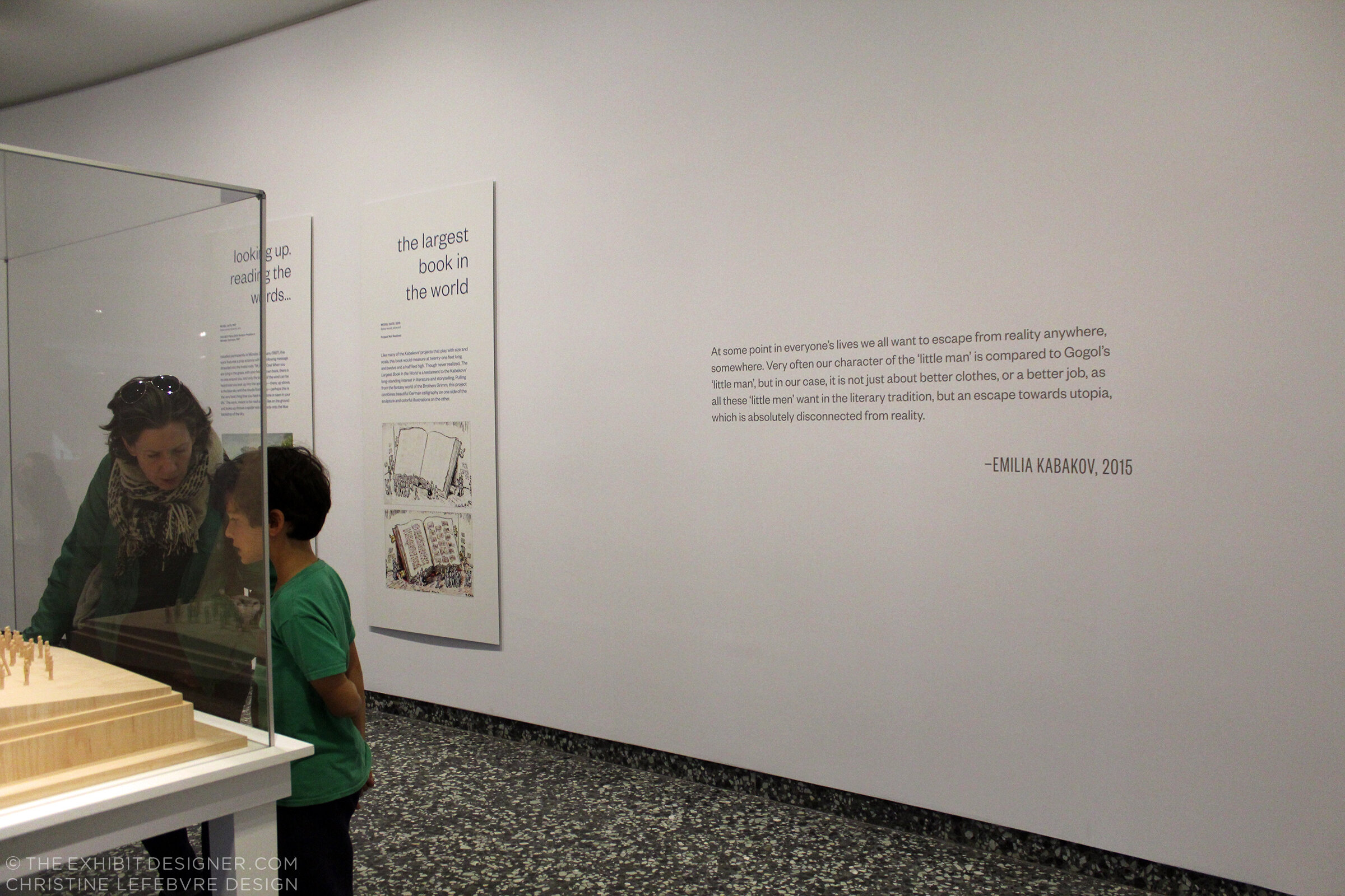
Working in collaboration with the museum’s design department, I designed the exhibition’s title wall, didactic graphics, and wall quotations.

The title wall graphic is printed on DreamScape’s self-adhesive wallcovering, Caviar texture. I like the print quality of DreamScape wallcoverings — I first spec’ed them for the exhibits at the FDR Museum, and have used them a few times since. The wallcovering was installed using butt seams. The installers (Blair, Inc. in Virginia, also the graphics fabricator) wrapped the wallcovering around the wall’s edges, a tricky detail that would have looked terrible if done poorly.

the-exhibit-designer_christine-lefebvre_Hirshhorn_Kabakov-exhibition2

The graphic panels are digital prints wrapped on sign blank with a matte over-laminate. They are hung on French cleats (simple but strong), which is an easy way to hang nearly anything. Also on the panels’ backsides is MDF blocking that provides rigidity for the sign blank fronts. Here’s a photo I snapped during installation, of the backsides:

the-exhibit-designer_christine-lefebvre_Hirshhorn_Kabakov-panel-backs
the-exhibit-designer_christine-lefebvre_Hirshhorn_Kabakov-quote
the-exhibit-designer_christine-lefebvre_Hirshhorn_Kabakov-exhibition1

The Utopian Projects is on view through March 4. The Kabakovs’ work is fascinating — their models are so cool. Check it out if you can!

The other exhibition at the Hirshhorn, for which I designed the graphics, is What Absence Is Made Of, on view through Summer 2019. For this exhibition I designed the title wall, didactics, and an exterior advertising poster for the National Mall.

the-exhibit-designer_christine-lefebvre_Hirshhorn_WAIMO-entrance

The curator requested reflective vinyl. In addition to layout experiments, I played with color combinations (silver on white? silver on black? on gray? which gray?). I love the way the selected title design looks in silver vinyl — it catches reflections and disappears, then reappears, as you walk by it.

the-exhibit-designer_christine-lefebvre_Hirshhorn_WAIMO-entrance2
the-exhibit-designer_christine-lefebvre_Hirshhorn_WAIMO-didactic

Post updated in January 2021 with minor text edits. Broken links have been fixed. This post was originally published at theexhibitdesigner.com on 5 January 2018.

Markus Lüpertz: Threads of History

A quick check-in here. I stopped by the Hirshhorn Museum and Sculpture Garden this past weekend for Sound Scene X, and to take some photos of a project I currently have on view in the museum’s lower level: the exhibition Markus Lüpertz: Threads of History, on view through September 10.

the-exhibit-designer_christine-lefebvre_Hirshhorn_Lupertz_entrance.jpg

I developed the concept for the exhibition graphics, and after many rounds of refinement, handed over template files for the museum’s designers to produce final graphics (with the exception of the timeline graphic, which I laid out). I much prefer to handle the layout of final production files but aligning the museum’s schedule with mine was tough in this instance.

the-exhibit-designer_christine-lefebvre_Hirshhorn_Lupertz_entrance_timeline.jpg
the-exhibit-designer_christine-lefebvre_Hirshhorn_Lupertz_timeline-details.jpg
the-exhibit-designer_christine-lefebvre_Hirshhorn_Lupertz_section.jpg

I also designed two exterior signs advertising the exhibition, for display outside the museum. The blue sign has already been replaced with one for another exhibition — things move fast on the Mall sometimes! Additional information about the exhibition can be found on my portfolio.

the-exhibit-designer_christine-lefebvre_Hirshhorn_Lupertz_exterior-signs

Please check out the exhibition if you're in the DC area! And if you like it, there is a concurrently-open exhibition to see, Markus Lüpertz at the Phillips Collection. I have become a fan of Lüpertz’s work — particularly the Donald Duck paintings, one of which is visible through the exhibition’s entrance (in the first photo) and on the blue sign above.

Hirshhorn_SoundSceneX.jpg

This weekend was a good time to be a kid (of any age) at the Hirshhorn—the galleries were full of interactive sound installations, live museum, and sound-related activities, all part of Sound Scene X: Dissonance.

While there, I took the opportunity to also check out the newly-opened, Ai WeiWei: Trace at Hirshhorn.

Hirshhorn_AiWeiwei

I am currently working with the museum on another exhibition, Ilya and Emilia Kabakov: Utopian Projects, set to open in a month. Stay tuned for that!

Post updated in January 2021 with minor text edits. This post was originally published at theexhibitdesigner.com on 10 July 2017.

Mr. Toilet House and Nam June Paik

In April I spent two weeks in South Korea and a week in Japan. While there, I did what I always do while touristing — visited many museums. Some of them were forgettable, but many are worthy of a post, including these two that are thematically very different but, geographically, neighbors; they are both located in Suwon, about 20 miles south of Seoul. First up is the Toilet Museum (Haewoojae) also known as “Mr. Toilet House.”

theexhibitdesigner_MrToiletHouse-exterior1.jpg
theexhibitdesigner_MrToiletHouse-exhibits1

The story behind Mr. Toilet House: Suwon’s late mayor Sim Jae-Duck was given the nickname “Mr. Toilet” for his passionate leadership of the “Toilet Culture Movement” to improve public toilets. In 1996 he started the Beautiful Toilet Culture Campaign, and the city declared its intent to build the most beautiful public toilets in the world (motivated also in part by the then-upcoming 2002 FIFA World Cup which they were to host). Mr. Toilet took things a bit further than merely creating government departments and task forces, however, when he rebuilt his own house in the shape of a toilet and named it Haewoojae, which means “a room where you can relieve your worries.” It features a central toilet room as the “core of living,” with transparent glass walls that turn opaque with the flip of a light switch. The house was completed in 2007, and upon Sim’s death in 2009, it was willed to the city of Suwon. The city then converted it into a museum and culture park.

theexhibitdesigner_MrToiletHouse-exhibits2

The museum is small and has clear, simple graphics (nearly all with English translations) that earnestly convey information about the history and global spread of modern sanitation, and other toilet-related subjects. There are also lighthearted illustrations of poops and flies (including on the floor, used as a navigational device) and hilarious double entendres in the writing.

Outside, there is a culture park. A meandering path leads you past examples of toilets, used throughout Eastern and Western history, that give an understanding of how toilets have physically changed over time.

theexhibitdesigner_MrToiletHouse-exterior2

Next door you can visit the Haewoojae Culture Center for a birds-eye view of the Toilet Museum.

theexhibitdesigner_MrToiletHouse-exterior3
theexhibitdesigner_NamJunePaikCenter-exterior2.jpg

Our next stop in Suwon: the Nam June Paik Art Center. The Nam June Paik Art Center opened in 2008 and holds 248 pieces of video installations and drawings, mostly of Nam June Paik’s but also of other contemporary artists. The art center hosts changing exhibitions of Paik’s work, special exhibitions of contemporary artists, performances, events, and educational programs. It also houses Paik’s archives and a library, undertakes research, and publishes scholarly journals and monographs.

theexhibitdesigner_NamJunePaikCenter-exhibits1

The art center changes exhibitions regularly; they use their Nam June Paik-focused exhibitions to focus on different aspects of his work. While I was there, the exhibition was called Point-Line-Plane-TV, which “explored Nam June Paik’s canvas including intermedia [sic] such as television, score, film, and video, in notion of flatness.”

theexhibitdesigner_NamJunePaikCenter-exhibits2.jpg
theexhibitdesigner_NamJunePaikCenter-exhibits4

On the mezzanine level is the Education Room, seen in the photos below; a quiet place to have a seat and read some tables about the artist’s life.

theexhibitdesigner_NamJunePaikCenter-exhibits3

Upstairs was Imaginary Asia, a special exhibition of 23 pieces in the motion images genre. Many of the videos were projected onto large walls, with small bench nooks that could sit 2–3 people for viewing.

theexhibitdesigner_NamJunePaikCenter-exhibits6.jpg
theexhibitdesigner_NamJunePaikCenter-exhibits7

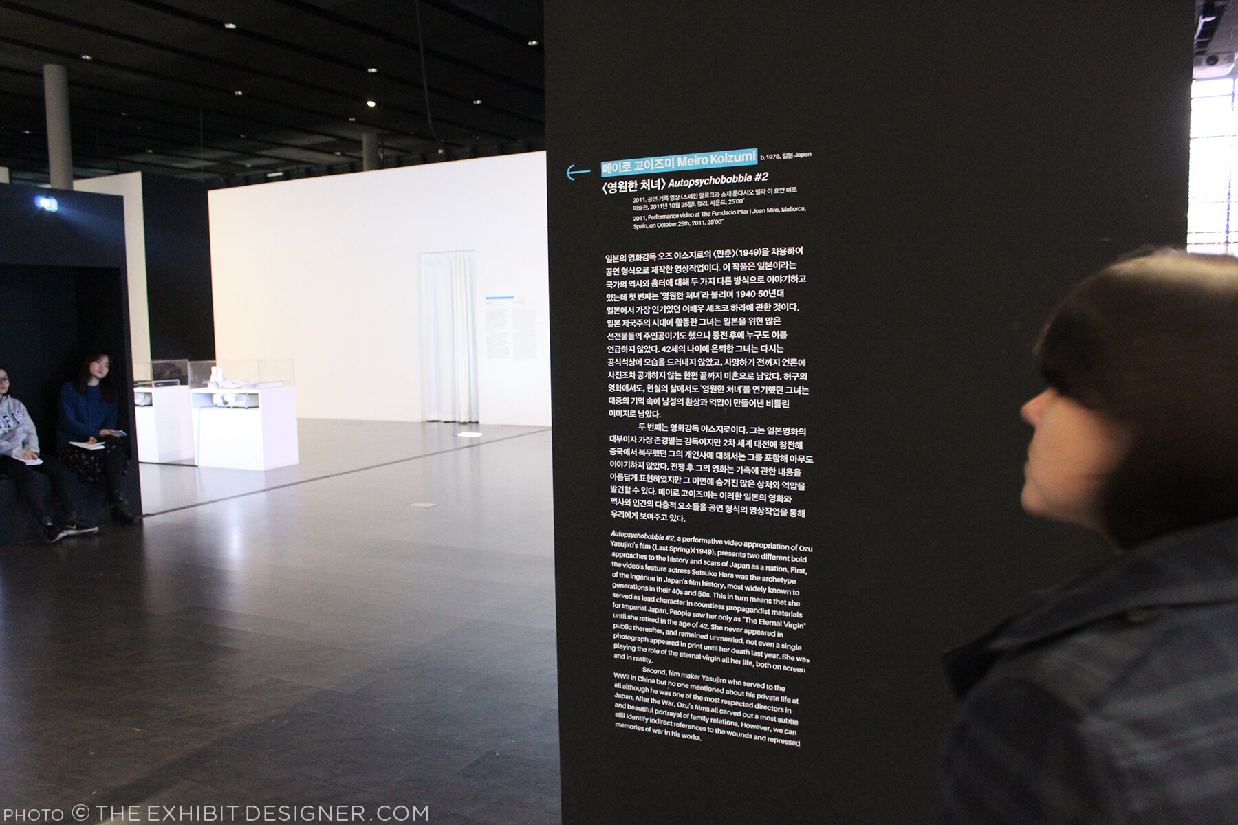
Like at Mr. Toilet House — and actually at many, many places I visited in South Korea — navigational cues and directions were applied directly to floors. In the Point-Line-Plane-TV exhibition as well they applied interpretive text to the floor. Interpretive text was in both Korean and English.

theexhibitdesigner_NamJunePaikCenter-exhibits5

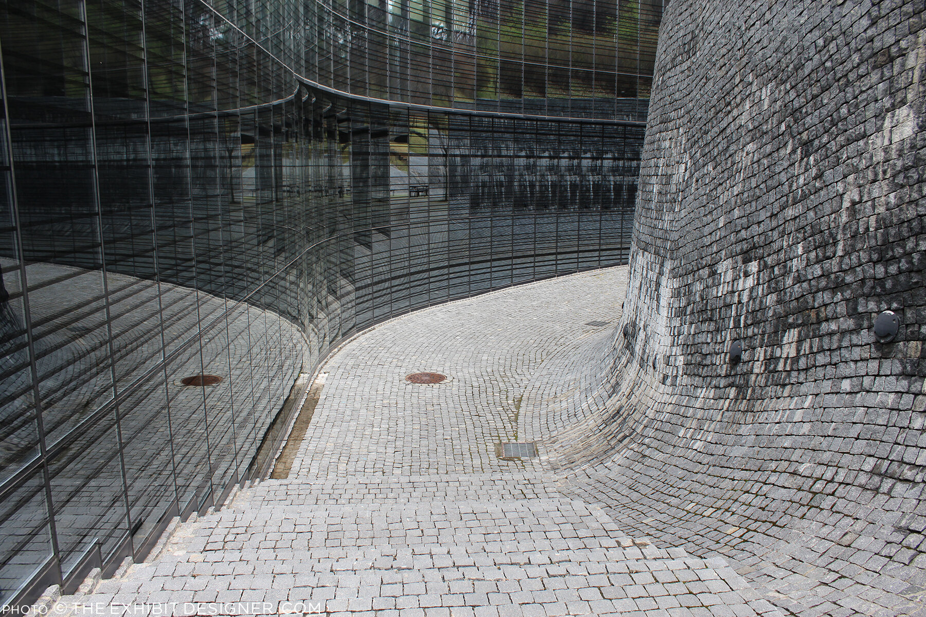
Outside, the curved glass exterior of the the art center is modeled on the form of a grand piano, a common motif in Paik’s work, and on the letter P. But that is only apparent when you look at the museum map — the actual experience from outside is simply of an impressive modernist building.

theexhibitdesigner_NamJunePaikCenter-exterior

There is a small park just beside the museum — perfect for a rest after an afternoon’s museum visit — and nearby are the Gyeonggi Provincial Museum (which has limited English translations) and the Gyeonggi Children’s Museum.

Post updated in January 2021 with minor text edits. Broken links have been replaced with archived URLs, courtesy of archive.org. This post was originally published at theexhibitdesigner.com on 24 May 2017.

Weekend in NYC: the Cooper Hewitt, Jewish Museum, more

I went up to New York City a couple weekends ago. My time was packed with museum visits, including my first to the Tenement Museum, at 97 Orchard Street in Manhattan’s Lower East Side. I took their Shop Life tour. The museum’s sixty- and ninety-minute-long tours are docent-led through restored tenement apartments. Most tours focuses on one apartment, one period in time, and one actual family; the Shop Life tour is slightly different in that it highlights multiple families, across time periods, who lived and worked in the basement-level shops. I highly recommend the museum for an engrossing, educational experience. (Summertime hint: the Shop Life tour is the only one air-conditioned!)

From top left, clock-wise: volunteers pull weeds on the High Line; the entrance to the "Shop Life" tour at the Tenement Museum (no photos allowed inside!); Fly By Night at the Brooklyn Navy Yard; Goshka Macuga at the New Museum

From top left, clock-wise: volunteers pull weeds on the High Line; the entrance to the "Shop Life" tour at the Tenement Museum (no photos allowed inside!); Fly By Night at the Brooklyn Navy Yard; Goshka Macuga at the New Museum

I also stopped by the New Museum, since I was in the neighborhood for the Tenement Museum, and truth be told, I was mostly perplexed (I’m not that hip, apparently). I paid another visit to the High Line, which has expanded and its plantings matured since I was last there. And I saw a performance of Duke Riley’s Fly By Night, in which, “at dusk, a massive flock of pigeons … elegantly twirl, swoop, and glide above the East River.” The pigeons wear LED anklets and respond to whistles and waving flags, flying overhead as commanded. The performance pays homage to the mostly forgotten culture of pigeon keeping and — with just another week to go — is being held at the Brooklyn Navy Yard, once home to the country’s largest naval fleet of pigeon carriers. I loved it.

theexhibitdesigner_new-york-met-breuer

At the Met Breuer, the Metropolitan Museum of Art’s new home for modern and contemporary exhibitions (in the Whitney’s former building), I saw the exhibition Unfinished. There was nothing ground breaking in the actual exhibition design, but the premise was compelling and a lot of the artwork was fantastic.

And I took in the Nasreen Mohamedi retrospective. (Just closed, on June 5.) After the jam-packed Unfinished, the meditative exhibition was a welcome respite.

theexhibitdesigner_new-york-met-breuer2

But hands down, my two favorite exhibits during this visit were at the Jewish Museum and the Cooper Hewitt.

theexhibitdesigner_new-york-jewishmus_burle-marx

At the Jewish Museum, I fell in love with Roberto Burle Marx. Burle Marx was a Brazilian artist who drew upon diverse cultural influences to reinvent the landscape architecture discipline. He incorporated abstracted, irregular forms, native plants (he was a passionate environmental advocate), and Brazilian modernism into his landscape designs. His work is incredible; visit this exhibition!

theexhibitdesigner_new-york-jewishmus_burle-marx-exhibit-cases

The exhibition design was spot-on, evoking the geometries and curves of Burle Marx’s landscapes and emphasizing the art on display. An interlocked massing of display cases in the center of the room dominated the exhibition space; an 87-foot-long tapestry (below, left), designed by Burle Marx for the Santo André Civic Center in 1969, provided a stunning focal point. His hand-drawn and painted landscape plans are wonderful to behold; some examples from the exhibition are shown below.

theexhibitdesigner_new-york-jewishmus_burle-marx-exhibit-displays
theexhibitdesigner_new-york-jewishmus_burle-marx2

A few blocks north, Beauty, the Cooper Hewitt Design Triennial was bustling. The wide-ranging contemporary design exhibition is a must-see for designers and artists.

theexhibitdesigner_new-york-cooper-hewitt-beauty
theexhibitdesigner_new-york-cooper-hewitt-beauty2

The exhibition design was minimal, just the simplest of reader rails and small text panels. The museum encourages use of “pens” that allow you to interact with the digitized collection on touchscreen tables and to save objects from the exhibitions to be accessed later. A nice benefit of accessing your visit online is that for each object, museum curators have selected related objects for further exploration. For example, the online entry for Atmospheric Reentry, designed by Maiko Takeda (above, left), led me to this hat from Cameroon and this “hairy” garden pavilion.

theexhibitdesigner_new-york-cooper-hewitt-beauty-reader-rails

Below is one of my favorite entries from the Beauty Triennial, Architecture is Everywhere, designed by Sou Fujimoto Architects. From the project description: “the project discovers architectural possibility in found objects and everyday materials. Simple artifacts such as a lottery ticket, an ashtray, or a ring of binder clips become intriguing structures when placed on pedestals with tiny human figures.” It was delightful.

theexhibitdesigner_new-york-cooper-hewitt-beauty3

Post updated in January 2021 with minor text edits. Broken links have been fixed. This post was originally published at theexhibitdesigner.com on 13 June 2016.

On view now! New York City: A Portrait Through Stamp Art

New York City: A Portrait Through Stamp Art opened — today! — at the Smithsonian National Postal Museum. I was delighted to design this temporary art exhibition.

Postal-Museum-stamp-art_90A0119_Fotobriceno
Postal-Museum-stamp-art_90A0167_Fotobriceno

… Along with some printed pieces: a postcard booklet (free for museum visitors) and special postal cancellation (available in the museum’s post office).

christine-lefebvre-NYC-stamp-art_postcards-unfolded-sm.jpg

The thirty pieces of original artwork on display are part of the Postmaster General's [extensive] Art Collection, and are arranged in six categories: Baseball, Broadway, City Life, Icons, Politics, and Music. The artwork was selected to “celebrate important citizens, events and iconic buildings that have defined New York City as one of the greatest cities in the world.” Who knew there were so many New York City-themed stamps??

christine-lefebvre_Smithsonian-Postal-NYC-Stamp-Art-1
christine-lefebvre_Smithsonian-Postal-NYC-Stamp-Art-2
CLD_NPM_NYCstamp-Exhibit8.jpg

The exhibition will be on view through March 13, 2017. If you want the distinct pleasure of seeing TWO of my exhibits in one museum, Freedom Just Around the Corner is also on view at the National Postal Museum for two more months, until February 15, 2016.

christine-lefebvre_Smithsonian-Postal-Museum-stamp-art_90A0161_Fotobriceno-sm.jpg

Post updated in January 2021 with minor text edits. Broken links have been fixed. This post was originally published at theexhibitdesigner.com on 10 December 2015.

Lazy Love at the Biodôme

I was in Montréal for just shy a week and spent a few hours at the Biodôme — it was so much fun! I have plenty to share of the rest of the museum, but to dip my toes back into blogging after (ahem) plenty of time away, here are some photos of the temporary exhibit/art installation, Calme Aimant (Lazy Love).

Within the low, glass-walled enclosure, sloths slept inside their cocoon-like nests, hanging from artistic interpretations of trees — the trees were wrapped in braids and painted in monochrome — while a couple tortoises tottered around. Sheer white fabric panels hung from the ceiling, rippling slightly as people passed beneath them.

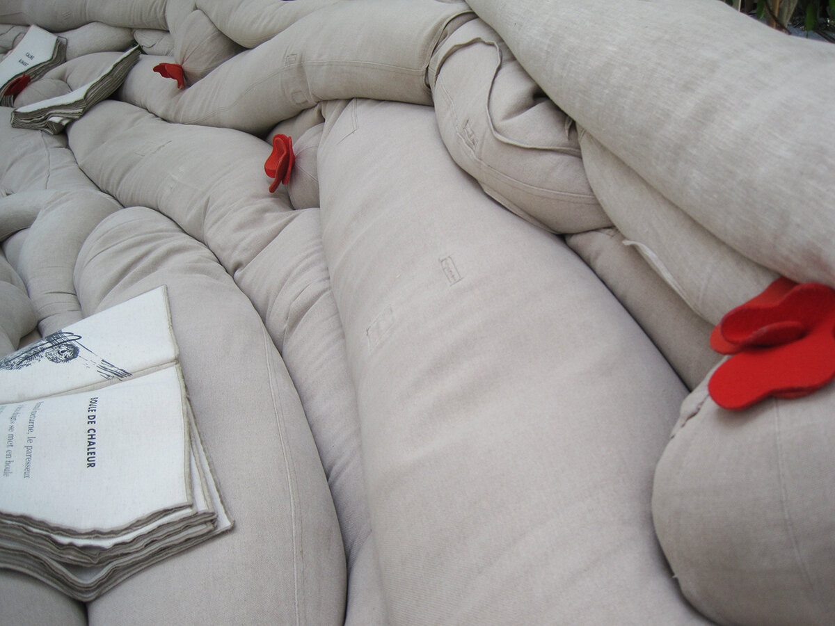
The exhibit invited guests to have a seat and enjoy a few moments of quiet contemplation. A quiet soundscape played from speakers hidden within the sofas — the speakers are the balls with red felt flowers — and fabric books told the sloths’ story.

Lazy Love was our last stop at the Biodôme, and it was a lovely, relaxing, quiet moment to end on. I am sorry to report that the exhibit closed last week, so a bientôt, sloths.

Post updated in January 2021 with minor text edits. Broken links have been replaced with archived URLs, courtesy of archive.org. This post was originally published at theexhibitdesigner.com on 18 September 2015.

The News 04.11.12

A compilation of design-related web finds.

Everyone’s been raving about Doug Aitken: SONG 1 at the Hirshhorn — because it’s awesome. I’ve visited twice and would (will) visit at least once more before it closes on May 13. You have to experience it in person.

My former firm, Christopher Chadbourne & Associates, announced their closure. This past summer I accepted a position with Gallagher & Associates, and moved to Washington, DC | In memory of the 100th anniversary of the Titanic’s sinking on April 15, dozens of exhibits about the ship have opened, including the the world’s largest, in Belfast; also: Fire & Ice: Hindenburg and Titanic at the Smithsonian National Postal Museum; Titanic: The Artifact Exhibition, everywhere; Titanic at the South Street Seaport Museum in New York, NY | The Union Pacific Railroad Museum’s Building America traveling exhibit is located in a traveling train car, naturally. The entire museum opens in Iowa in a month | Part 1 in a series of articles describing exhibit design, from Mark Walhimer at museumplanner.org | Blueprint, a guidebook to build your own history museum in the 21st century, from The Museum of the Future | Pinned Inspiration: ice ceiling; purple-sided lightboxes; German Expressionism at the MoMA; education center at the San Diego Children's Museum.

Post updated in January 2021 with text edits. Broken links have been replaced with archived URLs, courtesy of archive.org. This post was originally published at theexhibitdesigner.com on 11 April 2012.

Talk to Me, at MoMA

I’d rather not include too many posts about now-closed exhibits that I saw ages ago, but in the case of Talk to Me at the MoMA, the online exhibit is itself worth exploring.

A simple but compelling design. I liked the pixel illustrations on the introduction wall and the punchy red walls and reader rails.

Post updated in January 2021 with minor text edits. Broken links have been fixed. This post was originally published at theexhibitdesigner.com on 8 April 2012.

Music at the MoMA

At the Museum of Modern Art in NY through June 6 is the exhibition Looking at Music 3.0. (Many installation photos at that link.) It explores music’s influence on contemporary art, and vice versa, during the 80s and 90s. Dim lighting, gaudy neon walls, and early music videos blasting on the large screen in the middle of the gallery — it’s as though you’ve returned to the time of boom boxes and mix tapes. Social and political issues are mentioned briefly in the exhibit copy, but there are many topics touched upon in this relatively small space, so don’t expect a thorough history lesson. Art and music are loosely grouped by topics such as “early hip hop” but, fittingly, neither chronology nor subject dictate the layout of the exhibition in an obvious way.

There was a large cushioned platform to sit and watch music videos. There were only a few in the loop, to discourage lingering I’d imagine. What they may not have realized is that people would stay quite awhile to watch Grace Jones. There were listening stations throughout the exhibition (below, left) and an interactive media installation by Perry Holberman (right).

You can read more about the process of creating the exhibit in this blog post, Listening to Art, written by the curator.

Below are photos of the entrance to Picasso: Guitars 1912–1914, an exhibition of 70 collages, constructions, drawings, mixed-media paintings, and photographs. On view through June 6 and definitely worth seeing.

Post updated in January 2021 with minor text edits. Broken links have been fixed. This post was originally published at theexhibitdesigner.com on 20 March 2011.

The News 02.17.11

A compilation of design-related web finds.

The realities of renovating the Barnum Museum in Bridgeport, CT after it was hit by a tornado | The winner of the PaleoArt Prize in 3D art for “achievement in ... depicting or sculpting paleontological subjects and fossils” | China asks the Penn Museum to return all artifacts from its Silk Road exhibition | The New York Times, on scalies | Winners of this year’s MoMA PS1 Young Architects program asked local businesses and nonprofits what materials they needed, then designed the courtyard space to incorporate those materials, with the intention of donating them at the end of the summer | An exhibit of tattooed arms in Paris | And another, of dismembered dandies, in Sweden | South African printmaking at Boston University’s 808 Gallery | Edward Gorey at the Boston Athenæum | Tangible Things at Harvard | The Charles Hayden Planetarium in Boston reopens after a $9 million yearlong reconstruction | The Museum of Arts and Design’s new Center for Olfactory Art | The reopening of the American Museum of the Moving Image; inaugural events continue.

Post updated in January 2021 with minor text edits. Broken links have been fixed or replaced with archived URLs, courtesy of archive.org. This post was originally published at theexhibitdesigner.com on 17 February 2011.

Build Boston 2011: Touring the MFA

GUEST POST

Writing and photography by Katelyn Mayfield, an exhibit designer at Christopher Chadbourne & Associates. She has a Bachelor of Architecture degree from the Rhode Island School of Design. In her spare time, she makes handstitched books.

After a private tour of the Museum of Fine Art Boston’s new Art of the Americas wing, given by architect Adi Toledano of CBT Architects, I now feel certain that Boston has a world class museum. The tour was given prior to the wing’s grand opening as part of Build Boston. We got up close and personal with the details since almost no one was around, except security guards and last minute glass case cleaners.

My first response in the galleries was to the artifact display cases. These cases were undeniably eye-catching, like no other. The glass was crystal clear, completely devoid of prints of any kind. When standing on one side of a case, I could see perfectly through it and into cases beyond because of the impeccable clarity. The sleekness of the cases also succeeds in hiding complex mechanics, as described in this article. All 200 cases in the new wing were designed, manufactured, and assembled in Milan, Italy by Goppion Museum Workshop before they were shipped to Boston for installation. Goppion has also created display systems for the Mona Lisa at the Louvre and the Crown Jewels of England, among others, so high quality craftsmanship is a given. And once I got past the perfection of the cases, the artifacts inside were not so bad themselves!

Sir Norman Foster along with Foster + Partners was the Design Architect and creative masterminds of the new wing. Our guide, Adi, kept repeating, “Foster wanted ‘everything to line up’”, meaning everything had to be flush. Foster gets what Foster wants. He was knighted in 1990 and won the Pritzker Architecture Prize for his entire portfolio in 1999, the most prestigious international prize awarded in the field of architecture. He was also awarded the American Institute of Architects Gold Medal in 1994. I think he is worthy of dictating every detail, as he did in this project. No detail was overlooked and all components work harmoniously. It was the responsibility of CBT, the local architect of record, to design the actual details that accomplished this harmony. For me, highlights were the “landscape corridor,” the day-lighting strategies, and the details that made “everything line up.”

The landscape corridor is a thoughtful nod to the existing museum structure and the outdoors. Between the original building and the new building, a narrow 6' space is left full of vegetation. While in the main courtyard, which has two elevations of three-story-high glass walls, the corridors are visible on either side. The natural light, the view of the vegetation and the sky beyond, and the height of the ceiling makes this space feel like an actual outdoor courtyard. The landscape corridor is also visible when crossing over the enclosed bridges from the new wing to other wings. It really is a nice sight.

The main concept of the day-lighting strategy is based on indirect light. It’s seemingly simple; very successful. Because all four floors of the wing open onto small glass vestibules which open to the stairways, and then to the courtyard, all four floors have indirect natural light access. Sunlight is obviously harmful to artwork and artifacts, but otherwise a welcome source of light. The solution to safely utilizing this indirect light was to diffuse it through two layers of glass.

This idea that “everything must line up” is showcased in every aspect of the architecture; from the construction of the walls, to the lighting in the ceiling, to the emergency exit signs. The wall surface uses the skim coat plaster technique that is superior to average drywall. It is labor intensive — thick coats of plaster are applied to an expanded wire lath — however, it provides better durability and ease of replacing single spots of wall if necessary.

Even the smallest components, the exit signs, were meticulously executed. In the auditorium, which is covered in wood paneling, a sign protruding perpendicularly from the wall would not do at all. Instead, the letters E-X-I-T were cut into the wood and green light shines through from behind. Apparently this small project in itself was not easily accomplished. It took much compromise and discussion from the Boston Fire Department. The outcome is sleek and yes, “lined up.”

Then there is the door to the bathroom hallway. So well done! The door has no molding, no knob, no latch; it’s a push door, double swing, that extends all the way to the ceiling, with just a 1/4" gap between.

I also have to mention the graphics. The explanatory texts were short and sweet, subtle yet still noticeable. I appreciated the subdued graphics and simple 1" deep panels painted the same color as the wall. This created a different visual plane to draw your attention, but allowed the artwork and artifacts to take the lead. Within the cases, small numbers on tiny frosted pieces of glass show you which artifact matches up with which label below. In any case, go see the Boston MFA’s new wing. It is elegant, modern, and simply beautiful.

Post updated in January 2021. Broken links have been fixed or replaced with archived URLs, courtesy of archive.org. This post was originally published at theexhibitdesigner.com on 1 December 2010.

Field Trip Day!

Last week a few of my Chadbourne colleagues and I took a day to visit some local museums in Cambridge.

Nothing I haven’t already covered here on TED, but it’s always nice to see old friends. First stop: the Harvard Museum of Natural History/Peabody Museum of Archeology & Ethnology. They had a new, small but interesting exhibit, Headgear: The Natural History of Horns and Antlers (left and center, below) and they seem to be continuing the renovation work begun in the Great Mammal Hall. I peeked behind a drawn curtain to see what the deal was, but was stopped by this guy on the right:

I’ve written in the past about the HMNH, but I can’t resist adding a few more photos here. Slowly but surely the museums seem to be getting cleaner and brighter.

We then made our way over to the Harvard Art Museums, currently housed in the Sackler Museum, and previously seen on The Exhibit Designer, here.

We ended the day at the MIT Museum where, because of our tired feet and the heat of the day, we plunked down on a bench and became entirely engrossed in a video of Alan Alda swimming with a robotic tuna. (No really, I’m not kidding about the tuna. The video is from the episode “Natural Born Robots” of the PBS show Scientific American Frontiers.) Previous MIT Museum coverage here.

Post updated in January 2021 with minor text edits. Broken links have been fixed. This post was originally published at theexhibitdesigner.com on 30 September 2010.

Lists: not done

Just my luck! I arrived when the exhibition Lists: To-dos, Illustrated Inventories, Collected Thoughts, and Other Artists' Enumerations (in the Lawrence A. Fleischman Gallery at the Reynolds Center) was closed to transition from Part One to Two, when all the cases were empty and the only thing to read, teasingly, was the silkscreen on the wall. It would have been great to see the lists in person, but alas, I'll have to make due with the book.

Post updated in January 2021. Broken links have been fixed. This post was originally published at theexhibitdesigner.com on 27 June 2010.

Harvard Art Museum / Big

A big entry sign ... and big gallery titles ... leading to a bigger Harvard Art Museum. The Harvard Art Museum is in the midst of a “transformation” that will bring its three separate museums — the Fogg, the Busch-Reisinger, and the Sackler — together in a renovated and expanded building on Quincy Street. The project, designed by Renzo Piano (naturally: his name seems to be on every museum’s expansion), is scheduled to open in 2013.

In the meantime, the Sackler offers Re-View, a survey of the three museums’ collections. It’s worth a visit if you are in Cambridge. After, you can take a stroll down the street and stop in here for a scoop of Milk Chocolate Gianduia.

Post updated in January 2021 with minor text edits. Broken links have been fixed or replaced with archived URLs, courtesy of archive.org. This post was originally published at theexhibitdesigner.com on 20 June 2010.

Angularity at Denver Art

The Denver Art Museum’s new (c. 2006) Hamilton Building will make you do the Angle Dance, guaranteed.

Not one of the building’s planes — floor, wall, or ceiling — is parallel or perpendicular to another. Consider that for a moment.

Studio Libeskind’s design is meant to evoke “the peaks of the Rocky Mountains and geometric rock crystals found in the foothills near Denver,” an idea the exhibit designers ran with. Suspend your disbelief and peaks and rock crystals can be found everywhere — in the artwork hung directly onto skewed walls and the sculptures tucked into odd spaces where acute and obtuse walls meet.

You don’t actually have to suspend your disbelief to appreciate the angularity brought to aspects of the exhibit design, such as the display cases in the gallery of African art.

I’m not crazy about the light fixtures — they’re big and distracting! — but otherwise, the cases are intriguing and beautifully highlight the artwork and objects on display.

The dimensional letters used for gallery names are pretty incredible. The letters’ faces are perpendicular to the floor, and the depth, top-to-bottom, varies to meet the angle of the wall. I love the beautiful shapes and the shadows they create.

As for the art itself, I was surprised to find that I enjoyed the gallery of post-1900 Western American art (it’s not a genre I’d usually leap to explore). I also liked this installation by Sandy Skoglund.

Post updated in January 2021 with minor text edits. Broken links have been fixed. This post was originally published at theexhibitdesigner.com on 20 May 2010.

The News 04.13.10

A compilation of design-related web finds.

Grab a Museum Discovery Pass next time you’re in New York for 2-for-1 admission to seven of the city’s smaller, more specialized museums such as the American Folk Art Museum or Asia Society Museum | A green consulting company gains extra LEED points by effectively turning their office into an indoor jungle | The National September 11 Memorial & Museum announced that it will receive $2.29 million from the Lower Manhattan Development Corporation and released renderings of the exhibit design (renderings link no longer available; instead, an opinion on the building’s architecture) | MoMA’s upcoming design and architecture exhibition, Talk to Me, to explore “the communication between people and objects,” won’t open until next July, 2011 but in the meantime follow the exhibition blog | Esther Stocker’s installations, discovered via BLDGBLOG | Also seen on BLDGBLOG: Pulse Room, from 2006, an “interactive installation featuring one to three hundred clear incandescent light bulbs, the brightness of which was controlled by an interface and sensor that could detect the heart rate of participants” | And another light installation: UVA: Speed of Light is an immersive laser-based light installation and sound experience in London, up through April 19 | Endangered animals built from Legos by Sean Kenney for the Philadelphia Zoo exhibit Creatures of Habitat: A Gazillion-Piece Animal Adventure.

Post updated in January 2021 with minor text edits. Broken links have been fixed, replaced, or replaced with archived URLs, courtesy of archive.org. This post was originally published at theexhibitdesigner.com on 13 April 2010.

Philagrafika

Philagrafika 2010 is a Philadelphia-wide festival and exhibition of contemporary printmaking. The festival is divided into three components: The Graphic Unconscious is the core exhibition that features the work of thirty-five artists, from eighteen countries, in five art museums and galleries; Out of Print is work created by five artists who were paired with historic Philadelphia institutions; and Independent Projects is a variety of exhibitions organized by other institutions throughout the city.

Additional programing — films and such — supplemented the exhibitions. I like that this festival is all over the city (it was obviously some undertaking), and I really like the title treatment (photo above) and festival map and guidebook by Philly-based Smyrski Creative. Quite nice.

I visited The Galleries at Moore College of Art & Design, part of the Graphic Unconscious exhibition, and saw (and loved) Regina Silveira’s Mundus Admirabilis, an installation wherein a domestic setting is invaded by common pests to invoke biblical plagues and comment on the “plagues” of contemporary society. You can read an interview with Regina Silveira on the Philagrafika blog, here.

Lucky Philadelphians, able to take their time exploring the entire festival, at least for another two weeks (it ends April 11). I wasn’t able to spend nearly enough time with it.

Post updated in Jan 2021 with minor text edits. Broken links have been fixed or replaced with archived URLs, courtesy of archive.org. This post was originally published at theexhibitdesigner.com on 29 March 2010.

The News 03.17.10

A compilation of design-related web finds.

Today, the Smithsonian’s Museum of Natural History opened its 15,000 square-foot Hall of Human Origins (original link no longer available). It looks nice. Lots of skulls | March is Women in History Month; to celebrate, the Smithsonian’s National Postal Museum has a four-part online exhibition Women on Stamps | A behind-the-scenes video of The First Ladies at the Smithsonian National Museum of American History | The MoMA’s changing wall colors, from their blog (link no longer available) | An interactive matrix of green design strategies | Congratulations to Bisphenol A (BPA) — found in my friend vinyl — for its win at The Toxies in the category “Worst Breakthrough Performance and Viewer’s Choice Award for Worst Chemical of 2009” | Kinetic sculptures are awesome: Magic Wave by Reuben Margolin, and the BMW Museum’s kinetic sculpture | “Moomin Valley,” designed for a family entertainment center, is adorable and clever | I love, love, love, Tara Donovan. If you’re anywhere near Indianapolis between April 4 and August 1, you need to see her show at the Indianapolis Museum of Art | Tomás Saraceno (link added in 2021; very cool website) collaborated with astrophysicists, architects, engineers and arachnologists (spider researchers!) for this interactive art installation based on “the imagery and structure of spider webs to map the origin and structure of the universe” | Bruno Maag’s typographic exhibition Shape My Language in which “long streams of clear plastic cards hang from the ceiling, engulfing the gallery visitors in a typographic mist.”

Post updated in January 2021 with minor text edits. Broken link has been fixed, replaced, or replaced with archived URLs, courtesy of archive.org. This post was originally published at theexhibitdesigner.com on 17 March 2010.