Design News

Old Faithful Visitor Center’s grand opening

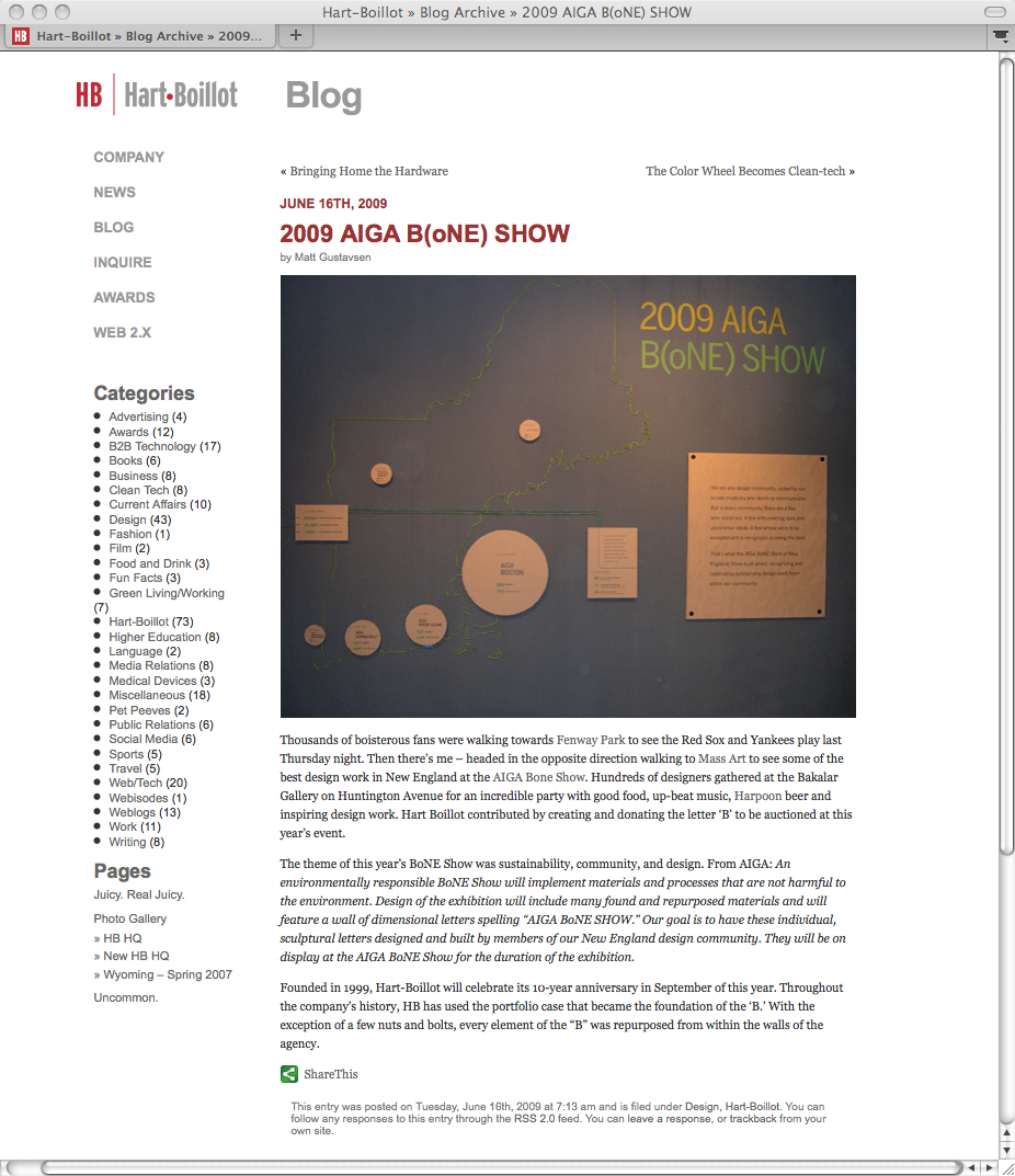
I took a trip out West last week, with my colleagues from Christopher Chadbourne & Associates, for the grand opening of the Old Faithful Visitor Education Center in Yellowstone National Park. Exciting! Post soon!

I have a somewhat hefty backlog of content for the blog. Some of it dates to when we were wearing knit hats and snow boots. I hope to have it all up asap.

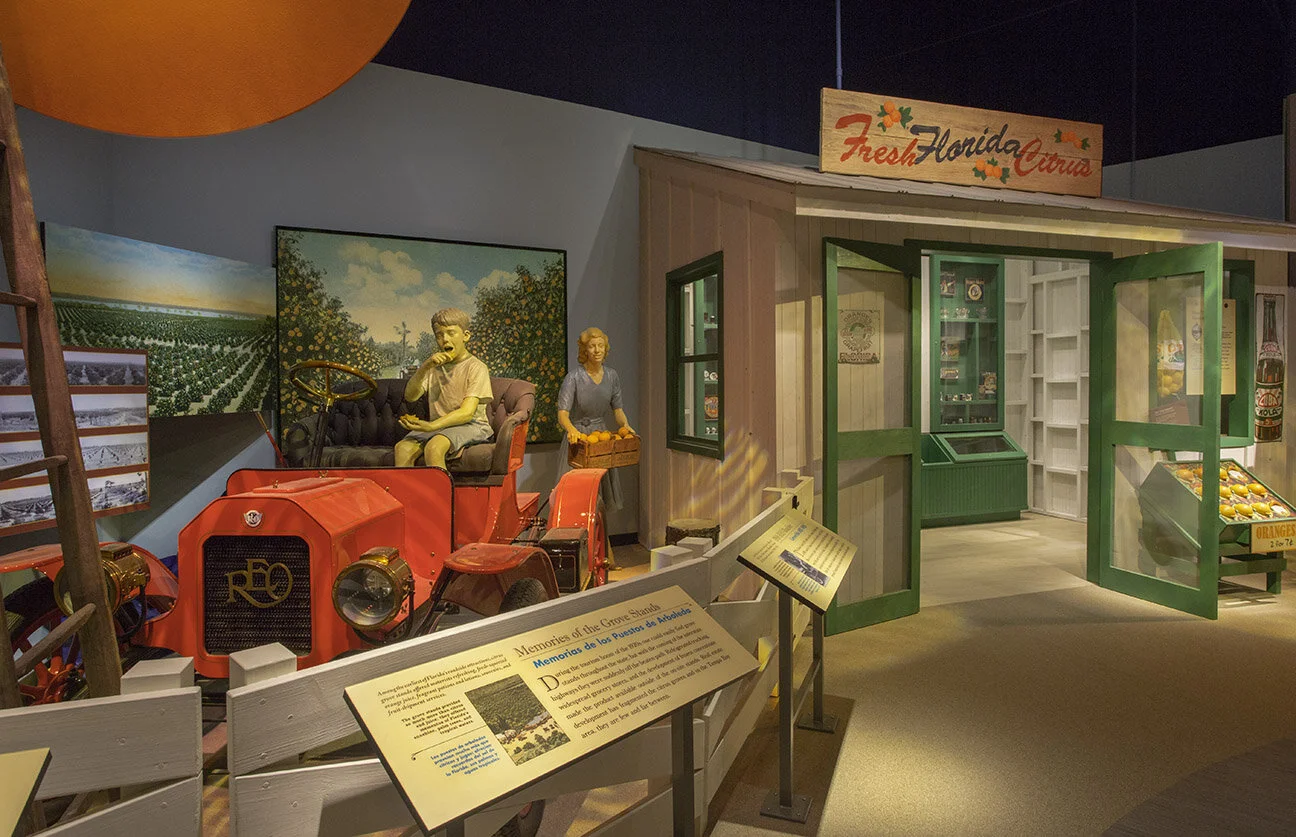
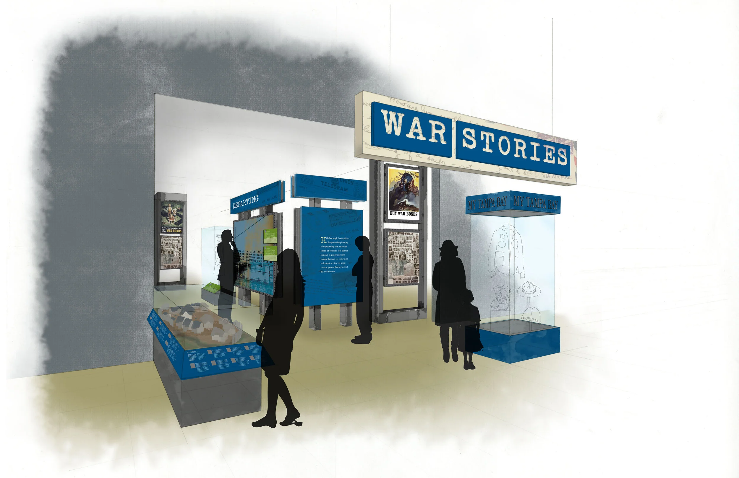
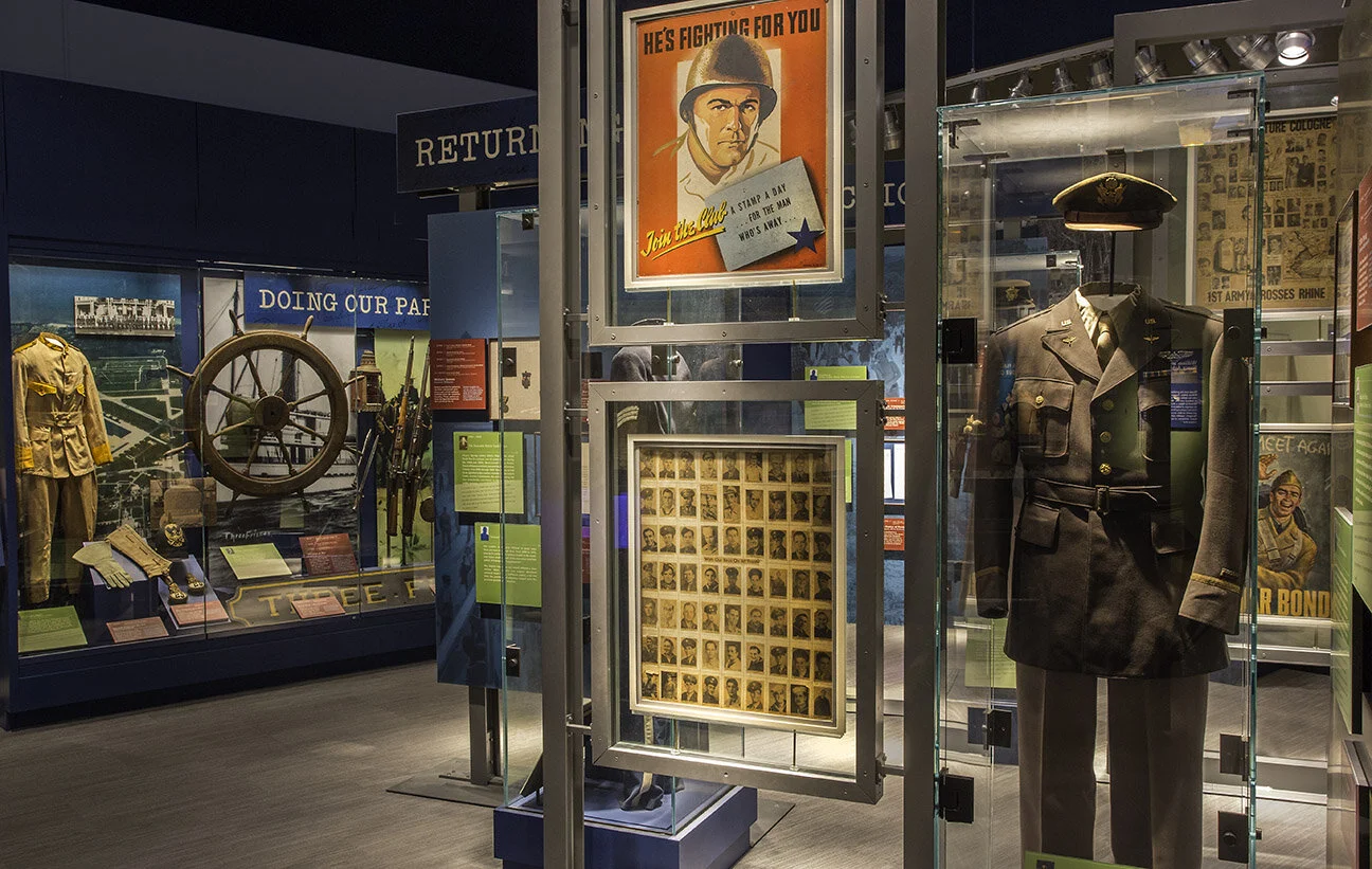
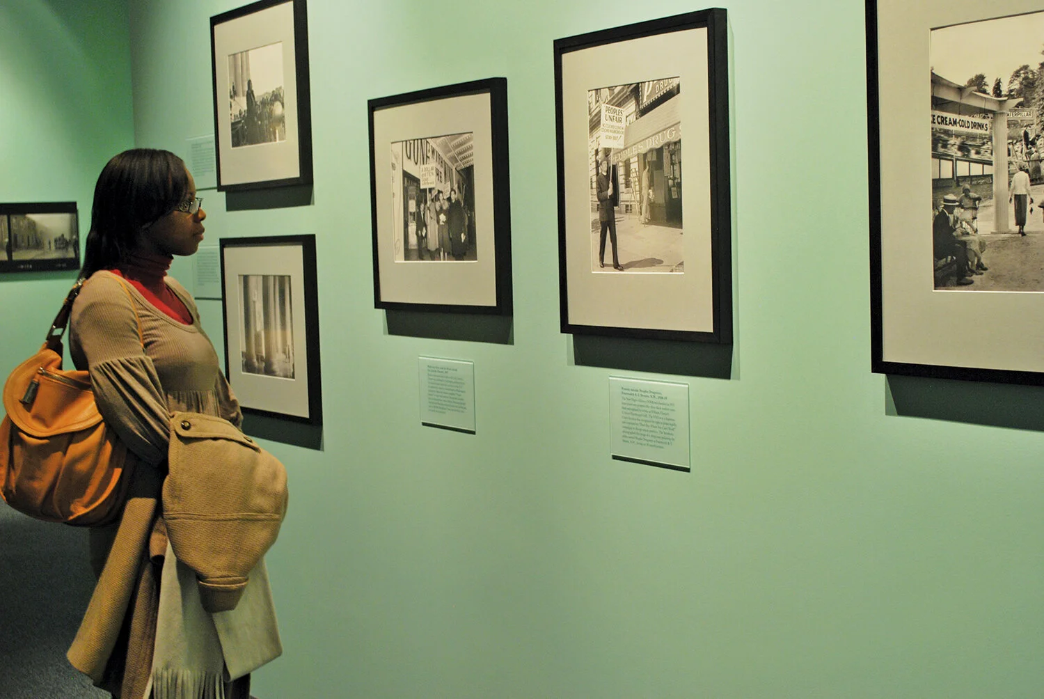
Update: I got most of them. Changing Earth | Electricity | State of Deception | Cars, Culture, and the City | America’s Mayor | Samurai in New York | New England Habitats | Mass MoCA | Old Faithful Visitor Center

Post updated in January 2021. Broken links have been fixed. This post was originally published at theexhibitdesigner.com on 29 August 2010.

The News 06.23.10

A compilation of design-related web finds.

Sometimes it seems like there really is a museum for and about everything. Name a topic, and I bet you can find an obscure museum dedicated to it. Tractors? Barbed wire? Plastics? Architectural models? Chinese shadow puppets? Battlestar Galactica? | Natural history exhibits opening this summer, in no way exhaustive: Whales at the Museum of Science, Boston (they offer a museum admission/whale watch ticket combo); The Deep at the Natural History Museum, London; Race to the End of the Earth, about Arctic explorers, at the American Museum of Natural History; the AMNH’s Climate Change exhibit moves to the Field Museum in Chicago; Age of Mammals, a “a postmodern diorama” in the Natural History Museum of Los Angeles’s newly restored 1912 building | This photo of the Smithsonian Natural History Museum’s collection of thousands of birds is just great | A Micro Museum for the Design of and with Typography; Typopassage Vienna is inside the Museumsquartier in Vienna and open 24 hours a day, every week of the year. (Curious; who’d be there at 4am?) | Shape Lab, an interactive educational space for families. Who wouldn’t want to play there? | The British Museum and Wikipedia’s unusual collaboration.

Post updated in January 2021 with minor text edits. Broken links have been fixed or replaced. This post was originally published at theexhibitdesigner.com on 23 June 2010.

2009 AIGA BoNE Show wins (another!) award

Exciting news: a project I worked on last year, the 2009 AIGA BoNE Show, has taken home another award!

As the exhibit designer, I worked with BoNE Show co-directors Jeff Stammen and Brandon Bird, to step up and shake up the biennial, Boston-based awards show/exhibition. It was a nearly year-long process to put it together and our goal throughout was to create something engaging and memorable. In the end, the feedback was glowing — everyone who went had the most fun at the show’s opening last June* — and we won a couple of design awards to boot.

In September, we received an AIGA (Re)designAward for Sustainable Design; the awards recognize social responsibility and environmental sustainability in design. We were one of 25 winners in 2009.

And last week at the 2010 SEGD Conference, we were honored with an SEGD Design Award, in the “Lot With a Little” category.

*Some blog post mentions: Common Content | Hart-Boillot | MIT Press | Pinkergreen | South of the Sahara

But — you ask — what exactly is this BoNE Show?

The BoNE (Best of New England) [Design] Show is a biennial competition, exhibition, and fundraiser to benefit AIGA’s Boston chapter. Our theme for 2009 was Community. While the primary purpose of the exhibition was to showcase the 49 winning design pieces, the planning team (myself included) also wanted the experience to engage, educate, and help designers to feel more connected to their design community. One aspect of that was re-branding the BoNE Show into B(oNE) — as in “be one” — with the tagline, “One Region. One community.”

Thirteen local designers, design firms, and artists were commissioned to build large dimensional letter sculptures that together spelled out AIGA B(oNE) SHOW. (top photo) This became a centerpiece of the exhibition, and the letters were auctioned off at the opening reception.

boneshow2009_4.jpg
boneshow2009_10.jpg

My goal was to create an exhibition that would celebrate the competition winners and also the New England design community as a whole. To push the Community theme, I created an infographic wall about the AIGA in New England, including chapter sizes, locations, and other basic information.

boneshow2009_11.jpg

A second infographic wall — B(oNE) Show Deconstructed — provided a glimpse into the creation of the exhibition, including statistics about the designers who entered work in the competition and the designers who won recognition.

boneshow2009_14.jpg
boneshow2009_13.jpg
boneshow2009_12.jpg

Another area of the exhibition gave visitors the opportunity to share their ideas of what it takes to “B” a great designer — by contributing to a wall of B (fill-in-the-blank) speech-bubble directives. Some were earnest; others humorous.

I sourced environment-friendly and local materials, with the help of my design team. Graphics were printed with UV-curing ink on recycled chlorine-free kraft paper, at a printer located five miles from the gallery — or they were drawn by hand. Discarded furniture taken off the street, piles of cardboard collected from area businesses, an old door and a roll of twine found in a garage: “trash” that we salvaged and put to good use. The designs integrated mechanical fasteners and non-toxic glues. And to describe the “greenness” of the project for visitors to the exhibit, we created the Green Lounge, which was painted entirely in green, even the furniture. We used Old Fashioned Milk Paint — it's earth- and people-friendly, and manufactured nearby in Groton, MA. The Green Lounge also featured a slide show of past award winners to pull together BoNE Shows past and present, and add another element of Community.

boneshow2009_9.jpg
boneshow2009_8.jpg
boneshow2009_15.jpg

The biggest undertaking for the exhibition were the displays for the winning entries. We repurposed roughly 50 wooden shipping pallets collected from around the Boston area. These were deconstructed into planks, then planed and reconfigured into custom display fixtures — shelves, platforms, and frames — each designed to highlight the unique elements of the winning entry it held.

boneshow2009_18.jpg
boneshow2009_19.jpg
boneshow2009_16.jpg
boneshow2009_20.jpg
boneshow2009_17.jpg
boneshow2009_22.jpg
boneshow2009_21.jpg
boneshow2009_23.jpg

More photos of the exhibit here, and of the opening night here.

I’m going to take advantage of my blog/soapbox to also thank the many, many people who volunteered their time and helped put together the show: event photographer Christian Phillips; carpenter Mark Laning, Matt White of Dirk+Weiss (A/V), Melissa DePasquale (print design), Rochelle Ask, Colleen Baker, Rachel Boothby, Kimberly Cloutier, Luke Garro, Ben Gebo, Lee Gentry, Justin Hattingh, Andrea Kulish, Joe Liberty, Mike Mai, Cedric Mason, Julie Ogletree, Juliana Press, George Restrepo, Jason Rubin, Shaona Sen, Andrea Shorey, Drew Spieth, Sarah Tenney Stammen, Jason Stevens, Ken Takagi, Mende Williams, and Andrea Worthington. Thank you also to the AIGA Boston board — especially Suzanne McKenzie and Tracy Swyst — and the most excellent people at CCA, who were never-endingly supportive of Jeff and I as we in effect worked a second full-time job (they wrote this lovely news release about us) and our friends and families who had to deal with us in the duration. And here it is, our SEGD award:

Post updated in January 2021. Broken links have been fixed or replaced with archived URLs, courtesy of archive.org. This post was originally published at theexhibitdesigner.com on 17 June 2010.

The News 04.13.10

A compilation of design-related web finds.

Grab a Museum Discovery Pass next time you’re in New York for 2-for-1 admission to seven of the city’s smaller, more specialized museums such as the American Folk Art Museum or Asia Society Museum | A green consulting company gains extra LEED points by effectively turning their office into an indoor jungle | The National September 11 Memorial & Museum announced that it will receive $2.29 million from the Lower Manhattan Development Corporation and released renderings of the exhibit design (renderings link no longer available; instead, an opinion on the building’s architecture) | MoMA’s upcoming design and architecture exhibition, Talk to Me, to explore “the communication between people and objects,” won’t open until next July, 2011 but in the meantime follow the exhibition blog | Esther Stocker’s installations, discovered via BLDGBLOG | Also seen on BLDGBLOG: Pulse Room, from 2006, an “interactive installation featuring one to three hundred clear incandescent light bulbs, the brightness of which was controlled by an interface and sensor that could detect the heart rate of participants” | And another light installation: UVA: Speed of Light is an immersive laser-based light installation and sound experience in London, up through April 19 | Endangered animals built from Legos by Sean Kenney for the Philadelphia Zoo exhibit Creatures of Habitat: A Gazillion-Piece Animal Adventure.

Post updated in January 2021 with minor text edits. Broken links have been fixed, replaced, or replaced with archived URLs, courtesy of archive.org. This post was originally published at theexhibitdesigner.com on 13 April 2010.

The News 03.30.10

A compilation of design-related web finds.

The Future is Collaborative from the Center for the Future of Museums; a call for libraries, archives, and museums to share resources | The MoMA blog has chronicled the development of the museum’s newest exhibition, Rising Currents: Projects for New York’s Waterfront, since November. ArchDaily has a descriptive article about the projects on view | Across the Atlantic? Another show about sustainability, Sustainable Futures, just opened at Design Museum London | Once you start to explore the Museum of Online Museums (review) just try to stop | The Art Handling Olympics, “a combination roast, ‘Jackass’-style stunt extravaganza, and excuse to drink a lot” | The Regent’s Place Pavilion in London looks beautiful in photos | I saw these sliding shelves and thought, hm ... add descriptive labels or an interactive prompt, and you’ve got yourself a nice display case. Or maybe I just see “museums” everywhere.

Post updated in January 2021 with minor text edits. Broken links have been fixed or replaced. This post was originally published at theexhibitdesigner.com on 30 April 2010.

The News 03.23.10

A compilation of design-related web finds.

The exhibition China Design Now at the Portland Art Museum transformed the city and demonstrated the four Cs of relevant museum experiences: Content, Conversation, Curation, and Continuation | I’m spending some quality time in the New York Times Museums Special Section | D-Shape printer uses sand and magnesium-based glue to print 3D rock sculptures ... potentially entire buildings ... potentially on the moon | The Curno Public Library in Italy is a “monolith of concrete pigmented with iron oxides, completely decorated with a bas-relief engraved with the letters of the alphabet.” Beautiful | Frank Gehry uses plywood in some funky ways for the Signature Theater Company in NY | Photos from Shanghai as it prepares for the 2010 World Expo — amazing creativity.

Post updated in January 2021 with minor text edits. Broken link has been replaced with archived URL, courtesy of archive.org. This post was originally published at theexhibitdesigner.com on 23 March 2010.

The News 03.17.10

A compilation of design-related web finds.

Today, the Smithsonian’s Museum of Natural History opened its 15,000 square-foot Hall of Human Origins (original link no longer available). It looks nice. Lots of skulls | March is Women in History Month; to celebrate, the Smithsonian’s National Postal Museum has a four-part online exhibition Women on Stamps | A behind-the-scenes video of The First Ladies at the Smithsonian National Museum of American History | The MoMA’s changing wall colors, from their blog (link no longer available) | An interactive matrix of green design strategies | Congratulations to Bisphenol A (BPA) — found in my friend vinyl — for its win at The Toxies in the category “Worst Breakthrough Performance and Viewer’s Choice Award for Worst Chemical of 2009” | Kinetic sculptures are awesome: Magic Wave by Reuben Margolin, and the BMW Museum’s kinetic sculpture | “Moomin Valley,” designed for a family entertainment center, is adorable and clever | I love, love, love, Tara Donovan. If you’re anywhere near Indianapolis between April 4 and August 1, you need to see her show at the Indianapolis Museum of Art | Tomás Saraceno (link added in 2021; very cool website) collaborated with astrophysicists, architects, engineers and arachnologists (spider researchers!) for this interactive art installation based on “the imagery and structure of spider webs to map the origin and structure of the universe” | Bruno Maag’s typographic exhibition Shape My Language in which “long streams of clear plastic cards hang from the ceiling, engulfing the gallery visitors in a typographic mist.”

Post updated in January 2021 with minor text edits. Broken link has been fixed, replaced, or replaced with archived URLs, courtesy of archive.org. This post was originally published at theexhibitdesigner.com on 17 March 2010.

The News 03.02.10

A compilation of design-related web finds.

Design Museum Boston (update: now simply, Design Museum) is all set to pop-up in the window of an abandoned storefront near you | A video tour of the “Biology Range” at the New York State Museum, where they keep their preserved biological specimens | The Mercedes-Benz Museum in Stuttgart has the World’s Largest Artificial Tornado inside; the ventilation system draws in smoke from the building and sends it up and out an exhaust vent | Another German museum, another car museum: exploded views from the Porsche Museum (also in Stuttgart) and the Harley Davidson Museum (in Milwaukee) | If cars are not your thing but exploded views are, you might instead enjoy one of an Etch A Sketch | Multiple Shadow House by Olafur Eliasson at the Tonya Bonakdar Gallery in NY: “The individual lights are all different colors, but they create white light when they all blend on a single wall. As visitors walk in front of the light sources, that hides certain colors — thus freeing the rest to reveal themselves as colored shadows.” | The One Day Poem Pavilion “demonstrates the poetic, transitory, site-sensitive and time-based nature of light and shadow.”

Post updated in January 2021 with minor text edits. Broken link has been fixed. This post was originally published at theexhibitdesigner.com on 2 March 2010.

The News 02.23.10

A compilation of design-related web finds.

The Center for the Future of Museums on gestural interfaces and 3-D printers | At the end of the month, the exhibition Design for the Other 90%, from the Cooper Hewitt National Design Museum, will be closing at the Mercy Corps Action Center in Portland, Oregon. The exhibition will reopen in April at the National Geographic Museum in DC | In New York? Check out the art exhibition, Size DOES Matter, curated by Shaquille O’Neal. “This is art, people. This right here is art.” (Were you able to see Big! at the National Archives in DC before it closed? A small, deliberate, interesting exhibition … that also included a shoe belonging to Shaq. Here’s the review from the New York Times) | Running the Numbers: An American Self-Portrait by Chris Jordan (originally via The Age of Impossible Numbers, a slideshow from Seed Magazine) | We Remember the Frankfurt Victims of the Shoa the Jewish Museum Frankfurt.

Post updated in January 2021 with text edits. Broken links have been fixed, replaced, or replaced with archived URLs, courtesy of archive.org. This post was originally published at theexhibitdesigner.com on 23 February 2010.

The News 02.16.10

A compilation of design-related web finds.

The Red Line Tour of Innovation in Boston. First stop: Ether Dome | I haven’t yet been to The New Typography at MoMA, but it is up there on my list of things to see. Interview with the exhibition’s curator | I have been to Slash: Paper Under the Knife at the Museum of Arts and Design in NY, and I can’t rave enough about it. I took home the exhibition catalogue — I love it | Israel now has a Design Museum | The Changing Landscape of Education in EGD, from Arrows & Icons Magazine | Hate mail | Patterned prefabricated concrete (link no longer available) | Where Ben Franklin Meets Supermodels. I love the Woodward and for some time have wanted to show you its modern/colonial cabinet of curiosities mashup style, but each time I go I am unfortunately too busy drinking delicious cocktails to be bothered with taking photos | Neon Bone Yard in Las Vegas | Gold leaf glass gilding by sign painter John Downer, a lost art | Beautiful,subtle wayfinding for Surry Hills Library | The Third & The Seventh; or take a quick look at the stills | The Pursuit of Happiness by Maira Kalman, the interview | And finally, Happy Valentine's Day, to you.

Post updated in January 2021 with minor text edits. Broken links have been fixed, replaced, or replaced with archived URLs, courtesy of archive.org. This post was originally published at theexhibitdesigner.com on 16 February 2010.

The News 02.09.10

A compilation of design-related web finds.

“...The abandoned Tremont Street Subway tunnel, which runs underneath Boston Common ... becomes a network of underground cultural venues, including a theater, a cinema, art galleries, and a ‘media-infused trolley museum.’” From the winning proposal for the SHIFTboston Ideas Competition | How Different Types of Museums Approach Participation, from Museum 2.0 | Aquarium Design: Top 10 Trends, from ObjectIDEA | Easy=True (link no longer available) | Museum admissions tabs: part ticket, part souvenir; Tag, You're It! | ExhibitFiles has launched a new “Bits” feature | A Parallel Image light installation at Transmediale, the festival for art and digital culture in Berlin; “an electronic camera obscura ... media-archaeological, interactive sculpture.” Your guess as to what that means is probably better than mine | “Four days into the show, sufficient personal injury had been incurred — with ambulances being called in and a first aid unit being erected inside the Tate — that the Director, Norman Reid, decided to close the exhibition.” Neo Classic at the Tate, 1971.

Post updated in January 2021 with minor text edits. Broken links have been fixed, replaced, or replaced with archived URLs, courtesy of archive.org. This post was originally published at theexhibitdesigner.com on 9 February 2010.

The News 02.02.10

A compilation of design-related web finds.

FREE Day at Mass MoCA | “When you’ve hit that saturation point and your attention wanes, go gladly home. Take your joyful experience and be thankful for it.” (How to Go to the Zoo) | And with that — zoos and aquaria are excluded from accessing funds in the recently-passed House version of the “Jobs for Main Street Act” (H.R. 2847, Sec. 1702) | Ideum released an open-source gesture library for Flash multitouch development | Sync/Lost is a multi-user audio-visual installation for exploring the history of electronic music and the relationships amongst its sub-genres | From Lunar, The Designer’s Field Guide to Sustainability; “materials, processes and resources that will lessen the impact of products on our ecosystem” | Metal foam | We Love Typography | Diana Larrea’s installations | Pentagram’s new identity for the North Carolina Museum of Art — I love it | Pole Dance by SO-IL for P.S.1’s Young Architects Program.

Post updated in January 2021 with minor text edits. Broken links have been fixed, replaced, or replaced with archived URLs, courtesy of archive.org. This post was originally published at theexhibitdesigner.com on 2 February 2010.

The News 01.26.10

A compilation of design-related web finds.

The Isabella Stewart Gardner Museum announced that it has broken ground on a new 70,000 sq ft wing designed by Renzo Piano. I think the expanded space is much needed and it should be beautiful. But what about that whole “the museum has to stay As-Is for perpetuity” thing? Further reading: write-ups from the New York Times and the Boston Globe | Why do we go to museums?, from the Walker Art Center, includes a list of visitors’ motivational identities and characterizations | Paola Antonelli, Architecture and Design Curator for the MoMA, talks to Johnny Holland Magazine about “her process for creating an exhibition, the future of design, and how we make people and objects more elastic” | No, everything is not going to be okay | Why [designers don't have a] place at the table | Gravity is a Force to be Reckoned With at Mass MoCA; “based upon Mies van der Rohe’s uncompleted project, the House with Four Columns (1951), a square structure open to view on all four sides through glass walls. … the house was constructed at approximately half scale and inverted, the ceiling of the original becoming the sculpture’s floor, the floor becoming the ceiling, and all interior elements such as Mies-designed furniture and partition walls installed upside down” | Eero Saarinen: Shaping the Future at the Museum of the City of New York; “the first retrospective of this prolific, unorthodox, and controversial 20th-century architect” | Read My Pins: The Madeline Albright Collection at the Museum of Arts and Design in NY | An interactive map of public art and notable architecture on the MIT campus, from the List Center | Trade Show History, a photo archive to spend some hours in | If your interest in New England textiles was piqued by my post about the American Textile History Museum, a short essay from Looking Backward: Why Chicago Made Doors and Boston Made Textiles | Boarded up Buckydome along with Buckminster Fuller’s Everything I Know | Urban Nature Project by Naoko Ito.

Post updated in January 2021 with minor text edits. Broken links have been fixed, replaced, or replaced with archived URLs, courtesy of archive.org. This post was originally published at theexhibitdesigner.com on 26 January 2010.

The News 01.19.10

A compilation of design-related web finds.

L.A.’s Natural History Museum to receive $1-million grant for new permanent exhibition | Rising Currents: Projects for New York’s Waterfront — I’ve been following with interest the progress of the program and upcoming exhibit on the MoMA/P.S.1 blog | Towards a New Mainstream? On 27 January 2–3pm EST, a lecture by Gregory Rodriguez exploring demographic change in the Americas, cultural transformation, and the future of museums | Color Identifying System for the Color Blind | An Increasing Craving for Experiences; there has been a lot written lately about experience-over-stuff — hello, museums! | Light Touch interactive projector turns any flat surface into a touchscreen | An Architect’s Philosophy of Photography | Steffen Dam: Specimen Panels These are beautiful; very “natural history museum” | Barton’s Bonbonniere, From Architectural Forum c. 1952 — I love it! What a fun space.

AND NOW, something from the portfolio:

Work shown was completed while I was a designer at Christopher Chadbourne & Associates.

Perfectos.jpg

This time last year (January 17, 2009), the Tampa Bay History Center — designed by Christopher Chadbourne & Associates — held its grand opening in downtown Tampa, Florida. I worked closely with the project’s senior graphic designer Jeff Stammen on design development.

(Photo above and first three photos below, courtesy Tampa Bay History Center.)

Cattle.jpg
Container.jpg
07 Tampa Bay History Center 214_sm.jpg

I took a leading design role for the timeline (Your Tampa Bay) and the War Stories gallery. Below is my sketch of the War Stories gallery, and below that, a photo I took during installation — hence the empty case.

theexhibitdesigner_TBHC-war-stories-install.jpg

All the graphics in this museum were designed with both English and Spanish text. I love the challenge of designing multilingual graphics.

I was also responsible for Construction Administration, and supervised the exhibit installation. I love shop visits, site visits, inspecting fabrication samples … all of that. What happened with the Tampa installation was a little … let’s just say, complicated. The local fabricator, Creative Arts, was fantastic and saved the installation day in a lot of ways. I ended up effectively living in a hotel room for a couple weeks during the tail end of installation — much longer than my trip to Tampa was supposed to be. It was quite the learning experience. In hindsight, I can say I had fun.

(Photo above and photo below, courtesy Tampa Bay History Center.)

Your_Tampa_Bay.jpg
tampa_092.JPG
tampa_290edit.jpg

Post updated in January 2021. Broken links have been fixed or replaced with archived URLs, courtesy of archive.org. This post was originally published at theexhibitdesigner.com on 19 January 2010.

Picturing the Promise

The Scurlock Studio and Black Washington: Picturing the Promise — a collaboration between the National Museum of African American History and Culture and the National Museum of American History — is currently on view in the NMAAHC gallery within NMAH. You have about two months to catch it; it closes on February 28. Construction of the NMAAHC’s permanent home on the mall is scheduled to begin in 2012, and its opening is scheduled for 2015.

This exhibit was designed by Christopher Chadbourne & Associates. I assisted with the graphic design.

theexhibitdesign_chadbourne_scurlock1.jpg
theexhibitdesign_chadbourne_scurlock2.jpg

Post updated in January 2021 with minor text edits. Broken links have been fixed or replaced with archived URLs, courtesy of archive.org. This post was originally published at theexhibitdesigner.com on 3 January 2010.