Museum Visits

State of Deception, at USHMM

The United States Holocaust Memorial Museum has a temporary exhibition State of Deception: The Power of Nazi Propaganda that I’d like you all to see. (I know I have a stellar track record of posting about temporary exhibits after they’ve closed, but not this time — State of Deception is open through December 2011.)

The exhibition, by the museum’s description, “reveals how the Nazi Party used modern techniques as well as new technologies and carefully crafted messages to sway millions with its vision for a new Germany.” There are books, posters, newspapers, and photos to look at, archival sound recordings to listen to, and films to watch. There’s a lot to take in, but the exhibition does a great job of leading you through and presenting its themes clearly and succinctly.

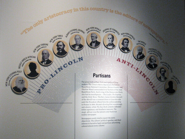
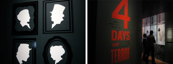
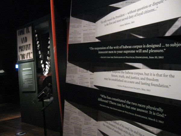
I was drawn in by the compelling design of the exhibit’s graphics. I liked the modernist layouts, which reminded me of Die Neue Typographie and Jan Tschichold’s work during the mid–late 1920s. (Side note: Tschichold was arrested by the Nazis for his “un-German typography.”...If you're interested in being led astray by the internet: do some research into Nazi Germany’s changes in typeface doctrine.)

I liked that each graphic was unique — the torn paper and painting texture is all custom done. An interesting thing the designers did was to change the lengths of the secondary and label-level text panels to fit the length of the text. With a relatively small exhibit like this, it works well, though it would certainly be difficult to control for in a larger exhibit. But here it made every panel seem intentional and thoughtful. A lot of care was put into these graphics, and the effect is quite beautiful. I wanted to read every single label.

I also recommend that you spend some time with the exhibition’s accompanying website, if you make it to the exhibition in person or not. It is rich with information and the website design ties in well with the exhibition’s.

Post updated in January 2021 with minor text edits. Broken links have been fixed. This post was originally published at theexhibitdesigner.com on 7 October 2010.

Field Trip Day!

Last week a few of my Chadbourne colleagues and I took a day to visit some local museums in Cambridge.

Nothing I haven’t already covered here on TED, but it’s always nice to see old friends. First stop: the Harvard Museum of Natural History/Peabody Museum of Archeology & Ethnology. They had a new, small but interesting exhibit, Headgear: The Natural History of Horns and Antlers (left and center, below) and they seem to be continuing the renovation work begun in the Great Mammal Hall. I peeked behind a drawn curtain to see what the deal was, but was stopped by this guy on the right:

I’ve written in the past about the HMNH, but I can’t resist adding a few more photos here. Slowly but surely the museums seem to be getting cleaner and brighter.

We then made our way over to the Harvard Art Museums, currently housed in the Sackler Museum, and previously seen on The Exhibit Designer, here.

We ended the day at the MIT Museum where, because of our tired feet and the heat of the day, we plunked down on a bench and became entirely engrossed in a video of Alan Alda swimming with a robotic tuna. (No really, I’m not kidding about the tuna. The video is from the episode “Natural Born Robots” of the PBS show Scientific American Frontiers.) Previous MIT Museum coverage here.

Post updated in January 2021 with minor text edits. Broken links have been fixed. This post was originally published at theexhibitdesigner.com on 30 September 2010.

Two Whales

Update: The Whale Museum no longer exists. Instead, the Dorr Museum is located on the edge of the College of the Atlantic campus; exhibits are designed and produced by College of the Atlantic students.

A few photos from the Bar Harbor Whale Museum in Maine, an unassuming experience, with some whale skeletons and exhibits of marine mammals, prepared by students and staff of the College of the Atlantic.

whalemuseum1.jpg
whalemuseum2.jpg

Whales/Tohorā is at the Museum of Science, Boston through September 14. Just like at the Whale Museum, you will learn fascinating facts about whales: The first whales walked on land! Baleen whales have two blowholes! Toothed whales have only one! Unlike the Whale Museum, Whales/Tohorā is a slick exhibit with clearly a much bigger budget. It was developed by the Museum of New Zealand/Te Papa Tongarewa.

The black, slightly angled, reflective platforms below the two largest whale skeletons are a dramatic centerpiece to the exhibit. I found myself returning to this display numerous times to look again. The same technique was used for some of the smaller skeletons too, like that of the walking whale (below, right). Graphics were all rear-lit. It’s a fine line with rear-lit graphics … a soft glow is easier on the eyes.

The structure of this timeline/artifact case reminds me of a backbone and rib cage, and ever-so-slightly of the Design for a Living World exhibit I saw at the Cooper Hewitt.

The whale skulls cases (below) are beautiful. Everything looks substantial and high quality. I like this straightforward presentation style when showing multiples: Keep the design minimal and the text to a minimum.

Post updated in January 2021. Broken links have been fixed. This updated post, originally published at theexhibitdesigner.com on 12 August 2010, was combined with a similar post dated 8 August 2010.

American High Style

Mannequins like models on a runway, posed dramatically or playfully, frozen under spotlights in otherwise dimly-lit exhibit rooms. Stylized design details like gold dimensional letters for titles, and the mannequins’ sculpted hairstyles, added just a touch of flair to the restrained presentation.

American High Style: Fashioning a National Collection, at the Brooklyn Museum, is presented in honor of the transferred stewardship of the Brooklyn Museum’s costume collection to the Costume Institute at the Metropolitan Museum, and as a complement to the Met’s exhibit, American Woman: Fashioning a National Identity. The Met’s presentation is decidedly more theatrical, with its painted backdrops, props, wigs, and themed galleries. I haven’t yet seen it in person but I have seen photos, and I plan (to try) to catch it before it closes on August 15. Because that seems like the thing to do: see both and compare them.

But back to the Brooklyn Museum. Do see American High Style, I highly recommend it. And hurry — it closes on August 1.

The layout of the exhibit was straightforward, and it was apparent that a lot of thought was put into its organization. Approximately 85 mannequins were arranged into six groupings: the House of Worth, French Couture 1900–1940 and 1946–1970, the designer Elsa Schiaparelli, the designer Charles James, American women designers, and American men designers. Additionally, there were accessories and design sketches, a wall of rare dolls dressed in the finest French fashions from 1715–1906, and a room filled with shoe prototypes and drawings by Steven Arpad (a highlight). With all this to see, the exhibit was still succinct in its offering, and the accompanying text was interesting to read.

The mannequins stood on plywood “runways” with label text printed directly onto the plywood, with a subtle translucent white screen as first layer. (I'm guessing, as I can't tell for certain from my photographs and my memory fails me. Second guess: applied film. Anyone?) I liked the un-embellished, though still polished, plywood but not the trough-like detail at the front of the “runways.” It would have been cleaner if instead of its V shape, the runway were still angled at the front, but then went straight down, perpendicular to the floor. This was my only (minor) critique of an overall truly nice-looking exhibit.

Post updated in January 2021 with minor text edits. Broken links have been fixed. This post was originally published at theexhibitdesigner.com on 27 July 2010.

Too many mummies

There are SO MANY mummy exhibits right now. There is the heavily-advertised Tutankhamun and the Golden Age of the Pharaohs in New York; Cleopatra: The Search for the Last Queen of Egypt at the Franklin Institute in Philadelphia; Melvin the Mummy at the Brooklyn Museum; Mummies of the World at the California Science Center … and certainly many others which I am not aware of — and then there’s this underwater museum.

And THEN we have — had The Secrets of Tomb 10A at the Museum of Fine Arts Boston. I’ve taken so long to post about this exhibition that it seems to have closed. Yesterday. Sorry. Truly sorry. I liked the exhibit very much. You should have seen for yourself that it was a perfect balance of anthropology and art; it was fascinating and beautiful.

The story of Tomb 10A goes something like this: It was the tomb of the high official Djehutynakhts (pronounced “je-hooty-knocked”), discovered in 1920 by a group of Harvard University/Boston Museum of Fine Arts archeologists. Inside was the largest funerary assemblage of a Middle Kingdom (2040–1640 BC) official ever found intact (despite the tomb’s having been robbed in antiquity): four coffins, walking sticks, pottery, canopic jars, wooden models of daily life, and a disembodied head (great New York Times article). Egypt gave the entire collection to the MFA and sent it along to Boston. It met with some minor setbacks en route — not least, the collection’s catching fire — but arrive it did, only to be mostly tucked away in storage for ninety years. This exhibition was the first time that everything from the tomb has been put on display.

Walking into the exhibit, you first see a statue, representative of Egypt during the Middle Kingdom, standing in front of large, richly moody photographs of the area around the tomb. This first room sets the stage: information about Egypt during Djehutynakht’s time, introductions to the “cast of characters,” and a description of how the exhibit was organized. In the next room you’ll see objects from the actual tomb, in the third room you’ll see what was missing from the tomb, and in the final room you’ll learn about the archeological investigations still underway on the site. I appreciated this road map of what was to come in the relatively large exhibit. It helped to keep clear in my mind where I was within its organization. But, it begs the question, for non-museum-design/development-types: Is information like this important to you? Do you find it helpful? Do you even notice it?

The second room, below, was by far my favorite part of the exhibit. The wooden models were all gorgeous, and I love the simplicity of the wall of boats. The artifact displays throughout were sparse and reverential, arranged simply and tastefully. Absolutely lovely. The color palette was nice as well. (Speaking of colors, have you ever wondered about Egyptian color symbolism? Of course you have.)

I’ve also recently seen The Mummy Chamber at the Brooklyn Museum in New York (below). While Tomb 10A is dark and moody, The Mummy Chamber is bright, bright, bright — especially on a sunny summer afternoon. It too has some nicely currated artifact cases, though I prefer the moodiness of the MFA show. The Mummy Chamber exhibit is still open.

Post updated in January 2021 with minor text edits. Broken links have been fixed. This post was originally published at theexhibitdesigner.com on 29 June 2010.

Angularity at Denver Art

The Denver Art Museum’s new (c. 2006) Hamilton Building will make you do the Angle Dance, guaranteed.

Not one of the building’s planes — floor, wall, or ceiling — is parallel or perpendicular to another. Consider that for a moment.

Studio Libeskind’s design is meant to evoke “the peaks of the Rocky Mountains and geometric rock crystals found in the foothills near Denver,” an idea the exhibit designers ran with. Suspend your disbelief and peaks and rock crystals can be found everywhere — in the artwork hung directly onto skewed walls and the sculptures tucked into odd spaces where acute and obtuse walls meet.

You don’t actually have to suspend your disbelief to appreciate the angularity brought to aspects of the exhibit design, such as the display cases in the gallery of African art.

I’m not crazy about the light fixtures — they’re big and distracting! — but otherwise, the cases are intriguing and beautifully highlight the artwork and objects on display.

The dimensional letters used for gallery names are pretty incredible. The letters’ faces are perpendicular to the floor, and the depth, top-to-bottom, varies to meet the angle of the wall. I love the beautiful shapes and the shadows they create.

As for the art itself, I was surprised to find that I enjoyed the gallery of post-1900 Western American art (it’s not a genre I’d usually leap to explore). I also liked this installation by Sandy Skoglund.

Post updated in January 2021 with minor text edits. Broken links have been fixed. This post was originally published at theexhibitdesigner.com on 20 May 2010.

I love the Infantry Museum

I love the infantry because they are the underdogs. They are the mud-rain-frost-and-wind boys. They have no comforts, and they even learn to live without the necessities. And in the end they are the guys that wars can’t be won without.

— Ernie Pyle

3663088152_2719e4b083_c.jpg

This past week I went down to Columbus, Georgia to see Christopher Chadbourne & Associates’s National Infantry Museum at Fort Benning. I worked on this project as a junior designer — I helped to finalize design drawings and produced final graphic design files. (Brent Johnson was the lead exhibit designer, and Jeff Stammen the lead graphic designer.) I suppose I cut my exhibit design teeth on this one. I learned SO MUCH about the design process while working on this. And I know all these graphics so well — it’s thrilling to see them realized, and in person. It was an honor to work on this museum.

3662317079_b59e1794d3_k.jpg
3662289083_caa2fd494e_c.jpg
3662312977_7ba0fdd5af_c.jpg
3663116074_775bc1f085_c.jpg
3663093094_619baa7b46_c.jpg
3662549865_9547275977_c.jpg
3662292219_65c5685a05_c.jpg
3662306275_62a45a58b5_c.jpg
3663101462_13b54694cb_c.jpg
3662301917_a8dca51e26_c.jpg
3662303971_56e07a4fd0_c.jpg
3663116830_126434212d_c.jpg
3663117450_6f3d182f7b_c.jpg
3662301179_f5d7e69775_c.jpg
3663097234_5befa0bb84_c.jpg
3663118116_1ace7be532_c.jpg

Post updated in January 2021. This post was originally published at theexhibitdesigner.com on 2 May 2010.

The scariest thing about Eastern State Penitentiary

The scariest thing about Eastern State Penitentiary … is surely not the daffodils growing outside its walls.

It calls itself “America’s Most Historic Prison.” The Library of Congress writes in this photo survey, It was elected to the World Monuments List in 1996 as one of the world’s 100 most endangered monuments. Eastern State Penitentiary is an internationally significant landmark which has directly influenced the design of 300 prisons on four continents and inspired an ongoing conversation about architecture and social control.”

ESP has a fascinating history. It closed as a prison in 1971, and remained abandoned (save for a family of feral cats) until 1994. In 1994 the tour program started and stabilization projects were initiated to maintain the prison as a “semi-ruin.” These stabilization projects were to “stop the deterioration and to make the tour route safe for visitors” and some projects restored areas (such as Al Capone’s cell) to how they looked at specific times in the building’s history. It makes for interesting juxtapositions of ruin/19th or 20th century prison design.

The penitentiary is open every day of the year and offers a number of themed tours. I would recommend that you explore on your own (on-your-own-with-a-friend I mean). Much like at the Ether Dome in Boston (post and photos, here) quiet and solitude enhance the experience. With that said, the free audio tour is worth picking up: it’s interesting and it is narrated by Steve Buscemi.

So is this place scary? I visited late on a chilly and overcast March day and rarely crossed paths with the few other visitors there. The photos I took certainly make the place look sinister, right? Above on the left is Cell Block 1, one of the originals from 1829. To the right, Death Row (Cell Block 15), built in 1959. Below is Cell Block 14. The sign reads “Is Eastern State Penitentiary Haunted?” (The short answer: yes.)

But I was going to tell you the scariest thing about Eastern State Penitentiary. I’d have to say it’s these pink exhibit graphics. Update, 2021: ESP has more recent exhibits whose design is more fitting to the environment.

Post updated in January 2021 with minor text edits. Broken links have been replaced with archived URLs, courtesy of archive.org. This post was originally published at theexhibitdesigner.com on 10 April 2010.

Naked Ambition

About a month or two back I visited the Museum of Sex in NY — an unfortunate time to visit, as they were in the midst of a renovation that closed off their main entrance and rerouted the visitor flow to a back stairwell coated with drywall dust and redolent with body odor. (Because of the construction? Just the usual aroma of the museum? Not sure. Moving on.)

On view during that time was Naked Ambition, an exhibition of Michael Grecco’s photographs taken at the AVN Awards in Las Vegas (the “Oscars of porn”). The photos and their accompanying text were from the Naked Ambition art book, and the videos on view were clips from the Naked Ambition documentary.

Within the exhibition and on the accompanying website (link no longer available), the entire undertaking is described as “an R rated look at an X rated industry.” I think that description is fitting. The exhibit (photos of porn stars) and certainly this museum (about sex) are not everyone’s cup of tea and if your sensibilities are easily offended, you will be offended. Subject matter aside, I thought the photography was quite good, and the subjects’ stories were interesting. And since this blog is foremost about exhibition design, I am now moving on, again.

nakedambition1.jpg

Lowercase Helvetica Rounded for the title, and the script typeface used for the “nicknames” above the photographs gave the exhibition just a touch of kitschy punch without distracting from the photographs. Overall, the design was pretty understated.

The biography text was too small and the line lengths too long, which made them difficult to read. A nice touch on these is the way they were produced: the entire text box was printed on vinyl with the names cut from the black band so that the wall showed through. I liked that.

There was an issue with shadows. The photos were all spot-lit from above, and in some areas this caused the frames to cast deep shadows over the text. It’s important to consider how shadows will affect graphics and other objects on display.

In addition to Spotlight on the Permanent Collection, there was a third temporary exhibit: Action: Sex and the Moving Image. I liked the design of the graphics, reminiscent of marquees, especially when backlit — as were the secondary-level stories. Since the room was so dark, though, reading the larger primary-level stories was difficult. (They were vinyl applied to the wall.) The tabletop screens made good use of the gallery space.

Post updated in January 2021 with minor text edits. Broken links have been fixed. This post was originally published at theexhibitdesigner.com on 13 March 2010.

Mathematica, the Eames-designed exhibit

The legendary Charles and Ray Eames are perhaps best known for their design of a certain lounge chair, but let’s not forget their architecture, print design, photography, film, textiles — and exhibitions. During their career they designed more than a dozen, of which only Mathematica: A World of Numbers ... and Beyond — from 1961! — is still on view.

Three versions were created and two of them remain open to the public: one at the New York Hall of Science and the other at Boston’s Museum of Science. Update: There is now a third at The Henry Ford Museum.

Probability, Topology, Boolean Algebra, Geometry, Calculus, and Logic ... I don't feel particularly moved by any of those, but inarguably this exhibition, with all its quirks and charms, makes math accessible and interesting. I have been to it a number of times, and it’s usually packed with people happily learning about mathematics and engaging with the interactive exhibits.

The photos above are of my favorite part of the exhibit: the case about projective geometry. I like the colors of the geometric shapes, the way that the pieces are held in position by Inspector Gadget-like hinged poles, and the grid on the bottom of the case. The graphics perched on black blocks are simple and handsome.

The photo below is of another element in the exhibit that I like: math-related quotation panels overhead, playing nice with the track lighting frame.

Mathematica is successful as an exhibit about math, but more importantly, from an exhibit-design standpoint it is an incomparable artifact, a fascinating time capsule of an exhibit designed during the 1960s.

I’m a sucker for retro graphic design, but I have to say that I don’t like the illustrations. They’re cute and fun, I suppose, but they annoy me.... I ... hate them. There, I said it.

I also don’t like that some parts of the exhibit look as though they were pasted together for a high school statistics class presentation. Picture below, on the right: I'm talking to you. This encased collage is deadly boring and it’s often skipped in favor of the fun hands-on interactives, which are fantastic.

The other part of the exhibit that doesn’t do it for me is the math history wall. I have heard it described as wallpaper, or an art piece. The black and white bars do create a graphically interesting pattern, but then the wall is cluttered up with other bits of browning paper and artwork.

The capitalized, justified serif font used is extremely difficult to read, if you were inclined to try. It makes me dizzy. And yet the darnedest thing: people do sometimes read it. (I have no idea....) Another (obvious) issue with this wall is that the timeline ends in 1961, and the MOS’s solution, a poster, is not well integrated. NYSCI’s solution, an interactive monitor, is a better one, at least in theory. (I haven't been to the New York Mathematica to see it firsthand.)

I like the “probability machine.” The full text reads: THE T/HEORY/OF PR/OBABI/LITIES/IS NO/THING/MORE/THAN/GOOD/SENSE/CONFI/RMED/BY CA/LCULATION. :LA/PLACE/1796

Balls fall from above and form a bell curve. Simple, elegant — and if the text is a little wonky, it does force you to read it over a few times to understand, maybe making you internalize its message.

I feel like quite the curmudgeon with my criticisms of Mathematica. The exhibit is nearly fifty years old, after all — it’s miraculous that it still exists. And despite its literal dustiness, it is an exhibit beloved and cherished by many, a vintage exhibit that allows us to step back in time to experience firsthand a 60s era exhibit full of the Eames’s joie de vivre, fun, and humor. I think any designer would agree that that in itself is pretty cool.

If you have been, what do you think?

Post updated in January 2021 with minor text edits. Broken links have been fixed or replaced. This post was originally published at theexhibitdesigner.com on 16 February 2010.

Visit the Ether Dome

Here’s something to do in Boston if you’re looking for an under-the-radar, quick-hit-of-history experience: visit the Ether Dome at Mass General. The Ether Dome was the hospital’s original surgical operating amphitheater and in it, on 16 October 1846, the use of ether as an anesthetic was first publicly demonstrated by dentist William T.G. Morton and MGH Chief of Surgery John Collins Warren. More info in the Wikipedia entry.

Unless in use for teaching, the Ether Dome is open to the public daily, 9am until 8pm. (Update: Hours are now Monday – Friday, 9am – 5pm.) I find it crazy, and love, that this place is open nearly anytime for anyone to explore. When I went, late in the afternoon on a Sunday, I had to call Security to unlock the door. I had to call Security a second time to ask how to turn on the lights. But then — wow! It is a little eerie, and very cool.

The space has been restored to how it looked when it was built, in the early 19th century. (If you’re curious to learn more: The Ether Dome: The restoration of an icon.) Inside you will find an Egyptian mummy, a statue of David, an anatomical skeleton once used for teaching, and a couple cases of antique surgical equipment. There are the seats used by doctors of yore, impossibly steep, with name plates attached to the backs, and that beautiful copper-plated, skylighted, dome.

There are old photographs and documents in the stairwell (look for the photo of the Bulfinch Building, home to the Ether Dome, from when it used to sit directly on the bank of the Charles River; the building is now about a quarter mile from the bank).

In the artifact cases, there are a few, brief, typewritten labels — but little overall in the way of interpretation. There is a text panel by the entrance to the Dome, and one resting at the feet of the Egyptian mummy. I’m glad I did a little bit of research before I went.

On the left, Dr. Warren’s seat:

I'll let you in on something I discovered: if you stand about where I was standing to take that photo (in front of the seats), make noise and listen for the acoustic effects.

Below is a contemporary painting of that famous surgery, created for “Ether Day 2001,” and here is an article about the reenactment staged for its creation. I put up my full set of Ether Dome photos on flickr, here.

Post updated in January 2021 with minor text edits. Broken links have been fixed, replaced, or replaced with archived URLs, courtesy of archive.org. This post was originally published at theexhibitdesigner.com on 18 January 2010.

A yarn about yarn, at the American Textile History Museum

Update: The American Textile History Museum closed permanently in 2016.

The American Textile History Museum in Lowell, MA — grandly reopened after a $1.5 million renovation — is home to “the most significant collection of historic textile items in the Americas, possibly the world.”

I went with a couple of friends not knowing what to expect, and we ended up having a great time exploring the historic machine shop-turned-museum’s labyrinthine rooms and passages. The permanent exhibit is Textile Revolution: An Exploration Through Space and Time, and from what I understand, it is a huge improvement and expansion from the museum’s previous offerings.

There were so many things in this museum to become enthralled with: bales of raw fibers, bolts of fabrics, spools of ribbons, tapestries, clothing, looms, weaving and spinning machines, fabric printing tools, photographs, documents, and now (I believe this was part of the expansion), examples of modern textiles, like those used to make swimsuits, bicycles, astronauts’ uniforms, even planes.

The exhibit labels are extremely simple; to the museum’s credit, they are not themed — lord knows that could have turned ugly fast. There were some instances of type use I did not like at all but I’ll let them slide because of my overall enjoyment of the museum. And I like the label system more now that I've taken another look at photos of the visit — the black boxes have grown on me. The black bands reminded me of NY subway signage. The low-budget mounting system worked: the labels, printed on paper, are easily replaceable but still look nice behind plexiglass.

I loved studying the boxes of indigo cakes and jars of powdered dye. Those jar labels, and their chemical structure drawings — how neat are they?! I’d happily go back.

And here are a couple pictures from the temporary exhibit, Changing Landscapes: Contemporary Chinese Fabric Art. On the left is a detail of the gorgeous The Season of Fluorescence by Chen Yanlin, and on the right, a beautiful old counterpane (bedspread).

chen-yanlin.jpg
athm-counterpane.jpg

Post updated in January 2021 with minor text edits. Broken link has been replaced with an archived URL, courtesy of archive.org. This post was originally published at theexhibitdesigner.com on 11 January 2010.

Design for a Living World

I’m glad I dragged myself out on New Year’s Eve Day to catch Design for a Living World at the Cooper Hewitt in NY. Maybe you too should ease back into work — take a half day, spend the afternoon in Andrew Carnegie’s mansion. The Monday after New Year’s is hard, I know.

While the other exhibit on display, Design USA, was a crowded retread of design work that I have seen many times before, by designers whose work I am already well familiar with — I didn’t leave it feeling any more illuminated or inspired than I did when I walked in — I really enjoyed Design for a Living World. The exhibit organizer, Nature Conservancy, and exhibit co-curators, Abbott Miller and Ellen Lupton, commissioned ten designers to develop new uses for sustainably grown and harvested materials from endangered ecosystems.

Abbott Miller also designed the exhibition, with Brian Raby, Jeremy Hoffman, and Kristen Spilman (Pentagram — the exhibition photos on their site are worlds better than my breaking-the-rules sneaky pics). It was tastefully, and thoughtfully, designed, with content that was succinct, organized, and very interesting in its explanation of the materials, the designers, and the ecosystems. On view were the final commissioned pieces from each designer, along with process sketches and experiments.

Wrapping the walls of the rooms were image panels, printed by dye-sublimation directly onto aluminum (manufactured with 94% recycled content). These appeared to glow and glitter. I really love the dye-sub printing process. The image panels were mounted to angled wooden scaffolding, made from FSC certified plywood. The legs of the display cases were also made from the plywood. More details about the “green” considerations for the design — of exhibition and of print — can be found in these posts from the Cooper Hewitt blog. The exhibit felt both minimal and rich, because of its materials and the attention to details. (Notice the little round number pucks in the display case, two photos below.)

One part of the exhibit that was particularly gorgeous (see here for a photo because I couldn’t get one, foiled by a docent!) was a long display case in the center of a long room, central within the exhibit space. I happened to come to this at the end of the exhibit, but just as easily I could have seen it first, and it would have worked either way. Printed on the base of the case was a black and white world map, and placed on their locations of origin were samples of the materials used by the ten designers. It was simple and beautiful, and tied everything together.

Post updated in January 2021 with minor text edits. Broken links have been fixed or replaced. This post was originally published at theexhibitdesigner.com on 4 January 2010.

Lincoln and New York

I hadn’t intended to see the Lincoln exhibit at the New-York Historical Society. It so happened that as I was on my way to the American Museum of Natural History — planning to first stop by the Extreme Mammals exhibit before joining an SEGD tour — I was distracted by the banners hanging from every single lamppost along Central Park West. Lincoln and New York… Lincoln and New York… Lincoln and New York…

I decided I needed to check it out (those banners were like a siren’s call) and sadly never made it to Extreme Mammals. But no matter. (It’ll come to Boston, I’m sure….) Lincoln and New York is an excellent exhibit, designed by NYHS’s in-house design department with Angela Voulangas (The Graphics Office) as outside creative consultant and graphic designer. (Nicer exhibit photos can be seen in those two links.)

Walking in, I was greeted by these bold dimensional letters:

They look great, don't you think? I like the slab/sans font mix, and I thought the use of saturated colors for area introductions was very nice — it made the walls pop in the low lighting. My one critique about the area introductions: I thought the text was too large for the space, and line length too long. Reading them was slightly uncomfortable for me. (Okay, the other critique would be the exhibit’s almost exclusive use of vinyl, but you knew I would say that, right?)

I was pleasantly surprised by the contemporary design of the exhibit. The designers, Julia Zaccone and Angela Voulanges, made a smart move by incorporating stylish — trendy, really, but good for them — elements like silhouettes and dingbats. Why do historical topics always have to be presented in the same sepia-tinted way? I liked this fresher approach.

Also compelling were the wall structures and layouts. Below are some dramatically angled walls and black and white quotation banners. Nice work all around.The exhibit is on view through March 25, so New Yorkers: you have three months’ time to see it for yourself.

Post updated in January 2021 with minor text edits. Broken links have been fixed or replaced. This post was originally published at theexhibitdesigner.com on 30 December 2009.

The Silk Road, Tim Burton, and Bauhaus

I have no photos to share of the American Museum of Natural History‘s new exhibit Traveling the Silk Road: Ancient Pathway to the Modern World — though you can see some here and in the New York Times review — so you’ll have to take my word for it that it is fantastic. The museum invited in the NY chapter of SEGD for an exhibit open house on Friday evening. (I am in the Boston chapter, but they let me crash the party.) It was a really nice experience — I’d like to give a big thank-you to the museum’s in-house design department, who were all super friendly and welcoming.

See it now through the end of August, or if you somehow are able to wait for it, the exhibit will eventually travel to other museums. Silk Road has everything that I’ve come to expect from AMNH: an interesting theme, beautiful prop work, fascinating artifact displays, and lovely, compelling graphics.

Saturday, I had a less-than-pleasant experience at the Tim Burton exhibit at the MoMA. (Exhibit timeline, above.) It wasn’t Tim Burton’s fault (I love his work), and not entirely the exhibit’s fault, but I do think it was a mistake for the museum to put this exhibit in the gallery they did. The larger gallery space on the sixth floor might have been better able to handle the number of people. Granted, it was a Saturday afternoon when I went, but people were packed cheek by jowl, making it impossible to move, and it was unbearably hot.

I had trouble figuring out the intended navigation of the space, which seemed to be trying for a chronological arrangement. The placement of the walls, however, created human gridlocks as people came around walls from different directions and refused to cede any space in front of any of the art. Photos of the exhibit can be seen at the exhibit link.

Then, I was on to the exhibit Bauhaus 1919–1933: Workshops for Modernity. I loved the work on display, which included everything from furniture to tapestry to poster design, from the Avant-Garde art school, and I really liked the entrance graphics. This post from the MoMA blog talks about the graphic design department’s process of designing the exhibit as a fresh take on Bauhaus graphic sensibilities.

Post updated in January 2021 with minor text edits. Broken links have been fixed or replaced. This post was originally published at theexhibitdesigner.com on 15 December 2009.

A private WWII museum outside Boston

Update: In 2019, “The International Museum of World War II in Natick closed down abruptly over the weekend amid a legal battle with billionaire Ronald S. Lauder, with whose help the museum had planned to relocate eventually to Washington, D.C.” — from The Boston Globe (pdf)

Yesterday I had an incredible experience. A group of colleagues and I took a trip to the Museum of World War II in Natick, MA. This museum is not open to the public; it is a private collection, open often but not always, and only by appointment.

On display is the continually-expanding collection of Kenneth Rendell, accumulated over the past forty years. It is “the most comprehensive display of original World War II artifacts on display anywhere in the world,” according to the museum's website, and it spans from the Versailles Treaty, after World War I, to the Nuremberg and Tokyo war crimes trials. It is an amazing collection. The space is packed fore and aft, and there is so, so much to see — and touch. The 10,000 square foot space reflects Mr. Rendell’s vision of the ideal history museum and his philosophy on artifacts. While some of the fragile or especially valuable artifacts are inside glass display cases, most — I’m serious: most —are set out on tables, hung on walls, stacked up on the floor.

Here are some of my memorable experiences: I touched Hitler’s SA shirt. (Touching the mannequins, however, is frowned upon — apparently a number of veterans want to shake the Hitler mannequin’s hand and now it has a permanently dislocated right shoulder.) It gave me chills to touch it, and to look at personal objects like his reading glasses, with their little carrying case, and his sketches. I picked up shell cases and bullets, then put on a helmet to climb into a Sherman Tank. That scared me. I couldn’t believe how thin the floor seemed, and how cramped the interior is. I scrutinized Winston Churchill’s “Siren Suit” for spots of oil paint. David turned the handle of an air raid siren (for far too long) — I had never heard that sound outside of a movie, and it is chilling. I marveled at the impossibly tiny compasses in the area about espionage, and felt sick looking at huge knives that could puncture helmets. I was bemused by the bust of Hitler that General Patton used as a doorstop — Patton taught his dog to urinate on it, and it has never been cleaned. (I did not touch that.)

There are few interpretive text panels, but they are beside the point. While there are enough artifact labels to call attention to key artifacts, “less time reading and more time looking” seemed to be the motto at the Museum of WWII. An audio tour gave only the barest of context and some anecdotal history — like the story about Patton’s Hitler bust — but Mr. Rendell was there to answer questions. He wants visitors to really look at and interact with his collection, and in doing so, connect with the people embodied by these pieces of history. An artifact locked behind glass … how do you create a human connections with that? How do you absorb the stories they can tell if you can’t hold them and examine them up-close? This museum is an argument for artifacts themselves creating the narrative.

Of course an experience like this is nearly impossible to offer to the general public. How would you protect the artifacts from damage and theft? How can a person without at least some understanding of historical context appreciate the significance of an object if there isn’t a helpful and knowledgeable guide alongside them? I feel fortunate to have been able to visit this museum, as did my coworkers who went with me. We couldn’t stop talking about it for the rest of the day, and the next day too; it was that incredible an experience. I hope that every one of you, Readers, gets to have experiences like this yourselves, often and regularly.

More details about the museum, and pictures can be found in this article from the Boston Globe.

Post updated in January 2021 with text edits. Broken links have been replaced with archived URLs, courtesy of archive.org. This post was originally published at theexhibitdesigner.com on 11 December 2009.

Invention, Energy, and Exploration at CT Science Center

The Connecticut Science Center opened this past June, boasting ten galleries and 40,000 square feet of exhibits, and 150+ hands-on interactives. The building is nice, too — kinetic sculptures hang in the vertigo-inducing, six-story-high central atrium.

csc-lobby21.jpg

One aspect of the architecture that I really like is the number of windows. There are windows in the exhibit galleries that look out on the city of Hartford, and windows that look in, down on the atrium. To pause at those windows provides welcome and needed little moments of serenity.

I went to the science center on the rainy-day Friday after Thanksgiving. Yikes.

The pictures I am about to show will give you little sense of the number of people there, nor of the mayhem happening around me. It seemed that just about everything in the museum spun, whistled, bounced, beeped, whizzed, banged … and was covered in smudgy little fingerprints.

The Invention Dimension exhibit is about “the process of developing new products, new theories, new substances, and new uses for items that no one has ever thought of or attempted before.” The graphics are friendly, with rounded corners and bright, vibrant colors, and nicely illustrated — the illustrations are bold yet finely-detailed as in technical drawings.

csc-inventiondimension 1
csc-inventiondimension3

Energy City, about alternative energy technologies, was my favorite exhibit. I would describe the graphics as future-retro, with bright, bold colors, and video game-inspired diagrammatic illustrations. It was fun to see.

The graphic panels appeared to be printed on a metallic substrate then laminated with a protective film, or printed on the second side of a laminating film. The sheer number of graphic panels here was impressive.

Exploring Space — spelled out in acrylic dimensional letters, over a color-changing lightbox.

The large-scale images of extraterrestrial surfaces were striking as background murals. Area panels were front- and rear-printed on frosted acrylic, making effective use of the material’s depth. Graphics, especially the reader rail graphics, were cleanly designed with subtle textural details and interesting diagrams.

The Forces in Motion exhibit, about the power of the wind, magnets, and robotics, took advantage of its high ceilings: swaths of bold colors, supergraphic-sized type (FREEZE!), and huge vector diagrams on the walls.

There is a “design your own mag-lev (magnetic levitation) train” interactive which was a lot of fun.

The exhibits use low-energy lighting fixtures, which cuts their energy usage to 40% that of traditionally-lit exhibit spaces. It was too close to sensory-overload for my tastes, but if you’d like to engage with dozens of stellar exhibit interactives, you should take a trip here.

The exhibits were designed by Thinc Design (NY) and Jeff Kennedy & Associates (Boston), with many interaction designers: Snibbe Interactive, aesthetec, Boston Productions, Red Hill Studios, and I don't know who else (150+ interactives makes for a lot of interaction designers).

Post updated in January 2021 with minor text edits. Broken links have been fixed or replaced. This post was originally published at theexhibitdesigner.com on 29 November 2009.

Glass flowers and old museum labels

The Harvard Museum of Natural History was founded not too long ago, in 1998, yet it is one of the oldest natural history museums in the country — older than both the National Museum in DC (founded 1910) and the American Museum in New York (1868).

Harvard’s museum was established as “the public face” of three museums: the Museum of Comparative Zoology (founded 1859), the Harvard University Herbaria (1858), and the Mineralogical and Geological Museum (1784). I included all those dates to impress on you that this is an old museum.

Old natural history museums have old funky taxidermy and old funky graphic design. I am not here to pick on HMNH — on the contrary. I’m focusing this post on their older exhibits — the botanical, the zoological, and the mineralogical galleries — because I think their outmoded displays of minerals and glass flowers, and their similarly outmoded specimen labels within, are beyond charming. The labels say as much about the history of the museum, and exhibit design as a whole, as they do about the taxidermy they're identifying.

The Glass Flowers gallery is a perfect example of that. It is mesmerizing. In a smallish, dimly-lit room are displayed the 4,400 life-size glass models made between 1886 and 1936 by father and son glass artists Leopold and Rudolph Blaschka. Every single flower, leaf, and seed, is made out of colored or hand-painted glass. Some have wire armatures. It is a beautifully illustrated botany book in three dimensions — all crafted in glass. The labels are modest and straightforward, without extraneous decoration, which feel just right here. It’s an incredible presentation and a must-see.

Most of the taxidermy displays in the older sections of the museum are like that: charmingly antiquated little labels with nothing more than a common and a Latin name, maybe a genus, a species; maybe a sentence about what an animal likes to eat, or where it likes to live. I just love these bird displays:

Every display looks different from the others because each one was put together at a different time and made in a different way by different people. Even within a single display there can be a lack of consistency, based, maybe, on when the museum acquired different specimens. Take the photographs below. It might be hard to tell (none of my close-up photos turned out, unfortunately) but trust me — there is quite the smorgasbord of type represented here.

Do I think these old galleries needs an upgrade? Yes, with a ‘but.’ On the one hand, a redesign is exactly what is needed to revive these rather gloomy collections of musty stuffed animals (among other things, like better lighting, and ventilation). And alongside the “charmingly-antiquated” graphics are a lot of ugly, unfortunate graphics. (Much of that is found in the relatively-recently designed parts of the museum.)

Those old, neglected galleries can be dark, creepy, and stinky — all in marked contrast to the museum’s newly-renovated Hall of Mammals (below). The Hall of Mammal’s historically-sensitive renovation was completed in October of this year. Original nineteen-century paint colors were restored, the animals were given a good dusting (conservation), and energy-conserving light bulbs were thrown in for good measure. After making my way through the narrow maze-like hallways of the previous galleries, it was a relief to come out into this lovely light-filled room:

This is a good direction for the museum: thoughtful renovations that retain the character and charm of the old exhibits. But here’s the on-the-other-hand: The new graphics in the Hall of Mammals are simple, nice, and unoffensive, yet they are missing that old natural history museum je ne sais quoi.

It could have been worse, true. The overhaul of a museum’s labeling, giving it a true “graphic system,” does not necessarily result in great graphics. Couldn’t the graphics have been done in such a way as to be both fresh and cabinet-of-curiosities; given some personality and a nod to the museum’s history? Obviously, the answer is yes. I hope that when the museum renovates other galleries (rumor has it that the mineral gallery might be next), it keeps that in mind.

To wrap this up: In the fossils hall, there are some fantastic dimensional letters. Cut out by hand, undoubtedly. In a shade of green you don’t often see anymore. I believe Crayola calls it “Old Natural History Museum Green.” (It’s in the 120 pack.)

Post updated in January 2021 with minor text edits. Broken links have been fixed. This post was originally published at theexhibitdesigner.com on 24 November 2009.

DC part 3: National Museum of Natural History

For this final post about my recent trip to DC, I am sharing some photographs from the Smithsonian’s National Museum of Natural History. NMNH is a big museum, with some exhibits dating back to the Paleolithic era, so I skipped a lot of it. The three permanent exhibits below are a few to see if, like me, you’re primarily interested in a museum’s graphics.

nmnh-title

The Sant Ocean Hall recently re-opened, in 2008, with exhibit redesign by Maryland-based Gallagher & Associates. (Exhibit photos on the fabricator, D&P’s website.) Each subject area in the Ocean Hall had color palettes distinct from other area; important because there wasn’t a prescribed path for a visitor to follow — everyone wandered around in whatever direction struck their fancy. The colors unified the island-like display cases. I liked the color selections and image/title compositions for the area introductions. (Seahorses, they are photogenic!) The infilled, etched illustrations were quite nice.

Ocean-Hall1
Ocean-Hall2
Ocean-Hall3

In the Bone Hall; cheerful colors and swirling, retro patterns. This is an old exhibit, but wonderful nonetheless, with clever interplay between the patterns at the backs of display cases and the skeletons’ poses. I didn’t look closely at how these graphics were produced but I would hazard a guess that patterns were painted/stenciled on the wall and text was silkscreened. (Thanks to my colleague Jeff for these two photos.)

bones3
bones2

And finally, the Hall of Mammals, an excellent redesign by Canadian firm Reich + Petch. (Great photos of the exhibition at that link.) The gallery panels were beautiful: they were scenically-treated and textured lightboxes (the third image below is a close-up of the texture on the North American panel) which was in beautiful contrast to the overall minimalism of the exhibit. I also liked the use of vector art in the diorama backdrops (an example is shown in the “Getting Around in Open Woodlands” photo), which added another element to the graphic palette. The line illustrations on the specimen labels were great. (Thanks to my colleague Jeff for the Australia diorama and the ‘Rainforest’ text photos.)

Mammals1
Mammals5
Mammals4
Mammals3
Mammals2

Post updated in January 2021 with minor text edits. Broken links have been fixed or replaced. This post was originally published at theexhibitdesigner.com on 14 November 2009.

Timelines (and more) at the Newseum

Update: The Newseum closed to the public in 2019. The Freedom Forum hopes to find a suitable location to serve as the Newseum’s next home; in the meantime, it hosts traveling exhibits and pop-up exhibits.

newseum-lobby-walk

In October 2007, while preparing for a visit to Washington, DC, I wrote to a friend, “The Newseum doesn’t open until April! Bummed I can’t see it. I’ll have to go back….” Go back I did.

Here is my live, in-person, eye-witness report: It is every bit as superlative as I had heard. Ralph Appelbaum & Associates did an amazing job on this project. I spent hours and hours and hours there. It’s huge! And so much of the content is fascinating.

newseum-1
newseum-2

What riveted me most, of course, were the graphics. They’re gorgeous. I loved the inset painted titles, and that rich black the designers used. Reversed text? Yes, please! Looks good.

newseum-3

The graphics throughout the museum were clean and modern (excluding some temporary exhibits, which had themed but still lovely aesthetics). The mood was sometimes somber, sometimes light — I love the treatment for Who Controls the News? —but either way, done just right.

newseum-4

There were a number of timelines in the Newseum, and I liked how artifact cases were integrated into them in a way that didn’t feel cluttered or overwhelming. I am always on the lookout for timeline inspiration; designing timelines regularly is nearly unavoidable in this field. If you see one that’s done well, please share!

newseum-8
newseum-10
newseum-7
newseum-9

Post updated in January 2021 with minor text edits. Links have been fixed. This post was originally published at theexhibitdesigner.com on 11 November 2009.