Freedom Just Around the Corner opens at the National Postal Museum

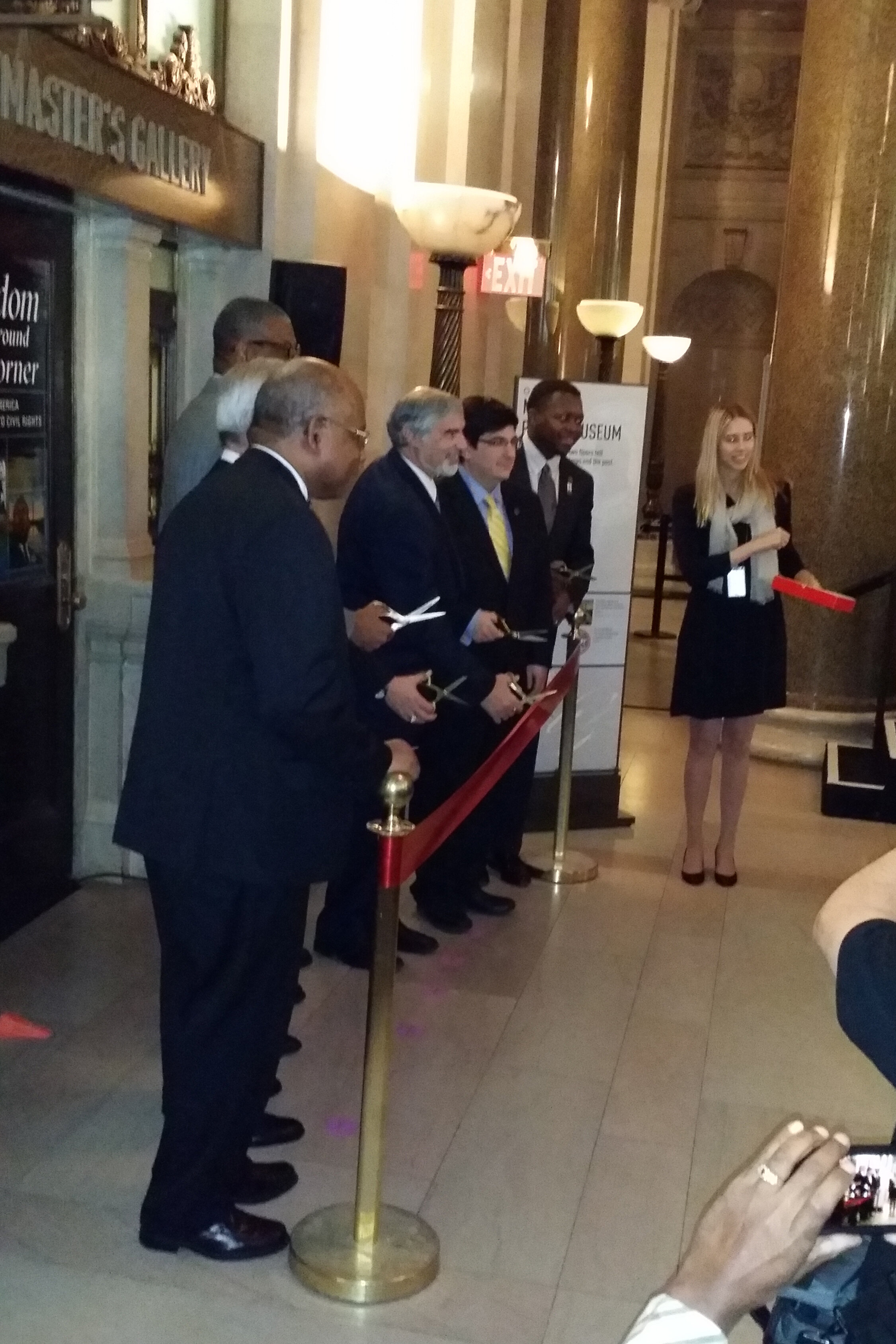
The exhibition I designed for the Smithsonian’s National Postal Museum, Freedom Just Around the Corner: Black America From Civil War to Civil Rights, opened yesterday!

CLD_NPM_Freedom-Exhibit1.jpg

Last night was its reception, with all expected fanfare including ribbon cutting and speeches, cocktails and finger foods. It was all quite nice — I do love exhibit openings. Here are some photos of the reception; thank you to photographer Bruce Guthrie for sharing them.

freedo_150212_001_stitch.jpg

Alongside the exhibition, I designed the catalogue, postcard takeaway, special postal cancel, and exterior banners. (Photos of the print design can be seen here.)

The women working the USPS table — who were selling commemorative stamps and giving commemorative cancels — heard that I was the designer and I ended up signing some books.

CLD-NPM-Freedom-catalog25.jpg

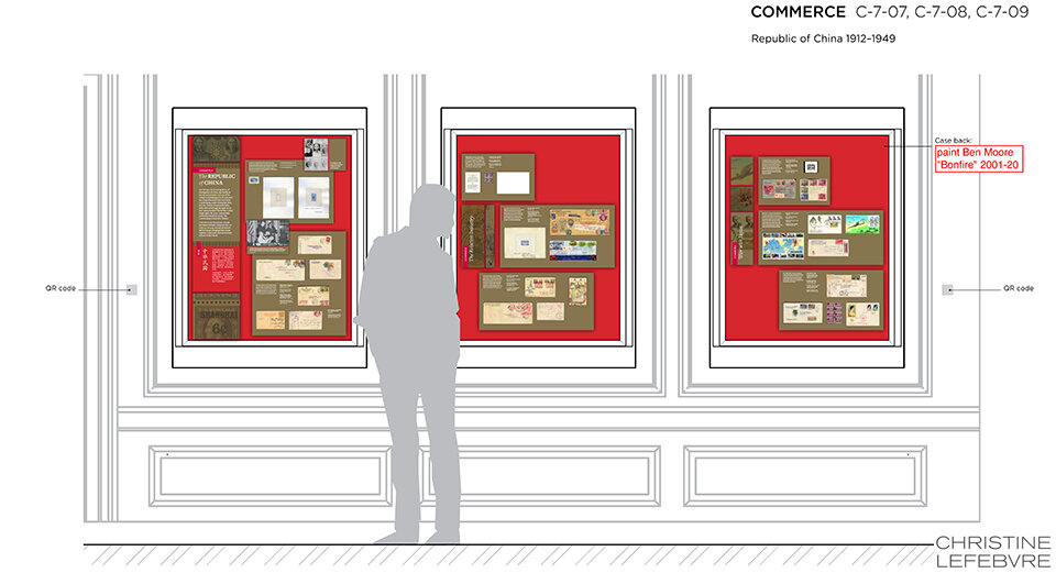
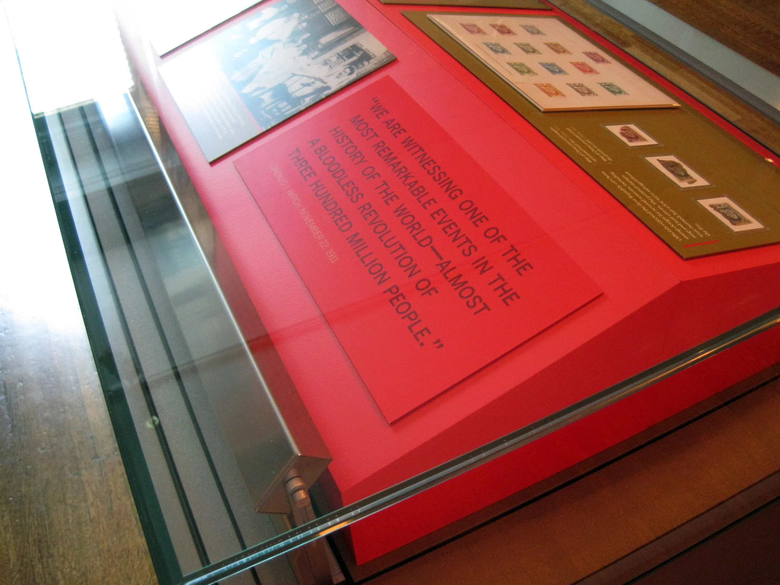
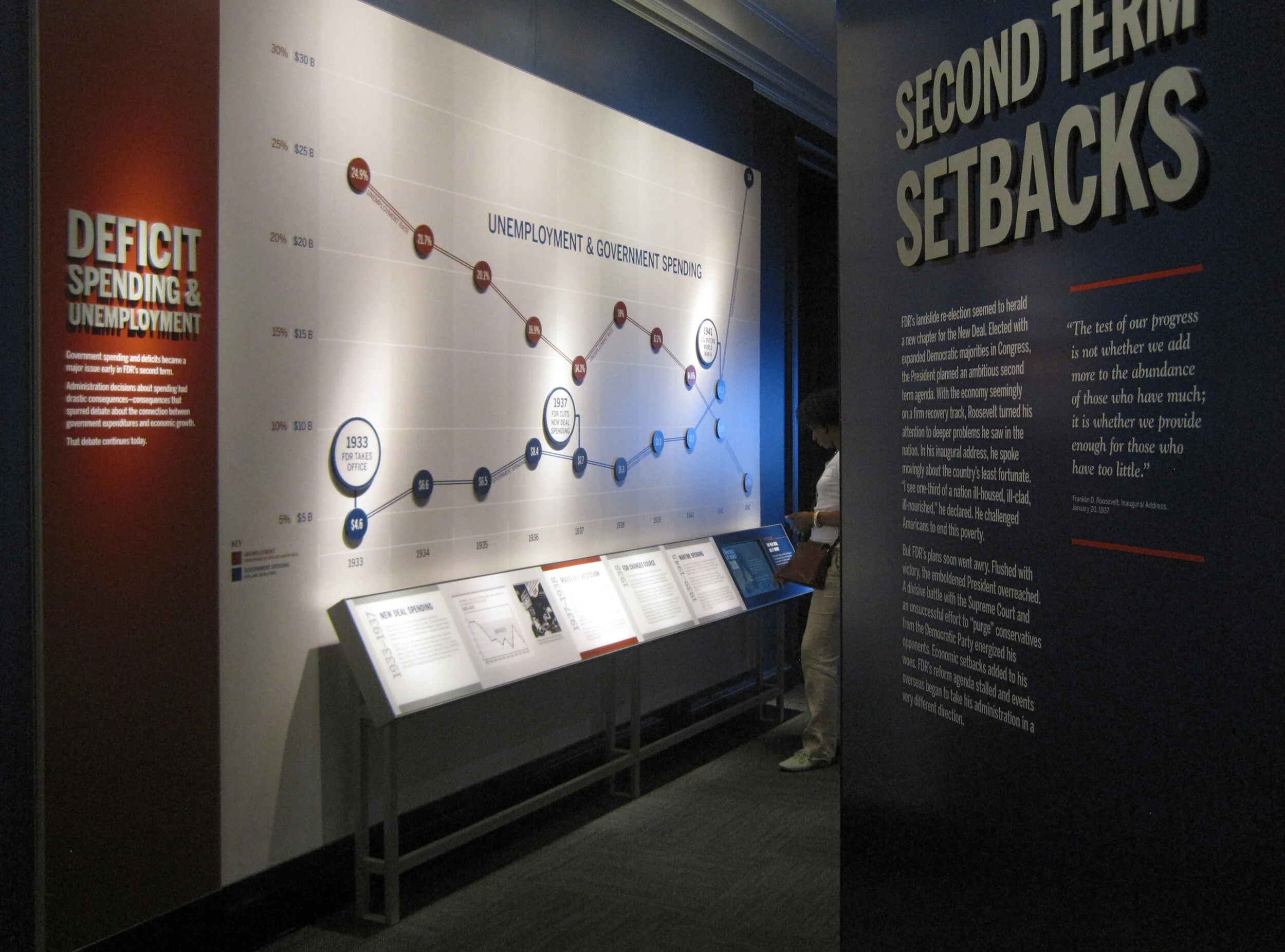
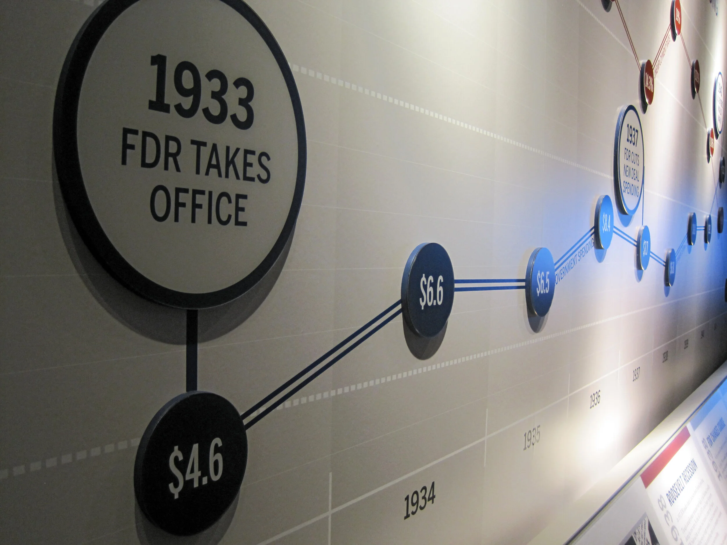
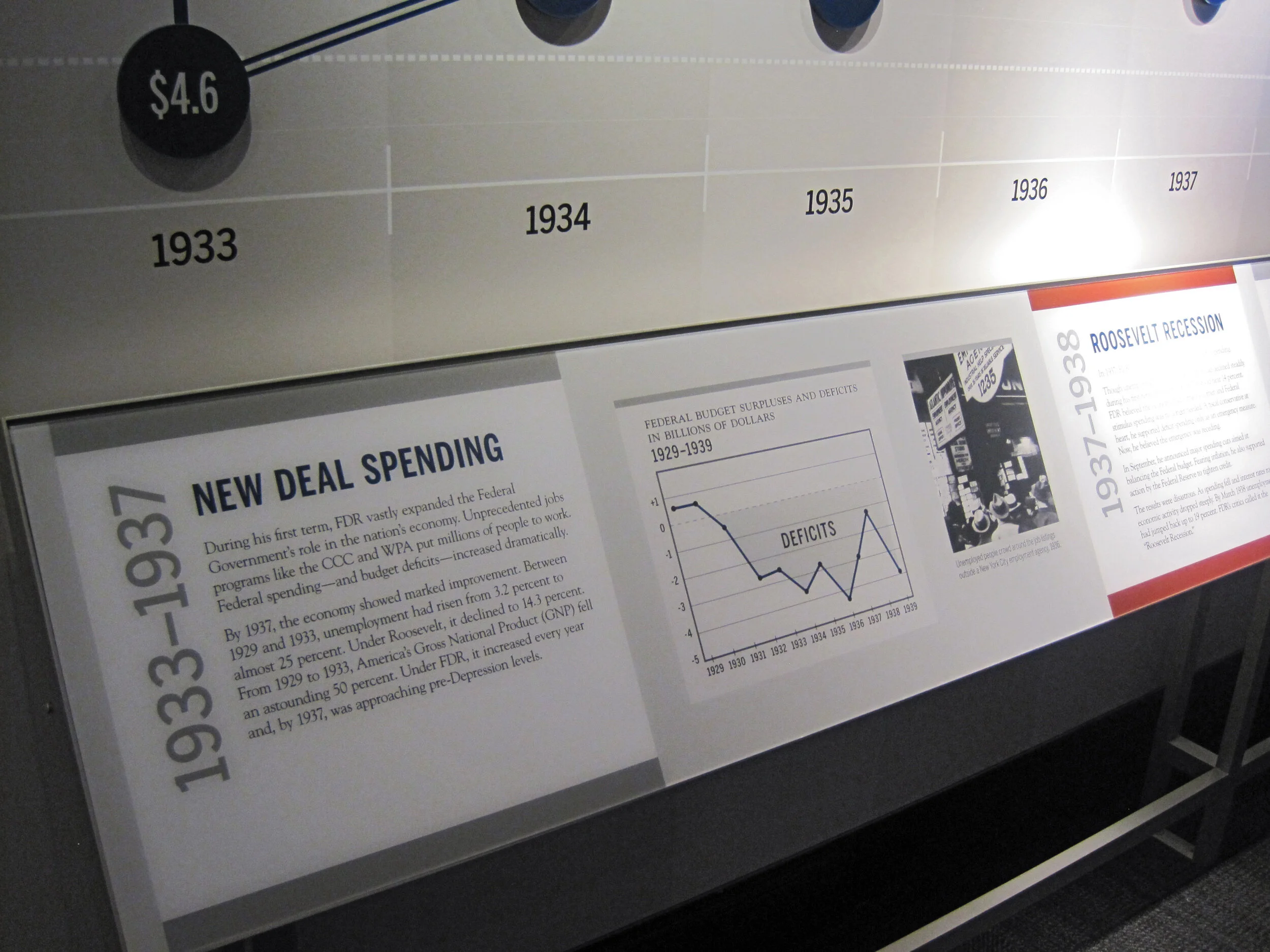
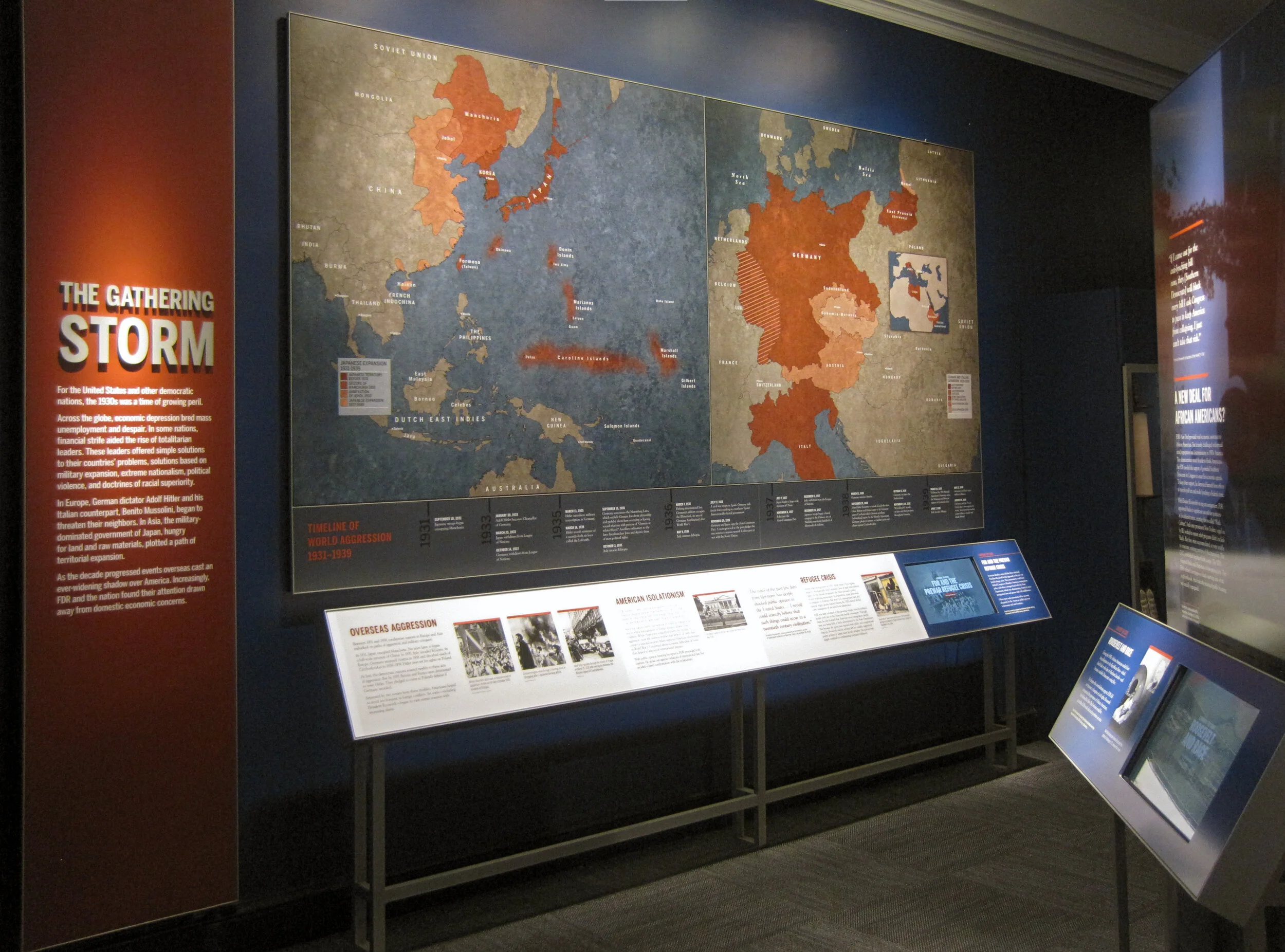
And, some photos of the exhibition. More photos can be seen, here.

CLD_NPM_Freedom-Exhibit5.jpg
CLD_NPM_Freedom-Exhibit16.jpg
CLD_NPM_Freedom-Exhibit23.jpg
CLD_NPM_Freedom-Exhibit7.jpg

Post updated in January 2021. This post was originally published at theexhibitdesigner.com on 13 February 2015. This updated post was combined with a similar post originally dated 19 February 2015.

I Want to Design this Exhibit: Banned Books Week

While scooting through downtown yesterday I saw these great big graphics on the side of the the DC Public Library on G Street.

I like the red blocks — they make me think of classified documents and redacted memos. Since the graphics had so successfully caught my attention, I was bummed to learn that I have missed Banned Books Week 2014 and its associated events. But I have enjoyed designing a little temporary exhibit in my mind ... books to flip through, excerpts printed large. I imagine someone reading one and saying, “really?! Charlotte’s Web??” and discussions about First Amendment rights and censorship.... Next year?

Post updated in January 2021 with minor text edits. Broken links have been replaced with archived URLs, courtesy of archive.org. This post was originally published at theexhibitdesigner.com on 3 October 2014.

Pacific Exchange, open at the National Postal Museum

Work shown was completed while I was a designer at Gallagher & Associates.

It’s open! Okay, old news. It opened well over a month ago, on March 6. I had also planned to post about the opening reception, but that was March 20, so — old news there as well. In any case, the reception was lovely, with Chinese food served and tinkling glassware and everyone dressed quite nicely.

Pacific Exchange: China & U.S. Mail is the second exhibit to be on view in the Postmasters Suite gallery at the Smithsonian National Postal Museum. From the exhibit website: Using mail and stamps, Pacific Exchange brings a human scale to Chinese–U.S. relations in three areas: commerce, culture, and community. The exhibit focuses on the 1860s to the 1970s, a time of extraordinary change in China. It also explores Chinese immigration to the United States, now home to four million Chinese Americans. (Thank you to James O'Donnell of the Smithsonian for the above photo.)

Upfront: I am a bit of a stamp nerd. I have a small collection of Olympics stamps, mostly international, from the 1960s and 1970s. (You have to focus when collecting stamps!) So I really enjoyed working on an exhibit about philately.

This was my swan song at Gallagher & Associates. I handled the design myself, from designing the exhibit’s visual concept to laying out production files for all of the graphics. I also designed the exhibit plan and artifact case layouts. Even though this is a small exhibit space, it had more than 100 artifacts, so making [nearly] everything fit comfortably was a bit of a challenge!

The design drawing above is an example of how a case layout looked during design development, and below are those same cases, made real:

PacificExchange_commerce-cases2.jpg

Graphics were digital output mounted on sign blank, trimmed to edges, with a matte overlaminate. The wall-mounted and freestanding graphics were backed with 1/2" MDF painted Benjamin Moore “Bonfire” to match the primary exhibit red (Pantone 1795). The freestanding graphics had duplicate panels on either side of the mdf — a panel sandwich which was held in place by adjustable metal sign bases. The Smithsonian Office of Exhibits Central printed and built the graphic components. Blair Fabrication built the case furniture.

PacificExchange_culture-case2.jpg

Most of the exhibit text is in English and Chinese, a design challenge I enjoyed. In the artifact case below, some of the artifacts were loans that had to be displayed flat. The other half of the plinth has a 15° rise to create a comfortable reading angle.

I arrived at the color palette after some research into significant colors in Chinese culture. I used red and gold as the dominant exhibit colors, with a deeper maroon red for accent. I used a third red, one with pink undertones — red, is the color of prosperity and good fortune, among other meanings — for the Commerce section of the exhibit; yellow, the color of heroism, for the Community section; and blue-green (or qing), to give a feeling of Chinese history and tradition, for the Culture section. I also drew distinctive vector patterns for each section.

The element that most people extol is the group of banners in the entrance. There are three individual banners and they’re more than 20 feet tall! EPI Colorspace printed and installed them. (Install photos here.) They were printed on “Brilliant Banner” 12 mil. polyester banner fabric. The fabric has a very subtle canvas texture that wasn’t what I originally intended — I wanted a silken look for the banners — but the color saturation and printing quality was so good that I went with EPI’s recommendation.

PacificExchange_entrance-timeline.jpg

I also designed a few of the related print graphics: the exhibit catalogue, a postcard, and the invitation to the opening reception.

The exhibit has been well-received overall and I’m thrilled with how everything turned out. If you’re in DC between now and January 4, 2015, please check it out!

Post updated in January 2021 with minor text edits and additional photos. Broken links have been fixed. This post was originally published at theexhibitdesigner.com on 26 April 2014.

My hazy memories of the Perot Museum

A few days ago I was talking with some colleagues about the Perot Museum of Nature and History in Dallas, Texas. Someone remembered one responsive interactive; I remembered a different one ... and then I remembered that I haven’t shared any photos from my visit (nearly a year ago).

The responsive interactive I remembered was located in the lobby. Models of water molecules danced up and down from the ceiling in response to the movements of people below. The molecule models were controlled by cameras in the ceiling that sensed movement and triggered motors that made them dance.

And that’s about where my specific memories break down. What I do remember is how large the museum is, with 11 permanent exhibit halls, and that the day I went it was JAM-PACKED.

There was something there for everyone though, even if it took a bit of maneuvering to get around and find it. I liked the dinosaur gallery:

And bits and pieces of other galleries, including the entrance to the Gems and Minerals Hall:

I was really taken with these benches sprinkled throughout the museum, with their cut-out factoids:

Overall, we were intrigued, learned some things, and had fun. (Just don’t ask me for details.)

I’ll wrap this post up with a photo I took of the roof. From the museum’s Wikipedia page: “It has a stone roof which features a landscape of drought-tolerant greenery inspired by Dallas surroundings. … Building on the museum’s commitment to resource conservation, the new building integrates a variety of sustainable strategies including a rainwater collection system that captures run-off water from the roof and parking lot, satisfying 74% of the museum’s non-potable water needs and 100% of its irrigation needs.”

Post updated in January 2021 with minor text edits. This post was originally published at theexhibitdesigner.com on 20 March 2014.

Pacific Exchange install

Work shown was completed while I was a designer at Gallagher & Associates.

I stopped by the Smithsonian National Postal Museum to check in on the installation of Pacific Exchange. I’m excited for the exhibit — my last project Gallagher & Associates — to open next week, on March 6.

While I was onsite, EPI Colorspace was there installing the large-format graphics. I’m very satisfied with the quality. Above, one of the EPI crew installs the hanging hardware for the set of three banners that introduce the exhibit. To the right is a fourth banner with the exhibit title.

After the banners were unfurled they were checked and checked again to ensure that they hung plumb. (Success!) The major graphics for this exhibit were in both English and simplified Chinese. Below: The windows to the right of the banners belong to the educational loft; we had some spectators!

Below: A detail of the weight and stitching at the banner’s bottom.

Above: Within the exhibit’s main room there is another dramatic introductory moment, this time produced in fabric stretched over a wooden frame and hung with heavy-duty D rings. There were happily no problems with measurements and everything went up easy peasy — I had my fingers crossed because there are odd cabinets with door knobs and molding behind the graphic. The EPI crew said I must be lucky.

Below: Graphics wait to be installed within the window openings between the gallery and the lobby.

Above: Work zone!—and three of the completed artifact cases. Below: Installed artifacts. More photos to come when everything is complete!

Post updated in January 2021 with minor text edits. Broken links have been fixed. This post was originally published at theexhibitdesigner.com on 27 February 2014.

Gone Solo

I’ve thought about setting out on my own for a while now.

ChristineLefebvreDesign_open2.jpg

When my partner and I chose to move to a beautiful house in the woods just outside southern DC — which would make commuting up to Silver Spring onerous — the timing suddenly made sense to leave my position as a Senior Designer at Gallagher & Associates.

I am now practicing as Christine Lefebvre Design. I offer services in graphic design, museum exhibition design, and interiors. Over the past eight years I’ve had the opportunity to work on a vast assortment of design projects in various capacities. My experience has been both specialized — in museum exhibition design, all phases — and broad. (Print work? Of course. Website design? Check. Event graphics? Yep.) I am currently available for project-based contract work, so if you are interested in working together, please get in touch! Thank you all for your support, and for following along on The Exhibit Designer.

Post updated in January 2021. This post was originally published at theexhibitdesigner.com on 11 Feb 2014.

Fun projects for the National Postal Museum

Work shown was completed while I was a designer at Gallagher & Associates.

I spent the end of summer through early fall wrapping up construction administration work for the newly opened Stamp Gallery at the Smithsonian National Postal Museum. (Designed by Gallagher & Associates.)

I inherited the project from a departing colleague and had very little to do with the design of the exhibit, but I did design the museum’s gallery guide, a fun little project.

I have also been working on a temporary exhibit for the Postal Museum called Pacific Exchange, about China–U.S. relations “through the lens” of stamps and mail. The opening is set for March and I am excited. I’ve really enjoyed the content and being able to give a good amount of attention to a small exhibit. Here’s a sneak peak of the design development:

Post updated in January 2021 with minor text edits. Broken links have been fixed. This post was originally published at theexhibitdesigner.com on 19 November 2013.

The FDR Museum is open!

The Franklin D. Roosevelt Presidential Library and Museum was rededicated on Sunday June 29 and is now open to the public. The New York Times published a flattering review and we are thrilled. Here we (the Gallagher team) are at the gala reception, with the museum’s chief curator:

Post updated in January 2021 with minor text edits. Broken links have been fixed. This post was originally published at theexhibitdesigner.com on 3 July 2013.

FDR Museum, part 4: rear-lit and neon

Work shown was completed while I was a designer at Gallagher & Associates.

To wrap up my series on the design, fabrication, and installation of the Franklin D. Roosevelt Museum, a close look at the first exhibition gallery.

The first gallery sets the stage for FDR’s presidency: the Great Depression. The focal point here is the neon-illuminated “FEAR” wall. Text is silkscreened onto the glass panels and rear-illuminated with LED pads. The red color comes from the custom “UMEMPLOYED” neon letters; the mural image in the back is a black and white photographic print.

The FEAR letters are applied to the rear of the glass. I wanted them to be translucent — to allow the mural image to show through and create depth — and also be as richly black as possible. The fabricators, Explus, provided a variety of production samples to try to achieve the effect I was after. Printing the letters on a transparent film and applying it to the glass, in particular, was unacceptable as I wanted a uniform transparency (no streaks, no dots).

Explus created a self-adhering vinyl by applying Sentinel OptiClear Adhesive to the face of the gel sheet (Rosco Cinegel Neutral Density N.9 Gel Extra Wide) and die-cutting it. I was happy, but the fabricators had some difficulty with cutting and applying the gel sheets. Their graphics manager told me that if they were to do something like this again they would use a standard window tint that has the application adhesive already on it. Here’s the sample:

Turning to the wall opposite:

The background mural is printed on DreamScape, as I mentioned in a previous post. Most of the murals in this museum were applied to backers, framed, and cleat-hung to the wall, but this particular one was applied directly to the wall and its edges captured with flat aluminum strips.

The framed graphics are digital prints with an overlaminate, mounted to sign blank. They were applied onsite to an MDF backer panel and aluminum frame. (The backer and frame are screwed to the exhibit wall; the graphic is applied with VHB tape.) Explus welded the frames’ corners before painting them, and that made a huge difference in the appearance of them. They are nicely finished and high-quality.

Post updated in January 2021 with minor text edits. Broken links have been fixed. This post was originally published at theexhibitdesigner.com on 25 June 2013.

FDR Museum, part 3: almost done!

Work shown was completed while I was a designer at Gallagher & Associates.

I am back in Hyde Park — installation continues! The exhibits are quickly coming together as the opening nears. Most of the graphics are hung, dimensional letters have been pinned (there are a ton throughout the museum — I went dimensional-letter-happy), and the interactives are being field-tested. I think it all is looking great. Some photos of the A New Deal gallery:

IMG_8087.JPG
IMG_7985.JPG
IMG_7806.JPG
IMG_8131.JPG

Artifact cases are being filled:

It’s a papier-mâché FDR sphinx!

IMG_8146.JPG

The World War II timeline is nearly complete (two weeks ago there wasn’t much hung besides the skeleton). What a bear that was to design!

IMG_7941.JPG
IMG_8168.JPG

I may have snuck into some New York Times photos while I was onsite. The critic and photographer were there, I was there ... who’s to say. We’ll see.

Post updated in January 2021 with minor text edits and additional photos. This post was originally published at theexhibitdesigner.com on 24 June 2013.

FDR Museum, part 2: installation continues

Work shown was completed while I was a designer at Gallagher & Associates.

I was back onsite with the Gallagher team at the FDR Library this past week and took more photos of the exhibit installation. It’s exciting to see the various elements go up. The exhibits are dense and layered; it’s a big story to tell in a relatively small space. The exhibits are in the original — now renovated — library conceived by Roosevelt himself so we were restricted to the existing spaces while designing the new exhibits.

Most of the graphics still have a protective film layer and ID label on them. In other places there are backers awaiting graphics, brown paper-wrapped graphics sitting on the floor, and assorted construction detritus. But bit-by-bit it’s going up! And we all know that everything happens in the last week before opening anyway. ;)

Updated, to add a photo of the finished gallery, The Promise of Change:

IMG_8042.JPG

Updated, to add a photo of the finished gallery, Foundations of a Public Life:

IMG_8066.JPG

Below, left: These graphics will be installed into the WWII timeline, on the right side of the photo above. They are printed on Laserchrome, which I mentioned in my previous post — and they look incredible.

I also mentioned the DreamScape wallcovering; below is a shot of some installed murals. I think they look good. Once the text panels, dimensional titles, reader rails, etc. go up — it will look great. More, soon!

Post updated in January 2021 with minor text edits and additional photos. Broken links have been fixed. This post was originally published at theexhibitdesigner.com on 16 June 2013.

FDR Museum, part 1: under construction and opening soon

Work shown was completed while I was a designer at Gallagher & Associates.

For the past couple of years I’ve been working on the Franklin D. Roosevelt Presidential Library and Museum, in Hyde Park, New York and (holy cow) the public opening is less than a month away. With time dwindling, I am finally sharing some process photos: production samples, shop visits, and installation.

The library has been posting photos of the installation on their tumblr. (2021 update: their tumblr is still going strong!) The photo below comes from there; I grabbed it to highlight the graphic in the background. There are four of these structures throughout the museum, one for each of FDR’s elections.

The “election stats” graphics are silkscreened onto Acrylite P-95 with white vinyl film adhered to the second surface. Silkscreening on P-95 creates a subtle shadow, which at certain angles makes the text appear dimensional. (For this reason, it should also be done with caution.) Here’s a photo of the sample provided by Explus, the fabricator (the installed graphic above is waiting for its red dimensional stars to be attached):

Below, the main story panels, used in the World War II gallery, which I am especially happy with:

They’re built from 5/8" clear acrylic, which has been painted on the front surface with acrylic paint, with a “window” left free of paint. The text is printed onto the painted acrylic surface, and then the photo — a Laserchrome metallic print — is adhered to the second surface of the acrylic, within the window area.

The photo above gives you a sense of the depth and jewel box effect created by layering the photo behind the acrylic. And here’s a peek at the backside of the pane. The aluminum angle frames are painted with Matthews acrylic polyurethane paint:

For wall murals I spec’ed DreamScape wallcoverings in various finishes. Above is another photo from the FDR blog, showing a few installed murals (currently missing their dimensional titles, and the scaffolding structure that will be located in front). I’m pleased with the crisp image quality, especially on the rough textures, such as “Plaster” (below, on the left) and “Mystical” (on the right).

Post updated in January 2021 with minor text edits. Broken links have been fixed. This post was originally published at theexhibitdesigner.com on 3 June 2013.

Century of the Child, at MoMA

I stopped in on Century of the Child, “an exploration and celebration of modern design for children in the 20th century,” at the Museum of Modern Art in NY. It was fascinating and delightful, and brought back some memories. For further reading definitely check out the exhibition website, the blog, and the tumblr.

Post updated in January 2021 with minor text edits. Broken links have been replaced with archived URLs, courtesy of archive.org. This post was originally published at theexhibitdesigner.com on 19 August 2012.

The News 08.16.12

A compilation of design-related web finds.

The Google Web Lab at the Science Museum in London | Designing for Accessibility: MoMA’s Material Lab | Harvard Medical School’s “Training the Eye” course | SEGD is hosting a symposium, “The Art of Collaboration” (link no longer available) in Raleigh October 4–5 | The last day to see the Terracotta Warriors in North America is August 26 in Times Square | The National Museum of American Jewish History in Philadelphia now offers free admission for their first floor gallery | Why the Museum of Broken Relationships is so great (it’s not just the name) | 100 Toys that Define Our Childhood — vote for your favorites for a new exhibit at the Children’s Museum of Indianapolis. Voting ends tomorrow, August 17 | Places that Work: U.S. Botanic Gardens | Spiders Alive! at the American Museum of Natural History (NY Times review) | Are some fonts more believable than others? and How to explain why typography matters | I’ve been pinning obsessively over on Pinterest.

Post updated in January 2021 with minor text edits. Broken links have been replaced with archived URLs, courtesy of archive.org. This post was originally published at theexhibitdesigner.com on 16 August 2012.

Game on: The Art of Video Games

I visited The Art of Video Games at the Smithsonian American Art Museum. (It’s gotten quite a bit of press — here is one thoughtful review, from The Mary Sue.) The exhibit covers the past 40 years of video game art and includes interviews of game designers and developers, conceptual art, video displays of 80 games (voted on by the public), and playable games (five, for the five eras of game technology).

I would have loved to play some Super Mario Brothers, but the wait was at least 10 kids deep so I had to move on. Vintage game consoles were on display in lit display “consoles,” along with video game stills and interpretive text.

The exhibit designers describe their process and the materials and production techniques used, in this blog post from Smithsonian Exhibits. There is also an upcoming gallery talk, “Building The Art of Video Games(link no longer available) on August 21. For those of you not in the DC area, the exhibit will travel beginning late October.

Post updated in January 2021 with text edits. Broken links have been replaced with archived URLs, courtesy of archive.org. This post was originally published at theexhibitdesigner.com on 15 August 2012.

Another world: the Van Cleef & Arpels traveling exhibit

I am awed by the Van Cleef & Arpels traveling exhibition. But alas, I can only look at photos.

My colleague Zhengyuan saw this exhibit twice. Once while it was on view in NY at the Smithsonian Cooper-Hewitt (where it was called Set in Style) and then again when it moved to MOCA Shanghai (where its name was changed to Timeless Beauty). (When it was on view in Tokyo it had yet another name, Spirit of Beauty.)

Zhengyuan shared photos of the MOCA Shanghai exhibit:

She described the exhibit, “they didn't move the entire exhibit set to Shanghai, but there were some new displays, like the octopus-like structure. The space is very dark ... and the sparkling bubble glass displays make it look like an underwater world!” She thought both versions were fantastic.

The designers, Patrick Jouin, explain: “for this exhibition we wanted the visitors to lose all sense of time, to open a door onto an imaginary world. The nature theme, which is a major source of inspiration for Van Cleef & Arpels, has also influenced the scenography. The pieces in the exhibition are presented in gigantic glass drops. In order to create a sensual and mysterious installation, we have used various types of illusions.”

The photos below are from the Cooper-Hewitt exhibit, taken by Matt Flynn, © Smithsonian Institution:

While both exhibit versions used the bubble glass cases, the Cooper-Hewitt’s version seemed more traditional than MOCA Shanghai’s. Less octopus-structure and more tables and wall vitrines. I’m curious what challenges the designers had to address as they designed an exhibit for travel to four different countries (Japan, the US, Shanghai, and France). In all its iterations, it is a gorgeous exhibition.

Post updated in January 2021 with minor text edits. Broken links have been fixed. This post was originally published at theexhibitdesigner.com on 21 June 2012.

America’s Mayor, at MCNY

Dragging out photos from the archives for your inspiration:

I loved this exhibit at the Museum of the City of New York. America’s Mayor: John V. Lindsay and the Reinvention of News York opened and closed two years ago, but I still remember it for its bold colors and interesting story.

The museum’s description: “America’s Mayor examines the controversial tenure (1966–1973) and dramatic times of New York’s 103rd mayor. The exhibition presents John V. Lindsay’s efforts to lead a city that was undergoing radical changes and that was at the center of the upheavals of the 1960s and 1970s; it highlights Mayor Lindsay’s ambitious initiatives to redefine New York City’s government, economy, culture, and urban design. Through his outspoken championship of city life, commitment to civil rights, and opposition to the Vietnam War, Lindsay emerged as a national figure in a troubled and exhilarating era.”

The bold design pulled me in. I loved the punchy colors used on the murals and inside artifact cases. The images, text treatment, and the clustering of framed print artifacts, all helped to convey the upheaval of the time period.

Artifact vitrines intersect walls in interesting ways — such as the tabletop case above, and the vitrine below, which cuts into the triangular, freestanding wall. I liked the reflective, silver sides of the cases.

Also noteworthy was the amount of information and artifacts on display. Overwhelming, perhaps, for some, but my observation was that the people there were genuinely interested in reading and looking at objects and documents, and for those with shorter attention spans, the large titles provided sign posts to help locate areas that would be of most interest to them.

Post updated in January 2021 with text edits. Broken links have been replaced with archived URLs, courtesy of archive.org. This post was originally published at theexhibitdesigner.com on 10 June 2012.

BoNE Show 2011, the wrap-up

The AIGA BoNE Show — Best of New England [Design] — is a design competition for New England, hosted biennially by AIGA Boston. I was asked to direct the 2011 show, after doing a decent job of designing the exhibit for the 2009 show, and when I said “yes!” without even thinking about it, I found myself responsible for its call-for-entries, judging, meet-the-judges event, awards show, exhibition, website, catalogue ... every little thing involved in putting on a design competition. (It was also the very last thing I did before I left Boston for DC, back in June.)

First I had to create a theme. I worked with George Restrepo to brainstorm a half dozen promising directions. The eventual winner — “Wicked Problems/Wicked Solutions” — was born while myself, George, and a couple other AIGA volunteers on the BoNE committee were discussing the concept of wicked problems and how design is essential to problem solving. Keeping tongue in cheek, I also liked that if people didn’t exactly understand the deeper meaning of the theme, it could also be interpreted as simply “wicked” in the New England sense.

The call-for-entries (above), designed by Kristen Coogan, featured a playful Rube Goldberg-esque problem-solving machine. This visual identity was carried through the rest of the competition and awards show’s graphic pieces, including the website, designed by Justin Hattingh, with technical assistance from Jeremy Perkins.

Below: In keeping everything aligned to the theme, at the meet-the-judges event — held in Boston the evening before judging began — the three judges each gave a presentation related to “wicked problems.”

All event and exhibition photos by Ben Gebo Photography. More event photos, here.

When designing the exhibition, we continued to play with the problem solving theme. Katelyn Mayfield designed a component-based display system: individual displays could be arranged in any configuration to take advantage of our huge gallery space on Boston University’s campus. The displays could then be packed flat and shipped to other venues when the BoNE Show “went on the road” after its run in Boston.

Here is the exhibition, full of guests on the evening of the awards show:

Exhibit displays were located in the front third of the 808 Gallery. Each display was custom-designed for the design project it held and hand-built from corrugated plastic sheets and PVC pipes. Windows and shelves were built by cutting and folding the plastic sheets, by Katelyn and a crack team of volunteers, including BU’s student AIGA group.

WICKED PROBLEMS and WICKED SOLUTIONS were applied to the wall in giant red and cyan vinyl. Winners’ names were laser cut from thick illustration board and the edges of shelves were finished with cyan-colored tape.

Above, left: I commissioned furniture designer Seth Wiseman of ConForm Lab to design and build two sets of benches which could be moved into endless configurations — a human-sized three-dimensional tangram game. The benches were sold during the event auction and the money benefited AIGA Boston. Seth also designed and built the tangram stage, which is in a couple of photos below.

Above, right: For the media-based winning entries, we built a simple kiosk. Joe Morris designed the interface.

Below, left: Dan Watkins (aka Dan the Man Photo) manned the “photo booth.” He also shot all the photography for the show’s catalogue. Below, right: DJs Dan Riti & Kevin James in their sophomore BoNE Show appearance.

Above, left: The silent auction table. We also held a live auction for the big-ticket items. Jason Stevens and Kathleen Byrnes headed the sponsorship drive. Because the point of this entire production was to raise money for AIGA, we tried to get everything for free (or at least on the cheap), and were very thankful for all of our generous sponsors.

And then there was the gorgeous (award-winning, itself) awards show catalogue, designed by George Restrepo and printed and bound by ACME Bookbinding. The embossed covers came in both red and cyan. The keepsake entry ticket was designed by Ira Cummings and printed and foil stamped by EM Letterpress.

And … the awards show! AIGA Boston chapter president Matthew Bacon served as Master of Ceremonies. Trophies were bone-shaped and cast in aluminum (bronzed for the Judges’ Choice winners), with embossed winners’ names. Names were all punched by hand (by Bridget Sandison, who also — along with Juliana Press and Meghann Hickson — took care of receiving and sorting and tracking all the competition entries) using a vintage Dymo label maker. Same way the awards have been made since the BoNE Show’s inception in 1995.

Thank you to Tracy Swyst, AIGA Boston’s VP of operation, who has overseen many many many BoNE Shows, and to the rest of the AIGA Boston board: Heather, Jodi, Colleen, Brandon, Jillfrancis, Diane, Chiranit, Lee, Mat, Jason R, and Sarah, and to the boards from AIGA Connecticut, Rhode Island, Maine, and NH/VT, and everyone else who lent a hand in any way. It was a really great experience.

Post updated in January 2021 with text edits and minor photo edits. Broken links have been fixed. This post was originally published at theexhibitdesigner.com on 24 April 2012.

The News 04.11.12

A compilation of design-related web finds.

Everyone’s been raving about Doug Aitken: SONG 1 at the Hirshhorn — because it’s awesome. I’ve visited twice and would (will) visit at least once more before it closes on May 13. You have to experience it in person.

My former firm, Christopher Chadbourne & Associates, announced their closure. This past summer I accepted a position with Gallagher & Associates, and moved to Washington, DC | In memory of the 100th anniversary of the Titanic’s sinking on April 15, dozens of exhibits about the ship have opened, including the the world’s largest, in Belfast; also: Fire & Ice: Hindenburg and Titanic at the Smithsonian National Postal Museum; Titanic: The Artifact Exhibition, everywhere; Titanic at the South Street Seaport Museum in New York, NY | The Union Pacific Railroad Museum’s Building America traveling exhibit is located in a traveling train car, naturally. The entire museum opens in Iowa in a month | Part 1 in a series of articles describing exhibit design, from Mark Walhimer at museumplanner.org | Blueprint, a guidebook to build your own history museum in the 21st century, from The Museum of the Future | Pinned Inspiration: ice ceiling; purple-sided lightboxes; German Expressionism at the MoMA; education center at the San Diego Children's Museum.

Post updated in January 2021 with text edits. Broken links have been replaced with archived URLs, courtesy of archive.org. This post was originally published at theexhibitdesigner.com on 11 April 2012.

Talk to Me, at MoMA

I’d rather not include too many posts about now-closed exhibits that I saw ages ago, but in the case of Talk to Me at the MoMA, the online exhibit is itself worth exploring.

A simple but compelling design. I liked the pixel illustrations on the introduction wall and the punchy red walls and reader rails.

Post updated in January 2021 with minor text edits. Broken links have been fixed. This post was originally published at theexhibitdesigner.com on 8 April 2012.